


Regexes Got Good: The History And Future Of Regular Expressions In JavaScript
Although JavaScript regexes used to be underpowered compared to other modern flavors, numerous improvements in recent years mean that’s no longer true. Steven Levithan evaluates the history and pres
Javascript
Freebie Release: Wintry Blue Wallpaper
Nature lovers may be able to find a soft spot in their hearts (and devices) for this wintry blue delight. A dandelion froze near the end of winter. If it holds on long enough to thaw out, there might
Freebies
Freebie Release: Dark Reflections Wallpaper
After a rough day at the office, there is solace to be found in a quiet night’s drive on a deserted bridge. Perhaps it’s due to the serenity afforded by the enveloping night, or a calming effect o
Freebies

Freebie: Infographic Elements Pack
If you love our last freebie release of 5 sets of inforgaphic banner elements, we are back with another infographic freebie release, made available exclusively for our loyal Hongkiat readers by our fr
FreebiesIf you love our last freebie release of 5 sets of inforgaphic banner elements, we are back with another infographic freebie release, made available exclusively for our loyal Hongkiat readers by our friends at freepik.com.
This is a great pack containing 100% vector elements including graphs, chart graphics, timelines, banners, pie charts, pyramids, infographic maps and buntings, all in a bright and beautiful color scheme, ready to be edited and released. Apart from these you are also getting bubble elements, arrow elements, puzzle elements and other option elements.
This infographic elements pack comes in AI and EPS formats.


Download
Please enter your email address below and click the Download Files button. The download link will be sent to you by email.
The post Freebie: Infographic Elements Pack appeared first on Hongkiat.

The Power Of The Intl API: A Definitive Guide To Browser-Native Internationalization
Internationalization isn’t just translation. It’s about formatting dates, pluralizing words, sorting names, and more, all according to specific locales. Instead of relying on heavy third-party lib
Javascript
The Power Of The <code>Intl</code> API: A Definitive Guide To Browser-Native Internationalization
Fuqiao Xue
It’s a common misconception that internationalization (i18n) is simply about translating text. While crucial, translation is merely one facet. One of the complexities lies in adapting information for diverse cultural expectations: How do you display a date in Japan versus Germany? What’s the correct way to pluralize an item in Arabic versus English? How do you sort a list of names in various languages?
Many developers have relied on weighty third-party libraries or, worse, custom-built formatting functions to tackle these challenges. These solutions, while functional, often come with significant overhead: increased bundle size, potential performance bottlenecks, and the constant struggle to keep up with evolving linguistic rules and locale data.
Enter the ECMAScript Internationalization API, more commonly known as the Intl object. This silent powerhouse, built directly into modern JavaScript environments, is an often-underestimated, yet incredibly potent, native, performant, and standards-compliant solution for handling data internationalization. It’s a testament to the web’s commitment to being worldwide, providing a unified and efficient way to format numbers, dates, lists, and more, according to specific locales.
Intl And Locales: More Than Just Language Codes
At the heart of Intl lies the concept of a locale. A locale is far more than just a two-letter language code (like en for English or es for Spanish). It encapsulates the complete context needed to present information appropriately for a specific cultural group. This includes:
- Language: The primary linguistic medium (e.g.,
en,es,fr). - Script: The script (e.g.,
Latnfor Latin,Cyrlfor Cyrillic). For example,zh-Hansfor Simplified Chinese, vs.zh-Hantfor Traditional Chinese. - Region: The geographic area (e.g.,
USfor United States,GBfor Great Britain,DEfor Germany). This is crucial for variations within the same language, such asen-USvs.en-GB, which differ in date, time, and number formatting. - Preferences/Variants: Further specific cultural or linguistic preferences. See “Choosing a Language Tag” from W3C for more information.
Typically, you’ll want to choose the locale according to the language of the web page. This can be determined from the lang attribute:
// Get the page's language from the HTML lang attribute const pageLocale = document.documentElement.lang || 'en-US'; // Fallback to 'en-US' Occasionally, you may want to override the page locale with a specific locale, such as when displaying content in multiple languages:
// Force a specific locale regardless of page language const tutorialFormatter = new Intl.NumberFormat('zh-CN', { style: 'currency', currency: 'CNY' }); console.log(`Chinese example: ${tutorialFormatter.format(199.99)}`); // Output: ¥199.99 In some cases, you might want to use the user’s preferred language:
// Use the user's preferred language const browserLocale = navigator.language || 'ja-JP'; const formatter = new Intl.NumberFormat(browserLocale, { style: 'currency', currency: 'JPY' }); When you instantiate an Intl formatter, you can optionally pass one or more locale strings. The API will then select the most appropriate locale based on availability and preference.
Core Formatting Powerhouses
The Intl object exposes several constructors, each for a specific formatting task. Let’s delve into the most frequently used ones, along with some powerful, often-overlooked gems.
1. Intl.DateTimeFormat: Dates and Times, Globally
Formatting dates and times is a classic i18n problem. Should it be MM/DD/YYYY or DD.MM.YYYY? Should the month be a number or a full word? Intl.DateTimeFormat handles all this with ease.
const date = new Date(2025, 6, 27, 14, 30, 0); // June 27, 2025, 2:30 PM // Specific locale and options (e.g., long date, short time) const options = { weekday: 'long', year: 'numeric', month: 'long', day: 'numeric', hour: 'numeric', minute: 'numeric', timeZoneName: 'shortOffset' // e.g., "GMT+8" }; console.log(new Intl.DateTimeFormat('en-US', options).format(date)); // "Friday, June 27, 2025 at 2:30 PM GMT+8" console.log(new Intl.DateTimeFormat('de-DE', options).format(date)); // "Freitag, 27. Juni 2025 um 14:30 GMT+8" // Using dateStyle and timeStyle for common patterns console.log(new Intl.DateTimeFormat('en-GB', { dateStyle: 'full', timeStyle: 'short' }).format(date)); // "Friday 27 June 2025 at 14:30" console.log(new Intl.DateTimeFormat('ja-JP', { dateStyle: 'long', timeStyle: 'short' }).format(date)); // "2025年6月27日 14:30" The flexibility of options for DateTimeFormat is vast, allowing control over year, month, day, weekday, hour, minute, second, time zone, and more.
2. Intl.NumberFormat: Numbers With Cultural Nuance
Beyond simple decimal places, numbers require careful handling: thousands separators, decimal markers, currency symbols, and percentage signs vary wildly across locales.
const price = 123456.789; // Currency formatting console.log(new Intl.NumberFormat('en-US', { style: 'currency', currency: 'USD' }).format(price)); // "$123,456.79" (auto-rounds) console.log(new Intl.NumberFormat('de-DE', { style: 'currency', currency: 'EUR' }).format(price)); // "123.456,79 €" // Units console.log(new Intl.NumberFormat('en-US', { style: 'unit', unit: 'meter', unitDisplay: 'long' }).format(100)); // "100 meters" console.log(new Intl.NumberFormat('fr-FR', { style: 'unit', unit: 'kilogram', unitDisplay: 'short' }).format(5.5)); // "5,5 kg" Options like minimumFractionDigits, maximumFractionDigits, and notation (e.g., scientific, compact) provide even finer control.
3. Intl.ListFormat: Natural Language Lists
Presenting lists of items is surprisingly tricky. English uses “and” for conjunction and “or” for disjunction. Many languages have different conjunctions, and some require specific punctuation.
This API simplifies a task that would otherwise require complex conditional logic:
const items = ['apples', 'oranges', 'bananas']; // Conjunction ("and") list console.log(new Intl.ListFormat('en-US', { type: 'conjunction' }).format(items)); // "apples, oranges, and bananas" console.log(new Intl.ListFormat('de-DE', { type: 'conjunction' }).format(items)); // "Äpfel, Orangen und Bananen" // Disjunction ("or") list console.log(new Intl.ListFormat('en-US', { type: 'disjunction' }).format(items)); // "apples, oranges, or bananas" console.log(new Intl.ListFormat('fr-FR', { type: 'disjunction' }).format(items)); // "apples, oranges ou bananas" 4. Intl.RelativeTimeFormat: Human-Friendly Timestamps
Displaying “2 days ago” or “in 3 months” is common in UI, but localizing these phrases accurately requires extensive data. Intl.RelativeTimeFormat automates this.
const rtf = new Intl.RelativeTimeFormat('en-US', { numeric: 'auto' }); console.log(rtf.format(-1, 'day')); // "yesterday" console.log(rtf.format(1, 'day')); // "tomorrow" console.log(rtf.format(-7, 'day')); // "7 days ago" console.log(rtf.format(3, 'month')); // "in 3 months" console.log(rtf.format(-2, 'year')); // "2 years ago" // French example: const frRtf = new Intl.RelativeTimeFormat('fr-FR', { numeric: 'auto', style: 'long' }); console.log(frRtf.format(-1, 'day')); // "hier" console.log(frRtf.format(1, 'day')); // "demain" console.log(frRtf.format(-7, 'day')); // "il y a 7 jours" console.log(frRtf.format(3, 'month')); // "dans 3 mois" The numeric: 'always' option would force “1 day ago” instead of “yesterday”.
5. Intl.PluralRules: Mastering Pluralization
This is arguably one of the most critical aspects of i18n. Different languages have vastly different pluralization rules (e.g., English has singular/plural, Arabic has zero, one, two, many…). Intl.PluralRules allows you to determine the “plural category” for a given number in a specific locale.
const prEn = new Intl.PluralRules('en-US'); console.log(prEn.select(0)); // "other" (for "0 items") console.log(prEn.select(1)); // "one" (for "1 item") console.log(prEn.select(2)); // "other" (for "2 items") const prAr = new Intl.PluralRules('ar-EG'); console.log(prAr.select(0)); // "zero" console.log(prAr.select(1)); // "one" console.log(prAr.select(2)); // "two" console.log(prAr.select(10)); // "few" console.log(prAr.select(100)); // "other" This API doesn’t pluralize text directly, but it provides the essential classification needed to select the correct translation string from your message bundles. For example, if you have message keys like item.one, item.other, you’d use pr.select(count) to pick the right one.
6. Intl.DisplayNames: Localized Names For Everything
Need to display the name of a language, a region, or a script in the user’s preferred language? Intl.DisplayNames is your comprehensive solution.
// Display language names in English const langNamesEn = new Intl.DisplayNames(['en'], { type: 'language' }); console.log(langNamesEn.of('fr')); // "French" console.log(langNamesEn.of('es-MX')); // "Mexican Spanish" // Display language names in French const langNamesFr = new Intl.DisplayNames(['fr'], { type: 'language' }); console.log(langNamesFr.of('en')); // "anglais" console.log(langNamesFr.of('zh-Hans')); // "chinois (simplifié)" // Display region names const regionNamesEn = new Intl.DisplayNames(['en'], { type: 'region' }); console.log(regionNamesEn.of('US')); // "United States" console.log(regionNamesEn.of('DE')); // "Germany" // Display script names const scriptNamesEn = new Intl.DisplayNames(['en'], { type: 'script' }); console.log(scriptNamesEn.of('Latn')); // "Latin" console.log(scriptNamesEn.of('Arab')); // "Arabic" With Intl.DisplayNames, you avoid hardcoding countless mappings for language names, regions, or scripts, keeping your application robust and lean.
Browser Support
You might be wondering about browser compatibility. The good news is that Intl has excellent support across modern browsers. All major browsers (Chrome, Firefox, Safari, Edge) fully support the core functionality discussed (DateTimeFormat, NumberFormat, ListFormat, RelativeTimeFormat, PluralRules, DisplayNames). You can confidently use these APIs without polyfills for the majority of your user base.
Conclusion: Embrace The Global Web With Intl
The Intl API is a cornerstone of modern web development for a global audience. It empowers front-end developers to deliver highly localized user experiences with minimal effort, leveraging the browser’s built-in, optimized capabilities.
By adopting Intl, you reduce dependencies, shrink bundle sizes, and improve performance, all while ensuring your application respects and adapts to the diverse linguistic and cultural expectations of users worldwide. Stop wrestling with custom formatting logic and embrace this standards-compliant tool!
It’s important to remember that Intl handles the formatting of data. While incredibly powerful, it doesn’t solve every aspect of internationalization. Content translation, bidirectional text (RTL/LTR), locale-specific typography, and deep cultural nuances beyond data formatting still require careful consideration. (I may write about these in the future!) However, for presenting dynamic data accurately and intuitively, Intl is the browser-native answer.
Further Reading & Resources
- MDN Web Docs:
- ECMAScript Internationalization API Specification: The official ECMA-402 Standard
- Choosing a Language Tag
 (gg, yk)
20 Sports Related Design Freebies to Design for the Olympics
The 2016 Olympics are held in Rio de Janeiro, Brazil, and once again, contenders from around the world congregate and try to best each other in a variety of Olympic events which will test the enduranc
FreebiesThe 2016 Olympics are held in Rio de Janeiro, Brazil, and once again, contenders from around the world congregate and try to best each other in a variety of Olympic events which will test the endurance, stamina, skills and sportsmanship of athletes.
If you would like to join us in celebrating this event, you will need the right design resources. In this post we have collected free downloadable sports-related design resources you can use on this quest. To get the resource, follow the download link.
Recommended Reading: The hidden technologies powering Olympic events
Summer Olympics 2016 Pictograms Logo. Olympic events get the pictogram treatment in this set of 41 SVG logos. [Download vector]

Winter sports icons. A PSD set of 12+ free, colorful Winter Olympics icons. [Download PSD]
Sporties icon set. Sports theme line icons available in three different styles: stroke, solid and colored. Format available in AI, PS and Sketch. [Download vector]
Sport Glyph Vector Icons. A small pack of 15 glyphs. Available in PSD. [Download vector]
Sports icons. There are two versions of these 25 sports icons: line and fill. All are free for commercial use CC4.0. Available in AI and EPS. [Download vector]
Sports icon pack. A small range of 10 line sport icons available in EPS format. [Download vector]
100 Sports/Fitness icons. A pack containing icons related to sports and fitness, events, health, equipment and more, this set is available in AI and PNG. [Download vector]
Cartoon sports icons. 9 illustrated sports events like for running, rock climbing and swimming among others. [Download vector]
Cartoon sports icons 2. An extension from the earlier batch, this pack showcases 9 more illustrated sports. [Download vector]
Cartoon sports icons 3. 9 fully colored illustrated sports icons ranging from sailing to archery. [Download vector]
Torch icons pack. No Olympic freebie compilation is completed without the torch pack. This one has 5 torch designs with various shapes of flames. [Download vector]
Inline sport icon pictogram. A pack featuring 30 human glyphs ala matchstick men perform the Olympic events. [Download vector]
Soccer Player Uniforms. Find your favorite soccer players complete in their team jerseys — in icon form! [Download vector]

Vector sports icons. Find quality vectors of sports equipment like balls, rackets, stopwatches and helmets. [Download vector]
Flat Sports Vectors. 12 fully colored flat vector icons featuring long shadow. [Download vector]

Handball illustration vector. Need ball icons? Here are 9 ball icons including the snooker ball, baseball, basketball, golf ball, volleyball and more. [Download vector]

Flaticon Sports. 100 sports logos in a variety of formats, depicting events, equipment, medals, and even the Olympic rings themselves. [Download vector]

Sports elements. 80 colored line icons showcasing sports-related events and equipment and . [Download vector]

Olympic Games Athletes. A pack of 100 single-colored icons showing athletes doing their country proud. [Download vector]

The post 20 Sports Related Design Freebies to Design for the Olympics appeared first on Hongkiat.
Fostering An Accessibility Culture
Building an accessibility culture isn’t easy, and there’s no clear playbook. But Dani offers insights from his own journey, where small, consistent habits made a big difference.
Accessibility
Fostering An Accessibility Culture
Daniel Devesa Derksen-Staats
A year ago, I learned that my role as an accessibility engineer was at risk of redundancy. It was a tough moment, both professionally and personally. For quite some time, my mind raced with guilt, self-doubt, plain sadness… But as I sat with these emotions, I found one line of thought that felt productive: reflection. What did I do well? What could I have done better? What did I learn?
Looking back, I realized that as part of a small team in a massive organization, we focused on a long-term goal that we also believed was the most effective and sustainable path: gradually shaping the organization’s culture to embrace accessibility.
Around the same time, I started listening to “Atomic Habits” by James Clear. The connection was immediate. Habits and culture are tightly linked concepts, and fostering an accessibility culture was really about embedding accessibility habits into everyone’s processes. That’s what we focused on. It took us time (and plenty of trial and error) to figure this out, and while there’s no definitive playbook for creating an accessibility program at a large organization, I thought it might help others if I shared my experiences.
Before we dive in, here’s a quick note: This is purely my personal perspective, and you’ll find a bias towards culture and action in big organizations. I’m not speaking on behalf of any employer, past or present. The progress we made was thanks to the incredible efforts of every member of the team and beyond. I hope these reflections resonate with those looking to foster an accessibility culture at their own companies.
Goals Vs. Systems
To effectively shape habits, it’s crucial to focus on systems and processes (who we want to become) rather than obsessing over a final goal (or what we want to achieve). This perspective is especially relevant in accessibility.
Take the goal of making your app accessible. If you focus solely on achieving compliance without changing your systems (embedding accessibility into processes and culture), progress will be temporary.
For example, you might request an accessibility audit and fix the flagged issues to achieve compliance. While this can provide “quick” results, it’s often a short-lived solution.
Software evolves constantly: features are rewritten, old code is removed, and new functionality is added. Without an underlying system in place, accessibility issues can quickly resurface. Worse, this approach may reinforce the idea that accessibility is something external, checked by someone else, and fixed only when flagged. Not to mention that it becomes increasingly expensive the later accessibility issues are addressed in the process. It can also feel demoralizing when accessibility becomes synonymous with a long list of last-minute tickets when you are busiest.

Despite this, companies constantly focus on the goal rather than the systems.
“Accessibility is both a state and a practice.”
— Sommer Panage, SwiftTO talk, “Building Accessibility into Your Company, Team, and Culture”
I’ll take the liberty of tweaking that to an aspirational state. Without recognizing the importance of the practice, any progress made is at risk of regression.
Instead, I encourage organizations to focus on building habits and embedding good accessibility practices into their workflows. A strong system not only ensures lasting progress but also fosters a culture where accessibility becomes second nature.
What Is Your Actual Goal?
That doesn’t mean goals are useless — they’re very effective in setting up direction.
In my team, we often said (only half-jokingly) that our ultimate goal was to put ourselves out of a job. This mindset reflects an important principle: accessibility is a cross-organizational responsibility, not the task of a single person or team.
That’s why, in my opinion, focusing solely on compliance rather than culture transformation (or prioritizing the “state” of accessibility over the “practice”) is a flawed strategy.
The real goal should be to build a user-centric culture where accessibility is embedded in every workflow, decision, and process. By doing so, companies can create products where accessibility is not about checking boxes and closing tickets but delivering meaningful and inclusive experiences to all users.
How Do We Get There?
Different companies (of various sizes, structures, and cultures) will approach accessibility differently, depending on where they are in their journey. I still have to meet, though, an accessibility team that ever felt they had enough resources. This makes careful resource allocation a cornerstone of your strategy. And while there’s no one-size-fits-all solution, shifting left (addressing issues earlier in the development process) tends to be the most effective approach in most cases.
Design Systems
If your company has a design system, partnering with the team that owns it can be one of your biggest wins. Fixing a single component used across dozens of places improves the experience everywhere it’s used. This approach scales beautifully.
Involvement in foundational decisions and discussions, like choosing color palettes, typography, and component interactions, and so on, can also be very valuable. Contributing to documentation and guidelines tailored to accessibility can help teams across the organization make informed decisions.
For a deeper dive, I recommend Feli Bernutz’s excellent talk, “Designing APIs: How to Ensure Accessibility in Design Systems.”
Community Building
It is worth repeating, you’ll need as many allies as possible. The more limited your resources, the more important this becomes. Something as simple as a Slack channel that becomes a safe space where people can ask questions and share tips can go a long way. Other ideas include lunch-and-learns, regular meetups, office hours, or building a more formal champions network. And, very importantly, it is about finding ways of recognising and celebrating wins and everyone’s good work.
If you’re exploring this, I highly recommend joining the Champions of Accessibility Network (CAN) group. It’s a great way to learn and connect with others who are passionate about accessibility.
Education
Education is key for scaling accessibility efforts. While not everyone needs to be an expert, we should strive for everyone to know the basics. Repeatedly raising basic issues like missing accessibility labels, small target sizes, poor color contrast, and so on, can’t be productive.
Consider periodic training for different roles (PMs, designers, engineers…), embedding accessibility into onboarding sessions and documentation. You’ll need to find what works for you.
At Spotify, I found onboarding sessions for designers highly effective, as most features start with design. A Deque case study found that 67% of automatically detectable accessibility issues originate with design, reinforcing the importance of this approach. If your company has an education or training programme, partner with them. At Spotify, they were our biggest allies. They’ll help you get it right.
Automation
Everything that can be automated should eventually be automated. We know there’s already a lot on your plate, and automation should help lighten the load. This is especially true in larger organizations, where it can help scale efforts more efficiently. However, automated accessibility checks are not the silver bullet some might hope for.
One key issue is viewing automation as the solution rather than a safety net. Some companies claim automated tools catch as much as 57% of all issues or even 80% of issues by volume (PDF), though it is widely accepted that the figure is about 30%. Native mobile apps present greater challenges, making it likely that the real number is significantly lower for iOS and Android. These tools, and the high expectations around them, can create a false sense of security or reduce efforts to merely appease an automated tool of choice.
“
Whether your focus is on compliance or customer satisfaction, manual testing remains an essential part of the process. Whenever possible, you should also be testing with real users.
For me, the greatest value of automation is in catching basic regressions before release and serving as a gentle nudge to developers, reminding them to consider accessibility more thoughtfully. Ideally, they don’t just fix an issue and move on but take a moment to reflect:
- How did this issue arise in the first place?
- Did we consider accessibility during development?
- Did we skip manual testing with a screen reader?
When it comes to shaping habits, the environment matters. A strong accessibility culture isn’t built on willpower alone. It thrives on systems that encourage good practices and make bad ones harder to fall into. Nudges like automated checks, documentation, and proactive education are invaluable for keeping accessibility at the top of the mind.
Remediation
I won’t lie; the moment I was first told my new job was to work on accessibility, I immediately jumped in, doing what I knew best, trying to fix as many issues as possible myself. While rewarding at first, this approach isn’t scalable in larger organizations. It can quickly lead to burnout. It also sets an expectation within the company that it’s your team’s responsibility to get it done, an expectation that becomes increasingly difficult to reset as time goes on.
Not saying you shouldn’t be hands-on, though! But you need to be strategic. Try to focus on supporting teams with complex issues, pair programming with colleagues, code reviews, or implementing cross-app improvements, ideally in partnership with the design system teams. This way, your efforts can have a broader impact.
Auditing
Accessibility audits are another tool in your toolbox. Audits can be valuable but are often overused. They’re most effective after teams have done their best to make the product accessible, serving as a validation step rather than the starting point. After all, how useful is an audit if a significant portion of the flagged issues are basic problems that automated tools could have detected?
Alternatively, audits might help when you need quick results but don’t have the time or resources to upskill your workforce in time for a timely and necessary remediation.
While audits have their place and, as mentioned, can be valuable in certain situations, I wouldn’t rely on them to be the cornerstone of your strategy.
And So Much More
Try to find what works for your team, and, most importantly, adapt as circumstances change. Beyond the strategies mentioned, you might explore other initiatives:
- Collecting accessibility metrics,
- Conducting user research and testing,
- Improving procurement practices,
- Ensuring accessible content and communications,
- Supporting accessible hiring, workplace platforms, and tools.
It doesn’t mean one area of action is more important than another. Actually, in my view, one of the biggest reasons cultural change around accessibility takes longer than other areas is the lack of diversity in the workforce. Contributing to lines of action to address this issue might not be as immediately obvious as others.
The industry hasn’t done enough to hire people with disabilities, leaving them underrepresented in building products that truly work for them. Worse yet, they face more barriers in the hiring process. And even when they do get hired, they may find that the tools meant to enable us to do our work and be productive don’t work for them.
The key is to identify and lay out your areas of action first, then prioritize strategically while staying flexible as circumstances evolve. A thoughtful, adaptive approach ensures that no matter the challenge, your efforts remain impactful, avoiding stretching your team too thin and losing focus.
Valley Of Despair
Here’s the truth that everyone working in accessibility inevitably and unfortunately faces sooner rather than later: accessibility done right, as we’ve seen so far, takes time. And that goes against the “move fast and break things” culture of quick results and short-termism that many companies still follow, even if they won’t openly admit it.
The slow-cooking nature of the process can, therefore, work against us. Being patient and trusting that small changes will aggregate and compound over time is incredibly challenging and sometimes nerve-racking. On top of that, if there’s a misalignment with leadership about what the ultimate goal is, or if there’s pressure to deliver quick results, it’s easy to feel like throwing in the towel, or worse, to experience burnout.
Unfortunately, burnout is an all-too-common issue in the accessibility community.
If you’d like to learn more about it, I highly recommend Shell Little’s talk, “The Accessibility to Burnout Pipeline.”
In those moments of doubt, it is useful to remember the quote embraced by the San Antonio Spurs NBA team, originally from social reformer Jacob Riis:
“When nothing seems to help, I go and look at a stonecutter hammering away at his rock perhaps a hundred times without as much as a crack showing in it. Yet at the hundred and first blow it will split in two, and I know it was not that blow that did it — but all that had gone before.”
— Jacob Riis
This serves as a powerful reminder that every small effort contributes to the eventual breakthrough, even when progress feels invisible.
An Uncomfortable Truth
Top-down approaches are easier, and yet, most accessibility initiatives start from the bottom. For a sustainable strategy, however, you’ll need both. If necessary, you’ll have to get buy-in from leadership or risk feeling like you’re constantly swimming upstream. Surprisingly, this is often harder than it seems. This topic could easily be an article on its own, but Vitaly Friedman offers some useful pointers in his piece “How To Make A Strong Case For Accessibility.”
In my experience, leadership buy-in is crucial to fostering an accessibility culture. Leaders often want to see how accessibility impacts the bottom line and whether investing in it is profitable. The hardest part is getting started, so if you can make a convincing case this way, do it.
I once watched a talk by Dave Dame titled “Stakeholders Agree That Accessibility Is Important, But That Does Not Mean They Will Invest In Accessibility.” He made an excellent point: You may need to speak the business language to get their attention. As Dave put it, “I have Cerebral Palsy, but my money doesn’t.”
There is also data out there suggesting that accessibility can be a worthwhile investment.

Still, I would encourage everyone to strive to change that mindset.
“
It is better to do it for the “wrong” reasons than not to do it at all. But ultimately, those aren’t the reasons we should be doing it.
The “13 Letters” podcast opened with an incredibly interesting two-part episode featuring Mike Shebanek. In it, Mike explains how Apple eventually renewed its commitment to accessibility because, in the state of Maine, schools were providing Macs and needed a screen reader for students who required one. It seems like a somewhat business-driven decision. But years later, Tim Cook famously stated, “When we work on making our devices accessible by the blind, I don’t consider the bloody ROI.” He also remarked, “Accessibility rights are human rights.”
That’s the mindset I wish more CEOs and leaders had. It is a story of how a change of mindset from “we have to do it” to “it is a core part of what we do” leads to a lasting and successful accessibility culture. Going beyond the bare minimum, Apple has become a leader in accessibility. An innovative company that consistently makes products more accessible and pushes the entire industry forward.
The Good News
Once good habits are established, they tend to stick around. When I was let go, some people (I’m sure trying to comfort me) said the accessibility of the app would quickly regress and that the company would soon realize their mistake. Unexpectedly for them, I responded that I actually hoped it wouldn’t regress anytime soon. That, to me, would be the sign that I had done my job well.
And honestly, I felt confident it wouldn’t. Incredible people with deep knowledge and a passion for accessibility and building high-quality products stayed at the company. I knew the app was in good hands.
But it’s important not to fall into complacency. Cultures can be taken for granted, but they need constant nurturing and protection. A company that hires too fast, undergoes a major layoff, gets acquired, experiences high turnover, or sees changes in leadership or priorities… Any of these can pretty quickly destabilize something that took years to build.
Wrapping Up
This might not be your experience, and what we did may not work for you, but I hope you find this insight useful. I have, as they say, strong opinions, but loosely held. So I’m looking forward to knowing what you think and learning about your experiences too.
There’s no easy way or silver bullet! It’s actually very hard! The odds are against you. And we tend to constantly be puzzled about why the world is against us doing something that seems so obviously the right thing to do: to invite and include as many people as possible to use your product, to remove barriers, to avoid exclusion. It is important to talk about exclusion, too, when we talk about accessibility.
“Even though we were all talking about inclusion, we each had a different understanding of that word. Exclusion, on the other hand, is unanimously understood as being left out (…) Once we learn how to recognize exclusion, we can begin to see where a product or experience that works well for some might have barriers for someone else. Recognizing exclusion sparks a new kind of creativity on how a solution can be better.”
Something that might help: always assume goodwill and try to meet people where they are. I need to remind myself of this quite often.
“It is all about understanding where people are, meeting them where they’re at (…) People want to fundamentally do the right thing (…) They might not know what they don’t know (…) It might mean stepping back and going to the fundamentals (…) I know some people get frustrated about having to re-explain accessibility over and over again, but I believe that if we are not willing to do that, then how are we gonna change the hearts and minds of people?”
I’d encourage you to:
- If you haven’t, just start. No matter what.
- Play the long game, and focus more on systems and processes than just goals.
- Build a network: rally allies around you and secure buy-in from leadership by showing that accessibility is not extra work; if considered after the fact, they’re actually missed steps.
- Shift left and be strategic: reflect on where your limited resources can have the biggest, most lasting impact.
- Be persistent. Be resilient.
But honestly, anything you can do is progress. And progress is all we need, just for things to be a little better every day. Your job is incredibly important. Thanks for all you do!
Accessibility: This is the way!
(yk)
Beyond The Black Box: Practical XAI For UX Practitioners
Explainable AI isn’t just a challenge for data scientists. It’s also a design challenge and a core pillar of trustworthy, effective AI products. Victor Yocco offers practical guidance and design p
Ux
Beyond The Black Box: Practical XAI For UX Practitioners
Victor Yocco
In my last piece, we established a foundational truth: for users to adopt and rely on AI, they must trust it. We talked about trust being a multifaceted construct, built on perceptions of an AI’s Ability, Benevolence, Integrity, and Predictability. But what happens when an AI, in its silent, algorithmic wisdom, makes a decision that leaves a user confused, frustrated, or even hurt? A mortgage application is denied, a favorite song is suddenly absent from a playlist, and a qualified resume is rejected before a human ever sees it. In these moments, ability and predictability are shattered, and benevolence feels a world away.
Our conversation now must evolve from the why of trust to the how of transparency. The field of Explainable AI (XAI), which focuses on developing methods to make AI outputs understandable to humans, has emerged to address this, but it’s often framed as a purely technical challenge for data scientists. I argue it’s a critical design challenge for products relying on AI. It’s our job as UX professionals to bridge the gap between algorithmic decision-making and human understanding.
This article provides practical, actionable guidance on how to research and design for explainability. We’ll move beyond the buzzwords and into the mockups, translating complex XAI concepts into concrete design patterns you can start using today.
De-mystifying XAI: Core Concepts For UX Practitioners
XAI is about answering the user’s question: “Why?” Why was I shown this ad? Why is this movie recommended to me? Why was my request denied? Think of it as the AI showing its work on a math problem. Without it, you just have an answer, and you’re forced to take it on faith. In showing the steps, you build comprehension and trust. You also allow for your work to be double-checked and verified by the very humans it impacts.
Feature Importance And Counterfactuals
There are a number of techniques we can use to clarify or explain what is happening with AI. While methods range from providing the entire logic of a decision tree to generating natural language summaries of an output, two of the most practical and impactful types of information UX practitioners can introduce into an experience are feature importance (Figure 1) and counterfactuals. These are often the most straightforward for users to understand and the most actionable for designers to implement.
Feature Importance
This explainability method answers, “What were the most important factors the AI considered?” It’s about identifying the top 2-3 variables that had the biggest impact on the outcome. It’s the headline, not the whole story.
Example: Imagine an AI that predicts whether a customer will churn (cancel their service). Feature importance might reveal that “number of support calls in the last month” and “recent price increases” were the two most important factors in determining if a customer was likely to churn.
Counterfactuals
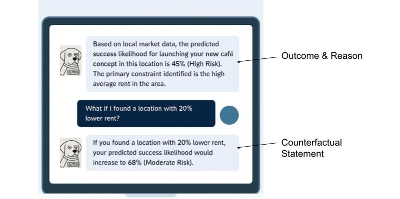
This powerful method answers, “What would I need to change to get a different outcome?” This is crucial because it gives users a sense of agency. It transforms a frustrating “no” into an actionable “not yet.”
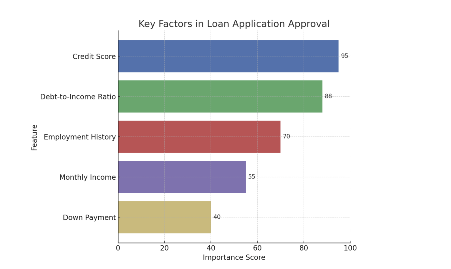
Example: Imagine a loan application system that uses AI. A user is denied a loan. Instead of just seeing “Application Denied,” a counterfactual explanation would also share, “If your credit score were 50 points higher, or if your debt-to-income ratio were 10% lower, your loan would have been approved.” This gives Sarah clear, actionable steps she can take to potentially get a loan in the future.
Using Model Data To Enhance The Explanation
Although technical specifics are often handled by data scientists, it’s helpful for UX practitioners to know that tools like LIME (Local Interpretable Model-agnostic Explanations) which explains individual predictions by approximating the model locally, and SHAP (SHapley Additive exPlanations) which uses a game theory approach to explain the output of any machine learning model are commonly used to extract these “why” insights from complex models. These libraries essentially help break down an AI’s decision to show which inputs were most influential for a given outcome.
When done properly, the data underlying an AI tool’s decision can be used to tell a powerful story. Let’s walk through feature importance and counterfactuals and show how the data science behind the decision can be utilized to enhance the user’s experience.
Now let’s cover feature importance with the assistance of Local Explanations (e.g., LIME) data: This approach answers, “Why did the AI make this specific recommendation for me, right now?” Instead of a general explanation of how the model works, it provides a focused reason for a single, specific instance. It’s personal and contextual.
Example: Imagine an AI-powered music recommendation system like Spotify. A local explanation would answer, “Why did the system recommend this specific song by Adele to you right now?” The explanation might be: “Because you recently listened to several other emotional ballads and songs by female vocalists.”
Finally, let’s cover the inclusion of Value-based Explanations (e.g. Shapley Additive Explanations (SHAP) data to an explanation of a decision: This is a more nuanced version of feature importance that answers, “How did each factor push the decision one way or the other?” It helps visualize what mattered, and whether its influence was positive or negative.
Example: Imagine a bank uses an AI model to decide whether to approve a loan application.
Feature Importance: The model output might show that the applicant’s credit score, income, and debt-to-income ratio were the most important factors in its decision. This answers what mattered.
Feature Importance with Value-Based Explanations (SHAP): SHAP values would take feature importance further based on elements of the model.
- For an approved loan, SHAP might show that a high credit score significantly pushed the decision towards approval (positive influence), while a slightly higher-than-average debt-to-income ratio pulled it slightly away (negative influence), but not enough to deny the loan.
- For a denied loan, SHAP could reveal that a low income and a high number of recent credit inquiries strongly pushed the decision towards denial, even if the credit score was decent.
This helps the loan officer explain to the applicant beyond what was considered, to how each factor contributed to the final “yes” or “no” decision.
It’s crucial to recognize that the ability to provide good explanations often starts much earlier in the development cycle. Data scientists and engineers play a pivotal role by intentionally structuring models and data pipelines in ways that inherently support explainability, rather than trying to bolt it on as an afterthought.
Research and design teams can foster this by initiating early conversations with data scientists and engineers about user needs for understanding, contributing to the development of explainability metrics, and collaboratively prototyping explanations to ensure they are both accurate and user-friendly.
XAI And Ethical AI: Unpacking Bias And Responsibility
Beyond building trust, XAI plays a critical role in addressing the profound ethical implications of AI*, particularly concerning algorithmic bias. Explainability techniques, such as analyzing SHAP values, can reveal if a model’s decisions are disproportionately influenced by sensitive attributes like race, gender, or socioeconomic status, even if these factors were not explicitly used as direct inputs.
For instance, if a loan approval model consistently assigns negative SHAP values to applicants from a certain demographic, it signals a potential bias that needs investigation, empowering teams to surface and mitigate such unfair outcomes.
The power of XAI also comes with the potential for “explainability washing.” Just as “greenwashing” misleads consumers about environmental practices, explainability washing can occur when explanations are designed to obscure, rather than illuminate, problematic algorithmic behavior or inherent biases. This could manifest as overly simplistic explanations that omit critical influencing factors, or explanations that strategically frame results to appear more neutral or fair than they truly are. It underscores the ethical responsibility of UX practitioners to design explanations that are genuinely transparent and verifiable.
UX professionals, in collaboration with data scientists and ethicists, hold a crucial responsibility in communicating the why of a decision, and also the limitations and potential biases of the underlying AI model. This involves setting realistic user expectations about AI accuracy, identifying where the model might be less reliable, and providing clear channels for recourse or feedback when users perceive unfair or incorrect outcomes. Proactively addressing these ethical dimensions will allow us to build AI systems that are truly just and trustworthy.
From Methods To Mockups: Practical XAI Design Patterns
Knowing the concepts is one thing; designing them is another. Here’s how we can translate these XAI methods into intuitive design patterns.
Pattern 1: The “Because” Statement (for Feature Importance)
This is the simplest and often most effective pattern. It’s a direct, plain-language statement that surfaces the primary reason for an AI’s action.
- Heuristic: Be direct and concise. Lead with the single most impactful reason. Avoid jargon at all costs.
Example: Imagine a music streaming service. Instead of just presenting a “Discover Weekly” playlist, you add a small line of microcopy.
Song Recommendation: “Velvet Morning”
Because you listen to “The Fuzz” and other psychedelic rock.
Pattern 2: The “What-If” Interactive (for Counterfactuals)
Counterfactuals are inherently about empowerment. The best way to represent them is by giving users interactive tools to explore possibilities themselves. This is perfect for financial, health, or other goal-oriented applications.
- Heuristic: Make explanations interactive and empowering. Let users see the cause and effect of their choices.
Example: A loan application interface. After a denial, instead of a dead end, the user gets a tool to determine how various scenarios (what-ifs) might play out (See Figure 1).

Pattern 3: The Highlight Reel (For Local Explanations)
When an AI performs an action on a user’s content (like summarizing a document or identifying faces in photos), the explanation should be visually linked to the source.
- Heuristic: Use visual cues like highlighting, outlines, or annotations to connect the explanation directly to the interface element it’s explaining.
Example: An AI tool that summarizes long articles.
AI-Generated Summary Point:
Initial research showed a market gap for sustainable products.Source in Document:
“…Our Q2 analysis of market trends conclusively demonstrated that no major competitor was effectively serving the eco-conscious consumer, revealing a significant market gap for sustainable products…”
Pattern 4: The Push-and-Pull Visual (for Value-based Explanations)
For more complex decisions, users might need to understand the interplay of factors. Simple data visualizations can make this clear without being overwhelming.
- Heuristic: Use simple, color-coded data visualizations (like bar charts) to show the factors that positively and negatively influenced a decision.
Example: An AI screening a candidate’s profile for a job.
Why this candidate is a 75% match:
Factors pushing the score up:
- 5+ Years UX Research Experience
- Proficient in Python
Factors pushing the score down:
- No experience with B2B SaaS
Learning and using these design patterns in the UX of your AI product will help increase the explainability. You can also use additional techniques that I’m not covering in-depth here. This includes the following:
- Natural language explanations: Translating an AI’s technical output into simple, conversational human language that non-experts can easily understand.
- Contextual explanations: Providing a rationale for an AI’s output at the specific moment and location, it is most relevant to the user’s task.
- Relevant visualizations: Using charts, graphs, or heatmaps to visually represent an AI’s decision-making process, making complex data intuitive and easier for users to grasp.
A Note For the Front End: Translating these explainability outputs into seamless user experiences also presents its own set of technical considerations. Front-end developers often grapple with API design to efficiently retrieve explanation data, and performance implications (like the real-time generation of explanations for every user interaction) need careful planning to avoid latency.
Some Real-world Examples
UPS Capital’s DeliveryDefense
UPS uses AI to assign a “delivery confidence score” to addresses to predict the likelihood of a package being stolen. Their DeliveryDefense software analyzes historical data on location, loss frequency, and other factors. If an address has a low score, the system can proactively reroute the package to a secure UPS Access Point, providing an explanation for the decision (e.g., “Package rerouted to a secure location due to a history of theft”). This system demonstrates how XAI can be used for risk mitigation and building customer trust through transparency.
Autonomous Vehicles
These vehicles of the future will need to effectively use XAI to help their vehicles make safe, explainable decisions. When a self-driving car brakes suddenly, the system can provide a real-time explanation for its action, for example, by identifying a pedestrian stepping into the road. This is not only crucial for passenger comfort and trust but is a regulatory requirement to prove the safety and accountability of the AI system.
IBM Watson Health (and its challenges)
While often cited as a general example of AI in healthcare, it’s also a valuable case study for the importance of XAI. The failure of its Watson for Oncology project highlights what can go wrong when explanations are not clear, or when the underlying data is biased or not localized. The system’s recommendations were sometimes inconsistent with local clinical practices because they were based on U.S.-centric guidelines. This serves as a cautionary tale on the need for robust, context-aware explainability.
The UX Researcher’s Role: Pinpointing And Validating Explanations
Our design solutions are only effective if they address the right user questions at the right time. An explanation that answers a question the user doesn’t have is just noise. This is where UX research becomes the critical connective tissue in an XAI strategy, ensuring that we explain the what and how that actually matters to our users. The researcher’s role is twofold: first, to inform the strategy by identifying where explanations are needed, and second, to validate the designs that deliver those explanations.
Informing the XAI Strategy (What to Explain)
Before we can design a single explanation, we must understand the user’s mental model of the AI system. What do they believe it’s doing? Where are the gaps between their understanding and the system’s reality? This is the foundational work of a UX researcher.
Mental Model Interviews: Unpacking User Perceptions Of AI Systems
Through deep, semi-structured interviews, UX practitioners can gain invaluable insights into how users perceive and understand AI systems. These sessions are designed to encourage users to literally draw or describe their internal “mental model” of how they believe the AI works. This often involves asking open-ended questions that prompt users to explain the system’s logic, its inputs, and its outputs, as well as the relationships between these elements.
These interviews are powerful because they frequently reveal profound misconceptions and assumptions that users hold about AI. For example, a user interacting with a recommendation engine might confidently assert that the system is based purely on their past viewing history. They might not realize that the algorithm also incorporates a multitude of other factors, such as the time of day they are browsing, the current trending items across the platform, or even the viewing habits of similar users.
Uncovering this gap between a user’s mental model and the actual underlying AI logic is critically important. It tells us precisely what specific information we need to communicate to users to help them build a more accurate and robust mental model of the system. This, in turn, is a fundamental step in fostering trust. When users understand, even at a high level, how an AI arrives at its conclusions or recommendations, they are more likely to trust its outputs and rely on its functionality.
AI Journey Mapping: A Deep Dive Into User Trust And Explainability
By meticulously mapping the user’s journey with an AI-powered feature, we gain invaluable insights into the precise moments where confusion, frustration, or even profound distrust emerge. This uncovers critical junctures where the user’s mental model of how the AI operates clashes with its actual behavior.
Consider a music streaming service: Does the user’s trust plummet when a playlist recommendation feels “random,” lacking any discernible connection to their past listening habits or stated preferences? This perceived randomness is a direct challenge to the user’s expectation of intelligent curation and a breach of the implicit promise that the AI understands their taste. Similarly, in a photo management application, do users experience significant frustration when an AI photo-tagging feature consistently misidentifies a cherished family member? This error is more than a technical glitch; it strikes at the heart of accuracy, personalization, and even emotional connection.
These pain points are vivid signals indicating precisely where a well-placed, clear, and concise explanation is necessary. Such explanations serve as crucial repair mechanisms, mending a breach of trust that, if left unaddressed, can lead to user abandonment.
The power of AI journey mapping lies in its ability to move us beyond simply explaining the final output of an AI system. While understanding what the AI produced is important, it’s often insufficient. Instead, this process compels us to focus on explaining the process at critical moments. This means addressing:
- Why a particular output was generated: Was it due to specific input data? A particular model architecture?
- What factors influenced the AI’s decision: Were certain features weighted more heavily?
- How the AI arrived at its conclusion: Can we offer a simplified, analogous explanation of its internal workings?
- What assumptions the AI made: Were there implicit understandings of the user’s intent or data that need to be surfaced?
- What the limitations of the AI are: Clearly communicating what the AI cannot do, or where its accuracy might waver, builds realistic expectations.
AI journey mapping transforms the abstract concept of XAI into a practical, actionable framework for UX practitioners. It enables us to move beyond theoretical discussions of explainability and instead pinpoint the exact moments where user trust is at stake, providing the necessary insights to build AI experiences that are powerful, transparent, understandable, and trustworthy.
Ultimately, research is how we uncover the unknowns. Your team might be debating how to explain why a loan was denied, but research might reveal that users are far more concerned with understanding how their data was used in the first place. Without research, we are simply guessing what our users are wondering.
Collaborating On The Design (How to Explain Your AI)
Once research has identified what to explain, the collaborative loop with design begins. Designers can prototype the patterns we discussed earlier—the “Because” statement, the interactive sliders—and researchers can put those designs in front of users to see if they hold up.
Targeted Usability & Comprehension Testing: We can design research studies that specifically test the XAI components. We don’t just ask, “*Is this easy to use?*” We ask, “*After seeing this, can you tell me in your own words why the system recommended this product?*” or “*Show me what you would do to see if you could get a different result.*” The goal here is to measure comprehension and actionability, alongside usability.
Measuring Trust Itself: We can use simple surveys and rating scales before and after an explanation is shown. For instance, we can ask a user on a 5-point scale, “*How much do you trust this recommendation?*” before they see the “Because” statement, and then ask them again afterward. This provides quantitative data on whether our explanations are actually moving the needle on trust.
This process creates a powerful, iterative loop. Research findings inform the initial design. That design is then tested, and the new findings are fed back to the design team for refinement. Maybe the “Because” statement was too jargony, or the “What-If” slider was more confusing than empowering. Through this collaborative validation, we ensure that the final explanations are technically accurate, genuinely understandable, useful, and trust-building for the people using the product.
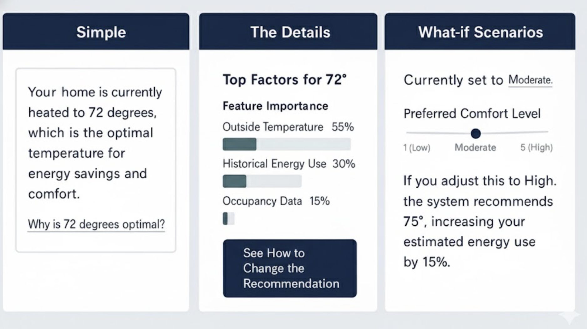
The Goldilocks Zone Of Explanation
A critical word of caution: it is possible to over-explain. As in the fairy tale, where Goldilocks sought the porridge that was ‘just right’, the goal of a good explanation is to provide the right amount of detail—not too much and not too little. Bombarding a user with every variable in a model will lead to cognitive overload and can actually decrease trust. The goal is not to make the user a data scientist.
One solution is progressive disclosure.
- Start with the simple. Lead with a concise “Because” statement. For most users, this will be enough.
- Offer a path to detail. Provide a clear, low-friction link like “Learn More” or “See how this was determined.”
- Reveal the complexity. Behind that link, you can offer the interactive sliders, the visualizations, or a more detailed list of contributing factors.
This layered approach respects user attention and expertise, providing just the right amount of information for their needs. Let’s imagine you’re using a smart home device that recommends optimal heating based on various factors.
Start with the simple: “*Your home is currently heated to 72 degrees, which is the optimal temperature for energy savings and comfort.*”
Offer a path to detail: Below that, a small link or button: “Why is 72 degrees optimal?“
Reveal the complexity: Clicking that link could open a new screen showing:
- Interactive sliders for outside temperature, humidity, and your preferred comfort level, demonstrating how these adjust the recommended temperature.
- A visualization of energy consumption at different temperatures.
- A list of contributing factors like “Time of day,” “Current outside temperature,” “Historical energy usage,” and “Occupancy sensors.”
It’s effective to combine multiple XAI methods and this Goldilocks Zone of Explanation pattern, which advocates for progressive disclosure, implicitly encourages this. You might start with a simple “Because” statement (Pattern 1) for immediate comprehension, and then offer a “Learn More” link that reveals a “What-If” Interactive (Pattern 2) or a “Push-and-Pull Visual” (Pattern 4) for deeper exploration.
For instance, a loan application system could initially state the primary reason for denial (feature importance), then allow the user to interact with a “What-If” tool to see how changes to their income or debt would alter the outcome (counterfactuals), and finally, provide a detailed “Push-and-Pull” chart (value-based explanation) to illustrate the positive and negative contributions of all factors. This layered approach allows users to access the level of detail they need, when they need it, preventing cognitive overload while still providing comprehensive transparency.
Determining which XAI tools and methods to use is primarily a function of thorough UX research. Mental model interviews and AI journey mapping are crucial for pinpointing user needs and pain points related to AI understanding and trust. Mental model interviews help uncover user misconceptions about how the AI works, indicating areas where fundamental explanations (like feature importance or local explanations) are needed. AI journey mapping, on the other hand, identifies critical moments of confusion or distrust in the user’s interaction with the AI, signaling where more granular or interactive explanations (like counterfactuals or value-based explanations) would be most beneficial to rebuild trust and provide agency.
Ultimately, the best way to choose a technique is to let user research guide your decisions, ensuring that the explanations you design directly address actual user questions and concerns, rather than simply offering technical details for their own sake.
XAI for Deep Reasoning Agents
Some of the newest AI systems, known as deep reasoning agents, produce an explicit “chain of thought” for every complex task. They do not merely cite sources; they show the logical, step-by-step path they took to arrive at a conclusion. While this transparency provides valuable context, a play-by-play that spans several paragraphs can feel overwhelming to a user simply trying to complete a task.
The principles of XAI, especially the Goldilocks Zone of Explanation, apply directly here. We can curate the journey, using progressive disclosure to show only the final conclusion and the most salient step in the thought process first. Users can then opt in to see the full, detailed, multi-step reasoning when they need to double-check the logic or find a specific fact. This approach respects user attention while preserving the agent’s full transparency.
Next Steps: Empowering Your XAI Journey
Explainability is a fundamental pillar for building trustworthy and effective AI products. For the advanced practitioner looking to drive this change within their organization, the journey extends beyond design patterns into advocacy and continuous learning.
To deepen your understanding and practical application, consider exploring resources like the AI Explainability 360 (AIX360) toolkit from IBM Research or Google’s What-If Tool, which offer interactive ways to explore model behavior and explanations. Engaging with communities like the Responsible AI Forum or specific research groups focused on human-centered AI can provide invaluable insights and collaboration opportunities.
Finally, be an advocate for XAI within your own organization. Frame explainability as a strategic investment. Consider a brief pitch to your leadership or cross-functional teams:
“By investing in XAI, we’ll go beyond building trust; we’ll accelerate user adoption, reduce support costs by empowering users with understanding, and mitigate significant ethical and regulatory risks by exposing potential biases. This is good design and smart business.”
Your voice, grounded in practical understanding, is crucial in bringing AI out of the black box and into a collaborative partnership with users.
(yk)
JavaScript For Everyone: Iterators
Here is a lesson on Iterators: iterables implement the iterable iteration interface, and iterators implement the iterator iteration interface. Sounds confusing? Mat breaks it all down in the article.
Javascript
JavaScript For Everyone: Iterators
Mat Marquis
Hey, I’m Mat, but “Wilto” works too — I’m here to teach you JavaScript. Well, not here-here; technically, I’m over at Piccalil.li’s JavaScript for Everyone course to teach you JavaScript. The following is an excerpt from the Iterables and Iterators module: the lesson on Iterators.
Iterators are one of JavaScript’s more linguistically confusing topics, sailing easily over what is already a pretty high bar. There are iterables — array, Set, Map, and string — all of which follow the iterable protocol. To follow said protocol, an object must implement the iterable interface. In practice, that means that the object needs to include a [Symbol.iterator]() method somewhere in its prototype chain. Iterable protocol is one of two iteration protocols. The other iteration protocol is the iterator protocol.
See what I mean about this being linguistically fraught? Iterables implement the iterable iteration interface, and iterators implement the iterator iteration interface! If you can say that five times fast, then you’ve pretty much got the gist of it; easy-peasy, right?
No, listen, by the time you reach the end of this lesson, I promise it won’t be half as confusing as it might sound, especially with the context you’ll have from the lessons that precede it.
An iterable object follows the iterable protocol, which just means that the object has a conventional method for making iterators. The elements that it contains can be looped over with for…of.
An iterator object follows the iterator protocol, and the elements it contains can be accessed sequentially, one at a time.
To reiterate — a play on words for which I do not forgive myself, nor expect you to forgive me — an iterator object follows iterator protocol, and the elements it contains can be accessed sequentially, one at a time. Iterator protocol defines a standard way to produce a sequence of values, and optionally return a value once all possible values have been generated.
In order to follow the iterator protocol, an object has to — you guessed it — implement the iterator interface. In practice, that once again means that a certain method has to be available somewhere on the object’s prototype chain. In this case, it’s the next() method that advances through the elements it contains, one at a time, and returns an object each time that method is called.
In order to meet the iterator interface criteria, the returned object must contain two properties with specific keys: one with the key value, representing the value of the current element, and one with the key done, a Boolean value that tells us if the iterator has advanced beyond the final element in the data structure. That’s not an awkward phrasing the editorial team let slip through: the value of that done property is true only when a call to next() results in an attempt to access an element beyond the final element in the iterator, not upon accessing the final element in the iterator. Again, a lot in print, but it’ll make more sense when you see it in action.
You’ve seen an example of a built-in iterator before, albeit briefly:
const theMap = new Map([ [ "aKey", "A value." ] ]); console.log( theMap.keys() ); // Result: Map Iterator { constructor: Iterator() } That’s right: while a Map object itself is an iterable, Map’s built-in methods keys(), values(), and entries() all return Iterator objects. You’ll also remember that I looped through those using forEach (a relatively recent addition to the language). Used that way, an iterator is indistinguishable from an iterable:
const theMap = new Map([ [ "key", "value " ] ]); theMap.keys().forEach( thing => { console.log( thing ); }); // Result: key All iterators are iterable; they all implement the iterable interface:
const theMap = new Map([ [ "key", "value " ] ]); theMap.keys()[ Symbol.iterator ]; // Result: function Symbol.iterator() And if you’re angry about the increasing blurriness of the line between iterators and iterables, wait until you get a load of this “top ten anime betrayals” video candidate: I’m going to demonstrate how to interact with an iterator by using an array.
“BOO,” you surely cry, having been so betrayed by one of your oldest and most indexed friends. “Array is an iterable, not an iterator!” You are both right to yell at me in general, and right about array in specific — an array is an iterable, not an iterator. In fact, while all iterators are iterable, none of the built-in iterables are iterators.
However, when you call that [ Symbol.iterator ]() method — the one that defines an object as an iterable — it returns an iterator object created from an iterable data structure:
const theIterable = [ true, false ]; const theIterator = theIterable[ Symbol.iterator ](); theIterable; // Result: Array [ true, false ] theIterator; // Result: Array Iterator { constructor: Iterator() } The same goes for Set, Map, and — yes — even strings:
const theIterable = "A string." const theIterator = theIterable[ Symbol.iterator ](); theIterator; // Result: String Iterator { constructor: Iterator() } What we’re doing here manually — creating an iterator from an iterable using %Symbol.iterator% — is precisely how iterable objects work internally, and why they have to implement %Symbol.iterator% in order to be iterables. Any time you loop through an array, you’re actually looping through an iterator created from that Array. All built-in iterators are iterable. All built-in iterables can be used to create iterators.
Alternately — preferably, even, since it doesn’t require you to graze up against %Symbol.iterator% directly — you can use the built-in Iterator.from() method to create an iterator object from any iterable:
const theIterator = Iterator.from([ true, false ]); theIterator; // Result: Array Iterator { constructor: Iterator() } You remember how I mentioned that an iterator has to provide a next() method (that returns a very specific Object)? Calling that next() method steps through the elements that the iterator contains one at a time, with each call returning an instance of that Object:
const theIterator = Iterator.from([ 1, 2, 3 ]); theIterator.next(); // Result: Object { value: 1, done: false } theIterator.next(); // Result: Object { value: 2, done: false } theIterator.next(); // Result: Object { value: 3, done: false } theIterator.next(); // Result: Object { value: undefined, done: true } You can think of this as a more controlled form of traversal than the traditional “wind it up and watch it go” for loops you’re probably used to — a method of accessing elements one step at a time, as-needed. Granted, you don’t have to step through an iterator in this way, since they have their very own Iterator.forEach method, which works exactly like you would expect — to a point:
const theIterator = Iterator.from([ true, false ]); theIterator.forEach( element => console.log( element ) ); /* Result: true false */ But there’s another big difference between iterables and iterators that we haven’t touched on yet, and for my money, it actually goes a long way toward making linguistic sense of the two. You might need to humor me for a little bit here, though.
See, an iterable object is an object that is iterable. No, listen, stay with me: you can iterate over an Array, and when you’re done doing so, you can still iterate over that Array. It is, by definition, an object that can be iterated over; it is the essential nature of an iterable to be iterable:
const theIterable = [ 1, 2 ]; theIterable.forEach( el => { console.log( el ); }); /* Result: 1 2 */ theIterable.forEach( el => { console.log( el ); }); /* Result: 1 2 */ In a way, an iterator object represents the singular act of iteration. Internal to an iterable, it is the mechanism by which the iterable is iterated over, each time that iteration is performed. As a stand-alone iterator object — whether you step through it using the next method or loop over its elements using forEach — once iterated over, that iterator is past tense; it is iterated. Because they maintain an internal state, the essential nature of an iterator is to be iterated over, singular:
const theIterator = Iterator.from([ 1, 2 ]); theIterator.next(); // Result: Object { value: 1, done: false } theIterator.next(); // Result: Object { value: 2, done: false } theIterator.next(); // Result: Object { value: undefined, done: true } theIterator.forEach( el => console.log( el ) ); // Result: undefined That makes for neat work when you’re using the Iterator constructor’s built-in methods to, say, filter or extract part of an Iterator object:
const theIterator = Iterator.from([ "First", "Second", "Third" ]); // Take the first two values from `theIterator`: theIterator.take( 2 ).forEach( el => { console.log( el ); }); /* Result: "First" "Second" */ // theIterator now only contains anything left over after the above operation is complete: theIterator.next(); // Result: Object { value: "Third", done: false } Once you reach the end of an iterator, the act of iterating over it is complete. Iterated. Past-tense.
And so too is your time in this lesson, you might be relieved to hear. I know this was kind of a rough one, but the good news is: this course is iterable, not an iterator. This step in your iteration through it — this lesson — may be over, but the essential nature of this course is that you can iterate through it again. Don’t worry about committing all of this to memory right now — you can come back and revisit this lesson anytime.
Conclusion
I stand by what I wrote there, unsurprising as that probably is: this lesson is a tricky one, but listen, you got this. JavaScript for Everyone is designed to take you inside JavaScript’s head. Once you’ve started seeing how the gears mesh — seen the fingerprints left behind by the people who built the language, and the good, bad, and sometimes baffling decisions that went into that — no itera-, whether -ble or -tor will be able to stand in your way.

My goal is to teach you the deep magic — the how and the why of JavaScript, using the syntaxes you’re most likely to encounter in your day-to-day work, at your pace and on your terms. If you’re new to the language, you’ll walk away from this course with a foundational understanding of JavaScript worth hundreds of hours of trial-and-error. If you’re a junior developer, you’ll finish this course with a depth of knowledge to rival any senior.
I hope to see you there.
(gg, yk)
Accessible UX Research, eBook Now Available For Download
We’ve got exciting news! eBook versions of “Accessible UX Research,” a new Smashing Book by Michele A. Williams, are now available for download! Which means soon the book will go to the printer.
Ux
Accessible UX Research, eBook Now Available For Download
Ari Stiles
This article is sponsored by Accessible UX Research
Smashing Library expands again! We’re so happy to announce our newest book, Accessible UX Research, is now available for download in eBook formats. Michele A. Williams takes us for a deep dive into the real world of UX testing, and provides a road map for including users with different abilities and needs in every phase of testing.
But the truth is, you don’t need to be conducting UX testing or even be a UX professional to get a lot out of this book. Michele gives in-depth descriptions of the assistive technology we should all be familiar with, in addition to disability etiquette, common pitfalls when creating accessible prototypes, and so much more. You’ll refer to this book again and again in your daily work.

Print + eBook
$ 44.00
Quality hardcover. Free worldwide shipping early 2026.
100 days money-back-guarantee.
eBook
$ 19.00
DRM-free, of course. ePUB, Kindle, PDF.
Included with your Smashing Membership.
Get the eBook
Download PDF, ePUB, Kindle.
Thanks for being smashing! ❤️
This is also your last chance to get your printed copy at our discounted presale price. We expect printed copies to start shipping in early 2026. We know you’ll love this book, but don’t just take our word for it — we asked a few industry experts to check out Accessible UX Research too:
“Accessible UX Research stands as a vital and necessary resource. In addressing disability at the User Experience Research layer, it helps to set an equal and equitable tone for products and features that resonates through the rest of the creation process. The book provides a solid framework for all aspects of conducting research efforts, including not only process considerations, but also importantly the mindset required to approach the work.
This is the book I wish I had when I was first getting started with my accessibility journey. It is a gift, and I feel so fortunate that Michele has chosen to share it with us all.”
Eric Bailey, Accessibility Advocate
“User research in accessibility is non-negotiable for actually meeting users’ needs, and this book is a critical piece in the puzzle of actually doing and integrating that research into accessibility work day to day.”
Devon Pershing, Author of The Accessibility Operations Guidebook
“Our decisions as developers and designers are often based on recommendations, assumptions, and biases. Usually, this doesn’t work, because checking off lists or working solely from our own perspective can never truly represent the depth of human experience. Michele’s book provides you with the strategies you need to conduct UX research with diverse groups of people, challenge your assumptions, and create truly great products.”
Manuel Matuzović, Author of the Web Accessibility Cookbook
“This book is a vital resource on inclusive research. Michele Williams expertly breaks down key concepts, guiding readers through disability models, language, and etiquette. A strong focus on real-world application equips readers to conduct impactful, inclusive research sessions. By emphasizing diverse perspectives and proactive inclusion, the book makes a compelling case for accessibility as a core principle rather than an afterthought. It is a must-read for researchers, product-makers, and advocates!”
Anna E. Cook, Accessibility and Inclusive Design Specialist
About The Book
The book isn’t a checklist for you to complete as a part of your accessibility work. It’s a practical guide to inclusive UX research, from start to finish. If you’ve ever felt unsure how to include disabled participants, or worried about “getting it wrong,” this book is for you. You’ll get clear, practical strategies to make your research more inclusive, effective, and reliable.
Inside, you’ll learn how to:
- Plan research that includes disabled participants from the start,
- Recruit participants with disabilities,
- Facilitate sessions that work for a range of access needs,
- Ask better questions and avoid unintentionally biased research methods,
- Build trust and confidence in your team around accessibility and inclusion.
The book also challenges common assumptions about disability and urges readers to rethink what inclusion really means in UX research and beyond. Let’s move beyond compliance and start doing research that reflects the full diversity of your users. Whether you’re in industry or academia, this book gives you the tools — and the mindset — to make it happen.
High-quality hardcover, 320 pages. Written by Dr. Michele A. Williams. Cover art by Espen Brunborg. Print edition shipping early 2026. eBook now available for download. Download a free sample (PDF, 2.3MB) and reserve your print copy at the presale price.
Contents
- Disability mindset: For inclusive research to succeed, we must first confront our mindset about disability, typically influenced by ableism.
- Diversity of disability: Accessibility is not solely about blind screen reader users; disability categories help us unpack and process the diversity of disabled users.
- Disability in the stages of UX research: Disabled participants can and should be part of every research phase — formative, prototype, and summative.
- Recruiting disabled participants: Recruiting disabled participants is not always easy, but that simply means we need to learn strategies on where to look.
- Designing your research: While our goal is to influence accessible products, our research execution must also be accessible.
- Facilitating an accessible study: Preparation and communication with your participants can ensure your study logistics run smoothly.
- Analyzing and reporting with accuracy and impact: How you communicate your findings is just as important as gathering them in the first place — so prepare to be a storyteller, educator, and advocate.
- Disability in the UX research field: Inclusion isn’t just for research participants, it’s important for our colleagues as well, as explained by blind UX Researcher Dr. Cynthia Bennett.
Who This Book Is For
Whether a UX professional who conducts research in industry or academia, or more broadly part of an engineering, product, or design function, you’ll want to read this book if…
- You have been tasked to improve accessibility of your product, but need to know where to start to facilitate this successfully.
- You want to establish a culture for accessibility in your company, but not sure how to make it work.
- You want to move from WCAG/EAA compliance to established accessibility practices and inclusion in research practices and beyond.
- You want to improve your overall accessibility knowledge and be viewed as an Accessibility Specialist for your organization.

Print + eBook
$ 44.00
Quality hardcover. Free worldwide shipping early 2026.
100 days money-back-guarantee.
eBook
$ 19.00
DRM-free, of course. ePUB, Kindle, PDF.
Included with your Smashing Membership.
Get the eBook
Download PDF, ePUB, Kindle.
Thanks for being smashing! ❤️
About the Author
 Dr. Michele A. Williams is owner of M.A.W. Consulting, LLC – Making Accessibility Work. Her 20+ years of experience include influencing top tech companies as a Senior User Experience (UX) Researcher and Accessibility Specialist and obtaining a PhD in Human-Centered Computing focused on accessibility. An international speaker, published academic author, and patented inventor, she is passionate about educating and advising on technology that does not exclude disabled users.
Technical Details
- ISBN: 978-3-910835-03-0 (print)
- Quality hardcover, stitched binding, ribbon page marker.
- Free worldwide airmail shipping from Germany early 2026. We are currently unable to ship printed books to the United States due to customs clearance issues. If you have any questions, please contact us any time.
- eBook now available for download as PDF, ePUB, and Amazon Kindle.
- Order the eBook for instant download now.
- Reserve your print copy at the presale price.
Community Matters ❤️
Producing a book takes quite a bit of time, and we couldn’t pull it off without the support of our wonderful community. A huge shout-out to Smashing Members for the kind, ongoing support. The eBook is and always will be free for Smashing Members. Plus, Members get a friendly discount when purchasing their printed copy. Just sayin’! 😉
More Smashing Books & Goodies
Promoting best practices and providing you with practical tips to master your daily coding and design challenges has always been (and will be) at the core of everything we do at Smashing.
In the past few years, we were very lucky to have worked together with some talented, caring people from the web community to publish their wealth of experience as printed books that stand the test of time. Trine, Heather, and Steven are three of these people. Have you checked out their books already?

The Ethical Design Handbook
A practical guide on ethical design for digital products.
Understanding Privacy
Everything you need to know to put your users first and make a better web.
Touch Design for Mobile Interfaces
Learn how touchscreen devices really work — and how people really use them.
(cm, il)
How UX Professionals Can Lead AI Strategy
Lead your organization’s AI strategy before someone else defines it for you. A practical framework for UX professionals to shape AI implementation.
Ux
How UX Professionals Can Lead AI Strategy
Paul Boag
Your senior management is excited about AI. They’ve read the articles, attended the webinars, and seen the demos. They’re convinced that AI will transform your organization, boost productivity, and give you a competitive edge.
Meanwhile, you’re sitting in your UX role wondering what this means for your team, your workflow, and your users. You might even be worried about your job security.
The problem is that the conversation about how AI gets implemented is happening right now, and if you’re not part of it, someone else will decide how it affects your work. That someone probably doesn’t understand user experience, research practices, or the subtle ways poor implementation can damage the very outcomes management hopes to achieve.
You have a choice. You can wait for directives to come down from above, or you can take control of the conversation and lead the AI strategy for your practice.
Why UX Professionals Must Own the AI Conversation
Management sees AI as efficiency gains, cost savings, competitive advantage, and innovation all wrapped up in one buzzword-friendly package. They’re not wrong to be excited. The technology is genuinely impressive and can deliver real value.
But without UX input, AI implementations often fail users in predictable ways:
- They automate tasks without understanding the judgment calls those tasks require.
- They optimize for speed while destroying the quality that made your work valuable.
Your expertise positions you perfectly to guide implementation. You understand users, workflows, quality standards, and the gap between what looks impressive in a demo and what actually works in practice.
Use AI Momentum to Advance Your Priorities
Management’s enthusiasm for AI creates an opportunity to advance priorities you’ve been fighting for unsuccessfully. When management is willing to invest in AI, you can connect those long-standing needs to the AI initiative. Position user research as essential for training AI systems on real user needs. Frame usability testing as the validation method that ensures AI-generated solutions actually work.
How AI gets implemented will shape your team’s roles, your users’ experiences, and your organization’s capability to deliver quality digital products.
Your Role Isn’t Disappearing (It’s Evolving)
Yes, AI will automate some of the tasks you currently do. But someone needs to decide which tasks get automated, how they get automated, what guardrails to put in place, and how automated processes fit around real humans doing complex work.
That someone should be you.
Think about what you already do. When you conduct user research, AI might help you transcribe interviews or identify themes. But you’re the one who knows which participant hesitated before answering, which feedback contradicts what you observed in their behavior, and which insights matter most for your specific product and users.
When you design interfaces, AI might generate layout variations or suggest components from your design system. But you’re the one who understands the constraints of your technical platform, the political realities of getting designs approved, and the edge cases that will break a clever solution.
Your future value comes from the work you’re already doing:
- Seeing the full picture.
You understand how this feature connects to that workflow, how this user segment differs from that one, and why the technically correct solution won’t work in your organization’s reality. - Making judgment calls.
You decide when to follow the design system and when to break it, when user feedback reflects a real problem versus a feature request from one vocal user, and when to push back on stakeholders versus find a compromise. - Connecting the dots.
You translate between technical constraints and user needs, between business goals and design principles, between what stakeholders ask for and what will actually solve their problem.
AI will keep getting better at individual tasks. But you’re the person who decides which solution actually works for your specific context. The people who will struggle are those doing simple, repeatable work without understanding why. Your value is in understanding context, making judgment calls, and connecting solutions to real problems.
Step 1: Understand Management’s AI Motivations
Before you can lead the conversation, you need to understand what’s driving it. Management is responding to real pressures: cost reduction, competitive pressure, productivity gains, and board expectations.
Speak their language. When you talk to management about AI, frame everything in terms of ROI, risk mitigation, and competitive advantage. “This approach will protect our quality standards” is less compelling than “This approach reduces the risk of damaging our conversion rate while we test AI capabilities.”
Separate hype from reality. Take time to research what AI capabilities actually exist versus what’s hype. Read case studies, try tools yourself, and talk to peers about what’s actually working.
Identify real pain points AI might legitimately address in your organization. Maybe your team spends hours formatting research findings, or accessibility testing creates bottlenecks. These are the problems worth solving.
Step 2: Audit Your Current State and Opportunities
Map your team’s work. Where does time actually go? Look at the past quarter and categorize how your team spent their hours.
Identify high-volume, repeatable tasks versus high-judgment work. Repeatable tasks are candidates for automation. High-judgment work is where you add irreplaceable value.
Also, identify what you’ve wanted to do but couldn’t get approved. This is your opportunity list. Maybe you’ve wanted quarterly usability tests, but only get budget annually. Write these down separately. You’ll connect them to your AI strategy in the next step.
Spot opportunities where AI could genuinely help:
- Research synthesis: AI can help organize and categorize findings.
- Analyzing user behavior data: AI can process analytics and session recordings to surface patterns you might miss.
- Rapid prototyping: AI can quickly generate testable prototypes, speeding up your test cycles.
Step 3: Define AI Principles for Your UX Practice
Before you start forming your strategy, establish principles that will guide every decision.
Set non-negotiables. User privacy, accessibility, and human oversight of significant decisions. Write these down and get agreement from leadership before you pilot anything.
Define criteria for AI use. AI is good at pattern recognition, summarization, and generating variations. AI is poor at understanding context, making ethical judgments, and knowing when rules should be broken.
Define success metrics beyond efficiency. Yes, you want to save time. But you also need to measure quality, user satisfaction, and team capability. Build a balanced scorecard that captures what actually matters.
Create guardrails. Maybe every AI-generated interface needs human review before it ships. These guardrails prevent the obvious disasters and give you space to learn safely.
Step 4: Build Your AI-in-UX Strategy
Now you’re ready to build the actual strategy you’ll pitch to leadership. Start small with pilot projects that have a clear scope and evaluation criteria.
Connect to business outcomes management cares about. Don’t pitch “using AI for research synthesis.” Pitch “reducing time from research to insights by 40%, enabling faster product decisions.”
Piggyback your existing priorities on AI momentum. Remember that opportunity list from Step 2? Now you connect those long-standing needs to your AI strategy. If you’ve wanted more frequent usability testing, explain that AI implementations need continuous validation to catch problems before they scale. AI implementations genuinely benefit from good research practices. You’re simply using management’s enthusiasm for AI as the vehicle to finally get resources for practices that should have been funded all along.
Define roles clearly. Where do humans lead? Where does AI assist? Where won’t you automate? Management needs to understand that some work requires human judgment and should never be fully automated.
Plan for capability building. Your team will need training and new skills. Budget time and resources for this.
Address risks honestly. AI could generate biased recommendations, miss important context, or produce work that looks good but doesn’t actually function. For each risk, explain how you’ll detect it and what you’ll do to mitigate it.
Step 5: Pitch the Strategy to Leadership
Frame your strategy as de-risking management’s AI ambitions, not blocking them. You’re showing them how to implement AI successfully while avoiding the obvious pitfalls.
Lead with outcomes and ROI they care about. Put the business case up front.
Bundle your wish list into the AI strategy. When you present your strategy, include those capabilities you’ve wanted but couldn’t get approved before. Don’t present them as separate requests. Integrate them as essential components. “To validate AI-generated designs, we’ll need to increase our testing frequency from annual to quarterly” sounds much more reasonable than “Can we please do more testing?” You’re explaining what’s required for their AI investment to succeed.
Show quick wins alongside a longer-term vision. Identify one or two pilots that can show value within 30-60 days. Then show them how those pilots build toward bigger changes over the next year.
Ask for what you need. Be specific. You need a budget for tools, time for pilots, access to data, and support for team training.
Step 6: Implement and Demonstrate Value
Run your pilots with clear before-and-after metrics. Measure everything: time saved, quality maintained, user satisfaction, team confidence.
Document wins and learning. Failures are useful too. If a pilot doesn’t work out, document why and what you learned.
Share progress in management’s language. Monthly updates should focus on business outcomes, not technical details. “We’ve reduced research synthesis time by 35% while maintaining quality scores” is the right level of detail.
Build internal advocates by solving real problems. When your AI pilots make someone’s job easier, you create advocates who will support broader adoption.
Iterate based on what works in your specific context. Not every AI application will fit your organization. Pay attention to what’s actually working and double down on that.
Taking Initiative Beats Waiting
AI adoption is happening. The question isn’t whether your organization will use AI, but whether you’ll shape how it gets implemented.
Your UX expertise is exactly what’s needed to implement AI successfully. You understand users, quality, and the gap between impressive demos and useful reality.
Take one practical first step this week. Schedule 30 minutes to map one AI opportunity in your practice. Pick one area where AI might help, think through how you’d pilot it safely, and sketch out what success would look like.
Then start the conversation with your manager. You might be surprised how receptive they are to someone stepping up to lead this.
“
Your role isn’t disappearing. It’s evolving into something more strategic, more valuable, and more secure. But only if you take the initiative to shape that evolution yourself.
Further Reading On SmashingMag
- “Designing With AI, Not Around It: Practical Advanced Techniques For Product Design Use Cases”, Ilia Kanazin & Marina Chernyshova
- “Beyond The Hype: What AI Can Really Do For Product Design”, Nikita Samutin
- “A Week In The Life Of An AI-Augmented Designer”, Lyndon Cerejo
- “Functional Personas With AI: A Lean, Practical Workflow”, Paul Boag
(yk)
Best Web Development Blogs To Follow Right Now [2022]
The vast plains of the internet can be a bit overwhelming at times. Finding what you need has never been easier, but with billions of information fighting for your attention, it’s hard not to get lo
BusinessWith this list of 10 best web development blogs, with a treat of best YouTube channels and podcasts, you’ll be able to stay up to date with the latest web standards on all fronts — front end, back end, as well as UX/UI design, and every other branch pertaining to the web development services.
Your experience doesn’t matter; if you’re a code newbie looking for new skills or you’re a veteran in the coding world looking for latest news, new standards or solutions to unconventional problems, this list is still for you. And even if you’re neither, and you simply want to discover all the things web development is about, stay on this page and read on!
Top 9 blogs for web developers.
1. A List Apart

Main Topics: Code, Content, Design, Industry & Business, Process, User Experience
Audience: Front end Developers, Project Managers, UX/UI Designers, Graphic Designers, Content Creators
A List Apart is a webzine that’s been active for 23 years now, with a focus on web design and development, web content and its meaning, best practices and standards of modern web. Most of the content consists of opinion articles, ranging from future trends to environmental impact of IT and career advice. That’s why this site is wonderful for people who are not involved directly with web development — they can prepare themselves for better teamwork, understand common practices and be able to spot frauds during recruitment.
The articles are of the highest quality. They do invite writers to submit their pieces, but they’re all diligently checked over, reviewed, and edited. It’s not easy to submit a guest post, but they promise that it’s very rewarding. So you can expect to find articles from other IT professionals, keen on sharing their coding expertise.
A List Apart doesn’t stop at blogging. They also organise An Event Apart, a conference in San Francisco (which you can also join online) that’s known for being informative, educational, as well as inspirational. For some, it’s an event you can’t miss, especially since the invited speakers are well–known industry leaders.
And if you’re looking for knowledge condensed in one place, check out their book: A Book Apart, for those who design, write, and code.
2. Codrops

Main Topics: Tutorials, Resources, Code, Design, User Experience
Audience: Front end Developers, UX/UI Designers
Codrops is a fantastic source for front end developers, full of inspiration, useful tutorials, free resources that we all love, and articles with practical advice.
Their tutorials are long and comprehensive, and easy to follow through. They have plenty of embedded images, experimental videos, and lines of code shown in action. So if you want to learn fancy tricks, from creating infinite circular galleries to kinetic typography and glitch effects, this is your go–to site. Just like when you need inspiration: Codrops regularly posts Inspirational Websites Roundup, UI Interactions & Animations Roundup, and many others to spark your creativity.
If you’re not experienced enough to jump straight into tutorials and want to start with the CSS basics, there’s a CSS Reference library with the most important properties and information for you. All for free!
And if you want to know what’s happening in the tech world, check out their Collective, bundles of posts highlighting the latest news and resources.
For non–coding people, it’s a good site to see what can be done, and what the possibilities are.
3. CSS Author

Main Topics: Resources, Design, Content, User Experience
Audience: Front end Developers, UX/UI Designers, Graphic Designers, Content Creators
CSS Author is a front end coding blog that’s a goldmine of resources for web developers and web designers alike, with occasional publications useful for graphic designers and content writers as well. It has a staggering amount of “freebies”: you can find mockups, icons, and templates for WordPress and CMS, such as Magento or Drupal, etc. They’re all available for personal and commercial use.
This site acts as a good place to find free libraries, plugins, bootstraps, and tools for developers working with HTML, CSS, Java Script, jQuery, PHP.
4. CSS–Tricks

Main Topics: Tutorials, Resources, Code, User Experience
Audience: Front end Developers, UX/UI Designers
CSS–Tricks is a site you can count on to be constantly posting, sometimes even several times a day. They focus on CSS, HTML, and Java Script in the form of tutorials, guides, tricks, and articles. They range from animation, typography, accessibility, web performance, serverless, and many more. And if you’d rather watch a video than read — there’s more than 200 video posts to choose from.
When it comes to resources, there’s an Almanac with CSS Selectors and CSS Properties with lots of examples and demos. If you’d like some concrete knowledge in one place, the author of the site, Chris Coyier, has two books that are available to MVP Supporters.
5. David Walsh

Main Topics: Tips and Guides, Code, Mobile Development, User Experience
Audience: Full–Stack Developers, UX/UI Designers, Content Creators
David Walsh is a personal blog, run by a professional senior full stack engineer
working for MetaMask, who also used to work for Mozilla for eight years. So you can be sure that the guy knows what he’s talking about.
Besides tips and guides mostly on JavaScript (React, Node.js, jQuery), HTML5, CSS3, you can also find sneak peeks into a life in a web development industry, some career advice, and even interviews with other experienced developers. He’s a firm believer that practice triumphs over theory, and that experiments are a worthy pursuit. This approach has resulted in almost 83,000 followers on Twitter.
If you want to discover what a successful web developer needs to make an impact, following David’s blog is a good choice. Especially since new articles just keep on coming, even though the blog has been up for more than a decade.
There’s also some advice on technical SEO, so Content Creators should definitely take a closer look.
6. Dev.to

Main Topics: Tutorials, Code, Graphic Design, Content, User Experience, Industry & Business, Career Advice
Audience: Full–Stack Developers, UX/UI Designers, Graphic Designers, Content Creators, Project Managers
Dev.to isn’t really a blog and more of a community of software developers, but we couldn’t not mention it.
On the contrary to all the previous blogs, anyone can contribute to dev.to. All the posts published on the feed are tagged for easier navigation, and it’s easy to notice the popularity of Java Script, React.Js, Python, CSS, HTML, Node.js, PHP, Vue.js, and Ruby. There’s also a lot of content for beginners, as well as posts centered around career, testing, machine learning, and security, among others.
If you like podcasts, dev.to has hundreds of them, along with videos in the form of practical tutorials, guides, tips, and useful tricks. You can also find full blog posts that are often cross shared in places like Medium or Hacker Noon. And if you have trouble understanding a concept, you can ask the community to explain it to you “like you’re five years old”. It works wonders and is great even for non–tech people.
7. Joel on Software

Main Topics: Software Development, Project Management, Industry & Business, Career Advice
Audience: Software developers, Tech Leads, Project Managers, Recruiters, CEOs, Startup Founders
Joel on Software is another personal blog of an accomplished software engineer, Joel Spolsky, a creator of the project management software Trello and a Stack Exchange network. He shares his perspective not only on software development itself, but also on business, project management, recruitment, and getting started in the tech field, served with practical advice on career.
When it comes to the blog, which has been online for over a decade, it has more than 1000 useful articles. Anyone can find valuable content for themselves, from developers and tech leads to project managers, CEOs, and recruiters. Part of that knowledge has been captured into five books, available on Amazon.
8. SitePoint

Main Topics: Code, Web Application Development, Graphic Design, User Experience, Industry
Audience: Full–Stack Developers, UI/UX Designers, Entrepreneurs
SitePoint is bursting with books, online courses, and tech talks on topics of Java Script, HTML, CSS, PHP, Python, WordPress, Design & UX, App Development. The library is curated by the experts in web design and web development, so you can trust their input.
This web development blog focuses on a much wider range of subjects. You can learn more about the next wave of web technologies, such as Deno, Eleventy, Gatsby, Rust, WebAssembly, and many others. Reading the blog also ensures that you’re staying up to date with the future of the web and the state of the technology industry.
Not only web developers will benefit from paying attention to this blog, but designers as well. If you want to master Adobe XD, Figma or Sketch, along with any other similar programs, check out their materials. And even those that only want to polish their skills with Notion, Airtable, Obsidian, and other productivity tools, should also take a look.
It’s also a good place for people looking for a web development job or who want to advance their already prospering career. You can find articles full of advice for juniors and seniors alike, along with current job listings for remote positions.
And lastly, if you have questions that are still left unanswered after perusing the blog’s content, you can easily ask the community.
9. Smashing Magazine

Main Topics: Code, Mobile App Development, User Experience, Graphic Design
Audience: Full–Stack Developers, Mobile Developers, UX/UI Designers, Graphic Designers
Smashing Magazine is an online magazine of the highest quality, geared towards professional web designers and developers, offering them practical and useful content to improve their skills.
Their goal is to support the virtual community of the coding world with news on the latest web technologies, from app development, responsive web design to accessibility and usability, among many others.
New articles are published several times a week on a wide variety of topics, to keep front end developers, designers, animators, and illustrators more than satisfied. And of course, you can find articles to keep up with the latest trends and opinion articles as food for thought, along with productivity tips
Besides the articles, you can also jump right into guides, books, and online workshops. Not all of them are for free — to access them, you need to buy a membership. There are three levels: for $3, $5 and $9 a month or $30, $50 and $90 a year.
Don’t forget to check out this site’s podcasts. “The Smashing Podcast” runs around 1 hour each, so be prepared to gain a lot of new insight.
Smashing Magazine also takes care to post current job openings and present–day conferences.
Searching For Knowledge Beyond Blogs
Nowadays, blogging sites are not the only source of knowledge that’s worthy of our notice. Several times we’ve mentioned videos and podcasts, that’s why it would have been remiss of us not to list our favourites.
Youtube Channels
freeCodeCamp
FreeCodeCamp is a non–profit organization, supported by donors, with a mission to help people become developers for free. Besides a youtube channel, they run their own site with even more resources, and they also organize study group sessions around the world. They even offer certifications to give you an easier start in the industry.
FreeCodeCamp is perfect for self–learners. You can find there long and comprehensive courses for beginners on Python, SQL, Java Script, C++, C, Penetration Testing, HTML, Data Structure, React, HTML5, CSS3, Django, PHP, APIs, Laravel, and many more. Some of them even last for 15 hours.
TraversyMedia
Traversy Media is perfect for people who already know some basics and wish to learn something new in a quick manner without delving too deeply into each concept. Offered courses last from 20 minutes to 2 hours, with the more comprehensive ones available on Udemy. HTML, CSS, JavaScript, React, Async.js, Laravel, Rust, Ruby, Ruby on Rails, and many more — they’re all waiting to be learned and mastered while building projects from scratch.
The Net Ninja
If you prefer your courses divided into small, digestible parts, look up The Net Ninja. It’s perfect for beginners who want to learn bits and pieces on the run or in between other tasks. The overall tone is light and fun, due to the enthusiastic nature of the host, who is also very thorough and methodical in his approach.
You can choose what to learn next from over 1000 tutorials, that delve into Java Script, Firebase, Flutter, HTML & CSS, Laravel, MongoDB, Node.js, PHP, React, Vue.js, and many more. You can find both beginner and advanced material, so better keep a close eye on this channel.
Fireship
If you’re even more pressed for time, look up Fireship, a channel created by Jeff Delaney on the topic of building web applications of highest quality fast. His longest series is called “100 Seconds of Code”, which is straight to the point while being very informative. It’s perfect for those who want to grasp various concepts quickly before delving into them, or for those who simply want a reminder.
Besides that, you can find out more about development tools, pro tips, productivity tips, 15–25 minutes beginner guides, both for front end and back end, from Java Script to API and cloud infrastructure.
Coding Tech
If you’d like to take a step back from tutorials and to find out what’s happening during tech conferences without attending any, go to Coding Tech. They partner with many different conferences around the world and have their explicit permission to publish videos on youtube. Among their partners are ConFoo, JavaScriptLA, Pixels Camp, PyData, React Amsterdam, You Gotta Love Frontend, and many others. So if you want to stay on top of trends in the tech world, gain some valuable career tips while developing your hard and soft skills, subscribe without further delay.
Podcasts
JavaScript Talks / Conferences as Podcasts
JavaScript Talks was created with accessibility in mind. To bring conferences to those, who cannot attend them themselves, who can’t watch the videos due to visual impairment, or who simply don’t have the time to sit down and press play. It’s also a solution to those who lack a proper internet connection for one reason or another.
Thanks to this initiative, many people around the world can get access to Java Script conference talks, discover what’s new and, of course, to learn.
JS Party: JavaScript, CSS, Web Development
JS Party is a weekly podcast with a heavy focus on Java Script, but including as well Go, Ruby, Python, Node.js, and others. Besides talking about all things code, they also have episodes on developer’s culture, startups, sustainability, web development tools, and many others.
This podcast is well known for being informative (each episode lasts for an hour), yet at the same time, entertaining. With lots of banter involved.
React Talks
Interested in React? Then React Talks are perfect for you, with over 100 episodes, 1 hour long each. Every episode has a new guest invited to share their experience and expertise with React, from starting their career to leading some exciting projects to analyzing the newest and upcoming trends. If you like hearing stories concerning the web development world, listen to this one.
Syntax — Tasty Web Development Treats
Syntax is a podcast created by Full–Stack Developers Wes Bos and Scott Tolinski. It’s updated several times a month and each episode tends to last anywhere from 20 to 60 minutes. It’s well known for being fun, knowledgeable, and suited for both beginners and more experienced developers, improving their soft and hard skills.
Besides talking about their own experience as developers and dishing out career and portfolio tips, they explain Java Script and its frameworks, additionally venturing into HTML, CSS, Deno, development tools, freelancing, and many more.
Web Rush
Web Rush is another weekly JavaScript–centric podcast, run by John Papa, Ward Bell, Craig Shoemaker, and Dan Wahlin. They invite guests to share their stories of web development, challenges they’ve faced and the solutions they came up with. It’s full of practical advice and hands–on approach, making people excited to experiment on their own.
So if you’re curious about Google Maps behind the scenes, developing apps and themes for Shopify, or how to get started as a developer, check out this podcast.
Key Takeaways
Following a web development blog — still a necessity
Minimal commitment in website design won’t cut it. You need to stay up to date, which may seem like a challenge in the field that just keeps growing and changing. And if you’re not a web developer, but a graphic designer or a content creator, or an owner of your own website, it’s good to be aware of what’s happening on that front. This way you’ll create better content, by knowing what’s possible, what are the restrictions of web design, and what doesn’t work well in the long run.
And if you’re at the point of your coding journey where you can call yourself a professional, consider setting up your own web development blog or at least contributing to one. It’s a great way of giving back to the community and helping out those who are just starting. If you’re worried about creating competition for yourself, don’t — keep in mind the ongoing shortage of IT professionals that threatens the entire field and contribute to a better world instead.
Web App vs Mobile App: Which One to Invest in?
More and more people are using their mobile phones or devices to access different things, ranging from news, or information, through social media, all the way to delivery apps. They either access them
BusinessIn fact, it’s projected that in 2022 the mobile app revenue worldwide will reach $808.7 billion, and in 2023 it’ll reach the astonishing number of $935.2 billion. Compared to 2014, the revenue difference would be $837.5 billion. Quite impressive, isn’t it?
There’s also a wide choice of available options when it comes to the development of web or mobile applications. What’s the difference though? Do they actually differ, even if they look the same? In this article, we’ll cover all sorts of information about web apps, mobile apps, and how they’re built. What’s more, we’ll try to resolve the web app vs mobile app clash once and for all!
Web App and Mobile App – What’s the Difference?

Have you ever been confused about what a web app and a mobile app are? After all, they look very similar, right? The devil is in the details, so to speak.
Web apps and mobile apps, although they share some similarities to each other, they’re two different types of applications. At first glance, you may notice very few differences between the two as they almost look entirely the same. Design, custom logos, color scheme, functions, icons, they’re probably placed in the same spots. To bring these components to life, the use of cutting-edge AI tools can be of great assistance.
But don’t let this fool you, these two applications are even made differently. One classifies as a web application, and the other is a native mobile app.
The core difference is that native mobile apps are dedicated applications for specific mobile platforms, i.e. Android or iOS, whereas web apps can be accessed through different internet browsers on a computer or on a mobile device.
A great example of how a native app looks compared to a web application would be Uber Eats. You can access it through your mobile device by downloading an application or by accessing the website through your phone’s browser. They will look similar but will be different.
One more noticeable difference between a mobile and a web application would be the ability of native mobile apps to work offline, to a limited extent of course.
Native apps are built from scratch for the mentioned platforms. Users can download them through either App Store or Google Play. That fact alone increases the safety of the app. They require updates that can be done manually or automatically, depending on your preferences. That’s not the case with web apps though, as they are updated by the creators, whenever an update is ready, and it doesn’t take as much time as for the mobile apps.
Coming back to native apps, if you’d like to release an application with paid services for – let’s say – iOS, you’d have to pay a large fee to Apple for every made transaction.
Planning
Before proceeding to the actual building process, it’d be wise to plan your strategy ahead. What we mean is that you could follow one of the software development lifecycle models that would make the development and entire process easier and less complicated, as you would have every step planned and written down.
What’s more, think about your team, what roles would you need for your project. Two roles that you’d definitely need would be a web developer and web designer.
Building Process
Mobile apps are a much faster solution than a typical web application when it comes to performance. Let’s focus on the latter for now. What differentiates a native app from a web app besides the platform? Well, a number of functionalities or time spent on the creation. Your typical programming language or syntaxes for web apps would be either JavaScript, HTML, or CSS. With the help of CMS (like WordPress, Drupal, or Umbraco), devs can build them at a much faster rate.
Things are a little bit different for mobile apps. With more functionalities, native apps have to be developed in a specific programming language with the help of IDE – Integrated Development Environments (though IDEs are not limited to native apps). Additionally, the chosen programming language depends on the target device. For example, if you want to create an application for iOS, you would have to use Swift or Objective-C language. The same situation happens for IDE, as the default for creating apps for iOS would be Xcode. On the contrary to web apps, native mobile apps can be created with SDK – software development kits that are provided by Google and Apple. They can make the mobile app development much better and easier.
How about devices that run on Android? Well, in this case, you’d probably use Java or Kotlin programming languages along with Eclipse IDE or Android Studio software development kits.
There’s also HarmonyOS that’s worth mentioning but it’s much less popular than iOS or Android. So what languages would you use for creating Harmony apps for Huawei? The answer is either C, C++, Java, JavaScript, or Kotlin.
What should you do in a situation where you want to release the native app on multiple platforms? In this particular case, the best solution would be to use one of the cross-platform languages, like Flutter. By doing so you can develop a hybrid app that will land on every mobile platform.
To do so, you can use either React Native, Xamarin, or Cordova.
Pros and Cons of Native Mobile Apps
Examples of native apps: Spotify, Pokemon Go, WhatsApp
Pros and Cons of Web Apps
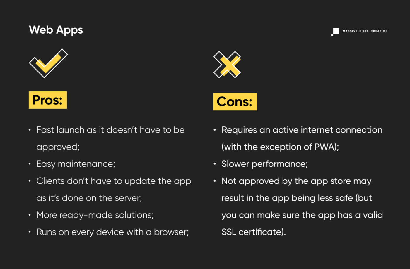
Examples of web apps: LinkedIn, Yahoo.
There’s a common ground though, and it’s called progressive web apps. Is it a good solution? Let’s find out.
Progressive Web Apps
A progressive web app (PWA) is a web application that combines features of both native mobile apps and web apps. What exactly? For starters, the ability of mobile apps to work offline. Even though it’s still a web application, it features something called Application Cache that allows it to work without an internet connection. Similar to web apps, they cannot be downloaded but accessed through an internet browser. Though they still can be added to the home screen.
Many programmers additionally use web frameworks like Angular or React to help them build their applications.
PWAs philosophy is based on three core pillars, they have to be:
- Capable;
- Reliable;
- Installable.
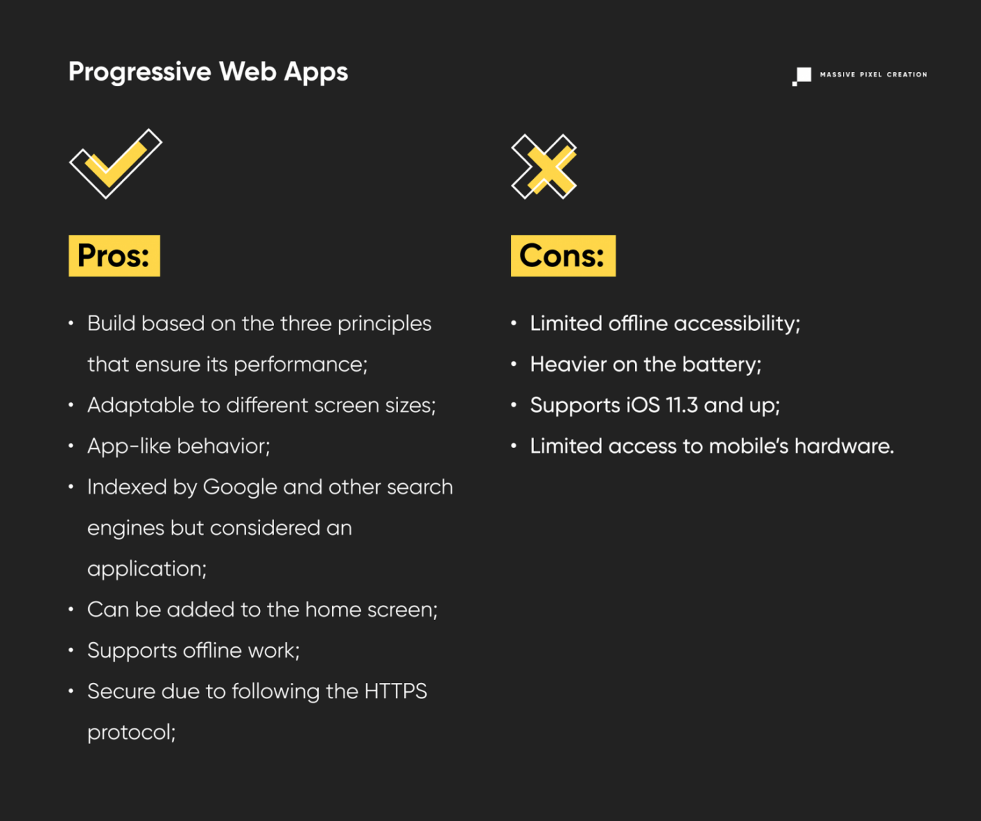
Examples of PWAs: Starbucks, Trivago, The Washington Post.
Hybrid Apps
Hybrid mobile apps may seem similar to PWAs, but they’re definitely not the same. Hybrid apps are a mix of both native and web apps, but they can be downloaded from the app store on either Android or iOS.
It’s a great option for those who wish to try out their idea before investing a lot of money. By developing the MVP release, you can see how your app is doing, take suggestions or release fixes.
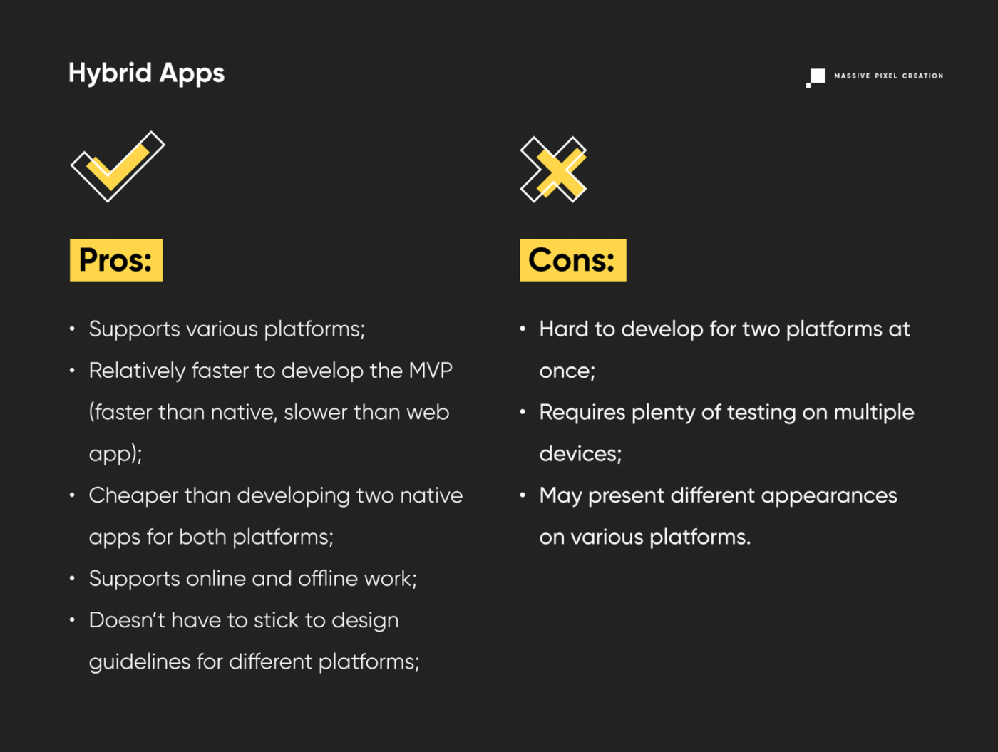
Examples of hybrid apps: Instagram, Gmail, Twitter.
The Dilemma
Are you perhaps stuck on deciding whether it’s better to create a web app, PWA, or a mobile app? Check out these facts that may help you make the choice!
As we mentioned before in this article, the number of mobile users grows year by year, month after month, and day by day. In fact, there are more mobile phone users than ones using desktops.
But what factors should you take into consideration when choosing one of the two options?
Costs
If you’d like to start with a mobile app then you better have your wallet at hand. Developing a mobile app instead of a web app requires a higher budget. Additionally, if you’d like to release the application on iOS and Android simultaneously, that will cost extra, both in terms of money and time.
Bottom line is that developing a website application or PWA first is a cheaper option (that of course depends on your idea and goal).
Speed
When it comes to speed, web applications lose (though the difference is minimal). Even though PWAs are still faster than web apps, native apps win the race because they’re launched directly from your device.
There’s a downside to it though. In order to access the mobile app, you have to download it first, whereas to access a website app you only need to type in the address and wait for it to load. For PWAs you don’t even have to launch your browser (with the exception of the first time). You can pin the shortcut to your home screen and access it from there.
Another advantage in favor of a mobile app is the ability to work offline, though probably with limited functions.
Accessibility
A well-written website application should work just fine on every platform, whether it’s Windows, Linux, macOS, Android, or iOS. On the other hand, even a well-written native app can work only on one platform. If you’d like it to work on a different one, you’d have to develop a new code from scratch. Definitely a downside of mobile apps.
User Preferences
Since the start of the SARS-CoV-2 pandemic, our lives have changed drastically. Many of us had to give up on social interactions for the time being. Plenty of employees have been sent to work from home and it’s not the only thing that has changed.
People started using their smartphones or mobile devices even more than they used to. The actual amount of hours spent on mobile apps by an average person is 4.2 hours daily which is a 30% increase compared to 2019. That’s more than half of a typical day of work.
The reason for bringing this up is that the web itself is less browsed by the users, but applications are on the top right now.
Visibility in Search Engines
Unlike mobile apps, web apps can be easily found on the internet due to the fact that they can be indexed by search engines. In order to have your app rank high when it comes to downloads and ratings, take proper screenshots showcasing the design and functionalities of your app. Without such actions, it would be much harder to find the application in the app store, compared to the website.
What’s your Target Audience?
Before allocating your budget to either mobile or web applications, think about your target audience. Do you want to develop a business web application for your company? Or perhaps you wish to create a social media platform that could potentially gather people with similar interests? Or maybe you want to start a pet store and develop an e-commerce website for it?
If the former is the case, then creating a web application would be a wiser choice. If your idea is more like the latter, then only the sky’s the limit.
The Verdict
It’s time to summarize all the things we learned about native, web, hybrid, and progressive web apps so far.
As we mentioned before, your go-to app should be chosen based on your idea and target.
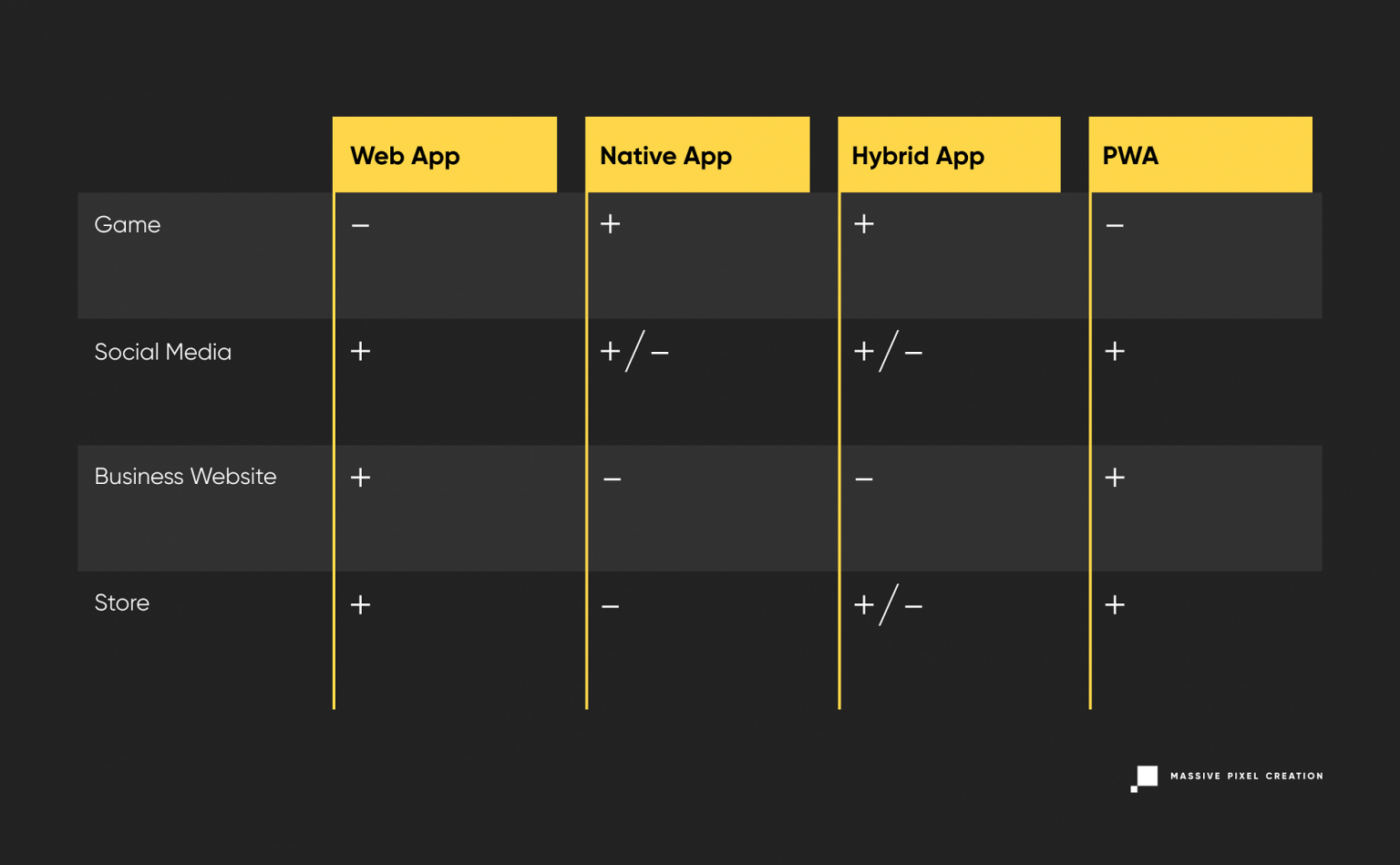
Real-Life Stories
Starbucks
Everyone heard about Starbucks. It’s one of the most popular coffee shops in the world. Let’s jump right into the time machine and head back to the year 2009.
You can hear Flo Rida’s or Pitbull’s songs all around, David Guetta is just becoming popular, and Starbucks just released their myStarbucks app. It lets the users find coffee shops in their proximity, learn about different coffee types, and more.
That was just the beginning of Starbucks’ online presence. In 2011, Starbucks released a loyalty program aimed at people who use the Card Mobile app. That move enabled users to make payments through their phones. In the following year 2012, Starbucks integrated their native app with Square and Apple passbook, the former is a payment system for mobile devices, and the latter is a place where you can keep your loyalty card information.
That’s still not everything. In 2017, Starbucks decided that it was time for a change. With new app ideas, the company released a PWA with everything that the user needs, like images, animations, and of course, offline accessibility. Customers could finally learn about the offered products, and their nutritional values, and could customize their orders, all done without internet access.
It turned out to be a huge success, as Starbucks doubled its daily active users. Moreover, compared to the huge and heavy iOS app (148MB), their PWA only weighs 233kB.
Everyone either has an account on Instagram or knows someone that does. It’s one of the biggest success stories regarding mobile apps. The picture-sharing platform gained a massive number of 100,000 users. To make matters more interesting, it even happened in the first week of its initial launch.
Released in 2010, Instagram continues to be one of the most popular social media platforms. Nothing speaks of success more than money, after all, Instagram was bought by Facebook in 2012, for approximately $1,000,000,000. Just wow.
From the companies’ point of view, now they can post to Instagram from a desktop for better quality and share engaging content to attract new audiences and interact with existing customers.
Pinterest is yet another success story of a low-performing website turned PWA. The company wasn’t doing very well. They had a slow-performing website with not as many views, and a poor conversion rate of 1%.
Even though Pinterest already had iOS and Android apps, they still couldn’t manage to get the wanted results. That’s when the idea of a progressive web app started to form.
Pinterest just hit a jackpot! Their core metrics increased, and users spent 40% more of their time on the app compared to the website. Even better, the company noted a 44% increase in revenue coming from the ads, as well as a 60% increase in user engagement.
After all, their PWA only weighs 150kB.
Trivago
The Trivago situation is a little bit different. They didn’t suffer from low numbers of views or lack of interest. Quite the opposite, actually. They were getting more and more visits from mobile users and it was time to think about the future.
Creating a native mobile app from scratch seemed like an expensive and problematic idea. The question of whether people will actually download the app has been one of the issues. Another one was the noticeable connection problems among the mobile visitors. These facts forced Trivago to rethink the idea.
Since native apps are out of the question, the company decided to place its bet on a progressive web application. The number of advantages like browser accessibility, push notifications, offline access, or the ability to add a shortcut to your home screen, had solidified the idea.
Was it a good idea? Did they succeed? They definitely did! Up to 2019, Trivago has been added to the home screen more than 500,000 times! Available in 55 countries and in 33 languages, the company’s user engagement increased by 150%. And that’s not all. Their repeated visits increased from 0.8% to 2%, and the push notifications contributed to increasing the conversion by 97%.
Key Takeaways
I promise, we’re almost here, but before we head to conclusions, let’s summarize what we’ve learned so far:
- Web applications can be accessed through the internet browser and are good for business websites, social media, etc.;
- Progressive web apps can be accessed through both the browser and the home screen, and they’re great for social media, news, and more;
- Hybrid apps can serve as a great starting point for testing the MVPs;
- Native apps are ideal for mobile games and other applications that require high performance and high usage of device’s components.
Conclusions
And here we are! We went through quite a lot of information here, starting from the difference between a mobile app and a web app, through planning, building, properties, and pros and cons of PWAs, hybrid, native, and web apps, to the dilemma, verdict, and some real-life success stories.
After reading this article you should be able to tell the difference between all those apps and decide which one would suit you and your business best.