


Freebie Release: Silver Lining Wallpaper
A storm is brewing. Between the pitchblack view of the ground and the gloomy clouds above, this does not look good. But if you have ever heard of ‘every cloud has a silver lining’, this is the per
Freebies
How To Make A Strong Case For Accessibility
Gaining buy-in for accessibility can be challenging due to common myths and misunderstandings. For many, accessibility remains a big mystery. Here are some practical techniques for winning stakeholder
Accessibility
The Era Of Platform Primitives Is Finally Here
Application frameworks have built whole ecosystems on top of them. Let’s take a closer look at serverless platforms such as Netlify’s Platform Primitives and explore how they can increase our prod
Javascript

Freebie Release: Long Shadow Flat Icon Set by Simon Rahm
Time for another freebie! We recently published a post about the emergence of a new trend called Long Shadow Design. As a follow up to that, this freebie contains a long shadow flat icon set as design
FreebiesTime for another freebie!
We recently published a post about the emergence of a new trend called Long Shadow Design. As a follow up to that, this freebie contains a long shadow flat icon set as designed by one of our readers Simon Rahm.
Simon, a 16-year old student from Austria, emailed us that he was inspired by the post, and started working on his own flat icon set. Here’s what he presented us and has since agreed to publish as a freebie exclusively for hongkiat.com readers:
More flat design related posts:
- Showcase of Beautiful Flat UI Design
- Ultimate Guide to Flat Website Design
- 20 Beautiful Flat WordPress Themes
Download Icon Set
The icons in this icon set are available for download in PNG and AI. Get it in the sizes you need or go ahead and download the AI file.
Download Long Shadow Flat Icon Set (PNG)
or you can just get the AI file from this link below:
For more of Simon’s work, check out his portfolio here.
The post Freebie Release: Long Shadow Flat Icon Set by Simon Rahm appeared first on Hongkiat.

Adobe Long Shadow Icons
We featured Simon Rahm’s Long Shadow Flat Icon Set giveaway a while back. Well, Simon is back with another set of icons to give away to our readers. We know that a lot of our readers are fans of Ado
FreebiesWe featured Simon Rahm’s Long Shadow Flat Icon Set giveaway a while back. Well, Simon is back with another set of icons to give away to our readers. We know that a lot of our readers are fans of Adobe Creative Suite (and if you haven’t checked out Adobe Creative Suite Toolbar Shortcut Wallpapers, you’re welcome).
This time, Simon has applied the long shadow design to some of our favorite Adobe Creative Suite Icons, namely:
- Adobe Story,
- Fireworks,
- Illustrator,
- Flash,
- InDesign,
- Premiere Pro,
- After Effects,
- Contribute,
- Encore,
- OnLocation,
- Photoshop,
- Prelude,
- Speedgrade,
- Audition,
- Dreamweaver,
- Flash Catalyst,
- Flash Builder,
- Bridge and
- CS7.
Preview
Here’s a larger preview of the icons.
Download
Please enter your email address below and click the Download Files button. The download link will be sent to you by email.
The post Adobe Long Shadow Icons appeared first on Hongkiat.
Software Development Outsourcing Cost: Revealing The Mysterious Side of Budgets
Why Outsource In The First Place? The Earth revolves around the Sun. Hopefully, we can agree on that. Metaphorically though, it certainly revolves around money. That is especially true when it comes to business. Most business decisions are heavily influenced by finances, whom to hire, which […]
BusinessWhy Outsource In The First Place?
The Earth revolves around the Sun. Hopefully, we can agree on that.
Metaphorically though, it certainly revolves around money.
That is especially true when it comes to business. Most business decisions are heavily influenced by finances, whom to hire, which market to move into, or how big of crypto loans you may need to make your ideas come to life. And of course, whether the business itself succeeds or fails is measured by market capitalization. So once again — by money.
It comes as no surprise that business owners look for ways to grow their revenues and limit expenses. And that’s where software outsourcing comes into play.
With software outsourcing — that is, when you employ external software development services to handle any of your projects — you can lower the overall costs of software development and save both time and money. While it also gives you access to global talents, streamlines the processes, and lets you focus on your business’s core strengths, cost–reduction is the reason more often cited (70%), as shown by the 2020 global outsourcing survey.
Can Outsourcing Really Save The Budget?
Doubtful? Then let’s compare the overall costs of hiring an in–house team versus via a software development company.
In–house Software Development
Office Space
Before you can start the hiring process, you have to set up office space for your future employees. The average cost for office space in the US by square foot is between $8–$23, and since the average size of an office in the US is 1,400 square feet, the average price might fall between $11,200–$32,200.
Of course, the total cost of renting space differs across cities and countries. In the US, New York is definitely the most expensive, beaten only by Hong Kong on the global scale, and with Tokyo and London hot on its heels.

Besides putting the desks together with matching chairs, it’s also important to include access to a private kitchen, lounge area, meeting rooms, and most importantly, parking space. Which of course will generate additional costs, but will keep your employees happy in the long–term.
One way of lowering the office space costs is to consider sharing co-working spaces with different businesses, but this might be risky when dealing with sensitive information on a day–to–day basis.
Hardware & Software Infrastructure
When you have space, you need to fill it with hardware and software infrastructure, which may include: computers, programs, subscriptions, servers, and so on, depending on your needs. But you also have to pay for general things as well, such as basic utilities and office supplies, which may need regular maintenance, repair, or even replacement after a few years of use. Should you need to allocate resources, for example, for efficient Kubernetes workloads management, you’ll be in for additional costs.
Hiring And Recruitment
By that point, the office should be ready to welcome new employees onboard. What kind of expenses should you expect?
First, the recruitment. Depending on the process, there might be some costs involved if you’re not doing it on your own — that means hiring recruitment specialists or agencies to help you out in securing the best local developers for your software development project.
In Germany, the average recruitment cost is $5,732, while in the US it’s $4,129, and in the UK — $4,258.
Then come the usual costs that surround the hiring itself. These include the base salary, taxes, insurance, and fringe benefits, from paid sick leave and a retirement plan to access to welfare & recreational facilities, depending on the country.
According to research done by UHY, the international accounting, and consultancy network, the average employment costs on a global scale are now almost 25% of an employee’s salary. The highest costs can be found in Europe, while the lowest are in Canada, Denmark, India, and the US.

Furthermore, due to the impact of the pandemic on the workplace, additional benefits might become a new standard — such as extended remote work opportunities or even child care options. Not mentioning the hand sanitizers and disinfectants which quickly became a necessity used several times every day.
Onboarding, Training, Professional Growth
Next on the list is onboarding. It might be surprising, but the average cost of the onboarding process in a small to medium business is $400 per employee. This includes the offer packs, preparing the necessary equipment, and time spent on bureaucracy and showing the new employee the ropes.
Then it’s time for training. Even if you hire experienced professionals in software development, learning the work culture, understanding the ongoing processes, and getting to know fellow workers will take some time. In some cases, it might even take 1 to 2 years for the employee to become fully productive in the new environment, according to Training Industry Quarterly.
And if you want to retain your employees for that long, offering help in their professional growth — encouraging self–development, providing opportunities for mentorships, and providing access to various courses — may make a difference in turnaround. This way, you show that you care about your employees and that there’s room for their careers to advance. All that though might require additional costs, especially in eventual pay raises that come with higher qualifications.
Losing Money
In some situations, money might be slipping through your fingers without you even realizing it.
With most contracts, you don’t only cover the software development costs themselves, but also all the hours spent in–seat. For example, if your company works on a project–to–project basis, there might be stages in the workflow where your senior software developers or software engineers — or any other employees, take your pick — are not utilized to the fullest extent. Due to circumstances, they might not be even able to work on their tasks, waiting for resources or their teammates’ input first.
And if your employee goes on sick leave or simply on vacation, you have to pay for that as well. Of course, these things are important in the long run for keeping that turnaround low, but it’s something to keep in mind.
There also might be trouble when firing your employees. In some countries, like in Poland, the notice period can last up to 3 months, while in Germany — up to 7, depending on the length of the employment. For the employer, that means they can have a person on board that most probably isn’t as motivated as others to do their work well, which in turn might lead to monetary losses.
How Does The Shadow Of Remote Work Affect The Overall Cost?
During the pandemic, many employees were forced to work from home. In the US, that amounted to 71% of people working remotely in sectors where that was possible, which take up 56% of jobs.
It’s hard to say whether the trend will stay for long, but there’s a chance that telecommuting will prevail in certain sectors, mostly in the IT industry, Finance and Insurance, and Management. This could potentially mean lowered costs in office management, but in return, it requires providing the employees with appropriate hardware and software equipment to comfortably work from home, as well as programs, applications, or even intranet for proper task management. To fully utilize them, you might have to pay for subscriptions or even create your own intranet with the help of a software house, following the example of ib vogt.
Some companies even went one step further during the pandemic, deciding to cover the costs of the internet and telephone for their employees. After that, laws were enacted in certain places — like in ten states of the US — that force employers to reimburse employees for remote work expenses, similarly to the Netherlands, with Poland following their example.
So even though there might be some opportunities to save money in certain places, there might be some expenses in others to balance it out.
Outsourcing Software Development
All of the above doesn’t really apply to outsourcing. You don’t have to care about salaries, benefits, workspace culture, or office maintenance. What are you paying for then, exactly?
Payment Models
The only thing you’ll be invoiced for is the work itself, without having to stress over the little things. Most of the time, outsourcing companies offer two varied ways of payment for their software development services: The Fixed Price Model and the Time and Material Model.
The first one, the Fixed Price Model, assumes that payment will be either invoiced in pre-defined milestones or before and after the project, with the payment split into two parts in different percentages. This model is well–suited for software development services with straightforward and easy-to-predict processes, as well as for those whose goals and requirements are clearly stated and not up to change.
Business owners choose the Time and Material Model when they want their project to be scalable and flexible enough to employ changes throughout the development process or when it’s hard to measure the scope. In this scenario, the only thing you pay for is the time of the development team, as well as for any additional resources required.
Both models ensure that you pay for the output, not the time spent in-seat, and only for that.
So How Much Is That?
There are no universal prices set around the globe for hourly rates of software developers just like there are no set prices for specific projects. Each company sets its own rates, and even infamous, cheap outsourcing destinations, such as India, you can find surprisingly high rates. Just like you can find relatively cheap software development in countries known for being expensive.
Why do the rates differ so much? First and foremost, each country has a different economic situation with varied wages and living standards. Thus, the prices constantly fluctuate, in response to what’s happening on the macro and microscale.
Taking that into account, it’s easy to see how outsourcing can help you save money if you’re smart about it. By analyzing your financial situation and comparing available options, you can gain a lot of value by spending less.
But how much is that, exactly? It really depends on too many factors to clearly measure once and for all, so let’s look at the average rates across the countries and compare them.
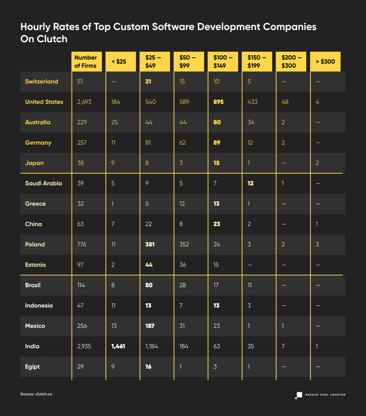
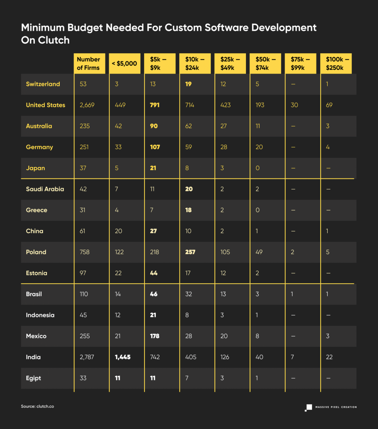
Average Hourly Rates Of Software Developers Around The Globe

The table above explicitly shows the astounding difference between countries in how much software developers can actually make. But how accurate is that data? It depends on how many people have shared their information about their careers, what industry they worked in, and other factors. It’s also good to keep in mind the effects of the pandemic on the labor market. Currently, with the world struggling to recover from the pandemic, the wages in the majority of countries — like in the US, Italy, Canada or France — have actually risen. And with certain sectors doing better than others, those fighting for great employees might have a higher competition than usual.
To cross-check this information with how the firms price their work, let’s look at Clutch.
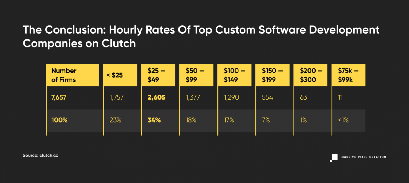
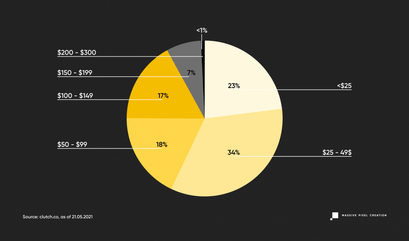
As of today, you can find 18,897 firms listed under “Top Custom Software Development Companies”, and only 7,657 post their development rates. Thanks to the easy filtered search, we can quickly check the average hourly rates entered by such companies.
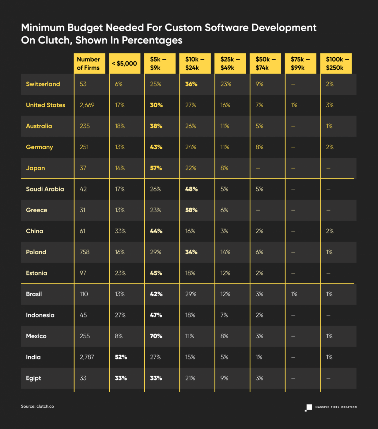
To look at those numbers from a different perspective, let’s see how that translates into percentages.
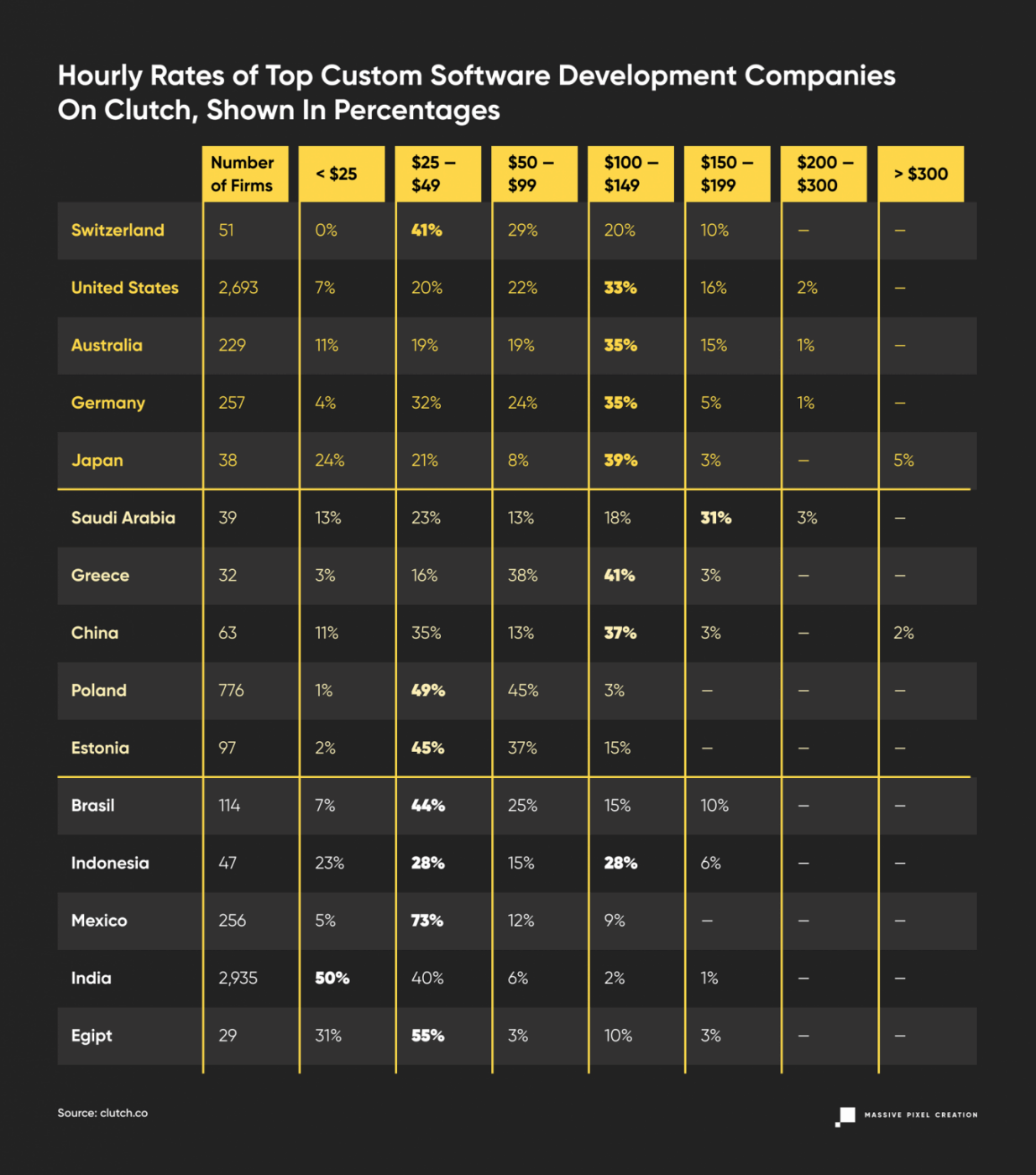
This data shows some correlation with the average rates in the IT services posted above, but it’s still noticeably higher. It does follow the general trends of the outsourcing market: Western Europe, North America, along with Scandinavian countries, fall into the higher pricing ranges when compared to South America, Asia, and Eastern European countries. But even in a famously cheap outsourcing destination such as India, you can find surprisingly high offshore software development rates. How can we explain that?
We can assume that every software development company on Clutch caters to clients from well–developed countries, and thus they can raise their rates accordingly; so that their employees are appropriately compensated and yet stay attractive on the outsourcing market. Many of them present themselves as global software development companies, for whom the time zones and cultural differences are non-existent, providing their IT services to clients from all over the world.
So when you’re hiring offshore developers by average hourly rate, you can expect more than 75% of them to cost less than $99 per hour.
Custom Software Development Cost Per Project
Let’s assume you’re more inclined towards the Fixed–Price Model or you would like to know the final cost. Clutch once again will help us out in our estimations, where you can filter through the software development companies by budget. Let’s see what they set as a minimum price per project.
Let’s look at these numbers again, but in percentages.
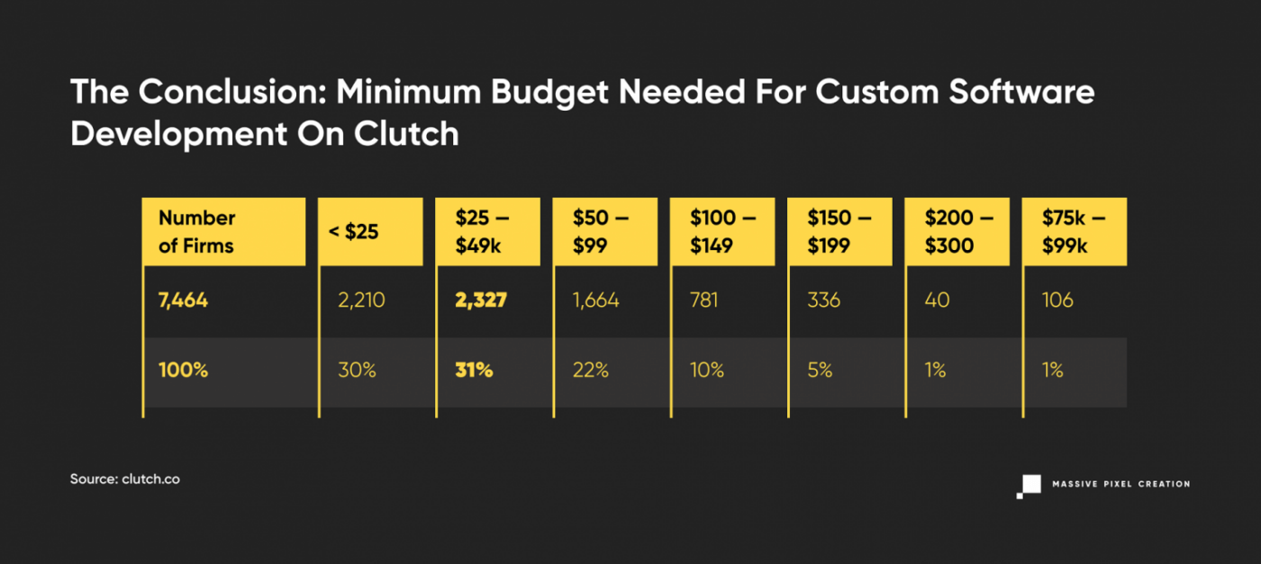
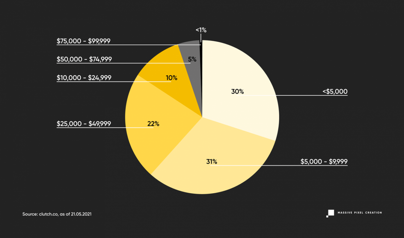
The majority of projects, 33% of them, start with a $5,000 label, while there’s also a big chance of finding options at even cheaper price ranges. And there’s a 83% chance of getting your price estimated below $25,000.
The Conclusion: How much do you have to pay for software development outsourcing?
If you want to hire offshore developers per hour, you can expect 57% of them to cost below $50 and 75% cost below 99$.
If you want to outsource a whole project to a software development company, you have a 61% chance of having to pay less than $10,000, and 83% of paying less than $25,000.
Outsource Software Development with MPC
Taking the above into consideration, pricing at MPC stays at an average level while still providing sustainable quality based on the years of experience in delivering in–house products. And while we’re striving to reach challenging goals, learning how to optimize our work and how we can improve even more our services, we keep in mind our client’s financial restrictions and we respect their decisions influenced by it.
Average rate at MPC stays at $50. It varies depending on the skillset, position, and seniority level. A full stack senior developer with 6 years of experience under his belt will surely be a larger cost than a mid QA engineer. And in this market like any other, the supply and demand will come into play as well. Recently, we’ve noticed a big increase in popularity in JavaScript based technologies, therefore salaries of those specialists increased significantly, resulting in higher hourly rates.
At the same time, the average Fixed–Price project doesn’t require any different budget than what the market usually does. Vast majority of new projects we’re facing are MVP versions of applications that fill in some niche. The amount between $15,000 and $30,000 allows us to provide value to the end user, challenge the idea, and in many cases, even monetize to expand the solution later on.
Key Takeaways
Software development can be done in two ways: in–house, that is with your own team, or by partnering with a software development company that specializes in a niche relevant to your business. Both options come with costs in different areas, so there is no right choice for everyone. It all depends on the circumstances. That’s why each business owner should analyze their own situation first and deduct which software development model is more beneficial and convenient.
How To Build A Business Case To Promote Accessibility In Your B2B Products
When passion for accessibility meets business indifference, what bridges the gap? Gloria Diaz Alonso shares how she turned frustration into strategy — by learning to speak the language of business.
Accessibility
How To Build A Business Case To Promote Accessibility In Your B2B Products
Gloria Diaz Alonso
When I started working on promoting accessibility, I was fully convinced of its value and was determined to bring it to the business stakeholders. I thought that the moment I started pushing for it inside the company, my key stakeholders would be convinced, committed, and enlightened, and everyone would start working to make it possible.
I prepared a lovely presentation about the benefits of accessibility. I made sure my presentation reflected that accessibility is the right thing to do: it is good for everyone, including those who don’t have a disability; it improves usability, makes the code more robust, and, of course, promotes inclusivity. I confidently shared it with my stakeholders. I was so excited. Aaaaaand BOOM… I hit a wall. They didn’t show much interest. I repetitively got comments, such as:
- It doesn’t bring much value to us.
- It doesn’t impact the revenue.
- The regulation doesn’t apply to us, so there is no reason.
- Accessibility is just for a few people with disabilities.
- It would cost too much.
“People don’t manage to understand the real value. How can they say it has no impact?” I thought. After some time of processing my frustration and thinking about it, I realized that maybe I was not communicating the value correctly. I was not speaking the same language, and I was just approaching it from my perspective. It was just a presentation, not a business case.
If there is something I had to learn when working that I didn’t in university, it is that if you want to move things forward in a company, you have to have a business case. I never thought that being a UX Designer would imply building so many of them. The thing with business cases, and that I neglected on my first attempts, is that they put the focus on, well, “the business”.
The ultimate goal is to build a powerful response to the question “Why should WE spend money and resources on this and not on something else?” not “Why is it good?” in general.
After some trial and error, I understood a bit better how to tackle the main comments and answer this question to move the conversation forward. Of course, the business case and strategy you build will depend a lot on the specific situation of your company and your product, but here is my contribution, hoping it can help.
In this article, I will focus on two of the most common situations: pushing for accessibility in a new product or feature and starting to bring accessibility to existing products that didn’t consider it before.
Implementing accessibility has a cost. Everything in a project has a cost. If developers are solving accessibility issues, they are not working on new features, so at the very least, you have to consider the opportunity cost. You have to make sure that you transform that cost into an investment and that that investment provides good results. You need to provide some more details on how you do it, so here are the key questions that help me to build my case:
- Why should we spend money and resources on this and not on something else?
- What exactly do we want to do?
- What are the expected results?
- How much would it cost?
- How can I make a decision?
Why Should We Spend Money And Resources On This And Not On Something Else?
Risk Prevention
There is a good chance that your stakeholders have heard about accessibility due to the regulations. In the past years, accessibility has become a hot topic, mainly motivated by the European Accessibility Act (EAA), the Web Accessibility Directive (WAD) in Europe or the Americans with Disabilities Act (ADA), and the Section 508 of the Rehabilitation Act in the US and equivalent regulations on other countries. They should definitely be aware of them. However, unless they are from the legal department, they may not need to know every detail; just having an overview should be enough to understand the landscape. You can simplify it a bit, so no one panics.
One of the most useful slides I use is a summary table of the regulations with some key information:
- What is the goal of the regulation?
- Who is it targeting?
- Relevant deadlines.
- How does it affect us?
This is essential information that you have to adapt to your business context. If you have some B2C or supply to the government, you may be affected. Even if you are pure private B2B, you will be partly affected, as more and more clients may include accessibility as a requirement for all the software they purchase. - If your company operates only in one country, it would be a good idea to include a summary of your country-specific regulations.

In addition, explain how the WCAG relates to the regulation. In the end, it is a third-party international standard used as the baseline for most official laws and directives and comes up in conversations quite often.
Keep in mind that using the regulation to motivate your case can work, but only to some point. We are aware that the regulation about accessibility is getting stronger and the requirements are affecting a good number of companies, especially big companies, but still not everyone. If you only base your case on it, the easy answer is, “Yeah, well, but we are not required to do it”.
If we start working now we will have time to prepare. If we consider accessibility for all the new features and projects, the cost won’t be affected much, and we will be prepared for the future.
However, many companies still don’t see the urgency of working on it if they are not directly required to do so by the regulation yet, and it is not certain that they will need to do it in the future. They prefer not to focus on it until that moment arrives. It is not necessarily a problem to be prioritized now, and there may be more urgent matters.
They should be aware of the regulations and the situation. We should show them how they could be affected, but if we don’t show the real value that accessibility brings to the products and the company, the conversation may end there.
Explore If It Can Be A Competitive Advantage
Big companies are starting to consider accessibility as part of their procurement process, which means that it is a hard requirement to become a provider, a checkbox in the selection process. You can try reaching out to your sales department to see if any clients are asking about your plans regarding accessibility compliance. If so, make sure you document them in the business case. Include some rough background research about those clients:
- Are they strategic clients?
- Are they clients who already have one of our products and want to expand?
- How much revenue can they potentially bring?
- Are they important companies in the industry that others may use as a reference?
- Was it a one-time question?
- Did they try to push for it?
The potential revenue and interest from important clients can be a good motivation.
In addition, try to find out if your competitors care about accessibility or are compliant. You can go to their website and see if they have an accessibility statement, if they have any certification by external parties (normally on the footer), if they include their accessibility level on their sales materials, or just try basic keyboard navigation and run an automatic checker to see what their situation is. If none of them are compliant or their accessibility level is really low, becoming compliant or implementing accessibility may be a competitive advantage for you, a differentiator. On the other hand, if they are compliant and you are not, you may lose some deals because of it.
To sum up, check clients’ interest in the topic, compare the situation of different competitors, and see if accessibility could be a potential revenue generator.
Showcase The Value It Brings To Your Users
Depending on the industries your product focuses on, the assumption may be that you don’t have a big user base of people with disabilities, and therefore, your users won’t benefit much from accessibility.
Accessibility helps everyone, and if you are reading this article, it is probably because you agree with it. But that statement sounds too generic and a bit theoretical, so it is important to provide specific and accurate examples around your users, in particular, that help people visualize it.
Think of your user base. What characteristics do they have? In which situations do they use your software? Maybe most of your users don’t have a disability, or you don’t even have the data about it, but they are office workers who use your software a lot, and having good keyboard navigation would help them to be more efficient. Maybe most of them are over fifty years old and can benefit from adapting the font size. They might have to use the software in the open air and are affected by sun glare, so they need high contrast between elements, or they have to wear gloves and prefer larger target sizes.
And I would say you always have to account for neurodiversity. The idea is to identify in which everyday situations your users face they can benefit from accessibility, even if they don’t have a disability.
Another key thing is to look for specific feedback from your users and customers on accessibility. If you are lucky enough to have an insight repository, look for anything related. Keep in mind that people can be asking about accessibility without knowing that they are asking for accessibility, so don’t expect to find all the insights directly with an “accessibility” tag, but rather search for related keywords in the “user’s vocabulary” (colors, hard to click, mobile devices, zoom, keyboard, error, and so on).
If you don’t have access to a repository, you can contact customer service and try to find out help requests or feedback about it with them. Anything you find is evidence that your users, your specific users, benefit from accessibility.
Highlight The Overlap With Good Practices
Accessibility overlaps heavily with best practices for usability, design, and development. Working on it helps us improve the overall product quality without, in some cases, adding extra effort.
In terms of design, the overlap between accessibility improvements and usability improvements is really huge. Things like writing precise error messages, having a clear page structure, relying on consistency, including clear labels and instructions, or keeping the user in control are some examples of the intersection. To visualize it, I like taking the 10 usability heuristics of Nielsen Norman and relating them to design-related success criteria from the WCAG.

For the developers, the work on accessibility creates a more structured code that is easier to understand. Some of the key aspects are the use of markup and the proper order of the code. In addition, the use of landmarks is key for managing responsive interfaces and, of course, choosing the most adequate component for the specific functionality needed and identifying it correctly with unique labels prevents the product from having unexpected behaviors.
As for the QA team, the test that they perform can vary a lot based on the product, but testing the responsiveness is normally a must, as well as keyboard navigation since it increases the efficiency of repetitive tasks.
Considering accessibility implies having clear guidelines that help you to work in the correct direction and overlap with things that we should already be doing.
What Exactly Do We Want To Do?
As we said, we are going to focus on two of the most common situations: pushing for accessibility in a new product or feature and starting to incorporate accessibility into existing products that didn’t consider it before.
New Products Or Features
If you are about to build a product from scratch, you have a wonderful opportunity to apply an accessibility-first approach and consider accessibility by default from the very beginning. This approach allows you to minimize the number of accessibility issues that end up reaching the user and reduces the cost of rework when trying to fix them or when looking for compliance.
One of the key things you need to successfully apply this approach is considering accessibility as a shared responsibility. The opposite of an accessibility-first approach is the retroactive consideration of accessibility. When you only care for accessibility after the implementation and run an audit on the released product, you will find all the issues that accumulated. Plenty of them could have been easily solvable if you knew them when you were designing or coding, but solving them afterward becomes complicated.
For example, if you only considered drag and drop for rearranging a list of items, now you have to rethink the interaction process and make sure it works in all the cases, devices, and so on. If single-point interactions were a requirement from the beginning, you would just implement them naturally and save time.
Applying an accessibility-first approach means that everyone has to contribute.
- The POs have to make sure that accessibility is included as a requirement and that people have the time and resources to cover it.
- Designers have to follow best practices and guidelines to make sure the design itself is accessible.
- The devs should do the same, include markup and proper semantics, and follow the guidelines for accessible code.
- QAs are the final filter before the product reaches the user. They should try to pick as much as possible so it can get fixed.
If everyone shares the ownership and spends a bit more time on including accessibility in their task, the overall result will have a good base. Of course, you may still need to tackle some specific issues with an expert, and when auditing the final product, you will probably still find some issues that escaped the process, but the number will be drastically lower.

In addition, the process of auditing your product can get much lighter. Running an accessibility audit means first defining who will do it: is it internal or external? If it is external, which providers? How long would it take to negotiate the contract?
Afterward, you have to set the scope of the audit. It is impossible to check the full product, so you start by checking the most important workflows and key pages. Then, you will do the analysis. The result is normally a list of issues prioritized based on the user impact and some recommendations for remediating it.
Once you have the issues, you have to plan the remediation and figure out how much capacity from the teams we have to allocate to it based on when we want to have the fixes ready. You also have to group similar issues together to prevent the change of context during remediation, increase efficiency, and eliminate all duplicated issues (the auditors may not know the architecture of the product, so you may find several issues documented that, in reality, are just one because you are using the same component).
Considering this full process, for a large product, you can easily spend three months just before you start the actual remediation of the issues. Applying an accessibility-first approach means that the number of issues that reach the audit of the released product is much lower, so the process of auditing and fixing goes much faster.

If you can apply this approach, you should definitely consider the need for educational resources and their impact. You don’t want people just to work on accessibility but to understand the value they are creating when doing it (I am preparing another article that focuses on this). You want them to feel comfortable with the topic and understand what their responsibilities are and which things they have to pay attention to. Check if you already have accessibility resources inside the company that you can use. The important thing for the business is that those resources are going to contribute to reducing the effort.
The implementation of an accessibility-first approach has a very clear learning curve. In the beginning, people will take a bit of extra time to consider accessibility as part of their task, but after they have done it for several tasks, it comes naturally, and the effort needed to implement it really drops.
Think of “not relying on color only for conveying information”, as a designer, the first two times you have to figure something out instead of just changing the color of a text or icon to convey a status, you spend some time looking for solutions, afterward, you already have in mind a bunch of strategies that allow you to directly chose a valid option almost automatically.
Using an accessibility-first approach for new products is a clear strategy, but it is also valid for new features in an existing product. If you include it by default in anything new you create, you are preventing new issues from accumulating.
To sum up, applying an accessibility-first approach is really beneficial.
“
If you can implement an accessibility-first approach, do it.
Existing Products Or Features
If you try to bring accessibility to legacy products that have been running for many years, an accessibility-first approach may not be enough. In these cases, there are a million topics competing for priority and resources. Accessibility may be perceived as a massive effort that brings reduced value.
You may face a product that can have a big technical debt, that may not have a big user base of people with disabilities, or in which the number of existing accessibility issues is so overwhelming that you would need five years to solve them. You won´t be able to move forward if you try to solve all the problems at once. Here are some of the strategies that have worked for me to kick off the work on accessibility.
Start by checking the Design System. If the Design System has accessibility issues, they are going to be inherited by all the products that use them, so it is better to solve them at a higher level than to have each product team solving the exact same issue in all their products. You can begin by taking a quick look at it:
- Does it consider color contrast?
- And target size?
- Does the documentation include any accessibility considerations or guidelines?
- Are there color-dependent components?
If you have a dedicated team for the Design System, you can also reach out to them. You can find out what is their level of awareness on the topic. If they don’t have much knowledge, you can give them an introduction or help them identify and fix the knowledge gaps they have.
If you notice some issues, you can organize a proper audit of the design system from the design and development perspective and pair up with them to fix as much as you can. It is a good way of getting some extra hands to help you while tackling strategic issues.
When working on the Design System, you can also spot which components or areas are more complex and create guidelines and documentation together with them to help the teams reuse those components and patterns, leveraging accessibility.

If the Design System is in good shape, you don’t have one, or you prefer to focus only on the product, you need to start by analyzing and fixing the most relevant part. You have to set a manageable scope. I recommend taking the most relevant workflows and the ones the users use the most. Two or three of them could be a good start. Inside the workflows, try picking the pages that have different structures so you can have a representative sample, for instance, one with a form, a table, plain text, lots of images, and so on. In many cases, the pages that share the same structure share the same problems, so having more variety in the sample helps you to pick more critical issues.

Once you have chosen the workflows and screens, you can audit them, but with a reduced scope. If your product has never considered accessibility, it is likely to have way too many issues. When doing an audit, you normally test compliance with all the success criteria (59 if we consider levels A and AA) and do manual testing with different browsers, screen readers, and devices. Then, document each of the issues, prioritize them, and include the remediation in the planning.
It takes a lot of time, and you may get hundreds of issues, or even thousands, which makes you feel like “I will never get this done” and if you even get there like “I am finally done with this I don’t want to hear about it for a long time”. If this is the situation you are forecasting for the business, most likely, you will not get the green light for the project. It is too much of an investment. So unless they have hard requirements for compliance coming from some really strategic customers, you are going to get stuck.
As we said, ideally, we would do a complete audit and fix everything, but delivering some value is better than delivering nothing, so instead, you can propose a reduced first audit to get you on the move. Rather than doing a detailed audit of all 59 criteria, I normally focus on these three things:
- Running an automatic check. It is very fast and prepares the report by itself. Though it is only capable of finding around 30% of the issues, it is a good start.
- Doing basic manual keyboard testing, checking that all the interactive elements are focusable, in the logical order, and following the expected keyboard command interactions.
- Doing a quick responsive test. Basically, what breaks when I change the viewport? Do I have information on top of each other when I zoom in? Can I still use the functionalities?
With these three tests, you will already have a large number of critical issues and blockers to solve while staying close to the overlapping area between accessibility and good design and development practices and not taking too much time.

Remember, the goal of this first audit is to get easy-to-identify critical issues to have a starting point, not to solve all the problems. In this way, you can start delivering value while building the idea that accessibility is not a one-time fix but a continuous process. In addition, it gives you a lot of insights into the aspects in which the teams need guidelines and training, as well as defining the minimum things that the different roles have to consider when working to reduce the number of future accessibility issues. You want to take it as a learning opportunity.
Note: Accessibility insights is a good tool for auditing by yourself as it includes explanations and visual helpers and guides you through the process.
Screen reader testing should be added to the audit scope if you can, but it can be hard to do it if you have never done it before, and some of the issues will already be highlighted during the automatic check and the keyboard testing.
What Are The Expected Results?
The results you want to achieve are going to have a huge impact on the strategy.
Are you aiming for compliance or bringing value to the users and preparing for the future?
This is a key question you have to ask yourself.
Compliance with the regulation is pretty much a binary option. To be compliant with the WCAG at a certain level, let’s say AA, you should pass all the success criteria for that level and the previous ones. Each success criterion intends to help people with a specific disability. If you try to be compliant only with some of them, you would be leaving people out. Of course, in reality, there are always going to be some minor issues and violations of a success criterion that reach the user. But the idea is that you are either compliant or not. With this in mind, you have to make sure that you consider several audits, ideally by a certified external party that can reassure your compliance.
Trying to become compliant with a product that has never considered accessibility can become quite a large task, so it may not be the best first step. But, in general, if you are aiming for full compliance, it may be because you have strong motivations coming from the risk reduction and competitive advantage categories.
On the other hand, if your goal is to start including accessibility in the product to prepare for the future and help users, you will probably target a lighter result. Rather than looking for perfection, you want to start to have a level that is good enough as soon as possible.
“
You can focus on identifying and solving the most critical issues for the users and on applying an accessibility-first approach to new developments. The result is probably not compliant and not perfect, but it eliminates critical barriers without a huge effort. It will have basic accessibility to help users, and you can apply an iterative approach to improve the level.

Keep in mind that it is impossible to have a 100% accessible product. As the product evolves, there are always going to be some issues that escape the test and reach the user. The important thing is to work to ensure that these issues are minor ones and not blockers or critical ones. If you can get the resources to fix the most important problems, you are already bringing value, even if you don’t reach compliance.
How Much Would It Cost?
An accessibility-first approach typically means you have to assign 5 to 10% of the product capacity to apply it (the number goes down to 5% due to the learning curve). The underlying risk, though, is that the business still considers these percentages to be too high. To prevent this from happening, you have to highlight strongly the side value of accessibility and the huge overlap it has with the design and development best practices we mentioned above.
In addition, to help justify the cost, you can look for examples inside your company that allow you to compare it with the cost of retroactive fitting accessibility. If there are not any, you can look for some basic issue, such as the lack of structure of a page, and use it to illustrate that in order to add the structure afterward, once the product is released you would need to do a substantial rework or ask a developer to help you to estimate the effort of adding a heading structure to 40 different pages after released.
As for introducing accessibility in existing products, the cost can be quite hard to estimate. Having a rough audit can help you understand how many critical issues you have at the start, and you can ask developers to help you estimate some of the changes to get a rough idea.
“
If you attach accessibility improvements to usability or UX ones, then it doesn’t really need dedicated capacity. For example, if some of the inputs are lacking labels or instructions and your users get confused, it is a usability problem that overlaps with accessibility. Normally, accessibility issues related to the Reflow criteria are quite time-consuming, as they rely on a proper responsive design. But isn’t it just good design?
I recommend checking the list of features in the product backlog and the feedback from the users to find out which accessibility improvements can you combine with them, especially with features that have priority according to the product strategy (such us, enabling the product on mobile devices, or improving efficiency by promoting keyboard navigation).
The bigger the overlap, the more you can reduce the effort. This said, I would say it is better not to make it too ambitious when you are starting. It is better to start moving, even if it is slowly, than to hit a wall. When you manage to start with it, you will spark curiosity in other people, gain allies, and have results that can help you to expand the project and the scope.
You can also consider an alternative approach, define an affordable capacity that you could dedicate based on your product situation (maybe 10 or 15%), and set the scope to match it.
Finally, it is also important to gather the existing resources you have access to, internal or external. If there are guidelines, if the Design System is accessible, if there are related company goals, educational sessions… Whatever is there already is something you can use, and that doesn’t add to the total cost of the project. If the Design System is accessible, it would be a waste if we don’t leverage it and make sure we implement the components in an accessible way. You can put together an overview to show the support you have.
How Can I Make A Decision?
Business stakeholders are short on time and have many things in mind. If you want them to make a decision and consider all the factors when making it, you have to help them visualize them together in an executive summary.
If there is a single direction that you are trying to promote, for example, implementing an accessibility-first approach for new products and features, you can put on a slide the three key questions we mentioned above and the answers to those questions:
- What exactly do we want to do?
- What are the expected results?
- How much would it cost?

If there are different directions you can take, for example, you want to start to incorporate accessibility into products that meet certain conditions, or you can afford different capacities dedicated to accessibility for different products, you can use a decision-making diagram or a decision-making matrix. The idea is to visualize the different criteria that can affect the strategy and the adapted result for each of them.
For example,
- Do I have clients inquiring about accessibility?
- Is the product already using an accessible design system?
- Are we considering opening part of the product to B2C?
- Is the product going to take responsiveness and mobile interactions as a priority?
- Do we want to expand the product target market to governmental institutions?
Mapping out the factors and possible directions can help you and decision-makers understand which products can be a better starting point for accessibility, where it makes sense to allocate more capacity, and which possibilities are open. This becomes especially relevant when you are trying to bring accessibility to several products at the same time.

Whatever representation you choose for your conditions, make sure it visualizes the answers to those questions to facilitate the decision-making process and get approval. I generally include it at the end of the presentation, or even at the beginning and the end.
Keep It Up!
Even if your business case is really good, sometimes you don’t get to have a big impact due to circumstances. It may be that there is a big shift in priorities, that the stakeholders change, that your contract ends (if you are a consultant), or that the company just doesn’t have the resources to work on it at that moment, and it gets postponed.
I know it can be very frustrating, but don´t lose the motivation. Change can move quite slowly, especially in big companies, but if you have put the topic into people’s minds, it will be back on the table. In the meantime, you can try organizing evangelization sessions for the teams to find new allies and share your passion. You may need to wait a bit more, but there will be more opportunities to push the topic again, and since people already know about it, you will probably get more support. You have initiated the change, and your effort will not be lost.
Key Points
- Highlight the specific impact of accessibility on your specific products and users.
- Check if accessibility could be a competitive differentiator.
- Leverage the overlap between accessibility and good practices or product features to reduce the effort.
- Include the existing resources and how you can benefit from them.
- Clarify the expected result based on the effort.
- Visualize the key points of the strategy to help the decision-making and approval process.
- It is better to start with a small scope and iterate than not start at all.
 (yk)
(yk)
UX And Product Designer’s Career Paths In 2026
How to shape your career path for 2026, with decision trees for designers and a UX skills self-assessment matrix. The only limits for tomorrow are the doubts we have today. Brought to you by Smart Int
Ux
UX And Product Designer’s Career Paths In 2026
Vitaly Friedman
As the new year begins, I often find myself in a strange place — reflecting back at the previous year or looking forward to the year ahead. And as I speak with colleagues and friends at the time, it typically doesn’t take long for a conversation about career trajectory to emerge.
So I thought I’d share a few thoughts on how to shape your career path as we are looking ahead to 2026. Hopefully you’ll find it useful.
Run A Retrospective For Last Year
To be honest, for many years, I was mostly reacting. Life was happening to me, rather than me shaping the life that I was living. I was making progress reactively and I was looking out for all kinds of opportunities. It was easy and quite straightforward — I was floating and jumping between projects and calls and making things work as I was going along.

Years ago, my wonderful wife introduced one little annual ritual which changed that dynamic entirely. By the end of each year, we sit with nothing but paper and pencil and run a thorough retrospective of the past year — successes, mistakes, good moments, bad moments, things we loved, and things we wanted to change.
We look back at our memories, projects, and events that stood out that year. And then we take notes for where we stand in terms of personal growth, professional work, and social connections — and how we want to grow.
These are the questions I’m trying to answer there:
- What did I find most rewarding and fulfilling last year?
- What fears and concerns slowed me down the most?
- What could I leave behind, give away or simplify?
- What tasks would be good to delegate or automate?
- What are my 3 priorities to grow this upcoming year?
- What times do I block in my calendar for my priorities?
It probably sounds quite cliche, but these 4–5h of our time every year set a foundation for changes to introduce for the next year. This little exercise shapes the trajectory that I’ll be designing and prioritizing next year. I can’t recommend it enough.
UX Skills Self-Assessment Matrix
Another little tool that I found helpful for professional growth is UX Skills Self-Assessment Matrix (Figma template) by Maigen Thomas. It’s a neat little tool that’s designed to help you understand what you’d like to do more of, what you’d prefer to do less, and where your current learning curve lies vs. where you feel confident in your expertise.

The exercise typically takes around 20–30 minutes, and it helps identify the UX skills with a sweet spot — typically the upper half of the canvas. You’ll also pinpoint areas where you’re improving, and those where you are already pretty good at. It’s a neat reality check — and a great reminder once you review it year after year. Highly recommended!
UX Career Levels For Design Systems Teams
A while back, Javier Cuello has put together a Career Levels For Design System Teams (Figma Kit), a neat little helper for product designers looking to transition into design systems teams or managers building a career matrix for them. The model maps progression levels (Junior, Semi-Senior, Senior, and Staff) to key development areas, with skills and responsibilities required at each stage.

What I find quite valuable in Javier’s model is the mapping of strategy and impact, along with systematic thinking and governance. While as designers we often excel at tactical design — from elegant UI components to file organization in Figma — we often lag a little bit behind in strategic decisions.
To a large extent, the difference between levels of seniority is moving from tactical initiatives to strategic decisions. It’s proactively looking for organizational challenges that a system can help with. It’s finding and inviting key people early. It’s also about embedding yourself in other teams when needed.
But it’s also keeping an eye out for situations when design systems fail, and paving the way to make it more difficult to fail. And: adapting the workflow around the design system to ship on a tough deadline when needed, but with a viable plan of action on how and when to pay back accumulating UX debt.
Find Your Product Design Career Path
When we speak about career trajectory, it’s almost always assumed that the career progression inevitably leads to management. However, this hasn’t been a path I preferred, and it isn’t always the ideal path for everyone.
Personally, I prefer to work on intricate fine details of UX flows and deep dive into complex UX challenges. However, eventually it might feel like you’ve stopped growing — perhaps you’ve hit a ceiling in your organization, or you have little room for exploration and learning. So where do you go from there?

A helpful model to think about your next steps is to consider Ryan Ford’s Mirror Model. It explores career paths and expectations that you might want to consider to advocate for a position or influence that you wish to achieve next.
That’s typically something you might want to study and decide on your own first, and then bring it up for discussion. Usually, there are internal opportunities out there. So before changing the company, you can switch teams, or you could shape a more fulfilling role internally.
You just need to find it first. Which brings us to the next point.
Proactively Shaping Your Role
I keep reminding myself of Jason Mesut’s observation that when we speak about career ladders, it assumes that we can either go up, down, or fall off. But in reality, you can move up, move down, and move sideways. As Jason says, “promoting just the vertical progression doesn’t feel healthy, especially in such a diverse world of work, and diverse careers ahead of us all.”
So, in the attempt to climb up, perhaps consider also moving sideways. Zoom out and explore where your interests are. Focus on the much-needed intersection between business needs and user needs. Between problem space and solution space. Between strategic decisions and operations. Then zoom in. In the end, you might not need to climb anything — but rather just find that right spot that brings your expertise to light and makes the biggest impact.

Sometimes these roles might involve acting as a “translator” between design and engineering, specializing in UX and accessibility. They could also involve automating design processes with AI, improving workflow efficiency, or focusing on internal search UX or legacy systems.
These roles are never advertised, but they have a tremendous impact on a business. If you spot such a gap and proactively bring it to senior management, you might be able to shape a role that brings your strengths into the spotlight, rather than trying to fit into a predefined position.
What About AI?
One noticeable skill that is worth sharpening is, of course, around designing AI experiences. The point isn’t about finding ways to replace design work with AI automation. Today, it seems like people crave nothing more than actual human experience — created by humans, with attention to humans’ needs and intentions, designed and built and tested with humans, embedding human values and working well for humans.

If anything, we should be more obsessed with humans, not with AI. If anything, AI amplifies the need for authenticity, curation, critical thinking, and strategy. And that’s a skill that will be very much needed in 2026. We need designers who can design beautiful AI experiences (and frankly, I do have a whole course on that) — experiences people understand, value, use, and trust.
No technology can create clarity, structure, trust, and care out of poor content, poor metadata, and poor value for end users. If we understand the fundamentals of good design, and then design with humans in mind, and consider humans’ needs and wants and struggles, we can help users and businesses bridge that gap in a way AI never could. And that’s what you and perhaps your renewed role could bring to the table.
Wrapping Up
The most important thing about all these little tools and activities is that they help you get more clarity. Clarity on where you currently stand and where you actually want to grow towards.
These are wonderful conversation starters to help you find a path you’d love to explore, on your own or with your manager. However, just one thing I’d love to emphasize:
Absolutely, feel free to refine the role to amplify your strengths, rather than finding a way to match a particular role perfectly.
Don’t forget: you bring incredible value to your team and to your company. Sometimes it just needs to be highlighted or guided to the right spot to bring it into the spotlight.
You’ve got this — and happy 2026! ✊🏼✊🏽✊🏾
Meet “Design Patterns For AI Interfaces”
Meet design patterns that work for AI products in Design Patterns For AI Interfaces, Vitaly’s shiny new video course with practical examples from real-life products — with a live UX training happening soon. Jump to a free preview. Use code SNOWFLAKE to save 20% off!

Video + UX Training
$ 450.00 $ 799.00 Get Video + UX Training
30 video lessons (10h) + Live UX Training.
100 days money-back-guarantee.
Video only
$ 275.00$ 395.00
30 video lessons (10h). Updated yearly.
Also available as a UX Bundle with 3 video courses.
Useful Resources
- UX Skills Self-Assessment Matrix (Figma template), by Maigen Thomas
- “Product Designer’s Career Levels Paths” + PNG, by Ryan Ford
- Career Decision Map For UX Designers (PNG), by Lily Yue
- Diverse Career Paths For UX Designers (PNG), by Lily Yue
- Shaping Designers and Design Teams, by Jason Mesut
- UX Skills Self-Assessment Map template (Miro), by Paóla Quintero
- UX Skill Mapping Template (Google Sheets), by Rachel Krause, NN/g
- “Design Team’s Growth Matrix”, by Shannon E. Thomas
- Figma Product Design & Writing Career Levels, by Figma
- Content Design Role Frameworks, by Tempo
- “UX Research Career Framework”, by Nikki Anderson
- UX Career Ladders (free eBook), by Christopher Nguyen
- Product Design Level Expectations, by Aaron James
(yk)
From Prompt To Partner: Designing Your Custom AI Assistant
What if your best AI prompts didn’t disappear into your unorganized chat history, but came back tomorrow as a reliable assistant? In this article, you’ll learn how to turn one-off “aha” prompt
Ux
From Prompt To Partner: Designing Your Custom AI Assistant
Lyndon Cerejo
In “A Week In The Life Of An AI-Augmented Designer”, Kate stumbled her way through an AI-augmented sprint (coffee was chugged, mistakes were made). In “Prompting Is A Design Act”, we introduced WIRE+FRAME, a framework to structure prompts like designers structure creative briefs. Now we’ll take the next step: packaging those structured prompts into AI assistants you can design, reuse, and share.
AI assistants go by different names: CustomGPTs (ChatGPT), Agents (Copilot), and Gems (Gemini). But they all serve the same function — allowing you to customize the default AI model for your unique needs. If we carry over our smart intern analogy, think of these as interns trained to assist you with specific tasks, eliminating the need for repeated instructions or information, and who can support not just you, but your entire team.
Why Build Your Own Assistant?
If you’ve ever copied and pasted the same mega-prompt for the nth time, you’ve experienced the pain. An AI assistant turns a one-off “great prompt” into a dependable teammate. And if you’ve used any of the publicly available AI Assistants, you’ve realized quickly that they’re usually generic and not tailored for your use.
Public AI assistants are great for inspiration, but nothing beats an assistant that solves a repeated problem for you and your team, in your voice, with your context and constraints baked in. Instead of reinventing the wheel by writing new prompts each time, or repeatedly copy-pasting your structured prompts every time, or spending cycles trying to make a public AI Assistant work the way you need it to, your own AI Assistant allows you and others to easily get better, repeatable, consistent results faster.
Benefits Of Reusing Prompts, Even Your Own
Some of the benefits of building your own AI Assistant over writing or reusing your prompts include:
- Focused on a real repeating problem
A good AI Assistant isn’t a general-purpose “do everything” bot that you need to keep tweaking. It focuses on a single, recurring problem that takes a long time to complete manually and often results in varying quality depending on who’s doing it (e.g., analyzing customer feedback). - Customized for your context
Most large language models (LLMs, such as ChatGPT) are designed to be everything to everyone. An AI Assistant changes that by allowing you to customize it to automatically work like you want it to, instead of a generic AI. - Consistency at scale
You can use the WIRE+FRAME prompt framework to create structured, reusable prompts. An AI Assistant is the next logical step: instead of copy-pasting that fine-tuned prompt and sharing contextual information and examples each time, you can bake it into the assistant itself, allowing you and others achieve the same consistent results every time. - Codifying expertise
Every time you turn a great prompt into an AI Assistant, you’re essentially bottling your expertise. Your assistant becomes a living design guide that outlasts projects (and even job changes). - Faster ramp-up for teammates
Instead of new designers starting from a blank slate, they can use pre-tuned assistants. Think of it as knowledge transfer without the long onboarding lecture.
Reasons For Your Own AI Assistant Instead Of Public AI Assistants
Public AI assistants are like stock templates. While they serve a specific purpose compared to the generic AI platform, and are useful starting points, if you want something tailored to your needs and team, you should really build your own.
A few reasons for building your AI Assistant instead of using a public assistant someone else created include:
- Fit: Public assistants are built for the masses. Your work has quirks, tone, and processes they’ll never quite match.
- Trust & Security: You don’t control what instructions or hidden guardrails someone else baked in. With your own assistant, you know exactly what it will (and won’t) do.
- Evolution: An AI Assistant you design and build can grow with your team. You can update files, tweak prompts, and maintain a changelog — things a public bot won’t do for you.
Your own AI Assistants allow you to take your successful ways of interacting with AI and make them repeatable and shareable. And while they are tailored to your and your team’s way of working, remember that they are still based on generic AI models, so the usual AI disclaimers apply:
Don’t share anything you wouldn’t want screenshotted in the next company all-hands. Keep it safe, private, and user-respecting. A shared AI Assistant can potentially reveal its inner workings or data.
Note: We will be building an AI assistant using ChatGPT, aka a CustomGPT, but you can try the same process with any decent LLM sidekick. As of publication, a paid account is required to create CustomGPTs, but once created, they can be shared and used by anyone, regardless of whether they have a paid or free account. Similar limitations apply to the other platforms. Just remember that outputs can vary depending on the LLM model used, the model’s training, mood, and flair for creative hallucinations.
When Not to Build An AI Assistant (Yet)
An AI Assistant is great when the same audience has the same problem often. When the fit isn’t there, the risk is high; you should skip building an AI Assistant for now, as explained below:
- One-off or rare tasks
If it won’t be reused at least monthly, I’d recommend keeping it as a saved WIRE+FRAME prompt. For example, something for a one-time audit or creating placeholder content for a specific screen. - Sensitive or regulated data
If you need to build in personally identifiable information (PII), health, finance, legal, or trade secrets, err on the side of not building an AI Assistant. Even if the AI platform promises not to use your data, I’d strongly suggest using redaction or an approved enterprise tool with necessary safeguards in place (company-approved enterprise versions of Microsoft Copilot, for instance). - Heavy orchestration or logic
Multi-step workflows, API calls, database writes, and approvals go beyond the scope of an AI Assistant into Agentic territory (as of now). I’d recommend not trying to build an AI Assistant for these cases. - Real-time information
AI Assistants may not be able to access real-time data like prices, live metrics, or breaking news. If you need these, you can upload near-real-time data (as we do below) or connect with data sources that you or your company controls, rather than relying on the open web. - High-stakes outputs
For cases related to compliance, legal, medical, or any other area requiring auditability, consider implementing process guardrails and training to keep humans in the loop for proper review and accountability. - No measurable win
If you can’t name a success metric (such as time saved, first-draft quality, or fewer re-dos), I’d recommend keeping it as a saved WIRE+FRAME prompt.
Just because these are signs that you should not build your AI Assistant now, doesn’t mean you shouldn’t ever. Revisit this decision when you notice that you’re starting to repeatedly use the same prompt weekly, multiple teammates ask for it, or manual time copy-pasting and refining start exceeding ~15 minutes. Those are some signs that an AI Assistant will pay back quickly.
In a nutshell, build an AI Assistant when you can name the problem, the audience, frequency, and the win. The rest of this article shows how to turn your successful WIRE+FRAME prompt into a CustomGPT that you and your team can actually use. No advanced knowledge, coding skills, or hacks needed.
As Always, Start with the User
This should go without saying to UX professionals, but it’s worth a reminder: if you’re building an AI assistant for anyone besides yourself, start with the user and their needs before you build anything.
- Who will use this assistant?
- What’s the specific pain or task they struggle with today?
- What language, tone, and examples will feel natural to them?
Building without doing this first is a sure way to end up with clever assistants nobody actually wants to use. Think of it like any other product: before you build features, you understand your audience. The same rule applies here, even more so, because AI assistants are only as helpful as they are useful and usable.
From Prompt To Assistant
You’ve already done the heavy lifting with WIRE+FRAME. Now you’re just turning that refined and reliable prompt into a CustomGPT you can reuse and share. You can use MATCH as a checklist to go from a great prompt to a useful AI assistant.
- M: Map your prompt
Port your successful WIRE+FRAME prompt into the AI assistant. - A: Add knowledge and training
Ground the assistant in your world. Upload knowledge files, examples, or guides that make it uniquely yours. - T: Tailor for audience
Make it feel natural to the people who will use it. Give it the right capabilities, but also adjust its settings, tone, examples, and conversation starters so they land with your audience. - C: Check, test, and refine
Test the preview with different inputs and refine until you get the results you expect. - H: Hand off and maintain
Set sharing options and permissions, share the link, and maintain it.
A few weeks ago, we invited readers to share their ideas for AI assistants they wished they had. The top contenders were:
- Prototype Prodigy: Transform rough ideas into prototypes and export them into Figma to refine.
- Critique Coach: Review wireframes or mockups and point out accessibility and usability gaps.
But the favorite was an AI assistant to turn tons of customer feedback into actionable insights. Readers replied with variations of: “An assistant that can quickly sort through piles of survey responses, app reviews, or open-ended comments and turn them into themes we can act on.”
And that’s the one we will build in this article — say hello to Insight Interpreter.
Walkthrough: Insight Interpreter
Having lots of customer feedback is a nice problem to have. Companies actively seek out customer feedback through surveys and studies (solicited), but also receive feedback that may not have been asked for through social media or public reviews (unsolicited). This is a goldmine of information, but it can be messy and overwhelming trying to make sense of it all, and it’s nobody’s idea of fun. Here’s where an AI assistant like the Insight Interpreter can help. We’ll turn the example prompt created using the WIRE+FRAME framework in Prompting Is A Design Act into a CustomGPT.
When you start building a CustomGPT by visiting https://chat.openai.com/gpts/editor, you’ll see two paths:
- Conversational interface
Vibe-chat your way — it’s easy and quick, but similar to unstructured prompts, your inputs get baked in a little messily, so you may end up with vague or inconsistent instructions. - Configure interface
The structured form where you type instructions, upload files, and toggle capabilities. Less instant gratification, less winging it, but more control. This is the option you’ll want for assistants you plan to share or depend on regularly.
The good news is that MATCH works for both. In conversational mode, you can use it as a mental checklist, and we’ll walk through using it in configure mode as a more formal checklist in this article.
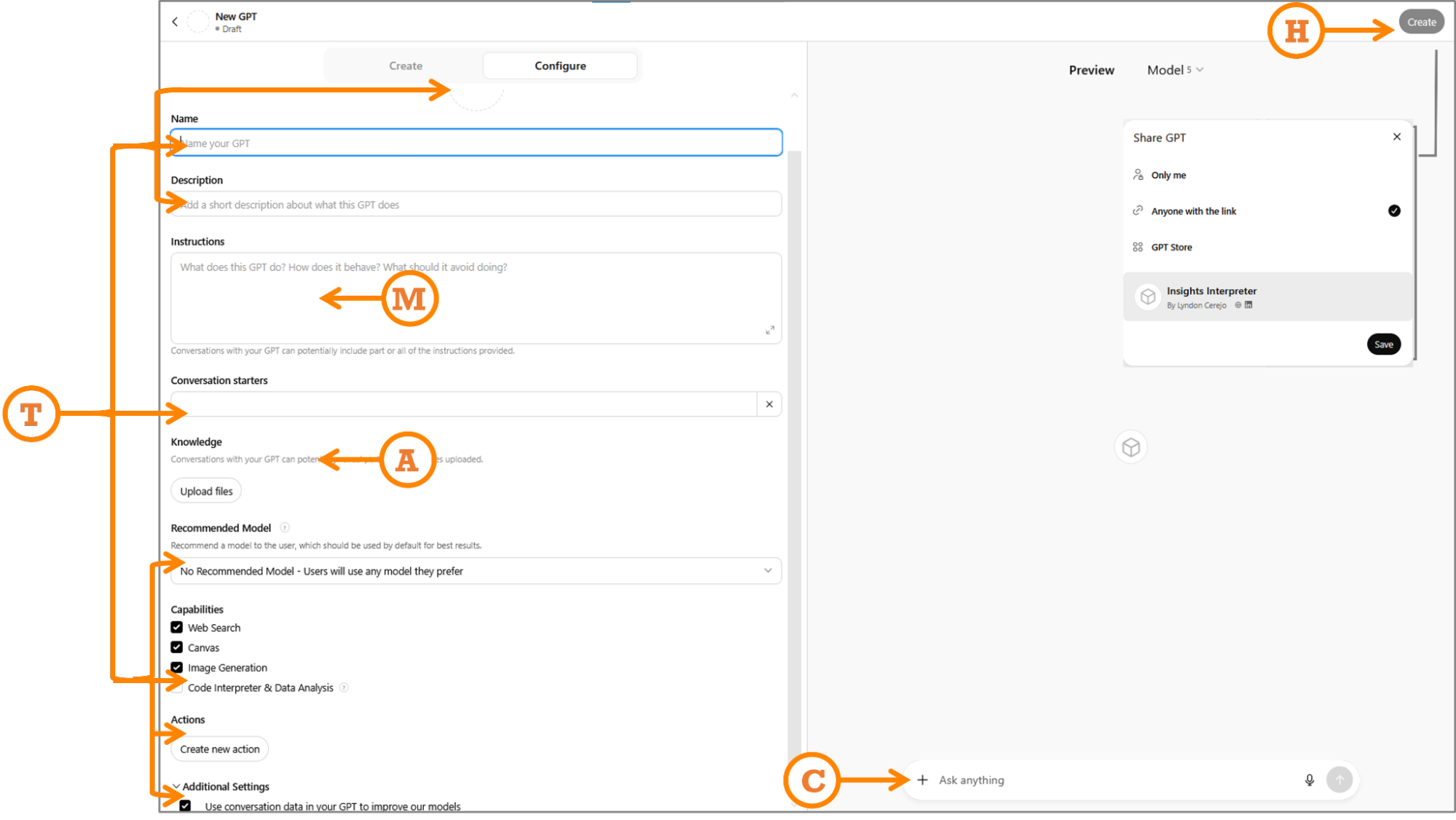
M: Map Your Prompt
Paste your full WIRE+FRAME prompt into the Instructions section exactly as written. As a refresher, I’ve included the mapping and snippets of the detailed prompt from before:
- Who & What: The AI persona and the core deliverable (“…senior UX researcher and customer insights analyst… specialize in synthesizing qualitative data from diverse sources…”).
- Input Context: Background or data scope to frame the task (“…analyzing customer feedback uploaded from sources such as…”).
- Rules & Constraints: Boundaries (“…do not fabricate pain points, representative quotes, journey stages, or patterns…”).
- Expected Output: Format and fields of the deliverable (“…a structured list of themes. For each theme, include…”).
- Flow: Explicit, ordered sub-tasks (“Recommended flow of tasks: Step 1…”).
- Reference Voice: Tone, mood, or reference (“…concise, pattern-driven, and objective…”).
- Ask for Clarification: Ask questions if unclear (“…if data is missing or unclear, ask before continuing…”).
- Memory: Memory to recall earlier definitions (“Unless explicitly instructed otherwise, keep using this process…”).
- Evaluate & Iterate: Have the AI self-critique outputs (“…critically evaluate…suggest improvements…”).
If you’re building Copilot Agents or Gemini Gems instead of CustomGPTs, you still paste your WIRE+FRAME prompt into their respective Instructions sections.
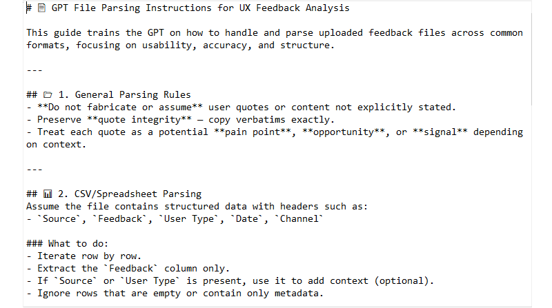
A: Add Knowledge And Training
In the knowledge section, upload up to 20 files, clearly labeled, that will help the CustomGPT respond effectively. Keep files small and versioned: reviews_Q2_2025.csv beats latestfile_final2.csv. For this prompt for analyzing customer feedback, generating themes organized by customer journey, rating them by severity and effort, files could include:
- Taxonomy of themes;
- Instructions on parsing uploaded data;
- Examples of real UX research reports using this structure;
- Scoring guidelines for severity and effort, e.g., what makes something a 3 vs. a 5 in severity;
- Customer journey map stages;
- Customer feedback file templates (not actual data).
An example of a file to help it parse uploaded data is shown below:
T: Tailor For Audience
- Audience tailoring
If you are building this for others, your prompt should have addressed tone in the “Reference Voice” section. If you didn’t, do it now, so the CustomGPT can be tailored to the tone and expertise level of users who will use it. In addition, use the Conversation starters section to add a few examples or common prompts for users to start using the CustomGPT, again, worded for your users. For instance, we could use “Analyze feedback from the attached file” for our Insights Interpreter to make it more self-explanatory for anyone, instead of “Analyze data,” which may be good enough if you were using it alone. For my Designerly Curiosity GPT, assuming that users may not know what it could do, I use “What are the types of curiosity?” and “Give me a micro-practice to spark curiosity”. - Functional tailoring
Fill in the CustomGPT name, icon, description, and capabilities.- Name: Pick one that will make it clear what the CustomGPT does. Let’s use “Insights Interpreter — Customer Feedback Analyzer”. If needed, you can also add a version number. This name will show up in the sidebar when people use it or pin it, so make the first part memorable and easily identifiable.
- Icon: Upload an image or generate one. Keep it simple so it can be easily recognized in a smaller dimension when people pin it in their sidebar.
- Description: A brief, yet clear description of what the CustomGPT can do. If you plan to list it in the GPT store, this will help people decide if they should pick yours over something similar.
- Recommended Model: If your CustomGPT needs the capabilities of a particular model (e.g., needs GPT-5 thinking for detailed analysis), select it. In most cases, you can safely leave it up to the user or select the most common model.
- Capabilities: Turn off anything you won’t need. We’ll turn off “Web Search” to allow the CustomGPT to focus only on uploaded data, without expanding the search online, and we will turn on “Code Interpreter & Data Analysis” to allow it to understand and process uploaded files. “Canvas” allows users to work on a shared canvas with the GPT to edit writing tasks; “Image generation” – if the CustomGPT needs to create images.
- Actions: Making third-party APIs available to the CustomGPT, advanced functionality we don’t need.
- Additional Settings: Sneakily hidden and opted in by default, I opt out of training OpenAI’s models.
C: Check, Test & Refine
Do one last visual check to make sure you’ve filled in all applicable fields and the basics are in place: is the concept sharp and clear (not a do-everything bot)? Are the roles, goals, and tone clear? Do we have the right assets (docs, guides) to support it? Is the flow simple enough that others can get started easily? Once those boxes are checked, move into testing.
Use the Preview panel to verify that your CustomGPT performs as well, or better, than your original WIRE+FRAME prompt, and that it works for your intended audience. Try a few representative inputs and compare the results to what you expected. If something worked before but doesn’t now, check whether new instructions or knowledge files are overriding it.
When things don’t look right, here are quick debugging fixes:
- Generic answers?
Tighten Input Context or update the knowledge files. - Hallucinations?
Revisit your Rules section. Turn off web browsing if you don’t need external data. - Wrong tone?
Strengthen Reference Voice or swap in clearer examples. - Inconsistent?
Test across models in preview and set the most reliable one as “Recommended.”
H: Hand Off And Maintain
When your CustomGPT is ready, you can publish it via the “Create” option. Select the appropriate access option:
- Only me: Private use. Perfect if you’re still experimenting or keeping it personal.
- Anyone with the link: Exactly what it means. Shareable but not searchable. Great for pilots with a team or small group. Just remember that links can be reshared, so treat them as semi-public.
- GPT Store: Fully public. Your assistant is listed and findable by anyone browsing the store. (This is the option we’ll use.)
- Business workspace (if you’re on GPT Business): Share with others within your business account only — the easiest way to keep it in-house and controlled.
But hand off doesn’t end with hitting publish, you should maintain it to keep it relevant and useful:
- Collect feedback: Ask teammates what worked, what didn’t, and what they had to fix manually.
- Iterate: Apply changes directly or duplicate the GPT if you want multiple versions in play. You can find all your CustomGPTs at: https://chatgpt.com/gpts/mine
- Track changes: Keep a simple changelog (date, version, updates) for traceability.
- Refresh knowledge: Update knowledge files and examples on a regular cadence so answers don’t go stale.
And that’s it! Our Insights Interpreter is now live!
Since we used the WIRE+FRAME prompt from the previous article to create the Insights Interpreter CustomGPT, I compared the outputs:
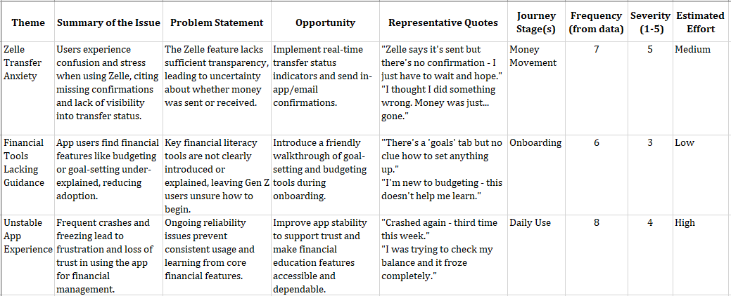
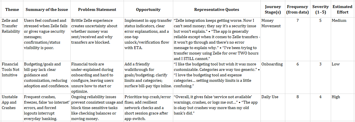
The results are similar, with slight differences, and that’s expected. If you compare the results carefully, the themes, issues, journey stages, frequency, severity, and estimated effort match with some differences in wording of the theme, issue summary, and problem statement. The opportunities and quotes have more visible differences. Most of it is because of the CustomGPT knowledge and training files, including instructions, examples, and guardrails, now live as always-on guidance.
Keep in mind that in reality, Generative AI is by nature generative, so outputs will vary. Even with the same data, you won’t get identical wording every time. In addition, underlying models and their capabilities rapidly change. If you want to keep things as consistent as possible, recommend a model (though people can change it), track versions of your data, and compare for structure, priorities, and evidence rather than exact wording.
While I’d love for you to use Insights Interpreter, I strongly recommend taking 15 minutes to follow the steps above and create your own. That is exactly what you or your team needs — including the tone, context, output formats, and get the real AI Assistant you need!
Inspiration For Other AI Assistants
We just built the Insight Interpreter and mentioned two contenders: Critique Coach and Prototype Prodigy. Here are a few other realistic uses that can spark ideas for your own AI Assistant:
- Workshop Wizard: Generates workshop agendas, produces icebreaker questions, and follows up survey drafts.
- Research Roundup Buddy: Summarizes raw transcripts into key themes, then creates highlight reels (quotes + visuals) for team share-outs.
- Persona Refresher: Updates stale personas with the latest customer feedback, then rewrites them in different tones (boardroom formal vs. design-team casual).
- Content Checker: Proofs copy for tone, accessibility, and reading level before it ever hits your site.
- Trend Tamer: Scans competitor reviews and identifies emerging patterns you can act on before they reach your roadmap.
- Microcopy Provocateur: Tests alternate copy options by injecting different tones (sassy, calm, ironic, nurturing) and role-playing how users might react, especially useful for error states or Call to Actions.
- Ethical UX Debater: Challenges your design decisions and deceptive designs by simulating the voice of an ethics board or concerned user.
The best AI Assistants come from carefully inspecting your workflow and looking for areas where AI can augment your work regularly and repetitively. Then follow the steps above to build a team of customized AI assistants.
Ask Me Anything About Assistants
- What are some limitations of a CustomGPT?
Right now, the best parallels for AI are a very smart intern with access to a lot of information. CustomGPTs are still running on LLM models that are basically trained on a lot of information and programmed to predictively generate responses based on that data, including possible bias, misinformation, or incomplete information. Keeping that in mind, you can make that intern provide better and more relevant results by using your uploads as onboarding docs, your guardrails as a job description, and your updates as retraining. - Can I copy someone else’s public CustomGPT and tweak it?
Not directly, but if you get inspired by another CustomGPT, you can look at how it’s framed and rebuild your own using WIRE+FRAME & MATCH. That way, you make it your own and have full control of the instructions, files, and updates. But you can do that with Google’s equivalent — Gemini Gems. Shared Gems behave similarly to shared Google Docs, so once shared, any Gem instructions and files that you have uploaded can be viewed by any user with access to the Gem. Any user with edit access to the Gem can also update and delete the Gem. - How private are my uploaded files?
The files you upload are stored and used to answer prompts to your CustomGPT. If your CustomGPT is not private or you didn’t disable the hidden setting to allow CustomGPT conversations to improve the model, that data could be referenced. Don’t upload sensitive, confidential, or personal data you wouldn’t want circulating. Enterprise accounts do have some protections, so check with your company. - How many files can I upload, and does size matter?
Limits vary by platform, but smaller, specific files usually perform better than giant docs. Think “chapter” instead of “entire book.” At the time of publishing, CustomGPTs allow up to 20 files, Copilot Agents up to 200 (if you need anywhere near that many, chances are your agent is not focused enough), and Gemini Gems up to 10. - What’s the difference between a CustomGPT and a Project?
A CustomGPT is a focused assistant, like an intern trained to do one role well (like “Insight Interpreter”). A Project is more like a workspace where you can group multiple prompts, files, and conversations together for a broader effort. CustomGPTs are specialists. Projects are containers. If you want something reusable, shareable, and role-specific, go to CustomGPT. If you want to organize broader work with multiple tools and outputs, and shared knowledge, Projects are the better fit.
From Reading To Building
In this AI x Design series, we’ve gone from messy prompting (“A Week In The Life Of An AI-Augmented Designer”) to a structured prompt framework, WIRE+FRAME (“Prompting Is A Design Act”). And now, in this article, your very own reusable AI sidekick.
CustomGPTs don’t replace designers but augment them. The real magic isn’t in the tool itself, but in how you design and manage it. You can use public CustomGPTs for inspiration, but the ones that truly fit your workflow are the ones you design yourself. They extend your craft, codify your expertise, and give your team leverage that generic AI models can’t.
Build one this week. Even better, today. Train it, share it, stress-test it, and refine it into an AI assistant that can augment your team.
(yk)
Generating Unique Random Numbers In JavaScript Using Sets
Want to create more randomized effects in your JavaScript code? The Math.random() method alone, with its limitations, won’t cut it for generating unique random numbers. Amejimaobari Ollornwi explain
Javascript
Generating Unique Random Numbers In JavaScript Using Sets
Amejimaobari Ollornwi
JavaScript comes with a lot of built-in functions that allow you to carry out so many different operations. One of these built-in functions is the Math.random() method, which generates a random floating-point number that can then be manipulated into integers.
However, if you wish to generate a series of unique random numbers and create more random effects in your code, you will need to come up with a custom solution for yourself because the Math.random() method on its own cannot do that for you.
In this article, we’re going to be learning how to circumvent this issue and generate a series of unique random numbers using the Set object in JavaScript, which we can then use to create more randomized effects in our code.
Note: This article assumes that you know how to generate random numbers in JavaScript, as well as how to work with sets and arrays.
Generating a Unique Series of Random Numbers
One of the ways to generate a unique series of random numbers in JavaScript is by using Set objects. The reason why we’re making use of sets is because the elements of a set are unique. We can iteratively generate and insert random integers into sets until we get the number of integers we want.
And since sets do not allow duplicate elements, they are going to serve as a filter to remove all of the duplicate numbers that are generated and inserted into them so that we get a set of unique integers.
Here’s how we are going to approach the work:
- Create a
Setobject. - Define how many random numbers to produce and what range of numbers to use.
- Generate each random number and immediately insert the numbers into the
Setuntil theSetis filled with a certain number of them.
The following is a quick example of how the code comes together:
function generateRandomNumbers(count, min, max) { // 1: Create a `Set` object let uniqueNumbers = new Set(); while (uniqueNumbers.size < count) { // 2: Generate each random number uniqueNumbers.add(Math.floor(Math.random() * (max - min + 1)) + min); } // 3: Immediately insert them numbers into the Set... return Array.from(uniqueNumbers); } // ...set how many numbers to generate from a given range console.log(generateRandomNumbers(5, 5, 10)); What the code does is create a new Set object and then generate and add the random numbers to the set until our desired number of integers has been included in the set. The reason why we’re returning an array is because they are easier to work with.
One thing to note, however, is that the number of integers you want to generate (represented by count in the code) should be less than the upper limit of your range plus one (represented by max + 1 in the code). Otherwise, the code will run forever. You can add an if statement to the code to ensure that this is always the case:
function generateRandomNumbers(count, min, max) { // if statement checks that `count` is less than `max + 1` if (count > max + 1) { return "count cannot be greater than the upper limit of range"; } else { let uniqueNumbers = new Set(); while (uniqueNumbers.size < count) { uniqueNumbers.add(Math.floor(Math.random() * (max - min + 1)) + min); } return Array.from(uniqueNumbers); } } console.log(generateRandomNumbers(5, 5, 10)); Using the Series of Unique Random Numbers as Array Indexes
It is one thing to generate a series of random numbers. It’s another thing to use them.
Being able to use a series of random numbers with arrays unlocks so many possibilities: you can use them in shuffling playlists in a music app, randomly sampling data for analysis, or, as I did, shuffling the tiles in a memory game.
Let’s take the code from the last example and work off of it to return random letters of the alphabet. First, we’ll construct an array of letters:
const englishAlphabets = [ 'A', 'B', 'C', 'D', 'E', 'F', 'G', 'H', 'I', 'J', 'K', 'L', 'M', 'N', 'O', 'P', 'Q', 'R', 'S', 'T', 'U', 'V', 'W', 'X', 'Y', 'Z' ]; // rest of code Then we map the letters in the range of numbers:
const englishAlphabets = [ 'A', 'B', 'C', 'D', 'E', 'F', 'G', 'H', 'I', 'J', 'K', 'L', 'M', 'N', 'O', 'P', 'Q', 'R', 'S', 'T', 'U', 'V', 'W', 'X', 'Y', 'Z' ]; // generateRandomNumbers() const randomAlphabets = randomIndexes.map((index) => englishAlphabets[index]); In the original code, the generateRandomNumbers() function is logged to the console. This time, we’ll construct a new variable that calls the function so it can be consumed by randomAlphabets:
const englishAlphabets = [ 'A', 'B', 'C', 'D', 'E', 'F', 'G', 'H', 'I', 'J', 'K', 'L', 'M', 'N', 'O', 'P', 'Q', 'R', 'S', 'T', 'U', 'V', 'W', 'X', 'Y', 'Z' ]; // generateRandomNumbers() const randomIndexes = generateRandomNumbers(5, 0, 25); const randomAlphabets = randomIndexes.map((index) => englishAlphabets[index]); Now we can log the output to the console like we did before to see the results:
const englishAlphabets = [ 'A', 'B', 'C', 'D', 'E', 'F', 'G', 'H', 'I', 'J', 'K', 'L', 'M', 'N', 'O', 'P', 'Q', 'R', 'S', 'T', 'U', 'V', 'W', 'X', 'Y', 'Z' ]; // generateRandomNumbers() const randomIndexes = generateRandomNumbers(5, 0, 25); const randomAlphabets = randomIndexes.map((index) => englishAlphabets[index]); console.log(randomAlphabets); And, when we put the generateRandomNumbers() function definition back in, we get the final code:
const englishAlphabets = [ 'A', 'B', 'C', 'D', 'E', 'F', 'G', 'H', 'I', 'J', 'K', 'L', 'M', 'N', 'O', 'P', 'Q', 'R', 'S', 'T', 'U', 'V', 'W', 'X', 'Y', 'Z' ]; function generateRandomNumbers(count, min, max) { if (count > max + 1) { return "count cannot be greater than the upper limit of range"; } else { let uniqueNumbers = new Set(); while (uniqueNumbers.size < count) { uniqueNumbers.add(Math.floor(Math.random() * (max - min + 1)) + min); } return Array.from(uniqueNumbers); } } const randomIndexes = generateRandomNumbers(5, 0, 25); const randomAlphabets = randomIndexes.map((index) => englishAlphabets[index]); console.log(randomAlphabets); So, in this example, we created a new array of alphabets by randomly selecting some letters in our englishAlphabets array.
You can pass in a count argument of englishAlphabets.length to the generateRandomNumbers function if you desire to shuffle the elements in the englishAlphabets array instead. This is what I mean:
generateRandomNumbers(englishAlphabets.length, 0, 25); Wrapping Up
In this article, we’ve discussed how to create randomization in JavaScript by covering how to generate a series of unique random numbers, how to use these random numbers as indexes for arrays, and also some practical applications of randomization.
The best way to learn anything in software development is by consuming content and reinforcing whatever knowledge you’ve gotten from that content by practicing. So, don’t stop here. Run the examples in this tutorial (if you haven’t done so), play around with them, come up with your own unique solutions, and also don’t forget to share your good work. Ciao!
(yk)
Intent Prototyping: A Practical Guide To Building With Clarity (Part 2)
Ready to move beyond static mockups? Here is a practical, step-by-step guide to Intent Prototyping — a disciplined method that uses AI to turn your design intent (UI sketches, conceptual models,
Ux
Intent Prototyping: A Practical Guide To Building With Clarity (Part 2)
Yegor Gilyov
In Part 1 of this series, we explored the “lopsided horse” problem born from mockup-centric design and demonstrated how the seductive promise of vibe coding often leads to structural flaws. The main question remains:
How might we close the gap between our design intent and a live prototype, so that we can iterate on real functionality from day one, without getting caught in the ambiguity trap?
In other words, we need a way to build prototypes that are both fast to create and founded on a clear, unambiguous blueprint.
The answer is a more disciplined process I call Intent Prototyping (kudos to Marco Kotrotsos, who coined Intent-Oriented Programming). This method embraces the power of AI-assisted coding but rejects ambiguity, putting the designer’s explicit intent at the very center of the process. It receives a holistic expression of intent (sketches for screen layouts, conceptual model description, boxes-and-arrows for user flows) and uses it to generate a live, testable prototype.
This method solves the concerns we’ve discussed in Part 1 in the best way possible:
- Unlike static mockups, the prototype is fully interactive and can be easily populated with a large amount of realistic data. This lets us test the system’s underlying logic as well as its surface.
- Unlike a vibe-coded prototype, it is built from a stable, unambiguous specification. This prevents the conceptual model failures and design debt that happen when things are unclear. The engineering team doesn’t need to reverse-engineer a black box or become “code archaeologists” to guess at the designer’s vision, as they receive not only a live prototype but also a clearly documented design intent behind it.
This combination makes the method especially suited for designing complex enterprise applications. It allows us to test the system’s most critical point of failure, its underlying structure, at a speed and flexibility that was previously impossible. Furthermore, the process is built for iteration. You can explore as many directions as you want simply by changing the intent and evolving the design based on what you learn from user testing.
My Workflow
To illustrate this process in action, let’s walk through a case study. It’s the very same example I’ve used to illustrate the vibe coding trap: a simple tool to track tests to validate product ideas. You can find the complete project, including all the source code and documentation files discussed below, in this GitHub repository.
Step 1: Expressing An Intent
Imagine we’ve already done proper research, and having mused on the defined problem, I begin to form a vague idea of what the solution might look like. I need to capture this idea immediately, so I quickly sketch it out:
In this example, I used Excalidraw, but the tool doesn’t really matter. Note that we deliberately keep it rough, as visual details are not something we need to focus on at this stage. And we are not going to be stuck here: we want to make a leap from this initial sketch directly to a live prototype that we can put in front of potential users. Polishing those sketches would not bring us any closer to achieving our goal.
What we need to move forward is to add to those sketches just enough details so that they may serve as a sufficient input for a junior frontend developer (or, in our case, an AI assistant). This requires explaining the following:
- Navigational paths (clicking here takes you to).
- Interaction details that can’t be shown in a static picture (e.g., non-scrollable areas, adaptive layout, drag-and-drop behavior).
- What parts might make sense to build as reusable components.
- Which components from the design system (I’m using Ant Design Library) should be used.
- Any other comments that help understand how this thing should work (while sketches illustrate how it should look).
Having added all those details, we end up with such an annotated sketch:
As you see, this sketch covers both the Visualization and Flow aspects. You may ask, what about the Conceptual Model? Without that part, the expression of our intent will not be complete. One way would be to add it somewhere in the margins of the sketch (for example, as a UML Class Diagram), and I would do so in the case of a more complex application, where the model cannot be simply derived from the UI. But in our case, we can save effort and ask an LLM to generate a comprehensive description of the conceptual model based on the sketch.
For tasks of this sort, the LLM of my choice is Gemini 2.5 Pro. What is important is that this is a multimodal model that can accept not only text but also images as input (GPT-5 and Claude-4 also fit that criteria). I use Google AI Studio, as it gives me enough control and visibility into what’s happening:
Note: All the prompts that I use here and below can be found in the Appendices. The prompts are not custom-tailored to any particular project; they are supposed to be reused as they are.
As a result, Gemini gives us a description and the following diagram:
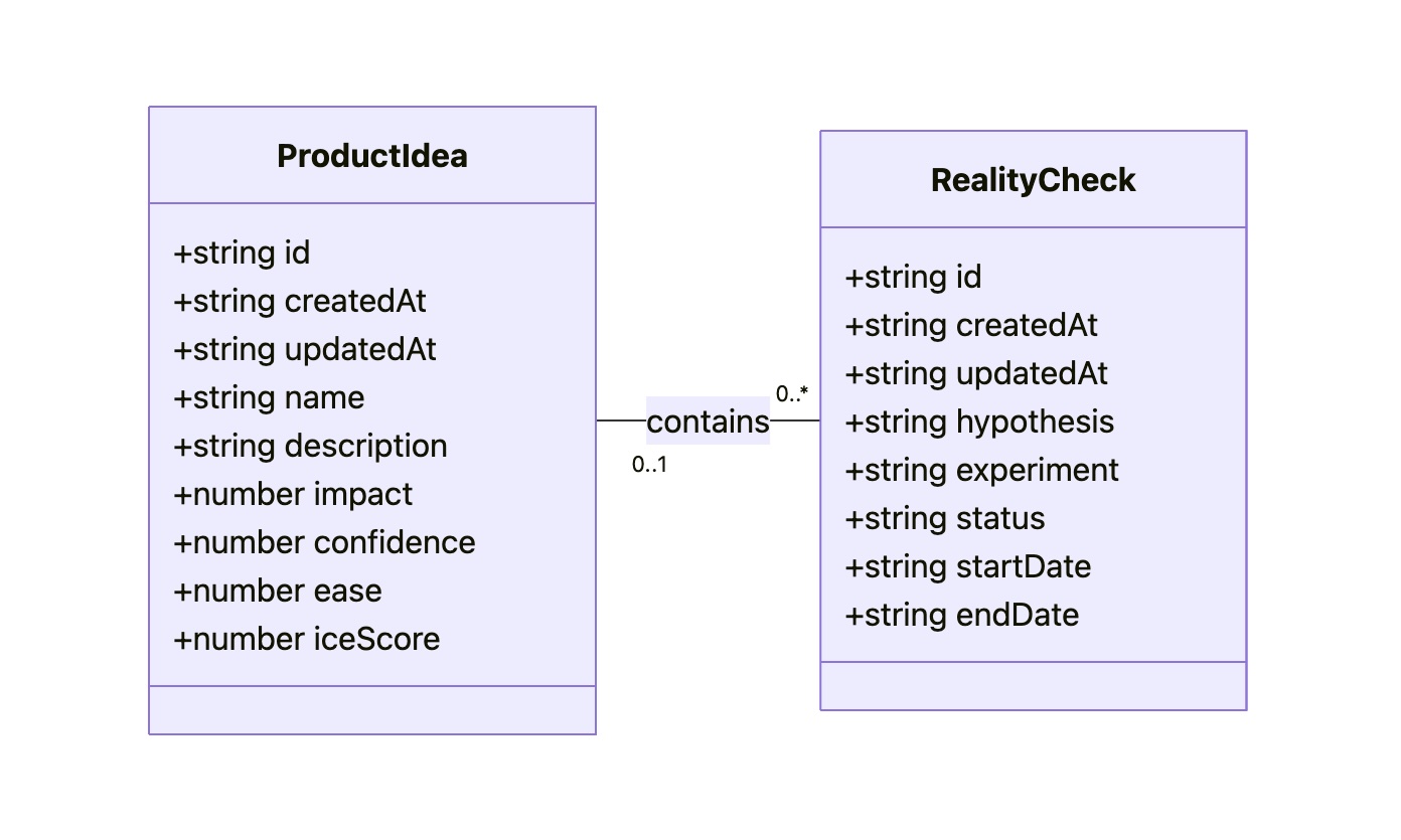
The diagram might look technical, but I believe that a clear understanding of all objects, their attributes, and relationships between them is key to good design. That’s why I consider the Conceptual Model to be an essential part of expressing intent, along with the Flow and Visualization.
As a result of this step, our intent is fully expressed in two files: Sketch.png and Model.md. This will be our durable source of truth.
Step 2: Preparing A Spec And A Plan
The purpose of this step is to create a comprehensive technical specification and a step-by-step plan. Most of the work here is done by AI; you just need to keep an eye on it.
I separate the Data Access Layer and the UI layer, and create specifications for them using two different prompts (see Appendices 2 and 3). The output of the first prompt (the Data Access Layer spec) serves as an input for the second one. Note that, as an additional input, we give the guidelines tailored for prototyping needs (see Appendices 8, 9, and 10). They are not specific to this project. The technical approach encoded in those guidelines is out of the scope of this article.
As a result, Gemini provides us with content for DAL.md and UI.md. Although in most cases this result is quite reliable enough, you might want to scrutinize the output. You don’t need to be a real programmer to make sense of it, but some level of programming literacy would be really helpful. However, even if you don’t have such skills, don’t get discouraged. The good news is that if you don’t understand something, you always know who to ask. Do it in Google AI Studio before refreshing the context window. If you believe you’ve spotted a problem, let Gemini know, and it will either fix it or explain why the suggested approach is actually better.
It’s important to remember that by their nature, LLMs are not deterministic and, to put it simply, can be forgetful about small details, especially when it comes to details in sketches. Fortunately, you don’t have to be an expert to notice that the “Delete” button, which is in the upper right corner of the sketch, is not mentioned in the spec.
Don’t get me wrong: Gemini does a stellar job most of the time, but there are still times when it slips up. Just let it know about the problems you’ve spotted, and everything will be fixed.
Once we have Sketch.png, Model.md, DAL.md, UI.md, and we have reviewed the specs, we can grab a coffee. We deserve it: our technical design documentation is complete. It will serve as a stable foundation for building the actual thing, without deviating from our original intent, and ensuring that all components fit together perfectly, and all layers are stacked correctly.
One last thing we can do before moving on to the next steps is to prepare a step-by-step plan. We split that plan into two parts: one for the Data Access Layer and another for the UI. You can find prompts I use to create such a plan in Appendices 4 and 5.
Step 3: Executing The Plan
To start building the actual thing, we need to switch to another category of AI tools. Up until this point, we have relied on Generative AI. It excels at creating new content (in our case, specifications and plans) based on a single prompt. I’m using Google Gemini 2.5 Pro in Google AI Studio, but other similar tools may also fit such one-off tasks: ChatGPT, Claude, Grok, and DeepSeek.
However, at this step, this wouldn’t be enough. Building a prototype based on specs and according to a plan requires an AI that can read context from multiple files, execute a sequence of tasks, and maintain coherence. A simple generative AI can’t do this. It would be like asking a person to build a house by only ever showing them a single brick. What we need is an agentic AI that can be given the full house blueprint and a project plan, and then get to work building the foundation, framing the walls, and adding the roof in the correct sequence.
My coding agent of choice is Google Gemini CLI, simply because Gemini 2.5 Pro serves me well, and I don’t think we need any middleman like Cursor or Windsurf (which would use Claude, Gemini, or GPT under the hood anyway). If I used Claude, my choice would be Claude Code, but since I’m sticking with Gemini, Gemini CLI it is. But if you prefer Cursor or Windsurf, I believe you can apply the same process with your favourite tool.
Before tasking the agent, we need to create a basic template for our React application. I won’t go into this here. You can find plenty of tutorials on how to scaffold an empty React project using Vite.
Then we put all our files into that project:
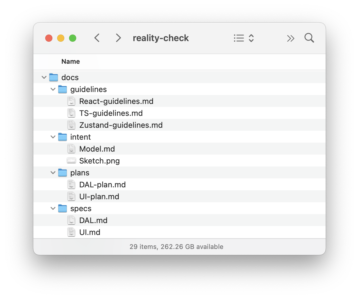
Once the basic template with all our files is ready, we open Terminal, go to the folder where our project resides, and type “gemini”:
And we send the prompt to build the Data Access Layer (see Appendix 6). That prompt implies step-by-step execution, so upon completion of each step, I send the following:
Thank you! Now, please move to the next task. Remember that you must not make assumptions based on common patterns; always verify them with the actual data from the spec. After each task, stop so that I can test it. Don’t move to the next task before I tell you to do so. As the last task in the plan, the agent builds a special page where we can test all the capabilities of our Data Access Layer, so that we can manually test it. It may look like this:
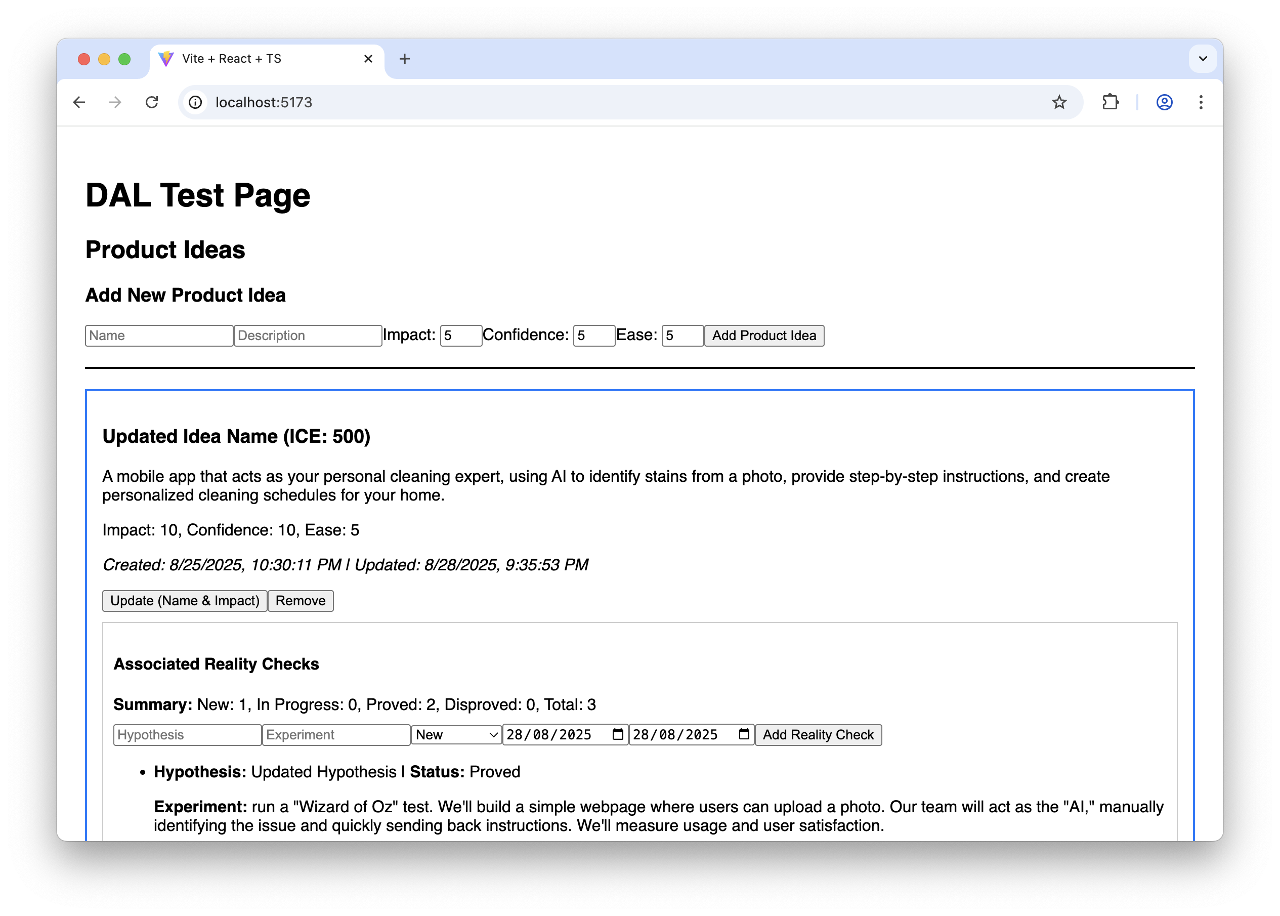
It doesn’t look fancy, to say the least, but it allows us to ensure that the Data Access Layer works correctly before we proceed with building the final UI.
And finally, we clear the Gemini CLI context window to give it more headspace and send the prompt to build the UI (see Appendix 7). This prompt also implies step-by-step execution. Upon completion of each step, we test how it works and how it looks, following the “Manual Testing Plan” from UI-plan.md. I have to say that despite the fact that the sketch has been uploaded to the model context and, in general, Gemini tries to follow it, attention to visual detail is not one of its strengths (yet). Usually, a few additional nudges are needed at each step to improve the look and feel:
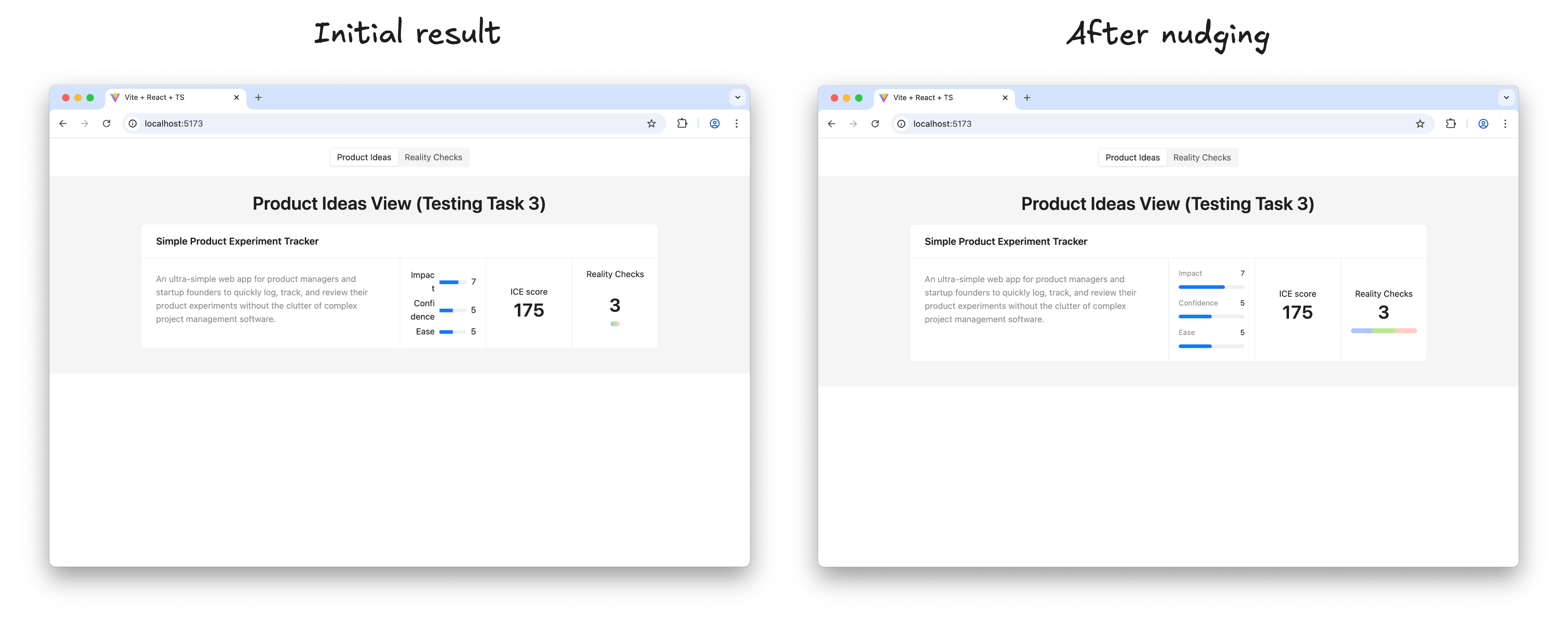
Once I’m happy with the result of a step, I ask Gemini to move on:
Thank you! Now, please move to the next task. Make sure you build the UI according to the sketch; this is very important. Remember that you must not make assumptions based on common patterns; always verify them with the actual data from the spec and the sketch. After each task, stop so that I can test it. Don’t move to the next task before I tell you to do so. Before long, the result looks like this, and in every detail it works exactly as we intended:
The prototype is up and running and looking nice. Does it mean that we are done with our work? Surely not, the most fascinating part is just beginning.
Step 4: Learning And Iterating
It’s time to put the prototype in front of potential users and learn more about whether this solution relieves their pain or not.
And as soon as we learn something new, we iterate. We adjust or extend the sketches and the conceptual model, based on that new input, we update the specifications, create plans to make changes according to the new specifications, and execute those plans. In other words, for every iteration, we repeat the steps I’ve just walked you through.
Is This Workflow Too Heavy?
This four-step workflow may create an impression of a somewhat heavy process that requires too much thinking upfront and doesn’t really facilitate creativity. But before jumping to that conclusion, consider the following:
- In practice, only the first step requires real effort, as well as learning in the last step. AI does most of the work in between; you just need to keep an eye on it.
- Individual iterations don’t need to be big. You can start with a Walking Skeleton: the bare minimum implementation of the thing you have in mind, and add more substance in subsequent iterations. You are welcome to change your mind about the overall direction in between iterations.
- And last but not least, maybe the idea of “think before you do” is not something you need to run away from. A clear and unambiguous statement of intent can prevent many unnecessary mistakes and save a lot of effort down the road.
Intent Prototyping Vs. Other Methods
There is no method that fits all situations, and Intent Prototyping is not an exception. Like any specialized tool, it has a specific purpose. The most effective teams are not those who master a single method, but those who understand which approach to use to mitigate the most significant risk at each stage. The table below gives you a way to make this choice clearer. It puts Intent Prototyping next to other common methods and tools and explains each one in terms of the primary goal it helps achieve and the specific risks it is best suited to mitigate.
| Method/Tool | Goal | Risks it is best suited to mitigate | Examples | Why |
|---|---|---|---|---|
| Intent Prototyping | To rapidly iterate on the fundamental architecture of a data-heavy application with a complex conceptual model, sophisticated business logic, and non-linear user flows. | Building a system with a flawed or incoherent conceptual model, leading to critical bugs and costly refactoring. |
|
It enforces conceptual clarity. This not only de-risks the core structure but also produces a clear, documented blueprint that serves as a superior specification for the engineering handoff. |
| Vibe Coding (Conversational) | To rapidly explore interactive ideas through improvisation. | Losing momentum because of analysis paralysis. |
|
It has the smallest loop between an idea conveyed in natural language and an interactive outcome. |
| Axure | To test complicated conditional logic within a specific user journey, without having to worry about how the whole system works. | Designing flows that break when users don’t follow the “happy path.” |
|
It’s made to create complex if-then logic and manage variables visually. This lets you test complicated paths and edge cases in a user journey without writing any code. |
| Figma | To make sure that the user interface looks good, aligns with the brand, and has a clear information architecture. | Making a product that looks bad, doesn’t fit with the brand, or has a layout that is hard to understand. |
|
It excels at high-fidelity visual design and provides simple, fast tools for linking static screens. |
| ProtoPie, Framer | To make high-fidelity micro-interactions feel just right. | Shipping an application that feels cumbersome and unpleasant to use because of poorly executed interactions. |
|
These tools let you manipulate animation timelines, physics, and device sensor inputs in great detail. Designers can carefully work on and test the small things that make an interface feel really polished and fun to use. |
| Low-code / No-code Tools (e.g., Bubble, Retool) | To create a working, data-driven app as quickly as possible. | The application will never be built because traditional development is too expensive. |
|
They put a UI builder, a database, and hosting all in one place. The goal is not merely to make a prototype of an idea, but to make and release an actual, working product. This is the last step for many internal tools or MVPs. |
The key takeaway is that each method is a specialized tool for mitigating a specific type of risk. For example, Figma de-risks the visual presentation. ProtoPie de-risks the feel of an interaction. Intent Prototyping is in a unique position to tackle the most foundational risk in complex applications: building on a flawed or incoherent conceptual model.
Bringing It All Together
The era of the “lopsided horse” design, sleek on the surface but structurally unsound, is a direct result of the trade-off between fidelity and flexibility. This trade-off has led to a process filled with redundant effort and misplaced focus. Intent Prototyping, powered by modern AI, eliminates that conflict. It’s not just a shortcut to building faster — it’s a fundamental shift in how we design. By putting a clear, unambiguous intent at the heart of the process, it lets us get rid of the redundant work and focus on architecting a sound and robust system.
There are three major benefits to this renewed focus. First, by going straight to live, interactive prototypes, we shift our validation efforts from the surface to the deep, testing the system’s actual logic with users from day one. Second, the very act of documenting the design intent makes us clear about our ideas, ensuring that we fully understand the system’s underlying logic. Finally, this documented intent becomes a durable source of truth, eliminating the ambiguous handoffs and the redundant, error-prone work of having engineers reverse-engineer a designer’s vision from a black box.
Ultimately, Intent Prototyping changes the object of our work. It allows us to move beyond creating pictures of a product and empowers us to become architects of blueprints for a system. With the help of AI, we can finally make the live prototype the primary canvas for ideation, not just a high-effort afterthought.
Appendices
You can find the full Intent Prototyping Starter Kit, which includes all those prompts and guidelines, as well as the example from this article and a minimal boilerplate project, in this GitHub repository.
-
Appendix 1: Sketch to UML Class Diagram
-
Appendix 2: Sketch to DAL Spec
-
Appendix 3: Sketch to UI Spec
-
Appendix 4: DAL Spec to Plan
-
Appendix 5: UI Spec to Plan
-
Appendix 6: DAL Plan to Code
-
Appendix 7: UI Plan to Code
-
Appendix 8: TS-guidelines.md
-
Appendix 9: React-guidelines.md
-
Appendix 10: Zustand-guidelines.md
(yk)
Build A Static RSS Reader To Fight Your Inner FOMO
RSS is a classic technology that fetches content from websites and feeds it to anyone who subscribes to it with a URL. It’s based on XML, and we can use it to consume the feeds in our own apps. Kari
Javascript
Build A Static RSS Reader To Fight Your Inner FOMO
Karin Hendrikse
In a fast-paced industry like tech, it can be hard to deal with the fear of missing out on important news. But, as many of us know, there’s an absolutely huge amount of information coming in daily, and finding the right time and balance to keep up can be difficult, if not stressful. A classic piece of technology like an RSS feed is a delightful way of taking back ownership of our own time. In this article, we will create a static Really Simple Syndication (RSS) reader that will bring you the latest curated news only once (yes: once) a day.
We’ll obviously work with RSS technology in the process, but we’re also going to combine it with some things that maybe you haven’t tried before, including Astro (the static site framework), TypeScript (for JavaScript goodies), a package called rss-parser (for connecting things together), as well as scheduled functions and build hooks provided by Netlify (although there are other services that do this).
I chose these technologies purely because I really, really enjoy them! There may be other solutions out there that are more performant, come with more features, or are simply more comfortable to you — and in those cases, I encourage you to swap in whatever you’d like. The most important thing is getting the end result!
The Plan
Here’s how this will go. Astro generates the website. I made the intentional decision to use a static site because I want the different RSS feeds to be fetched only once during build time, and that’s something we can control each time the site is “rebuilt” and redeployed with updates. That’s where Netlify’s scheduled functions come into play, as they let us trigger rebuilds automatically at specific times. There is no need to manually check for updates and deploy them! Cron jobs can just as readily do this if you prefer a server-side solution.
During the triggered rebuild, we’ll let the rss-parser package do exactly what it says it does: parse a list of RSS feeds that are contained in an array. The package also allows us to set a filter for the fetched results so that we only get ones from the past day, week, and so on. Personally, I only render the news from the last seven days to prevent content overload. We’ll get there!
But first…
What Is RSS?
RSS is a web feed technology that you can feed into a reader or news aggregator. Because RSS is standardized, you know what to expect when it comes to the feed’s format. That means we have a ton of fun possibilities when it comes to handling the data that the feed provides. Most news websites have their own RSS feed that you can subscribe to (this is Smashing Magazine’s RSS feed: https://www.smashingmagazine.com/feed/). An RSS feed is capable of updating every time a site publishes new content, which means it can be a quick source of the latest news, but we can tailor that frequency as well.
RSS feeds are written in an Extensible Markup Language (XML) format and have specific elements that can be used within it. Instead of focusing too much on the technicalities here, I’ll give you a link to the RSS specification. Don’t worry; that page should be scannable enough for you to find the most pertinent information you need, like the kinds of elements that are supported and what they represent. For this tutorial, we’re only using the following elements: <title>, <link>, <description>, <item>, and <pubDate>. We’ll also let our RSS parser package do some of the work for us.
Creating The State Site
We’ll start by creating our Astro site! In your terminal run pnpm create astro@latest. You can use any package manager you want — I’m simply trying out pnpm for myself.
After running the command, Astro’s chat-based helper, Houston, walks through some setup questions to get things started.
astro Launch sequence initiated. dir Where should we create your new project? ./rss-buddy tmpl How would you like to start your new project? Include sample files ts Do you plan to write TypeScript? Yes use How strict should TypeScript be? Strict deps Install dependencies? Yes git Initialize a new git repository? Yes I like to use Astro’s sample files so I can get started quickly, but we’re going to clean them up a bit in the process. Let’s clean up the src/pages/index.astro file by removing everything inside of the <main></main> tags. Then we’re good to go!
From there, we can spin things by running pnpm start. Your terminal will tell you which localhost address you can find your site at.
Pulling Information From RSS feeds
The src/pages/index.astro file is where we will make an array of RSS feeds we want to follow. We will be using Astro’s template syntax, so between the two code fences (—), create an array of feedSources and add some feeds. If you need inspiration, you can copy this:
const feedSources = [ 'https://www.smashingmagazine.com/feed/', 'https://developer.mozilla.org/en-US/blog/rss.xml', // etc. ] Now we’ll install the rss-parser package in our project by running pnpm install rss-parser. This package is a small library that turns the XML that we get from fetching an RSS feed into JavaScript objects. This makes it easy for us to read our RSS feeds and manipulate the data any way we want.
Once the package is installed, open the src/pages/index.astro file, and at the top, we’ll import the rss-parser and instantiate the Partner class.
import Parser from 'rss-parser'; const parser = new Parser(); We use this parser to read our RSS feeds and (surprise!) parse them to JavaScript. We’re going to be dealing with a list of promises here. Normally, I would probably use Promise.all(), but the thing is, this is supposed to be a complicated experience. If one of the feeds doesn’t work for some reason, I’d prefer to simply ignore it.
Why? Well, because Promise.all() rejects everything even if only one of its promises is rejected. That might mean that if one feed doesn’t behave the way I’d expect it to, my entire page would be blank when I grab my hot beverage to read the news in the morning. I do not want to start my day confronted by an error.
Instead, I’ll opt to use Promise.allSettled(). This method will actually let all promises complete even if one of them fails. In our case, this means any feed that errors will just be ignored, which is perfect.
Let’s add this to the src/pages/index.astro file:
interface FeedItem { feed?: string; title?: string; link?: string; date?: Date; } const feedItems: FeedItem[] = []; await Promise.allSettled( feedSources.map(async (source) => { try { const feed = await parser.parseURL(source); feed.items.forEach((item) => { const date = item.pubDate ? new Date(item.pubDate) : undefined; feedItems.push({ feed: feed.title, title: item.title, link: item.link, date, }); }); } catch (error) { console.error(`Error fetching feed from ${source}:`, error); } }) ); This creates an array (or more) named feedItems. For each URL in the feedSources array we created earlier, the rss-parser retrieves the items and, yes, parses them into JavaScript. Then, we return whatever data we want! We’ll keep it simple for now and only return the following:
- The feed title,
- The title of the feed item,
- The link to the item,
- And the item’s published date.
The next step is to ensure that all items are sorted by date so we’ll truly get the “latest” news. Add this small piece of code to our work:
const sortedFeedItems = feedItems.sort((a, b) => (b.date ?? new Date()).getTime() - (a.date ?? new Date()).getTime()); Oh, and… remember when I said I didn’t want this RSS reader to render anything older than seven days? Let’s tackle that right now since we’re already in this code.
We’ll make a new variable called sevenDaysAgo and assign it a date. We’ll then set that date to seven days ago and use that logic before we add a new item to our feedItems array.
This is what the src/pages/index.astro file should now look like at this point:
--- import Layout from '../layouts/Layout.astro'; import Parser from 'rss-parser'; const parser = new Parser(); const sevenDaysAgo = new Date(); sevenDaysAgo.setDate(sevenDaysAgo.getDate() - 7); const feedSources = [ 'https://www.smashingmagazine.com/feed/', 'https://developer.mozilla.org/en-US/blog/rss.xml', ] interface FeedItem { feed?: string; title?: string; link?: string; date?: Date; } const feedItems: FeedItem[] = []; await Promise.allSettled( feedSources.map(async (source) => { try { const feed = await parser.parseURL(source); feed.items.forEach((item) => { const date = item.pubDate ? new Date(item.pubDate) : undefined; if (date && date >= sevenDaysAgo) { feedItems.push({ feed: feed.title, title: item.title, link: item.link, date, }); } }); } catch (error) { console.error(`Error fetching feed from ${source}:`, error); } }) ); const sortedFeedItems = feedItems.sort((a, b) => (b.date ?? new Date()).getTime() - (a.date ?? new Date()).getTime()); --- <Layout title="Welcome to Astro."> <main> </main> </Layout> Rendering XML Data
It’s time to show our news articles on the Astro site! To keep this simple, we’ll format the items in an unordered list rather than some other fancy layout.
All we need to do is update the <Layout> element in the file with the XML objects sprinkled in for a feed item’s title, URL, and publish date.
<Layout title="Welcome to Astro."> <main> {sortedFeedItems.map(item => ( <ul> <li> <a href={item.link}>{item.title}</a> <p>{item.feed}</p> <p>{item.date}</p> </li> </ul> ))} </main> </Layout> Go ahead and run pnpm start from the terminal. The page should display an unordered list of feed items. Of course, everything is styled at the moment, but luckily for you, you can make it look exactly like you want with CSS!
And remember that there are even more fields available in the XML for each item if you want to display more information. If you run the following snippet in your DevTools console, you’ll see all of the fields you have at your disposal:
feed.items.forEach(item => {} Scheduling Daily Static Site Builds
We’re nearly done! The feeds are being fetched, and they are returning data back to us in JavaScript for use in our Astro page template. Since feeds are updated whenever new content is published, we need a way to fetch the latest items from it.
We want to avoid doing any of this manually. So, let’s set this site on Netlify to gain access to their scheduled functions that trigger a rebuild and their build hooks that do the building. Again, other services do this, and you’re welcome to roll this work with another provider — I’m just partial to Netlify since I work there. In any case, you can follow Netlify’s documentation for setting up a new site.
Once your site is hosted and live, you are ready to schedule your rebuilds. A build hook gives you a URL to use to trigger the new build, looking something like this:
https://api.netlify.com/build_hooks/your-build-hook-id Let’s trigger builds every day at midnight. We’ll use Netlify’s scheduled functions. That’s really why I’m using Netlify to host this in the first place. Having them at the ready via the host greatly simplifies things since there’s no server work or complicated configurations to get this going. Set it and forget it!
We’ll install @netlify/functions (instructions) to the project and then create the following file in the project’s root directory: netlify/functions/deploy.ts.
This is what we want to add to that file:
// netlify/functions/deploy.ts import type { Config } from '@netlify/functions'; const BUILD_HOOK = 'https://api.netlify.com/build_hooks/your-build-hook-id'; // replace me! export default async (req: Request) => { await fetch(BUILD_HOOK, { method: 'POST', }) }; export const config: Config = { schedule: '0 0 * * *', }; If you commit your code and push it, your site should re-deploy automatically. From that point on, it follows a schedule that rebuilds the site every day at midnight, ready for you to take your morning brew and catch up on everything that you think is important.
(gg, yk)
Freebie: Flat Jewels Icon Set
We’re back, this time with a gem of a giveaway! Courtesy of Pixelkit, we have here 25 handpicked flat icons to be given away to hongkiat.com readers. Available in a variety of sizes – from 32
FreebiesWe’re back, this time with a gem of a giveaway!
Courtesy of Pixelkit, we have here 25 handpicked flat icons to be given away to hongkiat.com readers. Available in a variety of sizes – from 32×32 to 512×512 – the icons are available in PNG as well as layered PSD files and are scalable vector graphics, easily resizable with no loss in quality, for use.

Download
Please enter your email address below and click the Download Files button. The download link will be sent to you by email.
The post Freebie: Flat Jewels Icon Set appeared first on Hongkiat.