


Adobe Long Shadow Icons
We featured Simon Rahm’s Long Shadow Flat Icon Set giveaway a while back. Well, Simon is back with another set of icons to give away to our readers. We know that a lot of our readers are fans of Ado
Freebies
Software Development Outsourcing Cost: Revealing The Mysterious Side of Budgets
Why Outsource In The First Place? The Earth revolves around the Sun. Hopefully, we can agree on that. Metaphorically though, it certainly revolves around money. That is especially true when it comes to business. Most business decisions are heavily influenced by finances, whom to hire, which […]
Business
How To Build A Business Case To Promote Accessibility In Your B2B Products
When passion for accessibility meets business indifference, what bridges the gap? Gloria Diaz Alonso shares how she turned frustration into strategy — by learning to speak the language of business.
Accessibility

Freebie: 10 High Quality Summer Letterings
Together with Freepik, we are releasing this Hongkiat-exclusive freebie offering of 10 Summer Letterings great for a design that is fit for the beach and perfect for paradise. The letterings are avail
FreebiesTogether with Freepik, we are releasing this Hongkiat-exclusive freebie offering of 10 Summer Letterings great for a design that is fit for the beach and perfect for paradise. The letterings are available in cursive, uppercase and lowercase and in numbers as well.
Check out these freebies and follow the instructions to get your hand on these files. All letterings are available in AI and EPS format.
Previews


Download
Please enter your email address below and click the Download Files button. The download link will be sent to you by email.
The post Freebie: 10 High Quality Summer Letterings appeared first on Hongkiat.

Designing For Stress And Emergency
Practical guidelines on designing time-critical products that prevent errors and improve accuracy. Part of the Measure UX & Design Impact (use the code 🎟 IMPACT to save 20% off today). With a l
Ux
Designing For Stress And Emergency
Vitaly Friedman
No design exists in isolation. As designers, we often imagine specific situations in which people will use our product. It might be indeed quite common — but there will also be other — urgent, frustrating, stressful situations. And they are the ones that we rarely account for.
So how do we account for such situations? How can we help people use our products while coping with stress — without adding to their cognitive load? Let’s take a closer look.
Study Where Your Product Fits Into People’s Lives
When designing digital products, sometimes we get a bit too attached to our shiny new features and flows — often forgetting the messy reality in which these features and flows have to neatly fit. And often it means 10s of other products, 100s of other tabs, and 1000s of other emails.

If your customers have to use a slightly older machine, with a smallish 22” screen and a lot of background noise, they might use your product differently than you might have imagined, e.g., splitting the screen into halves to see both views at the same time (as displayed above).
Chances are high that our customers will use our product while doing something else, often with very little motivation, very little patience, plenty of urgent (and way more important) problems, and an unhealthy dose of stress. And that’s where our product must do its job well.
What Is Stress?
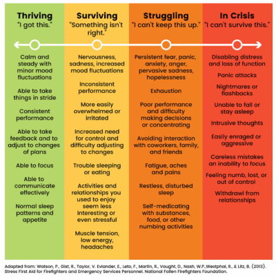
What exactly do we mean when we talk about “stress”? As H Locke noted, stress is the body’s response to a situation it cannot handle. There is a mismatch between what people can control, their own skills, and the challenge in front of them.
If the situation seems unmanageable and the goal they want to achieve moves further away, it creates an enormous sense of failing. It can be extremely frustrating and demotivating.
Some failures have a local scope, but many have a far-reaching impact. Many people can’t choose the products they have to use for work, so when a tool fails repeatedly, causes frustration, or is unreliable, it affects the worker, the work, the colleagues, and processes within the organization. Fragility has a high cost — and so does frustration.
How Stress Influences User Interactions
It’s not a big surprise: stress disrupts attention, memory, cognition, and decision-making. It makes it difficult to prioritize and draw logical conclusions. In times of stress, we rely on fast, intuitive judgments, not reasoning. Typically, it leads to instinctive responses based on established habits.

When users are in an emergency, they experience cognitive tunneling — it’s a state when their peripheral vision narrows, reading comprehension drops, fine motor skills deteriorate, and patience drops sharply. Under pressure, people often make decisions hastily, while others get entirely paralyzed. Either way is a likely path to mistakes — often irreversible ones and often without time for extensive deliberations.
Ideally, these decisions would be made way ahead of time — and then suggested when needed. But in practice, it’s not always possible. As it turns out, a good way to help people deal with stress is by providing order around how they manage it.
Single-Tasking Instead Of Multi-Tasking
People can’t really multi-task, especially in very stressful situations or emergencies. Especially with a big chunk of work in front of them, people need some order to make progress, reliably. That’s why simpler pages usually work better than one big complex page.
Order means giving users a clear plan of action to complete a task. No distractions, no unnecessary navigation. We ask simple questions and prompt simple actions, one after another, one thing at a time.
An example of the plan is the Task List Pattern, invented by fine folks at Gov.uk. We break a task into a sequence of sub-tasks, describe them with actionable labels, assign statuses, and track progress.
To support accuracy, we revise default settings, values, presets, and actions. Also, the order of actions and buttons matters, so we put high-priority things first to make them easier to find. Then we add built-in safeguards (e.g., Undo feature) to prevent irreversible errors.
Supporting In Emergencies
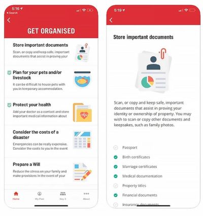
The most effective help during emergencies is to help people deal with the situation in a well-defined and effective way. That means being prepared for and designing an emergency mode, e.g., to activate instant alerts on emergency contacts, distribute pre-assigned tasks, and establish a line of communication.
Rediplan App by Australian Red Cross is an emergency plan companion that encourages citizens to prepare their documents and belongings with a few checklists and actions — including key contracts, meeting places, and medical information, all in one place.
Just Enough Friction
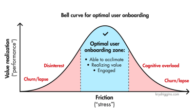
Not all stress is equally harmful, though. As Krystal Higgins points out, if there is not enough friction when onboarding new users and the experience is too passive or users are hand-held even through the most basic tasks, you risk that they won’t realize the personal value they gain from the experience and, ultimately, lose interest.
Design And Test For Stress Cases
Stress cases aren’t edge cases. We can’t predict the emotional state in which a user comes to our site or uses our product. A person looking for specific information on a hospital website or visiting a debt management website, for example, is most likely already stressed. Now, if the interface is overwhelming, it will only add to their cognitive load.
Stress-testing your product is critical to prevent this from happening. It’s useful to set up an annual day to stress test your product and refine emergency responses. It could be as simple as running content testing, or running tests in a real, noisy, busy environment where users actually work — at peak times.
And in case of emergencies, we need to check if fallbacks work as expected and if the current UX of the product helps people manage failures and exceptional situations well enough.
Wrapping Up
Emergencies will happen eventually — it’s just a matter of time. With good design, we can help mitigate risk and control damage, and make it hard to make irreversible mistakes. At its heart, that’s what good UX is exceptionally good at.
Key Takeaways
People can’t multitask, especially in very stressful situations.
- Stress disrupts attention, memory, cognition, decision-making.
- Also, it’s difficult to prioritize and draw logical conclusions.
- Under stress, we rely on fast, intuitive judgments — not reasoning.
- It leads to instinctive responses based on established habits.
Goal: Design flows that support focus and high accuracy.
- Start with better default settings, values, presets, and actions.
- High-priority first: order of actions and buttons matters.
- Break complex tasks down into a series of simple steps (10s–30s each).
- Add built-in safeguards to prevent irreversible errors (Undo).
Shift users to single-tasking: ask for one thing at a time.
- Simpler pages might work better than one complex page.
- Suggest a step-by-step plan of action to follow along.
- Consider, design, and test flows for emergency responses ahead of time.
- Add emergency mode for instant alerts and task assignments.
Meet “How To Measure UX And Design Impact”
You can find more details on UX Strategy in 🪴 Measure UX & Design Impact (8h), a practical guide for designers and UX leads to measure and show your UX impact on business. Use the code 🎟 IMPACT to save 20% off today. Jump to the details.

Video + UX Training
$ 495.00 $ 799.00 Get Video + UX Training
25 video lessons (8h) + Live UX Training.
100 days money-back-guarantee.
Video only
$ 250.00$ 395.00
25 video lessons (8h). Updated yearly.
Also available as a UX Bundle with 2 video courses.
Useful Resources
- “Designing The SOS Emergency System”, by Ritik Jayy
- “Designing For Crisis”, by Eric Meyer
- “Designing For Stressed Out Users” (Series), by H Locke
- Designing For Stress (Podcast), by Katie Swindler
- Designing For Edge Cases and Exceptions, by yours truly
- Design For Real Life, by Sara Wachter-Boettcher, Eric Mayer
- “Optimal Stress Levels For Onboarding, by Krystal Higgins
Further Reading
- “How To Minimize The Environmental Impact Of Your Website”, James Chudley
- “AI In UX: Achieve More With Less”, Paul Boag
- “How To Make Your UX Research Hard To Ignore”, Vitaly Friedman
- “From Prompt To Partner: Designing Your Custom AI Assistant,” Lyndon Cerejo
 (yk)
(yk)

Designing For Stress And Emergency
Designing For Stress And Emergency Designing For Stress And Emergency Vitaly Friedman 2025-11-24T13:00:00+00:00 2025-11-26T15:32:35+00:00 No design exists in isolation. As designers, we often imagine specific situations in which people will use our product. It might be indeed quite common — but there will also be […]
Accessibility
Designing For Stress And Emergency
Vitaly Friedman 2025-11-24T13:00:00+00:00
2025-11-26T15:32:35+00:00
No design exists in isolation. As designers, we often imagine specific situations in which people will use our product. It might be indeed quite common — but there will also be other — urgent, frustrating, stressful situations. And they are the ones that we rarely account for.
So how do we account for such situations? How can we help people use our products while coping with stress — without adding to their cognitive load? Let’s take a closer look.
Study Where Your Product Fits Into People’s Lives
When designing digital products, sometimes we get a bit too attached to our shiny new features and flows — often forgetting the messy reality in which these features and flows have to neatly fit. And often it means 10s of other products, 100s of other tabs, and 1000s of other emails.

If your customers have to use a slightly older machine, with a smallish 22” screen and a lot of background noise, they might use your product differently than you might have imagined, e.g., splitting the screen into halves to see both views at the same time (as displayed above).
Chances are high that our customers will use our product while doing something else, often with very little motivation, very little patience, plenty of urgent (and way more important) problems, and an unhealthy dose of stress. And that’s where our product must do its job well.
What Is Stress?
What exactly do we mean when we talk about “stress”? As H Locke noted, stress is the body’s response to a situation it cannot handle. There is a mismatch between what people can control, their own skills, and the challenge in front of them.
If the situation seems unmanageable and the goal they want to achieve moves further away, it creates an enormous sense of failing. It can be extremely frustrating and demotivating.
Some failures have a local scope, but many have a far-reaching impact. Many people can’t choose the products they have to use for work, so when a tool fails repeatedly, causes frustration, or is unreliable, it affects the worker, the work, the colleagues, and processes within the organization. Fragility has a high cost — and so does frustration.
How Stress Influences User Interactions
It’s not a big surprise: stress disrupts attention, memory, cognition, and decision-making. It makes it difficult to prioritize and draw logical conclusions. In times of stress, we rely on fast, intuitive judgments, not reasoning. Typically, it leads to instinctive responses based on established habits.
When users are in an emergency, they experience cognitive tunneling — it’s a state when their peripheral vision narrows, reading comprehension drops, fine motor skills deteriorate, and patience drops sharply. Under pressure, people often make decisions hastily, while others get entirely paralyzed. Either way is a likely path to mistakes — often irreversible ones and often without time for extensive deliberations.
Ideally, these decisions would be made way ahead of time — and then suggested when needed. But in practice, it’s not always possible. As it turns out, a good way to help people deal with stress is by providing order around how they manage it.
Single-Tasking Instead Of Multi-Tasking
People can’t really multi-task, especially in very stressful situations or emergencies. Especially with a big chunk of work in front of them, people need some order to make progress, reliably. That’s why simpler pages usually work better than one big complex page.
Order means giving users a clear plan of action to complete a task. No distractions, no unnecessary navigation. We ask simple questions and prompt simple actions, one after another, one thing at a time.
An example of the plan is the Task List Pattern, invented by fine folks at Gov.uk. We break a task into a sequence of sub-tasks, describe them with actionable labels, assign statuses, and track progress.
To support accuracy, we revise default settings, values, presets, and actions. Also, the order of actions and buttons matters, so we put high-priority things first to make them easier to find. Then we add built-in safeguards (e.g., Undo feature) to prevent irreversible errors.
Supporting In Emergencies
The most effective help during emergencies is to help people deal with the situation in a well-defined and effective way. That means being prepared for and designing an emergency mode, e.g., to activate instant alerts on emergency contacts, distribute pre-assigned tasks, and establish a line of communication.
Rediplan App by Australian Red Cross is an emergency plan companion that encourages citizens to prepare their documents and belongings with a few checklists and actions — including key contracts, meeting places, and medical information, all in one place.
Just Enough Friction
Not all stress is equally harmful, though. As Krystal Higgins points out, if there is not enough friction when onboarding new users and the experience is too passive or users are hand-held even through the most basic tasks, you risk that they won’t realize the personal value they gain from the experience and, ultimately, lose interest.
Design And Test For Stress Cases
Stress cases aren’t edge cases. We can’t predict the emotional state in which a user comes to our site or uses our product. A person looking for specific information on a hospital website or visiting a debt management website, for example, is most likely already stressed. Now, if the interface is overwhelming, it will only add to their cognitive load.
Stress-testing your product is critical to prevent this from happening. It’s useful to set up an annual day to stress test your product and refine emergency responses. It could be as simple as running content testing, or running tests in a real, noisy, busy environment where users actually work — at peak times.
And in case of emergencies, we need to check if fallbacks work as expected and if the current UX of the product helps people manage failures and exceptional situations well enough.
Wrapping Up
Emergencies will happen eventually — it’s just a matter of time. With good design, we can help mitigate risk and control damage, and make it hard to make irreversible mistakes. At its heart, that’s what good UX is exceptionally good at.
Key Takeaways
People can’t multitask, especially in very stressful situations.
- Stress disrupts attention, memory, cognition, decision-making.
- Also, it’s difficult to prioritize and draw logical conclusions.
- Under stress, we rely on fast, intuitive judgments — not reasoning.
- It leads to instinctive responses based on established habits.
Goal: Design flows that support focus and high accuracy.
- Start with better default settings, values, presets, and actions.
- High-priority first: order of actions and buttons matters.
- Break complex tasks down into a series of simple steps (10s–30s each).
- Add built-in safeguards to prevent irreversible errors (Undo).
Shift users to single-tasking: ask for one thing at a time.
- Simpler pages might work better than one complex page.
- Suggest a step-by-step plan of action to follow along.
- Consider, design, and test flows for emergency responses ahead of time.
- Add emergency mode for instant alerts and task assignments.
Meet “How To Measure UX And Design Impact”
You can find more details on UX Strategy in 🪴 Measure UX & Design Impact (8h), a practical guide for designers and UX leads to measure and show your UX impact on business. Use the code 🎟 IMPACT to save 20% off today. Jump to the details.

Video + UX Training
$ 495.00 $ 799.00
Get Video + UX Training
25 video lessons (8h) + Live UX Training.
100 days money-back-guarantee.
Video only
$ 250.00$ 395.00
25 video lessons (8h). Updated yearly.
Also available as a UX Bundle with 2 video courses.
Useful Resources
- “Designing The SOS Emergency System”, by Ritik Jayy
- “Designing For Crisis”, by Eric Meyer
- “Designing For Stressed Out Users” (Series), by H Locke
- Designing For Stress (Podcast), by Katie Swindler
- Designing For Edge Cases and Exceptions, by yours truly
- Design For Real Life, by Sara Wachter-Boettcher, Eric Mayer
- “Optimal Stress Levels For Onboarding, by Krystal Higgins
Further Reading
- “How To Minimize The Environmental Impact Of Your Website”, James Chudley
- “AI In UX: Achieve More With Less”, Paul Boag
- “How To Make Your UX Research Hard To Ignore”, Vitaly Friedman
- “From Prompt To Partner: Designing Your Custom AI Assistant,” Lyndon Cerejo
(yk)
Meet Accessible UX Research, A Brand-New Smashing Book
Meet our newest book, “Accessible UX Research” — now available for pre-order. Michele A. Williams takes us for a deep dive into the real world of UX research, with a roadmap for including users
Accessibility
Meet Accessible UX Research, A Brand-New Smashing Book
Vitaly Friedman
UX research can take so much of the guesswork out of the design process! But it’s easy to forget just how different people are and how their needs and preferences can vary. We can’t predict the needs of every user, but we shouldn’t expect different people using the product in roughly the same way. That’s how we end up with an incomplete, inaccurate, or simply wrong picture of our customers.
There is no shortage of accessibility checklists and guidelines. But accessibility isn’t a checklist. It doesn’t happen by accident. It’s a dedicated effort to include and consider and understand different needs of different users to make sure everyone can use our products successfully. That’s why we’ve teamed up with Michele A. Williams on a shiny new book around just that.
Meet Accessible UX Research, your guide to making UX research more inclusive of participants with different needs — from planning and recruiting to facilitation, asking better questions, avoiding bias, and building trust. Pre-order the book.
Please note that we are currently unable to ship printed books to the United States due to customs clearance issues. If you have any questions, please contact us any time.

Print + eBook
$ 44.00
Quality hardcover. Free worldwide shipping early 2026.
100 days money-back-guarantee.
eBook
$ 19.00
DRM-free, of course. ePUB, Kindle, PDF available for download in December 2025.
Included with your Smashing Membership.
Get the eBook
Download PDF, ePUB, Kindle.
Thanks for being smashing! ❤️
About The Book
The book isn’t a checklist for you to complete as a part of your accessibility work. It’s a practical guide to inclusive UX research, from start to finish. If you’ve ever felt unsure how to include disabled participants, or worried about “getting it wrong,” this book is for you. You’ll get clear, practical strategies to make your research more inclusive, effective, and reliable.
Inside, you’ll learn how to:
- Plan research that includes disabled participants from the start,
- Recruit participants with disabilities,
- Facilitate sessions that work for a range of access needs,
- Ask better questions and avoid unintentionally biased research methods,
- Build trust and confidence in your team around accessibility and inclusion.
The book also challenges common assumptions about disability and urges readers to rethink what inclusion really means in UX research and beyond. Let’s move beyond compliance and start doing research that reflects the full diversity of your users. Whether you’re in industry or academia, this book gives you the tools — and the mindset — to make it happen.
High-quality hardcover. Written by Dr. Michele A. Williams. Cover art by Espen Brunborg. Print edition shipping early 2026. eBook available for download in December 2025. Pre-order the book.
Contents
- Disability mindset: For inclusive research to succeed, we must first confront our mindset about disability, typically influenced by ableism.
- Diversity of disability: Accessibility is not solely about blind screen reader users; disability categories help us unpack and process the diversity of disabled users.
- Disability in the stages of UX research: Disabled participants can and should be part of every research phase — formative, prototype, and summative.
- Recruiting disabled participants: Recruiting disabled participants is not always easy, but that simply means we need to learn strategies on where to look.
- Designing your research: While our goal is to influence accessible products, our research execution must also be accessible.
- Facilitating an accessible study: Preparation and communication with your participants can ensure your study logistics run smoothly.
- Analyzing and reporting with accuracy and impact: How you communicate your findings is just as important as gathering them in the first place — so prepare to be a storyteller, educator, and advocate.
- Disability in the UX research field: Inclusion isn’t just for research participants, it’s important for our colleagues as well, as explained by blind UX Researcher Dr. Cynthia Bennett.
Who This Book Is For
Whether a UX professional who conducts research in industry or academia, or more broadly part of an engineering, product, or design function, you’ll want to read this book if…
- You have been tasked to improve accessibility of your product, but need to know where to start to facilitate this successfully.
- You want to establish a culture for accessibility in your company, but not sure how to make it work.
- You want to move from WCAG/EAA compliance to established accessibility practices and inclusion in research practices and beyond.
- You want to improve your overall accessibility knowledge and be viewed as an Accessibility Specialist for your organization.

Print + eBook
$ 44.00
Quality hardcover. Free worldwide shipping early 2026.
100 days money-back-guarantee.
eBook
$ 19.00
DRM-free, of course. ePUB, Kindle, PDF available for download in December 2025.
Included with your Smashing Membership.
Get the eBook
Download PDF, ePUB, Kindle.
Thanks for being smashing! ❤️
About the Author
 Dr. Michele A. Williams is owner of M.A.W. Consulting, LLC – Making Accessibility Work. Her 20+ years of experience include influencing top tech companies as a Senior User Experience (UX) Researcher and Accessibility Specialist and obtaining a PhD in Human-Centered Computing focused on accessibility. An international speaker, published academic author, and patented inventor, she is passionate about educating and advising on technology that does not exclude disabled users.
Testimonials
“Accessible UX Research stands as a vital and necessary resource. In addressing disability at the User Experience Research layer, it helps to set an equal and equitable tone for products and features that resonates through the rest of the creation process. The book provides a solid framework for all aspects of conducting research efforts, including not only process considerations, but also importantly the mindset required to approach the work.
This is the book I wish I had when I was first getting started with my accessibility journey. It is a gift, and I feel so fortunate that Michele has chosen to share it with us all.”
Eric Bailey, Accessibility Advocate
“User research in accessibility is non-negotiable for actually meeting users’ needs, and this book is a critical piece in the puzzle of actually doing and integrating that research into accessibility work day to day.”
Devon Pershing, Author of The Accessibility Operations Guidebook
“Our decisions as developers and designers are often based on recommendations, assumptions, and biases. Usually, this doesn’t work, because checking off lists or working solely from our own perspective can never truly represent the depth of human experience. Michele’s book provides you with the strategies you need to conduct UX research with diverse groups of people, challenge your assumptions, and create truly great products.”
Manuel Matuzović, Author of the Web Accessibility Cookbook
“This book is a vital resource on inclusive research. Michele Williams expertly breaks down key concepts, guiding readers through disability models, language, and etiquette. A strong focus on real-world application equips readers to conduct impactful, inclusive research sessions. By emphasizing diverse perspectives and proactive inclusion, the book makes a compelling case for accessibility as a core principle rather than an afterthought. It is a must-read for researchers, product-makers, and advocates!”
Anna E. Cook, Accessibility and Inclusive Design Specialist
Technical Details
- ISBN: 978-3-910835-03-0 (print)
- Quality hardcover, stitched binding, ribbon page marker.
- Free worldwide airmail shipping from Germany early 2026. We are currently unable to ship printed books to the United States due to customs clearance issues. If you have any questions, please contact us any time.
- eBook available for download as PDF, ePUB, and Amazon Kindle in December 2025.
Pre-order the book.
Community Matters ❤️
Producing a book takes quite a bit of time, and we couldn’t pull it off without the support of our wonderful community. A huge shout-out to Smashing Members for the kind, ongoing support. The eBook is and always will be free for Smashing Members as soon as it’s out. Plus, Members get a friendly discount when purchasing their printed copy. Just sayin’! 😉
More Smashing Books & Goodies
Promoting best practices and providing you with practical tips to master your daily coding and design challenges has always been (and will be) at the core of everything we do at Smashing.
In the past few years, we were very lucky to have worked together with some talented, caring people from the web community to publish their wealth of experience as printed books that stand the test of time. Addy, Heather, and Steven are three of these people. Have you checked out their books already?

Success at Scale
A deep dive into how production sites of different sizes tackle performance, accessibility, capabilities, and developer experience at scale.
Understanding Privacy
Everything you need to know to put your users first and make a better web.
Touch Design for Mobile Interfaces
Learn how touchscreen devices really work — and how people really use them.
(as, cm)
Six Key Components of UX Strategy
Six Key Components of UX Strategy Six Key Components of UX Strategy Vitaly Friedman 2025-11-05T13:00:00+00:00 2025-11-12T15:03:07+00:00 For years, “UX strategy” felt like a confusing, ambiguous, and overloaded term to me. To me, it was some sort of a roadmap or a “grand vision”, with a […]
Accessibility
Six Key Components of UX Strategy
Vitaly Friedman 2025-11-05T13:00:00+00:00
2025-11-12T15:03:07+00:00
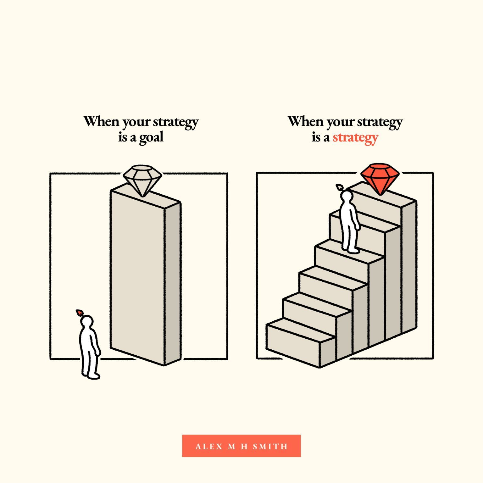
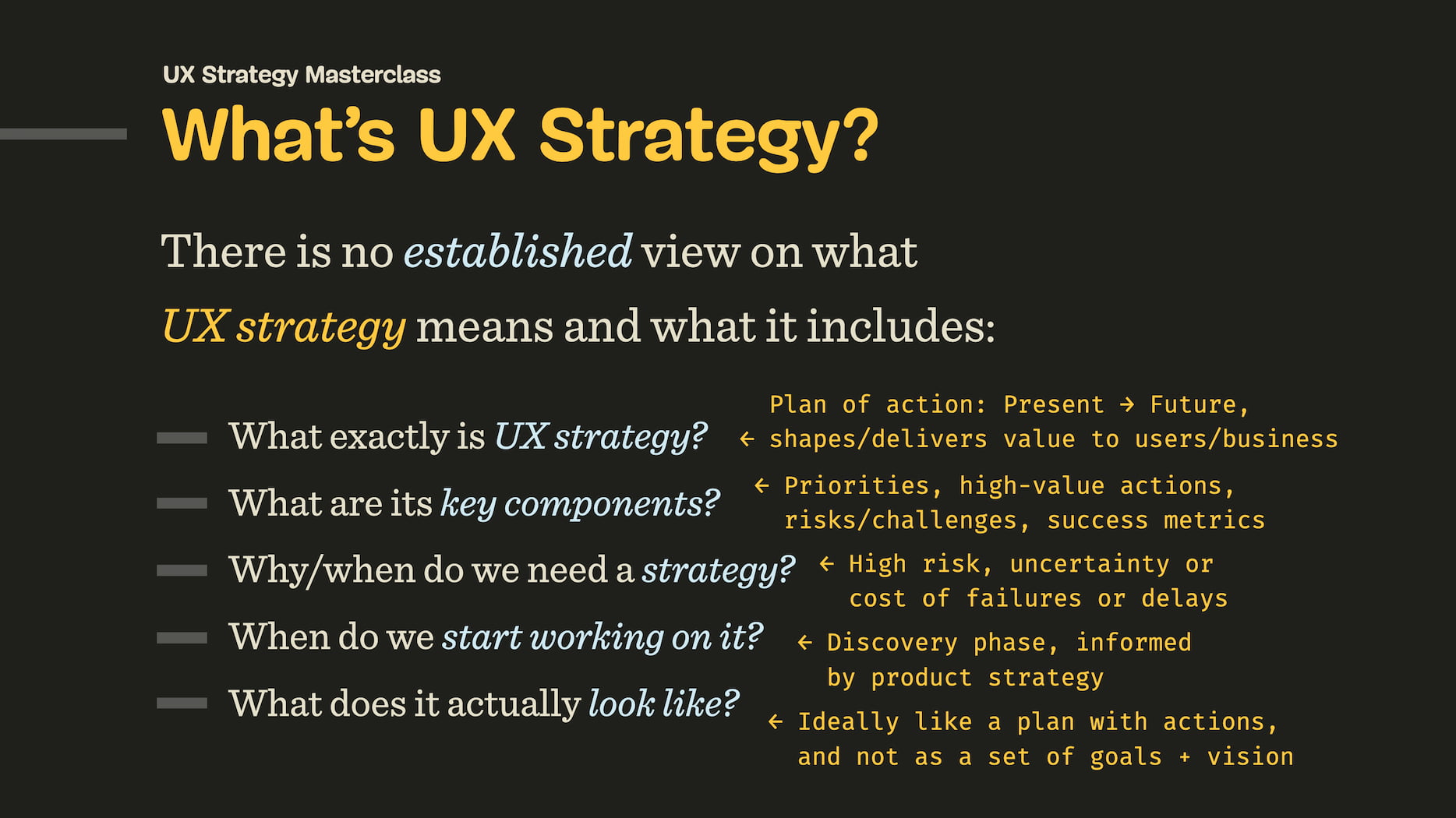
For years, “UX strategy” felt like a confusing, ambiguous, and overloaded term to me. To me, it was some sort of a roadmap or a “grand vision”, with a few business decisions attached to it. And looking back now, I realize that I was wrong all along.
UX Strategy isn’t a goal; it’s a journey towards that goal. A journey connecting where UX is today with a desired future state of UX. And as such, it guides our actions and decisions, things we do and don’t do. And its goal is very simple: to maximize our chances of success while considering risks, bottlenecks and anything that might endanger the project.
Let’s explore the components of UX strategy, and how it works with product strategy and business strategy to deliver user value and meet business goals.
Strategy vs. Goals vs. Plans
When we speak about strategy, we often speak about planning and goals — but they are actually quite different. While strategy answers “what” we’re doing and “why”, planning is about “how” and “when” we’ll get it done. And the goal is merely a desired outcome of that entire journey.
- Goals establish a desired future outcome,
- That outcome typically represents a problem to solve,
- Strategy shows a high-level solution for that problem,
- Plan is a detailed set of low-level steps for getting the solution done.

A strong strategy requires making conscious, and oftentimes tough, decisions about what we will do — and just as importantly, what we will not do, and why.
Business Strategy
UX strategy doesn’t live in isolation. It must inform and support product strategy and be aligned with business strategy. All these terms are often slightly confusing and overloaded, so let’s clear it up.
At the highest level, business strategy is about the distinct choices executives make to set the company apart from its competitors. They shape the company’s positioning, objectives, and (most importantly!) competitive advantage.

Typically, this advantage is achieved in two ways: through lower prices (cost leadership) or through differentiation. The latter part isn’t about being different, but rather being perceived differently by the target audience. And that’s exactly where UX impact steps in.
In short, business strategy is:
- A top-line vision, basis for core offers,
- Shapes positioning, goals, competitive advantage,
- Must always adapt to the market to keep a competitive advantage.
Product Strategy
Product strategy is how a high-level business direction is translated into a unique positioning of a product. It defines what the product is, who its users are, and how it will contribute to the business’s goals. It’s also how we bring a product to market, drive growth, and achieve product-market fit.
In short, product strategy is:
- Unique positioning and value of a product,
- How to establish and keep a product in the marketplace,
- How to keep competitive advantage of the product.
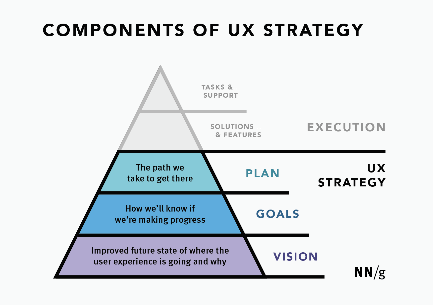
UX Strategy
UX strategy is about shaping and delivering product value through UX. Good UX strategy always stems from UX research and answers to business needs. It established what to focus on, what our high-value actions are, how we’ll measure success, and — quite importantly — what risks we need to mitigate.

Most importantly, it’s not a fixed plan or a set of deliverables; it’s a guide that informs our actions, but also must be prepared to change when things change.

In short, UX strategy is:
- How we shape and deliver product value through UX,
- Priorities, focus + why, actions, metrics, risks,
- Isn’t a roadmap, intention or deliverables.
Six Key Components of UX Strategy
The impact of good UX typically lives in differentiation mentioned above. Again, it’s not about how “different” our experience is, but the unique perceived value that users associate with it. And that value is a matter of a clear, frictionless, accessible, fast, and reliable experience wrapped into the product.

I always try to include 6 key components in any strategic UX work so we don’t end up following a wrong assumption that won’t bring any impact:
- Target goal
The desired, improved future state of UX. - User segments
Primary users that we are considering. - Priorities
What we will and, crucially, what we will not do, and why. - High-value actions
How we drive value and meet user and business needs. - Feasibility
Realistic assessment of people, processes, and resources. - Risks
Bottlenecks, blockers, legacy constraints, big unknowns.
It’s worth noting that it’s always dangerous to be designing a product with everybody in mind. As Jamie Levy noted, by being very broad too early, we often reduce the impact of our design and messaging. It’s typically better to start with a specific, well-defined user segment and then expand, rather than the other way around.
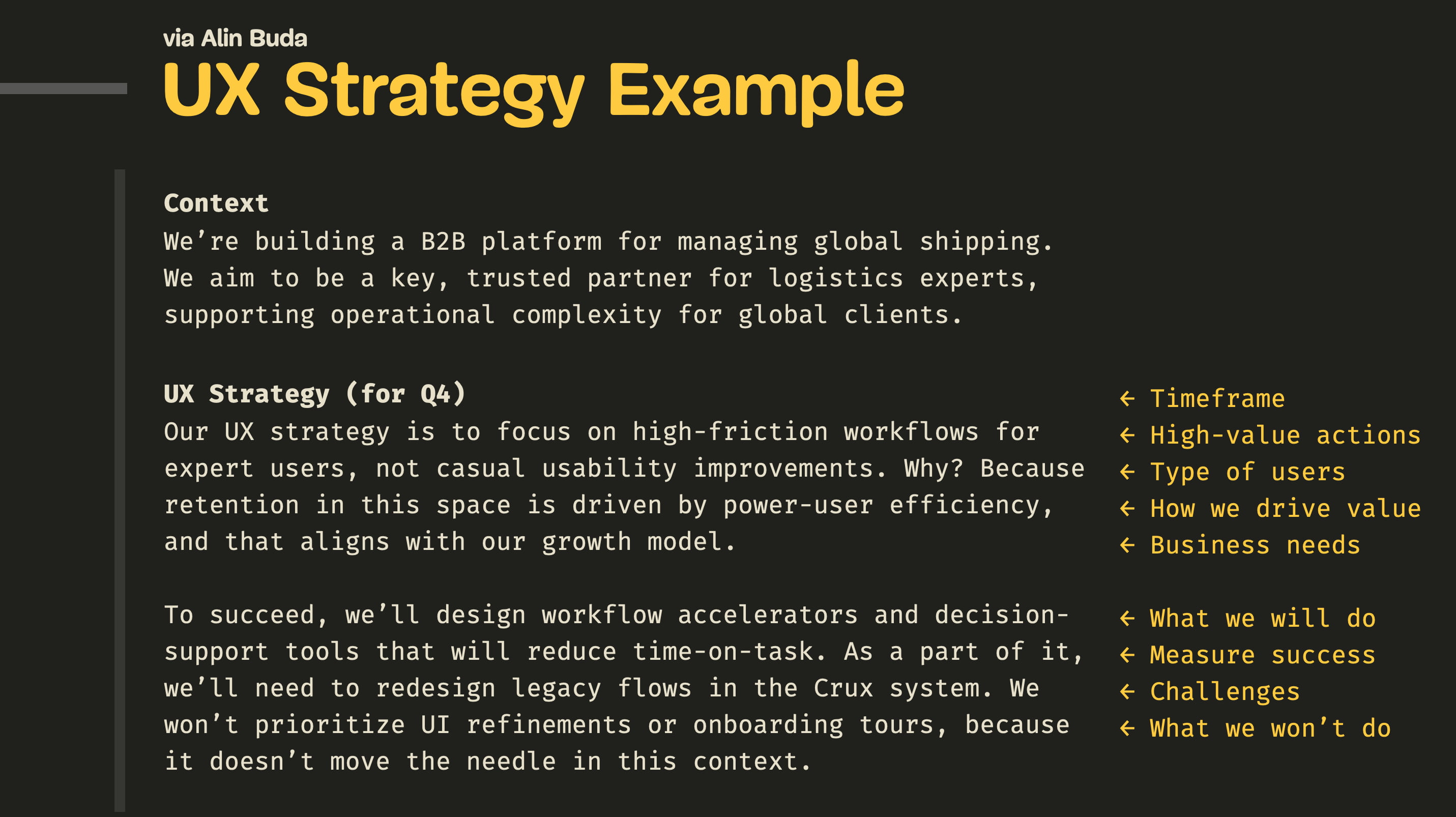
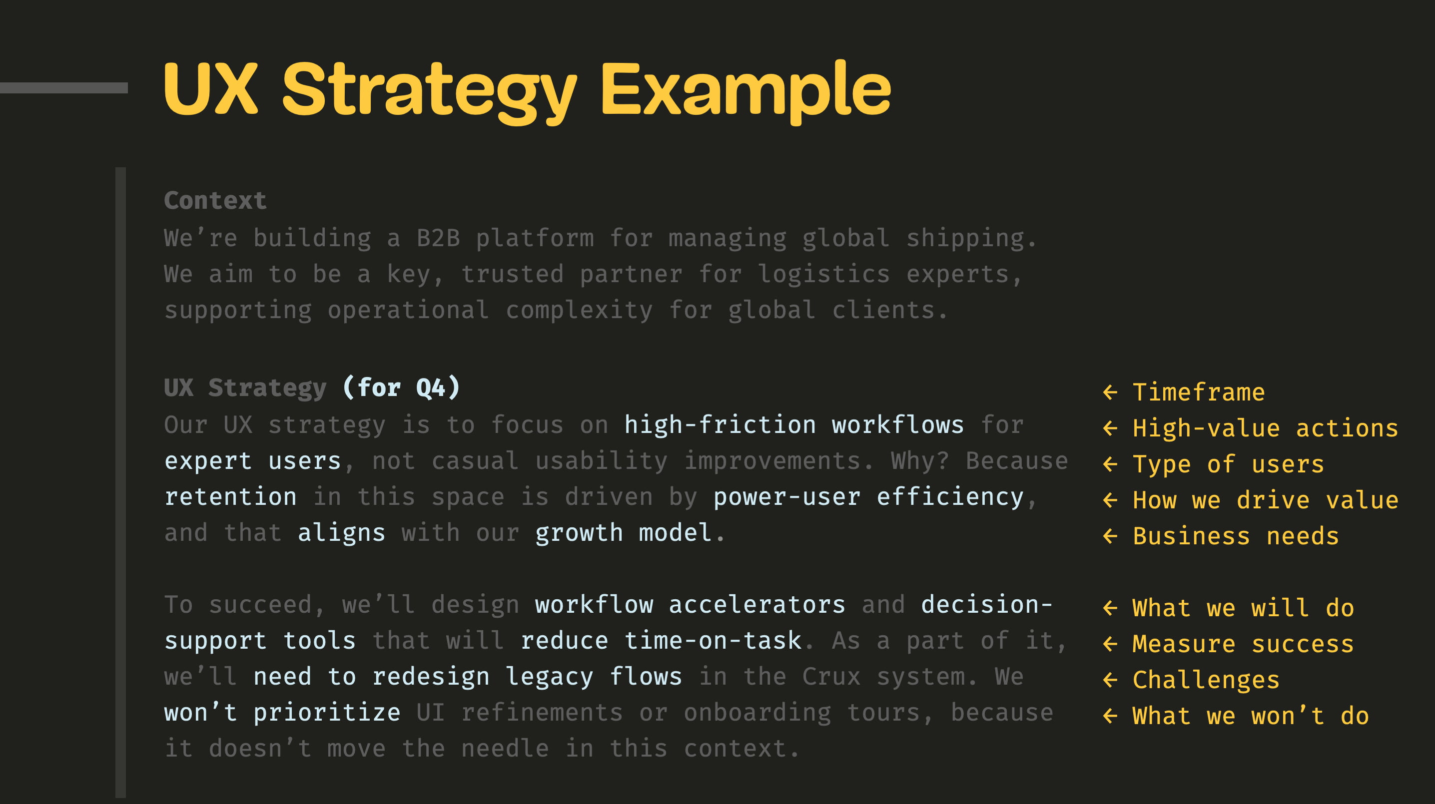
Practical Example (by Alin Buda)
UX strategy doesn’t have to be a big 40-page long PDF report or a Keynote presentation. A while back, Alin Buda kindly left a comment on one of my LinkedIn posts, giving a great example of what a concise UX strategy could look like:
UX Strategy (for Q4)
Our UX strategy is to focus on high-friction workflows for expert users, not casual usability improvements. Why? Because retention in this space is driven by power-user efficiency, and that aligns with our growth model.
To succeed, we’ll design workflow accelerators and decision-support tools that will reduce time-on-task. As a part of it, we’ll need to redesign legacy flows in the Crux system. We won’t prioritize UI refinements or onboarding tours, because it doesn’t move the needle in this context.


What I like most about this example is just how concise and clear it is. Getting to this level of clarity takes quite a bit of time, but it creates a very precise overview of what we do, what we don’t do, what we focus on, and how we drive value.
Wrapping Up
The best path to make a strong case with senior leadership is to frame your UX work as a direct contributor to differentiation. This isn’t just about making things look different; it’s about enhancing the perceived value.

A good strategy ties UX improvements to measurable business outcomes. It doesn’t speak about design patterns, consistency, or neatly organized components. Instead, it speaks the language of product and business strategy: OKRs, costs, revenue, business metrics, and objectives.
Design can succeed without a strategy. In the wise words of Sun Tzu, strategy without tactics is the slowest route to victory. And tactics without strategy are the noise before defeat.
Meet “How To Measure UX And Design Impact”
You can find more details on UX Strategy in 🪴 Measure UX & Design Impact (8h), a practical guide for designers and UX leads to measure and show your UX impact on business. Use the code 🎟 IMPACT to save 20% off today. Jump to the details.
Video + UX Training
$ 495.00 $ 799.00
Get Video + UX Training
25 video lessons (8h) + Live UX Training.
100 days money-back-guarantee.
Video only
$ 250.00$ 395.00
25 video lessons (8h). Updated yearly.
Also available as a UX Bundle with 2 video courses.
Useful Resources
- “UX Strategy: Definition and Components”, Sarah Gibbons, Anna Kaley
- “UX Strategy: Study Guide”, Sarah Gibbons, Anna Kaley
- What Goes Into a Proactive UX Strategy (video), Jared Spool
- “How To Develop An Effective UX Strategy”, Chloé Garnham
- The Little Book Of Strategy (free PDF), Peter Bihr
- “Enterprise UX Strategy”, Cassandra Naji
- “UX Strategy Guide” + Blueprint (Template), Alex Souza
- Product Strategy Playbooks
- UX Strategy, Jaime Levy
(yk)
JavaScript For Everyone: Iterators
JavaScript For Everyone: Iterators JavaScript For Everyone: Iterators Mat Marquis 2025-10-27T13:00:00+00:00 2025-10-29T15:03:21+00:00 Hey, I’m Mat, but “Wilto” works too — I’m here to teach you JavaScript. Well, not here-here; technically, I’m over at Piccalil.li’s JavaScript for Everyone course to teach you JavaScript. The following is […]
Accessibility
JavaScript For Everyone: Iterators
Mat Marquis 2025-10-27T13:00:00+00:00
2025-10-29T15:03:21+00:00
Hey, I’m Mat, but “Wilto” works too — I’m here to teach you JavaScript. Well, not here-here; technically, I’m over at Piccalil.li’s JavaScript for Everyone course to teach you JavaScript. The following is an excerpt from the Iterables and Iterators module: the lesson on Iterators.
Iterators are one of JavaScript’s more linguistically confusing topics, sailing easily over what is already a pretty high bar. There are iterables — array, Set, Map, and string — all of which follow the iterable protocol. To follow said protocol, an object must implement the iterable interface. In practice, that means that the object needs to include a [Symbol.iterator]() method somewhere in its prototype chain. Iterable protocol is one of two iteration protocols. The other iteration protocol is the iterator protocol.
See what I mean about this being linguistically fraught? Iterables implement the iterable iteration interface, and iterators implement the iterator iteration interface! If you can say that five times fast, then you’ve pretty much got the gist of it; easy-peasy, right?
No, listen, by the time you reach the end of this lesson, I promise it won’t be half as confusing as it might sound, especially with the context you’ll have from the lessons that precede it.
An iterable object follows the iterable protocol, which just means that the object has a conventional method for making iterators. The elements that it contains can be looped over with for…of.
An iterator object follows the iterator protocol, and the elements it contains can be accessed sequentially, one at a time.
To reiterate — a play on words for which I do not forgive myself, nor expect you to forgive me — an iterator object follows iterator protocol, and the elements it contains can be accessed sequentially, one at a time. Iterator protocol defines a standard way to produce a sequence of values, and optionally return a value once all possible values have been generated.
In order to follow the iterator protocol, an object has to — you guessed it — implement the iterator interface. In practice, that once again means that a certain method has to be available somewhere on the object’s prototype chain. In this case, it’s the next() method that advances through the elements it contains, one at a time, and returns an object each time that method is called.
In order to meet the iterator interface criteria, the returned object must contain two properties with specific keys: one with the key value, representing the value of the current element, and one with the key done, a Boolean value that tells us if the iterator has advanced beyond the final element in the data structure. That’s not an awkward phrasing the editorial team let slip through: the value of that done property is true only when a call to next() results in an attempt to access an element beyond the final element in the iterator, not upon accessing the final element in the iterator. Again, a lot in print, but it’ll make more sense when you see it in action.
You’ve seen an example of a built-in iterator before, albeit briefly:
const theMap = new Map([ [ "aKey", "A value." ] ]);

console.log( theMap.keys() );
// Result: Map Iterator { constructor: Iterator() }
That’s right: while a Map object itself is an iterable, Map’s built-in methods keys(), values(), and entries() all return Iterator objects. You’ll also remember that I looped through those using forEach (a relatively recent addition to the language). Used that way, an iterator is indistinguishable from an iterable:
const theMap = new Map([ [ "key", "value " ] ]);

theMap.keys().forEach( thing => {
  console.log( thing );
});
// Result: key
All iterators are iterable; they all implement the iterable interface:
const theMap = new Map([ [ "key", "value " ] ]);

theMap.keys()[ Symbol.iterator ];
// Result: function Symbol.iterator()
And if you’re angry about the increasing blurriness of the line between iterators and iterables, wait until you get a load of this “top ten anime betrayals” video candidate: I’m going to demonstrate how to interact with an iterator by using an array.
“BOO,” you surely cry, having been so betrayed by one of your oldest and most indexed friends. “Array is an iterable, not an iterator!” You are both right to yell at me in general, and right about array in specific — an array is an iterable, not an iterator. In fact, while all iterators are iterable, none of the built-in iterables are iterators.
However, when you call that [ Symbol.iterator ]() method — the one that defines an object as an iterable — it returns an iterator object created from an iterable data structure:
const theIterable = [ true, false ];
const theIterator = theIterable[ Symbol.iterator ]();

theIterable;
// Result: Array [ true, false ]

theIterator;
// Result: Array Iterator { constructor: Iterator() }
The same goes for Set, Map, and — yes — even strings:
const theIterable = "A string."
const theIterator = theIterable[ Symbol.iterator ]();

theIterator;
// Result: String Iterator { constructor: Iterator() }
What we’re doing here manually — creating an iterator from an iterable using %Symbol.iterator% — is precisely how iterable objects work internally, and why they have to implement %Symbol.iterator% in order to be iterables. Any time you loop through an array, you’re actually looping through an iterator created from that Array. All built-in iterators are iterable. All built-in iterables can be used to create iterators.
Alternately — preferably, even, since it doesn’t require you to graze up against %Symbol.iterator% directly — you can use the built-in Iterator.from() method to create an iterator object from any iterable:
const theIterator = Iterator.from([ true, false ]);

theIterator;
// Result: Array Iterator { constructor: Iterator() }
You remember how I mentioned that an iterator has to provide a next() method (that returns a very specific Object)? Calling that next() method steps through the elements that the iterator contains one at a time, with each call returning an instance of that Object:
const theIterator = Iterator.from([ 1, 2, 3 ]);

theIterator.next();
// Result: Object { value: 1, done: false }

theIterator.next();
// Result: Object { value: 2, done: false }

theIterator.next();
// Result: Object { value: 3, done: false }

theIterator.next();
// Result: Object { value: undefined, done: true }
You can think of this as a more controlled form of traversal than the traditional “wind it up and watch it go” for loops you’re probably used to — a method of accessing elements one step at a time, as-needed. Granted, you don’t have to step through an iterator in this way, since they have their very own Iterator.forEach method, which works exactly like you would expect — to a point:
const theIterator = Iterator.from([ true, false ]);

theIterator.forEach( element => console.log( element ) );
/* Result:
true
false
*/
But there’s another big difference between iterables and iterators that we haven’t touched on yet, and for my money, it actually goes a long way toward making linguistic sense of the two. You might need to humor me for a little bit here, though.
See, an iterable object is an object that is iterable. No, listen, stay with me: you can iterate over an Array, and when you’re done doing so, you can still iterate over that Array. It is, by definition, an object that can be iterated over; it is the essential nature of an iterable to be iterable:
const theIterable = [ 1, 2 ];

theIterable.forEach( el => {
  console.log( el );
});
/* Result:
1
2
*/

theIterable.forEach( el => {
  console.log( el );
});
/* Result:
1
2
*/
In a way, an iterator object represents the singular act of iteration. Internal to an iterable, it is the mechanism by which the iterable is iterated over, each time that iteration is performed. As a stand-alone iterator object — whether you step through it using the next method or loop over its elements using forEach — once iterated over, that iterator is past tense; it is iterated. Because they maintain an internal state, the essential nature of an iterator is to be iterated over, singular:
const theIterator = Iterator.from([ 1, 2 ]);

theIterator.next();
// Result: Object { value: 1, done: false }

theIterator.next();
// Result: Object { value: 2, done: false }

theIterator.next();
// Result: Object { value: undefined, done: true }

theIterator.forEach( el => console.log( el ) );
// Result: undefined
That makes for neat work when you’re using the Iterator constructor’s built-in methods to, say, filter or extract part of an Iterator object:
const theIterator = Iterator.from([ "First", "Second", "Third" ]);

// Take the first two values from `theIterator`:
theIterator.take( 2 ).forEach( el => {
  console.log( el );
});
/* Result:
"First"
"Second"
*/

// theIterator now only contains anything left over after the above operation is complete:
theIterator.next();
// Result: Object { value: "Third", done: false }
Once you reach the end of an iterator, the act of iterating over it is complete. Iterated. Past-tense.
And so too is your time in this lesson, you might be relieved to hear. I know this was kind of a rough one, but the good news is: this course is iterable, not an iterator. This step in your iteration through it — this lesson — may be over, but the essential nature of this course is that you can iterate through it again. Don’t worry about committing all of this to memory right now — you can come back and revisit this lesson anytime.
Conclusion
I stand by what I wrote there, unsurprising as that probably is: this lesson is a tricky one, but listen, you got this. JavaScript for Everyone is designed to take you inside JavaScript’s head. Once you’ve started seeing how the gears mesh — seen the fingerprints left behind by the people who built the language, and the good, bad, and sometimes baffling decisions that went into that — no itera-, whether -ble or -tor will be able to stand in your way.

My goal is to teach you the deep magic — the how and the why of JavaScript, using the syntaxes you’re most likely to encounter in your day-to-day work, at your pace and on your terms. If you’re new to the language, you’ll walk away from this course with a foundational understanding of JavaScript worth hundreds of hours of trial-and-error. If you’re a junior developer, you’ll finish this course with a depth of knowledge to rival any senior.
I hope to see you there.
(gg, yk)
AI In UX: Achieve More With Less
AI In UX: Achieve More With Less AI In UX: Achieve More With Less Paul Boag 2025-10-17T08:00:00+00:00 2025-10-22T16:03:02+00:00 I have made a lot of mistakes with AI over the past couple of years. I have wasted hours trying to get it to do things it […]
Accessibility
AI In UX: Achieve More With Less
Paul Boag 2025-10-17T08:00:00+00:00
2025-10-22T16:03:02+00:00
I have made a lot of mistakes with AI over the past couple of years. I have wasted hours trying to get it to do things it simply cannot do. I have fed it terrible prompts and received terrible output. And I have definitely spent more time fighting with it than I care to admit.
But I have also discovered that when you stop treating AI like magic and start treating it like what it actually is (a very enthusiastic intern with zero life experience), things start to make more sense.
Let me share what I have learned from working with AI on real client projects across user research, design, development, and content creation.
How To Work With AI
Here is the mental model that has been most helpful for me. Treat AI like an intern with zero experience.
An intern fresh out of university has lots of enthusiasm and qualifications, but no real-world experience. You would not trust them to do anything unsupervised. You would explain tasks in detail. You would expect to review their work multiple times. You would give feedback and ask them to try again.
This is exactly how you should work with AI.
The Basics Of Prompting
I am not going to pretend to be an expert. I have just spent way too much time playing with this stuff because I like anything shiny and new. But here is what works for me.
- Define the role.
Start with something like “Act as a user researcher” or “Act as a copywriter.” This gives the AI context for how to respond. - Break it into steps.
Do not just say “Analyze these interview transcripts.” Instead, say “I want you to complete the following steps. One, identify recurring themes. Two, look for questions users are trying to answer. Three, note any objections that come up. Four, output a summary of each.” - Define success.
Tell it what good looks like. “I am looking for a report that gives a clear indication of recurring themes and questions in a format I can send to stakeholders. Do not use research terminology because they will not understand it.” - Make it think.
Tell it to think deeply about its approach before responding. Get it to create a way to test for success (known as a rubric) and iterate on its work until it passes that test.
Here is a real prompt I use for online research:
Act as a user researcher. I would like you to carry out deep research online into [brand name]. In particular, I would like you to focus on what people are saying about the brand, what the overall sentiment is, what questions people have, and what objections people mention. The goal is to create a detailed report that helps me better understand the brand perception.
Think deeply about your approach before carrying out the research. Create a rubric for the report to ensure it is as useful as possible. Keep iterating until the report scores extremely high on the rubric. Only then, output the report.
That second paragraph (the bit about thinking deeply and creating a rubric), I basically copy and paste into everything now. It is a universal way to get better output.
Learn When To Trust It
You should never fully trust AI. Just like you would never fully trust an intern you have only just met.
To begin with, double-check absolutely everything. Over time, you will get a sense of when it is losing its way. You will spot the patterns. You will know when to start a fresh conversation because the current one has gone off the rails.
But even after months of working with it daily, I still check its work. I still challenge it. I still make it cite sources and explain its reasoning.
The key is that even with all that checking, it is still faster than doing it yourself. Much faster.
Using AI For User Research
This is where AI has genuinely transformed my work. I use it constantly for five main things.
Online Research
I love AI for this. I can ask it to go and research a brand online. What people are saying about it, what questions they have, what they like, and what frustrates them. Then do the same for competitors and compare.
This would have taken me days of trawling through social media and review sites. Now it takes minutes.
I recently did this for an e-commerce client. I wanted to understand what annoyed people about the brand and what they loved. I got detailed insights that shaped the entire conversion optimization strategy. All from one prompt.
Analyzing Interviews And Surveys
I used to avoid open-ended questions in surveys. They were such a pain to review. Now I use them all the time because AI can analyze hundreds of text responses in seconds.
For interviews, I upload the transcripts and ask it to identify recurring themes, questions, and requests. I always get it to quote directly from the transcripts so I can verify it is not making things up.
The quality is good. Really good. As long as you give it clear instructions about what you want.
Making Sense Of Data
I am terrible with spreadsheets. Put me in front of a person and I can understand them. Put me in front of data, and my eyes glaze over.
AI has changed that. I upload spreadsheets to ChatGPT and just ask questions. “What patterns do you see?” “Can you reformat this?” “Show me this data in a different way.”
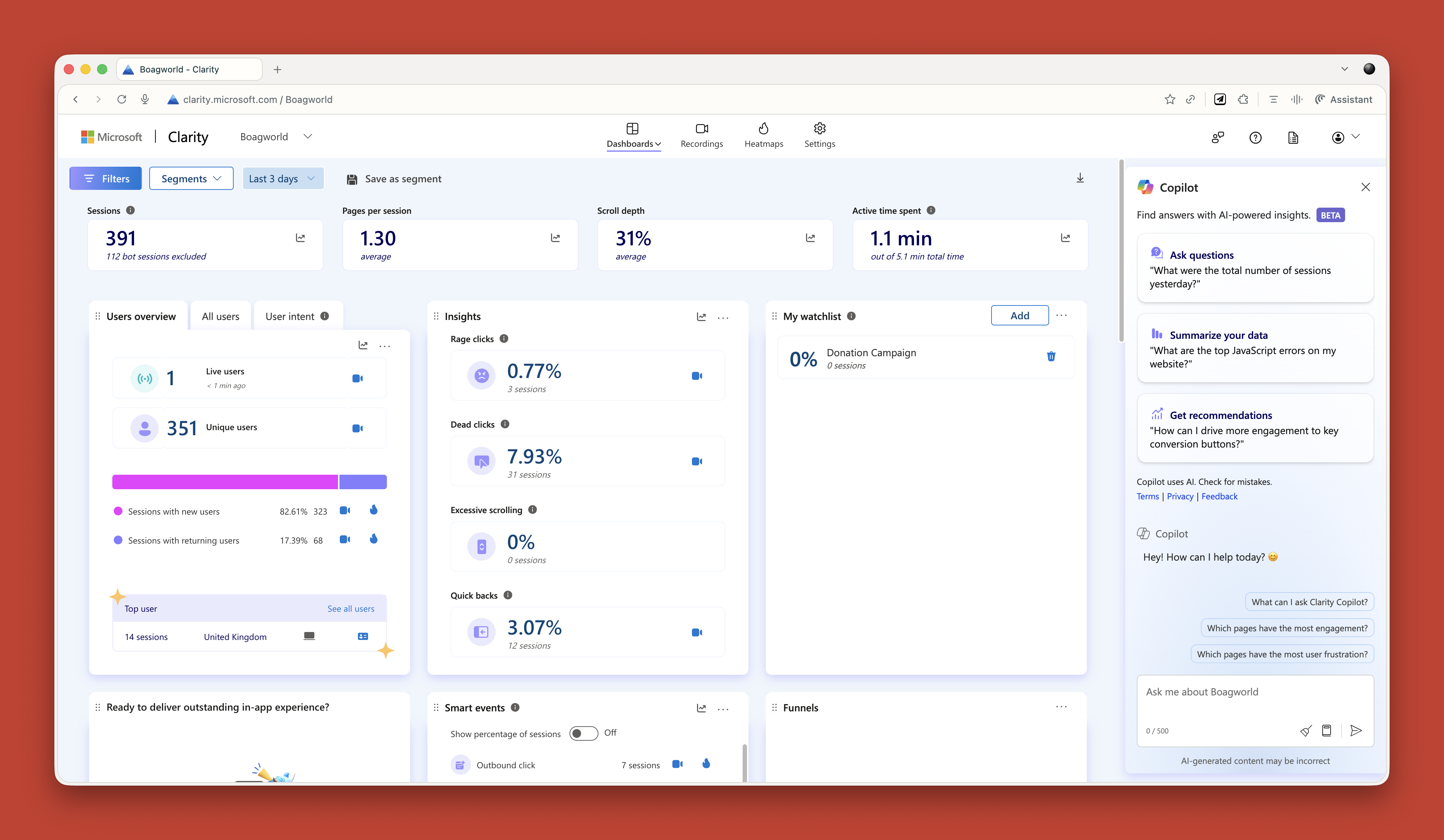
Microsoft Clarity now has Copilot built in, so you can ask it questions about your analytics data. Triple Whale does the same for e-commerce sites. These tools are game changers if you struggle with data like I do.

Research Projects
This is probably my favorite technique. In ChatGPT and Claude, you can create projects. In other tools, they are called spaces. Think of them as self-contained folders where everything you put in is available to every conversation in that project.
When I start working with a new client, I create a project and throw everything in. Old user research. Personas. Survey results. Interview transcripts. Documentation. Background information. Site copy. Anything I can find.
Then I give it custom instructions. Here is one I use for my own business:
Act as a business consultant and marketing strategy expert with good copywriting skills. Your role is to help me define the future of my UX consultant business and better articulate it, especially via my website. When I ask for your help, ask questions to improve your answers and challenge my assumptions where appropriate.
I have even uploaded a virtual board of advisors (people I wish I had on my board) and asked AI to research how they think and respond as they would.
Now I have this project that knows everything about my business. I can ask it questions. Get it to review my work. Challenge my thinking. It is like having a co-worker who never gets tired and has a perfect memory.
I do this for every client project now. It is invaluable.
Creating Personas
AI has reinvigorated my interest in personas. I had lost heart in them a bit. They took too long to create, and clients always said they already had marketing personas and did not want to pay to do them again.
Now I can create what I call functional personas. Personas that are actually useful to people who work in UX. Not marketing fluff about what brands people like, but real information about what questions they have and what tasks they are trying to complete.
I upload all my research to a project and say:
Act as a user researcher. Create a persona for [audience type]. For this persona, research the following information: questions they have, tasks they want to complete, goals, states of mind, influences, and success metrics. It is vital that all six criteria are addressed in depth and with equal vigor.
The output is really good. Detailed. Useful. Based on actual data rather than pulled out of thin air.
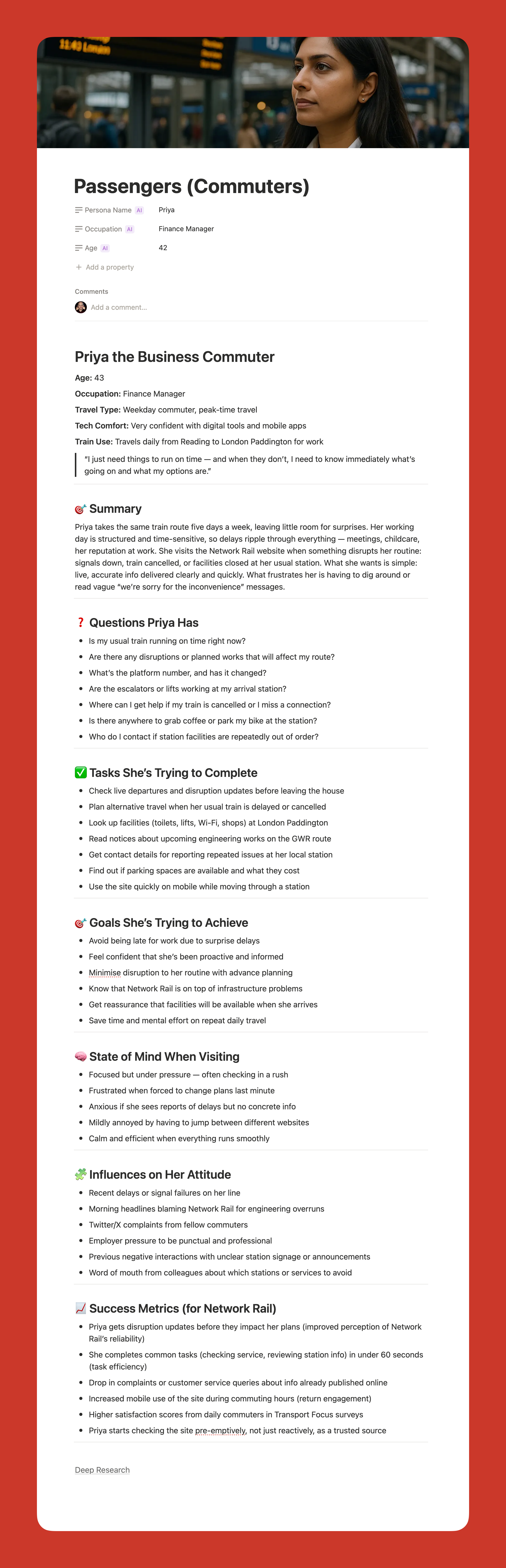

Here is my challenge to anyone who thinks AI-generated personas are somehow fake. What makes you think your personas are so much better? Every persona is a story of a hypothetical user. You make judgment calls when you create personas, too. At least AI can process far more information than you can and is brilliant at pattern recognition.
My only concern is that relying too heavily on AI could disconnect us from real users. We still need to talk to people. We still need that empathy. But as a tool to synthesize research and create reference points? It is excellent.
“
Using AI For Design And Development
Let me start with a warning. AI is not production-ready. Not yet. Not for the kind of client work I do, anyway.
Three reasons why:
- It is slow if you want something specific or complicated.
- It can be frustrating because it gets close but not quite there.
- And the quality is often subpar. Unpolished code, questionable design choices, that kind of thing.
But that does not mean it is not useful. It absolutely is. Just not for final production work.
Functional Prototypes
If you are not too concerned with matching a specific design, AI can quickly prototype functionality in ways that are hard to match in Figma. Because Figma is terrible at prototyping functionality. You cannot even create an active form field in a Figma prototype. It’s the biggest thing people do online other than click links — and you cannot test it.
Tools like Relume and Bolt can create quick functional mockups that show roughly how things work. They are great for non-designers who just need to throw together a prototype quickly. For designers, they can be useful for showing developers how you want something to work.
But you can spend ages getting them to put a hamburger menu on the right side of the screen. So use them for quick iteration, not pixel-perfect design.
Small Coding Tasks
I use AI constantly for small, low-risk coding work. I am not a developer anymore. I used to be, back when dinosaurs roamed the earth, but not for years.
AI lets me create the little tools I need. A calculator that calculates the ROI of my UX work. An app for running top task analysis. Bits of JavaScript for hiding elements on a page. WordPress plugins for updating dates automatically.
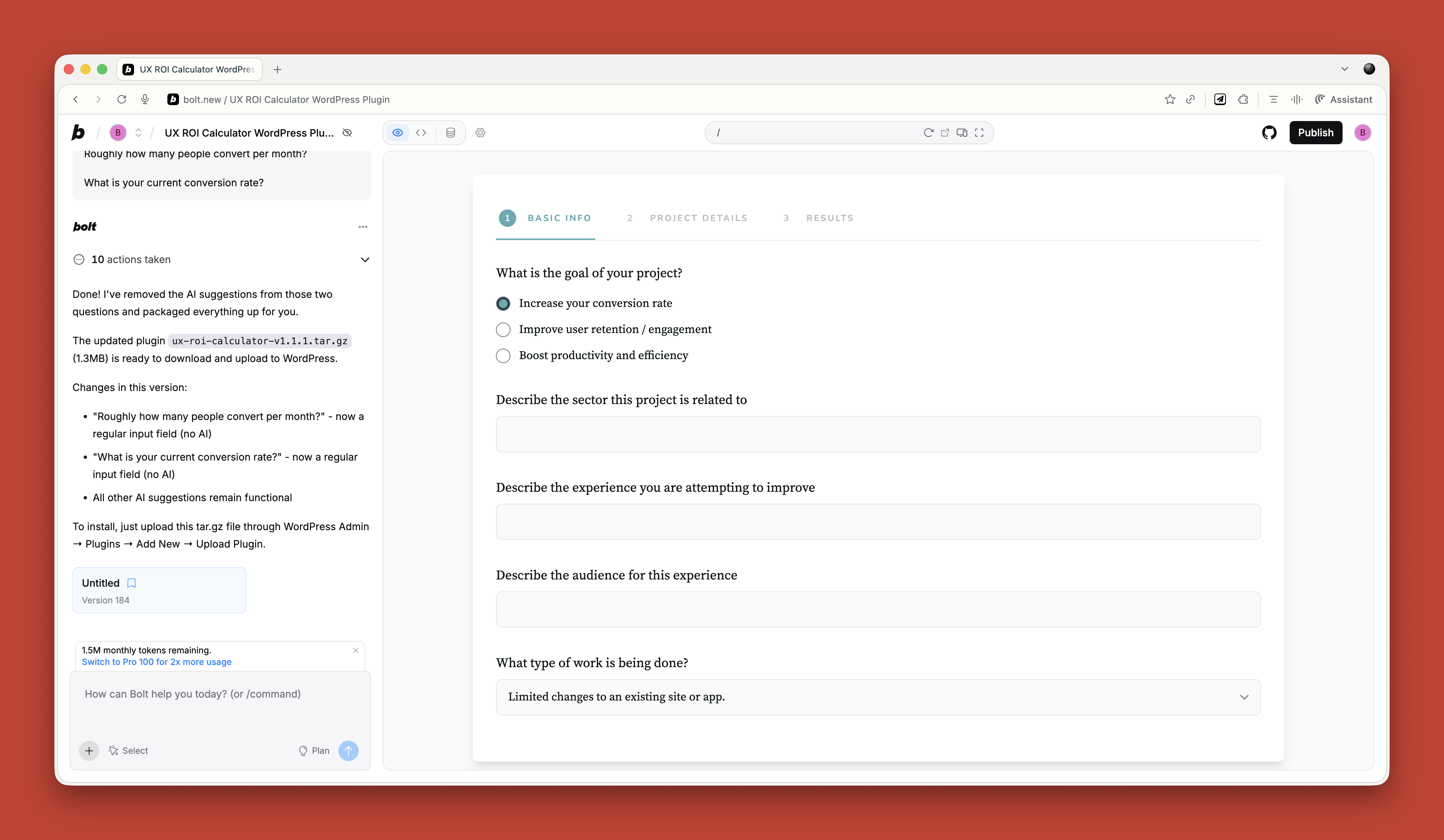

Just before running my workshop on this topic, I needed a tool to create calendar invites for multiple events. All the online services wanted £16 a month. I asked ChatGPT to build me one. One prompt. It worked. It looked rubbish, but I did not care. It did what I needed.
If you are a developer, you should absolutely be using tools like Cursor by now. They are invaluable for pair programming with AI. But if you are not a developer, just stick with Claude or Bolt for quick throwaway tools.
Reviewing Existing Services
There are some great tools for getting quick feedback on existing websites when budget and time are tight.
If you need to conduct a UX audit, Wevo Pulse is an excellent starting point. It automatically reviews a website based on personas and provides visual attention heatmaps, friction scores, and specific improvement recommendations. It generates insights in minutes rather than days.
Now, let me be clear. This does not replace having an experienced person conduct a proper UX audit. You still need that human expertise to understand context, make judgment calls, and spot issues that AI might miss. But as a starting point to identify obvious problems quickly? It is a great tool. Particularly when budget or time constraints mean a full audit is not on the table.
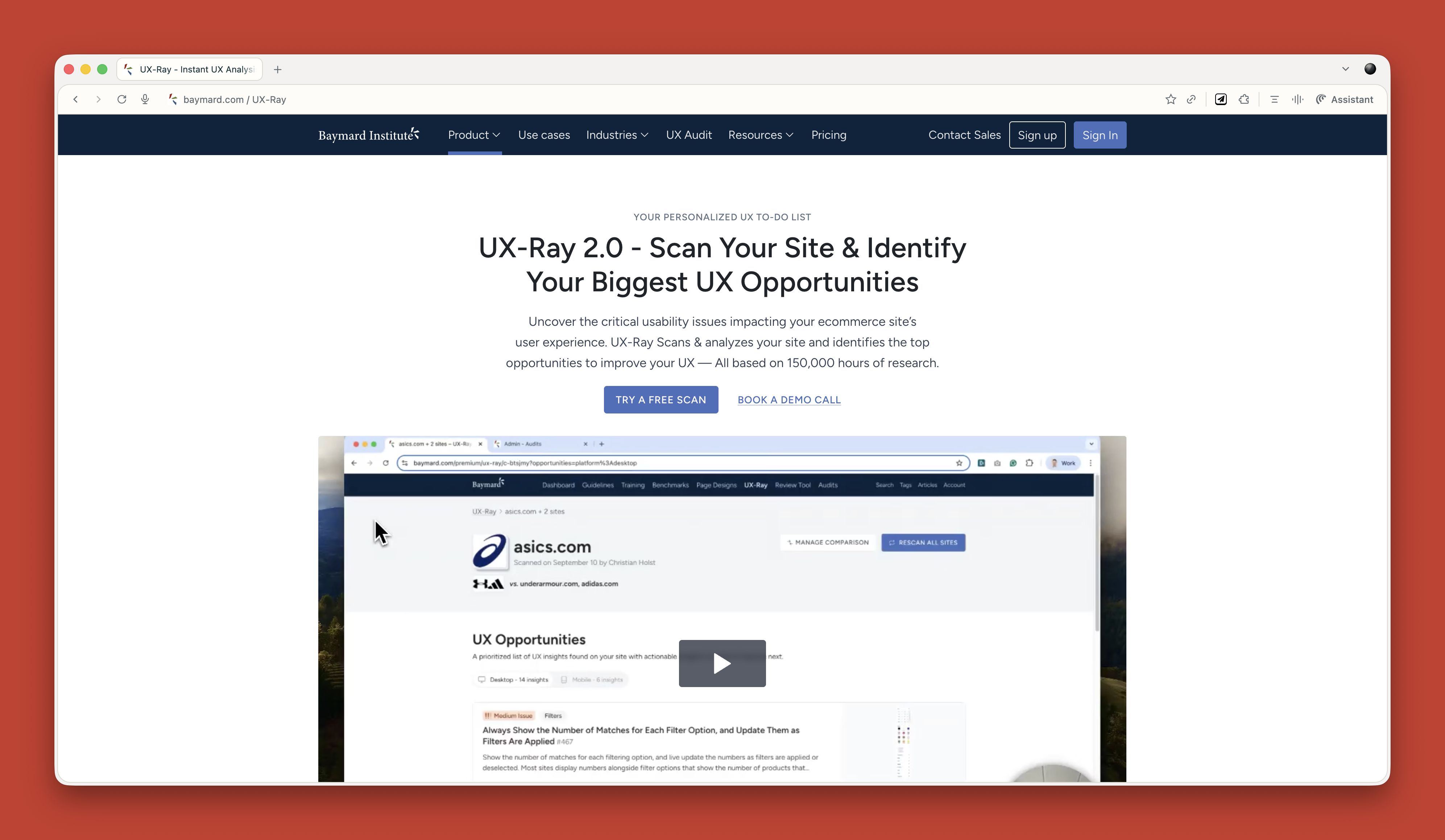
For e-commerce sites, Baymard has UX Ray, which analyzes flaws based on their massive database of user research.

Checking Your Designs
Attention Insight has taken thousands of hours of eye-tracking studies and trained AI on it to predict where people will look on a page. It has about 90 to 96 percent accuracy.
You upload a screenshot of your design, and it shows you where attention is going. Then you can play around with your imagery and layout to guide attention to the right place.
It is great for dealing with stakeholders who say, “People won’t see that.” You can prove they will. Or equally, when stakeholders try to crowd the interface with too much stuff, you can show them attention shooting everywhere.
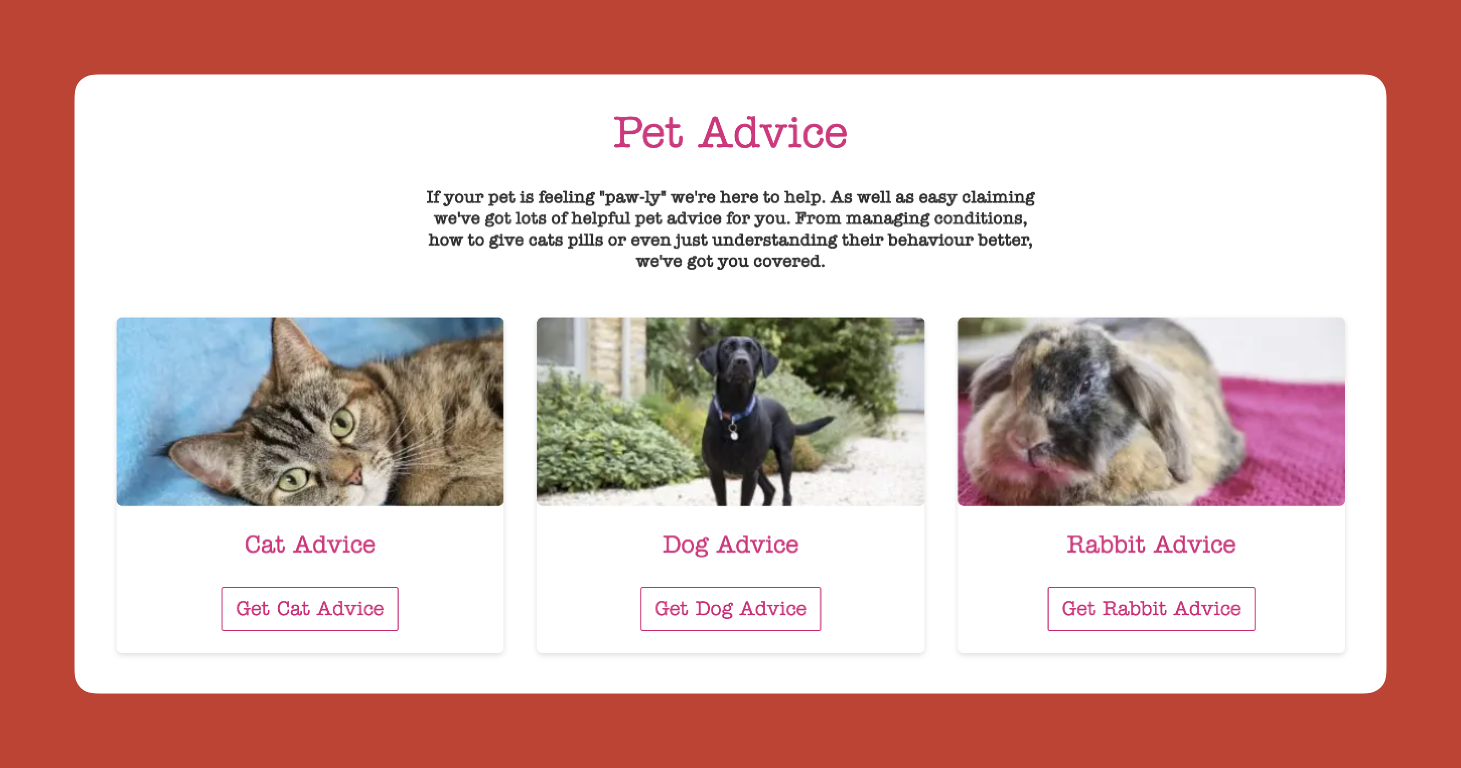
I use this constantly. Here is a real example from a pet insurance company. They had photos of a dog, cat, and rabbit for different types of advice. The dog was far from the camera. The cat was looking directly at the camera, pulling all the attention. The rabbit was half off-frame. Most attention went to the cat’s face.

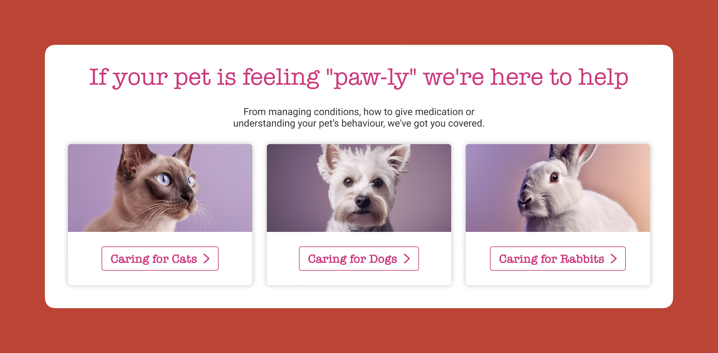
I redesigned it using AI-generated images, where I could control exactly where each animal looked. Dog looking at the camera. Cat looking right. Rabbit looking left. All the attention drawn into the center. Made a massive difference.

Creating The Perfect Image
I use AI all the time for creating images that do a specific job. My preferred tools are Midjourney and Gemini.
I like Midjourney because, visually, it creates stunning imagery. You can dial in the tone and style you want. The downside is that it is not great at following specific instructions.
So I produce an image in Midjourney that is close, then upload it to Gemini. Gemini is not as good at visual style, but it is much better at following instructions. “Make the guy reach here” or “Add glasses to this person.” I can get pretty much exactly what I want.
The other thing I love about Midjourney is that you can upload a photograph and say, “Replicate this style.” This keeps consistency across a website. I have a master image I use as a reference for all my site imagery to keep the style consistent.
Using AI For Content
Most clients give you terrible copy. Our job is to improve the user experience or conversion rate, and anything we do gets utterly undermined by bad copy.
I have completely stopped asking clients for copy since AI came along. Here is my process.
Build Everything Around Questions
Once I have my information architecture, I get AI to generate a massive list of questions users will ask. Then I run a top task analysis where people vote on which questions matter most.
I assign those questions to pages on the site. Every page gets a list of the questions it needs to answer.
Get Bullet Point Answers From Stakeholders
I spin up the content management system with a really basic theme. Just HTML with very basic formatting. I go through every page and assign the questions.
Then I go to my clients and say: “I do not want you to write copy. Just go through every page and bullet point answers to the questions. If the answer exists on the old site, copy and paste some text or link to it. But just bullet points.”
That is their job done. Pretty much.
Let AI Draft The Copy
Now I take control. I feed ChatGPT the questions and bullet points and say:
Act as an online copywriter. Write copy for a webpage that answers the question [question]. Use the following bullet points to answer that question: [bullet points]. Use the following guidelines: Aim for a ninth-grade reading level or below. Sentences should be short. Use plain language. Avoid jargon. Refer to the reader as you. Refer to the writer as us. Ensure the tone is friendly, approachable, and reassuring. The goal is to [goal]. Think deeply about your approach. Create a rubric and iterate until the copy is excellent. Only then, output it.
I often upload a full style guide as well, with details about how I want it to be written.
The output is genuinely good. As a first draft, it is excellent. Far better than what most stakeholders would give me.
Stakeholders Review And Provide Feedback
That goes into the website, and stakeholders can comment on it. Once I get their feedback, I take the original copy and all their comments back into ChatGPT and say, “Rewrite using these comments.”
Job done.
The great thing about this approach is that even if stakeholders make loads of changes, they are making changes to a good foundation. The overall quality still comes out better than if they started with a blank sheet.
It also makes things go smoother because you are not criticizing their content, where they get defensive. They are criticizing AI content.
Tools That Help
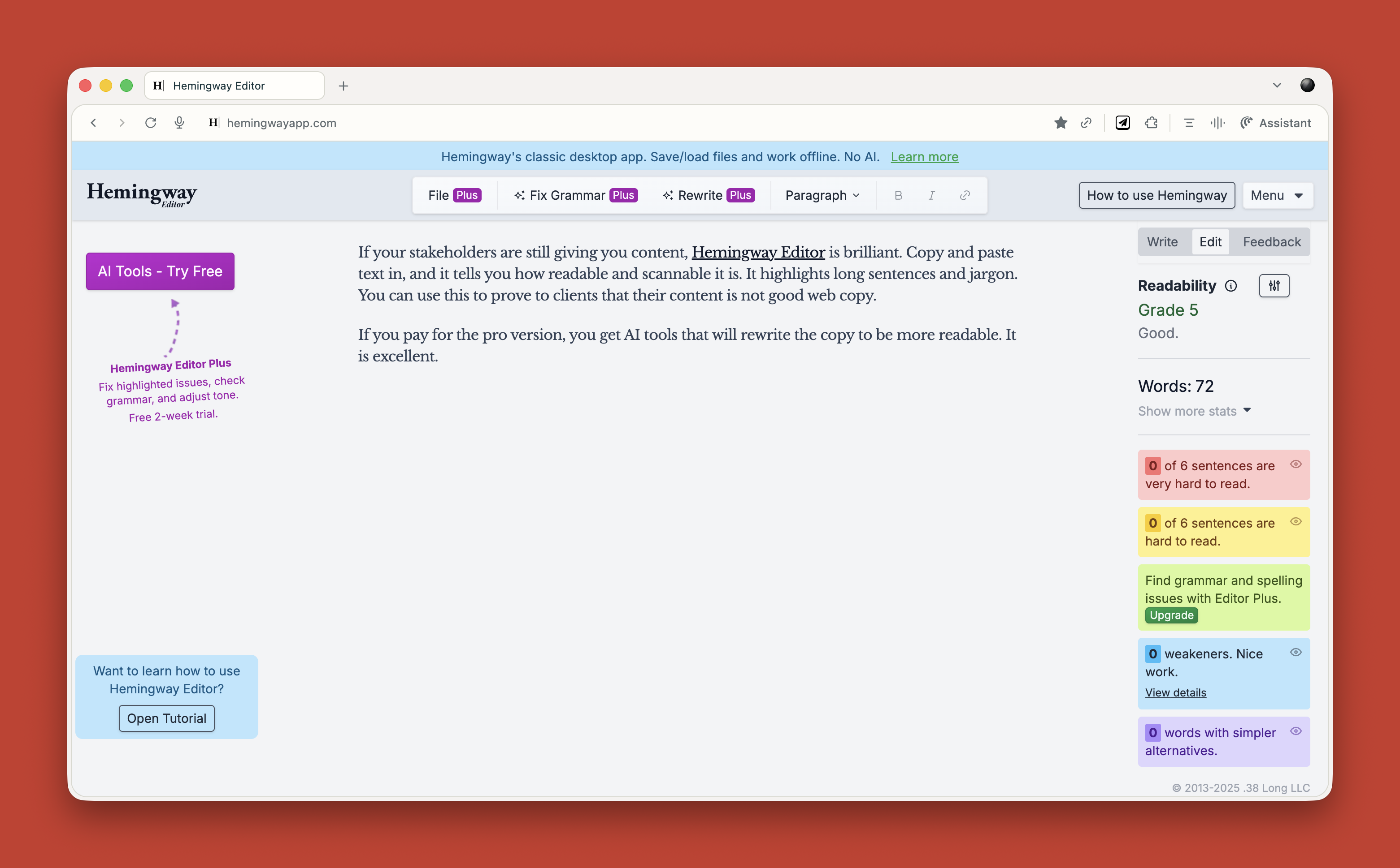
If your stakeholders are still giving you content, Hemingway Editor is brilliant. Copy and paste text in, and it tells you how readable and scannable it is. It highlights long sentences and jargon. You can use this to prove to clients that their content is not good web copy.

If you pay for the pro version, you get AI tools that will rewrite the copy to be more readable. It is excellent.
What This Means for You
Let me be clear about something. None of this is perfect. AI makes mistakes. It hallucinates. It produces bland output if you do not push it hard enough. It requires constant checking and challenging.
But here is what I know from two years of using this stuff daily. It has made me faster. It has made me better. It has freed me up to do more strategic thinking and less grunt work.
A report that would have taken me five days now takes three hours. That is not an exaggeration. That is real.
Overall, AI probably gives me a 25 to 33 percent increase in what I can do. That is significant.
Your value as a UX professional lies in your ideas, your questions, and your thinking. Not your ability to use Figma. Not your ability to manually review transcripts. Not your ability to write reports from scratch.
“
AI cannot innovate. It cannot make creative leaps. It cannot know whether its output is good. It cannot understand what it is like to be human.
That is where you come in. That is where you will always come in.
Start small. Do not try to learn everything at once. Just ask yourself throughout your day: Could I do this with AI? Try it. See what happens. Double-check everything. Learn what works and what does not.
Treat it like an enthusiastic intern with zero life experience. Give it clear instructions. Check its work. Make it try again. Challenge it. Push it further.
And remember, it is not going to take your job. It is going to change it. For the better, I think. As long as we learn to work with it rather than against it.
(yk)
How To Make Your UX Research Hard To Ignore
How To Make Your UX Research Hard To Ignore How To Make Your UX Research Hard To Ignore Vitaly Friedman 2025-10-16T13:00:00+00:00 2025-10-22T16:03:02+00:00 In the early days of my career, I believed that nothing wins an argument more effectively than strong and unbiased research. Surely facts […]
Accessibility
How To Make Your UX Research Hard To Ignore
Vitaly Friedman 2025-10-16T13:00:00+00:00
2025-10-22T16:03:02+00:00
In the early days of my career, I believed that nothing wins an argument more effectively than strong and unbiased research. Surely facts speak for themselves, I thought.
If I just get enough data, just enough evidence, just enough clarity on where users struggle — well, once I have it all and I present it all, it alone will surely change people’s minds, hearts, and beliefs. And, most importantly, it will help everyone see, understand, and perhaps even appreciate and commit to what needs to be done.
Well, it’s not quite like that. In fact, the stronger and louder the data, the more likely it is to be questioned. And there is a good reason for that, which is often left between the lines.
Research Amplifies Internal Flaws
Throughout the years, I’ve often seen data speaking volumes about where the business is failing, where customers are struggling, where the team is faltering — and where an urgent turnaround is necessary. It was right there, in plain sight: clear, loud, and obvious.

But because it’s so clear, it reflects back, often amplifying all the sharp edges and all the cut corners in all the wrong places. It reflects internal flaws, wrong assumptions, and failing projects — some of them signed off years ago, with secured budgets, big promotions, and approved headcounts. Questioning them means questioning authority, and often it’s a tough path to take.
As it turns out, strong data is very, very good at raising uncomfortable truths that most companies don’t really want to acknowledge. That’s why, at times, research is deemed “unnecessary,” or why we don’t get access to users, or why loud voices always win big arguments.

So even if data is presented with a lot of eagerness, gravity, and passion in that big meeting, it will get questioned, doubted, and explained away. Not because of its flaws, but because of hope, reluctance to change, and layers of internal politics.
This shows up most vividly in situations when someone raises concerns about the validity and accuracy of research. Frankly, it’s not that somebody is wrong and somebody is right. Both parties just happen to be right in a different way.
What To Do When Data Disagrees
We’ve all heard that data always tells a story. However, it’s never just a single story. People are complex, and pointing out a specific truth about them just by looking at numbers is rarely enough.
When data disagrees, it doesn’t mean that either is wrong. It’s just that different perspectives reveal different parts of a whole story that isn’t completed yet.

In digital products, most stories have 2 sides:
- Quantitative data ← What/When: behavior patterns at scale.
- Qualitative data ← Why/How: user needs and motivations.
- ↳ Quant usually comes from analytics, surveys, and experiments.
- ↳ Qual comes from tests, observations, and open-ended surveys.
Risk-averse teams overestimate the weight of big numbers in quantitative research. Users exaggerate the frequency and severity of issues that are critical for them. As Archana Shah noted, designers get carried away by users’ confident responses and often overestimate what people say and do.
And so, eventually, data coming from different teams paints a different picture. And when it happens, we need to reconcile and triangulate. With the former, we track what’s missing, omitted, or overlooked. With the latter, we cross-validate data — e.g., finding pairings of qual/quant streams of data, then clustering them together to see what’s there and what’s missing, and exploring from there.
And even with all of it in place and data conflicts resolved, we still need to do one more thing to make a strong argument: we need to tell a damn good story.
Facts Don’t Win Arguments, Stories Do
Research isn’t everything. Facts don’t win arguments — powerful stories do. But a story that starts with a spreadsheet isn’t always inspiring or effective. Perhaps it brings a problem into the spotlight, but it doesn’t lead to a resolution.

The very first thing I try to do in that big boardroom meeting is to emphasize what unites us — shared goals, principles, and commitments that are relevant to the topic at hand. Then, I show how new data confirms or confronts our commitments, with specific problems we believe we need to address.
When a question about the quality of data comes in, I need to show that it has been reconciled and triangulated already and discussed with other teams as well.
A good story has a poignant ending. People need to see an alternative future to trust and accept the data — and a clear and safe path forward to commit to it. So I always try to present options and solutions that we believe will drive change and explain our decision-making behind that.

They also need to believe that this distant future is within reach, and that they can pull it off, albeit under a tough timeline or with limited resources.
And: a good story also presents a viable, compelling, shared goal that people can rally around and commit to. Ideally, it’s something that has a direct benefit for them and their teams.
These are the ingredients of the story that I always try to keep in my mind when working on that big presentation. And in fact, data is a starting point, but it does need a story wrapped around it to be effective.
Wrapping Up
There is nothing more disappointing than finding a real problem that real people struggle with and facing the harsh reality of research not being trusted or valued.
We’ve all been there before. The best thing you can do is to be prepared: have strong data to back you up, include both quantitative and qualitative research — preferably with video clips from real customers — but also paint a viable future which seems within reach.
And sometimes nothing changes until something breaks. And at times, there isn’t much you can do about it unless you are prepared when it happens.
“Data doesn’t change minds, and facts don’t settle fights. Having answers isn’t the same as learning, and it for sure isn’t the same as making evidence-based decisions.”
— Erika Hall
Meet “How To Measure UX And Design Impact”
You can find more details on UX Research in Measure UX & Design Impact (8h), a practical guide for designers and UX leads to measure and show your UX impact on business. Use the code 🎟 IMPACT to save 20% off today. Jump to the details.
Video + UX Training
$ 495.00 $ 799.00
Get Video + UX Training
25 video lessons (8h) + Live UX Training.
100 days money-back-guarantee.
Video only
$ 250.00$ 395.00
25 video lessons (8h). Updated yearly.
Also available as a UX Bundle with 2 video courses.
Useful Resources
- “How to Present Research So Stakeholders Sit Up and Take Action”, by Nikki Anderson
- “What To Do When Data Disagrees”, by Subhasree Chatterjee, Archana Shah, Sanket Shukl, and Jason Bressler
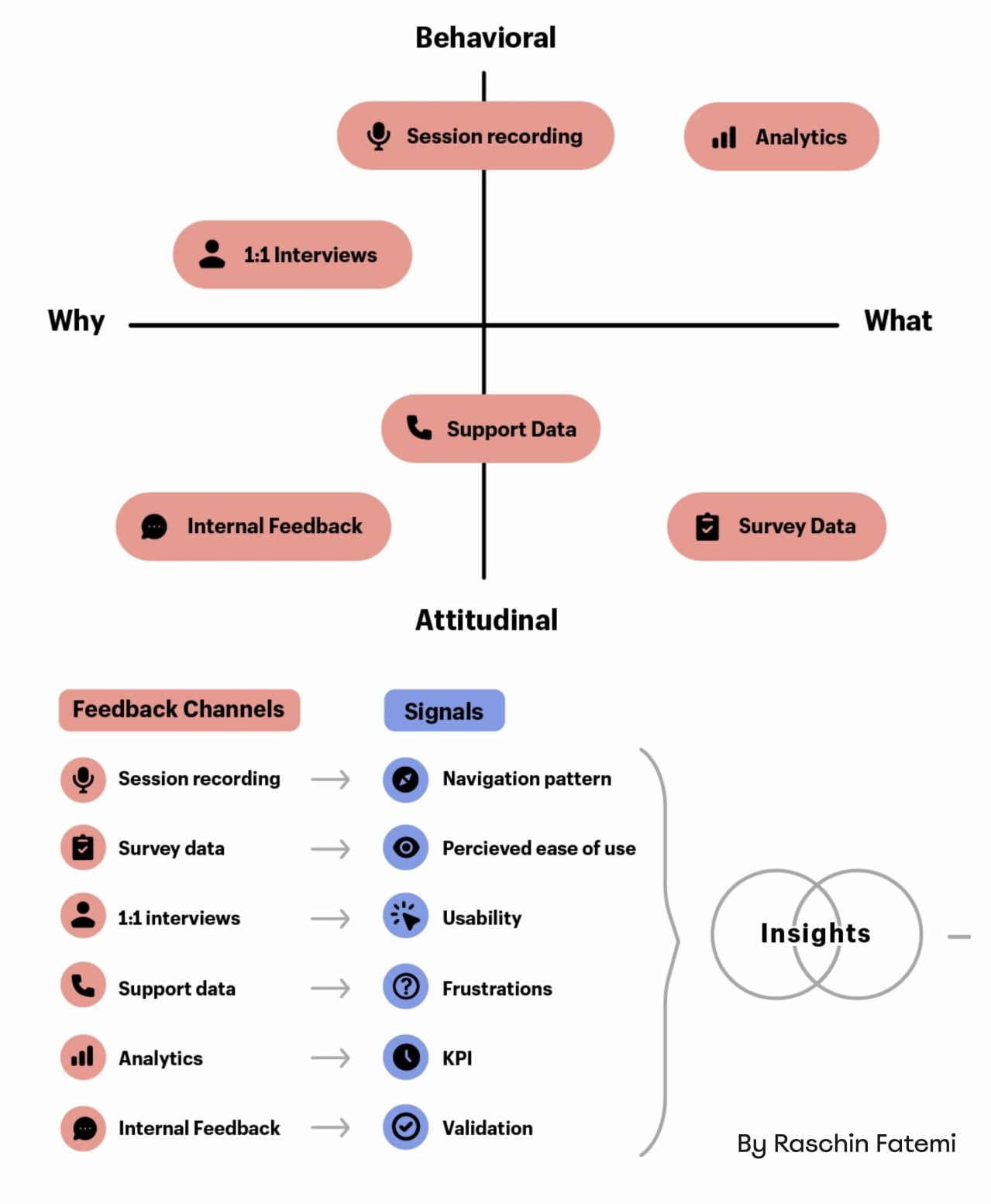
- “Mixed-Method UX Research”, by Raschin Fatemi
- “A Step-by-Step Framework For Mixed-Method Research”, by Jeremy Williams
- “The Ultimate Guide To Mixed Methods”, by Ben Wiedmaier
- Survey Design Cheatsheet, by yours truly
- Useful Calculators For UX Research, by yours truly
- Beyond Measure, by Erika Hall
Useful Books
- Just Enough Research, by Erika Hall
- Designing Surveys That Work, by Caroline Jarrett
- Designing Quality Survey Questions, by Sheila B. Robinson
(yk)
Intent Prototyping: A Practical Guide To Building With Clarity (Part 2)
Intent Prototyping: A Practical Guide To Building With Clarity (Part 2) Intent Prototyping: A Practical Guide To Building With Clarity (Part 2) Yegor Gilyov 2025-10-03T10:00:00+00:00 2025-10-08T15:02:36+00:00 In Part 1 of this series, we explored the “lopsided horse” problem born from mockup-centric design and demonstrated how […]
Accessibility
Intent Prototyping: A Practical Guide To Building With Clarity (Part 2)
Yegor Gilyov 2025-10-03T10:00:00+00:00
2025-10-08T15:02:36+00:00
In Part 1 of this series, we explored the “lopsided horse” problem born from mockup-centric design and demonstrated how the seductive promise of vibe coding often leads to structural flaws. The main question remains:
How might we close the gap between our design intent and a live prototype, so that we can iterate on real functionality from day one, without getting caught in the ambiguity trap?
In other words, we need a way to build prototypes that are both fast to create and founded on a clear, unambiguous blueprint.
The answer is a more disciplined process I call Intent Prototyping (kudos to Marco Kotrotsos, who coined Intent-Oriented Programming). This method embraces the power of AI-assisted coding but rejects ambiguity, putting the designer’s explicit intent at the very center of the process. It receives a holistic expression of intent (sketches for screen layouts, conceptual model description, boxes-and-arrows for user flows) and uses it to generate a live, testable prototype.
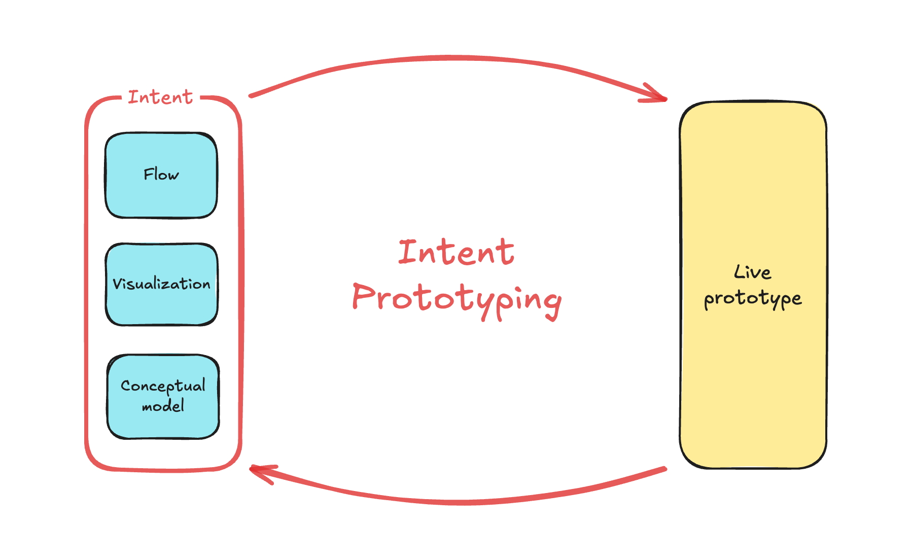

This method solves the concerns we’ve discussed in Part 1 in the best way possible:
- Unlike static mockups, the prototype is fully interactive and can be easily populated with a large amount of realistic data. This lets us test the system’s underlying logic as well as its surface.
- Unlike a vibe-coded prototype, it is built from a stable, unambiguous specification. This prevents the conceptual model failures and design debt that happen when things are unclear. The engineering team doesn’t need to reverse-engineer a black box or become “code archaeologists” to guess at the designer’s vision, as they receive not only a live prototype but also a clearly documented design intent behind it.
This combination makes the method especially suited for designing complex enterprise applications. It allows us to test the system’s most critical point of failure, its underlying structure, at a speed and flexibility that was previously impossible. Furthermore, the process is built for iteration. You can explore as many directions as you want simply by changing the intent and evolving the design based on what you learn from user testing.
My Workflow
To illustrate this process in action, let’s walk through a case study. It’s the very same example I’ve used to illustrate the vibe coding trap: a simple tool to track tests to validate product ideas. You can find the complete project, including all the source code and documentation files discussed below, in this GitHub repository.
Step 1: Expressing An Intent
Imagine we’ve already done proper research, and having mused on the defined problem, I begin to form a vague idea of what the solution might look like. I need to capture this idea immediately, so I quickly sketch it out:

In this example, I used Excalidraw, but the tool doesn’t really matter. Note that we deliberately keep it rough, as visual details are not something we need to focus on at this stage. And we are not going to be stuck here: we want to make a leap from this initial sketch directly to a live prototype that we can put in front of potential users. Polishing those sketches would not bring us any closer to achieving our goal.
What we need to move forward is to add to those sketches just enough details so that they may serve as a sufficient input for a junior frontend developer (or, in our case, an AI assistant). This requires explaining the following:
- Navigational paths (clicking here takes you to).
- Interaction details that can’t be shown in a static picture (e.g., non-scrollable areas, adaptive layout, drag-and-drop behavior).
- What parts might make sense to build as reusable components.
- Which components from the design system (I’m using Ant Design Library) should be used.
- Any other comments that help understand how this thing should work (while sketches illustrate how it should look).
Having added all those details, we end up with such an annotated sketch:

As you see, this sketch covers both the Visualization and Flow aspects. You may ask, what about the Conceptual Model? Without that part, the expression of our intent will not be complete. One way would be to add it somewhere in the margins of the sketch (for example, as a UML Class Diagram), and I would do so in the case of a more complex application, where the model cannot be simply derived from the UI. But in our case, we can save effort and ask an LLM to generate a comprehensive description of the conceptual model based on the sketch.
For tasks of this sort, the LLM of my choice is Gemini 2.5 Pro. What is important is that this is a multimodal model that can accept not only text but also images as input (GPT-5 and Claude-4 also fit that criteria). I use Google AI Studio, as it gives me enough control and visibility into what’s happening:

Note: All the prompts that I use here and below can be found in the Appendices. The prompts are not custom-tailored to any particular project; they are supposed to be reused as they are.
As a result, Gemini gives us a description and the following diagram:

The diagram might look technical, but I believe that a clear understanding of all objects, their attributes, and relationships between them is key to good design. That’s why I consider the Conceptual Model to be an essential part of expressing intent, along with the Flow and Visualization.
As a result of this step, our intent is fully expressed in two files: Sketch.png and Model.md. This will be our durable source of truth.
Step 2: Preparing A Spec And A Plan
The purpose of this step is to create a comprehensive technical specification and a step-by-step plan. Most of the work here is done by AI; you just need to keep an eye on it.
I separate the Data Access Layer and the UI layer, and create specifications for them using two different prompts (see Appendices 2 and 3). The output of the first prompt (the Data Access Layer spec) serves as an input for the second one. Note that, as an additional input, we give the guidelines tailored for prototyping needs (see Appendices 8, 9, and 10). They are not specific to this project. The technical approach encoded in those guidelines is out of the scope of this article.
As a result, Gemini provides us with content for DAL.md and UI.md. Although in most cases this result is quite reliable enough, you might want to scrutinize the output. You don’t need to be a real programmer to make sense of it, but some level of programming literacy would be really helpful. However, even if you don’t have such skills, don’t get discouraged. The good news is that if you don’t understand something, you always know who to ask. Do it in Google AI Studio before refreshing the context window. If you believe you’ve spotted a problem, let Gemini know, and it will either fix it or explain why the suggested approach is actually better.
It’s important to remember that by their nature, LLMs are not deterministic and, to put it simply, can be forgetful about small details, especially when it comes to details in sketches. Fortunately, you don’t have to be an expert to notice that the “Delete” button, which is in the upper right corner of the sketch, is not mentioned in the spec.
Don’t get me wrong: Gemini does a stellar job most of the time, but there are still times when it slips up. Just let it know about the problems you’ve spotted, and everything will be fixed.
Once we have Sketch.png, Model.md, DAL.md, UI.md, and we have reviewed the specs, we can grab a coffee. We deserve it: our technical design documentation is complete. It will serve as a stable foundation for building the actual thing, without deviating from our original intent, and ensuring that all components fit together perfectly, and all layers are stacked correctly.
One last thing we can do before moving on to the next steps is to prepare a step-by-step plan. We split that plan into two parts: one for the Data Access Layer and another for the UI. You can find prompts I use to create such a plan in Appendices 4 and 5.
Step 3: Executing The Plan
To start building the actual thing, we need to switch to another category of AI tools. Up until this point, we have relied on Generative AI. It excels at creating new content (in our case, specifications and plans) based on a single prompt. I’m using Google Gemini 2.5 Pro in Google AI Studio, but other similar tools may also fit such one-off tasks: ChatGPT, Claude, Grok, and DeepSeek.
However, at this step, this wouldn’t be enough. Building a prototype based on specs and according to a plan requires an AI that can read context from multiple files, execute a sequence of tasks, and maintain coherence. A simple generative AI can’t do this. It would be like asking a person to build a house by only ever showing them a single brick. What we need is an agentic AI that can be given the full house blueprint and a project plan, and then get to work building the foundation, framing the walls, and adding the roof in the correct sequence.
My coding agent of choice is Google Gemini CLI, simply because Gemini 2.5 Pro serves me well, and I don’t think we need any middleman like Cursor or Windsurf (which would use Claude, Gemini, or GPT under the hood anyway). If I used Claude, my choice would be Claude Code, but since I’m sticking with Gemini, Gemini CLI it is. But if you prefer Cursor or Windsurf, I believe you can apply the same process with your favourite tool.
Before tasking the agent, we need to create a basic template for our React application. I won’t go into this here. You can find plenty of tutorials on how to scaffold an empty React project using Vite.
Then we put all our files into that project:

Once the basic template with all our files is ready, we open Terminal, go to the folder where our project resides, and type “gemini”:
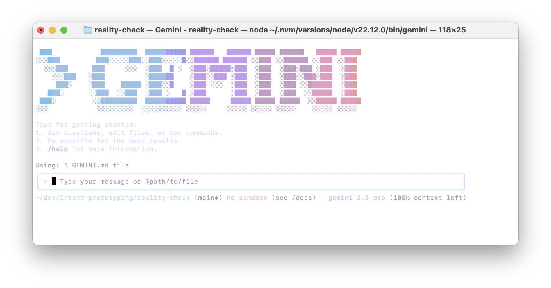

And we send the prompt to build the Data Access Layer (see Appendix 6). That prompt implies step-by-step execution, so upon completion of each step, I send the following:
Thank you! Now, please move to the next task.
Remember that you must not make assumptions based on common patterns; always verify them with the actual data from the spec.
After each task, stop so that I can test it. Don’t move to the next task before I tell you to do so.
As the last task in the plan, the agent builds a special page where we can test all the capabilities of our Data Access Layer, so that we can manually test it. It may look like this:
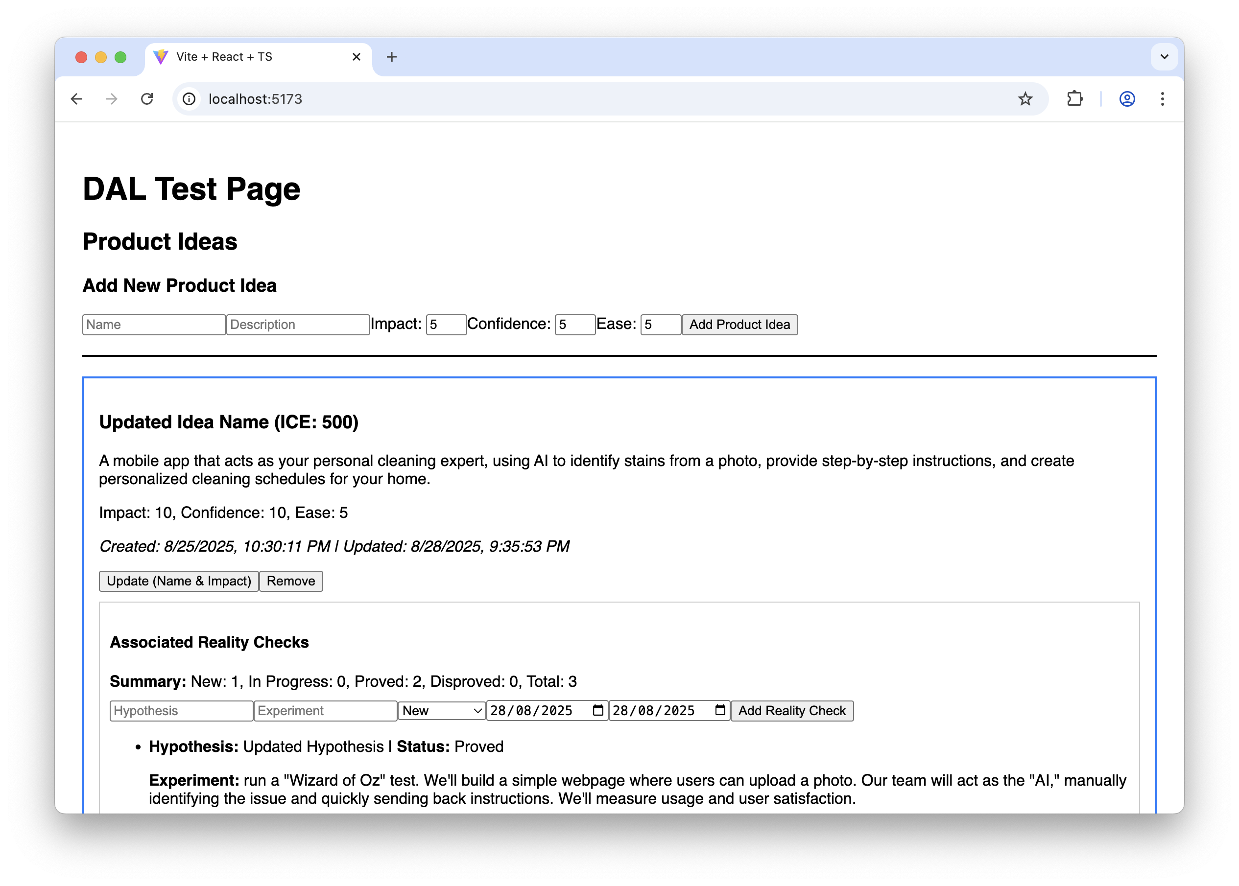

It doesn’t look fancy, to say the least, but it allows us to ensure that the Data Access Layer works correctly before we proceed with building the final UI.
And finally, we clear the Gemini CLI context window to give it more headspace and send the prompt to build the UI (see Appendix 7). This prompt also implies step-by-step execution. Upon completion of each step, we test how it works and how it looks, following the “Manual Testing Plan” from UI-plan.md. I have to say that despite the fact that the sketch has been uploaded to the model context and, in general, Gemini tries to follow it, attention to visual detail is not one of its strengths (yet). Usually, a few additional nudges are needed at each step to improve the look and feel:
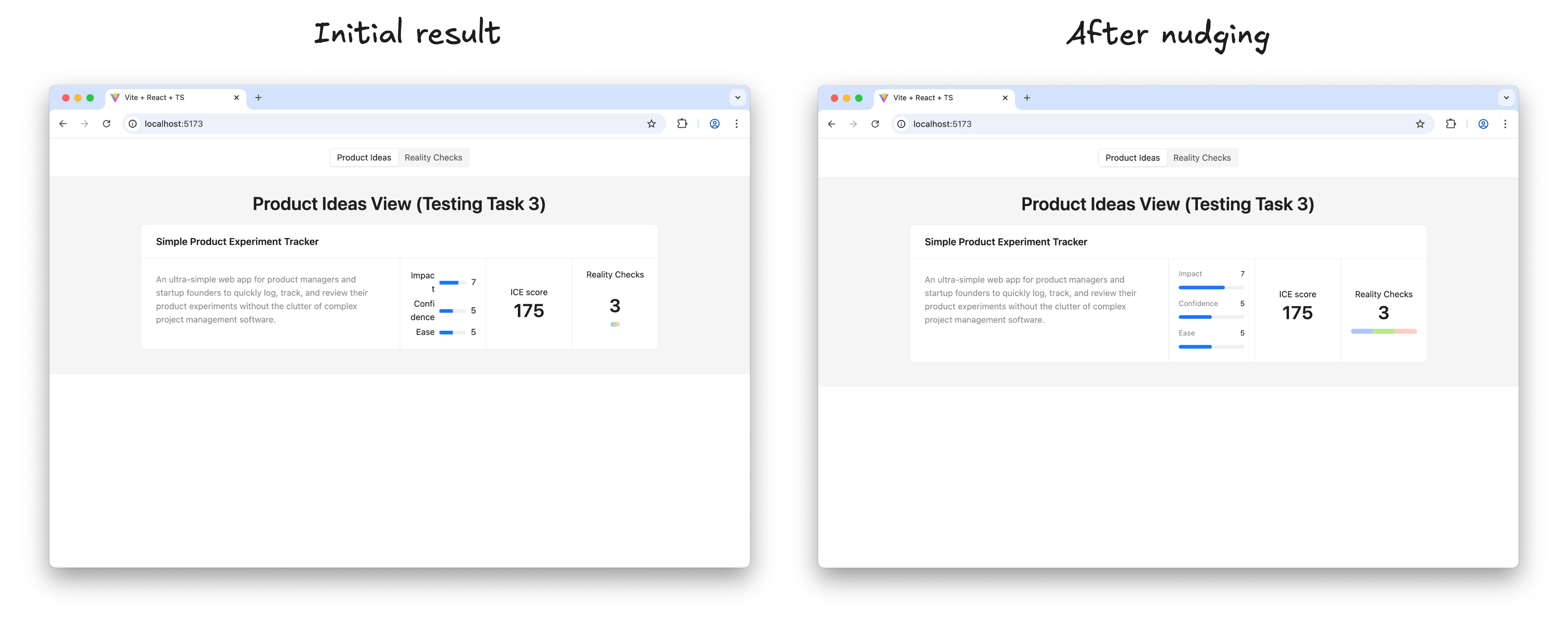

Once I’m happy with the result of a step, I ask Gemini to move on:
Thank you! Now, please move to the next task.
Make sure you build the UI according to the sketch; this is very important. Remember that you must not make assumptions based on common patterns; always verify them with the actual data from the spec and the sketch.
After each task, stop so that I can test it. Don’t move to the next task before I tell you to do so.
Before long, the result looks like this, and in every detail it works exactly as we intended:
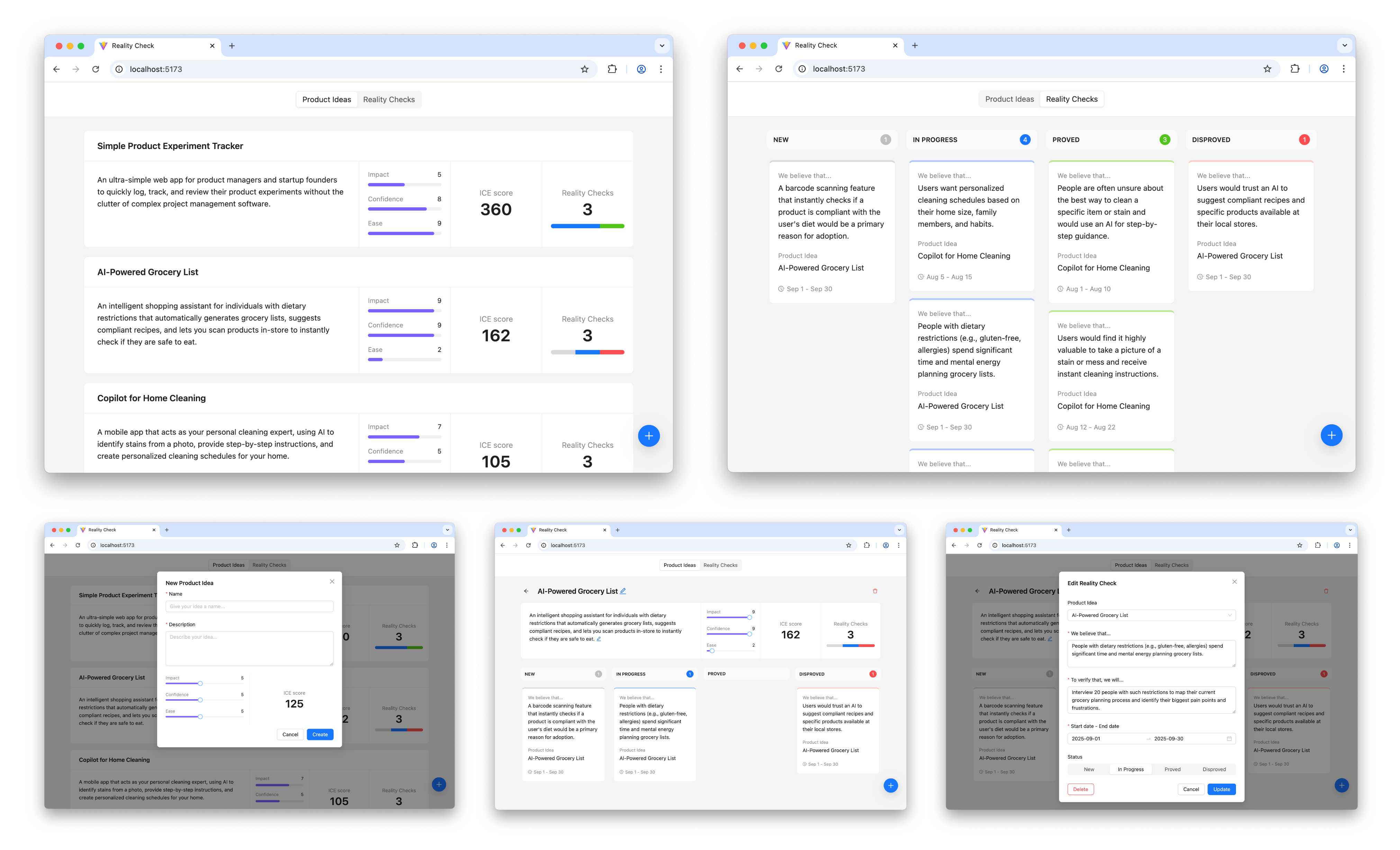

The prototype is up and running and looking nice. Does it mean that we are done with our work? Surely not, the most fascinating part is just beginning.
Step 4: Learning And Iterating
It’s time to put the prototype in front of potential users and learn more about whether this solution relieves their pain or not.
And as soon as we learn something new, we iterate. We adjust or extend the sketches and the conceptual model, based on that new input, we update the specifications, create plans to make changes according to the new specifications, and execute those plans. In other words, for every iteration, we repeat the steps I’ve just walked you through.
Is This Workflow Too Heavy?
This four-step workflow may create an impression of a somewhat heavy process that requires too much thinking upfront and doesn’t really facilitate creativity. But before jumping to that conclusion, consider the following:
- In practice, only the first step requires real effort, as well as learning in the last step. AI does most of the work in between; you just need to keep an eye on it.
- Individual iterations don’t need to be big. You can start with a Walking Skeleton: the bare minimum implementation of the thing you have in mind, and add more substance in subsequent iterations. You are welcome to change your mind about the overall direction in between iterations.
- And last but not least, maybe the idea of “think before you do” is not something you need to run away from. A clear and unambiguous statement of intent can prevent many unnecessary mistakes and save a lot of effort down the road.
Intent Prototyping Vs. Other Methods
There is no method that fits all situations, and Intent Prototyping is not an exception. Like any specialized tool, it has a specific purpose. The most effective teams are not those who master a single method, but those who understand which approach to use to mitigate the most significant risk at each stage. The table below gives you a way to make this choice clearer. It puts Intent Prototyping next to other common methods and tools and explains each one in terms of the primary goal it helps achieve and the specific risks it is best suited to mitigate.
| Method/Tool | Goal | Risks it is best suited to mitigate | Examples | Why |
|---|---|---|---|---|
| Intent Prototyping | To rapidly iterate on the fundamental architecture of a data-heavy application with a complex conceptual model, sophisticated business logic, and non-linear user flows. | Building a system with a flawed or incoherent conceptual model, leading to critical bugs and costly refactoring. |
|
It enforces conceptual clarity. This not only de-risks the core structure but also produces a clear, documented blueprint that serves as a superior specification for the engineering handoff. |
| Vibe Coding (Conversational) | To rapidly explore interactive ideas through improvisation. | Losing momentum because of analysis paralysis. |
|
It has the smallest loop between an idea conveyed in natural language and an interactive outcome. |
| Axure | To test complicated conditional logic within a specific user journey, without having to worry about how the whole system works. | Designing flows that break when users don’t follow the “happy path.” |
|
It’s made to create complex if-then logic and manage variables visually. This lets you test complicated paths and edge cases in a user journey without writing any code. |
| Figma | To make sure that the user interface looks good, aligns with the brand, and has a clear information architecture. | Making a product that looks bad, doesn’t fit with the brand, or has a layout that is hard to understand. |
|
It excels at high-fidelity visual design and provides simple, fast tools for linking static screens. |
| ProtoPie, Framer | To make high-fidelity micro-interactions feel just right. | Shipping an application that feels cumbersome and unpleasant to use because of poorly executed interactions. |
|
These tools let you manipulate animation timelines, physics, and device sensor inputs in great detail. Designers can carefully work on and test the small things that make an interface feel really polished and fun to use. |
| Low-code / No-code Tools (e.g., Bubble, Retool) | To create a working, data-driven app as quickly as possible. | The application will never be built because traditional development is too expensive. |
|
They put a UI builder, a database, and hosting all in one place. The goal is not merely to make a prototype of an idea, but to make and release an actual, working product. This is the last step for many internal tools or MVPs. |
The key takeaway is that each method is a specialized tool for mitigating a specific type of risk. For example, Figma de-risks the visual presentation. ProtoPie de-risks the feel of an interaction. Intent Prototyping is in a unique position to tackle the most foundational risk in complex applications: building on a flawed or incoherent conceptual model.
Bringing It All Together
The era of the “lopsided horse” design, sleek on the surface but structurally unsound, is a direct result of the trade-off between fidelity and flexibility. This trade-off has led to a process filled with redundant effort and misplaced focus. Intent Prototyping, powered by modern AI, eliminates that conflict. It’s not just a shortcut to building faster — it’s a fundamental shift in how we design. By putting a clear, unambiguous intent at the heart of the process, it lets us get rid of the redundant work and focus on architecting a sound and robust system.
There are three major benefits to this renewed focus. First, by going straight to live, interactive prototypes, we shift our validation efforts from the surface to the deep, testing the system’s actual logic with users from day one. Second, the very act of documenting the design intent makes us clear about our ideas, ensuring that we fully understand the system’s underlying logic. Finally, this documented intent becomes a durable source of truth, eliminating the ambiguous handoffs and the redundant, error-prone work of having engineers reverse-engineer a designer’s vision from a black box.
Ultimately, Intent Prototyping changes the object of our work. It allows us to move beyond creating pictures of a product and empowers us to become architects of blueprints for a system. With the help of AI, we can finally make the live prototype the primary canvas for ideation, not just a high-effort afterthought.
Appendices
You can find the full Intent Prototyping Starter Kit, which includes all those prompts and guidelines, as well as the example from this article and a minimal boilerplate project, in this GitHub repository.
-
Appendix 1: Sketch to UML Class Diagram
-
Appendix 2: Sketch to DAL Spec
-
Appendix 3: Sketch to UI Spec
-
Appendix 4: DAL Spec to Plan
-
Appendix 5: UI Spec to Plan
-
Appendix 6: DAL Plan to Code
-
Appendix 7: UI Plan to Code
-
Appendix 8: TS-guidelines.md
-
Appendix 9: React-guidelines.md
-
Appendix 10: Zustand-guidelines.md
(yk)
From Prompt To Partner: Designing Your Custom AI Assistant
From Prompt To Partner: Designing Your Custom AI Assistant From Prompt To Partner: Designing Your Custom AI Assistant Lyndon Cerejo 2025-09-26T10:00:00+00:00 2025-10-01T15:02:43+00:00 In “A Week In The Life Of An AI-Augmented Designer”, Kate stumbled her way through an AI-augmented sprint (coffee was chugged, mistakes were […]
Accessibility
From Prompt To Partner: Designing Your Custom AI Assistant
Lyndon Cerejo 2025-09-26T10:00:00+00:00
2025-10-01T15:02:43+00:00
In “A Week In The Life Of An AI-Augmented Designer”, Kate stumbled her way through an AI-augmented sprint (coffee was chugged, mistakes were made). In “Prompting Is A Design Act”, we introduced WIRE+FRAME, a framework to structure prompts like designers structure creative briefs. Now we’ll take the next step: packaging those structured prompts into AI assistants you can design, reuse, and share.
AI assistants go by different names: CustomGPTs (ChatGPT), Agents (Copilot), and Gems (Gemini). But they all serve the same function — allowing you to customize the default AI model for your unique needs. If we carry over our smart intern analogy, think of these as interns trained to assist you with specific tasks, eliminating the need for repeated instructions or information, and who can support not just you, but your entire team.
Why Build Your Own Assistant?
If you’ve ever copied and pasted the same mega-prompt for the nth time, you’ve experienced the pain. An AI assistant turns a one-off “great prompt” into a dependable teammate. And if you’ve used any of the publicly available AI Assistants, you’ve realized quickly that they’re usually generic and not tailored for your use.
Public AI assistants are great for inspiration, but nothing beats an assistant that solves a repeated problem for you and your team, in your voice, with your context and constraints baked in. Instead of reinventing the wheel by writing new prompts each time, or repeatedly copy-pasting your structured prompts every time, or spending cycles trying to make a public AI Assistant work the way you need it to, your own AI Assistant allows you and others to easily get better, repeatable, consistent results faster.
Benefits Of Reusing Prompts, Even Your Own
Some of the benefits of building your own AI Assistant over writing or reusing your prompts include:
- Focused on a real repeating problem
A good AI Assistant isn’t a general-purpose “do everything” bot that you need to keep tweaking. It focuses on a single, recurring problem that takes a long time to complete manually and often results in varying quality depending on who’s doing it (e.g., analyzing customer feedback). - Customized for your context
Most large language models (LLMs, such as ChatGPT) are designed to be everything to everyone. An AI Assistant changes that by allowing you to customize it to automatically work like you want it to, instead of a generic AI. - Consistency at scale
You can use the WIRE+FRAME prompt framework to create structured, reusable prompts. An AI Assistant is the next logical step: instead of copy-pasting that fine-tuned prompt and sharing contextual information and examples each time, you can bake it into the assistant itself, allowing you and others achieve the same consistent results every time. - Codifying expertise
Every time you turn a great prompt into an AI Assistant, you’re essentially bottling your expertise. Your assistant becomes a living design guide that outlasts projects (and even job changes). - Faster ramp-up for teammates
Instead of new designers starting from a blank slate, they can use pre-tuned assistants. Think of it as knowledge transfer without the long onboarding lecture.
Reasons For Your Own AI Assistant Instead Of Public AI Assistants
Public AI assistants are like stock templates. While they serve a specific purpose compared to the generic AI platform, and are useful starting points, if you want something tailored to your needs and team, you should really build your own.
A few reasons for building your AI Assistant instead of using a public assistant someone else created include:
- Fit: Public assistants are built for the masses. Your work has quirks, tone, and processes they’ll never quite match.
- Trust & Security: You don’t control what instructions or hidden guardrails someone else baked in. With your own assistant, you know exactly what it will (and won’t) do.
- Evolution: An AI Assistant you design and build can grow with your team. You can update files, tweak prompts, and maintain a changelog — things a public bot won’t do for you.
Your own AI Assistants allow you to take your successful ways of interacting with AI and make them repeatable and shareable. And while they are tailored to your and your team’s way of working, remember that they are still based on generic AI models, so the usual AI disclaimers apply:
Don’t share anything you wouldn’t want screenshotted in the next company all-hands. Keep it safe, private, and user-respecting. A shared AI Assistant can potentially reveal its inner workings or data.
Note: We will be building an AI assistant using ChatGPT, aka a CustomGPT, but you can try the same process with any decent LLM sidekick. As of publication, a paid account is required to create CustomGPTs, but once created, they can be shared and used by anyone, regardless of whether they have a paid or free account. Similar limitations apply to the other platforms. Just remember that outputs can vary depending on the LLM model used, the model’s training, mood, and flair for creative hallucinations.
When Not to Build An AI Assistant (Yet)
An AI Assistant is great when the same audience has the same problem often. When the fit isn’t there, the risk is high; you should skip building an AI Assistant for now, as explained below:
- One-off or rare tasks
If it won’t be reused at least monthly, I’d recommend keeping it as a saved WIRE+FRAME prompt. For example, something for a one-time audit or creating placeholder content for a specific screen. - Sensitive or regulated data
If you need to build in personally identifiable information (PII), health, finance, legal, or trade secrets, err on the side of not building an AI Assistant. Even if the AI platform promises not to use your data, I’d strongly suggest using redaction or an approved enterprise tool with necessary safeguards in place (company-approved enterprise versions of Microsoft Copilot, for instance). - Heavy orchestration or logic
Multi-step workflows, API calls, database writes, and approvals go beyond the scope of an AI Assistant into Agentic territory (as of now). I’d recommend not trying to build an AI Assistant for these cases. - Real-time information
AI Assistants may not be able to access real-time data like prices, live metrics, or breaking news. If you need these, you can upload near-real-time data (as we do below) or connect with data sources that you or your company controls, rather than relying on the open web. - High-stakes outputs
For cases related to compliance, legal, medical, or any other area requiring auditability, consider implementing process guardrails and training to keep humans in the loop for proper review and accountability. - No measurable win
If you can’t name a success metric (such as time saved, first-draft quality, or fewer re-dos), I’d recommend keeping it as a saved WIRE+FRAME prompt.
Just because these are signs that you should not build your AI Assistant now, doesn’t mean you shouldn’t ever. Revisit this decision when you notice that you’re starting to repeatedly use the same prompt weekly, multiple teammates ask for it, or manual time copy-pasting and refining start exceeding ~15 minutes. Those are some signs that an AI Assistant will pay back quickly.
In a nutshell, build an AI Assistant when you can name the problem, the audience, frequency, and the win. The rest of this article shows how to turn your successful WIRE+FRAME prompt into a CustomGPT that you and your team can actually use. No advanced knowledge, coding skills, or hacks needed.
As Always, Start with the User
This should go without saying to UX professionals, but it’s worth a reminder: if you’re building an AI assistant for anyone besides yourself, start with the user and their needs before you build anything.
- Who will use this assistant?
- What’s the specific pain or task they struggle with today?
- What language, tone, and examples will feel natural to them?
Building without doing this first is a sure way to end up with clever assistants nobody actually wants to use. Think of it like any other product: before you build features, you understand your audience. The same rule applies here, even more so, because AI assistants are only as helpful as they are useful and usable.
From Prompt To Assistant
You’ve already done the heavy lifting with WIRE+FRAME. Now you’re just turning that refined and reliable prompt into a CustomGPT you can reuse and share. You can use MATCH as a checklist to go from a great prompt to a useful AI assistant.
- M: Map your prompt
Port your successful WIRE+FRAME prompt into the AI assistant. - A: Add knowledge and training
Ground the assistant in your world. Upload knowledge files, examples, or guides that make it uniquely yours. - T: Tailor for audience
Make it feel natural to the people who will use it. Give it the right capabilities, but also adjust its settings, tone, examples, and conversation starters so they land with your audience. - C: Check, test, and refine
Test the preview with different inputs and refine until you get the results you expect. - H: Hand off and maintain
Set sharing options and permissions, share the link, and maintain it.
A few weeks ago, we invited readers to share their ideas for AI assistants they wished they had. The top contenders were:
- Prototype Prodigy: Transform rough ideas into prototypes and export them into Figma to refine.
- Critique Coach: Review wireframes or mockups and point out accessibility and usability gaps.
But the favorite was an AI assistant to turn tons of customer feedback into actionable insights. Readers replied with variations of: “An assistant that can quickly sort through piles of survey responses, app reviews, or open-ended comments and turn them into themes we can act on.”
And that’s the one we will build in this article — say hello to Insight Interpreter.
Walkthrough: Insight Interpreter
Having lots of customer feedback is a nice problem to have. Companies actively seek out customer feedback through surveys and studies (solicited), but also receive feedback that may not have been asked for through social media or public reviews (unsolicited). This is a goldmine of information, but it can be messy and overwhelming trying to make sense of it all, and it’s nobody’s idea of fun. Here’s where an AI assistant like the Insight Interpreter can help. We’ll turn the example prompt created using the WIRE+FRAME framework in Prompting Is A Design Act into a CustomGPT.
When you start building a CustomGPT by visiting https://chat.openai.com/gpts/editor, you’ll see two paths:
- Conversational interface
Vibe-chat your way — it’s easy and quick, but similar to unstructured prompts, your inputs get baked in a little messily, so you may end up with vague or inconsistent instructions. - Configure interface
The structured form where you type instructions, upload files, and toggle capabilities. Less instant gratification, less winging it, but more control. This is the option you’ll want for assistants you plan to share or depend on regularly.
The good news is that MATCH works for both. In conversational mode, you can use it as a mental checklist, and we’ll walk through using it in configure mode as a more formal checklist in this article.
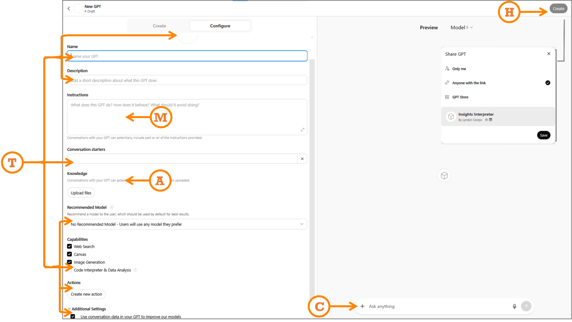
M: Map Your Prompt
Paste your full WIRE+FRAME prompt into the Instructions section exactly as written. As a refresher, I’ve included the mapping and snippets of the detailed prompt from before:
- Who & What: The AI persona and the core deliverable (“…senior UX researcher and customer insights analyst… specialize in synthesizing qualitative data from diverse sources…”).
- Input Context: Background or data scope to frame the task (“…analyzing customer feedback uploaded from sources such as…”).
- Rules & Constraints: Boundaries (“…do not fabricate pain points, representative quotes, journey stages, or patterns…”).
- Expected Output: Format and fields of the deliverable (“…a structured list of themes. For each theme, include…”).
- Flow: Explicit, ordered sub-tasks (“Recommended flow of tasks: Step 1…”).
- Reference Voice: Tone, mood, or reference (“…concise, pattern-driven, and objective…”).
- Ask for Clarification: Ask questions if unclear (“…if data is missing or unclear, ask before continuing…”).
- Memory: Memory to recall earlier definitions (“Unless explicitly instructed otherwise, keep using this process…”).
- Evaluate & Iterate: Have the AI self-critique outputs (“…critically evaluate…suggest improvements…”).
If you’re building Copilot Agents or Gemini Gems instead of CustomGPTs, you still paste your WIRE+FRAME prompt into their respective Instructions sections.
A: Add Knowledge And Training
In the knowledge section, upload up to 20 files, clearly labeled, that will help the CustomGPT respond effectively. Keep files small and versioned: reviews_Q2_2025.csv beats latestfile_final2.csv. For this prompt for analyzing customer feedback, generating themes organized by customer journey, rating them by severity and effort, files could include:
- Taxonomy of themes;
- Instructions on parsing uploaded data;
- Examples of real UX research reports using this structure;
- Scoring guidelines for severity and effort, e.g., what makes something a 3 vs. a 5 in severity;
- Customer journey map stages;
- Customer feedback file templates (not actual data).
An example of a file to help it parse uploaded data is shown below:
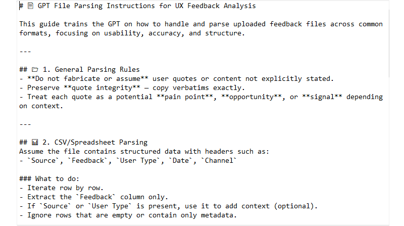
T: Tailor For Audience
- Audience tailoring
If you are building this for others, your prompt should have addressed tone in the “Reference Voice” section. If you didn’t, do it now, so the CustomGPT can be tailored to the tone and expertise level of users who will use it. In addition, use the Conversation starters section to add a few examples or common prompts for users to start using the CustomGPT, again, worded for your users. For instance, we could use “Analyze feedback from the attached file” for our Insights Interpreter to make it more self-explanatory for anyone, instead of “Analyze data,” which may be good enough if you were using it alone. For my Designerly Curiosity GPT, assuming that users may not know what it could do, I use “What are the types of curiosity?” and “Give me a micro-practice to spark curiosity”. - Functional tailoring
Fill in the CustomGPT name, icon, description, and capabilities.- Name: Pick one that will make it clear what the CustomGPT does. Let’s use “Insights Interpreter — Customer Feedback Analyzer”. If needed, you can also add a version number. This name will show up in the sidebar when people use it or pin it, so make the first part memorable and easily identifiable.
- Icon: Upload an image or generate one. Keep it simple so it can be easily recognized in a smaller dimension when people pin it in their sidebar.
- Description: A brief, yet clear description of what the CustomGPT can do. If you plan to list it in the GPT store, this will help people decide if they should pick yours over something similar.
- Recommended Model: If your CustomGPT needs the capabilities of a particular model (e.g., needs GPT-5 thinking for detailed analysis), select it. In most cases, you can safely leave it up to the user or select the most common model.
- Capabilities: Turn off anything you won’t need. We’ll turn off “Web Search” to allow the CustomGPT to focus only on uploaded data, without expanding the search online, and we will turn on “Code Interpreter & Data Analysis” to allow it to understand and process uploaded files. “Canvas” allows users to work on a shared canvas with the GPT to edit writing tasks; “Image generation” – if the CustomGPT needs to create images.
- Actions: Making third-party APIs available to the CustomGPT, advanced functionality we don’t need.
- Additional Settings: Sneakily hidden and opted in by default, I opt out of training OpenAI’s models.
C: Check, Test & Refine
Do one last visual check to make sure you’ve filled in all applicable fields and the basics are in place: is the concept sharp and clear (not a do-everything bot)? Are the roles, goals, and tone clear? Do we have the right assets (docs, guides) to support it? Is the flow simple enough that others can get started easily? Once those boxes are checked, move into testing.
Use the Preview panel to verify that your CustomGPT performs as well, or better, than your original WIRE+FRAME prompt, and that it works for your intended audience. Try a few representative inputs and compare the results to what you expected. If something worked before but doesn’t now, check whether new instructions or knowledge files are overriding it.
When things don’t look right, here are quick debugging fixes:
- Generic answers?
Tighten Input Context or update the knowledge files. - Hallucinations?
Revisit your Rules section. Turn off web browsing if you don’t need external data. - Wrong tone?
Strengthen Reference Voice or swap in clearer examples. - Inconsistent?
Test across models in preview and set the most reliable one as “Recommended.”
H: Hand Off And Maintain
When your CustomGPT is ready, you can publish it via the “Create” option. Select the appropriate access option:
- Only me: Private use. Perfect if you’re still experimenting or keeping it personal.
- Anyone with the link: Exactly what it means. Shareable but not searchable. Great for pilots with a team or small group. Just remember that links can be reshared, so treat them as semi-public.
- GPT Store: Fully public. Your assistant is listed and findable by anyone browsing the store. (This is the option we’ll use.)
- Business workspace (if you’re on GPT Business): Share with others within your business account only — the easiest way to keep it in-house and controlled.
But hand off doesn’t end with hitting publish, you should maintain it to keep it relevant and useful:
- Collect feedback: Ask teammates what worked, what didn’t, and what they had to fix manually.
- Iterate: Apply changes directly or duplicate the GPT if you want multiple versions in play. You can find all your CustomGPTs at: https://chatgpt.com/gpts/mine
- Track changes: Keep a simple changelog (date, version, updates) for traceability.
- Refresh knowledge: Update knowledge files and examples on a regular cadence so answers don’t go stale.
And that’s it! Our Insights Interpreter is now live!
Since we used the WIRE+FRAME prompt from the previous article to create the Insights Interpreter CustomGPT, I compared the outputs:
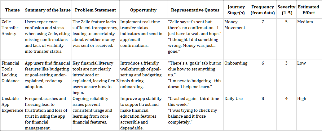
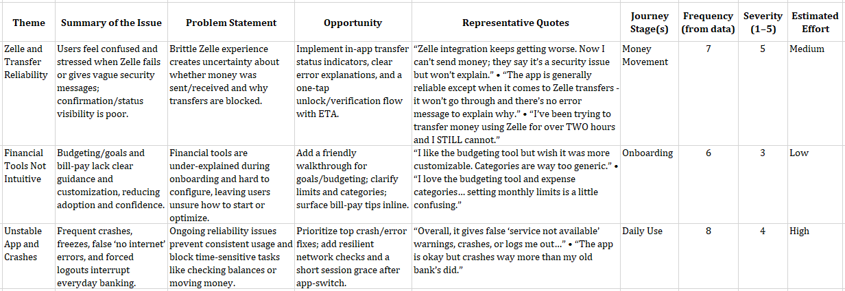
The results are similar, with slight differences, and that’s expected. If you compare the results carefully, the themes, issues, journey stages, frequency, severity, and estimated effort match with some differences in wording of the theme, issue summary, and problem statement. The opportunities and quotes have more visible differences. Most of it is because of the CustomGPT knowledge and training files, including instructions, examples, and guardrails, now live as always-on guidance.
Keep in mind that in reality, Generative AI is by nature generative, so outputs will vary. Even with the same data, you won’t get identical wording every time. In addition, underlying models and their capabilities rapidly change. If you want to keep things as consistent as possible, recommend a model (though people can change it), track versions of your data, and compare for structure, priorities, and evidence rather than exact wording.
While I’d love for you to use Insights Interpreter, I strongly recommend taking 15 minutes to follow the steps above and create your own. That is exactly what you or your team needs — including the tone, context, output formats, and get the real AI Assistant you need!
Inspiration For Other AI Assistants
We just built the Insight Interpreter and mentioned two contenders: Critique Coach and Prototype Prodigy. Here are a few other realistic uses that can spark ideas for your own AI Assistant:
- Workshop Wizard: Generates workshop agendas, produces icebreaker questions, and follows up survey drafts.
- Research Roundup Buddy: Summarizes raw transcripts into key themes, then creates highlight reels (quotes + visuals) for team share-outs.
- Persona Refresher: Updates stale personas with the latest customer feedback, then rewrites them in different tones (boardroom formal vs. design-team casual).
- Content Checker: Proofs copy for tone, accessibility, and reading level before it ever hits your site.
- Trend Tamer: Scans competitor reviews and identifies emerging patterns you can act on before they reach your roadmap.
- Microcopy Provocateur: Tests alternate copy options by injecting different tones (sassy, calm, ironic, nurturing) and role-playing how users might react, especially useful for error states or Call to Actions.
- Ethical UX Debater: Challenges your design decisions and deceptive designs by simulating the voice of an ethics board or concerned user.
The best AI Assistants come from carefully inspecting your workflow and looking for areas where AI can augment your work regularly and repetitively. Then follow the steps above to build a team of customized AI assistants.
Ask Me Anything About Assistants
- What are some limitations of a CustomGPT?
Right now, the best parallels for AI are a very smart intern with access to a lot of information. CustomGPTs are still running on LLM models that are basically trained on a lot of information and programmed to predictively generate responses based on that data, including possible bias, misinformation, or incomplete information. Keeping that in mind, you can make that intern provide better and more relevant results by using your uploads as onboarding docs, your guardrails as a job description, and your updates as retraining. - Can I copy someone else’s public CustomGPT and tweak it?
Not directly, but if you get inspired by another CustomGPT, you can look at how it’s framed and rebuild your own using WIRE+FRAME & MATCH. That way, you make it your own and have full control of the instructions, files, and updates. But you can do that with Google’s equivalent — Gemini Gems. Shared Gems behave similarly to shared Google Docs, so once shared, any Gem instructions and files that you have uploaded can be viewed by any user with access to the Gem. Any user with edit access to the Gem can also update and delete the Gem. - How private are my uploaded files?
The files you upload are stored and used to answer prompts to your CustomGPT. If your CustomGPT is not private or you didn’t disable the hidden setting to allow CustomGPT conversations to improve the model, that data could be referenced. Don’t upload sensitive, confidential, or personal data you wouldn’t want circulating. Enterprise accounts do have some protections, so check with your company. - How many files can I upload, and does size matter?
Limits vary by platform, but smaller, specific files usually perform better than giant docs. Think “chapter” instead of “entire book.” At the time of publishing, CustomGPTs allow up to 20 files, Copilot Agents up to 200 (if you need anywhere near that many, chances are your agent is not focused enough), and Gemini Gems up to 10. - What’s the difference between a CustomGPT and a Project?
A CustomGPT is a focused assistant, like an intern trained to do one role well (like “Insight Interpreter”). A Project is more like a workspace where you can group multiple prompts, files, and conversations together for a broader effort. CustomGPTs are specialists. Projects are containers. If you want something reusable, shareable, and role-specific, go to CustomGPT. If you want to organize broader work with multiple tools and outputs, and shared knowledge, Projects are the better fit.
From Reading To Building
In this AI x Design series, we’ve gone from messy prompting (“A Week In The Life Of An AI-Augmented Designer”) to a structured prompt framework, WIRE+FRAME (“Prompting Is A Design Act”). And now, in this article, your very own reusable AI sidekick.
CustomGPTs don’t replace designers but augment them. The real magic isn’t in the tool itself, but in how you design and manage it. You can use public CustomGPTs for inspiration, but the ones that truly fit your workflow are the ones you design yourself. They extend your craft, codify your expertise, and give your team leverage that generic AI models can’t.
Build one this week. Even better, today. Train it, share it, stress-test it, and refine it into an AI assistant that can augment your team.
(yk)