


Freebie Release: “Bare Responsive” – A blank and responsive WordPress Theme
Creating WordPress Themes from scratch can be challenging. After completing this task multiple times, you might start seeking a more straightforward approach. I’ve discovered that building on a basi
Freebies
Freebie Release: 10 Business Card Templates (PSD)
Until the business card finds a better, faster, more convenient replacement, it serves as the most secure connection one can make with another in the offline world of business. Putting all your contac
Freebies
Freebie Release: Long Shadow Flat Icon Set by Simon Rahm
Time for another freebie! We recently published a post about the emergence of a new trend called Long Shadow Design. As a follow up to that, this freebie contains a long shadow flat icon set as design
Freebies

What Does It Really Mean For A Site To Be Keyboard Navigable
Keyboard navigation is a vital aspect of accessible web design, and a detail-oriented approach is crucial. Prioritizing keyboard navigation prioritizes the user experience for a diverse audience, exte
Accessibility
What Does It Really Mean For A Site To Be Keyboard Navigable
Eleanor Hecks
Efficient navigation is vital for a functional website, but not everyone uses the internet the same way. While most visitors either scroll on mobile or click through with a mouse, many people only use their keyboards. Up to 10 million American adults have carpal tunnel syndrome, which may cause pain when holding a mouse, and vision problems can make it difficult to follow a cursor. Consequently, you should keep your site keyboard navigable to achieve universal appeal and accessibility.
Understanding Keyboard Navigation
Keyboard navigation allows users to engage with your website solely through keyboard input. That includes using shortcuts and selecting elements with the Tab and Enter keys.
There are more than 500 keyboard shortcuts among operating systems and specific apps your audience may use. Standard ones for web navigation include Ctrl + F to find words or resources, Shift + Arrow to select text, and Ctrl + Tab to move between browser tabs. While these are largely the responsibilities of the software companies behind the specific browser or OS, you should still consider them.
Single-button navigation is another vital piece of keyboard navigability. Users may move between clickable items with the Tab and Shift keys, use the Arrow keys to scroll, press Enter or Space to “click” a link, and exit pop-ups with Esc.

The Washington Post homepage goes further. Pressing Tab highlights clickable elements as it should, but the first button press brings up a link to the site’s accessibility statement first. Users can navigate past this, but including it highlights how the design understands how keyboard navigability is a matter of accessibility.
You should understand how people may use these controls so you can build a site that facilitates them. These navigation options are generally standard, so any deviation or lack of functionality will stand out. Ensuring keyboard navigability, especially in terms of enabling these specific shortcuts and controls, will help you meet such expectations and avoid turning users away.
Why Keyboard Navigation Matters In Web Design
Keyboard navigability is crucial for a few reasons. Most notably, it makes your site more accessible. In the U.S. alone, over one in four people have a disability, and many such conditions affect technology use. For instance, motor impairments make it challenging for someone to use a standard mouse, and users with vision problems typically require keyboard and screen reader use.
Beyond accounting for various usage needs, enabling a wider range of control methods makes a site convenient. Using a keyboard rather than a mouse is faster when it works as it should and may feel more comfortable. Considering how workers spend nearly a third of their workweek looking for information, any obstacles to efficiency can be highly disruptive.
Falling short in these areas may lead to legal complications. Regulations like the Americans with Disabilities Act necessitate tech accessibility. While the ADA has no binding rules for what constitutes an accessible website, it specifically mentions keyboard navigation in its nonbinding guidance. Failing to support such functionality does not necessarily mean you’ll face legal penalties, but courts can use these standards to inform their decision on whether your site is reasonably accessible.
In 2023, Kitchenaid faced a class-action lawsuit for failing to meet such standards. Plaintiffs alleged that the company’s site didn’t support alt text or keyboard navigation, making it inaccessible to users with visual impairments. While the case ultimately settled out of court, it’s a reminder of the potential legal and financial repercussions of overlooking inclusivity.
Outside the law, an inaccessible site presents ethical concerns, as it shows preferential treatment for those who can use a mouse, even if that’s unintentional. Even without legal action, public recognition of this bias may lead to a drop in visitors and a tainted public image.
Elements Of A Keyboard-Navigable Site
Thankfully, ensuring keyboard navigability is a straightforward user experience design practice. Because navigation is standard across OSes and browsers, keyboard-accessible sites employ a few consistent elements.
Focus Indicators
Web Accessibility In Mind states that sites must provide a visual indicator of elements currently in focus when users press Tab. Focus indicators are typically a simple box around the highlighted icon.
These are standard in CSS, but some designers hide them, so avoid using outline:0 or outline:none to limit their visibility. You can also increase the contrast or change the indicator’s color in CSS.

The CNN Breaking News homepage is a good example of a strong focus indicator. Pressing Tab immediately brings up the box, which is bold enough to see easily and even uses a white border when necessary to stand out against black or dark-colored site elements.
Logical Tab Order
The order in which the focus indicator moves between elements also matters. Generally speaking, pressing the Tab key should move it from left to right and top to bottom — the same way people read in English.
A few errors can stand in the way. Disabled buttons disrupt keyboard navigation flow by skipping an element with no explanation or highlighting it without making it clickable. Similarly, an interface where icons don’t fall in a predictable left-to-right, top-to-bottom order will make logical tab movement difficult.

The Sutton Maddock Vehicle Rental site is a good example of what not to do. When you press Tab, the focus indicator jumps from “Contact” to the Facebook link before going backward to the Twitter link. It starts at the right and moves left when it goes to the next line — the opposite order of what feels natural.
Skip Navigation Links
Skip links are also essential. These interactive elements let keyboard users jump to specific content without repeated keystrokes. Remember, these skips must be one of the first areas highlighted when you press Tab so they work as intended.

The HSBC Group homepage has a few skip navigation links. Pressing Tab pulls up three options, letting users quickly jump to whichever part of the site interests them.
Keyboard-Accessible Interactive Elements
Finally, all interactive elements on a keyboard-navigable site should be accessible via keystrokes. Anything people can click on or drag with a cursor should also support navigation and interaction. Enabling this is as simple as letting users select all items with the Tab or Arrow keys and press them with Space or Enter.

Appropriately, this Arizona State University page on keyboard accessibility showcases this concept well. All drop-down menus are possible to open by navigating to them via Tab and pressing Enter, so users don’t need a mouse to interact with them.
How to Test for Keyboard Navigability
After designing a keyboard-accessible UX, you should test it to ensure that it works properly. The easiest way to do this is to explore the site solely with your keyboard. The chart below outlines the criteria to look for when determining whether your site is legitimately keyboard navigable.
| Keyboard Navigable | Not Keyboard Navigable | |
|---|---|---|
| Clickable Elements | All elements are reachable through the keyboard and open when you press Enter. | Only some elements are possible to reach through the keyboard. Some links may be broken or not open when you press Enter. |
| Focus Indicators | Pressing Tab, Space, or Enter brings up a focus indicator that is easy to see in all browsers. | Focus indicators may not appear when pressing all buttons. The box may be hard to see or only appear in some browsers. |
| Skip Navigation Links | Pressing Tab for the first time pulls up at least one skip link to take users to much-visited content or menus. Continuing to press Tab moves the focus indicator past these links to highlight elements on the page as normal. | No skip links appear when pressing Tab for the first time. Alternatively, they appear after moving through all other elements. Skip links may not be functional. |
| Screen Reader Support | Screen readers can read each element when highlighted with the focus indicator. | Some elements may not encourage any action from screen readers when highlighted. |
The Web Content Accessibility Guidelines outline two test rules to verify keyboard navigability:
- The first ensures all interactive elements are accessible via the Tab key,
- The second checks for keyboard scroll functionality.
Employ both standards to review your UX before making a site live.
Typical issues include the inability to highlight elements with the Tab key or things that don’t fall in a natural order. You can discover both problems by trying to access everything with your keyboard. However, you may prefer to conduct a navigability audit through a third party. Many private companies offer these services, but you can also use the Bureau of Internet Accessibility for a basic WCAG audit.
Make Your Site Keyboard Navigable Today
Keyboard navigability ensures you cater to all needs and preferences for an inclusive, accessible website design. While it’s straightforward to implement, it’s also easy to miss, so remember these principles when designing your UX and testing your site.
WCAG provides several techniques you can employ to meet keyboard accessibility standards and enhance your users’ experience:
- Technique G90, for keyboard-triggered event handlers
- Technique G202, for general keyboard functionality
- Technique H91, for forming controls and links in HTML
Follow these guidelines and use WCAG’s test rules to create an accessible site. Remember to re-check it every time you add elements or change your UX.
Additionally, consider the following recommended reads to learn more about keyboards and their role in accessibility:
- “A Guide To Keyboard Accessibility: HTML And CSS (Part 1),” Cristian Díaz
- “A Guide To Keyboard Accessibility: JavaScript (Part 2),” Cristian Díaz
- “A Complete Guide To Mechanical Keyboards,” Ben Frain
- “UX Improvements For Keyboard Accessibility,” Vitaly Friedman
- “I Used The Web For A Day With Just A Keyboard,” Chris Ashton
User-friendliness is an industry best practice that demonstrates your commitment to inclusivity for all. Even users without disabilities will appreciate intuitive, efficient keyboard navigation.
 (yk)
(yk)

Freebie: Professional Business Infographic Template
Looking for a freebie? We have here, in collaboration our friends at Freepik, an exclusive release for HKDC readers. You’re looking at a business-themed statistical infographic template which is pac
FreebiesLooking for a freebie? We have here, in collaboration our friends at Freepik, an exclusive release for HKDC readers. You’re looking at a business-themed statistical infographic template which is packed with elements that are great for data visualization purposes, for annual report presentations or for making an awesome-looking infographic.
Included in this pack are different types of bar charts/graphs (stacked, vertical, horizontal), pie charts, histograms, world maps, graphical timelines, line charts and more, in multiple variants. Each design is available in a three-color scheme. Check out the preview before you download the files.
Preview

Download
Please enter your email address below and click the Download Files button. The download link will be sent to you by email.
The post Freebie: Professional Business Infographic Template appeared first on Hongkiat.
Agile Principles Explained: Definitions and Examples for Software Development
Businesses nowadays are continually looking for frameworks and strategies to optimize their processes. With Agile being around for more than two decades, helping teams deliver value to their customers
BusinessAgile was founded based on values and principles. It’s not a methodology or a philosophy to get things done but rather a framework, and a collection of beliefs teams use to make decisions.
The Agile principles will help you guide your team on the right path, even when you’re unsure of your next step. In this article, we will explain the 12 Agile principles and how these help software teams adapt, optimize, and improve the development of software products or services.
What is Agile?
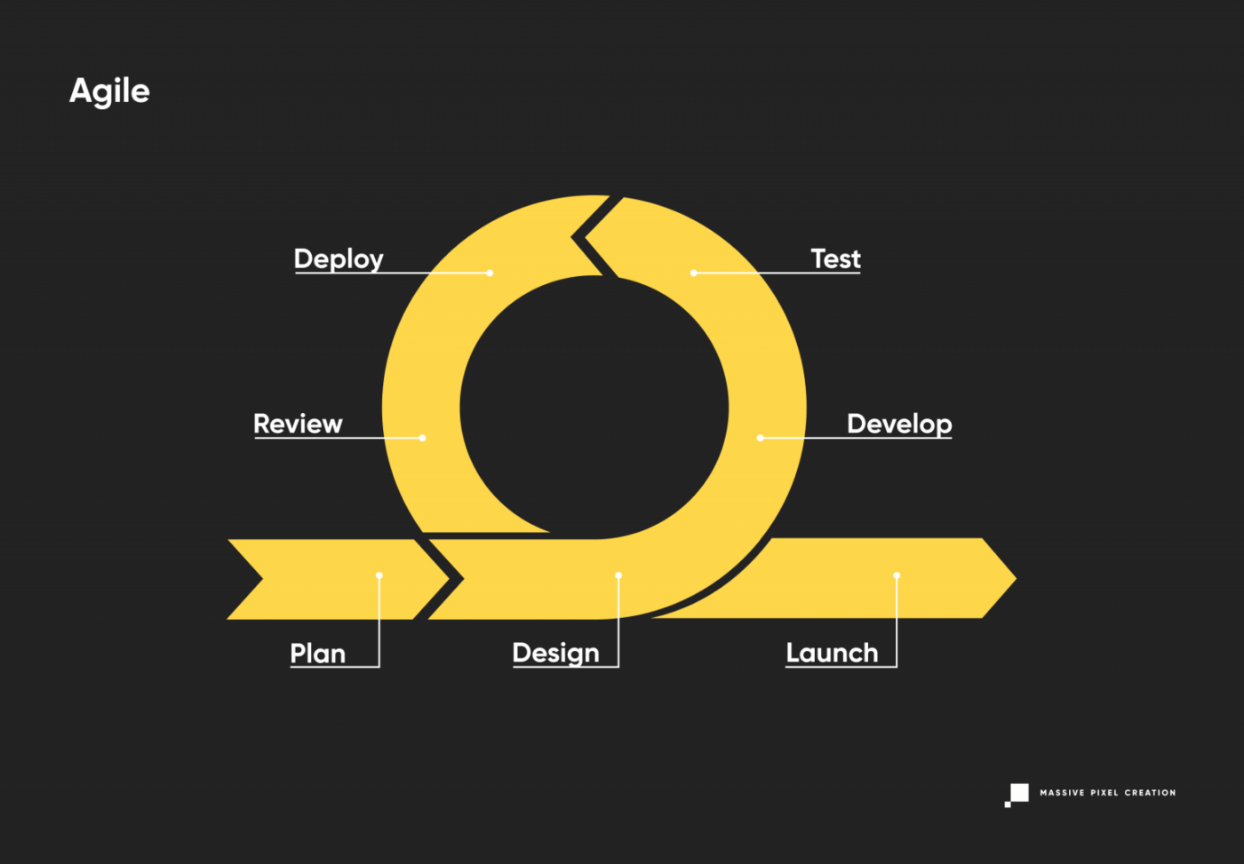
Agile refers to methodologies focused on iterative development where processes and solutions occur through continual collaboration among cross-functional teams.
Instead of following a well-defined and strict plan, Agile teams focus on continual improvement and efficiency. They work under “sprints,” which consist of specific tasks or deliverables boxed in a time frame. Each sprint typically lasts from two to four weeks, but this depends on the product in development. What’s worth noting is that sprints are not used in every single Agile approach. Kanban, for example, doesn’t use it.
In software development, Agile transformed entirely the way teams structured processes. Before Agile, software development life cycles like Waterfall focused on delivering software through a linear and rigid process.
With Agile, there’s no set of rules, procedures, or hierarchy that needs to be followed. The Agile software development life cycle (SDLC) focuses on breaking the process into manageable actions that can be continually improved until it reaches its primary goal. What matters is to deliver the best result possible.
A group of 17 engineers created Agile, focusing on building an efficient foundation to manage projects. However, since its inception, Agile has been more than a series of methodologies.
With 4 core values and 12 principles, Agile has become a globally accepted mindset for managing projects.
4 Agile Values
The Agile manifesto has 4 values and the 12 supporting principles that lead the Agile approach to software development.
1. Individuals and Interactions Over Processes and Tools
You can have high-tech tools and solid processes, but it’s the team that determines a project’s success. This value focuses on the importance of having teams with fluid communication who can respond to changes and customer needs. No matter if your team uses Slack, Microsoft Teams, or a virtual phone system, you simply must communicate clearly to work well.
2. Working Software Over Comprehensive Documentation
One of the reasons software development was slower and ineffective was due to all the technical specifications, requirements, documents, extensive planning, etc. Some Agile requirements are presented as a user story, which helps speed up the process. Documentation is still valuable, but working software is even more valuable in Agile.
3. Customer Collaboration Over Contract Negotiation
Agile aims to have customers engaged and who collaborate throughout the development process. Instead of having a negotiation period to outline all project details, it focuses on having a collaborative relationship from the start resulting in customers being heavily involved in the process. This makes it easy for Agile teams to quickly implement the customer’s feedback, understanding their needs and requirements.
4. Responding to Change Over Following a Plan
What characterizes Agile is that it embraces change. Instead of having a very strict and specific plan of development, the project should focus on delivering value. The definition of what value means for the project will vary, along with the project scope.
The 12 Agile Principles Explained

What are the 12 principles of Agile?
The 12 Agile Manifesto Principles are designed to help teams focus on what’s important, such as efficiently delivering valuable software, embracing change, working collaboratively, and prioritizing the customer’s needs, among other things.
These are the 12 principles of Agile explained:
1. “Our highest priority is to satisfy the customer through early and continuous delivery of valuable software.”
Understanding customers’ changing expectations is one of the priorities in Agile teams. Instead of having a linear structure, where they engage with customers only at the start and end of the project, Agile emphasizes the importance of having a continuous cycle of feedback and improvement.
Agile understands that a customer’s needs might change or evolve, so instead of focusing on a rigid plan, teams focus on a series of iterations followed by customer feedback. This way, it’s easier for the product to be aligned with customer expectations and allows the team to focus only on valuable features.
Example:
As this principle focuses on the continuous feedback cycle, Agile teams often build a minimum viable product (MVP), and its response informs future releases. Product teams can test and validate their ideas by using MVP and experimentations. Teams do not release a final product, but iterations continue to make improvements until the product has reached a certain level of satisfaction.
2. “Welcome changing requirements, even late in development. Agile processes harness change for the customer’s competitive advantage.”
One of the main characteristics of an Agile project is its adaptability. This second principle means that teams need to be willing to make changes to stay competitive even when the project is advanced.
Often, software teams think that the most reliable way to achieve a successful product is to make a solid plan and stick to it. But for Agile, it’s the other way around. Allowing change is necessary for teams to gain a competitive advantage.
Agile teams embrace change and are continually reconsidering their strategies and processes to ensure the quality of the product.
Adaptation and the willingness to change are part of Agile’s core strengths. Allowing change becomes necessary for teams to gain a competitive advantage.
A good way for strengthening your adaptation skills though may be taking part in agile project management training online. Especially, if you haven’t worked in the Agile methodology just yet. Learning directly from experts can particularly speed up the whole process.
Example:
Instead of prioritizing having well-documented plans, the Agile team focuses on observing the market, the customer needs, studying them in-depth, and being aware of the competitive threats they might face along the way.
3. “Deliver working software frequently, from a couple of weeks to a couple of months, with a preference to the shorter timescale.”
As mentioned, for Agile, the clients’ and stakeholders’ feedback is fundamental. Instead of waiting to build a final product to present it, Agile focuses on delivering work frequently.
This means that Agile teams work with “sprints” where tasks and goals are usually planned in the short term.
Sprints allow customers to see how the product is evolving and for the team to evaluate if there are improvements to be made. The idea is to achieve goals on smaller scales that will ultimately contribute to the product as a whole. Teams are aware of the specific goals they need to reach while adapting and changing the product until it fulfills the customer’s expectations.
Example:
Software development teams work in sprints with a set timeframe between 2 and 4 weeks.
4. “Business people and developers must work together daily throughout the project.”
The fourth Agile principle focuses on unifying departments, prioritizing collaboration regularly. The idea is that customers, key stakeholders, and leadership work hand in hand with developers, strengthening the communication channels to ensure everyone is on the same page.
During the development of a product, business and tech groups work together consistently, building trust and transparency throughout the process. It also helps give immediate feedback to developers making sure that new arising requirements and details for existing ones are taken into consideration.
While, for some teams who haven’t applied Agile, having everyone involved through all the stages might seem like it will cost more time, in the long term, it’s more beneficial because it optimizes processes. It helps teams recognize gaps between business and tech teams early enough to avoid future problems.
Transparency while delivering a product is crucial on both sides. Businesses should be aware of development status and blockers as much as developers need to be aware of all market/business or organizational restraints of the project.
Example:
Agile teams prioritize regular meetings. For instance, every day, they have a daily meeting that takes only 15 minutes, and each member of the group shares what they are currently working on and if they have had any roadblocks.
5. “Build projects around motivated individuals. Give them the environment and support they need, and trust them to get the job done.”
Usually, at the start of the project, where the planning and first steps take place, the team is motivated and ready to get started. However, it is harder for individuals to stay motivated and focused on the final goal when problems arise.
Agile principle 5 emphasizes the importance of choosing the right people with the right skills and roles to be part of the project to achieve success. And it also encourages team leaders to give them the necessary tools and resources.
Motivating team members is also about listening to their ideas and showing that it’s important. Giving team members the confidence to speak up is also a way to help them improve their performance.
This principle also focuses on trust, which translates into avoiding micromanagement. A key aspect of the Agile framework is to empower team members through trust and autonomy.
Example:
Team leaders need to ensure that developers understand strategy and requirements before development starts. Not necessarily focusing on how something will be built, but more on the “what” and “why”. The delivery team is who determines the “how” through the process.
The goal is to provide support when roadblocks appear and brainstorm on possible solutions through the sprints, not micromanaging.
6. “The most efficient and effective method of conveying information to and within a development team is face-to-face conversation.”
The sixth Agile principle translates primarily into two things: Communication and collaboration. The most effective way for teams to be on the same page is to communicate continually.
While this principle focuses on the face-to-face aspects, something to keep in mind is that it was written two decades ago, when Zoom and other remote tools weren’t part of the panorama.
In today’s world, applying this principle is not for face-to-face exclusively, but it highlights the importance of meaningful connections and conversations. While email and texting are fast and easier alternatives, video calls, and even regular phone calls are the best channels for remote teams to communicate effectively.
Example:
This principle is applied in software teams through daily meetings, brainstorming sessions, sprint planning meetings, frequent demos, and pair programming.
7. “Working software is the primary measure of progress.”
To understand this principle, let’s rewind to pre-Agile times to understand how teams used to measure success.
As mentioned, in many cases, software development was a hierarchical and linear process. This meant that teams, instead of working through iterations, left most of the testing and refactoring to the final stage. In the end, this left unhappy customers and many problems to review and improve, and that took time.
Agile focuses on maintaining a working software, measuring the progress of what has been completed. Each feature and addition is reviewed by the tech team and the client. So when it’s time to work on the next steps, the client is happy, and revisions and testing have already taken place.
Working software is not the final product, but it refers to each iteration. Agile teams work on Minimum Viable Features. That way, they measure success by delivering a working product that satisfies customers.
Example:
Software teams design and release Minimum Viable Features instead of fully-fledged features to get feedback and validate the product while building software. This makes agile teams have the capacity to adapt to change and gain a competitive advantage, as explained in the previous principles.
8. “Agile processes promote sustainable development. The sponsors, developers, and users should be able to maintain a constant pace indefinitely.”
The key concept in this principle is “sustainable development.” What Agile means by this is that project managers and leaders should set realistic and clear expectations, even if that means that a project will take longer than expected.
In some cases, software development teams set high expectations trying to fulfill all requirements in a short period. And the problem is that putting in extra time to meet deadlines quickly burns out the team, impacting the quality of the outcome, morale, and motivation.
The idea is to strengthen morale by encouraging a healthy work-life balance with realistic goals. It’s not about finishing projects fast, but about making them at a constant rate.
Example:
Before every sprint takes place, teams need to consider the amount of work they can commit to. Instead of overpromising and not fulfilling expectations, teams should set realistic goals without adding more tasks through the process. Once a sprint starts, teams stick to the goals and tasks they have already established.
9. “Continuous attention to technical excellence and good design enhances agility.”
This principle focuses on constantly reviewing the product after every iteration. Agile promotes continuous attention to technical excellence and good quality design.
The purpose of this principle is to encourage teams to avoid shortcuts just because they want to finish a project faster. Most of the time, shortcuts become more costly in the long run.
Example:
Developers and the product management team work hand in hand to understand if the technical debt is acceptable. Usually, they will need to allocate development resources to refactoring efforts.
10. “Simplicity—the art of maximizing the amount of work not done—is essential.”
This Agile principle focuses on keeping processes as simple as possible. In other words, it talks about working smart, not hard.
Agile teams recognize what adds value to a project and what doesn’t, which enables them to maximize the resources that best serve their project. Too many features and planning are avoided at all costs. The idea is to avoid distractions and streamline the cycle to make it more efficient.
For Agile, simplifying and focusing on the things that truly matter is what has the most impact. In a product management context, leaders should always be focused on prioritizing, even if that means making difficult decisions.
Example:
Product managers are strongly aligned with organizational goals, and the customer wants and needs. This makes them selective in the user stories and features they pick. With prioritization techniques, they ensure that the strategies they implement always have a purpose and a “why” behind them.
11. “The best architectures, requirements, and designs emerge from self-organizing teams.”
Self-organizing teams are made up of a committed and motivated group able to plan, estimate and complete the work autonomously while engaging with the customers. This also breaks down the traditional vertical management style.
This Agile principle focuses on self-organizing teams that work under a more flat and horizontal management style. This translates into autonomous teams capable of acting faster, as they don’t need permission for every decision they make.
Example:
In practice, Agile teams are autonomous groups in an organization that have full control over their projects and take ownership in such areas.
12. “At regular intervals, the team reflects on how to become more effective, then tunes and adjusts its behavior accordingly.”
This last Agile principle encourages leaders to take time to evaluate what the team has done, how they’ve performed, and how they can improve.
Agile focuses on delivering products through continual improvement, always considering feedback. Similar to this process, teams need to frequently evaluate their process and see ways to make it more efficient.
Example:
The idea behind this principle is to have sessions where the team reflects on their performance and discuss ways management and technical skills can be improved.
Key Takeaways
Agile Principles focus on providing guidelines to ensure teams focus on the right things. These are the 12 Agile Principles, explained in simpler terms:
1. Customer satisfaction through early and continuous delivery of software.
2. Focus on working on smaller and achievable tasks.
3. Adhere to a timeframe for the delivery of a working product.
4. Stakeholders need to frequently collaborate throughout the entire development process to ensure the project moves in the right direction.
5. Create a supportive environment that motivates team members.
6. Constant communication is key to a project’s success.
7. Progress is measured by working software.
8. Maintain a constant and realistic pace of development.
9. Always keep an eye out for technical details.
10. Simplicity is key.
11. Promote self-organization.
12. Reflect on the team’s performance to continue improving.
Conclusion
Thousands of organizations across the world claim to be Agile. However, as explained in the article, Agile is not a methodology or a philosophy; it is a framework.
Understanding the values and the principles of Agile provides teams with a foundation to make the right decisions, create quality software, and solid cross-functional teams.
WCAG 3.0’s Proposed Scoring Model: A Shift In Accessibility Evaluation
WCAG is evolving. Since 1999, the Web Content Accessibility Guidelines have defined accessibility in binary terms: either a success criterion is met or not. But real user experience is rarely that sim
Accessibility
WCAG 3.0’s Proposed Scoring Model: A Shift In Accessibility Evaluation
Mikhail Prosmitskiy
Since their introduction in 1999, the Web Content Accessibility Guidelines (WCAG) have shaped how we design and develop inclusive digital products. The WCAG 2.x series, released in 2008, introduced clear technical criteria judged in a binary way: either a success criterion is met or not. While this model has supported regulatory clarity and auditability, its “all-or-nothing” nature often fails to reflect the nuance of actual user experience (UX).
Over time, that disconnect between technical conformance and lived usability has become harder to ignore. People engage with digital systems in complex, often nonlinear ways: navigating multistep flows, dynamic content, and interactive states. In these scenarios, checking whether an element passes a rule doesn’t always answer the main question: can someone actually use it?
WCAG 3.0 is still in draft, but is evolving — and it represents a fundamental rethinking of how we evaluate accessibility. Rather than asking whether a requirement is technically met, it asks how well users with disabilities can complete meaningful tasks. Its new outcome-based model introduces a flexible scoring system that prioritizes usability over compliance, shifting focus toward the quality of access rather than the mere presence of features.
Draft Status: Ambitious, But Still Evolving
WCAG 3.0 was first introduced as a public working draft by the World Wide Web Consortium (W3C) Accessibility Guidelines Working Group in early 2021. The draft is still under active development and is not expected to reach W3C Recommendation status for several years, if not decades, by some accounts. This extended timeline reflects both the complexity of the task and the ambition behind it:
WCAG 3.0 isn’t just an update — it’s a paradigm shift.
Unlike WCAG 2.x, which focused primarily on web pages, WCAG 3.0 aims to cover a much broader ecosystem, including applications, tools, connected devices, and emerging interfaces like voice interaction and extended reality. It also rebrands itself as the W3C Accessibility Guidelines (while the WCAG acronym remains the same), signaling that accessibility is no longer a niche concern — it’s a baseline expectation across the digital world.
Importantly, WCAG 3.0 will not immediately replace 2.x. Both standards will coexist, and conformance to WCAG 2.2 will continue to be valid and necessary for some time, especially in legal and policy contexts.
This expansion isn’t just technical.
“
Rules alone can’t capture whether a system truly works for someone. That’s why WCAG 3.0 leans into flexibility and future-proofing, aiming to support evolving technologies and real-world use over time. It formalizes a principle long understood by practitioners:
Inclusive design isn’t about passing a test; it’s about enabling people.
A New Structure: From Success Criteria To Outcomes And Methods
WCAG 2.x is structured around four foundational principles — Perceivable, Operable, Understandable, and Robust (aka POUR) — and testable success criteria organized into three conformance levels (A, AA, AAA). While technically precise, these criteria often emphasize implementation over impact.
WCAG 3.0 reorients this structure toward user needs and real outcomes. Its hierarchy is built on:
- Guidelines: High-level accessibility goals tied to specific user needs.
- Outcomes: Testable, user-centered statements (e.g., “Users have alternatives for time-based media”).
- Methods: Technology-specific or agnostic techniques that help achieve the outcomes, including code examples and test instructions.
- How-To Guides: Narrative documentation that provides practical advice, user context, and design considerations.
This shift is more than organizational. It reflects a deeper commitment to aligning technical implementation with UX. Outcomes speak the language of capability, which is about what users should be able to do (rather than just technical presence).
Crucially, outcomes are also where conformance scoring begins to take shape. For example, imagine a checkout flow on an e-commerce website. Under WCAG 2.x, if even one field in the checkout form lacks a label, the process may fail AA conformance entirely. However, under WCAG 3.0, that same flow might be evaluated across multiple outcomes (such as keyboard navigation, form labeling, focus management, and error handling), with each outcome receiving a separate score. If most areas score well but the error messaging is poor, the overall rating might be “Good” instead of “Excellent”, prompting targeted improvements without negating the entire flow’s accessibility.
From Binary Checks To Graded Scores
Rather than relying on pass or fail outcomes, WCAG 3.0 introduces a scoring model that reflects how well accessibility is supported. This shift allows teams to recognize partial successes and prioritize real improvements.
How Scoring Works
Each outcome in WCAG 3.0 is evaluated through one or more atomic tests. These can include the following:
- Binary tests: “Yes” and “no” outcomes (e.g., does every image have alternative text?)
- Percentage-based tests: Coverage-based scoring (e.g., what percentage of form fields have labels?)
- Qualitative tests: Rated judgments based on criteria (e.g., how descriptive is the alternative text?)
The result of these tests produces a score for each outcome, often normalized on a 0-4 or 0-5 scale, with labels like Poor, Fair, Good, and Excellent. These scores are then aggregated across functional categories (vision, mobility, cognition, etc.) and user flows.
This allows teams to measure progress, not just compliance. A product that improves from “Fair” to “Good” over time shows real evolution — a concept that doesn’t exist in WCAG 2.x.
Critical Errors: A Balancing Mechanism
To ensure that severity still matters, WCAG 3.0 introduces critical errors, which are high-impact accessibility failures that can override an otherwise positive score.
For example, consider a checkout flow. Under WCAG 2.x, a single missing label might cause the entire flow to fail conformance. WCAG 3.0, however, evaluates multiple outcomes — like form labeling, keyboard access, and error handling — each with its own score. Minor issues, such as unclear error messages or a missing label on an optional field, might lower the rating from “Excellent” to “Good”, without invalidating the entire experience.
But if a user cannot complete a core action, like submitting the form, making a purchase, or logging in, that constitutes a critical error. These failures directly block task completion and significantly reduce the overall score, regardless of how polished the rest of the experience is.
On the other hand, problems with non-essential features — like uploading a profile picture or changing a theme color — are considered lower-impact and won’t weigh as heavily in the evaluation.
Conformance Levels: Bronze, Silver, Gold
In place of categorizing conformance in tiers of Level A, Level AA, and Level AAA, WCAG 3.0 proposes three different conformance tiers:
- Bronze: The new minimum. It is comparable to WCAG 2.2 Level AA, but based on scoring and foundational outcomes. The requirements are considered achievable via automated and guided manual testing.
- Silver: This is a higher standard, requiring broader coverage, higher scores, and usability validation from people with disabilities.
- Gold: The highest tier. Represents exemplary accessibility, likely requiring inclusive design processes, innovation, and extensive user involvement.
Unlike in WCAG 2.2, where Level AAA is often seen as aspirational and inconsistent, these levels are intended to incentivize progression. They can also be scoped in the sense that teams can claim conformance for a checkout flow, mobile app, or specific feature, allowing iterative improvement.
What You Should Do Now
While WCAG 3.0 is still being developed, its direction is clear. That said, it’s important to acknowledge that the guidelines are not expected to be finalized in a few years. Here’s how teams can prepare:
- Continue pursuing WCAG 2.2 Level AA. It remains the most robust, recognized standard.
- Familiarize yourself with WCAG 3.0 drafts, especially the outcomes and scoring model.
- Start thinking in outcomes. Focus on what users need to accomplish, not just what features are present.
- Embed accessibility into workflows. Shift left. Don’t test at the end — design and build with access in mind.
- Involve users with disabilities early and regularly.
These practices won’t just make your product more inclusive; they’ll position your team to excel under WCAG 3.0.
Potential Downsides
Even though WCAG 3.0 presents a bold step toward more holistic accessibility, several structural risks deserve early attention, especially for organizations navigating regulation, scaling design systems, or building sustainable accessibility practices. Importantly, many of these risks are interconnected: challenges in one area may amplify issues in others.
Subjective Scoring
The move from binary pass or fail criteria to scored evaluations introduces room for subjective interpretation. Without standardized calibration, the same user flow might receive different scores depending on the evaluator. This makes comparability and repeatability harder, particularly in procurement or multi-vendor environments. A simple alternative text might be rated as “adequate” by one team and “unclear” by another.
Reduced Compliance Clarity
That same subjectivity leads to a second concern: the erosion of clear compliance thresholds. Scored evaluations replace the binary clarity of “compliant” or “not” with a more flexible, but less definitive, outcome. This could complicate legal enforcement, contractual definitions, and audit reporting. In practice, a product might earn a “Good” rating while still presenting critical usability gaps for certain users, creating a disconnect between score and actual access.
Legal and Policy Misalignment
As clarity around compliance blurs, so does alignment with existing legal frameworks. Many current laws explicitly reference WCAG 2.x and its A, AA, and AAA levels (e.g. Section 508 of the Rehabilitation Act of 1973, European Accessibility Act, The Public Sector Bodies (Websites and Mobile Applications) (No. 2) Accessibility Regulations 2018).
Until WCAG 3.0 is formally mapped to those standards, its use in regulated contexts may introduce risk. Teams operating in healthcare, finance, or public sectors will likely need to maintain dual conformance strategies in the interim, increasing cost and complexity.
Risk Of Minimum Viable Accessibility
Perhaps most concerning, this ambiguity can set the stage for a “minimum viable accessibility” mindset. Scored models risk encouraging “Bronze is good enough” thinking, particularly in deadline-driven environments. A team might deprioritize improvements once they reach a passing grade, even if essential barriers remain.
For example, a mobile app with strong keyboard support but missing audio transcripts could still achieve a passing tier, leaving some users excluded.
Conclusion
WCAG 3.0 marks a new era in accessibility — one that better reflects the diversity and complexity of real users. By shifting from checklists to scored evaluations and from rigid technical compliance to practical usability, it encourages teams to prioritize real-world impact over theoretical perfection.
As one might say, “It’s not about the score. It’s about who can use the product.” In my own experience, I’ve seen teams pour hours into fixing minor color contrast issues while overlooking broken keyboard navigation, leaving screen reader users unable to complete essential tasks. WCAG 3.0’s focus on outcomes reminds us that accessibility is fundamentally about functionality and inclusion.
“
For teams across design, development, and product leadership, this shift is a chance to rethink what success means. Accessibility isn’t about ticking boxes — it’s about enabling people.
By preparing now, being mindful of the risks, and focusing on user outcomes, we don’t just get ahead of WCAG 3.0 — we build digital experiences that are truly usable, sustainable, and inclusive.
Further Reading On SmashingMag
- “A Roundup Of WCAG 2.2 Explainers,” Geoff Graham
- “Getting To The Bottom Of Minimum WCAG-Conformant Interactive Element Size,” Eric Bailey
- “How To Make A Strong Case For Accessibility,” Vitaly Friedman
- “A Designer’s Accessibility Advocacy Toolkit,” Yichan Wang
(gg, yk)
Designing For Neurodiversity
Designing for neurodiversity means recognizing that people aren’t edge cases but individuals with varied ways of thinking and navigating the web. So, how can we create more inclusive experiences tha
Accessibility
Designing For Neurodiversity
Vitaly Friedman
This article is sponsored by TetraLogical
Neurodivergent needs are often considered as an edge case that doesn’t fit into common user journeys or flows. Neurodiversity tends to get overlooked in the design process. Or it is tackled late in the process, and only if there is enough time.
But people aren’t edge cases. Every person is just a different person, performing tasks and navigating the web in a different way. So how can we design better, more inclusive experiences that cater to different needs and, ultimately, benefit everyone? Let’s take a closer look.
Neurodiversity Or Neurodivergent?
There is quite a bit of confusion about both terms on the web. Different people think and experience the world differently, and neurodiversity sees differences as natural variations, not deficits. It distinguishes between neurotypical and neurodivergent people.
- Neurotypical people see the world in a “typical” and widely perceived as expected way.
- Neurodivergent people experience the world differently, for example, people with ADHD, dyslexia, dyscalculia, synesthesia, and hyperlexia.
According to various sources, around 15–40% of the population has neurodivergent traits. These traits can be innate (e.g., autism) or acquired (e.g., trauma). But they are always on a spectrum, and vary a lot. A person with autism is not neurodiverse — they are neurodivergent.
One of the main strengths of neurodivergent people is how imaginative and creative they are, coming up with out-of-the-box ideas quickly. With exceptional levels of attention, strong long-term memory, a unique perspective, unbeatable accuracy, and a strong sense of justice and fairness.
Being different in a world that, to some degree, still doesn’t accept these differences is exhausting. So unsurprisingly, neurodivergent people often bring along determination, resilience, and high levels of empathy.
Design With People, Not For Them
As a designer, I often see myself as a path-maker. I’m designing reliable paths for people to navigate to their goals comfortably. Without being blocked. Or confused. Or locked out.
That means respecting the simple fact that people’s needs, tasks, and user journeys are all different, and that they evolve over time. And: most importantly, it means considering them very early in the process.
Better accessibility is better for everyone. Instead of making decisions that need to be reverted or refined to be compliant, we can bring a diverse group of people — with accessibility needs, with neurodiversity, frequent and infrequent users, experts, newcomers — in the process, and design with them, rather than for them.
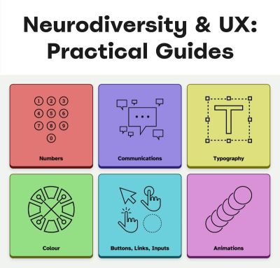
Neurodiversity & Inclusive Design Resources
A wonderful resource that helps us design for cognitive accessibility is Stéphanie Walter’s Neurodiversity and UX toolkit. It includes practical guidelines, tools, and resources to better understand and design for dyslexia, dyscalculia, autism, and ADHD.
Another fantastic resource is Will Soward’s Neurodiversity Design System. It combines neurodiversity and user experience design into a set of design standards and principles that you can use to design accessible learning interfaces.
Last but not least, I’ve been putting together a few summaries about neurodiversity and inclusive design over the last few years, so you might find them helpful, too:
- ADHD
- Autism
- Children
- Colorblindness
- Deafness
- Dyscalculia
- Dyslexia
- Legibility
- Left-Handed Users
- Mental Health
- Motivation
- Older Adults
- Screen Readers
- Teenagers
A huge thank-you to everyone who has been writing, speaking, and sharing articles, resources, and toolkits on designing for diversity. The topic is often forgotten and overlooked, but it has an incredible impact. 👏🏼👏🏽👏🏾
(vf, il, yk)
What I Wish Someone Told Me When I Was Getting Into ARIA
Accessible Rich Internet Applications (ARIA) is an inevitability when working on web accessibility. That said, it’s everyone’s first time learning about ARIA at some point.
Accessibility
What I Wish Someone Told Me When I Was Getting Into ARIA
Eric Bailey
If you haven’t encountered ARIA before, great! It’s a chance to learn something new and exciting. If you have heard of ARIA before, this might help you better understand it or maybe even teach you something new!
These are all things I wish someone had told me when I was getting started on my web accessibility journey. This post will:
- Provide a mindset for how to approach ARIA as a concept,
- Debunk some common misconceptions, and
- Provide some guiding thoughts to help you better understand and work with it.
It is my hope that in doing so, this post will help make an oft-overlooked yet vital corner of web design and development easier to approach.
What This Post Is Not
This is not a recipe book for how to use ARIA to build accessible websites and web apps. It is also not a guide for how to remediate an inaccessible experience. A lot of accessibility work is highly contextual. I do not know the specific needs of your project or organization, so trying to give advice here could easily do more harm than good.
Instead, think of this post as a “know before you go” guide. I’m hoping to give you a good headspace to approach ARIA, as well as highlight things to watch out for when you undertake your journey. So, with that out of the way, let’s dive in!
So, What Is ARIA?
ARIA is what you turn to if there is not a native HTML element or attribute that is better suited for the job of communicating interactivity, purpose, and state.
Think of it like a spice that you sprinkle into your markup to enhance things.
Adding ARIA to your HTML markup is a way of providing additional information to a website or web app for screen readers and voice control software.
- Interactivity means the content can be activated or manipulated. An example of this is navigating to a link’s destination.
- Purpose means what something is used for. An example of this is a text input used to collect someone’s name.
- State means the current status content has been placed in and controlled by states, properties, and values. An example of this is an accordion panel that can either be expanded or collapsed.
Here is an illustration to help communicate what I mean by this:

- The presence of HTML’s
buttonelement will instruct assistive technology to report it as a button, letting someone know that it can be activated to perform a predefined action. - The presence of the text string “Mute” will be reported by assistive technology to clue the person into what the button is used for.
- The presence of
aria-pressed="true"means that someone or something has previously activated the button, and it is now in a “pushed in” state that sustains its action.
This overall pattern will let people who use assistive technology know:
- If something is interactive,
- What kind of interactive behavior it performs, and
- Its current state.
ARIA’s History
ARIA has been around for a long time, with the first version published on September 26th, 2006.

“
The latest version of ARIA is version 1.2, published on June 6th, 2023. Version 1.3 is slated to be released relatively soon, and you can read more about it in this excellent article by Craig Abbott.
You may also see it referred to as WAI-ARIA, where WAI stands for “Web Accessibility Initiative.” The WAI is part of the W3C, the organization that sets standards for the web. That said, most accessibility practitioners I know call it “ARIA” in written and verbal communication and leave out the “WAI-” part.
The Spirit Of ARIA Reflects The Era In Which It Was Created
The reason for this is simple: The web was a lot less mature in the past than it is now. The most popular operating system in 2006 was Windows XP. The iPhone didn’t exist yet; it was released a year later.
From a very high level, ARIA is a snapshot of the operating system interaction paradigms of this time period. This is because ARIA recreates them.

The Mindset
Smartphones with features like tappable, swipeable, and draggable surfaces were far less commonplace. Single Page Application “web app” experiences were also rare, with Ajax-based approaches being the most popular. This means that we have to build the experiences of today using the technology of 2006. In a way, this is a good thing. It forces us to take new and novel experiences and interrogate them.
Interactions that cannot be broken down into smaller, more focused pieces that map to ARIA patterns are most likely inaccessible. This is because they won’t be able to be operated by assistive technology or function on older or less popular devices.
I may be biased, but I also think these sorts of novel interactions that can’t translate also serve as a warning that a general audience will find them to be confusing and, therefore, unusable. This belief is important to consider given that the internet serves:
- An unknown number of people,
- Using an unknown number of devices,
- Each with an unknown amount of personal customizations,
- Who have their own unique needs and circumstances and
- Have unknown motivational factors.
Interaction Expectations
Contemporary expectations for keyboard-based interaction for web content — checkboxes, radios, modals, accordions, and so on — are sourced from Windows XP and its predecessor operating systems. These interaction models are carried forward as muscle memory for older people who use assistive technology. Younger people who rely on assistive technology also learn these de facto standards, thus continuing the cycle.
What does this mean for you? Someone using a keyboard to interact with your website or web app will most likely try these Windows OS-based keyboard shortcuts first. This means things like pressing:
- Enter to navigate to a link’s destination,
- Space to activate buttons,
- Home and End to jump to the start or end of a list of items, and so on.
It’s Also A Living Document
This is not to say that ARIA has stagnated. It is constantly being worked on with new additions, removals, and clarifications. Remember, it is now at version 1.2, with version 1.3 arriving soon.
In parallel, HTML as a language also reflects this evolution. Elements were originally created to support a document-oriented web and have been gradually evolving to support more dynamic, app-like experiences. The great bit here is that this is all conducted in the open and is something you can contribute to if you feel motivated to do so.
ARIA Has Rules For Using It
There are five rules included in ARIA’s documentation to help steer how you approach it:
- Use a native element whenever possible.
An example would be using an anchor element (<a>) for a link rather than adivwith a click handler and aroleoflink. - Don’t adjust a native element’s semantics if at all possible.
An example would be trying to use a heading element as a tab rather than wrapping the heading in a semantically neutraldiv. - Anything interactive has to be keyboard operable.
If you can’t use it with a keyboard, it isn’t accessible. Full stop. - Do not use
role="presentation"oraria-hidden="true"on a focusable element.
This makes something intended to be interactive unable to be used by assistive technology. - Interactive elements must be named.
An example of this is using the text string “Print” for abuttonelement.
Observing these five rules will do a lot to help you out. The following is more context to provide even more support.
ARIA Has A Taxonomy
There is a structured grammar to ARIA, and it is centered around roles, as well as states and properties.
Roles
A Role is what assistive technology reads and then announces. A lot of people refer to this in shorthand as semantics. HTML elements have implied roles, which is why an anchor element will be announced as a link by screen readers with no additional work.
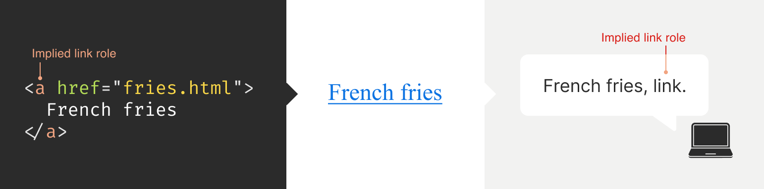
Implied roles are almost always better to use if the use case calls for them. Recall the first rule of ARIA here. This is usually what digital accessibility practitioners refer to when they say, “Just use semantic HTML.”
There are many reasons for favoring implied roles. The main consideration is better guarantees of support across an unknown number of operating systems, browsers, and assistive technology combinations.
Roles have categories, each with its own purpose. The Abstract role category is notable in that it is an organizing supercategory not intended to be used by authors:
Abstract roles are used for the ontology. Authors MUST NOT use abstract roles in content.
<!-- This won't work, don't do it --> <h2 role="sectionhead"> Anatomy and physiology </h2> <!-- Do this instead --> <section aria-labeledby="anatomy-and-physiology"> <h2 id="anatomy-and-physiology"> Anatomy and physiology </h2> </section> Additionally, in the same way, you can only declare ARIA on certain things, you can only declare some ARIA as children of other ARIA declarations. An example of this is the the listitem role, which requires a role of list to be present on its parent element.
So, what’s the best way to determine if a role requires a parent declaration? The answer is to review the official definition.
States And Properties
States and properties are the other two main parts of ARIA‘s overall taxonomy.
Implicit roles are provided by semantic HTML, and explicit roles are provided by ARIA. Both describe what an element is. States describe that element’s characteristics in a way that assistive technology can understand. This is done via property declarations and their companion values.

ARIA states can change quickly or slowly, both as a result of human interaction as well as application state. When the state is changed as a result of human interaction, it is considered an “unmanaged state.” Here, a developer must supply the underlying JavaScript logic to control the interaction.
When the state changes as a result of the application (e.g., operating system, web browser, and so on), this is considered “managed state.” Here, the application automatically supplies the underlying logic.
How To Declare ARIA
Think of ARIA as an extension of HTML attributes, a suite of name/value pairs. Some values are predefined, while others are author-supplied:

For the examples in the previous graphic, the polite value for aria-live is one of the three predefined values (off, polite, and assertive). For aria-label, “Save” is a text string manually supplied by the author.
You declare ARIA on HTML elements the same way you declare other attributes:
<!-- Applies an id value of "carrot" to the div --> <div id="carrot"></div> <!-- Hides the content of this paragraph element from assistive technology --> <p aria-hidden="true"> Assistive technology can't read this </p> <!-- Provides an accessible name of "Stop", and also communicates that the button is currently pressed. A type property with a value of "button" prevents browser form submission. --> <button aria-label="Stop" aria-pressed="true" type="button"> <!-- SVG icon --> </button> Other usage notes:
- You can place more than one ARIA declaration on an HTML element.
- The order of placement of ARIA when declared on an HTML element does not matter.
- There is no limit to how many ARIA declarations can be placed on an element. Be aware that the more you add, the more complexity you introduce, and more complexity means a larger chance things may break or not function as expected.
- You can declare ARIA on an HTML element and also have other non-ARIA declarations, such as
classorid. The order of declarations does not matter here, either.
It might also be helpful to know that boolean attributes are treated a little differently in ARIA when compared to HTML. Hidde de Vries writes about this in his post, “Boolean attributes in HTML and ARIA: what’s the difference?”.
Not A Whole Lot Of ARIA Is “Hardcoded”
In this context, “hardcoding” means directly writing a static attribute or value declaration into your component, view, or page.
A lot of ARIA is designed to be applied or conditionally modified dynamically based on application state or as a response to someone’s action. An example of this is a show-and-hide disclosure pattern:
- ARIA’s
aria-expandedattribute is toggled fromfalsetotrueto communicate if the disclosure is in an expanded or collapsed state. - HTML’s
hiddenattribute is conditionally removed or added in tandem to show or hide the disclosure’s full content area.
<div class="disclosure-container"> <button aria-expanded="false" class="disclosure-toggle" type="button"> How we protect your personal information </button> <div hidden class="disclosure-content"> <ul> <li>Fast, accurate, thorough and non-stop protection from cyber attacks</li> <li>Patching practices that address vulnerabilities that attackers try to exploit</li> <li>Data loss prevention practices help to ensure data doesn't fall into the wrong hands</li> <li>Supply risk management practices help ensure our suppliers adhere to our expectations</li> </ul> <p> <a href="/security/">Learn more about our security best practices</a>. </p> </div> </div> A common example of a hardcoded ARIA declaration you’ll encounter on the web is making an SVG icon inside a button decorative:
<button type="button> <svg aria-hidden="true"> <!-- SVG code --> </svg> Save </button> Here, the string “Save” is what is required for someone to understand what the button will do when they activate it. The accompanying icon helps that understanding visually but is considered redundant and therefore decorative.
Declaring An Aria Role On Something That Already Uses That Role Implicitly Does Not Make It “Extra” Accessible
An implied role is all you need if you’re using semantic HTML. Explicitly declaring its role via ARIA does not confer any additional advantages.
<!-- You don't need to declare role="button" here. Using the <button> element will make assistive technology announce it as a button. The role="button" declaration is redundant. --> <button role="button"> Save </button> You might occasionally run into these redundant declarations on HTML sectioning elements, such as <main role="main">, or <footer role="contentinfo">. This isn’t needed anymore, and you can just use the <main> or <footer> elements.
The reason for this is historic. These declarations were done for support reasons, in that it was a stop-gap technique for assistive technology that needed to be updated to support these new-at-the-time HTML elements.
Contemporary assistive technology does not need these redundant declarations. Think of it the same way that we don’t have to use vendor prefixes for the CSS border-radius property anymore.
Note: There is an exception to this guidance. There are circumstances where certain complex and complicated markup patterns don’t work as expected for assistive technology. In these cases, we want to hardcode the implicit role as explicit ARIA to ensure it works. This assistive technology support concern is covered in more detail later in this post.
You Don’t Need To Say What A Control Is; That Is What Roles Are For
Both implicit and explicit roles are announced by screen readers. You don’t need to include that part for things like the interactive element’s text string or an aria-label.
<!-- Don't do this --> <button aria-label="Save button" type="button"> <!-- Icon SVG --> </button> <!-- Do this instead --> <button aria-label="Save" type="button"> <!-- Icon SVG --> </button> Had we used the string value of “Save button” for our Save button, a screen reader would announce it along the lines of, “Save button, button.” That’s redundant and confusing.
ARIA Roles Have Very Specific Meanings
We sometimes refer to website and web app navigation colloquially as menus, especially if it’s an e-commerce-style mega menu.
In ARIA, menus mean something very specific. Don’t think of global or in-page navigation or the like. Think of menus in this context as what appears when you click the Edit menu button on your application’s menubar.

Using a role improperly because its name seems like an appropriate fit at first glance creates confusion for people who do not have the context of the visual UI. Their expectations will be set with the announcement of the role, then subverted when it does not act the way it is supposed to.
Imagine if you click on a link, and instead of taking you to another webpage, it sends something completely unrelated to your printer instead. It’s sort of like that.
Declaring role="menu" is a common example of a misapplied role, but there are others. The best way to know what a role is used for? Go straight to the source and read up on it.
Certain Roles Are Forbidden From Having Accessible Names
These roles are caption, code, deletion, emphasis, generic, insertion, paragraph, presentation, strong, subscript, and superscript.
This means you can try and provide an accessible name for one of these elements — say via aria-label — but it won’t work because it’s disallowed by the rules of ARIA’s grammar.
<!-- This won't work--> <strong aria-label="A 35% discount!"> $39.95 </strong> <!-- Neither will this --> <code title="let JavaScript example"> let submitButton = document.querySelector('button[type="submit"]'); </code> For these examples, recall that the role is implicit, sourced from the declared HTML element.
Note here that sometimes a browser will make an attempt regardless and overwrite the author-specified string value. This overriding is a confusing act for all involved, which led to the rule being established in the first place.
You Can’t Make Up ARIA And Expect It To Work
I’ve witnessed some developers guess-adding CSS classes, such as .background-red or .text-white, to their markup and being rewarded if the design visually updates correctly.
The reason this works is that someone previously added those classes to the project. With ARIA, the people who add the content we can use are the Accessible Rich Internet Applications Working Group. This means each new version of ARIA has a predefined set of properties and values. Assistive technology is then updated to parse those attributes and values, although this isn’t always a guarantee.
Declaring ARIA, which isn’t part of that predefined set, means assistive technology won’t know what it is and consequently won’t announce it.
<!-- There is no "selectpanel" role in ARIA. Because of this, this code will be announced as a button and not as a select panel. --> <button role="selectpanel" type="button"> Choose resources </button> ARIA Fails Silently
This speaks to the previous section, where ARIA won’t understand words spoken to it that exist outside its limited vocabulary.
There are no console errors for malformed ARIA. There’s also no alert dialog, beeping sound, or flashing light for your operating system, browser, or assistive technology. This fact is yet another reason why it is so important to test with actual assistive technology.
You don’t have to be an expert here, either. There is a good chance your code needs updating if you set something to announce as a specific state and assistive technology in its default configuration does not announce that state.
ARIA Only Exposes The Presence Of Something To Assistive Technology
Applying ARIA to something does not automatically “unlock” capabilities. It only sends a hint to assistive technology about how the interactive content should behave.
For assistive technology like screen readers, that hint could be for how to announce something. For assistive technology like refreshable Braille displays, it could be for how it raises and lowers its pins. For example, declaring role="button" on a div element does not automatically make it clickable. You will still need to:
- Target the
divelement in JavaScript, - Tie it to a click event,
- Author the interactive logic that it performs when clicked, and then
- Accommodate all the other expected behaviors.
This all makes me wonder why you can’t save yourself some work and use a button element in the first place, but that is a different story for a different day.
Additionally, adjusting an element’s role via ARIA does not modify the element’s native functionality. For example, you can declare role="image" on a div element. However, attempting to declare the alt or src attributes on the div won’t work. This is because alt and src are not supported attributes for div.

Declaring an ARIA Role On Something Will Override Its Semantics, But Not Its Behavior
This speaks to the previous section on ARIA only exposing something’s presence. Don’t forget that certain HTML elements have primary and secondary interactive capabilities built into them.
For example, an anchor element’s primary capability is navigating to whatever URL value is provided for its href attribute. Secondary capabilities for an anchor element include copying the URL value, opening it in a new tab or incognito window, and so on.

These secondary capabilities are still preserved. However, it may not be apparent to someone that they can use them — or use them in the way that they’d expect — depending on what is announced.
The opposite is also true. When an element has no capabilities, having its role adjusted does not grant it any new abilities. Remember, ARIA only announces. This is why that div with a role of button assigned to it won’t do anything when clicked if no companion JavaScript logic is also present.

You Will Need To Declare ARIA To Make Certain Interactions Accessible
A lot of the previous content may make it seem like ARIA is something you should avoid using altogether. This isn’t true. Know that this guidance is written to help steer you to situations where HTML does not offer the capability to describe an interaction out of the box. This space is where you want to use ARIA.
Knowing how to identify this area requires spending some time learning what HTML elements there are, as well as what they are and are not used for. I quite like HTML5 Doctor’s Element Index for upskilling on this.
Certain ARIA States Require Certain ARIA Roles To Be Present
This is analogous to how HTML has both global attributes and attributes that can only be used on a per-element basis. For example, aria-describedby can be used on any HTML element or role. However, aria-posinset can only be used with article, comment, listitem, menuitem, option, radio, row, and tab roles. Remember here that these roles can be provided by either HTML or ARIA.
Learning what states require which roles can be achieved by reading the official reference. Check for the “Used in Roles” portion of each entry’s characteristics:

aria-setsize. (Large preview) Automated code scanners — like axe, WAVE, ARC Toolkit, Pa11y, equal-access, and so on — can catch this sort of thing if they are written in error. I’m a big fan of implementing these sorts of checks as part of a continuous integration strategy, as it makes it a code quality concern shared across the whole team.
ARIA Is More Than Web Browsers
Speaking of technology that listens, it is helpful to know that the ARIA you declare instructs the browser to speak to the operating system the browser is installed on. Assistive technology then listens to what the operating system reports. It then communicates that to the person using the computer, tablet, smartphone, and so on.

A person can then instruct assistive technology to request the operating system to take action on the web content displayed in the browser.

This interaction model is by design. It is done to make interaction from assistive technology indistinguishable from interaction performed without assistive technology.
There are a few reasons for this approach. The most important one is it helps preserve the privacy and autonomy of the people who rely on assistive technologies.
Just Because It Exists In The ARIA Spec Does Not Mean Assistive Technology Will Support It
This support issue was touched on earlier and is a difficult fact to come to terms with.
Contemporary developers enjoy the hard-fought, hard-won benefits of the web standards movement. This means you can declare HTML and know that it will work with every major browser out there. ARIA does not have this. Each assistive technology vendor has its own interpretation of the ARIA specification. Oftentimes, these interpretations are convergent. Sometimes, they’re not.
Assistive technology vendors also have support roadmaps for their products. Some assistive technology vendors:
- Will eventually add support,
- May never, and some
- Might do so in a way that contradicts how other vendors choose to implement things.
There is also the operating system layer to contend with, which I’ll cover in more detail in a little bit. Here, the mechanisms used to communicate with assistive technology are dusty, oft-neglected areas of software development.
With these layers comes a scenario where the assistive technology can support the ARIA declared, but the operating system itself cannot communicate the ARIA’s presence, or vice-versa. The reasons for this are varied but ultimately boil down to a historic lack of support, prioritization, and resources. However, I am optimistic that this is changing.
Additionally, there is no equivalent to Caniuse, Baseline, or Web Platform Status for assistive technology. The closest analog we have to support checking resources is a11ysupport.io, but know that it is the painstaking work of a single individual. Its content may not be up-to-date, as the work is both Herculean in its scale and Sisyphean in its scope. Because of this, I must re-stress the importance of manually testing with assistive technology to determine if the ARIA you use works as intended.
How To Determine ARIA Support
There are three main layers to determine if something is supported:
- Operating system and version.
- Assistive technology and version,
- Browser and browser version.
1. Operating System And Version
Each operating system (e.g., Windows, macOS, Linux) has its own way of communicating what content is present to assistive technology. Each piece of assistive technology has to accommodate how to parse that communication.
Some assistive technology is incompatible with certain operating systems. An example of this is not being able to use VoiceOver with Windows, or JAWS with macOS. Furthermore, each version of each operating system has slight variations in what is reported and how. Sometimes, the operating system needs to be updated to “teach” it the updated AIRA vocabulary. Also, do not forget that things like bugs and regressions can occur.
2. Assistive Technology And Version
There is no “one true way” to make assistive technology. Each one is built to address different access needs and wants and is done so in an opinionated way — think how different web browsers have different features and UI.
Each piece of assistive technology that consumes web content has its own way of communicating this information, and this is by design. It works with what the operating system reports, filtered through things like heuristics and preferences.

aria-label. (Large preview) Like operating systems, assistive technology also has different versions with what each version is capable of supporting. They can also be susceptible to bugs and regressions.
Another two factors worth pointing out here are upgrade hesitancy and lack of financial resources. Some people who rely on assistive technology are hesitant to upgrade it. This is based on a very understandable fear of breaking an important mechanism they use to interact with the world. This, in turn, translates to scenarios like holding off on updates until absolutely necessary, as well as disabling auto-updating functionality altogether.
Lack of financial resources is sometimes referred to as the disability or crip tax. Employment rates tend to be lower for disabled populations, and with that comes less money to spend on acquiring new technology and updating it. This concern can and does apply to operating systems, browsers, and assistive technology.
3. Browser And Browser Version
Some assistive technology works better with one browser compared to another. This is due to the underlying mechanics of how the browser reports its content to assistive technology. Using Firefox with NVDA is an example of this.
Additionally, the support for this reporting sometimes only gets added for newer versions. Unfortunately, it also means support can sometimes accidentally regress, and people don’t notice before releasing the browser update — again, this is due to a historic lack of resources and prioritization.
The Less Commonly-Used The ARIA You Declare, The Greater The Chance You’ll Need To Test It
Common ARIA declarations you’ll come across include, but are not limited to:
aria-label,aria-labelledby,aria-describedby,aria-hidden,aria-live.
These are more common because they’re more supported. They are more supported because many of these declarations have been around for a while. Recall the previous section that discussed actual assistive technology support compared to what the ARIA specification supplies.
Newer, more esoteric ARIA, or historically deprioritized declarations, may not have that support yet or may never. An example of how complicated this can get is aria-controls.
aria-controls is a part of ARIA that has been around for a while. JAWS had support for aria-controls, but then removed it after user feedback. Meanwhile, every other screen reader I’m aware of never bothered to add support.
What does that mean for us? Determining support, or lack thereof, is best accomplished by manual testing with assistive technology.
The More ARIA You Add To Something, The Greater The Chance Something Will Behave Unexpectedly
This fact takes into consideration the complexities in preferences, different levels of support, bugs, regressions, and other concerns that come with ARIA’s usage.
Philosophically, it’s a lot like adding more interactive complexity to your website or web app via JavaScript. The larger the surface area your code covers, the bigger the chance something unintended happens.
Consider the amount of ARIA added to a component or discrete part of your experience. The more of it there is declared nested into the Document Object Model (DOM), the more it interacts with parent ARIA declarations. This is because assistive technology reads what the DOM exposes to help determine intent.
A lot of contemporary development efforts are isolated, feature-based work that focuses on one small portion of the overall experience. Because of this, they may not take this holistic nesting situation into account. This is another reason why — you guessed it — manual testing is so important.
Anecdotally, WebAIM’s annual Millions report — an accessibility evaluation of the top 1,000,000 websites — touches on this phenomenon:
Increased ARIA usage on pages was associated with higher detected errors. The more ARIA attributes that were present, the more detected accessibility errors could be expected. This does not necessarily mean that ARIA introduced these errors (these pages are more complex), but pages typically had significantly more errors when ARIA was present.
Assistive Technology May Support Your Invalid ARIA Declaration
There is a chance that ARIA, which is authored inaccurately, will actually function as intended with assistive technology. While I do not recommend betting on this fact to do your work, I do think it is worth mentioning when it comes to things like debugging.
This is due to the wide range of familiarity there is with people who author ARIA.
Some of the more mature assistive technology vendors try to accommodate the lower end of this familiarity. This is done in order to better enable the people who use their software to actually get what they need.
There isn’t an exhaustive list of what accommodations each piece of assistive technology has. Think of it like the forgiving nature of a browser’s HTML parser, where the ultimate goal is to render content for humans.
aria-label Is Tricky
aria-label is one of the most common ARIA declarations you’ll run across. It’s also one of the most misused.
aria-label can’t be applied to non-interactive HTML elements, but oftentimes is. It can’t always be translated and is oftentimes overlooked for localization efforts. Additionally, it can make things frustrating to operate for people who use voice control software, where the visible label differs from what the underlying code uses.
Another problem is when it overrides an interactive element’s pre-existing accessible name. For example:
<!-- Don't do this --> <a aria-label="Our services" href="/services/"> Services </a> This is a violation of WCAG Success Criterion 2.5.3: Label in Name, pure and simple. I have also seen it used as a way to provide a control hint. This is also a WCAG failure, in addition to being an antipattern:
<!-- Also don't do this --> <a aria-label="Click this link to learn more about our unique and valuable services" href="/services/"> Services </a> These factors — along with other considerations — are why I consider aria-label a code smell.
aria-live Is Even Trickier
Live region announcements are powered by aria-live and are an important part of communicating updates to an experience to people who use screen readers.
Believe me when I say that getting aria-live to work properly is tricky, even under the best of scenarios. I won’t belabor the specifics here. Instead, I’ll point you to “Why are my live regions not working?”, a fantastic and comprehensive article published by TetraLogical.
The ARIA Authoring Practices Guide Can Lead You Astray
Also referred to as the APG, the ARIA Authoring Practices Guide should be treated with a decent amount of caution.

The Downsides
The guide was originally authored to help demonstrate ARIA’s capabilities. As a result, its code examples near-exclusively, overwhelmingly, and disproportionately favor ARIA.
Unfortunately, the APG’s latest redesign also makes it far more approachable-looking than its surrounding W3C documentation. This is coupled with demonstrating UI patterns in a way that signals it’s a self-serve resource whose code can be used out of the box.
These factors create a scenario where people assume everything can be used as presented. This is not true.
Recall that just because ARIA is listed in the spec does not necessarily guarantee it is supported. Adrian Roselli writes about this in detail in his post, “No, APG’s Support Charts Are Not ‘Can I Use’ for ARIA”.
Also, remember the first rule of ARIA and know that an ARIA-first approach is counter to the specification’s core philosophy of use.
In my experience, this has led to developers assuming they can copy-paste code examples or reference how it’s structured in their own efforts, and everything will just work. This leads to mass frustration:
- Digital accessibility practitioners have to explain that “doing the right thing” isn’t going to work as intended.
- Developers then have to revisit their work to update it.
- Most importantly, people who rely on assistive technology risk not being able to use something.
This is to say nothing about things like timelines and resourcing, working relationships, reputation, and brand perception.
The Upside
The APG’s main strength is highlighting what keyboard keypresses people will expect to work on each pattern.
Consider the listbox pattern. It details keypresses you may expect (arrow keys, Space, and Enter), as well as less-common ones (typeahead selection and making multiple selections). Here, we need to remember that ARIA is based on the Windows XP era. The keyboard-based interaction the APG suggests is built from the muscle memory established from the UI patterns used on this operating system.
While your tree view component may look visually different from the one on your operating system, people will expect it to be keyboard operable in the same way. Honoring this expectation will go a long way to ensuring your experiences are not only accessible but also intuitive and efficient to use.
Another strength of the APG is giving standardized, centralized names to UI patterns. Is it a dropdown? A listbox? A combobox? A select menu? Something else?
When it comes to digital accessibility, these terms all have specific meanings, as well as expectations that come with them. Having a common vocabulary when discussing how an experience should work goes a long way to ensuring everyone will be on the same page when it comes time to make and maintain things.
macOS VoiceOver Can Also Lead You Astray
VoiceOver on macOS has been experiencing a lot of problems over the last few years. If I could wager a guess as to why this is, as an outsider, it is that Apple’s priorities are focused elsewhere.
The bulk of web development efforts are conducted on macOS. This means that well-intentioned developers will reach for VoiceOver, as it comes bundled with macOS and is therefore more convenient. However, macOS VoiceOver usage has a drastic minority share for desktops and laptops. It is under 10% of usage, with Windows-based JAWS and NVDA occupying a combined 78.2% majority share:

The Problem
The sad, sorry truth of the matter is that macOS VoiceOver, in its current state, has a lot of problems. It should only be used to confirm that it can operate the experience the way Windows-based screen readers can.
This means testing on Windows with NVDA or JAWS will create an experience that is far more accurate to what most people who use screen readers on a laptop or desktop will experience.
Dealing With The Problem
Because of this situation, I heavily encourage a workflow that involves:
- Creating an experience’s underlying markup,
- Testing it with NVDA or JAWS to set up baseline expectations,
- Testing it with macOS VoiceOver to identify what doesn’t work as expected.
Most of the time, I find myself having to declare redundant ARIA on the semantic HTML I write in order to address missed expected announcements for macOS VoiceOver.
macOS VoiceOver testing is still important to do, as it is not the fault of the person who uses macOS VoiceOver to get what they need, and we should ensure they can still have access.
You can use apps like VirtualBox and Windows evaluation Virtual Machines to use Windows in your macOS development environment. Services like AssistivLabs also make on-demand, preconfigured testing easy.
What About iOS VoiceOver?
Despite sharing the same name, VoiceOver on iOS is a completely different animal. As software, it is separate from its desktop equivalent and also enjoys a whopping 70.6% usage share.
With this knowledge, know that it’s also important to test the ARIA you write on mobile to make sure it works as intended.
You Can Style ARIA
ARIA attributes can be targeted via CSS the way other HTML attributes can. Consider this HTML markup for the main navigation portion of a small e-commerce site:
<nav aria-label="Main"> <ul> <li> <a href="/home/">Home</a> <a href="/products/">Products</a> <a aria-current="true" href="/about-us/">About Us</a> <a href="/contact/">Contact</a> </li> </ul> </nav> The presence of aria-current="true" on the “About Us” link will tell assistive technology to announce that it is the current part of the site someone is on if they are navigating through the main site navigation.
We can also tie that indicator of being the current part of the site into something that is shown visually. Here’s how you can target the attribute in CSS:
nav[aria-label="Main"] [aria-current="true"] { border-bottom: 2px solid #ffffff; } This is an incredibly powerful way to tie application state to user-facing state. Combine it with modern CSS like :has() and view transitions and you have the ability to create robust, sophisticated UI with less reliance on JavaScript.
You Can Also Use ARIA When Writing UI Tests
Tests are great. They help guarantee that the code you work on will continue to do what you intended it to do.
A lot of web UI-based testing will use the presence of classes (e.g., .is-expanded) or data attributes (ex, data-expanded) to verify a UI’s existence, position and states. These types of selectors also have a far greater likelihood to be changed as time goes on when compared to semantic code and ARIA declarations.
This is something my coworker Cam McHenry touches on in his great post, “How I write accessible Playwright tests”. Consider this piece of Playwright code, which checks for the presence of a button that toggles open an edit menu:
// Selects an element with a role of `button` // that has an accessible name of "Edit" const editMenuButton = await page.getByRole('button', { name: "Edit" }); // Requires the edit button to have a property // of `aria-haspopup` with a value of `true` expect(editMenuButton).toHaveAttribute('aria-haspopup', 'true'); The test selects UI based on outcome rather than appearance. That’s a far more reliable way to target things in the long-term.
This all helps to create a virtuous feedback cycle. It enshrines semantic HTML and ARIA’s presence in your front-end UI code, which helps to guarantee accessible experiences don’t regress. Combining this with styling, you have a powerful, self-contained system for building robust, accessible experiences.
ARIA Is Ultimately About Caring About People
Web accessibility can be about enabling important things like scheduling medical appointments. It is also about fun things like chatting with your friends. It’s also used for every web experience that lives in between.
Using semantic HTML — supplemented with a judicious application of ARIA — helps you enable these experiences. To sum things up, ARIA:
- Has been around for a long time, and its spirit reflects the era in which it was first created;
- Has a governing taxonomy, vocabulary, and rules for use and is declared in the same way HTML attributes are;
- Is mostly used for dynamically updating things, controlled via JavaScript;
- Has highly specific use cases in mind for each of its roles;
- Fails silently if mis-authored;
- Only exposes the presence of something to assistive technology and does not confer interactivity;
- Requires input from the web browser, but also the operating system, in order for assistive technology to use it;
- Has a range of actual support, complicated by the more of it you use;
- Has some things to watch out for, namely
aria-label, the ARIA Authoring Practices Guide, and macOS VoiceOver support; - Can also be used for things like visual styling and writing resilient tests;
- Is best evaluated by using actual assistive technology.
Viewed one way, ARIA is arcane, full of misconceptions, and fraught with potential missteps. Viewed another, ARIA is a beautiful and elegant way to programmatically communicate the interactivity and state of a user interface.
I choose the second view. At the end of the day, using ARIA helps to ensure that disabled people can use a web experience the same way everyone else can.
Thank you to Adrian Roselli and Jan Maarten for their feedback.
Further Reading
- “What the Heck is ARIA? A Beginner’s Guide to ARIA for Accessibility,” Kat Shaw
- “Accessibility APIs: A Key To Web Accessibility,” Léonie Watson & Chaals McCathie Nevile
- “Semantics to Screen Readers,” Melanie Richards
- “What ARIA does not do,” Steve Faulkner
- “What ARIA still does not do,” stevef
- “APG support tables — why they matter,” Michael Fairchild
- “ARIA vs HTML,” Adrian Roselli
(gg, yk)
UX & UI Best Practices To Increase Sales with Your B2B Website Design
For different B2B businesses, a website is an effective digital marketing tool for building close relationships with their customers and increasing brand awareness.
BusinessB2B website design with appropriate UX and UI can increase lead generation and support prospective customers at every stage of the purchase process.
There are key characteristics of B2B websites and B2B customers as well as effective UX and UI design practices that can help you convert new users into leads.
Key Differences Between B2B and B2C Sales
Nowadays, it’s extremely important to provide customers with more helpful and relevant shopping experiences. Brands have to get creative and find new, more meaningful ways to connect with consumers. To follow the latest 4 COVID-era trends and to further improve products and consumer experience, it makes sense to dive into the broad theme of what distinctive needs characterize B2B customers compared to B2C customers. Understanding these unique characteristics and the needs of your target audience is the key to the successful creation and implementation of the most relevant UX (user experience) and UI (user interface) web design decisions. Let’s start!
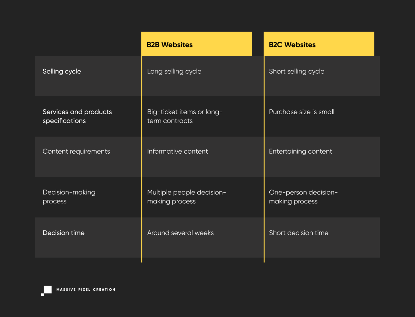
Time for a Decision
First of all, unlike most B2C customers, B2B clients often research potential purchase for several weeks. The reason is that B2B customers often involve multiple people in this process, from both the vendor’s company and their own.
Services and Products Specifications
B2B purchases are often big–ticket items or service contracts. The sites’ products and services are often extremely specialized, with complex specifications. Finally, decisions made on B2B websites can have long-term implications — after all, customers aren’t just making one-time purchases. They’re often buying into a long-term vendor relationship that includes support, follow-ups, and future enhancements and add-ons.
Content Requirements
Research and multicriteria decision-making dominate the B2B user experience. B2B websites must provide a much wider range of information than what’s common in the B2C sector. A B2B website has to offer simple facts that can be easily and quickly understood by an early prospect who’s just looking around to see what’s available.
Creating a well-designed and informative B2B customer journey map can greatly enhance this process, providing a clear roadmap for engaging and converting prospects at each stage of their buying journey.
Target Audience
Another major difference is that B2C users typically buy for themselves. Therefore, they use a one-person decision process: a single user provides the budget and approval, researches the options, makes the decision, completes the purchase, receives the shipment, and uses the product. In contrast, in B2B, each of these steps might involve different people and different departments. That’s why among B2B salespeople there are widely used terms like “choosers” and “users”. Later, as companies and individuals send transactional emails, these become more personalized and precise.
But a B2B website must address many different types of users with various needs. That’s why this added complexity only strengthens the argument for B2B websites to emphasize usability in their UX design.
In the meantime, you should also take security measures such as regarding DDoS attacks, cyberattacks, etc.
The Purchasing Phases of B2B Customers
It doesn’t matter whether you close the sale online or offline, supporting your target users’ purchase process is essential to converting prospects into paying customers. The key component in effective B2B marketing and sales is establishing credibility among prospective clients.
The nature of B2B products and services often demands long sales cycles that can take months or even years. Additionally, depending on the purchase phase, customers will have different needs. Therefore, B2B websites must consider all these variables, in order to:
- support the purchase process at each stage,
- establish and maintain good relationships with customers,
- increase TCR (task completion rate) on your website.
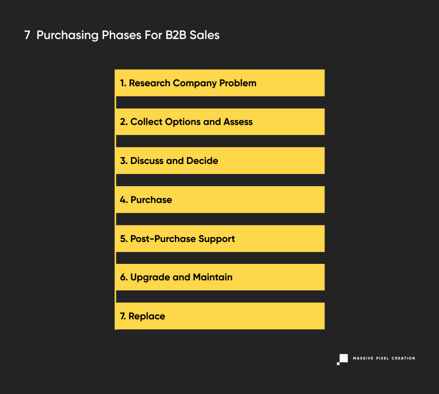
Research Company Problem
Usually, B2B customers start with a company problem that needs solving, not with a product they’ll have to justify purchasing. Especially when this is a new challenge to their business, this initial research phase is all about seeking out common solutions and identifying the top vendors. Some buyers skip this step for industries or problems that they are already familiar with.
What a good B2B website design needs at this stage:
- Content that shows expertise, examples of solutions, and already solved challenges. This can take the form of: blog posts and articles, case studies, landing pages that describe managed solutions for specific industries, and product pages about specific customer problems that can be solved with the vendor’s help. You can then repurpose that content sharing it in email newsletters that reach your potential clients directly. And to ensure data safety on both sides, you may want to use an SPF checker as well. Another way to do that is through a high quality podcast series featuring discussions with industry experts, video tutorials demonstrating product benefits, and interactive webinars showcasing real-world implementations to effectively educate, engage, and convert your target audience.
Collect Options and Assess
At this stage, users want to find lists of top vendors, learn more about the shortlisted companies, get a feel for them, call if necessary to fill in missing details, and refine research by getting answers to specific questions. Colleagues will often share options and collaborate to help put together a rubric or requirements for assessing the shortlisted companies.
What a good B2B website design needs at this stage:
- Detailed specs,
- Pricing information,
- Clear product photos,
- Case studies,
- Testimonials,
- Downloadable product assets.
Discuss and Decide
This stage features a heavy collaboration with colleagues from multiple departments to narrow the list of companies and make a final decision. Many B2B customers create presentation materials for the leadership to explain their decision in order to be granted authorization.
What a good B2B website design needs at this stage:
- Presentation materials,
- Pricing information,
- Lead times,
- Corporate and team member information,
- Comparison tools.
Purchase
Customers engage with sales representatives to negotiate a price or make an online purchase.
What a good B2B website design needs at this stage:
- Contact information,
- Locations of offices,
- Warranty for support information,
- Pricing information.
Post-Purchase Support
In the initial aftermath of the purchase, your customers will have higher support needs from your B2B website, ranging from technical support to questions about migrating from a competitor’s product to requesting adjustments.
What a good B2B website design needs at this stage:
- Technical support,
- Contact information for service and account representatives,
- Turnaround time for service,
- Implementation and migration guides,
- Technical documentation,
- Content on how to get the most value from the product.
Providing top-notch customer support is therefore essential in this stage. If you’re using email to do that, using an email verifier to ensure good deliverability might be a good idea.
Upgrade and Maintain
At this stage, your customers will be looking to extend the life of their purchase as much as possible. For large mechanical equipment, this often means buying parts, accessories, or consumables; sometimes users will want to upgrade service contracts to accommodate company growth. For software, this can mean purchasing upgrades, modules, and other stopgap solutions to make an older product retain usefulness until the next major purchasing cycle.
What a good B2B website design needs at this stage:
- Technical information for already owned products,
- Newer products that can replace older models,
- Add–ons, modules, and upgrades that can be added to the current product for more benefits,
- Parts and consumables.
Replace
The process starts again when a service contract ends or equipment reaches the end of its life.
What a good B2B website design needs at this stage:
- Newer products that can replace older models,
- Changes in the industry that require new equipment or services,
- Detailed specs,
- Clear product photos,
- Case studies,
- Testimonials,
- Downloadable product assets.
Understanding the purchasing phases for B2B customers is extremely important when you plan to implement user-centered design processes (UCD) while working on a website project. At the same time, if you already have a website, you can instantly identify the stages where your users’ needs are poorly covered.
Best Practices for B2B Websites
Demonstrate How You Solve Your Prospect’s Problems
B2B customers are ruthlessly focused on just one thing: how you can solve their problems. Your prospects come to you because their business faces a challenge they cannot deal with on their own, due to the lack of time, resources, or skills. Whether your prospects just need to replace the toner in the office copier, or they look for a partner to help them develop and implement a business strategy, they want to solve a problem. That’s why you should remember to always emphasize these topics on your B2B website and prove you know these challenges inside–out with solutions included.
It’s also a great practice to consider the context of the buyer’s problem and describe your products or services in a way that precedes any questions a client might have. Don’t just say “our cartridges contain 0.8ml of ink”, but rather “with our product, you can print up to 600 pages”. Another great example is Apple’s genius approach to marketing and their famous “1,000 songs in your pocket slogan” — they could have said “5GB of storage”, but instead they’ve turned the information around to make it more relevant to an average customer while addressing the issue of limited space on a device.
Another angle is to consider how people form their queries on Google. Most of the time, they’re not looking for specific models of printers — they will search for solutions to their problems (“why does my printer have lines”) or search for models with specific, non–technical characteristics (“which printer has the cheapest inks”) which also suggests an issue (in this case, limited budget). That’s why it’s important to target all these questions in advance and always be one step ahead of the customer.
Customers need to know immediately whether your organization has the capability to solve their problems. Provide signals on your site to let people know you cater to them.
It is worth emphasizing your unique value proposition too. Determine which elements of your business approach are key differentiators, then advertise them on the homepage and other relevant site areas. In this case, the price can be a key factor, but you should also include:
- Quick turnaround time for delivery of products,
- Quick turnaround time for services or consulting to begin,
- Customization, specialized products, and services,
- Unique feature set,
- Perceived quality,
- Compatibility with existing products or services,
- Location of the company,
- Shipping rates and delivery time.
Don’t forget to mention how you solved customer problems in the past. B2B prospects are seeking solutions to their challenges, and while a perfectly written copy might capture their attention, they will still demand proof.
Case studies, testimonials, reviews, and other ways of demonstrating success in past ventures are critical to turning skeptical website visitors into paying customers. For instance, you can offer reviews conducted by external, reputable sources or provide short and true-to-life case studies.
To summarize, demonstrating how you solve your prospect’s problems is a smart approach that can convince users to take specific actions and help you generate new leads on your B2B website.
Keeping Your Customers Engaged
Most B2B websites don’t sell to prospects immediately upon their first visit. With a long sales cycle, B2B websites have to be able to provide valuable information to prospects on a recurring basis in order to close the sale. In fact, the sites that provide the most helpful information to prospects are ones that they return to over and over again as they near the purchasing phase of the sales cycle. This recurring engagement is a crucial part of the customer success process, ensuring that businesses build strong relationships with their clients and guide them through the sales journey effectively.
Providing business value for customers and showcasing valuable content for them is one of digital marketing’s main tasks. There’s lots of talk these days about content strategy (which should be supported by content marketing) and its value for B2B websites.
Content is generated on a recurring basis to both build SEO (Search Engine Optimization) value and to draw returning visitors to your website. Content strategy is only valuable if it helps your prospects understand the business challenges that you solve, and why your expertise helps them.
Focus your efforts on describing common challenges your prospects face and how your company solves these issues. Remember when writing the content that many of your best prospects may have no idea who you are, but if you have a blog post that offers a simple breakdown of their problem, they’re more likely to revisit your website and put you on their shortlist. Providing useful resources differentiates you from your competitors by establishing your organization as having expertise and credibility — qualities every organization seeks.
Considering all of the above, you can use such types of resources as:
- customer guides,
- blog page with thorough articles,
- resource base,
- whitepapers.
So to increase organic search traffic and lead generation on your B2B website, you should optimize the content on the entire site not only for search engines but also for your specific target audience.
Create Good First Impression
A first impression can make or break potential transactions. People judge the company’s competence by the way the website looks. An organized and coherent website instills trust and proves competence. UI designers should keep in mind the “less is more” concept — cluttered design and bad information architecture will only lead to confusion. That’s why in the design process, this concept helps to prioritize user interface (UI) elements and, accordingly, reduce the number of unnecessary elements on each page layout.
Also, people have different expectations for what websites should look like depending on the industry. For example, people expect a website in creative industries to reflect a company’s philosophy. Technology companies aren’t held up to the same aesthetic standards as design agencies. More emphasis is placed on clean designs that express professionalism and expertise.
On the other hand, your UI design impacts the audience’s perception of your organization. In a split second, users interact with an interface and decide whether the website is worth their effort. When there’s a mismatch between a site’s user interface design and the company’s business image, people assume that the organization doesn’t have what they want and go elsewhere. UI design also serves another important purpose: people can instantly identify whether they’re on the right web page.
UI Design
Every UI or web designer should remember that a B2B website design isn’t about a lifestyle brand, it needs to convey professional expertise and competence. Carefully consider whether trendy design patterns and visual styles support a message of stability and reliability — especially since many design trends come and go. Pay attention to core design principles and visual guidelines that help users understand your website: visual hierarchy, negative space and balance, and element affordance.
No matter where your organization falls on the creativity spectrum, it’s important to have a simple interaction design. Simple interaction models match people’s mental models by behaving in expected ways. Business customers need websites to streamline their processes, answering their questions quickly and easily. Although creative designs can be delightful, simplicity must come first.
Subtle Cues
Make your UI design more user-friendly and provide subtle cues. Even when users think a website has what they want, scrolling takes effort, and they typically do it only if they see the proper visual cues. How you place critical elements on the web page can dictate whether people scroll or not. Placing indicators such as headers or content that peeks out into the display’s viewable area suggests that there’s more content below.
Loading Time
Make sure that your site loads quickly. If it takes more than six seconds to load, the users abandon the site. To avoid that, remove unnecessary elements and media that negatively impact page speed. Buggy or unstable elements that take too long to load reduce the user experience and prospect’s impression of your organization. Optimize file sizes and minimize loading time, especially when designing for business audiences.
Also, make sure you pick the best web hosting provider.
Tone of Voice
Use a reasoned, neutral voice on your website. Avoid excessive marketing-speak and meaningless sales phrases. Business customers prefer a straightforward tone that describes the company’s business without hyperbole. Easy access to information and even-handed comparison of products or services make participants feel like the company has nothing to hide.
Content
Write and present content in a way that optimizes scanning, for example by using such elements as headings, subheadings, large type, bold text, highlighted text, bulleted lists, graphics, and captions. Write text that is short and to the point. Don’t overload people with too much text; that can feel overwhelming and intimidating. Instead, use concise and simple language, as well as break up large blocks of information into short paragraphs.
About Us Section
Offer the About Us section regardless of your company’s size. Sometimes small and medium-sized businesses neglect to have an About Us section on their website, thinking it’s not important.
Surprise — it is. According to B2B Web Usability Report from 2015, 52% of respondents indicated that they want to see the About Us section on the vendor website home page. Only two other pages — Contact and Products & Services — got higher results (64% and 86%, respectively).
The About Us page is particularly important to companies whose brand is not widely recognized. On the other hand, household names can afford to neglect this section.
Navigation
Users prefer consistent navigational structures, especially in business situations where time is scarce. Consistent navigation helps users visualize their current location in site structure and identify alternative options, making it easier to find information and keep track of where they are. Make sure that links in header and footer navigation are named and grouped correctly both on desktop and mobile devices.
Key Takeaways
- Prove your professionalism and expertise to your potential customers at every step. The key is to understand your prospects’ problems and provide appropriate solutions that are better than your competitors.
- Engage your customers at each stage of the purchasing process. Provide meaningful content and valuable resources that keep the user’s attention.
- Create a good first impression using appropriate UI design, tone of voice, and convenient navigation that streamlines purchasing processes.
Conclusion
Whether you use all of these practices or just a few, remember to keep in mind that you create a B2B website design for your target audience. If you don’t know the specific problems and needs of your target audience, you should run user research first, or else you’ll totally misjudge your prospects and give the wrong impression.
If you’d like to learn more about shaping your content towards a specific audience and how to generate leads, read this article on Customer Acquisition Strategy. Without that knowledge, even all those tips on UX/UI design won’t save you from lack of engagement.
So keep all that in mind and design away!
The Accessibility Problem With Authentication Methods Like CAPTCHA
CAPTCHAs were meant to keep bots out, but too often, they lock people with disabilities out, too. From image classification to click-based tests, many “human checks” are anything but inclusive. Th
Ux
The Accessibility Problem With Authentication Methods Like CAPTCHA
Eleanor Hecks
The Completely Automated Public Turing test to tell Computers and Humans Apart (CAPTCHA) has become ingrained in internet browsing since personal computers gained momentum in the consumer electronics market. For nearly as long as people have been going online, web developers have sought ways to block spam bots.
The CAPTCHA service distinguishes between human and bot activity to keep bots out. Unfortunately, its methods are less than precise. In trying to protect humans, developers have made much of the web inaccessible to people with disabilities.

Authentication methods, such as CAPTCHA, typically use image classification, puzzles, audio samples, or click-based tests to determine whether the user is human. While the types of challenges are well-documented, their logic is not public knowledge. People can only guess what it takes to “prove” they are human.
What Is CAPTCHA?
A CAPTCHA is a reverse Turing test that takes the form of a challenge-response test. For example, if it instructs users to “select all images with stairs,” they must pick the stairs out from railings, driveways, and crosswalks. Alternatively, they may be asked to enter the text they see, add the sum of dice faces, or complete a sliding puzzle.
Image-based CAPTCHAs are responsible for the most frustrating shared experiences internet users have — deciding whether to select a square when only a small sliver of the object in question is in it.
Regardless of the method, a computer or algorithm ultimately determines whether the test-taker is human or machine. This authentication service has spawned many offshoots, including reCAPTCHA and hCAPTCHA. It has even led to the creation of entire companies, such as GeeTest and Arkose Labs. The Google-owned automated system reCAPTCHA requires users to click a checkbox labeled “I’m not a robot” for authentication. It runs an adaptive analysis in the background to assign a risk score. hCAPTCHA is an image-classification-based alternative.
Other authentication methods include multi-factor authentication (MFA), QR codes, temporary personal identification numbers (PINs), and biometrics. They do not follow the challenge-response formula, but serve fundamentally similar purposes.
These offshoots are intended to be better than the original, but they often fail to meet modern accessibility standards. Take hCaptcha, for instance, which uses a cookie to let you bypass the challenge-response test entirely. It’s a great idea in theory, but it doesn’t work in practice.
You’re supposed to receive a one-time code via email that you send to a specific number over SMS. Users report receiving endless error messages, forcing them to complete the standard text CAPTCHA. This is only available if the site explicitly enabled it during configuration. If it is not set up, you must complete an image challenge that does not recognize screen readers.
Even when the initial process works, subsequent authentication relies on a third-party cross-site cookie, which most browsers block automatically. Also, the code expires after a short period, so you have to redo the entire process if it takes you too long to move on to the next step.
Why Do Teams Use CAPTCHA And Similar Authentication Methods?
CAPTCHA is common because it is easy to set up. Developers can program it to appear, and it conducts the test automatically. This way, they can focus on more important matters while still preventing spam, fraud, and abuse. These tools are supposed to make it easier for humans to use the internet safely, but they often keep real people from logging in.
These tests result in a poor user experience overall. One study found users wasted over 819 million hours on over 512 billion reCAPTCHA v2 sessions as of 2023. Despite it all, bots prevail. Machine learning models can solve text-based CAPTCHA within fractions of a second with over 97% accuracy.
A 2024 study on Google’s reCAPTCHA v2 — which is still widely used despite the rollout of reCAPTCHA v3 — found bots can solve image classification CAPTCHA with up to 100% accuracy, depending on the object they are tasked with identifying. The researchers used a free, open-source model, which means that bad actors could easily replicate their work.
Why Should Web Developers Stop Using CAPTCHA?
Authentication methods like CAPTCHA have an accessibility problem. Machine learning advances forced these services to grow increasingly complex. Even still, they are not foolproof. Bots get it right more than people do. Research shows they can complete reCAPTCHA within 17.5 seconds, achieving 85% accuracy. Humans take longer and are less accurate.
Many people fail CAPTCHA tests and have no idea what they did wrong. For example, a prompt instructing users to “select all squares with traffic lights” seems simple enough, but it gets complicated if a sliver of the pole is in another square. Should they select that box, or is that what an algorithm would do?
Although bot capabilities have grown by magnitudes, humans have remained the same. As tests get progressively more difficult, they feel less inclined to attempt them. One survey shows nearly 59% of people will stop using a product after several bad experiences. If authentication is too cumbersome or complex, they might stop using the website entirely.
People can fail these tests for various reasons, including technical ones. If they block third-party cookies, have a local proxy running, or have not updated their browser in a while, they may keep failing, regardless of how many times they try.
Authentication Issues With CAPTCHA
Due to the reasons mentioned above, most types of CAPTCHA are inherently inaccessible. This is especially true for people with disabilities, as these challenge-response tests were not designed with their needs in mind. Some of the common issues include the following:
Issues Related To Visuals And Screen Reader Use
Screen readers cannot read standard visual CAPTCHAs, such as the distorted text test, since the jumbled, contorted words are not machine-readable. The image classification and sliding puzzle methods are similarly inaccessible.
In one WebAIM survey conducted from 2023 to 2024, screen reader users agreed CAPTCHA was the most problematic item, ranking it above ambiguous links, unexpected screen changes, missing alt text, inaccessible search, and lack of keyboard accessibility. Its spot at the top has remained largely unchanged for over a decade, illustrating its history of inaccessibility.
Issues Related To Hearing and Audio Processing
Audio CAPTCHAs are relatively uncommon because web development best practices advise against autoplay audio and emphasize the importance of user controls. However, audio CAPTCHAs still exist. People who are hard of hearing or deaf may encounter a barrier when attempting these tests. Even with assistive technology, the intentional audio distortion and background noise make these samples challenging for individuals with auditory processing disorders to comprehend.
Issues Related To Motor And Dexterity
Tests requiring motor and dexterity skills can be challenging for those with motor impairments or physical disabilities. For example, someone with a hand tremor may find the sliding puzzles difficult. Also, the image classification tests that load more images until none that fit the criteria are left may pose a challenge.
Issues Related To Cognition And Language
As CAPTCHAs become increasingly complex, some developers are turning to tests that require a combination of creative and critical thinking. Those that require users to solve a math problem or complete a puzzle can be challenging for people with dyslexia, dyscalculia, visual processing disorders, or cognitive impairments.
Why Assistive Technology Won’t Bridge The Gap
CAPTCHAs are intentionally designed for humans to interpret and solve, so assistive technology like screen readers and hands-free controls may be of little help. ReCAPTCHA in particular poses an issue because it analyzes background activity. If it flags the accessibility devices as bots, it will serve a potentially inaccessible CAPTCHA.
Even if this technology could bridge the gap, web developers shouldn’t expect it to. Industry standards dictate that they should follow universal design principles to make their websites as accessible and functional as possible.
“
There are better alternatives.
Principles For Accessible Authentication
The idea that humans should consistently outperform algorithms is outdated. Better authentication methods exist, such as multifactor authentication (MFA). The two-factor authentication market will be worth an estimated $26.7 billion by 2027, underscoring its popularity. This tool is more effective than a CAPTCHA because it prevents unauthorized access, even with legitimate credentials.

Ensure your MFA technique is accessible. Instead of having website visitors transcribe complex codes, you should send push notifications or SMS messages. Rely on the verification code autofill to automatically capture and enter the code. Alternatively, you can introduce a “remember this device” feature to skip authentication on trusted devices.
Apple’s two-factor authentication approach is designed this way. A trusted device automatically displays a six-digit verification code, so they do not have to search for it. When prompted, iPhone users can tap the suggestion that appears above their mobile keyboard for autofill.
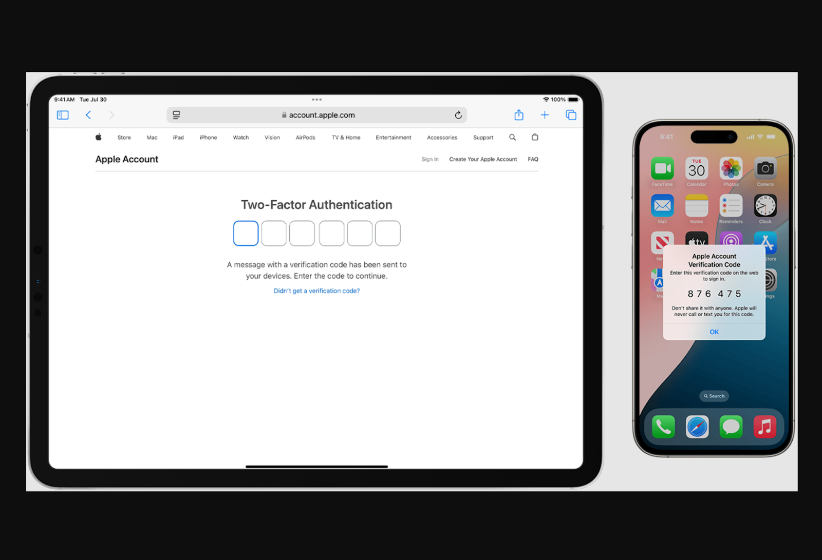
Single sign-on is another option. This session and user authentication service allows people to log in to multiple websites or applications with a single set of login credentials, minimizing the need for repeated identity verification.
One-time-use “magic links” are an excellent alternative to reCAPTCHA and temporary PINs. Rather than remembering a code or solving a puzzle, the user clicks on a button. Avoid imposing deadlines because, according to WCAG Success Criterion 2.2.3, users should not face time limits since those with disabilities may need more time to complete specific actions.
Alternatively, you could use Cloudflare Turnstile. It authenticates without showing a CAPTCHA, and most people never even have to check a box or hit a button. The software works by issuing a small JavaScript challenge behind the scenes to automatically differentiate between bots and humans. Cloudflare Turnstile can be embedded into any website, making it an excellent alternative to standard classification tasks.
Testing And Evaluation Of Accessible Authentication Designs
Testing and evaluating your accessible alternative authentication methods is essential. Many designs look good on paper but do not work in practice. If possible, gather feedback from actual users. An open beta may be an effective way to maximize visibility.
Remember, general accessibility considerations do not only apply to people with disabilities. They also include those who are neurodivergent, lack access to a mobile device, or use assistive technology. Ensure your alternative designs consider these individuals.
Realistically, you cannot create a perfect system since everyone is unique. Many people struggle to follow multistep processes, solve equations, process complex instructions, or remember passcodes. While universal web design principles can improve flexibility, no single solution can meet everyone’s needs.
“
Address The Accessibility Problem With Design Changes
A person with hand tremors may be unable to complete a sliding puzzle, while someone with an audio processing disorder may have trouble with distorted audio samples. However, you cannot simply replace CAPTCHAs with alternatives because they are often equally inaccessible.
QR codes, for example, may be difficult to scan for those with reduced fine motor control. People who are visually impaired may struggle to find it on the screen. Similarly, biometrics can pose an issue for people with facial deformities or a limited range of motion. Addressing the accessibility problem requires creative thinking.
You can start by visiting the Web Accessibility Initiative’s accessibility tutorials for developers to better understand universal design. Although these tutorials focus more on content than authentication, you can still use them to your advantage. The W3C Group Draft Note on the Inaccessibility of CAPTCHA provides more relevant guidance.
Getting started is as easy as researching best practices. Understanding the basics is essential because there is no universal solution for accessible web design. If you want to optimize accessibility, consider sourcing feedback from the people who actually visit your website.
Further Reading
- “The CAPTCHA: Perspectives and Challenges,” Darko Brodić and Alessia Amelio
- “Designing Accessible Text Over Images: Best Practices, Techniques, And Resources,” Hannah Milan
- “In Search Of The Best CAPTCHA,” David Bushell
- “WCAG 3.0’s Proposed Scoring Model: A Shift in Accessibility Evaluation,” Mikhail Prosmitskiy
(yk)
The Accessibility Problem With Authentication Methods Like CAPTCHA
The Accessibility Problem With Authentication Methods Like CAPTCHA The Accessibility Problem With Authentication Methods Like CAPTCHA Eleanor Hecks 2025-11-27T10:00:00+00:00 2025-12-03T15:02:58+00:00 The Completely Automated Public Turing test to tell Computers and Humans Apart (CAPTCHA) has become ingrained in internet browsing since personal computers gained momentum in […]
Accessibility
The Accessibility Problem With Authentication Methods Like CAPTCHA
Eleanor Hecks 2025-11-27T10:00:00+00:00
2025-12-03T15:02:58+00:00
The Completely Automated Public Turing test to tell Computers and Humans Apart (CAPTCHA) has become ingrained in internet browsing since personal computers gained momentum in the consumer electronics market. For nearly as long as people have been going online, web developers have sought ways to block spam bots.
The CAPTCHA service distinguishes between human and bot activity to keep bots out. Unfortunately, its methods are less than precise. In trying to protect humans, developers have made much of the web inaccessible to people with disabilities.

Authentication methods, such as CAPTCHA, typically use image classification, puzzles, audio samples, or click-based tests to determine whether the user is human. While the types of challenges are well-documented, their logic is not public knowledge. People can only guess what it takes to “prove” they are human.

What Is CAPTCHA?
A CAPTCHA is a reverse Turing test that takes the form of a challenge-response test. For example, if it instructs users to “select all images with stairs,” they must pick the stairs out from railings, driveways, and crosswalks. Alternatively, they may be asked to enter the text they see, add the sum of dice faces, or complete a sliding puzzle.
Image-based CAPTCHAs are responsible for the most frustrating shared experiences internet users have — deciding whether to select a square when only a small sliver of the object in question is in it.

Regardless of the method, a computer or algorithm ultimately determines whether the test-taker is human or machine. This authentication service has spawned many offshoots, including reCAPTCHA and hCAPTCHA. It has even led to the creation of entire companies, such as GeeTest and Arkose Labs. The Google-owned automated system reCAPTCHA requires users to click a checkbox labeled “I’m not a robot” for authentication. It runs an adaptive analysis in the background to assign a risk score. hCAPTCHA is an image-classification-based alternative.
Other authentication methods include multi-factor authentication (MFA), QR codes, temporary personal identification numbers (PINs), and biometrics. They do not follow the challenge-response formula, but serve fundamentally similar purposes.
These offshoots are intended to be better than the original, but they often fail to meet modern accessibility standards. Take hCaptcha, for instance, which uses a cookie to let you bypass the challenge-response test entirely. It’s a great idea in theory, but it doesn’t work in practice.
You’re supposed to receive a one-time code via email that you send to a specific number over SMS. Users report receiving endless error messages, forcing them to complete the standard text CAPTCHA. This is only available if the site explicitly enabled it during configuration. If it is not set up, you must complete an image challenge that does not recognize screen readers.
Even when the initial process works, subsequent authentication relies on a third-party cross-site cookie, which most browsers block automatically. Also, the code expires after a short period, so you have to redo the entire process if it takes you too long to move on to the next step.
Why Do Teams Use CAPTCHA And Similar Authentication Methods?
CAPTCHA is common because it is easy to set up. Developers can program it to appear, and it conducts the test automatically. This way, they can focus on more important matters while still preventing spam, fraud, and abuse. These tools are supposed to make it easier for humans to use the internet safely, but they often keep real people from logging in.
These tests result in a poor user experience overall. One study found users wasted over 819 million hours on over 512 billion reCAPTCHA v2 sessions as of 2023. Despite it all, bots prevail. Machine learning models can solve text-based CAPTCHA within fractions of a second with over 97% accuracy.
A 2024 study on Google’s reCAPTCHA v2 — which is still widely used despite the rollout of reCAPTCHA v3 — found bots can solve image classification CAPTCHA with up to 100% accuracy, depending on the object they are tasked with identifying. The researchers used a free, open-source model, which means that bad actors could easily replicate their work.
Why Should Web Developers Stop Using CAPTCHA?
Authentication methods like CAPTCHA have an accessibility problem. Machine learning advances forced these services to grow increasingly complex. Even still, they are not foolproof. Bots get it right more than people do. Research shows they can complete reCAPTCHA within 17.5 seconds, achieving 85% accuracy. Humans take longer and are less accurate.
Many people fail CAPTCHA tests and have no idea what they did wrong. For example, a prompt instructing users to “select all squares with traffic lights” seems simple enough, but it gets complicated if a sliver of the pole is in another square. Should they select that box, or is that what an algorithm would do?
Although bot capabilities have grown by magnitudes, humans have remained the same. As tests get progressively more difficult, they feel less inclined to attempt them. One survey shows nearly 59% of people will stop using a product after several bad experiences. If authentication is too cumbersome or complex, they might stop using the website entirely.
People can fail these tests for various reasons, including technical ones. If they block third-party cookies, have a local proxy running, or have not updated their browser in a while, they may keep failing, regardless of how many times they try.
Authentication Issues With CAPTCHA
Due to the reasons mentioned above, most types of CAPTCHA are inherently inaccessible. This is especially true for people with disabilities, as these challenge-response tests were not designed with their needs in mind. Some of the common issues include the following:
Issues Related To Visuals And Screen Reader Use
Screen readers cannot read standard visual CAPTCHAs, such as the distorted text test, since the jumbled, contorted words are not machine-readable. The image classification and sliding puzzle methods are similarly inaccessible.
In one WebAIM survey conducted from 2023 to 2024, screen reader users agreed CAPTCHA was the most problematic item, ranking it above ambiguous links, unexpected screen changes, missing alt text, inaccessible search, and lack of keyboard accessibility. Its spot at the top has remained largely unchanged for over a decade, illustrating its history of inaccessibility.
Issues Related To Hearing and Audio Processing
Audio CAPTCHAs are relatively uncommon because web development best practices advise against autoplay audio and emphasize the importance of user controls. However, audio CAPTCHAs still exist. People who are hard of hearing or deaf may encounter a barrier when attempting these tests. Even with assistive technology, the intentional audio distortion and background noise make these samples challenging for individuals with auditory processing disorders to comprehend.
Issues Related To Motor And Dexterity
Tests requiring motor and dexterity skills can be challenging for those with motor impairments or physical disabilities. For example, someone with a hand tremor may find the sliding puzzles difficult. Also, the image classification tests that load more images until none that fit the criteria are left may pose a challenge.
Issues Related To Cognition And Language
As CAPTCHAs become increasingly complex, some developers are turning to tests that require a combination of creative and critical thinking. Those that require users to solve a math problem or complete a puzzle can be challenging for people with dyslexia, dyscalculia, visual processing disorders, or cognitive impairments.
Why Assistive Technology Won’t Bridge The Gap
CAPTCHAs are intentionally designed for humans to interpret and solve, so assistive technology like screen readers and hands-free controls may be of little help. ReCAPTCHA in particular poses an issue because it analyzes background activity. If it flags the accessibility devices as bots, it will serve a potentially inaccessible CAPTCHA.
Even if this technology could bridge the gap, web developers shouldn’t expect it to. Industry standards dictate that they should follow universal design principles to make their websites as accessible and functional as possible.
CAPTCHA’s accessibility issues could be forgiven if it were an effective security tool, but it is far from foolproof since bots get it right more than humans do. Why keep using a method that is ineffective and creates barriers for people with disabilities?
“
There are better alternatives.
Principles For Accessible Authentication
The idea that humans should consistently outperform algorithms is outdated. Better authentication methods exist, such as multifactor authentication (MFA). The two-factor authentication market will be worth an estimated $26.7 billion by 2027, underscoring its popularity. This tool is more effective than a CAPTCHA because it prevents unauthorized access, even with legitimate credentials.

Ensure your MFA technique is accessible. Instead of having website visitors transcribe complex codes, you should send push notifications or SMS messages. Rely on the verification code autofill to automatically capture and enter the code. Alternatively, you can introduce a “remember this device” feature to skip authentication on trusted devices.
Apple’s two-factor authentication approach is designed this way. A trusted device automatically displays a six-digit verification code, so they do not have to search for it. When prompted, iPhone users can tap the suggestion that appears above their mobile keyboard for autofill.
Single sign-on is another option. This session and user authentication service allows people to log in to multiple websites or applications with a single set of login credentials, minimizing the need for repeated identity verification.
One-time-use “magic links” are an excellent alternative to reCAPTCHA and temporary PINs. Rather than remembering a code or solving a puzzle, the user clicks on a button. Avoid imposing deadlines because, according to WCAG Success Criterion 2.2.3, users should not face time limits since those with disabilities may need more time to complete specific actions.
Alternatively, you could use Cloudflare Turnstile. It authenticates without showing a CAPTCHA, and most people never even have to check a box or hit a button. The software works by issuing a small JavaScript challenge behind the scenes to automatically differentiate between bots and humans. Cloudflare Turnstile can be embedded into any website, making it an excellent alternative to standard classification tasks.
Testing And Evaluation Of Accessible Authentication Designs
Testing and evaluating your accessible alternative authentication methods is essential. Many designs look good on paper but do not work in practice. If possible, gather feedback from actual users. An open beta may be an effective way to maximize visibility.
Remember, general accessibility considerations do not only apply to people with disabilities. They also include those who are neurodivergent, lack access to a mobile device, or use assistive technology. Ensure your alternative designs consider these individuals.
Realistically, you cannot create a perfect system since everyone is unique. Many people struggle to follow multistep processes, solve equations, process complex instructions, or remember passcodes. While universal web design principles can improve flexibility, no single solution can meet everyone’s needs.
Regardless of the authentication technique you use, you should present users with multiple authentication options upfront. They know their capabilities best, so let them decide what to use instead of trying to over-engineer a solution that works for every edge case.
“
Address The Accessibility Problem With Design Changes
A person with hand tremors may be unable to complete a sliding puzzle, while someone with an audio processing disorder may have trouble with distorted audio samples. However, you cannot simply replace CAPTCHAs with alternatives because they are often equally inaccessible.
QR codes, for example, may be difficult to scan for those with reduced fine motor control. People who are visually impaired may struggle to find it on the screen. Similarly, biometrics can pose an issue for people with facial deformities or a limited range of motion. Addressing the accessibility problem requires creative thinking.
You can start by visiting the Web Accessibility Initiative’s accessibility tutorials for developers to better understand universal design. Although these tutorials focus more on content than authentication, you can still use them to your advantage. The W3C Group Draft Note on the Inaccessibility of CAPTCHA provides more relevant guidance.
Getting started is as easy as researching best practices. Understanding the basics is essential because there is no universal solution for accessible web design. If you want to optimize accessibility, consider sourcing feedback from the people who actually visit your website.
Further Reading
- “The CAPTCHA: Perspectives and Challenges,” Darko Brodić and Alessia Amelio
- “Designing Accessible Text Over Images: Best Practices, Techniques, And Resources,” Hannah Milan
- “In Search Of The Best CAPTCHA,” David Bushell
- “WCAG 3.0’s Proposed Scoring Model: A Shift in Accessibility Evaluation,” Mikhail Prosmitskiy
(yk)
Six Key Components of UX Strategy
Let’s dive into the building blocks of UX strategy and see how it speaks the language of product and business strategy to create user value while achieving company goals. Part of the Measure UX &
Ux
Six Key Components of UX Strategy
Vitaly Friedman
For years, “UX strategy” felt like a confusing, ambiguous, and overloaded term to me. To me, it was some sort of a roadmap or a “grand vision”, with a few business decisions attached to it. And looking back now, I realize that I was wrong all along.
UX Strategy isn’t a goal; it’s a journey towards that goal. A journey connecting where UX is today with a desired future state of UX. And as such, it guides our actions and decisions, things we do and don’t do. And its goal is very simple: to maximize our chances of success while considering risks, bottlenecks and anything that might endanger the project.
Let’s explore the components of UX strategy, and how it works with product strategy and business strategy to deliver user value and meet business goals.
Strategy vs. Goals vs. Plans
When we speak about strategy, we often speak about planning and goals — but they are actually quite different. While strategy answers “what” we’re doing and “why”, planning is about “how” and “when” we’ll get it done. And the goal is merely a desired outcome of that entire journey.
- Goals establish a desired future outcome,
- That outcome typically represents a problem to solve,
- Strategy shows a high-level solution for that problem,
- Plan is a detailed set of low-level steps for getting the solution done.

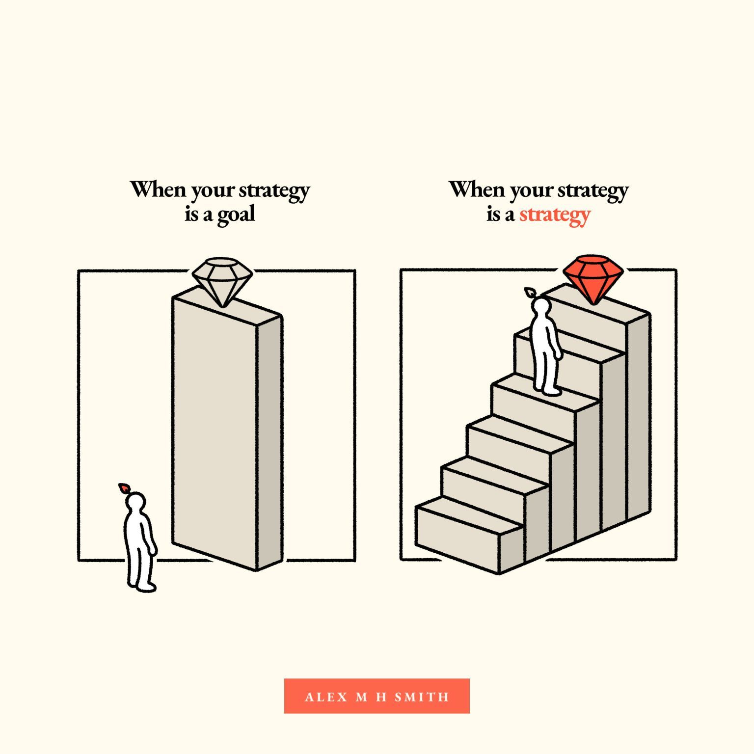
A strong strategy requires making conscious, and oftentimes tough, decisions about what we will do — and just as importantly, what we will not do, and why.
Business Strategy
UX strategy doesn’t live in isolation. It must inform and support product strategy and be aligned with business strategy. All these terms are often slightly confusing and overloaded, so let’s clear it up.
At the highest level, business strategy is about the distinct choices executives make to set the company apart from its competitors. They shape the company’s positioning, objectives, and (most importantly!) competitive advantage.

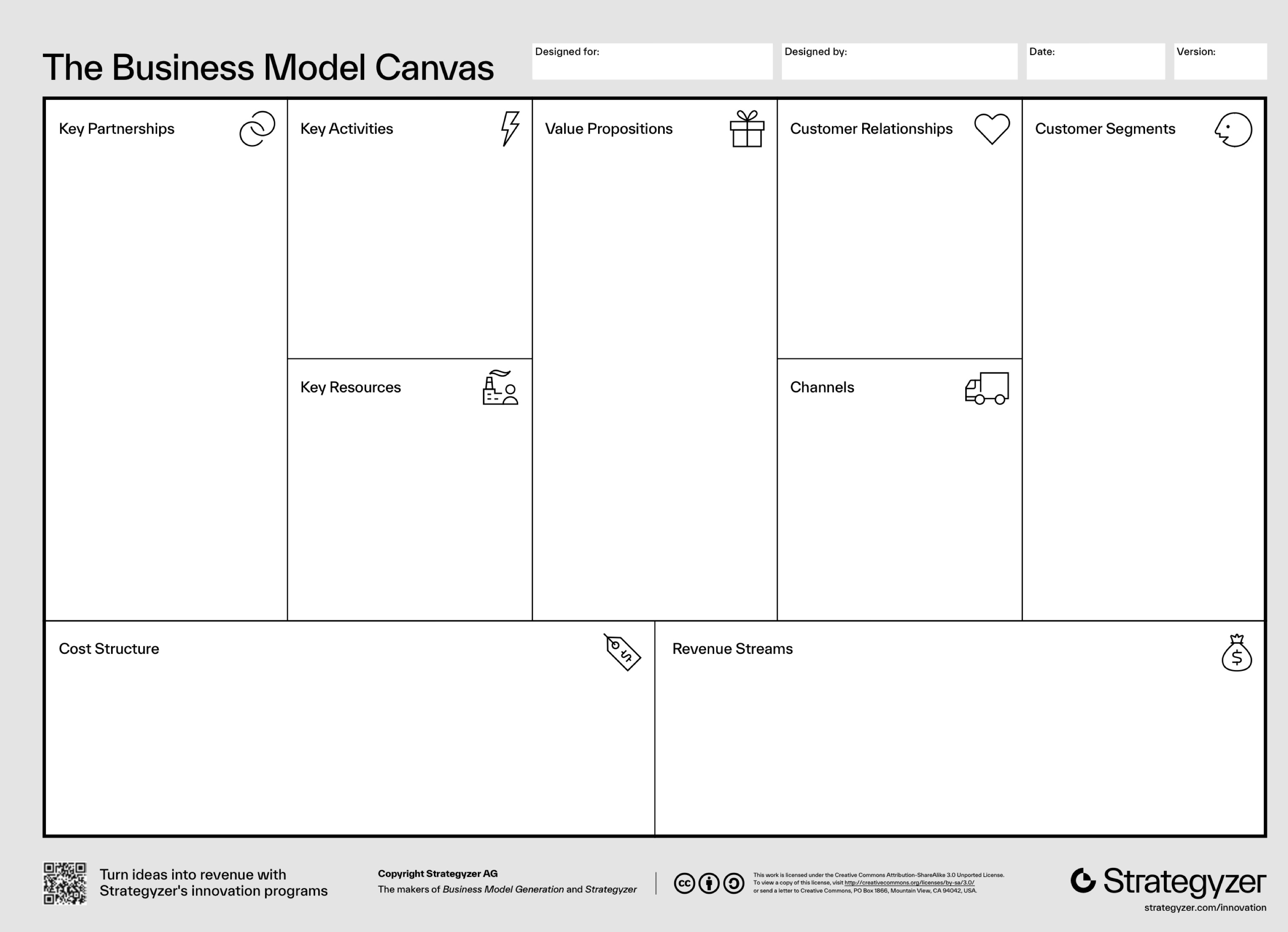
Typically, this advantage is achieved in two ways: through lower prices (cost leadership) or through differentiation. The latter part isn’t about being different, but rather being perceived differently by the target audience. And that’s exactly where UX impact steps in.
In short, business strategy is:
- A top-line vision, basis for core offers,
- Shapes positioning, goals, competitive advantage,
- Must always adapt to the market to keep a competitive advantage.
Product Strategy
Product strategy is how a high-level business direction is translated into a unique positioning of a product. It defines what the product is, who its users are, and how it will contribute to the business’s goals. It’s also how we bring a product to market, drive growth, and achieve product-market fit.
In short, product strategy is:
- Unique positioning and value of a product,
- How to establish and keep a product in the marketplace,
- How to keep competitive advantage of the product.
UX Strategy
UX strategy is about shaping and delivering product value through UX. Good UX strategy always stems from UX research and answers to business needs. It established what to focus on, what our high-value actions are, how we’ll measure success, and — quite importantly — what risks we need to mitigate.
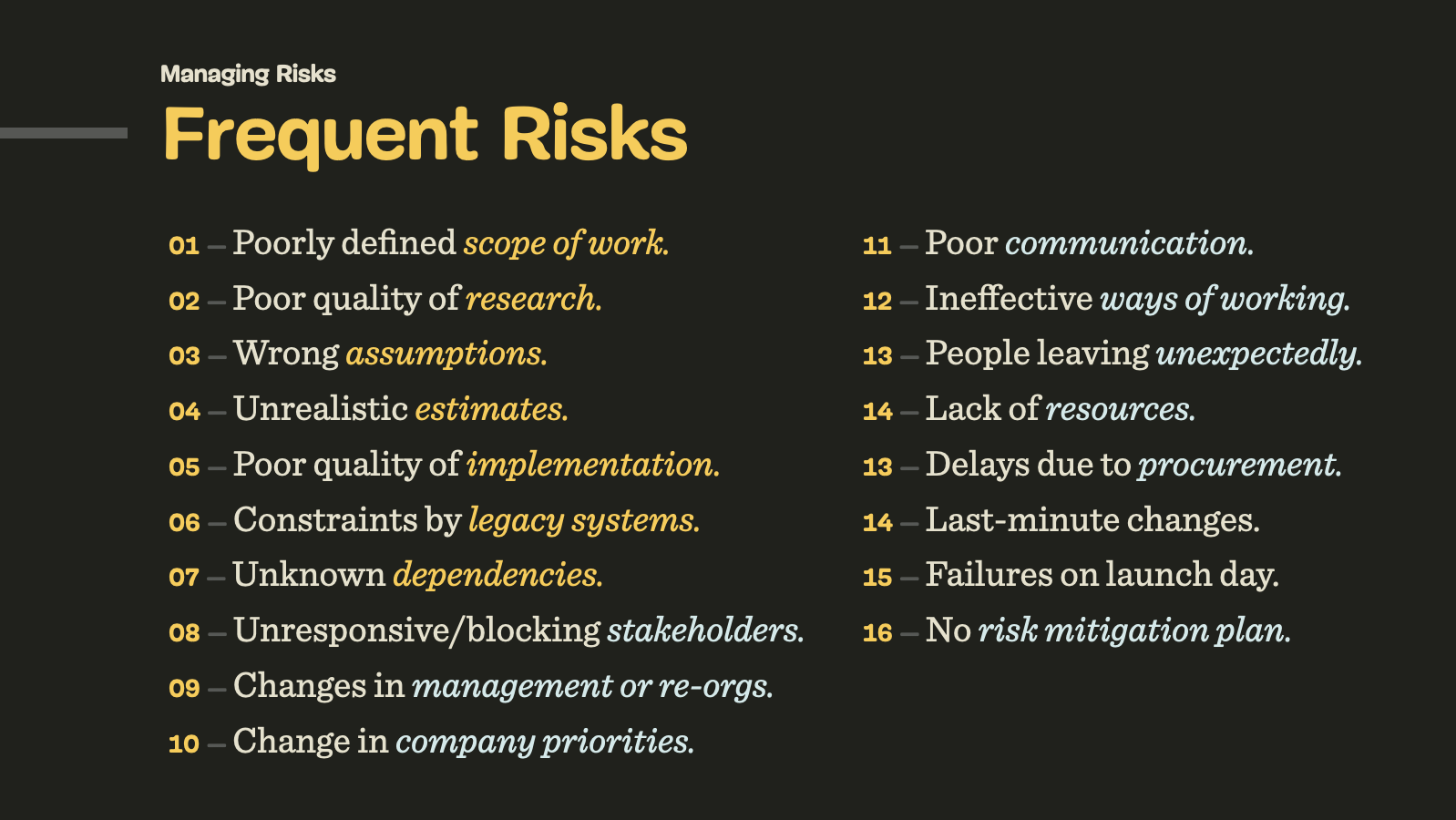
Most importantly, it’s not a fixed plan or a set of deliverables; it’s a guide that informs our actions, but also must be prepared to change when things change.

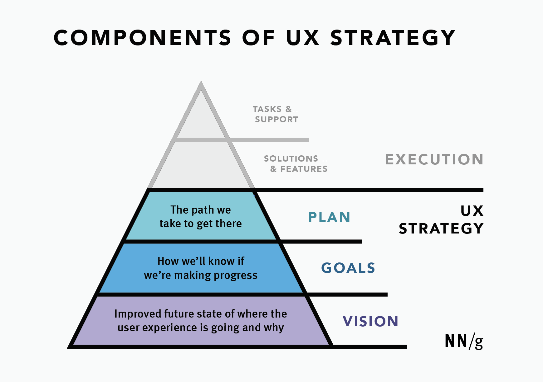
In short, UX strategy is:
- How we shape and deliver product value through UX,
- Priorities, focus + why, actions, metrics, risks,
- Isn’t a roadmap, intention or deliverables.
Six Key Components of UX Strategy
The impact of good UX typically lives in differentiation mentioned above. Again, it’s not about how “different” our experience is, but the unique perceived value that users associate with it. And that value is a matter of a clear, frictionless, accessible, fast, and reliable experience wrapped into the product.
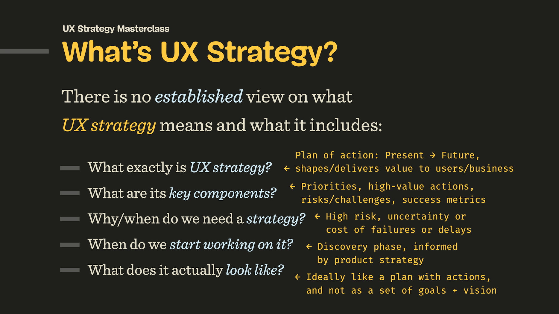
I always try to include 6 key components in any strategic UX work so we don’t end up following a wrong assumption that won’t bring any impact:
- Target goal
The desired, improved future state of UX. - User segments
Primary users that we are considering. - Priorities
What we will and, crucially, what we will not do, and why. - High-value actions
How we drive value and meet user and business needs. - Feasibility
Realistic assessment of people, processes, and resources. - Risks
Bottlenecks, blockers, legacy constraints, big unknowns.
It’s worth noting that it’s always dangerous to be designing a product with everybody in mind. As Jamie Levy noted, by being very broad too early, we often reduce the impact of our design and messaging. It’s typically better to start with a specific, well-defined user segment and then expand, rather than the other way around.
Practical Example (by Alin Buda)
UX strategy doesn’t have to be a big 40-page long PDF report or a Keynote presentation. A while back, Alin Buda kindly left a comment on one of my LinkedIn posts, giving a great example of what a concise UX strategy could look like:
UX Strategy (for Q4)
Our UX strategy is to focus on high-friction workflows for expert users, not casual usability improvements. Why? Because retention in this space is driven by power-user efficiency, and that aligns with our growth model.
To succeed, we’ll design workflow accelerators and decision-support tools that will reduce time-on-task. As a part of it, we’ll need to redesign legacy flows in the Crux system. We won’t prioritize UI refinements or onboarding tours, because it doesn’t move the needle in this context.
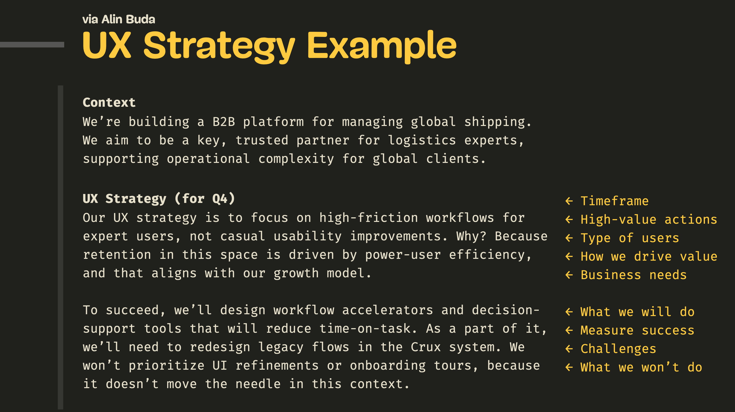
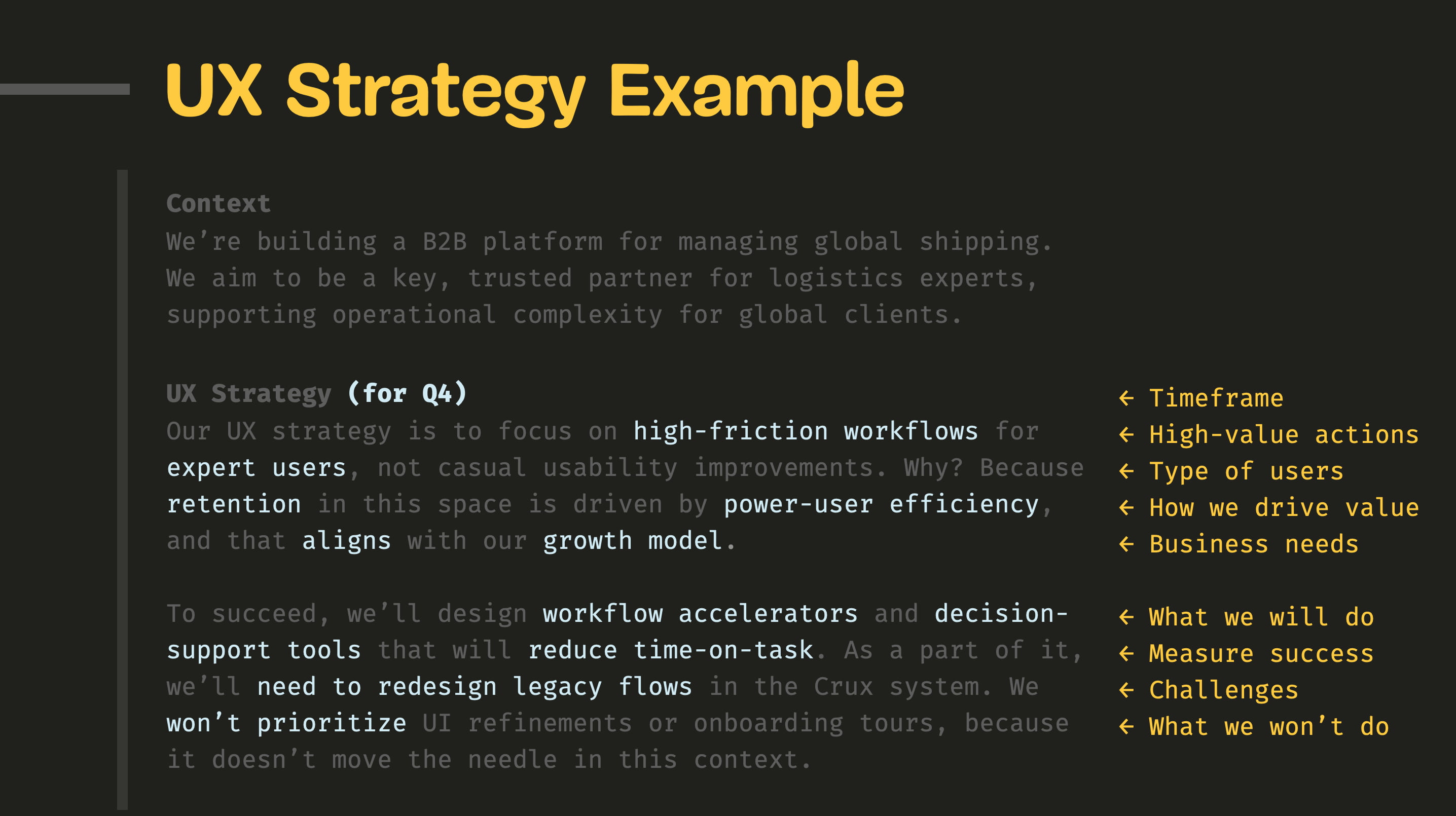
What I like most about this example is just how concise and clear it is. Getting to this level of clarity takes quite a bit of time, but it creates a very precise overview of what we do, what we don’t do, what we focus on, and how we drive value.
Wrapping Up
The best path to make a strong case with senior leadership is to frame your UX work as a direct contributor to differentiation. This isn’t just about making things look different; it’s about enhancing the perceived value.

A good strategy ties UX improvements to measurable business outcomes. It doesn’t speak about design patterns, consistency, or neatly organized components. Instead, it speaks the language of product and business strategy: OKRs, costs, revenue, business metrics, and objectives.
Design can succeed without a strategy. In the wise words of Sun Tzu, strategy without tactics is the slowest route to victory. And tactics without strategy are the noise before defeat.
Meet “How To Measure UX And Design Impact”
You can find more details on UX Strategy in 🪴 Measure UX & Design Impact (8h), a practical guide for designers and UX leads to measure and show your UX impact on business. Use the code 🎟 IMPACT to save 20% off today. Jump to the details.

Video + UX Training
$ 495.00 $ 799.00 Get Video + UX Training
25 video lessons (8h) + Live UX Training.
100 days money-back-guarantee.
Video only
$ 250.00$ 395.00
25 video lessons (8h). Updated yearly.
Also available as a UX Bundle with 2 video courses.
Useful Resources
- “UX Strategy: Definition and Components”, Sarah Gibbons, Anna Kaley
- “UX Strategy: Study Guide”, Sarah Gibbons, Anna Kaley
- What Goes Into a Proactive UX Strategy (video), Jared Spool
- “How To Develop An Effective UX Strategy”, Chloé Garnham
- The Little Book Of Strategy (free PDF), Peter Bihr
- “Enterprise UX Strategy”, Cassandra Naji
- “UX Strategy Guide” + Blueprint (Template), Alex Souza
- Product Strategy Playbooks
- UX Strategy, Jaime Levy
(yk)