


Getting To The Bottom Of Minimum WCAG-Conformant Interactive Element Size
WCAG provides guidance for making interactive elements more accessible by specifying minimum size requirements. In fact, the requirements are documented in two Success Criteria: 2.5.5 and 2.5.8. Despi
Accessibility
Uniting Web And Native Apps With 4 Unknown JavaScript APIs
Have you heard of the Screen Orientation API? What about the Device Orientation API, Vibration API, or the Contact Picker API? Juan Diego Rodriguez is interested in these under-the-radar web features
Javascript
How To Build A Multilingual Website With Nuxt.js
Handling translations for multilingual websites is famously difficult and, yet, crucial for many companies and organizations that serve a global audience. Thankfully, modern tooling abstracts away a g
Javascript

Inclusive Dark Mode: Designing Accessible Dark Themes For All Users
Dark mode isn’t just a trendy aesthetic. It’s a gateway to more inclusive digital experiences, but only if designed thoughtfully. While its sleek visuals and reduced eye strain appeal to many, poo
Accessibility
Inclusive Dark Mode: Designing Accessible Dark Themes For All Users
Alex Williams
Dark mode, a beloved feature in modern digital interfaces, offers a visually striking alternative to traditional light themes. Its allure lies in the striking visual contrast it provides, a departure from the light themes that have dominated our screens for decades.
However, its design often misses the mark on an important element — accessibility. For users with visual impairments or sensitivities, dark mode can introduce significant challenges if not thoughtfully implemented.
Hence, designing themes with these users in mind can improve user comfort in low-light settings while creating a more equitable digital experience for everyone. Let’s take a look at exactly how this can be done.
The Pros And Cons Of Dark Modes In Terms Of Accessibility
Dark mode can offer tangible accessibility benefits when implemented with care. For many users, especially those who experience light sensitivity, a well-calibrated dark theme can reduce eye strain and provide a more comfortable reading experience. In low-light settings, the softer background tones and reduced glare may help lessen fatigue and improve visual focus.
However, these benefits are not universal. For some users, particularly those with conditions such as astigmatism or low contrast sensitivity, dark mode can actually compromise readability. Light text on a dark background may lead to blurred edges or halo effects around characters, making it harder to distinguish content.
The Role Of Contrast In Dark Mode Accessibility
When you’re designing, contrast isn’t just another design element, it’s a key player in dark mode’s overall readability and accessibility. A well-designed dark mode, with the right contrast, can also enhance user engagement, creating a more immersive experience and drawing users into the content.

First and foremost, cleverly executing your site’s dark mode will result in a lower bounce rate (as much as 70%, according to one case study from Brazil). You can then further hack this statistic and greet visitors with a deep black, reinforcing your rankings in organic search results by sending positive signals to Google.
How is this possible? Well, the darker tones can hold attention longer, especially in low-light settings, leading to higher interaction rates while making your design more accessible. The point is, without proper contrast, even the sleekest dark mode design can become difficult to navigate and uncomfortable to use.
Designing For Contrast In Dark Mode
Instead of using pure black backgrounds, which can cause eye strain and make text harder to read, opt for dark grays. These softer tones help reduce harsh contrast and provide a modern look.
However, it’s important to note that color adjustments alone don’t solve technical challenges like anti-aliasing. In dark mode, anti-aliasing has the problem of halo effects, where the edges of the text appear blurred or overly luminous. To mitigate these issues, designers should test their interfaces on various devices and browsers and consider CSS properties to improve text clarity.
Real-world user testing, especially with individuals who have visual impairments, is essential to fine-tune these details and ensure an accessible experience for all users.
For individuals with low vision or color blindness, the right contrast can mean the difference between a frustrating and a seamless user experience. To keep your dark mode design looking its best, don’t forget to also:
- Try to choose high-contrast color combinations for improved readability.
- Make sure you avoid overly saturated colors, as they can strain the eyes in dark mode.
- Use contrast checker tools like WebAIM to evaluate your design choices and ensure accessibility.
These simple adjustments make a big difference in creating a dark mode that everyone can use comfortably.
The Importance Of Readability In Dark Themes
While dark themes provide a sleek and visually appealing interface, some features still require lighter colors to remain functional and readable.
Certain interactive elements like buttons or form fields need to be easily distinguishable, especially if it involves transactions or providing personal information. Simply put, no one wants to sign documents digitally if they have to look for the right field, nor do they want to make a transaction if there is friction.
In addition to human readability, machine readability is equally important in an age of increased automation. Machine readability refers to how effective computers and bots are at extracting and processing data from the interface without human intervention. It’s important for pretty much any type of interface that has automation built into the workflows. For example, if the interface utilizes machine learning, machine readability is essential. Machine learning relies on accurate, quality data and effective interaction between different modules and systems, which makes machine readability critical to make it effective.
You can help ensure your dark mode interface is machine-readable in the following ways:
- Use clear, semantic markup.
Write your HTML so that it naturally describes the structure of the page. This means using proper tags (like<header>,<nav>,<main>, and<footer>) and ARIA roles. When your code is organized this way, machines can read and understand your page better, regardless of whether it’s in dark or light mode. - Keep the structure consistent across themes.
Whether users choose dark mode or light mode, the underlying structure of your content should remain the same. This consistency ensures that screen readers and other accessibility tools can interpret the page without confusion. - Maintain good color contrast.
In dark mode, use color choices that meet accessibility standards. This not only helps people with low vision but also ensures that automated tools can verify your design’s accessibility. - Implement responsive styles with media queries.
Use CSS media queries like ‘prefers-color-scheme’ to automatically adjust the interface based on the user’s system settings. This makes sure that the switch between dark and light modes happens smoothly and predictably, which helps both users and assistive technologies process the content correctly.
Making sure that data, especially in automated systems, is clear and accessible prevents functionality breakdowns and guarantees seamless workflows.
Best Strategies For Designing Accessible Dark Themes
Although we associate visual accessibility with visual impairments, the truth is that it’s actually meant for everyone. Easier access is something we all strive for, right? But more than anything, practicality is what matters. Fortunately, the strategies below fit the description to a tee.
Strengthen Contrast For Usability
Contrast is the backbone of dark mode design. Without proper implementation, elements blend together, creating a frustrating user experience. Instead of looking at contrast as just a relationship between colors, try to view it in the context of other UI elements:
- Rethink background choices.
Instead of pure black, which can cause harsh contrast and eye strain, use dark gray shades like #121212. These tones offer a softer, more adaptable visual experience. - Prioritize key elements.
Ensure interactive elements like buttons and links have contrast ratios exceeding 4.5:1. This not only aids readability but also emphasizes functionality. - Test in real environments.
Simulate low-light and high-glare conditions to see how contrast performs in real-life scenarios.
Pay Special Attention To Typography In Dark Themes
The use of effective typography is vital for preserving readability in dark mode. In particular, the right font choice can make your design both visually appealing and functional, while the wrong one can cause strain and confusion for users.

Thus, when designing dark themes, it’s essential to prioritize text clarity without sacrificing aesthetics. You can do this by prioritizing:
- Sans-serif fonts
They are often the best option for dark mode, as they offer a clean, modern look and remain highly readable when paired with a well-balanced contrast. - Strategic use of light elements
Consider incorporating subtle, lighter accents to emphasize key elements, such as headings, call-to-action buttons, or critical information, without fully shifting to a light mode. These accents act as visual cues, drawing attention to important content. - Proper font metrics and stylization
It’s important to consider font size and weight—larger, bolder fonts tend to stand out better against dark backgrounds, ensuring that your text is easy to read.
Make Sure Your Color Integration Is Thoughtful
Colors in dark mode require a delicate balance to ensure accessibility. It’s not as simple as looking at a list of complimentary color pairs and basing your designs around them. Instead, you must think about how users with visual impairments will experience the dark theme design.
While avoiding color combinations like red and green for the sake of colorblind users is a widely known rule, visual impairment is more than just color blindness. In particular, you have to pay attention to:
- Low vision: Ensure text is clear with strong contrast and scalable fonts. Avoid thin typefaces and cluttered layouts for better readability.
- Light sensitivity (photophobia): Minimize bright elements against dark backgrounds to reduce eye strain. Provide brightness and contrast adjustment options for comfort.
- Glaucoma: Use bold, clear fonts and simplify layouts to minimize visual confusion. Focus on reducing clutter and enhancing readability.
- Macular degeneration: Provide large text and high-contrast visuals to aid users with central vision loss. Refrain from relying on centrally aligned, intricate elements.
- Diabetic retinopathy: Keep designs simple, avoiding patterns or textures that obscure content. Use high-contrast and well-spaced elements for clarity.
- Retinitis pigmentosa: Place essential elements centrally with high contrast for those with peripheral vision loss. Avoid spreading critical information across wide areas.
- Cataracts: Reduce glare by using dark gray backgrounds instead of pure black. Incorporate soft, muted colors, and avoid sharp contrasts.
- Night blindness: Provide bright, legible text with balanced contrast against dark themes. Steer clear of overly dim elements that can strain vision.
As you can see, there are a lot of different considerations. Something you need to account for is that it’s nigh-on impossible to have a solution that will fix all the issues. You can’t test an interface for every single individual who uses it. The best you can do is make it as accessible as possible for as many users as possible, and you can always make adjustments in later iterations if there are major issues for a segment of users.

Understanding Color Perception And Visual Impairments To Get The Ideal Dark Mode
Even though dark mode doesn’t target only users with visual impairments, their input and ease of use are perhaps the most important.
The role of color perception in dark mode varies significantly among users, especially for those with visual impairments like color blindness or low vision. These conditions can make it challenging to distinguish certain colors on dark backgrounds, which can affect how users navigate and interact with your design.
In particular, some colors that seem vibrant in light mode may appear muted or blend into the background, making it difficult for users to see or interact with key elements. This is exactly why testing your color palette across different displays and lighting conditions is essential to ensure consistency and accessibility. However, you probably won’t be able to test for every single screen type, device, or environmental condition. Once again, make the dark mode interface as accessible as possible, and make adjustments in later iterations based on feedback.
For users with visual impairments, accessible color palettes can make a significant difference in their experience. Interactive elements, such as buttons or links, need to stand out clearly from the rest of the design, using colors that provide strong contrast and clear visual cues.

In the example above, Slack did an amazing job providing users with visual impairments with premade options. That way, someone can save hours of valuable time. If it wasn’t obvious by now, apps that do this find much more success in customer attraction (and retention) than those that don’t.
Making Dark Mode A User Choice
Dark mode is often celebrated for its ability to reduce screen glare and blue light, making it more comfortable for users who experience certain visual sensitivities, like eye strain or discomfort from bright screens.
For many, this creates a more pleasant browsing experience, particularly in low-light environments. However, dark mode isn’t a perfect solution for everyone.

Users with astigmatism, for instance, may find it difficult to read light text on a dark background. The contrast can cause the text to blur or create halos, making it harder to focus. Likewise, some users prefer dark mode for its reduced eye strain, while others may find it harder to read or simply prefer light mode.
These different factors mean that adaptability is important to better accommodate users who may have certain visual sensitivities. You can allow users to toggle between dark and light modes based on their preferences. For even greater comfort, think of providing options to customize text colors and background shades.
Switching between dark and light modes should also be smooth and unobtrusive. Whether you’re working in a bright office or relaxing in a dimly lit room, the transition should never disrupt your workflow.
On top of that, remembering your preferences automatically for future sessions creates a consistent and thoughtful user experience. These adjustments turn dark mode into a truly personalized feature, tailored to elevate every interaction you have with the interface.
Conclusion
While dark mode offers benefits like reduced eye strain and energy savings, it still has its limits. Focusing on key elements like contrast, readability, typography, and color perception helps guarantee that your designs are inclusive and user-friendly for all of your users.
Offering dark mode as an optional, customizable feature empowers users to interact with your interface in a way that best suits their needs. Meanwhile, prioritizing accessibility in dark mode design creates a more equitable digital experience for everyone, regardless of their abilities or preferences.
 (yk)
(yk)

Software Development Lifecycle: The Definitive Guide [FREE]
Software development lifecycle may sound scary or confusing, but in fact, it’s a simple method of delivering software applications. Planning to start a software development project? Then this guide is here to map out your journey towards a successful, working app! In this article, we’ll explain […]
BusinessSoftware development lifecycle may sound scary or confusing, but in fact, it’s a simple method of delivering software applications. Planning to start a software development project? Then this guide is here to map out your journey towards a successful, working app!
In this article, we’ll explain the term “software development lifecycle” and go through its usual stages. We’ll also cover different software development life cycle models so you can get a full overview of the topic.
What Is Software Development Lifecycle?
Software development lifecycle, otherwise known as SDLC for short, is a term used by software houses to name a methodology of delivering high-quality, working software that meets the client’s requirements, deadlines, and budget. Coined in the 1950s and the 1960s, it has become a valuable tool used for thousands of applications for different industries and purposes (follow Techopedia if you want to learn more about the history of SDLC). Currently, its precise standards are covered within the ISO/IEC 12207 international norm defining the tasks required to develop software and maintain it.
A standard development cycle is divided into a couple of phases (more on that below) that define the type of tasks to get done inside them. Each task inside a project life cycle is then assigned and measured upon completion to ensure high-quality software.
Still confused? Think of the software development lifecycle as a roadmap with clear guidelines that take you all the way through the process of software engineering, from planning to maintenance. It’s also there to improve the efficiency of the development team and achieve the ultimate goal of meeting the client’s needs while staying within the budget and deadline.
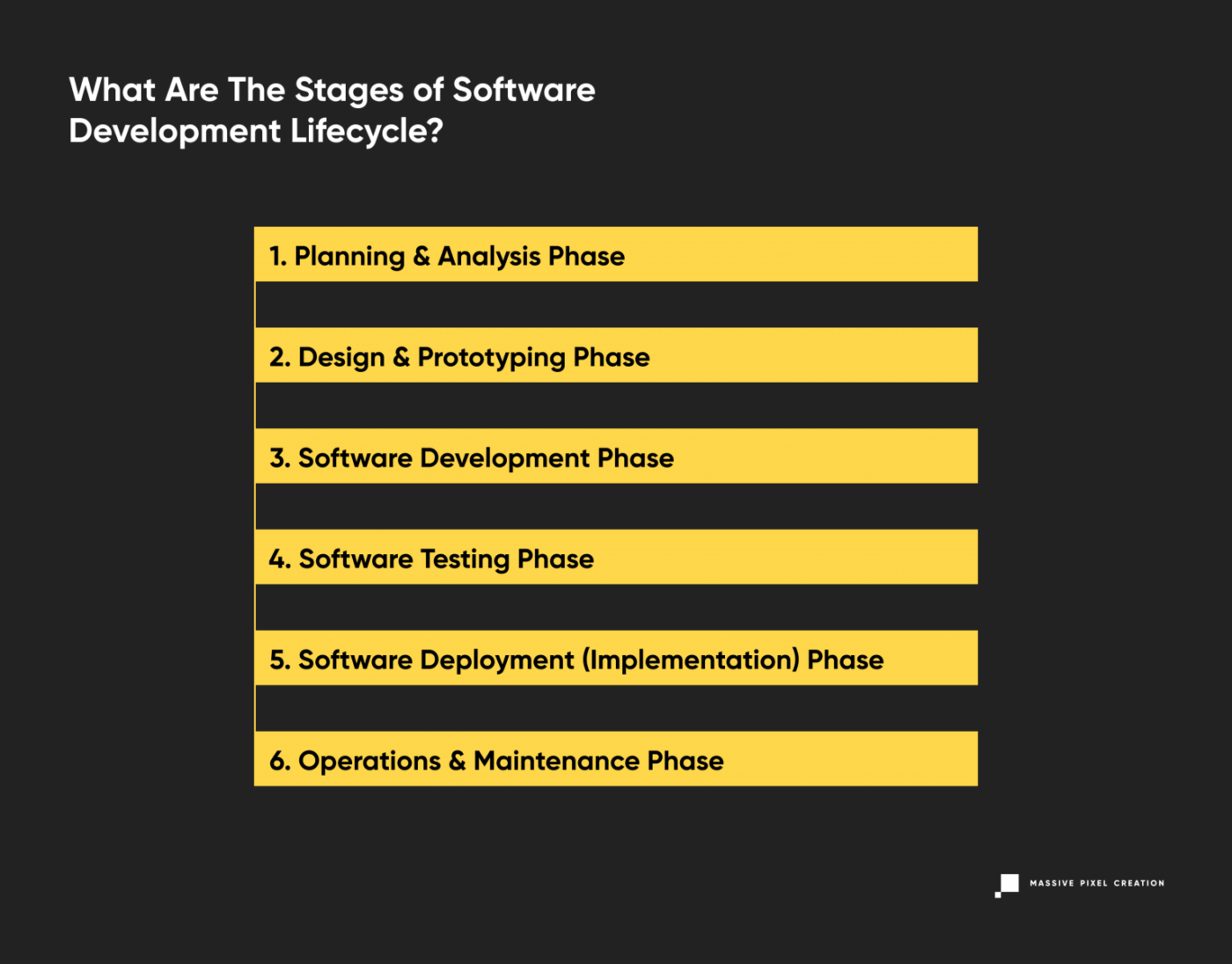
What Are The Stages of Software Development Lifecycle?
The software development process is usually divided into six to eight steps. Why does that number vary? Depending on the project’s scope and deadline, some project managers may combine steps or omit them altogether. However, this act doesn’t (or shouldn’t) influence the overall quality of the product in any way, so if you hear that your development team wants to do six phases instead of seven, don’t freak out.
Depending on the SDLC model you use, these stages may be repeated as needed. An iterative model (described later in this article), for example, works in sprint-based iterations that go back and forth between the phases multiple times to deliver better results.
Let’s review the traditional distinct work phases of the entire SDLC process.
1. Planning & Analysis Phase
Careful planning and requirement analysis are crucial in delivering great software. At this stage, the customer works together with the software house team to create a detailed scope of the project and calculate the time and resources needed.
A mutual understanding of the product’s features, benchmarks, and goals can be achieved in a number of ways, including workshops, market surveys, expert consultations, stakeholders’ feedback, and more. At this moment, other guidelines are planned as well, such as quality assurance requirements, risk identification, technical scope, production environment, and others.
The result? The team gets a first insight into their future work, while the customer has a clear view of the product’s scope and expected outcomes. Most models use this stage as a starting point and later adjust the tasks to current needs. Agile methodologies have mastered this process, dividing the development time into short increments that involve a specific scope of work established right before the start.
2. Design & Prototyping Phase
The design phase involves much more than just product designers’ jobs. In software development, it’s equally important to create the visual aspect of the end product (the ‘traditional’ perception of design) and the overall system architecture behind it.
Based on the requirements gathered in the previous stage, the software house team now works on designing the product’s structure, including the communication between the elements, data flow, and optional third-party modules. The architecture is created strictly in line with the software requirement specification as well as the deadline and budget constraints determined earlier.
At the same time, the product design team works on wireframes that act as a reference point for the development team and the client. Some SDLC methodologies use rapid prototyping to achieve optimal results that can later be iterated (more on this later). Wireframes and prototypes help the development teams meet customer expectations and move through development faster. They’re a great way of getting early feedback and delivering an MVP version of the future product. Later on, the MVP may be shaped and changed according to new requirements and details.
3. Software Development Phase
Most likely the longest part of the SDLC process, the software development stage requires the most involvement from the development teams and results in a working product including all the pre-agreed features.
The actual development is performed according to the software requirement specification and the wireframes & guidelines established in the design phase. If it wasn’t done at the requirement analysis phase, the entire development process starts with translating the outcomes of both previous stages into an initial set of assignments. Then, the project manager assigns due dates and work schedules for transparency. As the development proceeds, these assignments may change, as the product is delivered according to current business goals or user feedback.
The team rarely uses just one programming language. Most often, it’s a group of software engineers with various skills and experience (a cross-functional team) using a number of programming tools dedicated for delivering specific results. This approach helps to produce high-quality software that meets all business requirements. On top of that, software houses have a set of their own guidelines, standards, and tools to create software. The development team is also supported by tech leaders, project managers, and other roles that help with any bumps in the road.
4. Software Testing Phase
The code is released into a testing environment. The quality assurance team takes over to look for bugs, omissions, and other red flags inside the software. Once again, they check all features against the customer’s expectations and verify the software requirement specification.
Bugs and defects are a normal part of each development process, so you shouldn’t be alarmed by their presence. The software testing phase is designed to provide the highest possible quality in all fields: that’s why the team takes many different user scenarios under consideration and meticulously checks for all options possible. During this SDLC process, the code will probably go back and forth between the developers and QAs until it’s pixel-perfect, stable, and in line with the business requirements. If it’s meant to be combined with third-party software products, the quality assurance team will check for that as well.

The process of software testing involves all sorts of different tests, both automated and manual, like penetration tests, end-to-end tests, validation tests, and more.
Depending on the chosen SDLC model, the testing phase may occur all at once, after delivering the entire code, or interchangeably, in little increments, as more and more features are added to the software. Agile methodologies will lean towards testing during each sprint or release – more on that below.
5. Software Deployment (Implementation) Phase
It’s time to pop that champagne – the code now meets the pre-agreed software specifications! A completely developed product is ready for release to the market and deployed to the production environment. Larger products will require integrating with pre-existing systems. Developers will take one final look at the implemented system, and may work together with QAs and content writers to produce detailed documentation for it.
This stage also involves arranging an infrastructure that’ll support the new product, establishing the server and hosting provider, and creating a strategy for future deployments with product updates.
6. Operations & Maintenance Phase
The system development process is never finished. With time, unexpected bugs can be detected, upgrades may be needed, and feature enhancements might be in order. As the product is now live, the team may observe performance issues or room for improvement.
It’s wise to monitor and review the network performance, environment’s stability, and the product’s behavior after the release. As the product is moved to the final environment and tested by end-users, it needs to remain stable and fast-running. Taking this step leads to faster problem-solving and issue management in case of any changes or critical issues.
The maintenance phase is crucial to meet the ever-changing business requirements, performance standards, and user expectations. It can involve extra development work or code alterations, as well as QA input.
Other Phases
Like I said at the beginning of this section, it’s impossible to pinpoint exactly one ‘proper’ process of software development life cycle. SDLC is a guide, and depending on the project’s specification, scope, and software organization, the software development company may omit some of the phases, merge, or split them into smaller sections as needed. For example, the analysis phase may be divided into business, technical, and other aspects.
In some SDLC process models, like the Agile method, the phases like development and software testing will concur to ensure rapid application development. In others, like the waterfall model, they’ll happen one after another, linearly.
Software Development Process: The Reality
Still thinking of that roadmap comparison from the section above and wondering how this checks out if there are so many variants? You should know that SDLC is not a plan. It’s a tool that you can adjust to your current needs. A traditional perception of planning is rather stiff and leaves no wiggle room, with steps carefully taken one after the other. Most software development methodologies stay away from that concept, as it can be quite binding and unfruitful.
In the next part of this article, we’ll cover the most popular SDLC models and methodologies and explain the core differences between them.
Software Development Lifecycle Models
The number of methods is nearly infinite when it comes to the models of software development life cycle. SDLC methodology allows for a lot of flexibility, and with new ideas and methods of software development, the struggle with choosing the right provider is real.
In this article, I’ll describe these software application development methods that you’ll most likely stumble across when searching for the company to build your product.
Waterfall Life Cycle Model
Perhaps the earliest of all SDLC models, the waterfall model uses all standard phases of software development, putting an emphasis on the planning stage and detailed documentation. Its traditional perception of product development translates to sequential phases that don’t overlap. You may think of it as a ‘production line’ in a ‘software development factory’, where a part of the product is constructed and then passed on.
This model is easy to understand, plan out, and implement, however, as each phase depends on the execution and delivery of the previous one, the entire project is likely to be overdue.
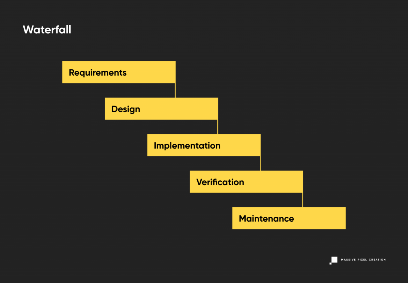
In the waterfall model, the progress flows in one direction and once you put it in motion, there’s a little chance of changing anything as you discover new requirements or constraints to the product. The decision was already made, and the shift will result in missed cost estimates and a ton of work going to waste.
On top of these risks, a significant drawback of the waterfall model is the fact that the end user won’t see a working product, or even a part of it, until very late in the process. This, combined with the high chance of missed deadlines and a long time passing between feasibility analysis and product release (eight to nine months in most scenarios), may result in a software that’s already obsolete when made available to the wide public.
Currently, software houses tend to use modified versions of this methodology, like Sashimi (Waterfall with Overlapping Phases) or Waterfall with Risk Reduction to minimize these uncertainties. Still, these models don’t answer many struggles of modern software development.
Iterative Model
Contrary to the above, there’s not as much emphasis put on preliminary planning in this model of software development life cycle. The SDLC model called Iterative involves breaking a product down into small chunks (iterations) according to the current state of knowledge about the project. All of them go through the standard phases of software development (planning, design phase, software testing, and so on) quickly and are immediately deployed for transparent, tangible results.
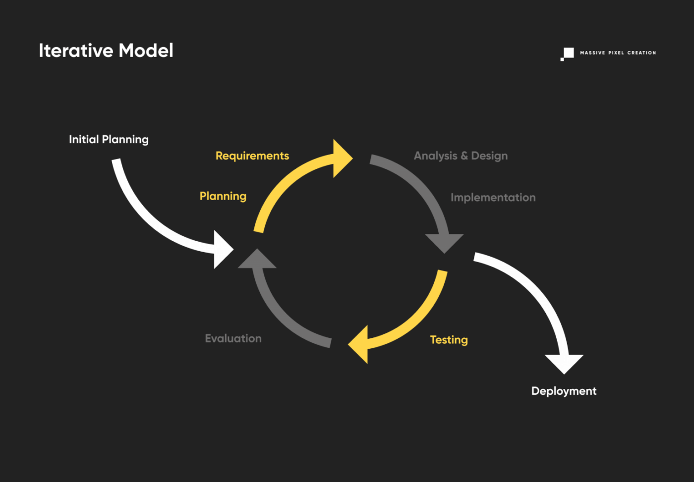
This way, users and clients can pin down the sections that need improvement, and send the product back for the next iteration of development, reducing costs. As the project progresses and more data is discovered, the planning also adjusts to meet new challenges and constraints, working in an iterative manner as well. The iterative SDLC model allows for slight changes to be made during the development, resulting in better market adjustment. Rapid prototyping can enhance client engagement and the feedback process. However, never-ending upgrades to the basic product can eat up resources and lead to out-of-scope software. This can be easily avoided by keeping your roadmap in mind.
Software Prototype Model
Not to be mixed with the iterative model, the software prototype involves fast prototyping of products that don’t have defined requirements. This variant of the software development lifecycle relies heavily on user feedback, as it pretty much construes the scope and details of the project. Therefore, it’s great for high-risk software industry projects with changing business requirements. What’s more, it can lead to huge budget savings, as you invest fewer resources and flaws are easy to locate and fix at an early stage.
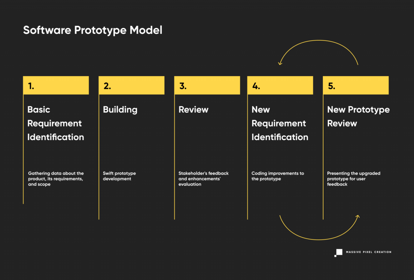
Software Prototype model is often subdivided into three types:
- Rapid prototyping (creating an MVP)
- Evolutionary (adjusting the product according to user feedback)
- Extreme prototyping (developing web applications in stages, starting with a static prototype and then moving on to simulated services and deployment).
However, this approach to software development isn’t risk-free. As the users’ needs can be easily changeable, it may take a long time to complete the ultimate version that pleases the stakeholders.
Spiral Model
The spiral model combines the best features of Waterfall and Prototype models to achieve fast application prototyping and advanced risk analysis. In this case, the team works on preliminary system architecture and design and delivers consecutive prototypes for stakeholders’ evaluation. Once a consensus has been reached, the final prototype is moved to the further stage and through the rest of the development cycles.
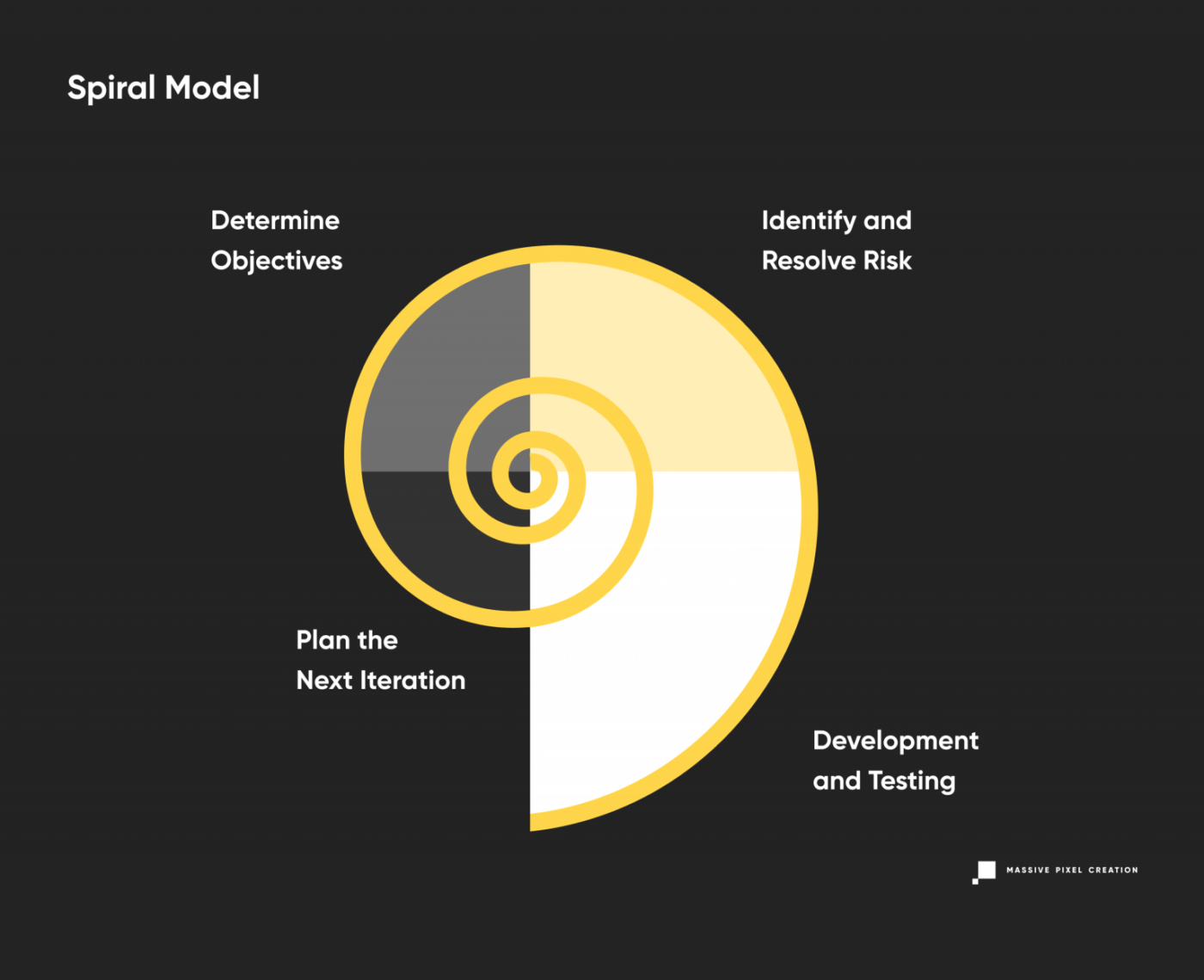
The spiral model enables thorough testing of each step, and even though requirements are set at the beginning, they can easily change with each iteration, reducing the business risk. Extra features may be added as needed, and continuous feedback makes this model more flexible than Waterfall. Still, you need to implement strict procedures to prevent endless spiraling and keep the clear image of the end product in mind.
V-Shaped Model
Yet another variation of the Waterfall model, the V-shaped model follows a parallel structure of tasks while keeping the traditional linear approach to software development. The emphasis is placed on the coextensive verification and validation phase, with coding right in the middle.
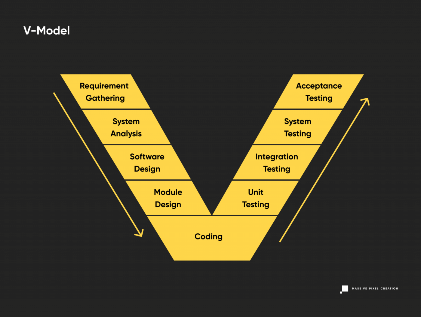
The robust validation phase ensures multi-level testing of all aspects of the newly-developed software. This leads to better risk management, however, its linear, disciplined progress makes it tough to introduce necessary changes at later stages. Also, working software shows up quite late in the cycle, so user feedback is harder to obtain.
This model works well for upgrading existing applications, but may not be so great for new projects that still have more question marks than actual, set-in-stone requirements.
Big Bang Model
The Big Bang Model may sound controversial, as its main characteristic is absolutely no planning. Instead, the team codes and tests as soon as they learn new requirements, which gives them a lot of flexibility, but may also bring unexpected changes and results into the project.
The Big Bang model is good for small projects with short (or unknown) deadlines and tiny teams. It works best when the job needs to be done fast, so every hour spent on planning seems like a waste of time.
As this approach can get quite messy, it’s best to use the Big Bang model with experienced, yet flexible team members (a cross-functional team) who can deliver results quickly and work with little to no input from the stakeholders. It’s also great for academic or practice projects.
Agile Life Cycle Model
The buzzword of modern-era software development, Agile methodologies are great for time-sensitive projects requiring a lot of user feedback. As it’s a disciplined process, many companies introduce roles like Scrum Master to ensure a well-organized, goal-oriented development model.
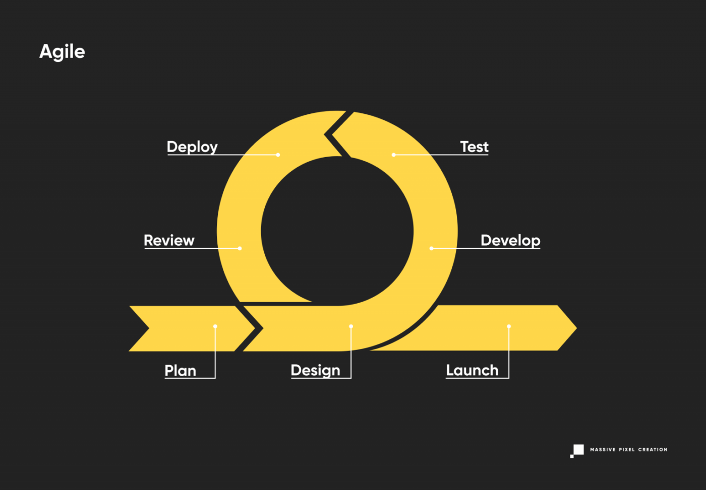
The Agile development model puts the customer first, accepting the inevitability of changes being made mid-project. It combines continuous iterating with robust testing for high quality of the end product and reduced risk; this philosophy divides the project into small sections of work lasting between 1 to 4 weeks.
Usually, if Scrum methodology is also used, each of these periods (called sprints) shares a pattern of kick-off meetings, planning, daily sync, release, and review. This way, the team and the client always have a clear understanding of the upcoming development phase and can adjust the conditions, scope, and process as they go.
The Agile model puts an emphasis on people and interactions between them, caring not only for the result, but also for the dynamics of the team and a clear communication between its members. This is a rare, yet valuable approach that helps to reduce communication gaps, misunderstandings, and time wasted on non-efficient problem reporting. It also ensures constant stakeholder engagement.
Models like XP (Extreme Programming) derive from Agile: XP focuses on the simplicity of development and often mixes the role of a developer and a tester. Another sub-model, Kanban, uses a special visual board to reduce the development time and improve the workflow. This method actually originated in Japanese manufacturing, where visual cues were implemented to prevent inventory pileup.
Other SDLC models
There are many models of software development life cycle. SDLC is a wide concept, and many companies and teams have introduced their own battle-tested methods based on hundreds of software development projects delivered.
Other popular SDLC models are:
- RAD (Rapid Application Development) model, which is similar to the Iterative model, but allows for separate deployment of each iteration;
- Dynamic System Development model, which derives from RAD, but focuses more on user involvement;
- FDD (Feature-Driven Development) model, which is a variant of the Iterative model that bases the project life cycle on features required for the end product;
- DevOps security model, which incorporates the Operations phase into the development loop for instant feedback during the design and implementation stage;
- Lean model, which focuses on easily-changeable software developed efficiently, with less workflow and a smaller budget.
How To Achieve High-Quality Software With SDLC
Regardless of the SDLC model, you choose, introducing some practices to your software development process will help you achieve high-quality results in a timely manner.
Team Communication
Highlighted in the Agile model, this really can’t be overemphasized. Each project will benefit from efficient team communication, as well as the relationship between the team and the customer. Even if you’re not a fan of Scrum or Kanban methodologies, get inspired by the wide pool of soft-skill tools they involve, like daily meetings or retrospective meetings that help solve problems and reduce hold-ups. These have all been battle-tested and bring real value to the project, even if they sound bizarre at first.
Transparency
Make sure that both parties stay on the same page at all times and speak about their expectations during each phase of software development. Let it be simple updates or complicated pivots – this easy rule is a real lifesaver and will cut you loads of extra time spent on fixing bugs and mistakes that weren’t communicated properly.

Continuous Integration
Patching different code snippets at the last minute will almost certainly result in missing deadlines and a lot of stress. Instead, implement continuous deployment and integrate each change into the system as soon as you deliver it to ensure total compatibility and reduce the risk of extra work needed to be done at the last stage.
Version Control
Better safe than sorry! Keep all the code secure and in a single location to prevent any leaks and chaos. Simple security measures such as encrypted Internet connection, logged access, and backup systems can go a long way if something goes wrong. Also, implement a change management system to track individual code input and keep safe, finalized versions of the product separately from unstable ones. Track changes carefully and allow your developers to collaborate on the same codebase.
Fruitful Partnership
Take some time to choose your software development outsourcing company carefully: look through online reviews, testimonials, and portfolios. You can also consider using a video testimonial software to access professional video testimonials – these can provide a more realistic feel for how past clients found their experiences.
Set your own set of expectations towards your partner (including budget and deadlines), and, above all, talk to your candidates!
SDLC: Key Takeaways
SDLC is an excellent way of running, analyzing, and improving the process of developing software. It guides you through all the phases of creating software, from planning to maintenance, and helps you pin down potential problems, hold-ups, and bottlenecks along the way, showing you how to fix them.
The basic SDLC process covers: planning & analysis, design & prototyping, development, testing, deployment, and operations & maintenance.
You can use a variety of models of tested software development life cycle. SDLC models include a traditional Waterfall model and more modern, flexible philosophies such as Agile methodology (with sub-methodologies like Scrum and Kanban that put more structure and detail to the process). Variations like Iterative, Prototype, Spiral, V-Shaped, and Big Bang fall in the middle, as they introduce more space for mid-project changes but are not as adaptable.
Each of these models has a wide portfolio of finished projects. Getting to know them closely will allow you to understand your project’s needs better and make an informed choice.
Creating An Effective Multistep Form For Better User Experience
Forms are already notoriously tough to customize and style — to the extent that we’re already starting to see new ideas for more flexible control. But what we don’t often discuss is designin
Javascript
Creating An Effective Multistep Form For Better User Experience
Amejimaobari Ollornwi
For a multistep form, planning involves structuring questions logically across steps, grouping similar questions, and minimizing the number of steps and the amount of required information for each step. Whatever makes each step focused and manageable is what should be aimed for.
In this tutorial, we will create a multistep form for a job application. Here are the details we are going to be requesting from the applicant at each step:
- Personal Information
Collects applicant’s name, email, and phone number. - Work Experience
Collects the applicant’s most recent company, job title, and years of experience. - Skills & Qualifications
The applicant lists their skills and selects their highest degree. - Review & Submit
This step is not going to collect any information. Instead, it provides an opportunity for the applicant to go back and review the information entered in the previous steps of the form before submitting it.
You can think of structuring these questions as a digital way of getting to know somebody. You can’t meet someone for the first time and ask them about their work experience without first asking for their name.
Based on the steps we have above, this is what the body of our HTML with our form should look like. First, the main <form> element:
<form id="jobApplicationForm"> <!-- Step 1: Personal Information --> <!-- Step 2: Work Experience --> <!-- Step 3: Skills & Qualifications --> <!-- Step 4: Review & Submit --> </form> Step 1 is for filling in personal information, like the applicant’s name, email address, and phone number:
<form id="jobApplicationForm"> <!-- Step 1: Personal Information --> <fieldset class="step" id="step-1"> <legend id="step1Label">Step 1: Personal Information</legend> <label for="name">Full Name</label> <input type="text" id="name" name="name" required /> <label for="email">Email Address</label> <input type="email" id="email" name="email" required /> <label for="phone">Phone Number</label> <input type="tel" id="phone" name="phone" required /> </fieldset> <!-- Step 2: Work Experience --> <!-- Step 3: Skills & Qualifications --> <!-- Step 4: Review & Submit --> </form> Once the applicant completes the first step, we’ll navigate them to Step 2, focusing on their work experience so that we can collect information like their most recent company, job title, and years of experience. We’ll tack on a new <fieldset> with those inputs:
<form id="jobApplicationForm"> <!-- Step 1: Personal Information --> <!-- Step 2: Work Experience --> <fieldset class="step" id="step-2" hidden> <legend id="step2Label">Step 2: Work Experience</legend> <label for="company">Most Recent Company</label> <input type="text" id="company" name="company" required /> <label for="jobTitle">Job Title</label> <input type="text" id="jobTitle" name="jobTitle" required /> <label for="yearsExperience">Years of Experience</label> <input type="number" id="yearsExperience" name="yearsExperience" min="0" required /> </fieldset> <!-- Step 3: Skills & Qualifications --> <!-- Step 4: Review & Submit --> </form> Step 3 is all about the applicant listing their skills and qualifications for the job they’re applying for:
<form id="jobApplicationForm"> <!-- Step 1: Personal Information --> <!-- Step 2: Work Experience --> <!-- Step 3: Skills & Qualifications --> <fieldset class="step" id="step-3" hidden> <legend id="step3Label">Step 3: Skills & Qualifications</legend> <label for="skills">Skill(s)</label> <textarea id="skills" name="skills" rows="4" required></textarea> <label for="highestDegree">Degree Obtained (Highest)</label> <select id="highestDegree" name="highestDegree" required> <option value="">Select Degree</option> <option value="highschool">High School Diploma</option> <option value="bachelor">Bachelor's Degree</option> <option value="master">Master's Degree</option> <option value="phd">Ph.D.</option> </select> </fieldset> <!-- Step 4: Review & Submit --> <fieldset class="step" id="step-4" hidden> <legend id="step4Label">Step 4: Review & Submit</legend> <p>Review your information before submitting the application.</p> <button type="submit">Submit Application</button> </fieldset> </form> And, finally, we’ll allow the applicant to review their information before submitting it:
<form id="jobApplicationForm"> <!-- Step 1: Personal Information --> <!-- Step 2: Work Experience --> <!-- Step 3: Skills & Qualifications --> <!-- Step 4: Review & Submit --> <fieldset class="step" id="step-4" hidden> <legend id="step4Label">Step 4: Review & Submit</legend> <p>Review your information before submitting the application.</p> <button type="submit">Submit Application</button> </fieldset> </form> Notice: We’ve added a hidden attribute to every fieldset element but the first one. This ensures that the user sees only the first step. Once they are done with the first step, they can proceed to fill out their work experience on the second step by clicking a navigational button. We’ll add this button later on.
Adding Styles
To keep things focused, we’re not going to be emphasizing the styles in this tutorial. What we’ll do to keep things simple is leverage the Simple.css style framework to get the form in good shape for the rest of the tutorial.
If you’re following along, we can include Simple’s styles in the document <head>:
<link rel="stylesheet" href="https://cdn.simplecss.org/simple.min.css" /> And from there, go ahead and create a style.css file with the following styles that I’ve folded up.
<details> <summary>View CSS</summary> body { min-height: 100vh; display: flex; align-items: center; justify-content: center; } main { padding: 0 30px; } h1 { font-size: 1.8rem; text-align: center; } .stepper { display: flex; justify-content: flex-end; padding-right: 10px; } form { box-shadow: 0px 0px 6px 2px rgba(0, 0, 0, 0.2); padding: 12px; } input, textarea, select { outline: none; } input:valid, textarea:valid, select:valid, input:focus:valid, textarea:focus:valid, select:focus:valid { border-color: green; } input:focus:invalid, textarea:focus:invalid, select:focus:invalid { border: 1px solid red; } </details> Form Navigation And Validation
An easy way to ruin the user experience for a multi-step form is to wait until the user gets to the last step in the form before letting them know of any error they made along the way. Each step of the form should be validated for errors before moving on to the next step, and descriptive error messages should be displayed to enable users to understand what is wrong and how to fix it.
Now, the only part of our form that is visible is the first step. To complete the form, users need to be able to navigate to the other steps. We are going to use several buttons to pull this off. The first step is going to have a Next button. The second and third steps are going to have both a Previous and a Next button, and the fourth step is going to have a Previous and a Submit button.
<form id="jobApplicationForm"> <!-- Step 1: Personal Information --> <fieldset> <!-- ... --> <button type="button" class="next" onclick="nextStep()">Next</button> </fieldset> <!-- Step 2: Work Experience --> <fieldset> <!-- ... --> <button type="button" class="previous" onclick="previousStep()">Previous</button> <button type="button" class="next" onclick="nextStep()">Next</button> </fieldset> <!-- Step 3: Skills & Qualifications --> <fieldset> <!-- ... --> <button type="button" class="previous" onclick="previousStep()">Previous</button> <button type="button" class="next" onclick="nextStep()">Next</button> </fieldset> <!-- Step 4: Review & Submit --> <fieldset> <!-- ... --> <button type="button" class="previous" onclick="previousStep()">Previous</button> <button type="submit">Submit Application</button> </fieldset> </form> Notice: We’ve added onclick attributes to the Previous and Next buttons to link them to their respective JavaScript functions: previousStep() and nextStep().
The “Next” Button
The nextStep() function is linked to the Next button. Whenever the user clicks the Next button, the nextStep() function will first check to ensure that all the fields for whatever step the user is on have been filled out correctly before moving on to the next step. If the fields haven’t been filled correctly, it displays some error messages, letting the user know that they’ve done something wrong and informing them what to do to make the errors go away.
Before we go into the implementation of the nextStep function, there are certain variables we need to define because they will be needed in the function. First, we need the input fields from the DOM so we can run checks on them to make sure they are valid.
// Step 1 fields const name = document.getElementById("name"); const email = document.getElementById("email"); const phone = document.getElementById("phone"); // Step 2 fields const company = document.getElementById("company"); const jobTitle = document.getElementById("jobTitle"); const yearsExperience = document.getElementById("yearsExperience"); // Step 3 fields const skills = document.getElementById("skills"); const highestDegree = document.getElementById("highestDegree"); Then, we’re going to need an array to store our error messages.
let errorMsgs = []; Also, we would need an element in the DOM where we can insert those error messages after they’ve been generated. This element should be placed in the HTML just below the last fieldset closing tag:
<div id="errorMessages" style="color: rgb(253, 67, 67)"></div> Add the above div to the JavaScript code using the following line:
const errorMessagesDiv = document.getElementById("errorMessages"); And finally, we need a variable to keep track of the current step.
let currentStep = 1;
Now that we have all our variables in place, here’s the implementation of the nextstep() function:
function nextStep() { errorMsgs = []; errorMessagesDiv.innerText = ""; switch (currentStep) { case 1: addValidationErrors(name, email, phone); validateStep(errorMsgs); break; case 2: addValidationErrors(company, jobTitle, yearsExperience); validateStep(errorMsgs); break; case 3: addValidationErrors(skills, highestDegree); validateStep(errorMsgs); break; } } The moment the Next button is pressed, our code first checks which step the user is currently on, and based on this information, it validates the data for that specific step by calling the addValidationErrors() function. If there are errors, we display them. Then, the form calls the validateStep() function to verify that there are no errors before moving on to the next step. If there are errors, it prevents the user from going on to the next step.
Whenever the nextStep() function runs, the error messages are cleared first to avoid appending errors from a different step to existing errors or re-adding existing error messages when the addValidationErrors function runs. The addValidationErrors function is called for each step using the fields for that step as arguments.
Here’s how the addValidationErrors function is implemented:
function addValidationErrors(fieldOne, fieldTwo, fieldThree = undefined) { if (!fieldOne.checkValidity()) { const label = document.querySelector(`label[for="${fieldOne.id}"]`); errorMsgs.push(`Please Enter A Valid ${label.textContent}`); } if (!fieldTwo.checkValidity()) { const label = document.querySelector(`label[for="${fieldTwo.id}"]`); errorMsgs.push(`Please Enter A Valid ${label.textContent}`); } if (fieldThree && !fieldThree.checkValidity()) { const label = document.querySelector(`label[for="${fieldThree.id}"]`); errorMsgs.push(`Please Enter A Valid ${label.textContent}`); } if (errorMsgs.length > 0) { errorMessagesDiv.innerText = errorMsgs.join("\n"); } } This is how the validateStep() function is defined:
function validateStep(errorMsgs) { if (errorMsgs.length === 0) { showStep(currentStep + 1); } } The validateStep() function checks for errors. If there are none, it proceeds to the next step with the help of the showStep() function.
function showStep(step) { steps.forEach((el, index) => { el.hidden = index + 1 !== step; }); currentStep = step; } The showStep() function requires the four fieldsets in the DOM. Add the following line to the top of the JavaScript code to make the fieldsets available:
const steps = document.querySelectorAll(".step"); What the showStep() function does is to go through all the fieldsets in our form and hide whatever fieldset is not equal to the one we’re navigating to. Then, it updates the currentStep variable to be equal to the step we’re navigating to.
The “Previous” Button
The previousStep() function is linked to the Previous button. Whenever the previous button is clicked, similarly to the nextStep function, the error messages are also cleared from the page, and navigation is also handled by the showStep function.
function previousStep() { errorMessagesDiv.innerText = ""; showStep(currentStep - 1); } Whenever the showStep() function is called with “currentStep - 1” as an argument (as in this case), we go back to the previous step, while moving to the next step happens by calling the showStep() function with “currentStep + 1” as an argument (as in the case of the validateStep() function).
Improving User Experience With Visual Cues
One other way of improving the user experience for a multi-step form, is by integrating visual cues, things that will give users feedback on the process they are on. These things can include a progress indicator or a stepper to help the user know the exact step they are on.
Integrating A Stepper
To integrate a stepper into our form (sort of like this one from Material Design), the first thing we need to do is add it to the HTML just below the opening <form> tag.
<form id="jobApplicationForm"> <div class="stepper"> <span><span class="currentStep">1</span>/4</span> </div> <!-- ... --> </form> Next, we need to query the part of the stepper that will represent the current step. This is the span tag with the class name of currentStep.
const currentStepDiv = document.querySelector(".currentStep"); Now, we need to update the stepper value whenever the previous or next buttons are clicked. To do this, we need to update the showStep() function by appending the following line to it:
currentStepDiv.innerText = currentStep; This line is added to the showStep() function because the showStep() function is responsible for navigating between steps and updating the currentStep variable. So, whenever the currentStep variable is updated, the currentStepDiv should also be updated to reflect that change.
Storing And Retrieving User Data
One major way we can improve the form’s user experience is by storing user data in the browser. Multistep forms are usually long and require users to enter a lot of information about themselves. Imagine a user filling out 95% of a form, then accidentally hitting the F5 button on their keyboard and losing all their progress. That would be a really bad experience for the user.
Using localStorage, we can store user information as soon as it is entered and retrieve it as soon as the DOM content is loaded, so users can always continue filling out their forms from wherever they left off. To add this feature to our forms, we can begin by saving the user’s information as soon as it is typed. This can be achieved using the input event.
Before adding the input event listener, get the form element from the DOM:
const form = document.getElementById("jobApplicationForm"); Now we can add the input event listener:
// Save data on each input event form.addEventListener("input", () => { const formData = { name: document.getElementById("name").value, email: document.getElementById("email").value, phone: document.getElementById("phone").value, company: document.getElementById("company").value, jobTitle: document.getElementById("jobTitle").value, yearsExperience: document.getElementById("yearsExperience").value, skills: document.getElementById("skills").value, highestDegree: document.getElementById("highestDegree").value, }; localStorage.setItem("formData", JSON.stringify(formData)); }); Next, we need to add some code to help us retrieve the user data once the DOM content is loaded.
window.addEventListener("DOMContentLoaded", () => { const savedData = JSON.parse(localStorage.getItem("formData")); if (savedData) { document.getElementById("name").value = savedData.name || ""; document.getElementById("email").value = savedData.email || ""; document.getElementById("phone").value = savedData.phone || ""; document.getElementById("company").value = savedData.company || ""; document.getElementById("jobTitle").value = savedData.jobTitle || ""; document.getElementById("yearsExperience").value = savedData.yearsExperience || ""; document.getElementById("skills").value = savedData.skills || ""; document.getElementById("highestDegree").value = savedData.highestDegree || ""; } }); Lastly, it is good practice to remove data from localStorage as soon as it is no longer needed:
// Clear data on form submit form.addEventListener('submit', () => { // Clear localStorage once the form is submitted localStorage.removeItem('formData'); }); Adding The Current Step Value To localStorage
If the user accidentally closes their browser, they should be able to return to wherever they left off. This means that the current step value also has to be saved in localStorage.
To save this value, append the following line to the showStep() function:
localStorage.setItem("storedStep", currentStep); Now we can retrieve the current step value and return users to wherever they left off whenever the DOM content loads. Add the following code to the DOMContentLoaded handler to do so:
const storedStep = localStorage.getItem("storedStep"); if (storedStep) { const storedStepInt = parseInt(storedStep); steps.forEach((el, index) => { el.hidden = index + 1 !== storedStepInt; }); currentStep = storedStepInt; currentStepDiv.innerText = currentStep; } Also, do not forget to clear the current step value from localStorage when the form is submitted.
localStorage.removeItem("storedStep"); The above line should be added to the submit handler.
Wrapping Up
Creating multi-step forms can help improve user experience for complex data entry. By carefully planning out steps, implementing form validation at each step, and temporarily storing user data in the browser, you make it easier for users to complete long forms.
For the full implementation of this multi-step form, you can access the complete code on GitHub.
(gg, yk)
How To Design For (And With) Deaf People
Practical UX guidelines to keep in mind for 466 million people who experience hearing loss. More design patterns in Smart Interface Design Patterns, a friendly video course on UX and design patterns b
Accessibility
How To Design For (And With) Deaf People
Vitaly Friedman
When we think about people who are deaf, we often assume stereotypes, such as “disabled” older adults with hearing aids. However, this perception is far from the truth and often leads to poor decisions and broken products.
Let’s look at when and how deafness emerges, and how to design better experiences for people with hearing loss.
Deafness Is A Spectrum
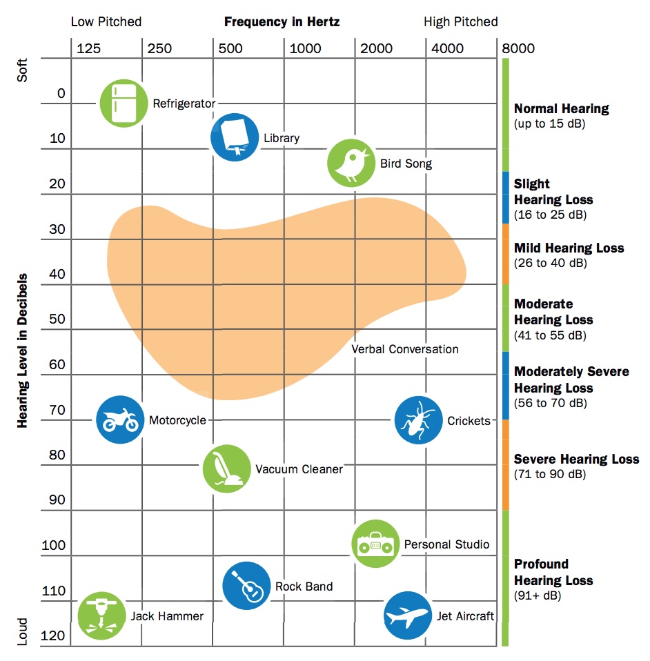
Deafness spans a broad continuum, from minor to profound hearing loss. Around 90–95% of deaf people come from hearing families, and deafness often isn’t merely a condition that people are born with. It frequently occurs due to exposure to loud noises, and it also emerges with age, disease, and accidents.

The loudness of sound is measured in units called decibels (dB). Everybody is on the spectrum of deafness, from normal hearing (up to 15 dB) to profound hearing loss (91+ dB):
- Slight Hearing Loss, 16–25 dB
At 16 dB hearing loss, a person can miss up to 10% of speech when a speaker is at a distance greater than 3 feet. - Mild hearing loss, 26–40 dB
Soft sounds are hard to hear, including whispering, which is around 40 dB in volume. It’s more difficult to hear soft speech sounds spoken at a normal volume. At 40dB hearing loss, a person may miss 50% of meeting discussions. - Moderate hearing loss, 41–55 dB
A person may hear almost no speech when another person is talking at normal volume. At a 50dB hearing loss, a person may not pick up to 80% of speech. - Moderately Severe Hearing Loss, 56–70 dB
A person may have problems hearing the sounds of a dishwasher (60dB). At 70 dB, they might miss almost all speech. - Severe Hearing Loss, 71–90 dB
A person will hear no speech when a person is talking at a normal level. They may hear only some very loud noises: vacuum (70 dB), blender (78 dB), hair dryer (90 dB). - Profound Hearing Loss, 91+ dB
Hear no speech and at most very loud sounds such as a music player at full volume (100 dB), which would be damaging for people with normal hearing, or a car horn (110 dB).
It’s worth mentioning that loss of hearing can also be situational and temporary, as people with “normal” hearing (0 to 25 dB hearing loss) will always encounter situations where they can’t hear, e.g., due to noisy environments.
Useful Things To Know About Deafness
Assumptions are always dangerous, and in the case of deafness, there are quite a few that aren’t accurate. For example, most deaf people actually do not know a sign language — it’s only around 1% in the US.
Also, despite our expectations, there is actually no universal sign language that everybody uses. For example, British signers often cannot understand American signers. There are globally around 300 different sign languages actively used.
“We never question making content available in different written or spoken languages, and the same should apply to signed languages.”

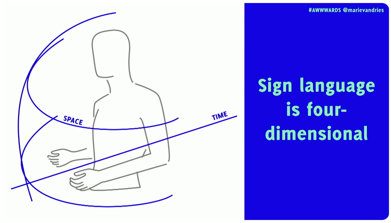
Sign languages are not just gestures or pantomime. They are 4D spatial languages with their own grammar and syntax, separate from spoken languages, and they don’t have a written form. They rely heavily on facial expression to convey meaning and emphasis. And they are also not universal — every country has its own sign language and dialects.
- You can only understand 30% of words via lip-reading.
- Most deaf people do not know any sign language.
- Many sign languages have local dialects that can be hard to interpret.
- Not all deaf people are fluent signers and often rely on visual clues.
- For many deaf people, a spoken language is their second language.
- Sign language is 4-dimensional, incorporating 3D space, time and also facial expressions.
How To Communicate Respectfully
Keep in mind that many deaf people use the spoken language of their country as their second language. So to communicate with a deaf person, it’s best to ask in writing. Don’t ask how much a person can understand, or if they can lip-read you.
However, as Rachel Edwards noted, don’t assume someone is comfortable with written language because they are deaf. Sometimes their literacy may be low, and so providing information as text and assuming that covers your deaf users might not be the answer.
Also, don’t assume that every deaf person can lip-read. You can see only about 30% of words on someone’s mouth. That’s why many deaf people need additional visual cues, like text or cued speech.

It’s also crucial to use respectful language. Deaf people do not always see themselves as disabled, but rather as a cultural linguistic minority with a unique identity. Others, as Meryl Evan has noted, don’t identify as deaf or hard of hearing, but rather as “hearing impaired”. So, it’s mostly up to an individual how they want to identify.
- Deaf (Capital ‘D’)
Culturally Deaf people who have been deaf since birth or before learning to speak. Sign language is often the first language, and written language is the second. - deaf (Lowercase ‘d’)
People who developed hearing loss later in life. Used by people who feel closer to the hearing/hard-of-hearing world and prefer to communicate written and/or oral. - Hard of Hearing
People with mild to moderate hearing loss who typically communicate orally and use hearing aids.
In general, avoid hearing impairment if you can, and use Deaf (for those deaf for most of their lives), deaf (for those who became deaf later), or hard of hearing (HoH) for partial hearing loss. But either way, ask politely first and then respect the person’s preferences.
Practical UX Guidelines
When designing UIs and content, consider these key accessibility guidelines for deaf and hard-of-hearing users:

- Don’t make the phone required or the only method of contact.
- Provide text alternatives for all audible alerts or notices.
- Add haptic feedback on mobile (e.g., vibration patterns).
- Ensure good lighting to help people see facial expressions.
- Circular seating usually works better, so everyone can see each other’s faces.
- Always include descriptions of non-spoken sounds (e.g., rain, laughter) in your content.
- Add a transcript and closed captions for audio and video.
- Clearly identify each speaker in all audio and video content.
- Design multiple ways to communicate in every instance (online + in-person).
- Invite video participants to keep the camera on to facilitate lip-reading and the viewing of facial expressions, which convey tone.
- Always test products with the actual community, instead of making assumptions for them.
Wrapping Up
I keep repeating myself like a broken record, but better accessibility always benefits everyone. When we improve experiences for some groups of people, it often improves experiences for entirely different groups as well.
As Marie Van Driessche rightfully noted, to design a great experience for accessibility, we must design with people, rather than for them. And that means always include people with lived experience of exclusion into the design process — as they are the true experts.
Accessibility never happens by accident — it’s a deliberate decision and a commitment.
“
No digital product is neutral. There must be a deliberate effort to make products and services more accessible. Not only does it benefit everyone, but it also shows what a company stands for and values.
And once you do have a commitment, it will be so much easier to retain accessibility rather than adding it last minute as a crutch — when it’s already too late to do it right and way too expensive to do it well.
Meet “Smart Interface Design Patterns”
You can find more details on design patterns and UX in Smart Interface Design Patterns, our 15h-video course with 100s of practical examples from real-life projects — with a live UX training later this year. Everything from mega-dropdowns to complex enterprise tables — with 5 new segments added every year. Jump to a free preview. Use code BIRDIE to save 15% off.

Video + UX Training
$ 495.00 $ 699.00 Get Video + UX Training
25 video lessons (15h) + Live UX Training.
100 days money-back-guarantee.
Video only
$ 300.00$ 395.00
40 video lessons (15h). Updated yearly.
Also available as a UX Bundle with 2 video courses.
Useful Resources
- Designing For Deaf People Helps Everyone, by Marie Van Driessche
- “Design considerations for the Deaf, deaf, and hard of hearing”, by Paul Roberts
- Beyond Video Captions and Sign Language, by Svetlana Kouznetsova
- “Best Practices For CC and Subtitles UX”, by Vitaly Friedman
- Web Accessibility for Deaf Users
- Inclusive Design Toolkit: Hearing
- “What It’s Like To Be Born Hard of Hearing”, by Twanna A. Hines, M.S.
- “Accessibility: Podcasts for the deaf”, by Mubarak Alabidun
Useful Books
- Sound Is Not Enough, by Svetlana Kouznetsova
- Mismatch: How Inclusion Shapes Design, by Kat Holmes
- Building for Everyone: Extend Your Product’s Reach Through Inclusive Design (+ free excerpt), by Annie Jean-Baptiste
(yk)
Building An Offline-Friendly Image Upload System
Poor internet connectivity doesn’t have to mean poor UX. With PWA technologies like IndexedDB, service workers, and the Background Sync API, you can build an offline-friendly image upload system tha
Javascript
Building An Offline-Friendly Image Upload System
Amejimaobari Ollornwi
So, you’re filling out an online form, and it asks you to upload a file. You click the input, select a file from your desktop, and are good to go. But something happens. The network drops, the file disappears, and you’re stuck having to re-upload the file. Poor network connectivity can lead you to spend an unreasonable amount of time trying to upload files successfully.
What ruins the user experience stems from having to constantly check network stability and retry the upload several times. While we may not be able to do much about network connectivity, as developers, we can always do something to ease the pain that comes with this problem.
One of the ways we can solve this problem is by tweaking image upload systems in a way that enables users to upload images offline — eliminating the need for a reliable network connection, and then having the system retry the upload process when the network becomes stable, without the user intervening.
This article is going to focus on explaining how to build an offline-friendly image upload system using PWA (progressive web application) technologies such as IndexedDB, service workers, and the Background Sync API. We will also briefly cover tips for improving the user experience for this system.
Planning The Offline Image Upload System
Here’s a flow chart for an offline-friendly image upload system.

As shown in the flow chart, the process unfolds as follows:
- The user selects an image.
The process begins by letting the user select their image. - The image is stored locally in
IndexedDB.
Next, the system checks for network connectivity. If network connectivity is available, the system uploads the image directly, avoiding unnecessary local storage usage. However, if the network is not available, the image will be stored inIndexedDB. - The service worker detects when the network is restored.
With the image stored inIndexedDB, the system waits to detect when the network connection is restored to continue with the next step. - The background sync processes pending uploads.
The moment the connection is restored, the system will try to upload the image again. - The file is successfully uploaded.
The moment the image is uploaded, the system will remove the local copy stored inIndexedDB.
Implementing The System
The first step in the system implementation is allowing the user to select their images. There are different ways you can achieve this:
- You can use a simple
<input type="file">element; - A drag-and-drop interface.
I would advise that you use both. Some users prefer to use the drag-and-drop interface, while others think the only way to upload images is through the <input type="file"> element. Having both options will help improve the user experience. You can also consider allowing users to paste images directly in the browser using the Clipboard API.
Registering The Service Worker
At the heart of this solution is the service worker. Our service worker is going to be responsible for retrieving the image from the IndexedDB store, uploading it when the internet connection is restored, and clearing the IndexedDB store when the image has been uploaded.
To use a service worker, you first have to register one:
if ('serviceWorker' in navigator) { navigator.serviceWorker.register('/service-worker.js') .then(reg => console.log('Service Worker registered', reg)) .catch(err => console.error('Service Worker registration failed', err)); } Checking For Network Connectivity
Remember, the problem we are trying to solve is caused by unreliable network connectivity. If this problem does not exist, there is no point in trying to solve anything. Therefore, once the image is selected, we need to check if the user has a reliable internet connection before registering a sync event and storing the image in IndexedDB.
function uploadImage() { if (navigator.onLine) { // Upload Image } else { // register Sync Event // Store Images in IndexedDB } } Note: I’m only using the navigator.onLine property here to demonstrate how the system would work. The navigator.onLine property is unreliable, and I would suggest you come up with a custom solution to check whether the user is connected to the internet or not. One way you can do this is by sending a ping request to a server endpoint you’ve created.
Registering The Sync Event
Once the network test fails, the next step is to register a sync event. The sync event needs to be registered at the point where the system fails to upload the image due to a poor internet connection.
async function registerSyncEvent() { if ('SyncManager' in window) { const registration = await navigator.serviceWorker.ready; await registration.sync.register('uploadImages'); console.log('Background Sync registered'); } } After registering the sync event, you need to listen for it in the service worker.
self.addEventListener('sync', (event) => { if (event.tag === 'uploadImages') { event.waitUntil(sendImages()); } }); The sendImages function is going to be an asynchronous process that will retrieve the image from IndexedDB and upload it to the server. This is what it’s going to look like:
async function sendImages() { try { // await image retrieval and upload } catch (error) { // throw error } } Opening The Database
The first thing we need to do in order to store our image locally is to open an IndexedDB store. As you can see from the code below, we are creating a global variable to store the database instance. The reason for doing this is that, subsequently, when we want to retrieve our image from IndexedDB, we wouldn’t need to write the code to open the database again.
let database; // Global variable to store the database instance function openDatabase() { return new Promise((resolve, reject) => { if (database) return resolve(database); // Return existing database instance const request = indexedDB.open("myDatabase", 1); request.onerror = (event) => { console.error("Database error:", event.target.error); reject(event.target.error); // Reject the promise on error }; request.onupgradeneeded = (event) => { const db = event.target.result; // Create the "images" object store if it doesn't exist. if (!db.objectStoreNames.contains("images")) { db.createObjectStore("images", { keyPath: "id" }); } console.log("Database setup complete."); }; request.onsuccess = (event) => { database = event.target.result; // Store the database instance globally resolve(database); // Resolve the promise with the database instance }; }); } Storing The Image In IndexedDB
With the IndexedDB store open, we can now store our images.
Now, you may be wondering why an easier solution like
localStoragewasn’t used for this purpose.The reason for that is that
IndexedDBoperates asynchronously and doesn’t block the main JavaScript thread, whereaslocalStorageruns synchronously and can block the JavaScript main thread if it is being used.
Here’s how you can store the image in IndexedDB:
async function storeImages(file) { // Open the IndexedDB database. const db = await openDatabase(); // Create a transaction with read and write access. const transaction = db.transaction("images", "readwrite"); // Access the "images" object store. const store = transaction.objectStore("images"); // Define the image record to be stored. const imageRecord = { id: IMAGE_ID, // a unique ID image: file // Store the image file (Blob) }; // Add the image record to the store. const addRequest = store.add(imageRecord); // Handle successful addition. addRequest.onsuccess = () => console.log("Image added successfully!"); // Handle errors during insertion. addRequest.onerror = (e) => console.error("Error storing image:", e.target.error); } With the images stored and the background sync set, the system is ready to upload the image whenever the network connection is restored.
Retrieving And Uploading The Images
Once the network connection is restored, the sync event will fire, and the service worker will retrieve the image from IndexedDB and upload it.
async function retrieveAndUploadImage(IMAGE_ID) { try { const db = await openDatabase(); // Ensure the database is open const transaction = db.transaction("images", "readonly"); const store = transaction.objectStore("images"); const request = store.get(IMAGE_ID); request.onsuccess = function (event) { const image = event.target.result; if (image) { // upload Image to server here } else { console.log("No image found with ID:", IMAGE_ID); } }; request.onerror = () => { console.error("Error retrieving image."); }; } catch (error) { console.error("Failed to open database:", error); } } Deleting The IndexedDB Database
Once the image has been uploaded, the IndexedDB store is no longer needed. Therefore, it should be deleted along with its content to free up storage.
function deleteDatabase() { // Check if there's an open connection to the database. if (database) { database.close(); // Close the database connection console.log("Database connection closed."); } // Request to delete the database named "myDatabase". const deleteRequest = indexedDB.deleteDatabase("myDatabase"); // Handle successful deletion of the database. deleteRequest.onsuccess = function () { console.log("Database deleted successfully!"); }; // Handle errors that occur during the deletion process. deleteRequest.onerror = function (event) { console.error("Error deleting database:", event.target.error); }; // Handle cases where the deletion is blocked (e.g., if there are still open connections). deleteRequest.onblocked = function () { console.warn("Database deletion blocked. Close open connections and try again."); }; } With that, the entire process is complete!
Considerations And Limitations
While we’ve done a lot to help improve the experience by supporting offline uploads, the system is not without its limitations. I figured I would specifically call those out because it’s worth knowing where this solution might fall short of your needs.
- No Reliable Internet Connectivity Detection
JavaScript does not provide a foolproof way to detect online status. For this reason, you need to come up with a custom solution for detecting online status. - Chromium-Only Solution
The Background Sync API is currently limited to Chromium-based browsers. As such, this solution is only supported by Chromium browsers. That means you will need a more robust solution if you have the majority of your users on non-Chromium browsers. IndexedDBStorage Policies
Browsers impose storage limitations and eviction policies forIndexedDB. For instance, in Safari, data stored inIndexedDBhas a lifespan of seven days if the user doesn’t interact with the website. This is something you should bear in mind if you do come up with an alternative for the background sync API that supports Safari.
Enhancing The User Experience
Since the entire process happens in the background, we need a way to inform the users when images are stored, waiting to be uploaded, or have been successfully uploaded. Implementing certain UI elements for this purpose will indeed enhance the experience for the users. These UI elements may include toast notifications, upload status indicators like spinners (to show active processes), progress bars (to show state progress), network status indicators, or buttons to provide retry and cancel options.
Wrapping Up
Poor internet connectivity can disrupt the user experience of a web application. However, by leveraging PWA technologies such as IndexedDB, service workers, and the Background Sync API, developers can help improve the reliability of web applications for their users, especially those in areas with unreliable internet connectivity.
(gg, yk)
Creating The “Moving Highlight” Navigation Bar With JavaScript And CSS
In this tutorial, Blake Lundquist walks us through two methods of creating the “moving-highlight” navigation pattern using only plain JavaScript and CSS. The first technique uses the getBoundingCl
Javascript
Creating The “Moving Highlight” Navigation Bar With JavaScript And CSS
Blake Lundquist
I recently came across an old jQuery tutorial demonstrating a “moving highlight” navigation bar and decided the concept was due for a modern upgrade. With this pattern, the border around the active navigation item animates directly from one element to another as the user clicks on menu items. In 2025, we have much better tools to manipulate the DOM via vanilla JavaScript. New features like the View Transition API make progressive enhancement more easily achievable and handle a lot of the animation minutiae.

In this tutorial, I will demonstrate two methods of creating the “moving highlight” navigation bar using plain JavaScript and CSS. The first example uses the getBoundingClientRect method to explicitly animate the border between navigation bar items when they are clicked. The second example achieves the same functionality using the new View Transition API.
The Initial Markup
Let’s assume that we have a single-page application where content changes without the page being reloaded. The starting HTML and CSS are your standard navigation bar with an additional div element containing an id of #highlight. We give the first navigation item a class of .active.
See the Pen [Moving Highlight Navbar Starting Markup [forked]](https://codepen.io/smashingmag/pen/EajQyBW) by Blake Lundquist.
For this version, we will position the #highlight element around the element with the .active class to create a border. We can utilize absolute positioning and animate the element across the navigation bar to create the desired effect. We’ll hide it off-screen initially by adding left: -200px and include transition styles for all properties so that any changes in the position and size of the element will happen gradually.
#highlight { z-index: 0; position: absolute; height: 100%; width: 100px; left: -200px; border: 2px solid green; box-sizing: border-box; transition: all 0.2s ease; } Add A Boilerplate Event Handler For Click Interactions
We want the highlight element to animate when a user changes the .active navigation item. Let’s add a click event handler to the nav element, then filter for events caused only by elements matching our desired selector. In this case, we only want to change the .active nav item if the user clicks on a link that does not already have the .active class.
Initially, we can call console.log to ensure the handler fires only when expected:
const navbar = document.querySelector('nav'); navbar.addEventListener('click', function (event) { // return if the clicked element doesn't have the correct selector if (!event.target.matches('nav a:not(active)')) { return; } console.log('click'); }); Open your browser console and try clicking different items in the navigation bar. You should only see "click" being logged when you select a new item in the navigation bar.
Now that we know our event handler is working on the correct elements let’s add code to move the .active class to the navigation item that was clicked. We can use the object passed into the event handler to find the element that initialized the event and give that element a class of .active after removing it from the previously active item.
const navbar = document.querySelector('nav'); navbar.addEventListener('click', function (event) { // return if the clicked element doesn't have the correct selector if (!event.target.matches('nav a:not(active)')) { return; } - console.log('click'); + document.querySelector('nav a.active').classList.remove('active'); + event.target.classList.add('active'); }); Our #highlight element needs to move across the navigation bar and position itself around the active item. Let’s write a function to calculate a new position and width. Since the #highlight selector has transition styles applied, it will move gradually when its position changes.
Using getBoundingClientRect, we can get information about the position and size of an element. We calculate the width of the active navigation item and its offset from the left boundary of the parent element. Then, we assign styles to the highlight element so that its size and position match.
// handler for moving the highlight const moveHighlight = () => { const activeNavItem = document.querySelector('a.active'); const highlighterElement = document.querySelector('#highlight'); const width = activeNavItem.offsetWidth; const itemPos = activeNavItem.getBoundingClientRect(); const navbarPos = navbar.getBoundingClientRect() const relativePosX = itemPos.left - navbarPos.left; const styles = { left: `${relativePosX}px`, width: `${width}px`, }; Object.assign(highlighterElement.style, styles); } Let’s call our new function when the click event fires:
navbar.addEventListener('click', function (event) { // return if the clicked element doesn't have the correct selector if (!event.target.matches('nav a:not(active)')) { return; } document.querySelector('nav a.active').classList.remove('active'); event.target.classList.add('active'); + moveHighlight(); }); Finally, let’s also call the function immediately so that the border moves behind our initial active item when the page first loads:
// handler for moving the highlight const moveHighlight = () => { // ... } // display the highlight when the page loads moveHighlight(); Now, the border moves across the navigation bar when a new item is selected. Try clicking the different navigation links to animate the navigation bar.
See the Pen [Moving Highlight Navbar [forked]](https://codepen.io/smashingmag/pen/WbvMxqV) by Blake Lundquist.
That only took a few lines of vanilla JavaScript and could easily be extended to account for other interactions, like mouseover events. In the next section, we will explore refactoring this feature using the View Transition API.
Using The View Transition API
The View Transition API provides functionality to create animated transitions between website views. Under the hood, the API creates snapshots of “before” and “after” views and then handles transitioning between them. View transitions are useful for creating animations between documents, providing the native-app-like user experience featured in frameworks like Astro. However, the API also provides handlers meant for SPA-style applications. We will use it to reduce the JavaScript needed in our implementation and more easily create fallback functionality.
For this approach, we no longer need a separate #highlight element. Instead, we can style the .active navigation item directly using pseudo-selectors and let the View Transition API handle the animation between the before-and-after UI states when a new navigation item is clicked.
We’ll start by getting rid of the #highlight element and its associated CSS and replacing it with styles for the nav a::after pseudo-selector:
<nav> - <div id="highlight"></div> <a href="#" class="active">Home</a> <a href="#services">Services</a> <a href="#about">About</a> <a href="#contact">Contact</a> </nav> - #highlight { - z-index: 0; - position: absolute; - height: 100%; - width: 0; - left: 0; - box-sizing: border-box; - transition: all 0.2s ease; - } + nav a::after { + content: " "; + position: absolute; + left: 0; + top: 0; + width: 100%; + height: 100%; + border: none; + box-sizing: border-box; + } For the .active class, we include the view-transition-name property, thus unlocking the magic of the View Transition API. Once we trigger the view transition and change the location of the .active navigation item in the DOM, “before” and “after” snapshots will be taken, and the browser will animate the border across the bar. We’ll give our view transition the name of highlight, but we could theoretically give it any name.
nav a.active::after { border: 2px solid green; view-transition-name: highlight; } Once we have a selector that contains a view-transition-name property, the only remaining step is to trigger the transition using the startViewTransition method and pass in a callback function.
const navbar = document.querySelector('nav'); // Change the active nav item on click navbar.addEventListener('click', async function (event) { if (!event.target.matches('nav a:not(.active)')) { return; } document.startViewTransition(() => { document.querySelector('nav a.active').classList.remove('active'); event.target.classList.add('active'); }); }); Above is a revised version of the click handler. Instead of doing all the calculations for the size and position of the moving border ourselves, the View Transition API handles all of it for us. We only need to call document.startViewTransition and pass in a callback function to change the item that has the .active class!
Adjusting The View Transition
At this point, when clicking on a navigation link, you’ll notice that the transition works, but some strange sizing issues are visible.

This sizing inconsistency is caused by aspect ratio changes during the course of the view transition. We won’t go into detail here, but Jake Archibald has a detailed explanation you can read for more information. In short, to ensure the height of the border stays uniform throughout the transition, we need to declare an explicit height for the ::view-transition-old and ::view-transition-new pseudo-selectors representing a static snapshot of the old and new view, respectively.
::view-transition-old(highlight) { height: 100%; } ::view-transition-new(highlight) { height: 100%; } Let’s do some final refactoring to tidy up our code by moving the callback to a separate function and adding a fallback for when view transitions aren’t supported:
const navbar = document.querySelector('nav'); // change the item that has the .active class applied const setActiveElement = (elem) => { document.querySelector('nav a.active').classList.remove('active'); elem.classList.add('active'); } // Start view transition and pass in a callback on click navbar.addEventListener('click', async function (event) { if (!event.target.matches('nav a:not(.active)')) { return; } // Fallback for browsers that don't support View Transitions: if (!document.startViewTransition) { setActiveElement(event.target); return; } document.startViewTransition(() => setActiveElement(event.target)); }); Here’s our view transition-powered navigation bar! Observe the smooth transition when you click on the different links.
See the Pen [Moving Highlight Navbar with View Transition [forked]](https://codepen.io/smashingmag/pen/ogXELKE) by Blake Lundquist.
Conclusion
Animations and transitions between website UI states used to require many kilobytes of external libraries, along with verbose, confusing, and error-prone code, but vanilla JavaScript and CSS have since incorporated features to achieve native-app-like interactions without breaking the bank. We demonstrated this by implementing the “moving highlight” navigation pattern using two approaches: CSS transitions combined with the getBoundingClientRect() method and the View Transition API.
Resources
getBoundingClientRect()method documentation- View Transition API documentation
- “View Transitions: Handling Aspect Ratio Changes” by Jake Archibald
(gg, yk)
Freebie: “Modern Business” Infographic Elements
The landscape of business is constantly changing and so does the technology and marketing techniques involved. A lot more businesses are using the power of infographics to really reach out to their ta
FreebiesThe landscape of business is constantly changing and so does the technology and marketing techniques involved. A lot more businesses are using the power of infographics to really reach out to their target market.
If you’re a designer doing some work for businesses in all shapes and sizes, chances are you have probably gotten some free vectors, PSDs and the like from Freepik. After all, Freepik.com is one of the biggest sites on the web for you to search for free vectors, stocks photos, PSD files and even SVG icons.
Below, we have a special treat that’s been designed by Freepik, exclusively for our Hongkiat.com readers. This “Modern Business Infographic Elements” consists of 3D elements, device graphs, gradients and other cool elements for you to choose from.
Available in AI. and .EPS format, go ahead and take a look for yourself.

Download
Please enter your email address below and click the Download Files button. The download link will be sent to you by email.
The post Freebie: “Modern Business” Infographic Elements appeared first on Hongkiat.
Valentine’s Day Freebie: 15 Lovely Patterns
If you haven’t gotten the hint yet, Valentine’s Day is this Saturday. Whether it’s for business or for your own personal use, chances are you’re probably in need of some Valentine’s Day insp
FreebiesIf you haven’t gotten the hint yet, Valentine’s Day is this Saturday. Whether it’s for business or for your own personal use, chances are you’re probably in need of some Valentine’s Day inspired resources. Well, you’re in luck.
We’ve teamed up with our friends over at Freepik.com to help celebrate Valentine’s in style. Ranging from your traditional lace Valentine’s card pattern to a few more modern and classic patterns, there’s 15 lovely Valentine’s patterns for you to choose from.
They are available in AI, EPS and JPG format for your use. The best thing about it? It’s all completely free. So take a look at the selection of patterns available below and consider this your early Valentine.
Click on each of the image to download their specific pattern, or click the download link at the bottom to download them all at once.
#1

#2

#3

#4

#5

#6

#7

#8

#9

#10

#11

#12

#13

#14

#15

The post Valentine’s Day Freebie: 15 Lovely Patterns appeared first on Hongkiat.
How To Make Your UX Research Hard To Ignore
Research isn’t everything. Facts alone don’t win arguments, but powerful stories do. Here’s how to turn your research into narratives that inspire trust and influence decisions.
Ux
How To Make Your UX Research Hard To Ignore
Vitaly Friedman
In the early days of my career, I believed that nothing wins an argument more effectively than strong and unbiased research. Surely facts speak for themselves, I thought.
If I just get enough data, just enough evidence, just enough clarity on where users struggle — well, once I have it all and I present it all, it alone will surely change people’s minds, hearts, and beliefs. And, most importantly, it will help everyone see, understand, and perhaps even appreciate and commit to what needs to be done.
Well, it’s not quite like that. In fact, the stronger and louder the data, the more likely it is to be questioned. And there is a good reason for that, which is often left between the lines.
Research Amplifies Internal Flaws
Throughout the years, I’ve often seen data speaking volumes about where the business is failing, where customers are struggling, where the team is faltering — and where an urgent turnaround is necessary. It was right there, in plain sight: clear, loud, and obvious.

But because it’s so clear, it reflects back, often amplifying all the sharp edges and all the cut corners in all the wrong places. It reflects internal flaws, wrong assumptions, and failing projects — some of them signed off years ago, with secured budgets, big promotions, and approved headcounts. Questioning them means questioning authority, and often it’s a tough path to take.
As it turns out, strong data is very, very good at raising uncomfortable truths that most companies don’t really want to acknowledge. That’s why, at times, research is deemed “unnecessary,” or why we don’t get access to users, or why loud voices always win big arguments.
So even if data is presented with a lot of eagerness, gravity, and passion in that big meeting, it will get questioned, doubted, and explained away. Not because of its flaws, but because of hope, reluctance to change, and layers of internal politics.
This shows up most vividly in situations when someone raises concerns about the validity and accuracy of research. Frankly, it’s not that somebody is wrong and somebody is right. Both parties just happen to be right in a different way.
What To Do When Data Disagrees
We’ve all heard that data always tells a story. However, it’s never just a single story. People are complex, and pointing out a specific truth about them just by looking at numbers is rarely enough.
When data disagrees, it doesn’t mean that either is wrong. It’s just that different perspectives reveal different parts of a whole story that isn’t completed yet.

In digital products, most stories have 2 sides:
- Quantitative data ← What/When: behavior patterns at scale.
- Qualitative data ← Why/How: user needs and motivations.
- ↳ Quant usually comes from analytics, surveys, and experiments.
- ↳ Qual comes from tests, observations, and open-ended surveys.
Risk-averse teams overestimate the weight of big numbers in quantitative research. Users exaggerate the frequency and severity of issues that are critical for them. As Archana Shah noted, designers get carried away by users’ confident responses and often overestimate what people say and do.
And so, eventually, data coming from different teams paints a different picture. And when it happens, we need to reconcile and triangulate. With the former, we track what’s missing, omitted, or overlooked. With the latter, we cross-validate data — e.g., finding pairings of qual/quant streams of data, then clustering them together to see what’s there and what’s missing, and exploring from there.
And even with all of it in place and data conflicts resolved, we still need to do one more thing to make a strong argument: we need to tell a damn good story.
Facts Don’t Win Arguments, Stories Do
Research isn’t everything. Facts don’t win arguments — powerful stories do. But a story that starts with a spreadsheet isn’t always inspiring or effective. Perhaps it brings a problem into the spotlight, but it doesn’t lead to a resolution.

The very first thing I try to do in that big boardroom meeting is to emphasize what unites us — shared goals, principles, and commitments that are relevant to the topic at hand. Then, I show how new data confirms or confronts our commitments, with specific problems we believe we need to address.
When a question about the quality of data comes in, I need to show that it has been reconciled and triangulated already and discussed with other teams as well.
A good story has a poignant ending. People need to see an alternative future to trust and accept the data — and a clear and safe path forward to commit to it. So I always try to present options and solutions that we believe will drive change and explain our decision-making behind that.

They also need to believe that this distant future is within reach, and that they can pull it off, albeit under a tough timeline or with limited resources.
And: a good story also presents a viable, compelling, shared goal that people can rally around and commit to. Ideally, it’s something that has a direct benefit for them and their teams.
These are the ingredients of the story that I always try to keep in my mind when working on that big presentation. And in fact, data is a starting point, but it does need a story wrapped around it to be effective.
Wrapping Up
There is nothing more disappointing than finding a real problem that real people struggle with and facing the harsh reality of research not being trusted or valued.
We’ve all been there before. The best thing you can do is to be prepared: have strong data to back you up, include both quantitative and qualitative research — preferably with video clips from real customers — but also paint a viable future which seems within reach.
And sometimes nothing changes until something breaks. And at times, there isn’t much you can do about it unless you are prepared when it happens.
“Data doesn’t change minds, and facts don’t settle fights. Having answers isn’t the same as learning, and it for sure isn’t the same as making evidence-based decisions.”
— Erika Hall
Meet “How To Measure UX And Design Impact”
You can find more details on UX Research in Measure UX & Design Impact (8h), a practical guide for designers and UX leads to measure and show your UX impact on business. Use the code 🎟 IMPACT to save 20% off today. Jump to the details.

Video + UX Training
$ 495.00 $ 799.00 Get Video + UX Training
25 video lessons (8h) + Live UX Training.
100 days money-back-guarantee.
Video only
$ 250.00$ 395.00
25 video lessons (8h). Updated yearly.
Also available as a UX Bundle with 2 video courses.
Useful Resources
- “How to Present Research So Stakeholders Sit Up and Take Action”, by Nikki Anderson
- “What To Do When Data Disagrees”, by Subhasree Chatterjee, Archana Shah, Sanket Shukl, and Jason Bressler
- “Mixed-Method UX Research”, by Raschin Fatemi
- “A Step-by-Step Framework For Mixed-Method Research”, by Jeremy Williams
- “The Ultimate Guide To Mixed Methods”, by Ben Wiedmaier
- Survey Design Cheatsheet, by yours truly
- Useful Calculators For UX Research, by yours truly
- Beyond Measure, by Erika Hall
Useful Books
- Just Enough Research, by Erika Hall
- Designing Surveys That Work, by Caroline Jarrett
- Designing Quality Survey Questions, by Sheila B. Robinson
(yk)
AI In UX: Achieve More With Less
A simple but powerful mental model for working with AI: treat it like an enthusiastic intern with no real-world experience. Paul Boag shares lessons learned from real client projects across user resea
Ux
AI In UX: Achieve More With Less
Paul Boag
I have made a lot of mistakes with AI over the past couple of years. I have wasted hours trying to get it to do things it simply cannot do. I have fed it terrible prompts and received terrible output. And I have definitely spent more time fighting with it than I care to admit.
But I have also discovered that when you stop treating AI like magic and start treating it like what it actually is (a very enthusiastic intern with zero life experience), things start to make more sense.
Let me share what I have learned from working with AI on real client projects across user research, design, development, and content creation.
How To Work With AI
Here is the mental model that has been most helpful for me. Treat AI like an intern with zero experience.
An intern fresh out of university has lots of enthusiasm and qualifications, but no real-world experience. You would not trust them to do anything unsupervised. You would explain tasks in detail. You would expect to review their work multiple times. You would give feedback and ask them to try again.
This is exactly how you should work with AI.
The Basics Of Prompting
I am not going to pretend to be an expert. I have just spent way too much time playing with this stuff because I like anything shiny and new. But here is what works for me.
- Define the role.
Start with something like “Act as a user researcher” or “Act as a copywriter.” This gives the AI context for how to respond. - Break it into steps.
Do not just say “Analyze these interview transcripts.” Instead, say “I want you to complete the following steps. One, identify recurring themes. Two, look for questions users are trying to answer. Three, note any objections that come up. Four, output a summary of each.” - Define success.
Tell it what good looks like. “I am looking for a report that gives a clear indication of recurring themes and questions in a format I can send to stakeholders. Do not use research terminology because they will not understand it.” - Make it think.
Tell it to think deeply about its approach before responding. Get it to create a way to test for success (known as a rubric) and iterate on its work until it passes that test.
Here is a real prompt I use for online research:
Act as a user researcher. I would like you to carry out deep research online into [brand name]. In particular, I would like you to focus on what people are saying about the brand, what the overall sentiment is, what questions people have, and what objections people mention. The goal is to create a detailed report that helps me better understand the brand perception.
Think deeply about your approach before carrying out the research. Create a rubric for the report to ensure it is as useful as possible. Keep iterating until the report scores extremely high on the rubric. Only then, output the report.
That second paragraph (the bit about thinking deeply and creating a rubric), I basically copy and paste into everything now. It is a universal way to get better output.
Learn When To Trust It
You should never fully trust AI. Just like you would never fully trust an intern you have only just met.
To begin with, double-check absolutely everything. Over time, you will get a sense of when it is losing its way. You will spot the patterns. You will know when to start a fresh conversation because the current one has gone off the rails.
But even after months of working with it daily, I still check its work. I still challenge it. I still make it cite sources and explain its reasoning.
The key is that even with all that checking, it is still faster than doing it yourself. Much faster.
Using AI For User Research
This is where AI has genuinely transformed my work. I use it constantly for five main things.
Online Research
I love AI for this. I can ask it to go and research a brand online. What people are saying about it, what questions they have, what they like, and what frustrates them. Then do the same for competitors and compare.
This would have taken me days of trawling through social media and review sites. Now it takes minutes.
I recently did this for an e-commerce client. I wanted to understand what annoyed people about the brand and what they loved. I got detailed insights that shaped the entire conversion optimization strategy. All from one prompt.
Analyzing Interviews And Surveys
I used to avoid open-ended questions in surveys. They were such a pain to review. Now I use them all the time because AI can analyze hundreds of text responses in seconds.
For interviews, I upload the transcripts and ask it to identify recurring themes, questions, and requests. I always get it to quote directly from the transcripts so I can verify it is not making things up.
The quality is good. Really good. As long as you give it clear instructions about what you want.
Making Sense Of Data
I am terrible with spreadsheets. Put me in front of a person and I can understand them. Put me in front of data, and my eyes glaze over.
AI has changed that. I upload spreadsheets to ChatGPT and just ask questions. “What patterns do you see?” “Can you reformat this?” “Show me this data in a different way.”
Microsoft Clarity now has Copilot built in, so you can ask it questions about your analytics data. Triple Whale does the same for e-commerce sites. These tools are game changers if you struggle with data like I do.
Research Projects
This is probably my favorite technique. In ChatGPT and Claude, you can create projects. In other tools, they are called spaces. Think of them as self-contained folders where everything you put in is available to every conversation in that project.
When I start working with a new client, I create a project and throw everything in. Old user research. Personas. Survey results. Interview transcripts. Documentation. Background information. Site copy. Anything I can find.
Then I give it custom instructions. Here is one I use for my own business:
Act as a business consultant and marketing strategy expert with good copywriting skills. Your role is to help me define the future of my UX consultant business and better articulate it, especially via my website. When I ask for your help, ask questions to improve your answers and challenge my assumptions where appropriate.
I have even uploaded a virtual board of advisors (people I wish I had on my board) and asked AI to research how they think and respond as they would.
Now I have this project that knows everything about my business. I can ask it questions. Get it to review my work. Challenge my thinking. It is like having a co-worker who never gets tired and has a perfect memory.
I do this for every client project now. It is invaluable.
Creating Personas
AI has reinvigorated my interest in personas. I had lost heart in them a bit. They took too long to create, and clients always said they already had marketing personas and did not want to pay to do them again.
Now I can create what I call functional personas. Personas that are actually useful to people who work in UX. Not marketing fluff about what brands people like, but real information about what questions they have and what tasks they are trying to complete.
I upload all my research to a project and say:
Act as a user researcher. Create a persona for [audience type]. For this persona, research the following information: questions they have, tasks they want to complete, goals, states of mind, influences, and success metrics. It is vital that all six criteria are addressed in depth and with equal vigor.
The output is really good. Detailed. Useful. Based on actual data rather than pulled out of thin air.
Here is my challenge to anyone who thinks AI-generated personas are somehow fake. What makes you think your personas are so much better? Every persona is a story of a hypothetical user. You make judgment calls when you create personas, too. At least AI can process far more information than you can and is brilliant at pattern recognition.
“
Using AI For Design And Development
Let me start with a warning. AI is not production-ready. Not yet. Not for the kind of client work I do, anyway.
Three reasons why:
- It is slow if you want something specific or complicated.
- It can be frustrating because it gets close but not quite there.
- And the quality is often subpar. Unpolished code, questionable design choices, that kind of thing.
But that does not mean it is not useful. It absolutely is. Just not for final production work.
Functional Prototypes
If you are not too concerned with matching a specific design, AI can quickly prototype functionality in ways that are hard to match in Figma. Because Figma is terrible at prototyping functionality. You cannot even create an active form field in a Figma prototype. It’s the biggest thing people do online other than click links — and you cannot test it.
Tools like Relume and Bolt can create quick functional mockups that show roughly how things work. They are great for non-designers who just need to throw together a prototype quickly. For designers, they can be useful for showing developers how you want something to work.
But you can spend ages getting them to put a hamburger menu on the right side of the screen. So use them for quick iteration, not pixel-perfect design.
Small Coding Tasks
I use AI constantly for small, low-risk coding work. I am not a developer anymore. I used to be, back when dinosaurs roamed the earth, but not for years.
AI lets me create the little tools I need. A calculator that calculates the ROI of my UX work. An app for running top task analysis. Bits of JavaScript for hiding elements on a page. WordPress plugins for updating dates automatically.
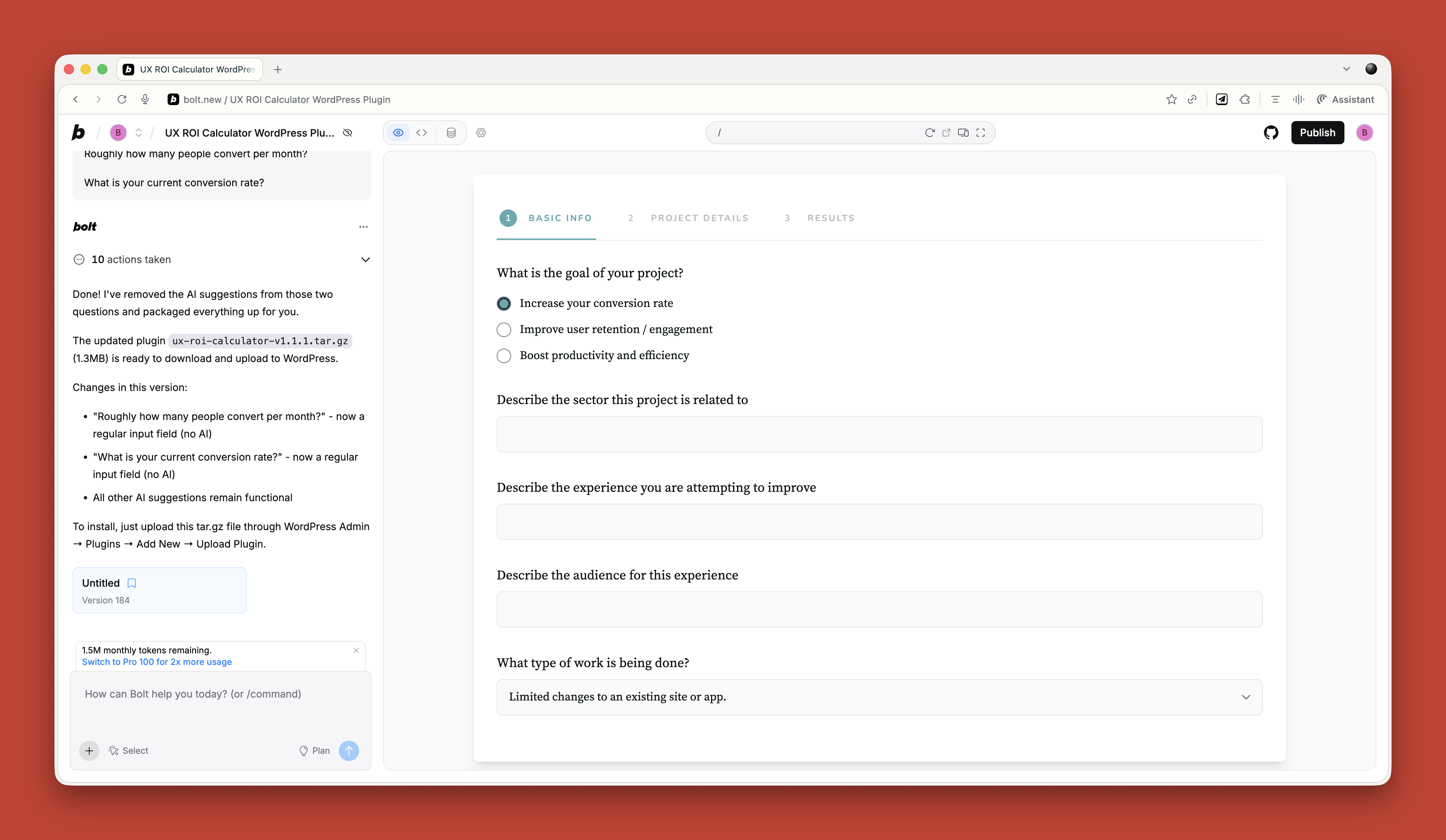
Just before running my workshop on this topic, I needed a tool to create calendar invites for multiple events. All the online services wanted £16 a month. I asked ChatGPT to build me one. One prompt. It worked. It looked rubbish, but I did not care. It did what I needed.
If you are a developer, you should absolutely be using tools like Cursor by now. They are invaluable for pair programming with AI. But if you are not a developer, just stick with Claude or Bolt for quick throwaway tools.
Reviewing Existing Services
There are some great tools for getting quick feedback on existing websites when budget and time are tight.
If you need to conduct a UX audit, Wevo Pulse is an excellent starting point. It automatically reviews a website based on personas and provides visual attention heatmaps, friction scores, and specific improvement recommendations. It generates insights in minutes rather than days.
Now, let me be clear. This does not replace having an experienced person conduct a proper UX audit. You still need that human expertise to understand context, make judgment calls, and spot issues that AI might miss. But as a starting point to identify obvious problems quickly? It is a great tool. Particularly when budget or time constraints mean a full audit is not on the table.
For e-commerce sites, Baymard has UX Ray, which analyzes flaws based on their massive database of user research.
Checking Your Designs
Attention Insight has taken thousands of hours of eye-tracking studies and trained AI on it to predict where people will look on a page. It has about 90 to 96 percent accuracy.
You upload a screenshot of your design, and it shows you where attention is going. Then you can play around with your imagery and layout to guide attention to the right place.
It is great for dealing with stakeholders who say, “People won’t see that.” You can prove they will. Or equally, when stakeholders try to crowd the interface with too much stuff, you can show them attention shooting everywhere.
I use this constantly. Here is a real example from a pet insurance company. They had photos of a dog, cat, and rabbit for different types of advice. The dog was far from the camera. The cat was looking directly at the camera, pulling all the attention. The rabbit was half off-frame. Most attention went to the cat’s face.
I redesigned it using AI-generated images, where I could control exactly where each animal looked. Dog looking at the camera. Cat looking right. Rabbit looking left. All the attention drawn into the center. Made a massive difference.
Creating The Perfect Image
I use AI all the time for creating images that do a specific job. My preferred tools are Midjourney and Gemini.
I like Midjourney because, visually, it creates stunning imagery. You can dial in the tone and style you want. The downside is that it is not great at following specific instructions.
So I produce an image in Midjourney that is close, then upload it to Gemini. Gemini is not as good at visual style, but it is much better at following instructions. “Make the guy reach here” or “Add glasses to this person.” I can get pretty much exactly what I want.
The other thing I love about Midjourney is that you can upload a photograph and say, “Replicate this style.” This keeps consistency across a website. I have a master image I use as a reference for all my site imagery to keep the style consistent.
Using AI For Content
Most clients give you terrible copy. Our job is to improve the user experience or conversion rate, and anything we do gets utterly undermined by bad copy.
I have completely stopped asking clients for copy since AI came along. Here is my process.
Build Everything Around Questions
Once I have my information architecture, I get AI to generate a massive list of questions users will ask. Then I run a top task analysis where people vote on which questions matter most.
I assign those questions to pages on the site. Every page gets a list of the questions it needs to answer.
Get Bullet Point Answers From Stakeholders
I spin up the content management system with a really basic theme. Just HTML with very basic formatting. I go through every page and assign the questions.
Then I go to my clients and say: “I do not want you to write copy. Just go through every page and bullet point answers to the questions. If the answer exists on the old site, copy and paste some text or link to it. But just bullet points.”
That is their job done. Pretty much.
Let AI Draft The Copy
Now I take control. I feed ChatGPT the questions and bullet points and say:
Act as an online copywriter. Write copy for a webpage that answers the question [question]. Use the following bullet points to answer that question: [bullet points]. Use the following guidelines: Aim for a ninth-grade reading level or below. Sentences should be short. Use plain language. Avoid jargon. Refer to the reader as you. Refer to the writer as us. Ensure the tone is friendly, approachable, and reassuring. The goal is to [goal]. Think deeply about your approach. Create a rubric and iterate until the copy is excellent. Only then, output it.
I often upload a full style guide as well, with details about how I want it to be written.
The output is genuinely good. As a first draft, it is excellent. Far better than what most stakeholders would give me.
Stakeholders Review And Provide Feedback
That goes into the website, and stakeholders can comment on it. Once I get their feedback, I take the original copy and all their comments back into ChatGPT and say, “Rewrite using these comments.”
Job done.
The great thing about this approach is that even if stakeholders make loads of changes, they are making changes to a good foundation. The overall quality still comes out better than if they started with a blank sheet.
It also makes things go smoother because you are not criticizing their content, where they get defensive. They are criticizing AI content.
Tools That Help
If your stakeholders are still giving you content, Hemingway Editor is brilliant. Copy and paste text in, and it tells you how readable and scannable it is. It highlights long sentences and jargon. You can use this to prove to clients that their content is not good web copy.
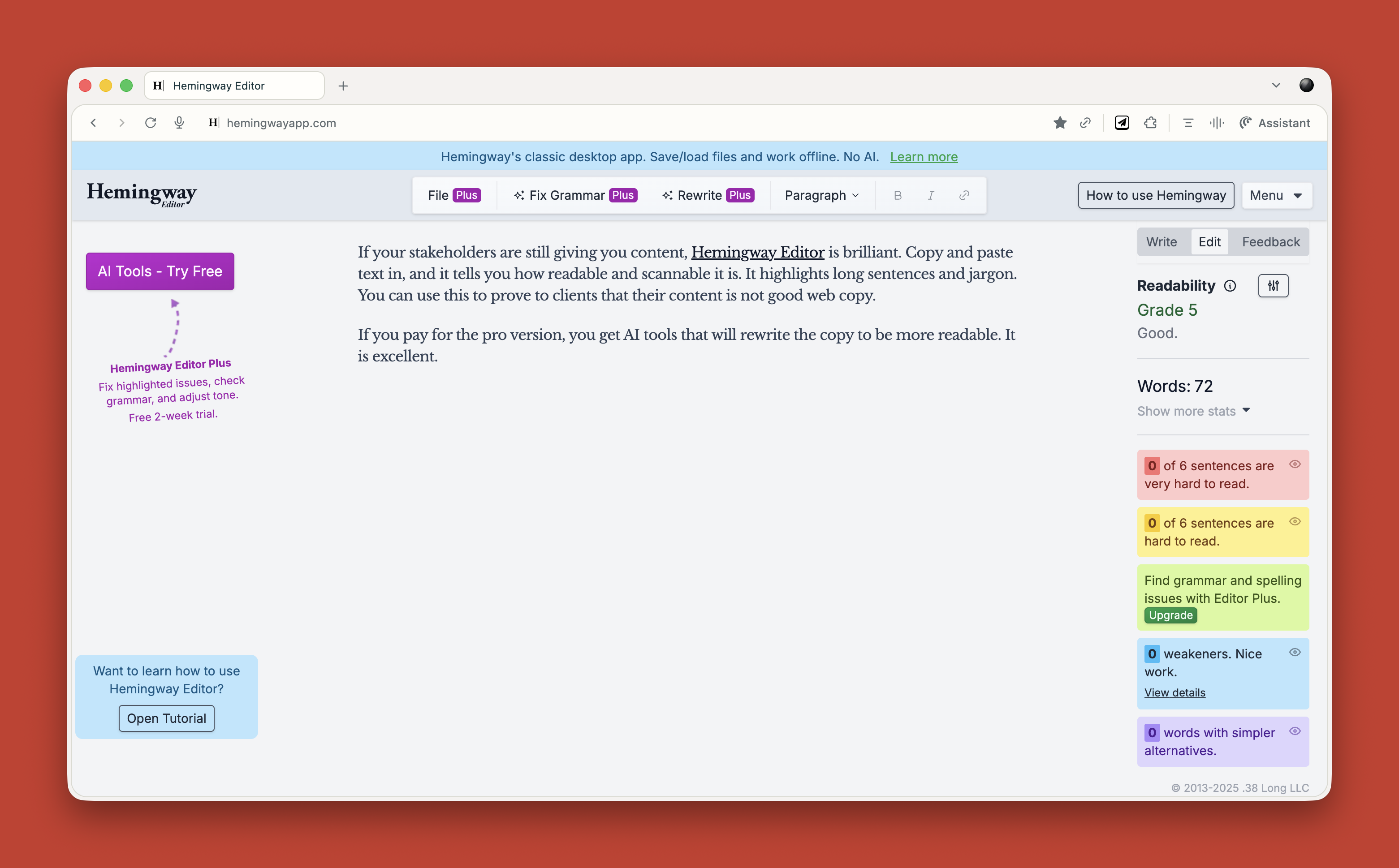
If you pay for the pro version, you get AI tools that will rewrite the copy to be more readable. It is excellent.
What This Means for You
Let me be clear about something. None of this is perfect. AI makes mistakes. It hallucinates. It produces bland output if you do not push it hard enough. It requires constant checking and challenging.
But here is what I know from two years of using this stuff daily. It has made me faster. It has made me better. It has freed me up to do more strategic thinking and less grunt work.
A report that would have taken me five days now takes three hours. That is not an exaggeration. That is real.
Overall, AI probably gives me a 25 to 33 percent increase in what I can do. That is significant.
“
AI cannot innovate. It cannot make creative leaps. It cannot know whether its output is good. It cannot understand what it is like to be human.
That is where you come in. That is where you will always come in.
Start small. Do not try to learn everything at once. Just ask yourself throughout your day: Could I do this with AI? Try it. See what happens. Double-check everything. Learn what works and what does not.
Treat it like an enthusiastic intern with zero life experience. Give it clear instructions. Check its work. Make it try again. Challenge it. Push it further.
And remember, it is not going to take your job. It is going to change it. For the better, I think. As long as we learn to work with it rather than against it.
(yk)