


How To Design For (And With) Deaf People
Practical UX guidelines to keep in mind for 466 million people who experience hearing loss. More design patterns in Smart Interface Design Patterns, a friendly video course on UX and design patterns b
Accessibility
Building An Offline-Friendly Image Upload System
Poor internet connectivity doesn’t have to mean poor UX. With PWA technologies like IndexedDB, service workers, and the Background Sync API, you can build an offline-friendly image upload system tha
Javascript
Creating The “Moving Highlight” Navigation Bar With JavaScript And CSS
In this tutorial, Blake Lundquist walks us through two methods of creating the “moving-highlight” navigation pattern using only plain JavaScript and CSS. The first technique uses the getBoundingCl
Javascript

Build A Static RSS Reader To Fight Your Inner FOMO
Build A Static RSS Reader To Fight Your Inner FOMO Build A Static RSS Reader To Fight Your Inner FOMO Karin Hendrikse 2024-10-07T13:00:00+00:00 2025-06-25T15:04:30+00:00 In a fast-paced industry like tech, it can be hard to deal with the fear of missing out on important news. […]
Accessibility
Build A Static RSS Reader To Fight Your Inner FOMO
Karin Hendrikse 2024-10-07T13:00:00+00:00
2025-06-25T15:04:30+00:00
In a fast-paced industry like tech, it can be hard to deal with the fear of missing out on important news. But, as many of us know, there’s an absolutely huge amount of information coming in daily, and finding the right time and balance to keep up can be difficult, if not stressful. A classic piece of technology like an RSS feed is a delightful way of taking back ownership of our own time. In this article, we will create a static Really Simple Syndication (RSS) reader that will bring you the latest curated news only once (yes: once) a day.
We’ll obviously work with RSS technology in the process, but we’re also going to combine it with some things that maybe you haven’t tried before, including Astro (the static site framework), TypeScript (for JavaScript goodies), a package called rss-parser (for connecting things together), as well as scheduled functions and build hooks provided by Netlify (although there are other services that do this).
I chose these technologies purely because I really, really enjoy them! There may be other solutions out there that are more performant, come with more features, or are simply more comfortable to you — and in those cases, I encourage you to swap in whatever you’d like. The most important thing is getting the end result!
The Plan
Here’s how this will go. Astro generates the website. I made the intentional decision to use a static site because I want the different RSS feeds to be fetched only once during build time, and that’s something we can control each time the site is “rebuilt” and redeployed with updates. That’s where Netlify’s scheduled functions come into play, as they let us trigger rebuilds automatically at specific times. There is no need to manually check for updates and deploy them! Cron jobs can just as readily do this if you prefer a server-side solution.
During the triggered rebuild, we’ll let the rss-parser package do exactly what it says it does: parse a list of RSS feeds that are contained in an array. The package also allows us to set a filter for the fetched results so that we only get ones from the past day, week, and so on. Personally, I only render the news from the last seven days to prevent content overload. We’ll get there!
But first…
What Is RSS?
RSS is a web feed technology that you can feed into a reader or news aggregator. Because RSS is standardized, you know what to expect when it comes to the feed’s format. That means we have a ton of fun possibilities when it comes to handling the data that the feed provides. Most news websites have their own RSS feed that you can subscribe to (this is Smashing Magazine’s RSS feed: https://www.smashingmagazine.com/feed/). An RSS feed is capable of updating every time a site publishes new content, which means it can be a quick source of the latest news, but we can tailor that frequency as well.
RSS feeds are written in an Extensible Markup Language (XML) format and have specific elements that can be used within it. Instead of focusing too much on the technicalities here, I’ll give you a link to the RSS specification. Don’t worry; that page should be scannable enough for you to find the most pertinent information you need, like the kinds of elements that are supported and what they represent. For this tutorial, we’re only using the following elements: <title>, <link>, <description>, <item>, and <pubDate>. We’ll also let our RSS parser package do some of the work for us.
Creating The State Site
We’ll start by creating our Astro site! In your terminal run pnpm create astro@latest. You can use any package manager you want — I’m simply trying out pnpm for myself.
After running the command, Astro’s chat-based helper, Houston, walks through some setup questions to get things started.
 astro   Launch sequence initiated.

   dir   Where should we create your new project?
         ./rss-buddy

  tmpl   How would you like to start your new project?
         Include sample files

    ts   Do you plan to write TypeScript?
         Yes

   use   How strict should TypeScript be?
         Strict

  deps   Install dependencies?
         Yes

   git   Initialize a new git repository?
         Yes
I like to use Astro’s sample files so I can get started quickly, but we’re going to clean them up a bit in the process. Let’s clean up the src/pages/index.astro file by removing everything inside of the <main></main> tags. Then we’re good to go!
From there, we can spin things by running pnpm start. Your terminal will tell you which localhost address you can find your site at.
Pulling Information From RSS feeds
The src/pages/index.astro file is where we will make an array of RSS feeds we want to follow. We will be using Astro’s template syntax, so between the two code fences (—), create an array of feedSources and add some feeds. If you need inspiration, you can copy this:
const feedSources = [
  'https://www.smashingmagazine.com/feed/',
  'https://developer.mozilla.org/en-US/blog/rss.xml',
  // etc.
]
Now we’ll install the rss-parser package in our project by running pnpm install rss-parser. This package is a small library that turns the XML that we get from fetching an RSS feed into JavaScript objects. This makes it easy for us to read our RSS feeds and manipulate the data any way we want.
Once the package is installed, open the src/pages/index.astro file, and at the top, we’ll import the rss-parser and instantiate the Partner class.
import Parser from 'rss-parser';
const parser = new Parser();
We use this parser to read our RSS feeds and (surprise!) parse them to JavaScript. We’re going to be dealing with a list of promises here. Normally, I would probably use Promise.all(), but the thing is, this is supposed to be a complicated experience. If one of the feeds doesn’t work for some reason, I’d prefer to simply ignore it.
Why? Well, because Promise.all() rejects everything even if only one of its promises is rejected. That might mean that if one feed doesn’t behave the way I’d expect it to, my entire page would be blank when I grab my hot beverage to read the news in the morning. I do not want to start my day confronted by an error.
Instead, I’ll opt to use Promise.allSettled(). This method will actually let all promises complete even if one of them fails. In our case, this means any feed that errors will just be ignored, which is perfect.
Let’s add this to the src/pages/index.astro file:
interface FeedItem {
  feed?: string;
  title?: string;
  link?: string;
  date?: Date;
}

const feedItems: FeedItem[] = [];

await Promise.allSettled(
  feedSources.map(async (source) => {
    try {
      const feed = await parser.parseURL(source);
      feed.items.forEach((item) => {
        const date = item.pubDate ? new Date(item.pubDate) : undefined;

          feedItems.push({
            feed: feed.title,
            title: item.title,
            link: item.link,
            date,
          });
      });
    } catch (error) {
      console.error(`Error fetching feed from ${source}:`, error);
    }
  })
);
This creates an array (or more) named feedItems. For each URL in the feedSources array we created earlier, the rss-parser retrieves the items and, yes, parses them into JavaScript. Then, we return whatever data we want! We’ll keep it simple for now and only return the following:
- The feed title,
- The title of the feed item,
- The link to the item,
- And the item’s published date.
The next step is to ensure that all items are sorted by date so we’ll truly get the “latest” news. Add this small piece of code to our work:
const sortedFeedItems = feedItems.sort((a, b) => (b.date ?? new Date()).getTime() - (a.date ?? new Date()).getTime());
Oh, and… remember when I said I didn’t want this RSS reader to render anything older than seven days? Let’s tackle that right now since we’re already in this code.
We’ll make a new variable called sevenDaysAgo and assign it a date. We’ll then set that date to seven days ago and use that logic before we add a new item to our feedItems array.
This is what the src/pages/index.astro file should now look like at this point:
---
import Layout from '../layouts/Layout.astro';
import Parser from 'rss-parser';
const parser = new Parser();

const sevenDaysAgo = new Date();
sevenDaysAgo.setDate(sevenDaysAgo.getDate() - 7);

const feedSources = [
  'https://www.smashingmagazine.com/feed/',
  'https://developer.mozilla.org/en-US/blog/rss.xml',
]

interface FeedItem {
  feed?: string;
  title?: string;
  link?: string;
  date?: Date;
}

const feedItems: FeedItem[] = [];

await Promise.allSettled(
  feedSources.map(async (source) => {
    try {
      const feed = await parser.parseURL(source);
      feed.items.forEach((item) => {
        const date = item.pubDate ? new Date(item.pubDate) : undefined;
        if (date && date >= sevenDaysAgo) {
          feedItems.push({
            feed: feed.title,
            title: item.title,
            link: item.link,
            date,
          });
        }
      });
    } catch (error) {
      console.error(`Error fetching feed from ${source}:`, error);
    }
  })
);

const sortedFeedItems = feedItems.sort((a, b) => (b.date ?? new Date()).getTime() - (a.date ?? new Date()).getTime());

---

<Layout title="Welcome to Astro.">
  <main>
  </main>
</Layout>
Rendering XML Data
It’s time to show our news articles on the Astro site! To keep this simple, we’ll format the items in an unordered list rather than some other fancy layout.
All we need to do is update the <Layout> element in the file with the XML objects sprinkled in for a feed item’s title, URL, and publish date.
<Layout title="Welcome to Astro.">
  <main>
  {sortedFeedItems.map(item => (
    <ul>
      <li>
        <a href={item.link}>{item.title}</a>
        <p>{item.feed}</p>
        <p>{item.date}</p>
      </li>
    </ul>
  ))}
  </main>
</Layout>
Go ahead and run pnpm start from the terminal. The page should display an unordered list of feed items. Of course, everything is styled at the moment, but luckily for you, you can make it look exactly like you want with CSS!
And remember that there are even more fields available in the XML for each item if you want to display more information. If you run the following snippet in your DevTools console, you’ll see all of the fields you have at your disposal:
feed.items.forEach(item => {}
Scheduling Daily Static Site Builds
We’re nearly done! The feeds are being fetched, and they are returning data back to us in JavaScript for use in our Astro page template. Since feeds are updated whenever new content is published, we need a way to fetch the latest items from it.
We want to avoid doing any of this manually. So, let’s set this site on Netlify to gain access to their scheduled functions that trigger a rebuild and their build hooks that do the building. Again, other services do this, and you’re welcome to roll this work with another provider — I’m just partial to Netlify since I work there. In any case, you can follow Netlify’s documentation for setting up a new site.
Once your site is hosted and live, you are ready to schedule your rebuilds. A build hook gives you a URL to use to trigger the new build, looking something like this:
https://api.netlify.com/build_hooks/your-build-hook-id
Let’s trigger builds every day at midnight. We’ll use Netlify’s scheduled functions. That’s really why I’m using Netlify to host this in the first place. Having them at the ready via the host greatly simplifies things since there’s no server work or complicated configurations to get this going. Set it and forget it!
We’ll install @netlify/functions (instructions) to the project and then create the following file in the project’s root directory: netlify/functions/deploy.ts.
This is what we want to add to that file:
// netlify/functions/deploy.ts

import type { Config } from '@netlify/functions';

const BUILD_HOOK =
  'https://api.netlify.com/build_hooks/your-build-hook-id'; // replace me!

export default async (req: Request) => {
  await fetch(BUILD_HOOK, {
    method: 'POST',
  })
};

export const config: Config = {
  schedule: '0 0 * * *',
};
If you commit your code and push it, your site should re-deploy automatically. From that point on, it follows a schedule that rebuilds the site every day at midnight, ready for you to take your morning brew and catch up on everything that you think is important.
(gg, yk)

How A Bottom-Up Design Approach Enhances Site Accessibility
How A Bottom-Up Design Approach Enhances Site Accessibility How A Bottom-Up Design Approach Enhances Site Accessibility Eleanor Hecks 2024-10-04T09:00:00+00:00 2025-06-25T15:04:30+00:00 Accessibility is key in modern web design. A site that doesn’t consider how its user experience may differ for various audiences — especially those with […]
Accessibility
How A Bottom-Up Design Approach Enhances Site Accessibility
Eleanor Hecks 2024-10-04T09:00:00+00:00
2025-06-25T15:04:30+00:00
Accessibility is key in modern web design. A site that doesn’t consider how its user experience may differ for various audiences — especially those with disabilities — will fail to engage and serve everyone equally. One of the best ways to prevent this is to approach your site from a bottom-up perspective.
Understanding Bottom-Up Design
Conventional, top-down design approaches start with the big picture before breaking these goals and concepts into smaller details. Bottom-up philosophies, by contrast, consider the minute details first, eventually achieving the broader goal piece by piece.
This alternative way of thinking is important for accessibility in general because it reflects how neurodivergent people commonly think. While non-autistic people tend to think from a top-down perspective, those with autism often employ a bottom-up way of thinking.
Of course, there is considerable variation, and researchers have identified at least three specialist thinking types within the autism spectrum:
- Visual thinkers who think in images;
- Pattern thinkers who think of concepts in terms of patterns and relationships;
- Verbal thinkers who think only in word detail.
Still, research shows that people with autism and ADHD show a bias toward bottom-up thinking rather than the top-down approach you often see in neurotypical users. Consequently, a top-down strategy means you may miss details your audience may notice, and your site may not feel easily usable for all users.

As a real-world example, consider the task of writing an essay. Many students are instructed to start an essay assignment by thinking about the main point they want to convey and then create an outline with points that support the main argument. This is top-down thinking — starting with the big picture of the topic and then gradually breaking down the topic into points and then later into words that articulate these points.

In contrast, someone who uses a bottom-up thinking approach might start an essay with no outline but rather just by freely jotting down every idea that comes to mind as it comes to mind — perhaps starting with one particular idea or example that the writer finds interesting and wants to explore further and branching off from there. Then, once all the ideas have been written out, the writer goes back to group related ideas together and arrange them into a logical outline. This writer starts with the small details of the essay and then works these details into the big picture of the final form.
In web design, in particular, a bottom-up approach means starting with the specifics of the user experience instead of the desired effect. You may determine a readable layout for a single blog post, then ask how that page relates to others and slowly build on these decisions until you have several well-organized website categories.
You may even get more granular. Say you start your site design by placing a menu at the bottom of a mobile site to make it easier to tap with one hand, improving ease of use. Then, you build a drop-down menu around that choice — placing the most popular or needed options at the bottom instead of the top for easy tapping. From there, you may have to rethink larger-scale layouts to work around those interactive elements being lower on the screen, slowly addressing larger categories until you have a finished site design.

In either case, the idea of bottom-up design is to begin with the most specific problems someone might have. You then address them in sequence instead of determining the big picture first.
Benefits Of A Bottom-Up Approach For Accessible Design
While neither bottom-up nor top-down approaches dominate the industry, some web engineers prefer the bottom-up approach due to the various accessibility benefits this process provides. This strategy has several accessibility benefits.
Putting User Needs First
The biggest benefit of bottom-up methods is that they prioritize the user’s needs.
Top-down approaches seem organized, but they often result in a site that reflects the designer’s choices and beliefs more than it serves your audience.
“
Consider some of the complaints that social media users have made over the years related to usability and accessibility for the everyday user. For example, many users complain that their Facebook feed will randomly refresh as they scroll for the sake of providing users with the most up-to-date content. However, the feature makes it virtually impossible to get back to a post a user viewed that they didn’t think to save. Likewise, TikTok’s watch history feature has come and gone over the years and still today is difficult for many users to find without viewing an outside tutorial on the subject.
This is a common problem: 95.9% of the largest one million homepages have Web Content Accessibility Guidelines (WCAG) errors. While a bottom-up alternative doesn’t mean you won’t make any mistakes, it may make them less likely, as bottom-up thinking often improves your awareness of new stimuli so you can catch things you’d otherwise overlook. It’s easier to meet user’s needs when you build your entire site around their experience instead of looking at UX as an afterthought.

Consider this example from Berkshire Hathaway, a multi-billion-dollar holding company. The overall design philosophy is understandable: It’s simple and direct, choosing to focus on information instead of fancy aesthetics that may not suit the company image. However, you could argue it loses itself in this big picture.
While it is simple, the lack of menus or color contrast and the small font make it harder to read and a little overwhelming. This confusion can counteract any accessibility benefits of its simplicity.

Alternatively, even a simple website redesign could include intuitive menus, additional contrast, and accessible font for easy navigation across the site.

The homepage for U.K. charity Scope offers a better example of web design centered around users’ needs. Concise, clear menus line the top of the page to aid quicker, easier navigation. The color scheme is simple enough to avoid confusion but provides enough contrast to make everything easy to read — something the sans-serif font further helps.
Ensuring Accessibility From The Start
A top-down method also makes catering to a diverse audience difficult because you may need to shoehorn features into an existing design.
For example, say, a local government agency creates a website focused on providing information and services to a general audience of residents. The site originally featured high-resolution images, bright colors, and interactive charts.

However, they realize the images are not accessible to people navigating the site with screen readers, while multiple layers of submenus are difficult for keyboard-only users. Further, the bright colors make it hard for visually impaired users to read the site’s information.
The agency, realizing these accessibility concerns, adds captions to each image. However, the captions disrupt the originally intended visual aesthetics and user flow. Further, adjusting the bright colors would involve completely rethinking the site’s entire color palette. If these considerations had been made before the site was built, the site build could have specifically accommodated these elements while still creating an aesthetically pleasing and user-friendly result.

Alternatively, a site initially built with high contrast, a calm color scheme, clear typography, simple menus, and reduced imagery would make this site much more accessible to a wide user base from the get-go.

As a real-world example, consider the Awwwards website. There are plenty of menus to condense information and ease navigation without overloading the screen — a solid accessibility choice. However, there does not seem to be consistent thought in these menus’ placement or organization.

There are far too many menus; some are at the top while others are at the bottom, and a scrolling top bar adds further distractions. It seems like Awwwards may have added additional menus as an afterthought to improve navigation. This leads to inconsistencies and crowding because they did not begin with this thought.
In contrast,
Bottom-up alternatives address usability issues from the beginning, which results in a more functional, accessible website.
“
Redesigning a system to address a usability issue it didn’t originally make room for is challenging. It can lead to errors like broken links and other unintended consequences that may hinder access for other visitors. Some sites have even claimed to lose 90% of their traffic after a redesign. While bottom-up approaches won’t eliminate those possibilities, they make them less likely by centering everything around usage from the start.

The website for the Vasa Museum in Stockholm, Sweden, showcases a more cohesive approach to ensuring accessibility. Like Awwwards, it uses menus to aid navigation and organization, but there seems to be more forethought into these features. All menus are at the top, and there are fewer of them, resulting in less clutter and a faster way to find what you’re looking for. The overall design complements this by keeping things simple and neat so that the menus stand out.
Increasing Awareness
Similarly, bottom-up design ensures you don’t miss as many accessibility concerns. When you start at the top, before determining what details fit within it, you may not consider all the factors that influence it. Beginning with the specifics instead makes it easier to spot and address problems you would’ve missed otherwise.
This awareness is particularly important for serving a diverse population. An estimated 16% of the global population — 1.6 billion people — have a significant disability. That means there’s a huge range of varying needs to account for, but most people lack firsthand experience living with these conditions. Consequently, it’s easy to miss things impacting others’ UX. You can overcome that knowledge gap by asking how everyone can use your site first.

Bottom-Up vs. Top-Down: Which Is Best for You?
As these benefits show, a bottom-up design philosophy can be helpful when building an accessible site. Still, top-down methods can be advantageous at times, too. Which is best depends on your situation.
Top-down approaches are a good way to ensure a consistent brand image, as you start with the overall idea and base future decisions on this concept. It also makes it easier to create a design hierarchy to facilitate decision-making within your team. When anyone has a question, they can turn to whoever is above them or refer to the broader goals. Such organization can also mean faster design processes.
Bottom-up methods, by contrast, are better when accessibility for a diverse audience is your main concern. It may be harder to keep everyone on the same overall design philosophy page, but it usually produces a more functional website. You can catch and solve problems early and pay great attention to detail. However, this can mean longer design cycles, which can incur extra costs.
It may come down to what your team is most comfortable with. People think and work differently, with some preferring a top-down approach while others find bottom-up more natural. Combining the two — starting with a top-down model before tackling updates from a bottom-up perspective — can be beneficial, too.
Strategies For Implementing A Bottom-Up Design Model
Should you decide a bottom-up design method is best for your goals, here are some ways you can embrace this philosophy.
Talk To Your Existing User Base
One of the most important factors in bottom-up web design is to center everything around your users. As a result, your existing user base — whether from a separate part of your business or another site you run — is the perfect place to start.
Survey customers and web visitors about their experience on your sites and others. Ask what pain points they have and what features they’d appreciate. Any commonalities between responses deserve attention. You can also turn to WCAG standards for inspiration on accessible functionality, but first-hand user feedback should form the core of your mission.
Look To Past Projects For Accessibility Gaps
Past sites and business projects can also reveal what specifics you should start with. Look for any accessibility gaps by combing through old customer feedback and update histories and using these sites yourself to find issues. Take note of any barriers or usability concerns to address in your next website.
Remember to document everything you find as you go. Up to 90% of organizations’ data is unstructured, making it difficult to analyze later. Reversing that trend by organizing your findings and recording your accessible design process will streamline future accessibility optimization efforts.
Divide Tasks But Communicate Often
Keep in mind that a bottom-up strategy can be time-consuming. One of the reasons why top-down alternatives are popular is because they’re efficient. You can overcome this gap by splitting tasks between smaller teams. However, these groups must communicate frequently to ensure separate design considerations work as a cohesive whole.
A DevOps approach is helpful here. DevOps has helped 49% of its adopters achieve a faster time to market, and 61% report higher-quality deliverables. It also includes space for both detailed work and team-wide meetings to keep everyone on track. Such benefits ensure you can remain productive in a bottom-up strategy.
Accessible Websites Need A Bottom-Up Design Approach
You can’t overstate the importance of accessible website design. By the same token, bottom-up philosophies are crucial in modern site-building. A detail-oriented approach makes it easier to serve a more diverse audience along several fronts. Making the most of this opportunity will both extend your reach to new niches and make the web a more equitable place.
The Web Accessibility Initiative’s WCAG standards are a good place to start. While these guidelines don’t necessarily describe how to apply a bottom-up approach, they do outline critical user needs and accessibility concerns your design should consider. The site also offers a free and comprehensive Digital Accessibility Foundations course for designers and developers.
Familiarizing yourself with these standards and best practices will make it easier to understand your audience before you begin designing your site. You can then build a more accessible platform from the ground up.
Additionally, the following are some valuable related reads that can act as inspiration in accessibility-centered and user-centric design.
- Inclusive Design for a Digital World: Designing with Accessibility in Mind by Regine M. Gilbert
- Practical Web Inclusion and Accessibility: A Comprehensive Guide to Access Needs by Ashley Firth
- Don’t Make Me Think, Revisited: A Common Sense Approach to Web Usability by Steve Krug
By employing bottom-up thinking as well as resources like these in your design approach, you can create websites that not only meet current accessibility standards but actively encourage site use among users of all backgrounds and abilities.
Further Reading On SmashingMag
- “Getting To The Bottom Of Minimum WCAG-Conformant Interactive Element Size,” Eric Bailey
- “How To Make A Strong Case For Accessibility,” Vitaly Friedman
- “A Guide To Accessible Form Validation,” Sandrina Pereira
- “Creating A High-Contrast Design System With CSS Custom Properties,” Brecht De Ruyte
(yk)
Generating Unique Random Numbers In JavaScript Using Sets
Generating Unique Random Numbers In JavaScript Using Sets Generating Unique Random Numbers In JavaScript Using Sets Amejimaobari Ollornwi 2024-08-26T15:00:00+00:00 2025-06-25T15:04:30+00:00 JavaScript comes with a lot of built-in functions that allow you to carry out so many different operations. One of these built-in functions is the […]
Accessibility
Generating Unique Random Numbers In JavaScript Using Sets
Amejimaobari Ollornwi 2024-08-26T15:00:00+00:00
2025-06-25T15:04:30+00:00
JavaScript comes with a lot of built-in functions that allow you to carry out so many different operations. One of these built-in functions is the Math.random() method, which generates a random floating-point number that can then be manipulated into integers.
However, if you wish to generate a series of unique random numbers and create more random effects in your code, you will need to come up with a custom solution for yourself because the Math.random() method on its own cannot do that for you.
In this article, we’re going to be learning how to circumvent this issue and generate a series of unique random numbers using the Set object in JavaScript, which we can then use to create more randomized effects in our code.
Note: This article assumes that you know how to generate random numbers in JavaScript, as well as how to work with sets and arrays.
Generating a Unique Series of Random Numbers
One of the ways to generate a unique series of random numbers in JavaScript is by using Set objects. The reason why we’re making use of sets is because the elements of a set are unique. We can iteratively generate and insert random integers into sets until we get the number of integers we want.
And since sets do not allow duplicate elements, they are going to serve as a filter to remove all of the duplicate numbers that are generated and inserted into them so that we get a set of unique integers.
Here’s how we are going to approach the work:
- Create a
Setobject. - Define how many random numbers to produce and what range of numbers to use.
- Generate each random number and immediately insert the numbers into the
Setuntil theSetis filled with a certain number of them.
The following is a quick example of how the code comes together:
function generateRandomNumbers(count, min, max) {
  // 1: Create a `Set` object
  let uniqueNumbers = new Set();
  while (uniqueNumbers.size < count) {
    // 2: Generate each random number
    uniqueNumbers.add(Math.floor(Math.random() * (max - min + 1)) + min);
  }
  // 3: Immediately insert them numbers into the Set...
  return Array.from(uniqueNumbers);
}
// ...set how many numbers to generate from a given range
console.log(generateRandomNumbers(5, 5, 10));
What the code does is create a new Set object and then generate and add the random numbers to the set until our desired number of integers has been included in the set. The reason why we’re returning an array is because they are easier to work with.
One thing to note, however, is that the number of integers you want to generate (represented by count in the code) should be less than the upper limit of your range plus one (represented by max + 1 in the code). Otherwise, the code will run forever. You can add an if statement to the code to ensure that this is always the case:
function generateRandomNumbers(count, min, max) {
  // if statement checks that `count` is less than `max + 1`
  if (count > max + 1) {
    return "count cannot be greater than the upper limit of range";
  } else {
    let uniqueNumbers = new Set();
    while (uniqueNumbers.size < count) {
      uniqueNumbers.add(Math.floor(Math.random() * (max - min + 1)) + min);
    }
    return Array.from(uniqueNumbers);
  }
}
console.log(generateRandomNumbers(5, 5, 10));
Using the Series of Unique Random Numbers as Array Indexes
It is one thing to generate a series of random numbers. It’s another thing to use them.
Being able to use a series of random numbers with arrays unlocks so many possibilities: you can use them in shuffling playlists in a music app, randomly sampling data for analysis, or, as I did, shuffling the tiles in a memory game.
Let’s take the code from the last example and work off of it to return random letters of the alphabet. First, we’ll construct an array of letters:
const englishAlphabets = [
  'A', 'B', 'C', 'D', 'E', 'F', 'G', 'H', 'I', 'J', 'K', 'L', 'M',
  'N', 'O', 'P', 'Q', 'R', 'S', 'T', 'U', 'V', 'W', 'X', 'Y', 'Z'
];

// rest of code
Then we map the letters in the range of numbers:
const englishAlphabets = [
  'A', 'B', 'C', 'D', 'E', 'F', 'G', 'H', 'I', 'J', 'K', 'L', 'M',
  'N', 'O', 'P', 'Q', 'R', 'S', 'T', 'U', 'V', 'W', 'X', 'Y', 'Z'
];

// generateRandomNumbers()

const randomAlphabets = randomIndexes.map((index) => englishAlphabets[index]);
In the original code, the generateRandomNumbers() function is logged to the console. This time, we’ll construct a new variable that calls the function so it can be consumed by randomAlphabets:
const englishAlphabets = [
  'A', 'B', 'C', 'D', 'E', 'F', 'G', 'H', 'I', 'J', 'K', 'L', 'M',
  'N', 'O', 'P', 'Q', 'R', 'S', 'T', 'U', 'V', 'W', 'X', 'Y', 'Z'
];

// generateRandomNumbers()

const randomIndexes = generateRandomNumbers(5, 0, 25);
const randomAlphabets = randomIndexes.map((index) => englishAlphabets[index]);
Now we can log the output to the console like we did before to see the results:
const englishAlphabets = [
  'A', 'B', 'C', 'D', 'E', 'F', 'G', 'H', 'I', 'J', 'K', 'L', 'M',
  'N', 'O', 'P', 'Q', 'R', 'S', 'T', 'U', 'V', 'W', 'X', 'Y', 'Z'
];

// generateRandomNumbers()

const randomIndexes = generateRandomNumbers(5, 0, 25);
const randomAlphabets = randomIndexes.map((index) => englishAlphabets[index]);
console.log(randomAlphabets);
And, when we put the generateRandomNumbers() function definition back in, we get the final code:
const englishAlphabets = [
  'A', 'B', 'C', 'D', 'E', 'F', 'G', 'H', 'I', 'J', 'K', 'L', 'M',
  'N', 'O', 'P', 'Q', 'R', 'S', 'T', 'U', 'V', 'W', 'X', 'Y', 'Z'
];
function generateRandomNumbers(count, min, max) {
  if (count > max + 1) {
    return "count cannot be greater than the upper limit of range";
  } else {
    let uniqueNumbers = new Set();
    while (uniqueNumbers.size < count) {
      uniqueNumbers.add(Math.floor(Math.random() * (max - min + 1)) + min);
    }
    return Array.from(uniqueNumbers);
  }
}
const randomIndexes = generateRandomNumbers(5, 0, 25);
const randomAlphabets = randomIndexes.map((index) => englishAlphabets[index]);
console.log(randomAlphabets);
So, in this example, we created a new array of alphabets by randomly selecting some letters in our englishAlphabets array.
You can pass in a count argument of englishAlphabets.length to the generateRandomNumbers function if you desire to shuffle the elements in the englishAlphabets array instead. This is what I mean:
generateRandomNumbers(englishAlphabets.length, 0, 25);
Wrapping Up
In this article, we’ve discussed how to create randomization in JavaScript by covering how to generate a series of unique random numbers, how to use these random numbers as indexes for arrays, and also some practical applications of randomization.
The best way to learn anything in software development is by consuming content and reinforcing whatever knowledge you’ve gotten from that content by practicing. So, don’t stop here. Run the examples in this tutorial (if you haven’t done so), play around with them, come up with your own unique solutions, and also don’t forget to share your good work. Ciao!
(yk)
Regexes Got Good: The History And Future Of Regular Expressions In JavaScript
Regexes Got Good: The History And Future Of Regular Expressions In JavaScript Regexes Got Good: The History And Future Of Regular Expressions In JavaScript Steven Levithan 2024-08-20T15:00:00+00:00 2025-06-25T15:04:30+00:00 Modern JavaScript regular expressions have come a long way compared to what you might be familiar with. […]
Accessibility
Regexes Got Good: The History And Future Of Regular Expressions In JavaScript
Steven Levithan 2024-08-20T15:00:00+00:00
2025-06-25T15:04:30+00:00
Modern JavaScript regular expressions have come a long way compared to what you might be familiar with. Regexes can be an amazing tool for searching and replacing text, but they have a longstanding reputation (perhaps outdated, as I’ll show) for being difficult to write and understand.
This is especially true in JavaScript-land, where regexes languished for many years, comparatively underpowered compared to their more modern counterparts in PCRE, Perl, .NET, Java, Ruby, C++, and Python. Those days are over.
In this article, I’ll recount the history of improvements to JavaScript regexes (spoiler: ES2018 and ES2024 changed the game), show examples of modern regex features in action, introduce you to a lightweight JavaScript library that makes JavaScript stand alongside or surpass other modern regex flavors, and end with a preview of active proposals that will continue to improve regexes in future versions of JavaScript (with some of them already working in your browser today).
The History of Regular Expressions in JavaScript
ECMAScript 3, standardized in 1999, introduced Perl-inspired regular expressions to the JavaScript language. Although it got enough things right to make regexes pretty useful (and mostly compatible with other Perl-inspired flavors), there were some big omissions, even then. And while JavaScript waited 10 years for its next standardized version with ES5, other programming languages and regex implementations added useful new features that made their regexes more powerful and readable.
But that was then.
Did you know that nearly every new version of JavaScript has made at least minor improvements to regular expressions?
Let’s take a look at them.
Don’t worry if it’s hard to understand what some of the following features mean — we’ll look more closely at several of the key features afterward.
- ES5 (2009) fixed unintuitive behavior by creating a new object every time regex literals are evaluated and allowed regex literals to use unescaped forward slashes within character classes (
/[/]/). - ES6/ES2015 added two new regex flags:
y(sticky), which made it easier to use regexes in parsers, andu(unicode), which added several significant Unicode-related improvements along with strict errors. It also added theRegExp.prototype.flagsgetter, support for subclassingRegExp, and the ability to copy a regex while changing its flags. - ES2018 was the edition that finally made JavaScript regexes pretty good. It added the
s(dotAll) flag, lookbehind, named capture, and Unicode properties (viap{...}andP{...}, which require ES6’s flagu). All of these are extremely useful features, as we’ll see. - ES2020 added the string method
matchAll, which we’ll also see more of shortly. - ES2022 added flag
d(hasIndices), which provides start and end indices for matched substrings. - And finally, ES2024 added flag
v(unicodeSets) as an upgrade to ES6’s flagu. Thevflag adds a set of multicharacter “properties of strings” top{...}, multicharacter elements within character classes viap{...}andq{...}, nested character classes, set subtraction[A--B]and intersection[A&&B], and different escaping rules within character classes. It also fixed case-insensitive matching for Unicode properties within negated sets[^...].
As for whether you can safely use these features in your code today, the answer is yes! The latest of these features, flag v, is supported in Node.js 20 and 2023-era browsers. The rest are supported in 2021-era browsers or earlier.
Each edition from ES2019 to ES2023 also added additional Unicode properties that can be used via p{...} and P{...}. And to be a completionist, ES2021 added string method replaceAll — although, when given a regex, the only difference from ES3’s replace is that it throws if not using flag g.
Aside: What Makes a Regex Flavor Good?
With all of these changes, how do JavaScript regular expressions now stack up against other flavors? There are multiple ways to think about this, but here are a few key aspects:
- Performance.
This is an important aspect but probably not the main one since mature regex implementations are generally pretty fast. JavaScript is strong on regex performance (at least considering V8’s Irregexp engine, used by Node.js, Chromium-based browsers, and even Firefox; and JavaScriptCore, used by Safari), but it uses a backtracking engine that is missing any syntax for backtracking control — a major limitation that makes ReDoS vulnerability more common. - Support for advanced features that handle common or important use cases.
Here, JavaScript stepped up its game with ES2018 and ES2024. JavaScript is now best in class for some features like lookbehind (with its infinite-length support) and Unicode properties (with multicharacter “properties of strings,” set subtraction and intersection, and script extensions). These features are either not supported or not as robust in many other flavors. - Ability to write readable and maintainable patterns.
Here, native JavaScript has long been the worst of the major flavors since it lacks thex(“extended”) flag that allows insignificant whitespace and comments. Additionally, it lacks regex subroutines and subroutine definition groups (from PCRE and Perl), a powerful set of features that enable writing grammatical regexes that build up complex patterns via composition.
So, it’s a bit of a mixed bag.
JavaScript regexes have become exceptionally powerful, but they’re still missing key features that could make regexes safer, more readable, and more maintainable (all of which hold some people back from using this power).
“
The good news is that all of these holes can be filled by a JavaScript library, which we’ll see later in this article.
Using JavaScript’s Modern Regex Features
Let’s look at a few of the more useful modern regex features that you might be less familiar with. You should know in advance that this is a moderately advanced guide. If you’re relatively new to regex, here are some excellent tutorials you might want to start with:
- RegexLearn and RegexOne are interactive tutorials that include practice problems.
- JavaScript.info’s regular expressions chapter is a detailed and JavaScript-specific guide.
- Demystifying Regular Expressions (video) is an excellent presentation for beginners by Lea Verou at HolyJS 2017.
- Learn Regular Expressions In 20 Minutes (video) is a live syntax walkthrough in a regex tester.
Named Capture
Often, you want to do more than just check whether a regex matches — you want to extract substrings from the match and do something with them in your code. Named capturing groups allow you to do this in a way that makes your regexes and code more readable and self-documenting.
The following example matches a record with two date fields and captures the values:
const record = 'Admitted: 2024-01-01nReleased: 2024-01-03';
const re = /^Admitted: (?<admitted>d{4}-d{2}-d{2})nReleased: (?<released>d{4}-d{2}-d{2})$/;
const match = record.match(re);
console.log(match.groups);
/* → {
  admitted: '2024-01-01',
  released: '2024-01-03'
} */
Don’t worry — although this regex might be challenging to understand, later, we’ll look at a way to make it much more readable. The key things here are that named capturing groups use the syntax (?<name>...), and their results are stored on the groups object of matches.
You can also use named backreferences to rematch whatever a named capturing group matched via k<name>, and you can use the values within search and replace as follows:
// Change 'FirstName LastName' to 'LastName, FirstName'
const name = 'Shaquille Oatmeal';
name.replace(/(?<first>w+) (?<last>w+)/, '$<last>, $<first>');
// → 'Oatmeal, Shaquille'
For advanced regexers who want to use named backreferences within a replacement callback function, the groups object is provided as the last argument. Here’s a fancy example:
function fahrenheitToCelsius(str) {
  const re = /(?<degrees>-?d+(.d+)?)Fb/g;
  return str.replace(re, (...args) => {
    const groups = args.at(-1);
    return Math.round((groups.degrees - 32) * 5/9) + 'C';
  });
}
fahrenheitToCelsius('98.6F');
// → '37C'
fahrenheitToCelsius('May 9 high is 40F and low is 21F');
// → 'May 9 high is 4C and low is -6C'
Lookbehind
Lookbehind (introduced in ES2018) is the complement to lookahead, which has always been supported by JavaScript regexes. Lookahead and lookbehind are assertions (similar to ^ for the start of a string or b for word boundaries) that don’t consume any characters as part of the match. Lookbehinds succeed or fail based on whether their subpattern can be found immediately before the current match position.
For example, the following regex uses a lookbehind (?<=...) to match the word “cat” (only the word “cat”) if it’s preceded by “fat ”:
const re = /(?<=fat )cat/g;
'cat, fat cat, brat cat'.replace(re, 'pigeon');
// → 'cat, fat pigeon, brat cat'
You can also use negative lookbehind — written as (?<!...) — to invert the assertion. That would make the regex match any instance of “cat” that’s not preceded by “fat ”.
const re = /(?<!fat )cat/g;
'cat, fat cat, brat cat'.replace(re, 'pigeon');
// → 'pigeon, fat cat, brat pigeon'
JavaScript’s implementation of lookbehind is one of the very best (matched only by .NET). Whereas other regex flavors have inconsistent and complex rules for when and whether they allow variable-length patterns inside lookbehind, JavaScript allows you to look behind for any subpattern.
The matchAll Method
JavaScript’s String.prototype.matchAll was added in ES2020 and makes it easier to operate on regex matches in a loop when you need extended match details. Although other solutions were possible before, matchAll is often easier, and it avoids gotchas, such as the need to guard against infinite loops when looping over the results of regexes that might return zero-length matches.
Since matchAll returns an iterator (rather than an array), it’s easy to use it in a for...of loop.
const re = /(?<char1>w)(?<char2>w)/g;
for (const match of str.matchAll(re)) {
  const {char1, char2} = match.groups;
  // Print each complete match and matched subpatterns
  console.log(`Matched "${match[0]}" with "${char1}" and "${char2}"`);
}
Note: matchAll requires its regexes to use flag g (global). Also, as with other iterators, you can get all of its results as an array using Array.from or array spreading.
const matches = [...str.matchAll(/./g)];
Unicode Properties
Unicode properties (added in ES2018) give you powerful control over multilingual text, using the syntax p{...} and its negated version P{...}. There are hundreds of different properties you can match, which cover a wide variety of Unicode categories, scripts, script extensions, and binary properties.
Note: For more details, check out the documentation on MDN.
Unicode properties require using the flag u (unicode) or v (unicodeSets).
Flag v
Flag v (unicodeSets) was added in ES2024 and is an upgrade to flag u — you can’t use both at the same time. It’s a best practice to always use one of these flags to avoid silently introducing bugs via the default Unicode-unaware mode. The decision on which to use is fairly straightforward. If you’re okay with only supporting environments with flag v (Node.js 20 and 2023-era browsers), then use flag v; otherwise, use flag u.
Flag v adds support for several new regex features, with the coolest probably being set subtraction and intersection. This allows using A--B (within character classes) to match strings in A but not in B or using A&&B to match strings in both A and B. For example:
// Matches all Greek symbols except the letter 'π'
/[p{Script_Extensions=Greek}--π]/v

// Matches only Greek letters
/[p{Script_Extensions=Greek}&&p{Letter}]/v
For more details about flag v, including its other new features, check out this explainer from the Google Chrome team.
A Word on Matching Emoji
Emoji are 🤩🔥😎👌, but how emoji get encoded in text is complicated. If you’re trying to match them with a regex, it’s important to be aware that a single emoji can be composed of one or many individual Unicode code points. Many people (and libraries!) who roll their own emoji regexes miss this point (or implement it poorly) and end up with bugs.
The following details for the emoji “👩🏻🏫” (Woman Teacher: Light Skin Tone) show just how complicated emoji can be:
// Code unit length
'👩🏻🏫'.length;
// → 7
// Each astral code point (above uFFFF) is divided into high and low surrogates
// Code point length
[...'👩🏻🏫'].length;
// → 4
// These four code points are: u{1F469} u{1F3FB} u{200D} u{1F3EB}
// u{1F469} combined with u{1F3FB} is '👩🏻'
// u{200D} is a Zero-Width Joiner
// u{1F3EB} is '🏫'
// Grapheme cluster length (user-perceived characters)
[...new Intl.Segmenter().segment('👩🏻🏫')].length;
// → 1
Fortunately, JavaScript added an easy way to match any individual, complete emoji via p{RGI_Emoji}. Since this is a fancy “property of strings” that can match more than one code point at a time, it requires ES2024’s flag v.
If you want to match emojis in environments without v support, check out the excellent libraries emoji-regex and emoji-regex-xs.
Making Your Regexes More Readable, Maintainable, and Resilient
Despite the improvements to regex features over the years, native JavaScript regexes of sufficient complexity can still be outrageously hard to read and maintain.
Regular Expressions are SO EASY!!!! pic.twitter.com/q4GSpbJRbZ
— Garabato Kid (@garabatokid) July 5, 2019
ES2018’s named capture was a great addition that made regexes more self-documenting, and ES6’s String.raw tag allows you to avoid escaping all your backslashes when using the RegExp constructor. But for the most part, that’s it in terms of readability.
However, there’s a lightweight and high-performance JavaScript library named regex (by yours truly) that makes regexes dramatically more readable. It does this by adding key missing features from Perl-Compatible Regular Expressions (PCRE) and outputting native JavaScript regexes. You can also use it as a Babel plugin, which means that regex calls are transpiled at build time, so you get a better developer experience without users paying any runtime cost.
PCRE is a popular C library used by PHP for its regex support, and it’s available in countless other programming languages and tools.
Let’s briefly look at some of the ways the regex library, which provides a template tag named regex, can help you write complex regexes that are actually understandable and maintainable by mortals. Note that all of the new syntax described below works identically in PCRE.
Insignificant Whitespace and Comments
By default, regex allows you to freely add whitespace and line comments (starting with #) to your regexes for readability.
import {regex} from 'regex';
const date = regex`
  # Match a date in YYYY-MM-DD format
  (?<year>  d{4}) - # Year part
  (?<month> d{2}) - # Month part
  (?<day>   d{2})   # Day part
`;
This is equivalent to using PCRE’s xx flag.
Subroutines and Subroutine Definition Groups
Subroutines are written as g<name> (where name refers to a named group), and they treat the referenced group as an independent subpattern that they try to match at the current position. This enables subpattern composition and reuse, which improves readability and maintainability.
For example, the following regex matches an IPv4 address such as “192.168.12.123”:
import {regex} from 'regex';
const ipv4 = regex`b
  (?<byte> 25[0-5] | 2[0-4]d | 1dd | [1-9]?d)
  # Match the remaining 3 dot-separated bytes
  (. g<byte>){3}
b`;
You can take this even further by defining subpatterns for use by reference only via subroutine definition groups. Here’s an example that improves the regex for admittance records that we saw earlier in this article:
const record = 'Admitted: 2024-01-01nReleased: 2024-01-03';
const re = regex`
  ^ Admitted: (?<admitted> g<date>) n
    Released: (?<released> g<date>) $

  (?(DEFINE)
    (?<date>  g<year>-g<month>-g<day>)
    (?<year>  d{4})
    (?<month> d{2})
    (?<day>   d{2})
  )
`;
const match = record.match(re);
console.log(match.groups);
/* → {
  admitted: '2024-01-01',
  released: '2024-01-03'
} */
A Modern Regex Baseline
regex includes the v flag by default, so you never forget to turn it on. And in environments without native v, it automatically switches to flag u while applying v’s escaping rules, so your regexes are forward and backward-compatible.
It also implicitly enables the emulated flags x (insignificant whitespace and comments) and n (“named capture only” mode) by default, so you don’t have to continually opt into their superior modes. And since it’s a raw string template tag, you don’t have to escape your backslashes like with the RegExp constructor.
Atomic Groups and Possessive Quantifiers Can Prevent Catastrophic Backtracking
Atomic groups and possessive quantifiers are another powerful set of features added by the regex library. Although they’re primarily about performance and resilience against catastrophic backtracking (also known as ReDoS or “regular expression denial of service,” a serious issue where certain regexes can take forever when searching particular, not-quite-matching strings), they can also help with readability by allowing you to write simpler patterns.
Note: You can learn more in the regex documentation.
What’s Next? Upcoming JavaScript Regex Improvements
There are a variety of active proposals for improving regexes in JavaScript. Below, we’ll look at the three that are well on their way to being included in future editions of the language.
Duplicate Named Capturing Groups
This is a Stage 3 (nearly finalized) proposal. Even better is that, as of recently, it works in all major browsers.
When named capturing was first introduced, it required that all (?<name>...) captures use unique names. However, there are cases when you have multiple alternate paths through a regex, and it would simplify your code to reuse the same group names in each alternative.
For example:
/(?<year>d{4})-dd|dd-(?<year>d{4})/
This proposal enables exactly this, preventing a “duplicate capture group name” error with this example. Note that names must still be unique within each alternative path.
Pattern Modifiers (aka Flag Groups)
This is another Stage 3 proposal. It’s already supported in Chrome/Edge 125 and Opera 111, and it’s coming soon for Firefox. No word yet on Safari.
Pattern modifiers use (?ims:...), (?-ims:...), or (?im-s:...) to turn the flags i, m, and s on or off for only certain parts of a regex.
For example:
/hello-(?i:world)/
// Matches 'hello-WORLD' but not 'HELLO-WORLD'
Escape Regex Special Characters with RegExp.escape
This proposal recently reached Stage 3 and has been a long time coming. It isn’t yet supported in any major browsers. The proposal does what it says on the tin, providing the function RegExp.escape(str), which returns the string with all regex special characters escaped so you can match them literally.
If you need this functionality today, the most widely-used package (with more than 500 million monthly npm downloads) is escape-string-regexp, an ultra-lightweight, single-purpose utility that does minimal escaping. That’s great for most cases, but if you need assurance that your escaped string can safely be used at any arbitrary position within a regex, escape-string-regexp recommends the regex library that we’ve already looked at in this article. The regex library uses interpolation to escape embedded strings in a context-aware way.
Conclusion
So there you have it: the past, present, and future of JavaScript regular expressions.
If you want to journey even deeper into the lands of regex, check out Awesome Regex for a list of the best regex testers, tutorials, libraries, and other resources. And for a fun regex crossword puzzle, try your hand at regexle.
May your parsing be prosperous and your regexes be readable.
(gg, yk)
How To Build A Multilingual Website With Nuxt.js
How To Build A Multilingual Website With Nuxt.js How To Build A Multilingual Website With Nuxt.js Tim Benniks 2024-08-01T15:00:00+00:00 2025-06-25T15:04:30+00:00 This article is sponsored by Hygraph Internationalization, often abbreviated as i18n, is the process of designing and developing software applications in a way that they […]
Accessibility
How To Build A Multilingual Website With Nuxt.js
Tim Benniks 2024-08-01T15:00:00+00:00
2025-06-25T15:04:30+00:00
This article is sponsored by Hygraph
Internationalization, often abbreviated as i18n, is the process of designing and developing software applications in a way that they can be easily adapted to various spoken languages like English, German, French, and more without requiring substantial changes to the codebase. It involves moving away from hardcoded strings and techniques for translating text, formatting dates and numbers, and handling different character encodings, among other tasks.
Internationalization can give users the choice to access a given website or application in their native language, which can have a positive impression on them, making it crucial for reaching a global audience.
What We’re Making
In this tutorial, we’re making a website that puts these i18n pieces together using a combination of libraries and a UI framework. You’ll want to have intermediate proficiency with JavaScript, Vue, and Nuxt to follow along. Throughout this article, we will learn by examples and incrementally build a multilingual Nuxt website. Together, we will learn how to provide i18n support for different languages, lazy-load locale messages, and switch locale on runtime.
After that, we will explore features like interpolation, pluralization, and date/time translations.
And finally, we will fetch dynamic localized content from an API server using Hygraph as our API server to get localized content. If you do not have a Hygraph account please create one for free before jumping in.
As a final detail, we will use Vuetify as our UI framework, but please feel free to use another framework if you want. The final code for what we’re building is published in a GitHub repository for reference. And finally, you can also take a look at the final result in a live demo.
The nuxt-i18n Library
nuxt-i18n is a library for implementing internationalization in Nuxt.js applications, and it’s what we will be using in this tutorial. The library is built on top of Vue I18n, which, again, is the de facto standard library for implementing i18n in Vue applications.
What makes nuxt-i18n ideal for our work is that it provides the comprehensive set of features included in Vue I18n while adding more functionalities that are specific to Nuxt, like lazy loading locale messages, route generation and redirection for different locales, SEO metadata per locale, locale-specific domains, and more.
Initial Setup
Start a new Nuxt.js project and set it up with a UI framework of your choice. Again, I will be using Vue to establish the interface for this tutorial.
Let us add a basic layout for our website and set up some sample Vue templates.
First, a “Blog” page:
<!-- pages/blog.vue -->
<template>
<div>
<v-card color="cardBackground">
<v-card-title class="text-overline">
Home
</v-card-title>
<v-card-text>
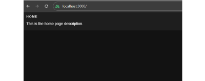
This is the home page description
</v-card-text>
</v-card>
</div>
</template>
Next, an “About” page:
<!-- pages/about.vue -->
<template>
  <div>
    <v-card color="cardBackground">
      <v-card-title class="text-overline">
        About
      </v-card-title>
      <v-card-text>
        This is the about page description
      </v-card-text>
    </v-card>
  </div>
</template>
This gives us a bit of a boilerplate that we can integrate our i18n work into.
Translating Plain Text
The page templates look good, but notice how the text is hardcoded. As far as i18n goes, hardcoded content is difficult to translate into different locales. That is where the nuxt-i18n library comes in, providing the language-specific strings we need for the Vue components in the templates.
We’ll start by installing the library via the command line:
npx nuxi@latest module add i18n
Inside the nuxt.config.ts file, we need to ensure that we have @nuxtjs/i18n inside the modules array. We can use the i18n property to provide module-specific configurations.
// nuxt.config.ts
export default defineNuxtConfig({
  // ...
  modules: [
    ...
    "@nuxtjs/i18n",
    // ...
  ],
  i18n: {
    // nuxt-i18n module configurations here
  }
  // ...
});
Since the nuxt-i18n library is built on top of the Vue I18n library, we can utilize its features in our Nuxt application as well. Let us create a new file, i18n.config.ts, which we will use to provide all vue-i18n configurations.
// i18n.config.ts
export default defineI18nConfig(() => ({
  legacy: false,
  locale: "en",
  messages: {
    en: {
      homePage: {
        title: "Home",
        description: "This is the home page description."
      },
      aboutPage: {
        title: "About",
        description: "This is the about page description."
      },
    },
  },
}));
Here, we have specified internationalization configurations, like using the en locale, and added messages for the en locale. These messages can be used inside the markup in the templates we made with the help of a $t function from Vue I18n.
Next, we need to link the i18n.config.ts configurations in our Nuxt config file.
// nuxt.config.ts
export default defineNuxtConfig({
  ...
  i18n: {
    vueI18n: "./i18n.config.ts"
  }
  ...
});
Now, we can use the $t function in our components — as shown below — to parse strings from our internationalization configurations.
Note: There’s no need to import $t since we have Nuxt’s default auto-import functionality.
<!-- i18n.config.ts -->
<template>
  <div>
    <v-card color="cardBackground">
      <v-card-title class="text-overline">
        {{ $t("homePage.title") }}
      </v-card-title>
      <v-card-text>
        {{ $t("homePage.description") }}
      </v-card-text>
    </v-card>
  </div>
</template>
Lazy Loading Translations
We have the title and description served from the configurations. Next, we can add more languages to the same config. For example, here’s how we can establish translations for English (en), French (fr) and Spanish (es):
// i18n.config.ts
export default defineI18nConfig(() => ({
  legacy: false,
  locale: "en",
  messages: {
    en: {
      // English
    },
    fr: {
      // French
    },
    es: {
      // Spanish
    }
  },
}));
For a production website with a lot of content that needs translating, it would be unwise to bundle all of the messages from different locales in the main bundle. Instead, we should use the nuxt-i18 lazy loading feature asynchronously load only the required language rather than all of them at once. Also, having messages for all locales in a single configuration file can become difficult to manage over time, and breaking them up like this makes things easier to find.
Let’s set up the lazy loading feature in nuxt.config.ts:
// etc.
  i18n: {
    vueI18n: "./i18n.config.ts",
    lazy: true,
    langDir: "locales",
    locales: [
      {
        code: "en",
        file: "en.json",
        name: "English",
      },
      {
        code: "es",
        file: "es.json",
        name: "Spanish",
      },
      {
        code: "fr",
        file: "fr.json",
        name: "French",
      },
    ],
    defaultLocale: "en",
    strategy: "no_prefix",
  },

// etc.
This enables lazy loading and specifies the locales directory that will contain our locale files. The locales array configuration specifies from which files Nuxt.js should pick up messages for a specific language.
Now, we can create individual files for each language. I’ll drop all three of them right here:
// locales/en.json
{
  "homePage": {
    "title": "Home",
    "description": "This is the home page description."
  },
  "aboutPage": {
    "title": "About",
    "description": "This is the about page description."
  },
  "selectLocale": {
    "label": "Select Locale"
  },
  "navbar": {
    "homeButton": "Home",
    "aboutButton": "About"
  }
}
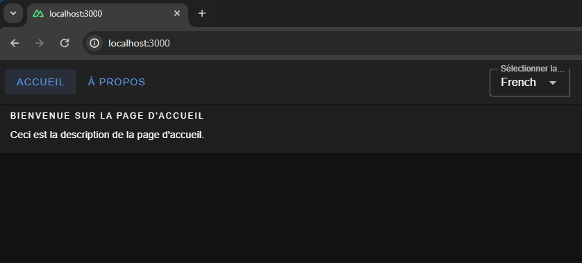
// locales/fr.json
{
  "homePage": {
    "title": "Bienvenue sur la page d'accueil",
    "description": "Ceci est la description de la page d'accueil."
  },
  "aboutPage": {
    "title": "À propos de nous",
    "description": "Ceci est la description de la page à propos de nous."
  },
  "selectLocale": {
    "label": "Sélectionner la langue"
  },
  "navbar": {
    "homeButton": "Accueil",
    "aboutButton": "À propos"
  }
}
// locales/es.json
{
  "homePage": {
    "title": "Bienvenido a la página de inicio",
    "description": "Esta es la descripción de la página de inicio."
  },
  "aboutPage": {
    "title": "Sobre nosotros",
    "description": "Esta es la descripción de la página sobre nosotros."
  },
  "selectLocale": {
    "label": "Seleccione el idioma"
  },
  "navbar": {
    "homeButton": "Inicio",
    "aboutButton": "Acerca de"
  }
}
We have set up lazy loading, added multiple languages to our application, and moved our locale messages to separate files. The user gets the right locale for the right message, and the locale messages are kept in a maintainable manner inside the code base.
Switching Between Languages
We have different locales, but to see them in action, we will build a component that can be used to switch between the available locales.
<!-- components/select-locale.vue -->
<script setup>
const { locale, locales, setLocale } = useI18n();

const language = computed({
  get: () => locale.value,
  set: (value) => setLocale(value),
});
</script>

<template>
  <v-select
    :label="$t('selectLocale.label')"
    variant="outlined"
    color="primary"
    density="compact"
    :items="locales"
    item-title="name"
    item-value="code"
    v-model="language"
  ></v-select>
</template>
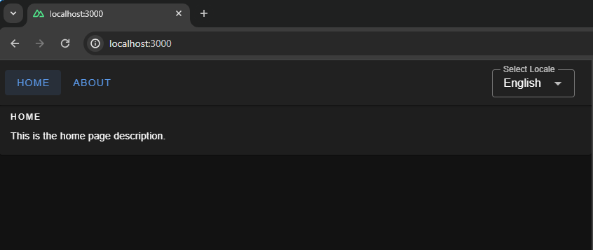
This component uses the useI18n hook provided by the Vue I18n library and a computed property language to get and set the global locale from a <select> input. To make this even more like a real-world website, we’ll include a small navigation bar that links up all of the website’s pages.
<!-- components/select-locale.vue -->
<template>
  <v-app-bar app :elevation="2" class="px-2">
    <div>
      <v-btn color="button" to="/">
        {{ $t("navbar.homeButton") }}
      </v-btn>
      <v-btn color="button" to="/about">
        {{ $t("navbar.aboutButton") }}
      </v-btn>
    </div>
    <v-spacer />
    <div class="mr-4 mt-6">
      <SelectLocale />
    </div>
  </v-app-bar>
</template>
That’s it! Now, we can switch between languages on the fly.


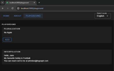
We have a basic layout, but I thought we’d take this a step further and build a playground page we can use to explore more i18n features that are pretty useful when building a multilingual website.
Interpolation and Pluralization
Interpolation and pluralization are internationalization techniques for handling dynamic content and grammatical variations across different languages. Interpolation allows developers to insert dynamic variables or expressions into translated strings. Pluralization addresses the complexities of plural forms in languages by selecting the appropriate grammatical form based on numeric values. With the help of interpolation and pluralization, we can create more natural and accurate translations.
To use pluralization in our Nuxt app, we’ll first add a configuration to the English locale file.
// locales/en.json
{
  // etc.
  "playgroundPage": {
    "pluralization": {
      "title": "Pluralization",
      "apple": "No Apple | One Apple | {count} Apples",
      "addApple": "Add"
    }
  }
  // etc.
}
The pluralization configuration set up for the key apple defines an output — No Apple — if a count of 0 is passed to it, a second output — One Apple — if a count of 1 is passed, and a third — 2 Apples, 3 Apples, and so on — if the count passed in is greater than 1.
Here is how we can use it in your component: Whenever you click on the add button, you will see pluralization in action, changing the strings.
<!-- pages/playground.vue -->
<script setup>
let appleCount = ref(0);
const addApple = () => {
  appleCount.value += 1;
};
</script>
<template>
  <v-container fluid>
    <!-- PLURALIZATION EXAMPLE  -->
    <v-card color="cardBackground">
      <v-card-title class="text-overline">
        {{ $t("playgroundPage.pluralization.title") }}
      </v-card-title>

      <v-card-text>
        {{ $t("playgroundPage.pluralization.apple", { count: appleCount }) }}
      </v-card-text>
      <v-card-actions>
        <v-btn
          @click="addApple"
          color="primary"
          variant="outlined"
          density="comfortable"
          >{{ $t("playgroundPage.pluralization.addApple") }}</v-btn
        >
      </v-card-actions>
    </v-card>
  </v-container>
</template>
To use interpolation in our Nuxt app, first, add a configuration in the English locale file:
// locales/en.json
{
  ...
  "playgroundPage": {
    ...
    "interpolation": {
      "title": "Interpolation",
      "sayHello": "Hello, {name}",
      "hobby": "My favourite hobby is {0}.",
      "email": "You can reach out to me at {account}{'@'}{domain}.com"
    },
    // etc.
  }
  // etc.
}
The message for sayHello expects an object passed to it having a key name when invoked — a process known as named interpolation.
The message hobby expects an array to be passed to it and will pick up the 0th element, which is known as list interpolation.
The message email expects an object with keys account, and domain and joins both with a literal string "@". This is known as literal interpolation.
Below is an example of how to use it in the Vue components:
<!-- pages/playground.vue -->
<template>
  <v-container fluid>
    <!-- INTERPOLATION EXAMPLE  -->
    <v-card color="cardBackground">
      <v-card-title class="text-overline">
        {{ $t("playgroundPage.interpolation.title") }}
      </v-card-title>
      <v-card-text>
        <p>
          {{
            $t("playgroundPage.interpolation.sayHello", {
              name: "Jane",
            })
          }}
        </p>
        <p>
          {{
            $t("playgroundPage.interpolation.hobby", ["Football", "Cricket"])
          }}
        </p>
        <p>
          {{
            $t("playgroundPage.interpolation.email", {
              account: "johndoe",
              domain: "hygraph",
            })
          }}
        </p>
      </v-card-text>
    </v-card>
  </v-container>
</template>
Date & Time Translations
Translating dates and times involves translating date and time formats according to the conventions of different locales. We can use Vue I18n’s features for formatting date strings, handling time zones, and translating day and month names for managing date time translations. We can give the configuration for the same using the datetimeFormats key inside the vue-i18n config object.
// i18n.config.ts
export default defineI18nConfig(() => ({
  fallbackLocale: "en",
  datetimeFormats: {
    en: {
      short: {
        year: "numeric",
        month: "short",
        day: "numeric",
      },
      long: {
        year: "numeric",
        month: "short",
        day: "numeric",
        weekday: "short",
        hour: "numeric",
        minute: "numeric",
        hour12: false,
      },
    },
    fr: {
      short: {
        year: "numeric",
        month: "short",
        day: "numeric",
      },
      long: {
        year: "numeric",
        month: "short",
        day: "numeric",
        weekday: "long",
        hour: "numeric",
        minute: "numeric",
        hour12: true,
      },
    },
    es: {
      short: {
        year: "numeric",
        month: "short",
        day: "numeric",
      },
      long: {
        year: "2-digit",
        month: "short",
        day: "numeric",
        weekday: "long",
        hour: "numeric",
        minute: "numeric",
        hour12: true,
      },
    },
  },
}));
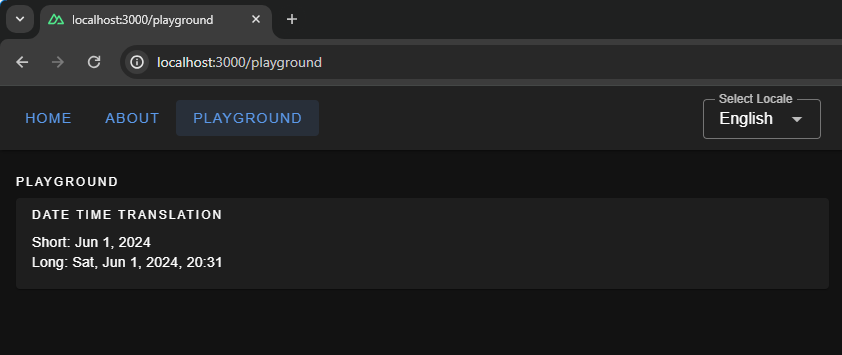
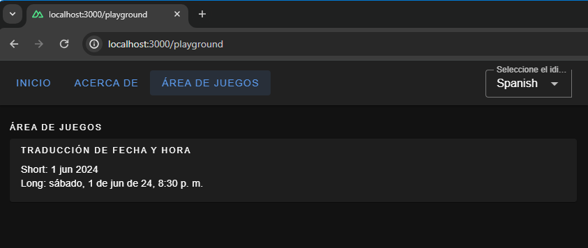
Here, we have set up short and long formats for all three languages. If you are coding along, you will be able to see available configurations for fields, like month and year, thanks to TypeScript and Intellisense features provided by your code editor. To display the translated dates and times in components, we should use the $d function and pass the format to it.
<!-- pages.playground.vue -->
<template>
  <v-container fluid>
    <!-- DATE TIME TRANSLATIONS EXAMPLE  -->
    <v-card color="cardBackground">
      <v-card-title class="text-overline">
        {{ $t("playgroundPage.dateTime.title") }}
      </v-card-title>
      <v-card-text>
        <p>Short: {{ (new Date(), $d(new Date(), "short")) }}</p>
        <p>Long: {{ (new Date(), $d(new Date(), "long")) }}</p>
      </v-card-text>
    </v-card>
  </v-container>
</template>

Localization On the Hygraph Side
We saw how to implement localization with static content. Now, we’ll attempt to understand how to fetch dynamic localized content in Nuxt.
We can build a blog page in our Nuxt App that fetches data from a server. The server API should accept a locale and return data in that specific locale.
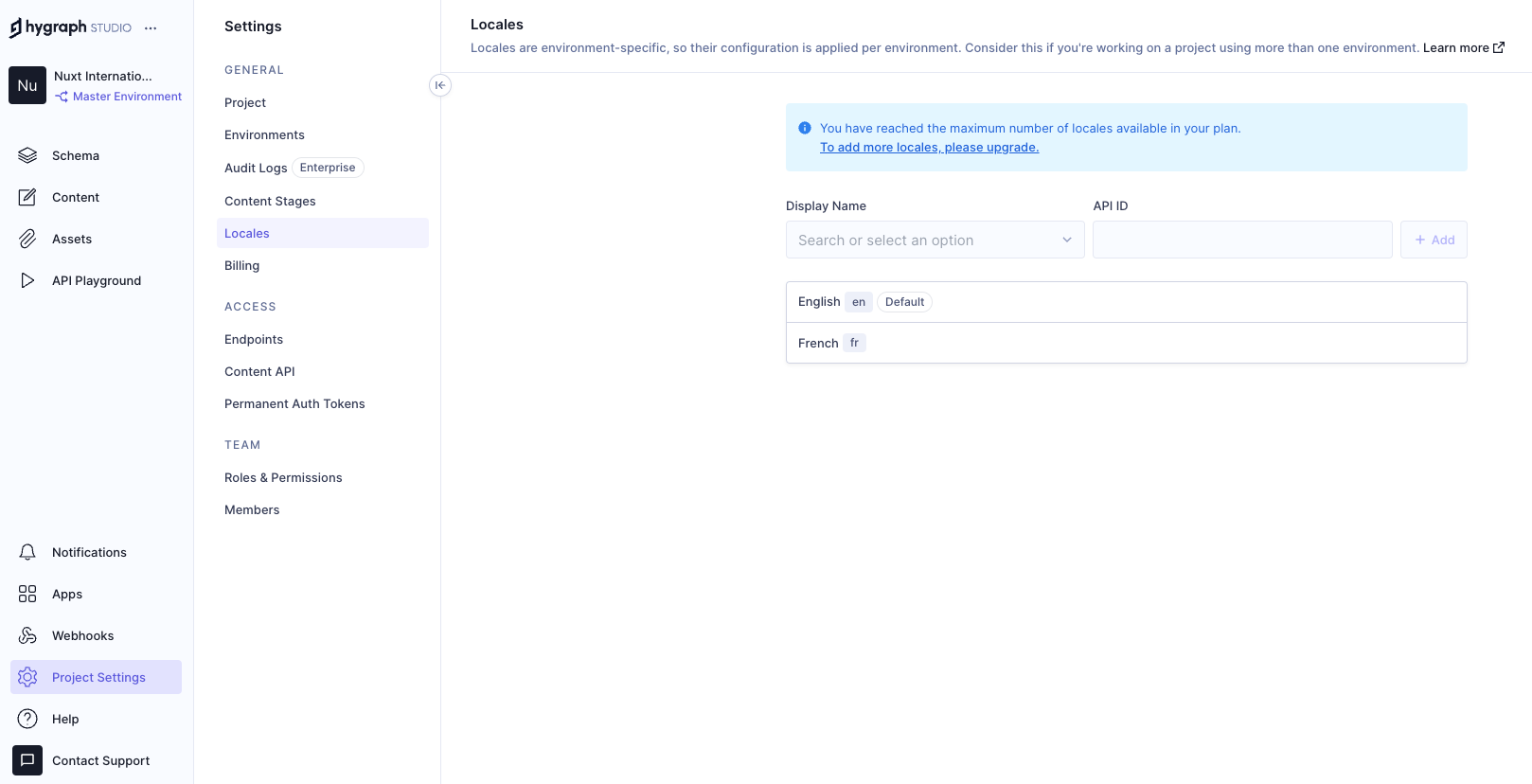
Hygraph has a flexible localization API that allows you to publish and query localized content. If you haven’t created a free Hygraph account yet, you can do that on the Hygraph website to continue following along.
Go to Project Settings → Locales and add locales for the API.

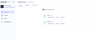
We have added two locales: English and French. Now we need aq localized_post model in our schema that only two fields: title and body. Ensure to make these “Localized” fields while creating them.
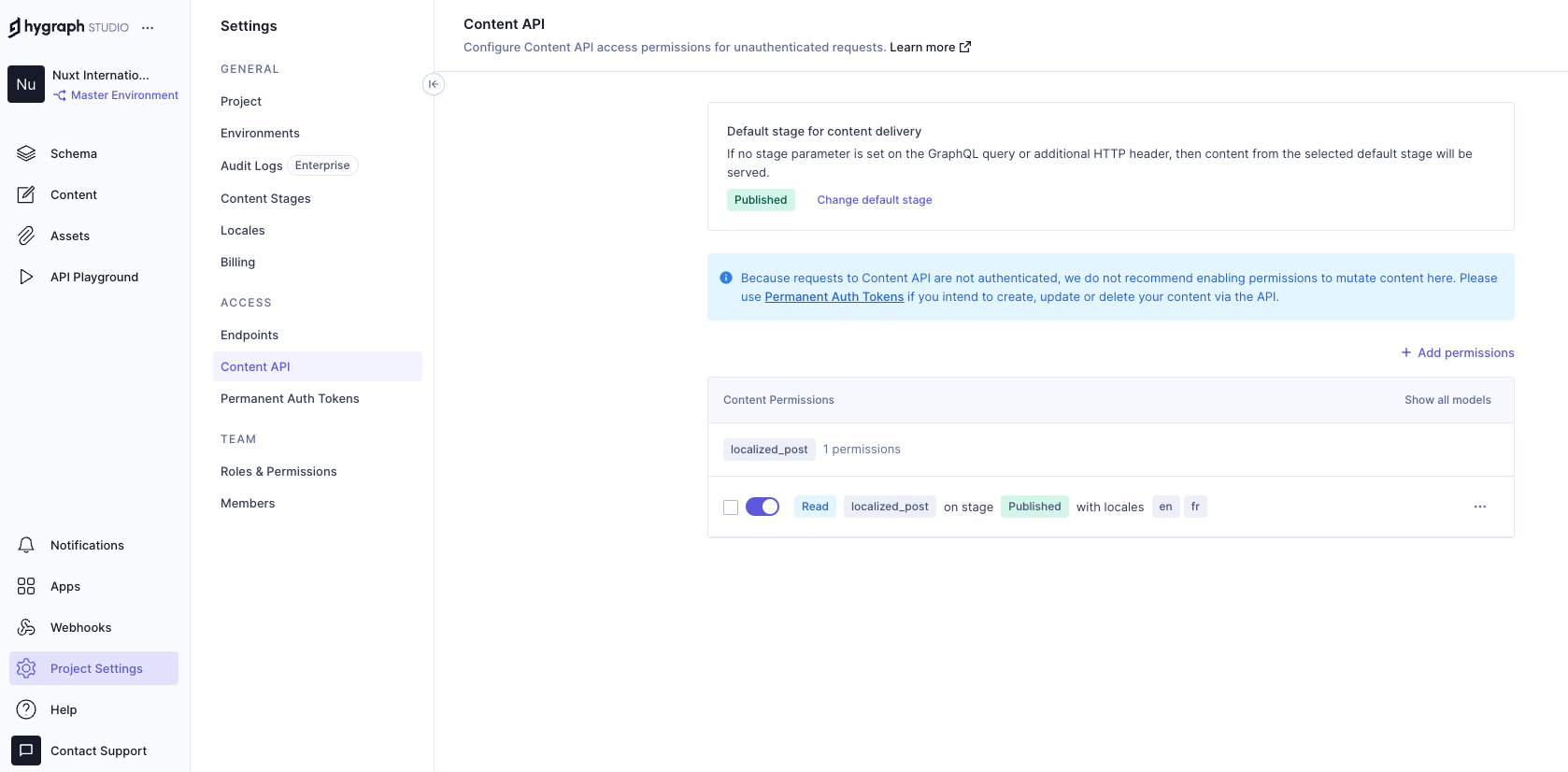
Add permissions to consume the localized content, go to Project settings → Access → API Access → Public Content API, and assign Read permissions to the localized_post model.

Now, we can go to the Hygrapgh API playground and add some localized data to the database with the help of GraphQL mutations. To limit the scope of this example, I am simply adding data from the Hygraph API playground. In an ideal world, a create/update mutation would be triggered from the front end after receiving user input.
Run this mutation in the Hygraph API playground:
mutation createLocalizedPost {
  createLocalizedPost(
    data: {
      title: "A Journey Through the Alps",
      body: "Exploring the majestic mountains of the Alps offers a thrilling experience. The stunning landscapes, diverse wildlife, and pristine environment make it a perfect destination for nature lovers.",
      localizations: {
        create: [
          {locale: fr, data: {title: "Un voyage à travers les Alpes", body: "Explorer les majestueuses montagnes des Alpes offre une expérience palpitante. Les paysages époustouflants, la faune diversifiée et l'environnement immaculé en font une destination parfaite pour les amoureux de la nature."}}
        ]
      }
    }
  ) {
    id
  }
}
The mutation above creates a post with the en locale and includes a fr version of the same post. Feel free to add more data to your model if you want to see things work from a broader set of data.
Putting Things Together
Now that we have Hygraph API content ready for consumption let’s take a moment to understand how it’s consumed inside the Nuxt app.
To do this, we’ll install nuxt-graphql-client to serve as the app’s GraphQL client. This is a minimal GraphQL client for performing GraphQL operations without having to worry about complex configurations, code generation, typing, and other setup tasks.
npx nuxi@latest module add graphql-client
// nuxt.config.ts
export default defineNuxtConfig({
  modules: [
    // ...
    "nuxt-graphql-client"
    // ...
  ],
  runtimeConfig: {
    public: {
      GQL_HOST: 'ADD_YOUR_GQL_HOST_URL_HERE_OR_IN_.env'
    }
  },
});
Next, let’s add our GraphQL queries in graphql/queries.graphql.
query getPosts($locale: [Locale!]!) {
  localizedPosts(locales: $locale) {
    title
    body
  }
}
The GraphQL client will automatically scan .graphql and .gql files and generate client-side code and typings in the .nuxt/gql folder. All we need to do is stop and restart the Nuxt application. After restarting the app, the GraphQL client will allow us to use a GqlGetPosts function to trigger the query.
Now, we will build the Blog page where by querying the Hygraph server and showing the dynamic data.
// pages/blog.vue
<script lang="ts" setup>
  import type { GetPostsQueryVariables } from "#gql";
  import type { PostItem, Locale } from "../types/types";

  const { locale } = useI18n();
  const posts = ref<PostItem[]>([]);
  const isLoading = ref(false);
  const isError = ref(false);

  const fetchPosts = async (localeValue: Locale) => {
    try {
      isLoading.value = true;
      const variables: GetPostsQueryVariables = {
        locale: [localeValue],
      };
      const data = await GqlGetPosts(variables);
      posts.value = data?.localizedPosts ?? [];
    } catch (err) {
      console.log("Fetch Error, Something went wrong", err);
      isError.value = true;
    } finally {
      isLoading.value = false;
    }
  };

  // Fetch posts on component mount
  onMounted(() => {
    fetchPosts(locale.value as Locale);
  });

  // Watch for locale changes
  watch(locale, (newLocale) => {
    fetchPosts(newLocale as Locale);
  });
</script>
This code fetches only the current locale from the useI18n hook and sends it to the fetchPosts function when the Vue component is mounted. The fetchPosts function will pass the locale to the GraphQL query as a variable and obtain localized data from the Hygraph server. We also have a watcher on the locale so that whenever the global locale is changed by the user we make an API call to the server again and fetch posts in that locale.
And, finally, let’s add markup for viewing our fetched data!
<!-- pages/blog.vue -->
<template>
  <v-container fluid>
    <v-card-title class="text-overline">Blogs</v-card-title>
    <div v-if="isLoading">
      <v-skeleton-loader type="card" v-for="n in 2" :key="n" class="mb-4" />
    </div>
    <div v-else-if="isError">
      <p>Something went wrong while getting blogs please check the logs.</p>
    </div>
    <div v-else>
      <div
        v-for="(post, index) in posts"
        :key="post.title || index"
        class="mb-4"
      >
        <v-card color="cardBackground">
          <v-card-title class="text-h6">{{ post.title }}</v-card-title>
          <v-card-text>{{ post.body }}</v-card-text>
        </v-card>
      </div>
    </div>
  </v-container>
</template>
Awesome! If all goes according to plan, then your app should look something like the one in the following video.
Wrapping Up
Check that out — we just made the functionality for translating content for a multilingual website! Now, a user can select a locale from a list of options, and the app fetches content for the selected locale and automatically updates the displayed content.
Did you think that translations would require more difficult steps? It’s pretty amazing that we’re able to cobble together a couple of libraries, hook them up to an API, and wire everything up to render on a page.
Of course, there are other libraries and resources for handling internationalization in a multilingual context. The exact tooling is less the point than it is seeing what pieces are needed to handle dynamic translations and how they come together.
(gg, yk)
Getting To The Bottom Of Minimum WCAG-Conformant Interactive Element Size
Getting To The Bottom Of Minimum WCAG-Conformant Interactive Element Size Getting To The Bottom Of Minimum WCAG-Conformant Interactive Element Size Eric Bailey 2024-07-19T13:00:00+00:00 2025-06-25T15:04:30+00:00 There are many rumors and misconceptions about conforming to WCAG criteria for the minimum sizing of interactive elements. I’d like to […]
Accessibility
Getting To The Bottom Of Minimum WCAG-Conformant Interactive Element Size
Eric Bailey 2024-07-19T13:00:00+00:00
2025-06-25T15:04:30+00:00
There are many rumors and misconceptions about conforming to WCAG criteria for the minimum sizing of interactive elements. I’d like to use this post to demystify what is needed for baseline compliance and to point out an approach for making successful and inclusive interactive experiences using ample target sizes.
Minimum Conformant Pixel Size
Getting right to it: When it comes to pure Web Content Accessibility Guidelines (WCAG) conformance, the bare minimum pixel size for an interactive, non-inline element is 24×24 pixels. This is outlined in Success Criterion 2.5.8: Target Size (Minimum).

Success Criterion 2.5.8 is level AA, which is the most commonly used level for public, mass-consumed websites. This Success Criterion (or SC for short) is sometimes confused for SC 2.5.5 Target Size (Enhanced), which is level AAA. The two are distinct and provide separate guidance for properly sizing interactive elements, even if they appear similar at first glance.
SC 2.5.8 is relatively new to WCAG, having been released as part of WCAG version 2.2, which was published on October 5th, 2023. WCAG 2.2 is the most current version of the standard, but this newer release date means that knowledge of its existence isn’t as widespread as the older SC, especially outside of web accessibility circles. That said, WCAG 2.2 will remain the standard until WCAG 3.0 is released, something that is likely going to take 10–15 years or more to happen.
SC 2.5.5 calls for larger interactive elements sizes that are at least 44×44 pixels (compared to the SC 2.5.8 requirement of 24×24 pixels). At the same time, notice that SC 2.5.5 is level AAA (compared to SC 2.5.8, level AA) which is a level reserved for specialized support beyond level AA.

Sites that need to be fully WCAG Level AAA conformant are rare. Chances are that if you are making a website or web app, you’ll only need to support level AA. Level AAA is often reserved for large or highly specialized institutions.
Making Interactive Elements Larger With CSS Padding
The family of padding-related properties in CSS can be used to extend the interactive area of an element to make it conformant. For example, declaring padding: 4px; on an element that measures 16×16 pixels invisibly increases its bounding box to a total of 24×24 pixels. This, in turn, means the interactive element satisfies SC 2.5.8.

This is a good trick for making smaller interactive elements easier to click and tap. If you want more information about this sort of thing, I enthusiastically recommend Ahmad Shadeed’s post, “Designing better target sizes”.
I think it’s also worth noting that CSS margin could also hypothetically be used to achieve level AA conformance since the SC includes a spacing exception:
The size of the target for pointer inputs is at least 24×24 CSS pixels, except where:
Spacing: Undersized targets (those less than 24×24 CSS pixels) are positioned so that if a 24 CSS pixel diameter circle is centered on the bounding box of each, the circles do not intersect another target or the circle for another undersized target;
[…]
The difference here is that padding extends the interactive area, while margin does not. Through this lens, you’ll want to honor the spirit of the success criterion because partial conformance is adversarial conformance. At the end of the day, we want to help people successfully click or tap interactive elements, such as buttons.
What About Inline Interactive Elements?
We tend to think of targets in terms of block elements — elements that are displayed on their own line, such as a button at the end of a call-to-action. However, interactive elements can be inline elements as well. Think of links in a paragraph of text.
Inline interactive elements, such as text links in paragraphs, do not need to meet the 24×24 pixel minimum requirement. Just as margin is an exception in SC 2.5.8: Target Size (Minimum), so are inline elements with an interactive target:
The size of the target for pointer inputs is at least 24×24 CSS pixels, except where:
[…]
Inline: The target is in a sentence or its size is otherwise constrained×the line-height of non-target text;
[…]

Apple And Android: The Source Of More Confusion
If the differences between interactive elements that are inline and block are still confusing, that’s probably because the whole situation is even further muddied by third-party human interface guidelines requiring interactive sizes closer to what the level AAA Success Criterion 2.5.5 Target Size (Enhanced) demands.
For example, Apple’s “Human Interface Guidelines” and Google’s “Material Design” are guidelines for how to design interfaces for their respective platforms. Apple’s guidelines recommend that interactive elements are 44×44 points, whereas Google’s guides stipulate target sizes that are at least 48×48 using density-independent pixels.
These may satisfy Apple and Google requirements for designing interfaces, but are they WCAG-conformant Apple and Google — not to mention any other organization with UI guidelines — can specify whatever interface requirements they want, but are they copasetic with WCAG SC 2.5.5 and SC 2.5.8?
It’s important to ask this question because there is a hierarchy when it comes to accessibility compliance, and it contains legal levels:
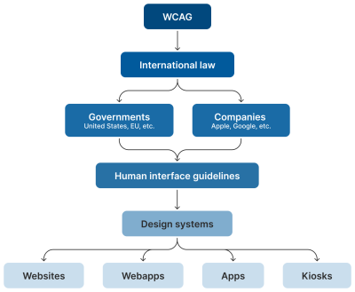
Human interface guidelines often inform design systems, which, in turn, influence the sites and apps that are built by authors like us. But they’re not the “authority” on accessibility compliance. Notice how everything is (and ought to be) influenced by WCAG at the very top of the chain.
Even if these third-party interface guidelines conform to SC 2.5.5 and 2.5.8, it’s still tough to tell when they are expressed in “points” and “density independent pixels” which aren’t pixels, but often get conflated as such. I’d advise not getting too deep into researching what a pixel truly is. Trust me when I say it’s a road you don’t want to go down. But whatever the case, the inconsistent use of unit sizes exacerbates the issue.
Can’t We Just Use A Media Query?
I’ve also observed some developers attempting to use the pointer media feature as a clever “trick” to detect when a touchscreen is present, then conditionally adjust an interactive element’s size as a way to get around the WCAG requirement.
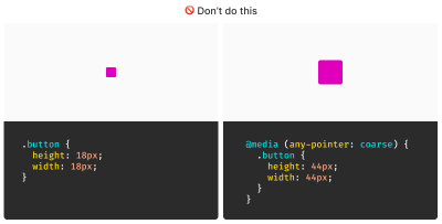
After all, mouse cursors are for fine movements, and touchscreens are for more broad gestures, right? Not always. The thing is, devices are multimodal. They can support many different kinds of input and don’t require a special switch to flip or button to press to do so. A straightforward example of this is switching between a trackpad and a keyboard while you browse the web. A less considered example is a device with a touchscreen that also supports a trackpad, keyboard, mouse, and voice input.
You might think that the combination of trackpad, keyboard, mouse, and voice inputs sounds like some sort of absurd, obscure Frankencomputer, but what I just described is a Microsoft Surface laptop, and guess what? They’re pretty popular.

Responsive Design Vs. Inclusive Design
There is a difference between the two, even though they are often used interchangeably. Let’s delineate the two as clearly as possible:
- Responsive Design is about designing for an unknown device.
- Inclusive Design is about designing for an unknown user.
The other end of this consideration is that people with motor control conditions — like hand tremors or arthritis — can and do use mice inputs. This means that fine input actions may be painful and difficult, yet ultimately still possible to perform.
People also use more precise input mechanisms for touchscreens all the time, including both official accessories and aftermarket devices. In other words, some devices designed to accommodate coarse input can also be used for fine detail work.
I’d be remiss if I didn’t also point out that people plug mice and keyboards into smartphones. We cannot automatically say that they only support coarse pointers:
My point is that a mode-based approach to inclusive design is a trap. This isn’t even about view–tap asymmetry. Creating entire alternate experiences based on assumed input mode reinforces an ugly “us versus them” mindset. It’s also far more work to set up, maintain, and educate others.
It’s better to proactively accommodate an unknown number of unknown people using an unknown suite of devices in unknown ways by providing an inclusive experience by default. Doing so has a list of benefits:
- More proactively accommodating,
- Less effort to create,
- Less effort to maintain,
- Less data to download, and
- Less compliance risk.
After all, that tap input might be coming from a tongue, and that click event might be someone raising their eyebrows.
WCAG Is The Floor, Not The Ceiling
A WCAG-conformant 24×24 minimum pixel size requirement for interactive elements is our industry’s best understanding of what can accommodate most access needs distributed across a global population accessing an unknown amount of content dealing with unknown topics in unknown ways under unknown circumstances.
The load-bearing word in that previous sentence is minimum. The guidance — and the pixel size it mandates — is likely a balancing act between:
- Setting something up that is functional enough while also
- Avoiding a standard that would be impossible to broadly achieve (hence the SC 2.5.5 level AAA rating).
Even the SC itself acknowledges this potential limitation:
“This Success Criterion defines a minimum size and, if this can’t be met, a minimum spacing. It is still possible to have very small and difficult-to-activate targets and meet the requirements of this Success Criterion.”
Larger interactive areas can be a good thing to strive for. This is to say a minimum of approximately 40 pixels may be beneficial for individuals who struggle with the smaller yet still WCAG-conformant size.
Interactive Area Sizing Is As Much An Art As It Is A Science
We should also be careful not to overcorrect by dropping in gigantic interactive elements in all of our work. If an interactive area is too large, it risks being activated by accident. This is important to note when an interactive element is placed in close proximity to other interactive elements and even more important to consider when activating those elements can result in irrevocable consequences.
There is also a phenomenon where elements, if large enough, are not interpreted or recognized as being interactive. Consequently, users may inadvertently miss them, despite large sizing.

Context Is King
Conformant and successful interactive areas — both large and small — require knowing the ultimate goals of your website or web app. When you arm yourself with this context, you are empowered to make informed decisions about the kinds of people who use your service, why they use the service, and how you can accommodate them.
For example, the Glow Baby app uses larger interactive elements because it knows the user is likely holding an adorable, albeit squirmy and fussy, baby while using the application. This allows Glow Baby to emphasize the interactive targets in the interface to accommodate parents who have their hands full.

In the same vein, SC SC 2.5.8 acknowledges that smaller touch targets — such as those used in map apps — may contextually be exempt:
For example, in digital maps, the position of pins is analogous to the position of places shown on the map. If there are many pins close together, the spacing between pins and neighboring pins will often be below 24 CSS pixels. It is essential to show the pins at the correct map location; therefore, the Essential exception applies.
[…]
When the “Essential” exception is applicable, authors are strongly encouraged to provide equivalent functionality through alternative means to the extent practical.
Note that this exemption language is not carte blanche to make your own work an exception to the rule. It is more of a mechanism, and an acknowledgment that broadly applied rules may have exceptions that are worth thinking through and documenting for future reference.
Further Considerations
We also want to consider the larger context of the device itself as well as the environment the device will be used in.
Larger, more fixed position touchscreens compel larger interactive areas. Smaller devices that are moved around in space a lot (e.g., smartwatches) may benefit from alternate input mechanisms such as voice commands.
What about people who are driving in a car? People in this context probably ought to be provided straightforward, simple interactions that are facilitated via large interactive areas to prevent them from taking their eyes off the road. The same could also be said for high-stress environments like hospitals and oil rigs.
Similarly, devices and apps that are designed for children may require interactive areas that are larger than WCAG requirements for interactive areas. So would experiences aimed at older demographics, where age-derived vision and motor control disability factors tend to be more present.
Minimum conformant interactive area experiences may also make sense in their own contexts. Data-rich, information-dense experiences like the Bloomberg terminal come to mind here.
Design Systems Are Also Worth Noting
While you can control what components you include in a design system, you cannot control where and how they’ll be used by those who adopt and use that design system. Because of this, I suggest defensively baking accessible defaults into your design systems because they can go a long way toward incorporating accessible practices when they’re integrated right out of the box.
One option worth consideration is providing an accessible range of choices. Components, like buttons, can have size variants (e.g., small, medium, and large), and you can provide a minimally conformant interactive target on the smallest variant and then offer larger, equally conformant versions.
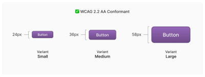
So, How Do We Know When We’re Good?
There is no magic number or formula to get you that perfect Goldilocks “not too small, not too large, but just right” interactive area size. It requires knowledge of what the people who want to use your service want, and how they go about getting it.
The best way to learn that? Ask people.
Accessibility research includes more than just asking people who use screen readers what they think. It’s also a lot easier to conduct than you might think! For example, prototypes are a great way to quickly and inexpensively evaluate and de-risk your ideas before committing to writing production code. “Conducting Accessibility Research In An Inaccessible Ecosystem” by Dr. Michele A. Williams is chock full of tips, strategies, and resources you can use to help you get started with accessibility research.
Wrapping Up
The bottom line is that
“Compliant” does not always equate to “usable.” But compliance does help set baseline requirements that benefit everyone.
“
To sum things up:
- 24×24 pixels is the bare minimum in terms of WCAG conformance.
- Inline interactive elements, such as links placed in paragraphs, are exempt.
- 44×44 pixels is for WCAG level AAA support, and level AAA is reserved for specialized experiences.
- Human interface guidelines by the likes of Apple, Android, and other companies must ultimately confirm to WCAG.
- Devices are multimodal and can use different kinds of input concurrently.
- Baking sensible accessible defaults into design systems can go a long way to ensuring widespread compliance.
- Larger interactive element sizes may be helpful in many situations, but might not be recognized as an interactive element if they are too large.
- User research can help you learn about your audience.
And, perhaps most importantly, all of this is about people and enabling them to get what they need.
Further Reading
- Foundations: target sizes (TetraLogical)
- Large Links, Buttons, and Controls (Web Accessibility Initiative)
- Interaction Media Features and Their Potential (for Incorrect Assumptions) (CSS-Tricks)
- Meeting WCAG Level AAA (TetraLogical)
(gg, yk)
How To Make A Strong Case For Accessibility
How To Make A Strong Case For Accessibility How To Make A Strong Case For Accessibility Vitaly Friedman 2024-06-26T12:00:00+00:00 2025-06-25T15:04:30+00:00 Getting support for accessibility efforts isn’t easy. There are many accessibility myths, wrong assumptions, and expectations that make accessibility look like a complex, expensive, and […]
Accessibility
How To Make A Strong Case For Accessibility
Vitaly Friedman 2024-06-26T12:00:00+00:00
2025-06-25T15:04:30+00:00
Getting support for accessibility efforts isn’t easy. There are many accessibility myths, wrong assumptions, and expectations that make accessibility look like a complex, expensive, and time-consuming project. Let’s fix that!
Below are some practical techniques that have been working well for me to convince stakeholders to support and promote accessibility in small and large companies.
.course-intro{–shadow-color:206deg 31% 60%;background-color:#eaf6ff;border:1px solid #ecf4ff;box-shadow:0 .5px .6px hsl(var(–shadow-color) / .36),0 1.7px 1.9px -.8px hsl(var(–shadow-color) / .36),0 4.2px 4.7px -1.7px hsl(var(–shadow-color) / .36),.1px 10.3px 11.6px -2.5px hsl(var(–shadow-color) / .36);border-radius:11px;padding:1.35rem 1.65rem}@media (prefers-color-scheme:dark){.course-intro{–shadow-color:199deg 63% 6%;border-color:var(–block-separator-color,#244654);background-color:var(–accent-box-color,#19313c)}}
This article is part of our ongoing series on UX. You might want to take a look at Smart Interface Design Patterns 🍣 and the upcoming live UX training as well. Use code BIRDIE to save 15% off.
Launching Accessibility Efforts
A common way to address accessibility is to speak to stakeholders through the lens of corporate responsibility and ethical and legal implications. Personally, I’ve never been very successful with this strategy. People typically dismiss concerns that they can’t relate to, and as designers, we can’t build empathy with facts, charts, or legal concerns.
The problem is that people often don’t know how accessibility applies to them. There is a common assumption that accessibility is dull and boring and leads to “unexciting” and unattractive products. Unsurprisingly, businesses often neglect it as an irrelevant edge case.
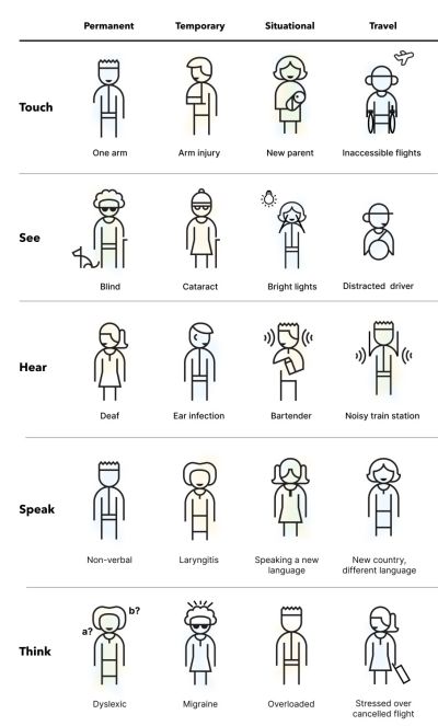
So, I use another strategy. I start conversations about accessibility by visualizing it. I explain the different types of accessibility needs, ranging from permanent to temporary to situational — and I try to explain what exactly it actually means to our products. Mapping a more generic understanding of accessibility to the specifics of a product helps everyone explore accessibility from a point that they can relate to.
And then I launch a small effort — just a few usability sessions, to get a better understanding of where our customers struggle and where they might be blocked. If I can’t get access to customers, I try to proxy test via sales, customer success, or support. Nothing is more impactful than seeing real customers struggling in their real-life scenario with real products that a company is building.
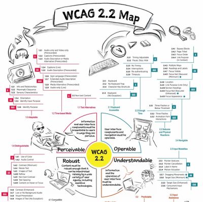
From there, I move forward. I explain inclusive design, accessibility, neurodiversity, EAA, WCAG, ARIA. I bring people with disabilities into testing as we need a proper representation of our customer base. I ask for small commitments first, then ask for more. I reiterate over and over and over again that accessibility doesn’t have to be expensive or tedious if done early, but it can be very expensive when retrofitted or done late.
Throughout that entire journey, I try to anticipate objections about costs, timing, competition, slowdowns, dullness — and keep explaining how accessibility can reduce costs, increase revenue, grow user base, minimize risks, and improve our standing in new markets. For that, I use a few templates that I always keep nearby just in case an argument or doubts arise.
Useful Templates To Make A Strong Case For Accessibility
1. “But Accessibility Is An Edge Case!”
❌ “But accessibility is an edge case. Given the state of finances right now, unfortunately, we really can’t invest in it right now.”
🙅🏽♀️ “I respectfully disagree. 1 in 6 people around the world experience disabilities. In fact, our competitors [X, Y, Z] have launched accessibility efforts ([references]), and we seem to be lagging behind. Plus, it doesn’t have to be expensive. But it will be very expensive once we retrofit much later.”
2. “But There Is No Business Value In Accessibility!”
❌ “We know that accessibility is important, but at the moment, we need to focus on efforts that will directly benefit business.”
🙅🏼♂️ “I understand what you are saying, but actually, accessibility directly benefits business. Globally, the extended market is estimated at 2.3 billion people, who control an incremental $6.9 trillion in annual disposable income. Prioritizing accessibility very much aligns with your goal to increase leads, customer engagement, mitigate risk, and reduce costs.” (via Yichan Wang)
3. “But We Don’t Have Disabled Users!”
❌ “Why should we prioritize accessibility? Looking at our data, we don’t really have any disabled users at all. Seems like a waste of time and resources.”
🙅♀️ “Well, if a product is inaccessible, users with disabilities can’t and won’t be using it. But if we do make our product more accessible, we open the door for prospect users for years to come. Even small improvements can have a high impact. It doesn’t have to be expensive nor time-consuming.”
4. “Screen Readers Won’t Work With Our Complex System!”
❌ “Our application is very complex and used by expert users. Would it even work at all with screen readers?”
🙅🏻♀️ “It’s not about designing only for screen readers. Accessibility can be permanent, but it can also be temporary and situational — e.g., when you hold a baby in your arms or if you had an accident. Actually, it’s universally useful and beneficial for everyone.”
5. “We Can’t Win Market With Accessibility Features!”
❌ “To increase our market share, we need features that benefit everyone and improve our standing against competition. We can’t win the market with accessibility.”
🙅🏾♂️ “Modern products succeed not by designing more features, but by designing better features that improve customer’s efficiency, success rate, and satisfaction. And accessibility is one of these features. For example, voice control and auto-complete were developed for accessibility but are now widely used by everyone. In fact, the entire customer base benefits from accessibility features.”
6. “Our Customers Can’t Relate To Accessibility Needs”
❌ “Our research clearly shows that our customers are young and healthy, and they don’t have accessibility needs. We have other priorities, and accessibility isn’t one of them.”
🙅♀️ “I respectfully disagree. People of all ages can have accessibility needs. In fact, accessibility features show your commitment to inclusivity, reaching out to every potential customer of any age, regardless of their abilities.
This not only resonates with a diverse audience but also positions your brand as socially responsible and empathetic. As you know, our young user base increasingly values corporate responsibility, and this can be a significant differentiator for us, helping to build a loyal customer base for years to come.” (via Yichan Wang)
7. “Let’s Add Accessibility Later”
❌ “At the moment, we need to focus on the core features of our product. We can always add accessibility later once the product is more stable.”
🙅🏼 “I understand concerns about timing and costs. However, it’s important to note that integrating accessibility from the start is far more cost-effective than retrofitting it later. If accessibility is considered after development is complete, we will face significant additional expenses for auditing accessibility, followed by potentially extensive work involving a redesign and redevelopment.
This process can be significantly more expensive than embedding accessibility from the beginning. Furthermore, delaying accessibility can expose your business to legal risks. With the increasing number of lawsuits for non-compliance with accessibility standards, the cost of legal repercussions could far exceed the expense of implementing accessibility now. The financially prudent move is to work on accessibility now.”
You can find more useful ready-to-use templates in Yichan Wang’s Designer’s Accessibility Advocacy Toolkit — a fantastic resource to keep nearby.
Building Accessibility Practices From Scratch
As mentioned above, nothing is more impactful than visualizing accessibility. However, it requires building accessibility research and accessibility practices from scratch, and it might feel like an impossible task, especially in large corporations. In “How We’ve Built Accessibility Research at Booking.com”, Maya Alvarado presents a fantastic case study on how to build accessibility practices and inclusive design into UX research from scratch.
Maya rightfully points out that automated accessibility testing alone isn’t reliable. Compliance means that a user can use your product, but it doesn’t mean that it’s a great user experience. With manual testing, we make sure that customers actually meet their goals and do so effectively.

Start by gathering colleagues and stakeholders interested in accessibility. Document what research was done already and where the gaps are. And then whenever possible, include 5–12 users with disabilities in accessibility testing.
Then, run a small accessibility initiative around key flows. Tap into critical touch points and research them. As you are making progress, extend to components, patterns, flows, and service design. And eventually, incorporate inclusive sampling into all research projects — at least 15% of usability testers should have a disability.
Companies often struggle to recruit testers with disabilities. One way to find participants is to reach out to local chapters, local training centers, non-profits, and public communities of users with disabilities in your country. Ask the admin’s permission to post your research announcement, and it won’t be rejected. If you test on site, add extra $25–$50 depending on disability transportation.
I absolutely love the idea of extending Microsoft’s Inclusive Design Toolkit to meet specific user needs of a product. It adds a different dimension to disability considerations which might be less abstract and much easier to relate for the entire organization.
As Maya noted, inclusive design is about building a door that can be opened by anyone and lets everyone in. Accessibility isn’t a checklist — it’s a practice that goes beyond compliance. A practice that involves actual people with actual disabilities throughout all UX research activities.
Wrapping Up
To many people, accessibility is a big mystery box. They might have never seen a customer with disabilities using their product, and they don’t really understand what it involves and requires. But we can make accessibility relatable, approachable, and visible by bringing accessibility testing to our companies — even if it’s just a handful of tests with people with disabilities.
No manager really wants to deliberately ignore the needs of their paying customers — they just need to understand these needs first. Ask for small commitments, and get the ball rolling from there.
Set up an accessibility roadmap with actions, timelines, roles and goals. Frankly, this strategy has been working for me much better than arguing about legal and moral obligations, which typically makes stakeholders defensive and reluctant to commit.
Fingers crossed! And a huge thank-you to everyone working on and improving accessibility in your day-to-day work, often without recognition and often fueled by your own enthusiasm and passion — thank you for your incredible work in pushing accessibility forward! 👏🏼👏🏽👏🏾
Useful Resources
Making A Case For Accessibility
- “How To Make The Business Case For Accessibility”, by R Gregory Williams
- “How We’ve Built Accessibility Research at Booking.com”, by Maya Alvarado
- “Designer’s Accessibility Advocacy Toolkit”, by Yichan Wang
- “Making The Case for Accessibility”, by Susanna Zaraysky
- “Making A Strong Case For Accessibility”, by Todd Libby
- “Accessibility Case Studies and Success Stories”, by Deque
- “Inclusive Design Toolkits and Templates”, by yours truly
Accessibility Testing
- “A Comprehensive Guide to Accessible UX Research”, by Brian Grellmann
- “Inclusive User Research: Recruiting Participants”, by Ela Gorla
- “Testing With Blind Users: A Cheatsheet”, by Slava Shestopalov
- “Mobile Accessibility Research with Screen-Reader Users”, by Tanner Kohler
- “How To Conduct UX Research With Participants With Disabilities”, by Peter McNally
- “How To Conduct Accessibility UX Research”, by AnswerLab
Meet Smart Interface Design Patterns
If you are interested in UX and design patterns, take a look at Smart Interface Design Patterns, our 10h-video course with 100s of practical examples from real-life projects — with a live UX training later this year. Everything from mega-dropdowns to complex enterprise tables — with 5 new segments added every year. Jump to a free preview. Use code BIRDIE to save 15% off.

100 design patterns & real-life
examples.
10h-video course + live UX training. Free preview.
(yk)
Uniting Web And Native Apps With 4 Unknown JavaScript APIs
Uniting Web And Native Apps With 4 Unknown JavaScript APIs Uniting Web And Native Apps With 4 Unknown JavaScript APIs Juan Diego Rodríguez 2024-06-20T18:00:00+00:00 2025-06-25T15:04:30+00:00 A couple of years ago, four JavaScript APIs that landed at the bottom of awareness in the State of JavaScript […]
Accessibility
Uniting Web And Native Apps With 4 Unknown JavaScript APIs
Juan Diego Rodríguez 2024-06-20T18:00:00+00:00
2025-06-25T15:04:30+00:00
A couple of years ago, four JavaScript APIs that landed at the bottom of awareness in the State of JavaScript survey. I took an interest in those APIs because they have so much potential to be useful but don’t get the credit they deserve. Even after a quick search, I was amazed at how many new web APIs have been added to the ECMAScript specification that aren’t getting their dues and with a lack of awareness and browser support in browsers.
That situation can be a “catch-22”:
An API is interesting but lacks awareness due to incomplete support, and there is no immediate need to support it due to low awareness.
“
Most of these APIs are designed to power progressive web apps (PWA) and close the gap between web and native apps. Bear in mind that creating a PWA involves more than just adding a manifest file. Sure, it’s a PWA by definition, but it functions like a bookmark on your home screen in practice. In reality, we need several APIs to achieve a fully native app experience on the web. And the four APIs I’d like to shed light on are part of that PWA puzzle that brings to the web what we once thought was only possible in native apps.
You can see all these APIs in action in this demo as we go along.
1. Screen Orientation API
The Screen Orientation API can be used to sniff out the device’s current orientation. Once we know whether a user is browsing in a portrait or landscape orientation, we can use it to enhance the UX for mobile devices by changing the UI accordingly. We can also use it to lock the screen in a certain position, which is useful for displaying videos and other full-screen elements that benefit from a wider viewport.
Using the global screen object, you can access various properties the screen uses to render a page, including the screen.orientation object. It has two properties:
type: The current screen orientation. It can be:"portrait-primary","portrait-secondary","landscape-primary", or"landscape-secondary".angle: The current screen orientation angle. It can be any number from 0 to 360 degrees, but it’s normally set in multiples of 90 degrees (e.g.,0,90,180, or270).
On mobile devices, if the angle is 0 degrees, the type is most often going to evaluate to "portrait" (vertical), but on desktop devices, it is typically "landscape" (horizontal). This makes the type property precise for knowing a device’s true position.
The screen.orientation object also has two methods:
.lock(): This is an async method that takes atypevalue as an argument to lock the screen..unlock(): This method unlocks the screen to its default orientation.
And lastly, screen.orientation counts with an "orientationchange" event to know when the orientation has changed.
Browser Support
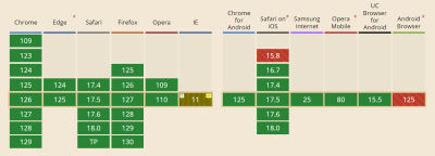
Finding And Locking Screen Orientation
Let’s code a short demo using the Screen Orientation API to know the device’s orientation and lock it in its current position.
This can be our HTML boilerplate:
<main>
  <p>
    Orientation Type: <span class="orientation-type"></span>
    <br />
    Orientation Angle: <span class="orientation-angle"></span>
  </p>

  <button type="button" class="lock-button">Lock Screen</button>

  <button type="button" class="unlock-button">Unlock Screen</button>

  <button type="button" class="fullscreen-button">Go Full Screen</button>
</main>
On the JavaScript side, we inject the screen orientation type and angle properties into our HTML.
let currentOrientationType = document.querySelector(".orientation-type");
let currentOrientationAngle = document.querySelector(".orientation-angle");

currentOrientationType.textContent = screen.orientation.type;
currentOrientationAngle.textContent = screen.orientation.angle;
Now, we can see the device’s orientation and angle properties. On my laptop, they are "landscape-primary" and 0°.

If we listen to the window’s orientationchange event, we can see how the values are updated each time the screen rotates.
window.addEventListener("orientationchange", () => {
  currentOrientationType.textContent = screen.orientation.type;
  currentOrientationAngle.textContent = screen.orientation.angle;
});
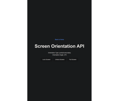
To lock the screen, we need to first be in full-screen mode, so we will use another extremely useful feature: the Fullscreen API. Nobody wants a webpage to pop into full-screen mode without their consent, so we need transient activation (i.e., a user click) from a DOM element to work.
The Fullscreen API has two methods:
Document.exitFullscreen()is used from the global document object,Element.requestFullscreen()makes the specified element and its descendants go full-screen.
We want the entire page to be full-screen so we can invoke the method from the root element at the document.documentElement object:
const fullscreenButton = document.querySelector(".fullscreen-button");

fullscreenButton.addEventListener("click", async () => {
  // If it is already in full-screen, exit to normal view
  if (document.fullscreenElement) {
    await document.exitFullscreen();
  } else {
    await document.documentElement.requestFullscreen();
  }
});
Next, we can lock the screen in its current orientation:
const lockButton = document.querySelector(".lock-button");

lockButton.addEventListener("click", async () => {
  try {
    await screen.orientation.lock(screen.orientation.type);
  } catch (error) {
    console.error(error);
  }
});
And do the opposite with the unlock button:
const unlockButton = document.querySelector(".unlock-button");

unlockButton.addEventListener("click", () => {
  screen.orientation.unlock();
});
Can’t We Check Orientation With a Media Query?
Yes! We can indeed check page orientation via the orientation media feature in a CSS media query. However, media queries compute the current orientation by checking if the width is “bigger than the height” for landscape or “smaller” for portrait. By contrast,
The Screen Orientation API checks for the screen rendering the page regardless of the viewport dimensions, making it resistant to inconsistencies that may crop up with page resizing.
“
You may have noticed how PWAs like Instagram and X force the screen to be in portrait mode even when the native system orientation is unlocked. It is important to notice that this behavior isn’t achieved through the Screen Orientation API, but by setting the orientation property on the manifest.json file to the desired orientation type.
2. Device Orientation API
Another API I’d like to poke at is the Device Orientation API. It provides access to a device’s gyroscope sensors to read the device’s orientation in space; something used all the time in mobile apps, mainly games. The API makes this happen with a deviceorientation event that triggers each time the device moves. It has the following properties:
event.alpha: Orientation along the Z-axis, ranging from 0 to 360 degrees.event.beta: Orientation along the X-axis, ranging from -180 to 180 degrees.event.gamma: Orientation along the Y-axis, ranging from -90 to 90 degrees.
Browser Support
Moving Elements With Your Device
In this case, we will make a 3D cube with CSS that can be rotated with your device! The full instructions I used to make the initial CSS cube are credited to David DeSandro and can be found in his introduction to 3D transforms.
See the Pen [Rotate cube [forked]](https://codepen.io/smashingmag/pen/vYwdMNJ) by Dave DeSandro.
You can see raw full HTML in the demo, but let’s print it here for posterity:
<main>
  <div class="scene">
    <div class="cube">
      <div class="cube__face cube__face--front">1</div>
      <div class="cube__face cube__face--back">2</div>
      <div class="cube__face cube__face--right">3</div>
      <div class="cube__face cube__face--left">4</div>
      <div class="cube__face cube__face--top">5</div>
      <div class="cube__face cube__face--bottom">6</div>
    </div>
  </div>
  <h1>Device Orientation API</h1>
  <p>
    Alpha: <span class="currentAlpha"></span>
    <br />
    Beta: <span class="currentBeta"></span>
    <br />
    Gamma: <span class="currentGamma"></span>
  </p>
</main>
To keep this brief, I won’t explain the CSS code here. Just keep in mind that it provides the necessary styles for the 3D cube, and it can be rotated through all axes using the CSS rotate() function.
Now, with JavaScript, we listen to the window’s deviceorientation event and access the event orientation data:
const currentAlpha = document.querySelector(".currentAlpha");
const currentBeta = document.querySelector(".currentBeta");
const currentGamma = document.querySelector(".currentGamma");

window.addEventListener("deviceorientation", (event) => {
  currentAlpha.textContent = event.alpha;
  currentBeta.textContent = event.beta;
  currentGamma.textContent = event.gamma;
});
To see how the data changes on a desktop device, we can open Chrome’s DevTools and access the Sensors Panel to emulate a rotating device.
To rotate the cube, we change its CSS transform properties according to the device orientation data:
const currentAlpha = document.querySelector(".currentAlpha");
const currentBeta = document.querySelector(".currentBeta");
const currentGamma = document.querySelector(".currentGamma");

const cube = document.querySelector(".cube");

window.addEventListener("deviceorientation", (event) => {
  currentAlpha.textContent = event.alpha;
  currentBeta.textContent = event.beta;
  currentGamma.textContent = event.gamma;

  cube.style.transform = `rotateX(${event.beta}deg) rotateY(${event.gamma}deg) rotateZ(${event.alpha}deg)`;
});
This is the result:

3. Vibration API
Let’s turn our attention to the Vibration API, which, unsurprisingly, allows access to a device’s vibrating mechanism. This comes in handy when we need to alert users with in-app notifications, like when a process is finished or a message is received. That said, we have to use it sparingly; no one wants their phone blowing up with notifications.
There’s just one method that the Vibration API gives us, and it’s all we need: navigator.vibrate().
vibrate() is available globally from the navigator object and takes an argument for how long a vibration lasts in milliseconds. It can be either a number or an array of numbers representing a patron of vibrations and pauses.
navigator.vibrate(200); // vibrate 200ms
navigator.vibrate([200, 100, 200]); // vibrate 200ms, wait 100, and vibrate 200ms.
Browser Support
Vibration API Demo
Let’s make a quick demo where the user inputs how many milliseconds they want their device to vibrate and buttons to start and stop the vibration, starting with the markup:
<main>
  <form>
    <label for="milliseconds-input">Milliseconds:</label>
    <input type="number" id="milliseconds-input" value="0" />
  </form>

  <button class="vibrate-button">Vibrate</button>
  <button class="stop-vibrate-button">Stop</button>
</main>
We’ll add an event listener for a click and invoke the vibrate() method:
const vibrateButton = document.querySelector(".vibrate-button");
const millisecondsInput = document.querySelector("#milliseconds-input");

vibrateButton.addEventListener("click", () => {
  navigator.vibrate(millisecondsInput.value);
});
To stop vibrating, we override the current vibration with a zero-millisecond vibration.
const stopVibrateButton = document.querySelector(".stop-vibrate-button");

stopVibrateButton.addEventListener("click", () => {
  navigator.vibrate(0);
});
4. Contact Picker API
In the past, it used to be that only native apps could connect to a device’s “contacts”. But now we have the fourth and final API I want to look at: the Contact Picker API.
The API grants web apps access to the device’s contact lists. Specifically, we get the contacts.select() async method available through the navigator object, which takes the following two arguments:
properties: This is an array containing the information we want to fetch from a contact card, e.g.,"name","address","email","tel", and"icon".options: This is an object that can only contain themultipleboolean property to define whether or not the user can select one or multiple contacts at a time.
Browser Support
I’m afraid that browser support is next to zilch on this one, limited to Chrome Android, Samsung Internet, and Android’s native web browser at the time I’m writing this.
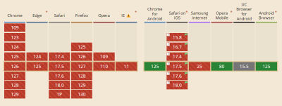
Selecting User’s Contacts
We will make another demo to select and display the user’s contacts on the page. Again, starting with the HTML:
<main>
  <button class="get-contacts">Get Contacts</button>
  <p>Contacts:</p>
  <ul class="contact-list">
    <!-- We’ll inject a list of contacts -->
  </ul>
</main>
Then, in JavaScript, we first construct our elements from the DOM and choose which properties we want to pick from the contacts.
const getContactsButton = document.querySelector(".get-contacts");
const contactList = document.querySelector(".contact-list");

const props = ["name", "tel", "icon"];
const options = {multiple: true};
Now, we asynchronously pick the contacts when the user clicks the getContactsButton.
const getContacts = async () => {
  try {
    const contacts = await navigator.contacts.select(props, options);
  } catch (error) {
    console.error(error);
  }
};

getContactsButton.addEventListener("click", getContacts);
Using DOM manipulation, we can then append a list item to each contact and an icon to the contactList element.
const appendContacts = (contacts) => {
  contacts.forEach(({name, tel, icon}) => {
    const contactElement = document.createElement("li");

    contactElement.innerText = `${name}: ${tel}`;
    contactList.appendChild(contactElement);
  });
};

const getContacts = async () => {
  try {
    const contacts = await navigator.contacts.select(props, options);
    appendContacts(contacts);
  } catch (error) {
    console.error(error);
  }
};

getContactsButton.addEventListener("click", getContacts);
Appending an image is a little tricky since we will need to convert it into a URL and append it for each item in the list.
const getIcon = (icon) => {
  if (icon.length > 0) {
    const imageUrl = URL.createObjectURL(icon[0]);
    const imageElement = document.createElement("img");
    imageElement.src = imageUrl;

    return imageElement;
  }
};

const appendContacts = (contacts) => {
  contacts.forEach(({name, tel, icon}) => {
    const contactElement = document.createElement("li");

    contactElement.innerText = `${name}: ${tel}`;
    contactList.appendChild(contactElement);

    const imageElement = getIcon(icon);
    contactElement.appendChild(imageElement);
  });
};

const getContacts = async () => {
  try {
    const contacts = await navigator.contacts.select(props, options);
    appendContacts(contacts);
  } catch (error) {
    console.error(error);
  }
};

getContactsButton.addEventListener("click", getContacts);
And here’s the outcome:
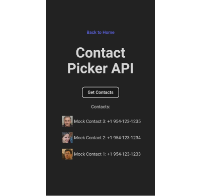
Note: The Contact Picker API will only work if the context is secure, i.e., the page is served over https:// or wss:// URLs.
Conclusion
There we go, four web APIs that I believe would empower us to build more useful and robust PWAs but have slipped under the radar for many of us. This is, of course, due to inconsistent browser support, so I hope this article can bring awareness to new APIs so we have a better chance to see them in future browser updates.
Aren’t they interesting? We saw how much control we have with the orientation of a device and its screen as well as the level of access we get to access a device’s hardware features, i.e. vibration, and information from other apps to use in our own UI.
But as I said much earlier, there’s a sort of infinite loop where a lack of awareness begets a lack of browser support. So, while the four APIs we covered are super interesting, your mileage will inevitably vary when it comes to using them in a production environment. Please tread cautiously and refer to Caniuse for the latest support information, or check for your own devices using WebAPI Check.
(gg, yk)
Scaling Success: Key Insights And Practical Takeaways
Scaling Success: Key Insights And Practical Takeaways Scaling Success: Key Insights And Practical Takeaways Addy Osmani 2024-06-04T12:00:00+00:00 2025-06-25T15:04:30+00:00 Building successful web products at scale is a multifaceted challenge that demands a combination of technical expertise, strategic decision-making, and a growth-oriented mindset. In Success at Scale, […]
Accessibility
Scaling Success: Key Insights And Practical Takeaways
Addy Osmani 2024-06-04T12:00:00+00:00
2025-06-25T15:04:30+00:00
Building successful web products at scale is a multifaceted challenge that demands a combination of technical expertise, strategic decision-making, and a growth-oriented mindset. In Success at Scale, I dive into case studies from some of the web’s most renowned products, uncovering the strategies and philosophies that propelled them to the forefront of their industries.
Here you will find some of the insights I’ve gleaned from these success stories, part of an ongoing effort to build a roadmap for teams striving to achieve scalable success in the ever-evolving digital landscape.
Cultivating A Mindset For Scaling Success
The foundation of scaling success lies in fostering the right mindset within your team. The case studies in Success at Scale highlight several critical mindsets that permeate the culture of successful organizations.
User-Centricity
Successful teams prioritize the user experience above all else.
They invest in understanding their users’ needs, behaviors, and pain points and relentlessly strive to deliver value. Instagram’s performance optimization journey exemplifies this mindset, focusing on improving perceived speed and reducing user frustration, leading to significant gains in engagement and retention.
By placing the user at the center of every decision, Instagram was able to identify and prioritize the most impactful optimizations, such as preloading critical resources and leveraging adaptive loading strategies. This user-centric approach allowed them to deliver a seamless and delightful experience to their vast user base, even as their platform grew in complexity.
Data-Driven Decision Making
Scaling success relies on data, not assumptions.
Teams must embrace a data-driven approach, leveraging metrics and analytics to guide their decisions and measure impact. Shopify’s UI performance improvements showcase the power of data-driven optimization, using detailed profiling and user data to prioritize efforts and drive meaningful results.
By analyzing user interactions, identifying performance bottlenecks, and continuously monitoring key metrics, Shopify was able to make informed decisions that directly improved the user experience. This data-driven mindset allowed them to allocate resources effectively, focusing on the areas that yielded the greatest impact on performance and user satisfaction.
Continuous Improvement
Scaling is an ongoing process, not a one-time achievement.
Successful teams foster a culture of continuous improvement, constantly seeking opportunities to optimize and refine their products. Smashing Magazine’s case study on enhancing Core Web Vitals demonstrates the impact of iterative enhancements, leading to significant performance gains and improved user satisfaction.
By regularly assessing their performance metrics, identifying areas for improvement, and implementing incremental optimizations, Smashing Magazine was able to continuously elevate the user experience. This mindset of continuous improvement ensures that the product remains fast, reliable, and responsive to user needs, even as it scales in complexity and user base.
Collaboration And Inclusivity
Silos hinder scalability.
High-performing teams promote collaboration and inclusivity, ensuring that diverse perspectives are valued and leveraged. The Understood’s accessibility journey highlights the power of cross-functional collaboration, with designers, developers, and accessibility experts working together to create inclusive experiences for all users.
By fostering open communication, knowledge sharing, and a shared commitment to accessibility, The Understood was able to embed inclusive design practices throughout its development process. This collaborative and inclusive approach not only resulted in a more accessible product but also cultivated a culture of empathy and user-centricity that permeated all aspects of their work.
Making Strategic Decisions for Scalability
Beyond cultivating the right mindset, scaling success requires making strategic decisions that lay the foundation for sustainable growth.
Technology Choices
Selecting the right technologies and frameworks can significantly impact scalability. Factors like performance, maintainability, and developer experience should be carefully considered. Notion’s migration to Next.js exemplifies the importance of choosing a technology stack that aligns with long-term scalability goals.
By adopting Next.js, Notion was able to leverage its performance optimizations, such as server-side rendering and efficient code splitting, to deliver fast and responsive pages. Additionally, the developer-friendly ecosystem of Next.js and its strong community support enabled Notion’s team to focus on building features and optimizing the user experience rather than grappling with low-level infrastructure concerns. This strategic technology choice laid the foundation for Notion’s scalable and maintainable architecture.
Ship Only The Code A User Needs, When They Need It
This best practice is so important when we want to ensure that pages load fast without over-eagerly delivering JavaScript a user may not need at that time. For example, Instagram made a concerted effort to improve the web performance of instagram.com, resulting in a nearly 50% cumulative improvement in feed page load time. A key area of focus has been shipping less JavaScript code to users, particularly on the critical rendering path.
The Instagram team found that the uncompressed size of JavaScript is more important for performance than the compressed size, as larger uncompressed bundles take more time to parse and execute on the client, especially on mobile devices. Two optimizations they implemented to reduce JS parse/execute time were inline requires (only executing code when it’s first used vs. eagerly on initial load) and serving ES2017+ code to modern browsers to avoid transpilation overhead. Inline requires improved Time-to-Interactive metrics by 12%, and the ES2017+ bundle was 5.7% smaller and 3% faster than the transpiled version.
While good progress has been made, the Instagram team acknowledges there are still many opportunities for further optimization. Potential areas to explore could include the following:
- Improved code-splitting, moving more logic off the critical path,
- Optimizing scrolling performance,
- Adapting to varying network conditions,
- Modularizing their Redux state management.
Continued efforts will be needed to keep instagram.com performing well as new features are added and the product grows in complexity.
Accessibility Integration
Accessibility should be an integral part of the product development process, not an afterthought.
Wix’s comprehensive approach to accessibility, encompassing keyboard navigation, screen reader support, and infrastructure for future development, showcases the importance of building inclusivity into the product’s core.
By considering accessibility requirements from the initial design stages and involving accessibility experts throughout the development process, Wix was able to create a platform that empowered its users to build accessible websites. This holistic approach to accessibility not only benefited end-users but also positioned Wix as a leader in inclusive web design, attracting a wider user base and fostering a culture of empathy and inclusivity within the organization.
Developer Experience Investment
Investing in a positive developer experience is essential for attracting and retaining talent, fostering productivity, and accelerating development.
Apideck’s case study in the book highlights the impact of a great developer experience on community building and product velocity.
By providing well-documented APIs, intuitive SDKs, and comprehensive developer resources, Apideck was able to cultivate a thriving developer community. This investment in developer experience not only made it easier for developers to integrate with Apideck’s platform but also fostered a sense of collaboration and knowledge sharing within the community. As a result, ApiDeck was able to accelerate product development, leverage community contributions, and continuously improve its offering based on developer feedback.
Leveraging Performance Optimization Techniques
Achieving optimal performance is a critical aspect of scaling success. The case studies in Success at Scale showcase various performance optimization techniques that have proven effective.
Progressive Enhancement and Graceful Degradation
Building resilient web experiences that perform well across a range of devices and network conditions requires a progressive enhancement approach. Pinafore’s case study in Success at Scale highlights the benefits of ensuring core functionality remains accessible even in low-bandwidth or JavaScript-constrained environments.
By leveraging server-side rendering and delivering a usable experience even when JavaScript fails to load, Pinafore demonstrates the importance of progressive enhancement. This approach not only improves performance and resilience but also ensures that the application remains accessible to a wider range of users, including those with older devices or limited connectivity. By gracefully degrading functionality in constrained environments, Pinafore provides a reliable and inclusive experience for all users.
Adaptive Loading Strategies
The book’s case study on Tinder highlights the power of sophisticated adaptive loading strategies. By dynamically adjusting the content and resources delivered based on the user’s device capabilities and network conditions, Tinder ensures a seamless experience across a wide range of devices and connectivity scenarios. Tinder’s adaptive loading approach involves techniques like dynamic code splitting, conditional resource loading, and real-time network quality detection. This allows the application to optimize the delivery of critical resources, prioritize essential content, and minimize the impact of poor network conditions on the user experience.
By adapting to the user’s context, Tinder delivers a fast and responsive experience, even in challenging environments.
Efficient Resource Management
Effective management of resources, such as images and third-party scripts, can significantly impact performance. eBay’s journey showcases the importance of optimizing image delivery, leveraging techniques like lazy loading and responsive images to reduce page weight and improve load times.
By implementing lazy loading, eBay ensures that images are only loaded when they are likely to be viewed by the user, reducing initial page load time and conserving bandwidth. Additionally, by serving appropriately sized images based on the user’s device and screen size, eBay minimizes the transfer of unnecessary data and improves the overall loading performance. These resource management optimizations, combined with other techniques like caching and CDN utilization, enable eBay to deliver a fast and efficient experience to its global user base.
Continuous Performance Monitoring
Regularly monitoring and analyzing performance metrics is crucial for identifying bottlenecks and opportunities for optimization. The case study on Yahoo! Japan News demonstrates the impact of continuous performance monitoring, using tools like Lighthouse and real user monitoring to identify and address performance issues proactively.
By establishing a performance monitoring infrastructure, Yahoo! Japan News gains visibility into the real-world performance experienced by their users. This data-driven approach allows them to identify performance regression, pinpoint specific areas for improvement, and measure the impact of their optimizations. Continuous monitoring also enables Yahoo! Japan News to set performance baselines, track progress over time, and ensure that performance remains a top priority as the application evolves.
Embracing Accessibility and Inclusive Design
Creating inclusive web experiences that cater to diverse user needs is not only an ethical imperative but also a critical factor in scaling success. The case studies in Success at Scale emphasize the importance of accessibility and inclusive design.
Comprehensive Accessibility Testing
Ensuring accessibility requires a combination of automated testing tools and manual evaluation. LinkedIn’s approach to automated accessibility testing demonstrates the value of integrating accessibility checks into the development workflow, catching potential issues early, and reducing the reliance on manual testing alone.
By leveraging tools like Deque’s axe and integrating accessibility tests into their continuous integration pipeline, LinkedIn can identify and address accessibility issues before they reach production. This proactive approach to accessibility testing not only improves the overall accessibility of the platform but also reduces the cost and effort associated with retroactive fixes. However, LinkedIn also recognizes the importance of manual testing and user feedback in uncovering complex accessibility issues that automated tools may miss. By combining automated checks with manual evaluation, LinkedIn ensures a comprehensive approach to accessibility testing.
Inclusive Design Practices
Designing with accessibility in mind from the outset leads to more inclusive and usable products. Success With Scale’s case study on Intercom about creating an accessible messenger highlights the importance of considering diverse user needs, such as keyboard navigation and screen reader compatibility, throughout the design process.
By embracing inclusive design principles, Intercom ensures that their messenger is usable by a wide range of users, including those with visual, motor, or cognitive impairments. This involves considering factors such as color contrast, font legibility, focus management, and clear labeling of interactive elements. By designing with empathy and understanding the diverse needs of their users, Intercom creates a messenger experience that is intuitive, accessible, and inclusive. This approach not only benefits users with disabilities but also leads to a more user-friendly and resilient product overall.
User Research And Feedback
Engaging with users with disabilities and incorporating their feedback is essential for creating truly inclusive experiences. The Understood’s journey emphasizes the value of user research and collaboration with accessibility experts to identify and address accessibility barriers effectively.
By conducting usability studies with users who have diverse abilities and working closely with accessibility consultants, The Understood gains invaluable insights into the real-world challenges faced by their users. This user-centered approach allows them to identify pain points, gather feedback on proposed solutions, and iteratively improve the accessibility of their platform.
By involving users with disabilities throughout the design and development process, The Understood ensures that their products not only meet accessibility standards but also provide a meaningful and inclusive experience for all users.
Accessibility As A Shared Responsibility
Promoting accessibility as a shared responsibility across the organization fosters a culture of inclusivity. Shopify’s case study underscores the importance of educating and empowering teams to prioritize accessibility, recognizing it as a fundamental aspect of the user experience rather than a mere technical checkbox.
By providing accessibility training, guidelines, and resources to designers, developers, and content creators, Shopify ensures that accessibility is considered at every stage of the product development lifecycle. This shared responsibility approach helps to build accessibility into the core of Shopify’s products and fosters a culture of inclusivity and empathy. By making accessibility everyone’s responsibility, Shopify not only improves the usability of their platform but also sets an example for the wider industry on the importance of inclusive design.
Fostering A Culture of Collaboration And Knowledge Sharing
Scaling success requires a culture that promotes collaboration, knowledge sharing, and continuous learning. The case studies in Success at Scale highlight the impact of effective collaboration and knowledge management practices.
Cross-Functional Collaboration
Breaking down silos and fostering cross-functional collaboration accelerates problem-solving and innovation. Airbnb’s design system journey showcases the power of collaboration between design and engineering teams, leading to a cohesive and scalable design language across web and mobile platforms.
By establishing a shared language and a set of reusable components, Airbnb’s design system enables designers and developers to work together more efficiently. Regular collaboration sessions, such as design critiques and code reviews, help to align both teams and ensure that the design system evolves in a way that meets the needs of all stakeholders. This cross-functional approach not only improves the consistency and quality of the user experience but also accelerates the development process by reducing duplication of effort and promoting code reuse.
Knowledge Sharing And Documentation
Capturing and sharing knowledge across the organization is crucial for maintaining consistency and enabling the efficient onboarding of new team members. Stripe’s investment in internal frameworks and documentation exemplifies the value of creating a shared understanding and facilitating knowledge transfer.
By maintaining comprehensive documentation, code examples, and best practices, Stripe ensures that developers can quickly grasp the intricacies of their internal tools and frameworks. This documentation-driven culture not only reduces the learning curve for new hires but also promotes consistency and adherence to established patterns and practices. Regular knowledge-sharing sessions, such as tech talks and lunch-and-learns, further reinforce this culture of learning and collaboration, enabling team members to learn from each other’s experiences and stay up-to-date with the latest developments.
Communities Of Practice
Establishing communities of practice around specific domains, such as accessibility or performance, promotes knowledge sharing and continuous improvement. Shopify’s accessibility guild demonstrates the impact of creating a dedicated space for experts and advocates to collaborate, share best practices, and drive accessibility initiatives forward.
By bringing together individuals passionate about accessibility from across the organization, Shopify’s accessibility guild fosters a sense of community and collective ownership. Regular meetings, workshops, and hackathons provide opportunities for members to share their knowledge, discuss challenges, and collaborate on solutions. This community-driven approach not only accelerates the adoption of accessibility best practices but also helps to build a culture of inclusivity and empathy throughout the organization.
Leveraging Open Source And External Expertise
Collaborating with the wider developer community and leveraging open-source solutions can accelerate development and provide valuable insights. Pinafore’s journey highlights the benefits of engaging with accessibility experts and incorporating their feedback to create a more inclusive and accessible web experience.
By actively seeking input from the accessibility community and leveraging open-source accessibility tools and libraries, Pinafore was able to identify and address accessibility issues more effectively. This collaborative approach not only improved the accessibility of the application but also contributed back to the wider community by sharing their learnings and experiences. By embracing open-source collaboration and learning from external experts, teams can accelerate their own accessibility efforts and contribute to the collective knowledge of the industry.
The Path To Sustainable Success
Achieving scalable success in the web development landscape requires a multifaceted approach that encompasses the right mindset, strategic decision-making, and continuous learning. The Success at Scale book provides a comprehensive exploration of these elements, offering deep insights and practical guidance for teams at all stages of their scaling journey.
By cultivating a user-centric, data-driven, and inclusive mindset, teams can prioritize the needs of their users and make informed decisions that drive meaningful results. Adopting a culture of continuous improvement and collaboration ensures that teams are always striving to optimize and refine their products, leveraging the collective knowledge and expertise of their members.
Making strategic technology choices, such as selecting performance-oriented frameworks and investing in developer experience, lays the foundation for scalable and maintainable architectures. Implementing performance optimization techniques, such as adaptive loading, efficient resource management, and continuous monitoring, helps teams deliver fast and responsive experiences to their users.
Embracing accessibility and inclusive design practices not only ensures that products are usable by a wide range of users but also fosters a culture of empathy and user-centricity. By incorporating accessibility testing, inclusive design principles, and user feedback into the development process, teams can create products that are both technically sound and meaningfully inclusive.
Fostering a culture of collaboration, knowledge sharing, and continuous learning is essential for scaling success. By breaking down silos, promoting cross-functional collaboration, and investing in documentation and communities of practice, teams can accelerate problem-solving, drive innovation, and build a shared understanding of their products and practices.
The case studies featured in Success at Scale serve as powerful examples of how these principles and strategies can be applied in real-world contexts. By learning from the successes and challenges of industry leaders, teams can gain valuable insights and inspiration for their own scaling journeys.
As you embark on your path to scaling success, remember that it is an ongoing process of iteration, learning, and adaptation. Embrace the mindsets and strategies outlined in this article, dive deeper into the learnings from the Success at Scale book, and continually refine your approach based on the unique needs of your users and the evolving landscape of web development.
Conclusion
Scaling successful web products requires a holistic approach that combines technical excellence, strategic decision-making, and a growth-oriented mindset. By learning from the experiences of industry leaders, as showcased in the Success at Scale book, teams can gain valuable insights and practical guidance on their journey towards sustainable success.
Cultivating a user-centric, data-driven, and inclusive mindset lays the foundation for scalability. By prioritizing the needs of users, making informed decisions based on data, and fostering a culture of continuous improvement and collaboration, teams can create products that deliver meaningful value and drive long-term growth.
Making strategic decisions around technology choices, performance optimization, accessibility integration, and developer experience investment sets the stage for scalable and maintainable architectures. By leveraging proven optimization techniques, embracing inclusive design practices, and investing in the tools and processes that empower developers, teams can build products that are fast and resilient.
Through ongoing collaboration, knowledge sharing, and a commitment to learning, teams can navigate the complexities of scaling success and create products that make a lasting impact in the digital landscape.
Print + eBook
{
“sku”: “success-at-scale”,
“type”: “Book”,
“price”: “44.00”,
“prices”: [{
“amount”: “44.00”,
“currency”: “USD”,
“items”: [
{“amount”: “34.00”, “type”: “Book”},
{“amount”: “10.00”, “type”: “E-Book”}
]
}, {
“amount”: “44.00”,
“currency”: “EUR”,
“items”: [
{“amount”: “34.00”, “type”: “Book”},
{“amount”: “10.00”, “type”: “E-Book”}
]
}
]
}
$
44.00
Quality hardcover. Free worldwide shipping.
100 days money-back-guarantee.
eBook
{
“sku”: “success-at-scale-ebook”,
“type”: “E-Book”,
“price”: “19.00”,
“prices”: [{
“amount”: “19.00”,
“currency”: “USD”
}, {
“amount”: “19.00”,
“currency”: “EUR”
}
]
}
$
19.00
DRM-free, of course. ePUB, Kindle, PDF.
Included with your Smashing Membership.
Get the eBook
Download PDF, ePUB, Kindle.
Thanks for being smashing! ❤️
We’re Trying Out Something New
In an effort to conserve resources here at Smashing, we’re trying something new with Success at Scale. The printed book is 304 pages, and we make an expanded PDF version available to everyone who purchases a print book. This accomplishes a few good things:
- We will use less paper and materials because we are making a smaller printed book;
- We’ll use fewer resources in general to print, ship, and store the books, leading to a smaller carbon footprint; and
- Keeping the book at more manageable size means we can continue to offer free shipping on all Smashing orders!
Smashing Books have always been printed with materials from FSC Certified forests. We are committed to finding new ways to conserve resources while still bringing you the best possible reading experience.

Community Matters ❤️
Producing a book takes quite a bit of time, and we couldn’t pull it off without the support of our wonderful community. A huge shout-out to Smashing Members for the kind, ongoing support. The eBook is and always will be free for Smashing Members. Plus, Members get a friendly discount when purchasing their printed copy. Just sayin’! 😉
More Smashing Books & Goodies
Promoting best practices and providing you with practical tips to master your daily coding and design challenges has always been (and will be) at the core of everything we do at Smashing.
In the past few years, we were very lucky to have worked together with some talented, caring people from the web community to publish their wealth of experience as printed books that stand the test of time. Heather and Steven are two of these people. Have you checked out their books already?
Understanding Privacy
Everything you need to know to put your users first and make a better web.

Touch Design for Mobile Interfaces
Learn how touchscreen devices really work — and how people really use them.

Interface Design Checklists
100 practical cards for common interface design challenges.
(gg, yk, vf, il)
The Era Of Platform Primitives Is Finally Here
The Era Of Platform Primitives Is Finally Here The Era Of Platform Primitives Is Finally Here Atila Fassina 2024-05-28T12:00:00+00:00 2025-06-25T15:04:30+00:00 This article is sponsored by Netlify In the past, the web ecosystem moved at a very slow pace. Developers would go years without a new […]
Accessibility
The Era Of Platform Primitives Is Finally Here
Atila Fassina 2024-05-28T12:00:00+00:00
2025-06-25T15:04:30+00:00
This article is sponsored by Netlify
In the past, the web ecosystem moved at a very slow pace. Developers would go years without a new language feature or working around a weird browser quirk. This pushed our technical leaders to come up with creative solutions to circumvent the platform’s shortcomings. We invented bundling, polyfills, and transformation steps to make things work everywhere with less of a hassle.
Slowly, we moved towards some sort of consensus on what we need as an ecosystem. We now have TypeScript and Vite as clear preferences—pushing the needle of what it means to build consistent experiences for the web. Application frameworks have built whole ecosystems on top of them: SolidStart, Nuxt, Remix, and Analog are examples of incredible tools built with such primitives. We can say that Vite and TypeScript are tooling primitives that empower the creation of others in diverse ecosystems.
With bundling and transformation needs somewhat defined, it was only natural that framework authors would move their gaze to the next layer they needed to abstract: the server.
Server Primitives
The UnJS folks have been consistently building agnostic tooling that can be reused in different ecosystems. Thanks to them, we now have frameworks and libraries such as H3 (a minimal Node.js server framework built with TypeScript), which enables Nitro (a whole server runtime powered by Vite, and H3), that in its own turn enabled Vinxi (an application bundler and server runtime that abstracts Nitro and Vite).
Nitro is used already by three major frameworks: Nuxt, Analog, and SolidStart. While Vinxi is also used by SolidStart. This means that any platform which supports one of these, will definitely be able to support the others with zero additional effort.
This is not about taking a bigger slice of the cake. But making the cake bigger for everyone.
Frameworks, platforms, developers, and users benefit from it. We bet on our ecosystem together instead of working in silos with our monolithic solutions. Empowering our developer-users to gain transferable skills and truly choose the best tool for the job with less vendor lock-in than ever before.
Serverless Rejoins Conversation
Such initiatives have probably been noticed by serverless platforms like Netlify. With Platform Primitives, frameworks can leverage agnostic solutions for common necessities such as Incremental Static Regeneration (ISR), Image Optimization, and key/value (kv) storage.
As the name implies, Netlify Platform Primitives are a group of abstractions and helpers made available at a platform level for either frameworks or developers to leverage when using their applications. This brings additional functionality simultaneously to every framework. This is a big and powerful shift because, up until now, each framework would have to create its own solutions and backport such strategies to compatibility layers within each platform.
Moreover, developers would have to wait for a feature to first land on a framework and subsequently for support to arrive in their platform of choice. Now, as long as they’re using Netlify, those primitives are available directly without any effort and time put in by the framework authors. This empowers every ecosystem in a single measure.
Serverless means server infrastructure developers don’t need to handle. It’s not a misnomer, but a format of Infrastructure As A Service.
As mentioned before, Netlify Platform Primitives are three different features:
- Image CDN
A content delivery network for images. It can handle format transformation and size optimization via URL query strings. - Caching
Basic primitives for their server runtime that help manage the caching directives for browser, server, and CDN runtimes smoothly. - Blobs
A key/value (KV) storage option is automatically available to your project through their SDK.
Let’s take a quick dive into each of these features and explore how they can increase our productivity with a serverless fullstack experience.
Image CDN
Every image in a /public can be served through a Netlify function. This means it’s possible to access it through a /.netlify/images path. So, without adding sharp or any image optimization package to your stack, deploying to Netlify allows us to serve our users with a better format without transforming assets at build-time. In a SolidStart, in a few lines of code, we could have an Image component that transforms other formats to .webp.
import { type JSX } from "solid-js";

const SITE_URL = "https://example.com";

interface Props extends JSX.ImgHTMLAttributes<HTMLImageElement> {
  format?: "webp" | "jpeg" | "png" | "avif" | "preserve";
  quality?: number | "preserve";
}

const getQuality = (quality: Props["quality"]) => {
  if (quality === "preserve") return"";
  return `&q=${quality || "75"}`;
};

function getFormat(format: Props["format"]) {
  switch (format) {
    case "preserve":
      return"  ";
    case "jpeg":
      return `&fm=jpeg`;
    case "png":
      return `&fm=png`;
    case "avif":
      return `&fm=avif`;
    case "webp":
    default:
      return `&fm=webp`;
  }
}

export function Image(props: Props) {
  return (
    <img
      {...props}
      src={`${SITE_URL}/.netlify/images?url=/${props.src}${getFormat(
        props.format
      )}${getQuality(props.quality)}`}
    />
  );
}
Notice the above component is even slightly more complex than bare essentials because we’re enforcing some default optimizations. Our getFormat method transforms images to .webp by default. It’s a broadly supported format that’s significantly smaller than the most common and without any loss in quality. Our get quality function reduces the image quality to 75% by default; as a rule of thumb, there isn’t any perceivable loss in quality for large images while still providing a significant size optimization.
Caching
By default, Netlify caching is quite extensive for your regular artifacts – unless there’s a new deployment or the cache is flushed manually, resources will last for 365 days. However, because server/edge functions are dynamic in nature, there’s no default caching to prevent serving stale content to end-users. This means that if you have one of these functions in production, chances are there’s some caching to be leveraged to reduce processing time (and expenses).
By adding a cache-control header, you already have done 80% of the work in optimizing your resources for best serving users. Some commonly used cache control directives:
{
  "cache-control": "public, max-age=0, stale-while-revalidate=86400"

}public: Store in a shared cache.max-age=0: resource is immediately stale.stale-while-revalidate=86400: if the cache is stale for less than 1 day, return the cached value and revalidate it in the background.
{
  "cache-control": "public, max-age=86400, must-revalidate"

}
public: Store in a shared cache.max-age=86400: resource is fresh for one day.must-revalidate: if a request arrives when the resource is already stale, the cache must be revalidated before a response is sent to the user.
Note: For more extensive information about possible compositions of Cache-Control directives, check the mdn entry on Cache-Control.
The cache is a type of key/value storage. So, once our responses are set with proper cache control, platforms have some heuristics to define what the key will be for our resource within the cache storage. The Web Platform has a second very powerful header that can dictate how our cache behaves.
The Vary response header is composed of a list of headers that will affect the validity of the resource (method and the endpoint URL are always considered; no need to add them). This header allows platforms to define other headers defined by location, language, and other patterns that will define for how long a response can be considered fresh.
The Vary response header is a foundational piece of a special header in Netlify Caching Primitive. The Netlify-Vary will take a set of instructions on which parts of the request a key should be based. It is possible to tune a response key not only by the header but also by the value of the header.
- query: vary by the value of some or all request query parameters.
- header: vary by the value of one or more request headers.
- language: vary by the languages from the
Accept-Languageheader. - country: vary by the country inferred from a GeoIP lookup on the request IP address.
- cookie: vary by the value of one or more request cookie keys.
This header offers strong fine-control over how your resources are cached. Allowing for some creative strategies to optimize how your app will perform for specific users.
Blob Storage
This is a highly-available key/value store, it’s ideal for frequent reads and infrequent writes. They’re automatically available and provisioned for any Netlify Project.
It’s possible to write on a blob from your runtime or push data for a deployment-specific store. For example, this is how an Action Function would register a number of likes in store with SolidStart.
import { getStore } from "@netlify/blobs";
import { action } from "@solidjs/router";

export const upVote = action(async (formData: FormData) => {
  "use server";

  const postId = formData.get("id");
  const postVotes = formData.get("votes");

  if (typeof postId !== "string" || typeof postVotes !== "string") return;

  const store = getStore("posts");
  const voteSum = Number(postVotes) + 1)

  await store.set(postId, String(voteSum);

  console.log("done");
  return voteSum

});
- Check
@netlify/blobsAPI documentation for more examples and use-cases.
Final Thoughts
With high-quality primitives, we can enable library and framework creators to create thin integration layers and adapters. This way, instead of focusing on how any specific platform operates, it will be possible to focus on the actual user experience and practical use-cases for such features. Monoliths and deeply integrated tooling make sense to build platforms fast with strong vendor lock-in, but that’s not what the community needs. Betting on the web platform is a more sensible and future-friendly way.
Let me know in the comments what your take is about unbiased tooling versus opinionated setups!
(il)