


Inclusive Dark Mode: Designing Accessible Dark Themes For All Users
Dark mode isn’t just a trendy aesthetic. It’s a gateway to more inclusive digital experiences, but only if designed thoughtfully. While its sleek visuals and reduced eye strain appeal to many, poo
Accessibility
Software Development Lifecycle: The Definitive Guide [FREE]
Software development lifecycle may sound scary or confusing, but in fact, it’s a simple method of delivering software applications. Planning to start a software development project? Then this guide is here to map out your journey towards a successful, working app! In this article, we’ll explain […]
Business
Creating An Effective Multistep Form For Better User Experience
Forms are already notoriously tough to customize and style — to the extent that we’re already starting to see new ideas for more flexible control. But what we don’t often discuss is designin
Javascript

Creating The “Moving Highlight” Navigation Bar With JavaScript And CSS
Creating The “Moving Highlight” Navigation Bar With JavaScript And CSS Creating The “Moving Highlight” Navigation Bar With JavaScript And CSS Blake Lundquist 2025-06-11T13:00:00+00:00 2025-06-25T15:04:30+00:00 I recently came across an old jQuery tutorial demonstrating a “moving highlight” navigation bar and decided the concept was due for […]
Accessibility
Creating The “Moving Highlight” Navigation Bar With JavaScript And CSS
Blake Lundquist 2025-06-11T13:00:00+00:00
2025-06-25T15:04:30+00:00
I recently came across an old jQuery tutorial demonstrating a “moving highlight” navigation bar and decided the concept was due for a modern upgrade. With this pattern, the border around the active navigation item animates directly from one element to another as the user clicks on menu items. In 2025, we have much better tools to manipulate the DOM via vanilla JavaScript. New features like the View Transition API make progressive enhancement more easily achievable and handle a lot of the animation minutiae.

In this tutorial, I will demonstrate two methods of creating the “moving highlight” navigation bar using plain JavaScript and CSS. The first example uses the getBoundingClientRect method to explicitly animate the border between navigation bar items when they are clicked. The second example achieves the same functionality using the new View Transition API.
The Initial Markup
Let’s assume that we have a single-page application where content changes without the page being reloaded. The starting HTML and CSS are your standard navigation bar with an additional div element containing an id of #highlight. We give the first navigation item a class of .active.
See the Pen [Moving Highlight Navbar Starting Markup [forked]](https://codepen.io/smashingmag/pen/EajQyBW) by Blake Lundquist.
For this version, we will position the #highlight element around the element with the .active class to create a border. We can utilize absolute positioning and animate the element across the navigation bar to create the desired effect. We’ll hide it off-screen initially by adding left: -200px and include transition styles for all properties so that any changes in the position and size of the element will happen gradually.
#highlight {
  z-index: 0;
  position: absolute;
  height: 100%;
  width: 100px;
  left: -200px;
  border: 2px solid green;
  box-sizing: border-box;
  transition: all 0.2s ease;
}
Add A Boilerplate Event Handler For Click Interactions
We want the highlight element to animate when a user changes the .active navigation item. Let’s add a click event handler to the nav element, then filter for events caused only by elements matching our desired selector. In this case, we only want to change the .active nav item if the user clicks on a link that does not already have the .active class.
Initially, we can call console.log to ensure the handler fires only when expected:
const navbar = document.querySelector('nav');

navbar.addEventListener('click', function (event) {
  // return if the clicked element doesn't have the correct selector
  if (!event.target.matches('nav a:not(active)')) {
    return;
  }

  console.log('click');
});
Open your browser console and try clicking different items in the navigation bar. You should only see "click" being logged when you select a new item in the navigation bar.
Now that we know our event handler is working on the correct elements let’s add code to move the .active class to the navigation item that was clicked. We can use the object passed into the event handler to find the element that initialized the event and give that element a class of .active after removing it from the previously active item.
const navbar = document.querySelector('nav');

navbar.addEventListener('click', function (event) {
  // return if the clicked element doesn't have the correct selector
  if (!event.target.matches('nav a:not(active)')) {
    return;
  }

-  console.log('click');
+  document.querySelector('nav a.active').classList.remove('active');
+  event.target.classList.add('active');

});
Our #highlight element needs to move across the navigation bar and position itself around the active item. Let’s write a function to calculate a new position and width. Since the #highlight selector has transition styles applied, it will move gradually when its position changes.
Using getBoundingClientRect, we can get information about the position and size of an element. We calculate the width of the active navigation item and its offset from the left boundary of the parent element. Then, we assign styles to the highlight element so that its size and position match.
// handler for moving the highlight
const moveHighlight = () => {
  const activeNavItem = document.querySelector('a.active');
  const highlighterElement = document.querySelector('#highlight');

  const width = activeNavItem.offsetWidth;

  const itemPos = activeNavItem.getBoundingClientRect();
  const navbarPos = navbar.getBoundingClientRect()
  const relativePosX = itemPos.left - navbarPos.left;

  const styles = {
    left: `${relativePosX}px`,
    width: `${width}px`,
  };

  Object.assign(highlighterElement.style, styles);
}
Let’s call our new function when the click event fires:
navbar.addEventListener('click', function (event) {
  // return if the clicked element doesn't have the correct selector
  if (!event.target.matches('nav a:not(active)')) {
    return;
  }

  document.querySelector('nav a.active').classList.remove('active');
  event.target.classList.add('active');

+  moveHighlight();
});
Finally, let’s also call the function immediately so that the border moves behind our initial active item when the page first loads:
// handler for moving the highlight
const moveHighlight = () => {
 // ...
}

// display the highlight when the page loads
moveHighlight();
Now, the border moves across the navigation bar when a new item is selected. Try clicking the different navigation links to animate the navigation bar.
See the Pen [Moving Highlight Navbar [forked]](https://codepen.io/smashingmag/pen/WbvMxqV) by Blake Lundquist.
That only took a few lines of vanilla JavaScript and could easily be extended to account for other interactions, like mouseover events. In the next section, we will explore refactoring this feature using the View Transition API.
Using The View Transition API
The View Transition API provides functionality to create animated transitions between website views. Under the hood, the API creates snapshots of “before” and “after” views and then handles transitioning between them. View transitions are useful for creating animations between documents, providing the native-app-like user experience featured in frameworks like Astro. However, the API also provides handlers meant for SPA-style applications. We will use it to reduce the JavaScript needed in our implementation and more easily create fallback functionality.
For this approach, we no longer need a separate #highlight element. Instead, we can style the .active navigation item directly using pseudo-selectors and let the View Transition API handle the animation between the before-and-after UI states when a new navigation item is clicked.
We’ll start by getting rid of the #highlight element and its associated CSS and replacing it with styles for the nav a::after pseudo-selector:
<nav>
  - <div id="highlight"></div>
  <a href="#" class="active">Home</a>
  <a href="#services">Services</a>
  <a href="#about">About</a>
  <a href="#contact">Contact</a>
</nav>
- #highlight {
-  z-index: 0;
-  position: absolute;
-  height: 100%;
-  width: 0;
-  left: 0;
-  box-sizing: border-box;
-  transition: all 0.2s ease;
- }

+ nav a::after {
+  content: " ";
+  position: absolute;
+  left: 0;
+  top: 0;
+  width: 100%;
+  height: 100%;
+  border: none;
+  box-sizing: border-box;
+ }
For the .active class, we include the view-transition-name property, thus unlocking the magic of the View Transition API. Once we trigger the view transition and change the location of the .active navigation item in the DOM, “before” and “after” snapshots will be taken, and the browser will animate the border across the bar. We’ll give our view transition the name of highlight, but we could theoretically give it any name.
nav a.active::after {
  border: 2px solid green;
  view-transition-name: highlight;
}
Once we have a selector that contains a view-transition-name property, the only remaining step is to trigger the transition using the startViewTransition method and pass in a callback function.
const navbar = document.querySelector('nav');

// Change the active nav item on click
navbar.addEventListener('click', async  function (event) {

  if (!event.target.matches('nav a:not(.active)')) {
    return;
  }

  document.startViewTransition(() => {
    document.querySelector('nav a.active').classList.remove('active');

    event.target.classList.add('active');
  });
});
Above is a revised version of the click handler. Instead of doing all the calculations for the size and position of the moving border ourselves, the View Transition API handles all of it for us. We only need to call document.startViewTransition and pass in a callback function to change the item that has the .active class!
Adjusting The View Transition
At this point, when clicking on a navigation link, you’ll notice that the transition works, but some strange sizing issues are visible.

This sizing inconsistency is caused by aspect ratio changes during the course of the view transition. We won’t go into detail here, but Jake Archibald has a detailed explanation you can read for more information. In short, to ensure the height of the border stays uniform throughout the transition, we need to declare an explicit height for the ::view-transition-old and ::view-transition-new pseudo-selectors representing a static snapshot of the old and new view, respectively.
::view-transition-old(highlight) {
  height: 100%;
}

::view-transition-new(highlight) {
  height: 100%;
}
Let’s do some final refactoring to tidy up our code by moving the callback to a separate function and adding a fallback for when view transitions aren’t supported:
const navbar = document.querySelector('nav');

// change the item that has the .active class applied
const setActiveElement = (elem) => {
  document.querySelector('nav a.active').classList.remove('active');
  elem.classList.add('active');
}

// Start view transition and pass in a callback on click
navbar.addEventListener('click', async  function (event) {
  if (!event.target.matches('nav a:not(.active)')) {
    return;
  }

  // Fallback for browsers that don't support View Transitions:
  if (!document.startViewTransition) {
    setActiveElement(event.target);
    return;
  }

  document.startViewTransition(() => setActiveElement(event.target));
});
Here’s our view transition-powered navigation bar! Observe the smooth transition when you click on the different links.
See the Pen [Moving Highlight Navbar with View Transition [forked]](https://codepen.io/smashingmag/pen/ogXELKE) by Blake Lundquist.
Conclusion
Animations and transitions between website UI states used to require many kilobytes of external libraries, along with verbose, confusing, and error-prone code, but vanilla JavaScript and CSS have since incorporated features to achieve native-app-like interactions without breaking the bank. We demonstrated this by implementing the “moving highlight” navigation pattern using two approaches: CSS transitions combined with the getBoundingClientRect() method and the View Transition API.
Resources
getBoundingClientRect()method documentation- View Transition API documentation
- “View Transitions: Handling Aspect Ratio Changes” by Jake Archibald
(gg, yk)

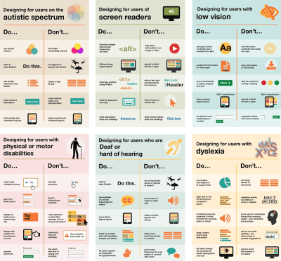
Designing For Neurodiversity
Designing For Neurodiversity Designing For Neurodiversity Vitaly Friedman 2025-06-02T08:00:00+00:00 2025-06-25T15:04:30+00:00 This article is sponsored by TetraLogical Neurodivergent needs are often considered as an edge case that doesn’t fit into common user journeys or flows. Neurodiversity tends to get overlooked in the design process. Or it […]
Accessibility
Designing For Neurodiversity
Vitaly Friedman 2025-06-02T08:00:00+00:00
2025-06-25T15:04:30+00:00
This article is sponsored by TetraLogical
Neurodivergent needs are often considered as an edge case that doesn’t fit into common user journeys or flows. Neurodiversity tends to get overlooked in the design process. Or it is tackled late in the process, and only if there is enough time.
But people aren’t edge cases. Every person is just a different person, performing tasks and navigating the web in a different way. So how can we design better, more inclusive experiences that cater to different needs and, ultimately, benefit everyone? Let’s take a closer look.

Neurodiversity Or Neurodivergent?
There is quite a bit of confusion about both terms on the web. Different people think and experience the world differently, and neurodiversity sees differences as natural variations, not deficits. It distinguishes between neurotypical and neurodivergent people.
- Neurotypical people see the world in a “typical” and widely perceived as expected way.
- Neurodivergent people experience the world differently, for example, people with ADHD, dyslexia, dyscalculia, synesthesia, and hyperlexia.
According to various sources, around 15–40% of the population has neurodivergent traits. These traits can be innate (e.g., autism) or acquired (e.g., trauma). But they are always on a spectrum, and vary a lot. A person with autism is not neurodiverse — they are neurodivergent.
One of the main strengths of neurodivergent people is how imaginative and creative they are, coming up with out-of-the-box ideas quickly. With exceptional levels of attention, strong long-term memory, a unique perspective, unbeatable accuracy, and a strong sense of justice and fairness.
Being different in a world that, to some degree, still doesn’t accept these differences is exhausting. So unsurprisingly, neurodivergent people often bring along determination, resilience, and high levels of empathy.
Design With People, Not For Them
As a designer, I often see myself as a path-maker. I’m designing reliable paths for people to navigate to their goals comfortably. Without being blocked. Or confused. Or locked out.
That means respecting the simple fact that people’s needs, tasks, and user journeys are all different, and that they evolve over time. And: most importantly, it means considering them very early in the process.
Better accessibility is better for everyone. Instead of making decisions that need to be reverted or refined to be compliant, we can bring a diverse group of people — with accessibility needs, with neurodiversity, frequent and infrequent users, experts, newcomers — in the process, and design with them, rather than for them.
Neurodiversity & Inclusive Design Resources
A wonderful resource that helps us design for cognitive accessibility is Stéphanie Walter’s Neurodiversity and UX toolkit. It includes practical guidelines, tools, and resources to better understand and design for dyslexia, dyscalculia, autism, and ADHD.
Another fantastic resource is Will Soward’s Neurodiversity Design System. It combines neurodiversity and user experience design into a set of design standards and principles that you can use to design accessible learning interfaces.
Last but not least, I’ve been putting together a few summaries about neurodiversity and inclusive design over the last few years, so you might find them helpful, too:
- ADHD
- Autism
- Children
- Colorblindness
- Deafness
- Dyscalculia
- Dyslexia
- Legibility
- Left-Handed Users
- Mental Health
- Motivation
- Older Adults
- Screen Readers
- Teenagers
A huge thank-you to everyone who has been writing, speaking, and sharing articles, resources, and toolkits on designing for diversity. The topic is often forgotten and overlooked, but it has an incredible impact. 👏🏼👏🏽👏🏾
(vf, il, yk)
WCAG 3.0’s Proposed Scoring Model: A Shift In Accessibility Evaluation
WCAG 3.0’s Proposed Scoring Model: A Shift In Accessibility Evaluation WCAG 3.0’s Proposed Scoring Model: A Shift In Accessibility Evaluation Mikhail Prosmitskiy 2025-05-02T11:00:00+00:00 2025-06-25T15:04:30+00:00 Since their introduction in 1999, the Web Content Accessibility Guidelines (WCAG) have shaped how we design and develop inclusive digital products. […]
Accessibility
WCAG 3.0’s Proposed Scoring Model: A Shift In Accessibility Evaluation
Mikhail Prosmitskiy 2025-05-02T11:00:00+00:00
2025-06-25T15:04:30+00:00
Since their introduction in 1999, the Web Content Accessibility Guidelines (WCAG) have shaped how we design and develop inclusive digital products. The WCAG 2.x series, released in 2008, introduced clear technical criteria judged in a binary way: either a success criterion is met or not. While this model has supported regulatory clarity and auditability, its “all-or-nothing” nature often fails to reflect the nuance of actual user experience (UX).
Over time, that disconnect between technical conformance and lived usability has become harder to ignore. People engage with digital systems in complex, often nonlinear ways: navigating multistep flows, dynamic content, and interactive states. In these scenarios, checking whether an element passes a rule doesn’t always answer the main question: can someone actually use it?
WCAG 3.0 is still in draft, but is evolving — and it represents a fundamental rethinking of how we evaluate accessibility. Rather than asking whether a requirement is technically met, it asks how well users with disabilities can complete meaningful tasks. Its new outcome-based model introduces a flexible scoring system that prioritizes usability over compliance, shifting focus toward the quality of access rather than the mere presence of features.
Draft Status: Ambitious, But Still Evolving
WCAG 3.0 was first introduced as a public working draft by the World Wide Web Consortium (W3C) Accessibility Guidelines Working Group in early 2021. The draft is still under active development and is not expected to reach W3C Recommendation status for several years, if not decades, by some accounts. This extended timeline reflects both the complexity of the task and the ambition behind it:
WCAG 3.0 isn’t just an update — it’s a paradigm shift.
Unlike WCAG 2.x, which focused primarily on web pages, WCAG 3.0 aims to cover a much broader ecosystem, including applications, tools, connected devices, and emerging interfaces like voice interaction and extended reality. It also rebrands itself as the W3C Accessibility Guidelines (while the WCAG acronym remains the same), signaling that accessibility is no longer a niche concern — it’s a baseline expectation across the digital world.
Importantly, WCAG 3.0 will not immediately replace 2.x. Both standards will coexist, and conformance to WCAG 2.2 will continue to be valid and necessary for some time, especially in legal and policy contexts.
This expansion isn’t just technical.
WCAG 3.0 reflects a deeper philosophical shift: accessibility is moving from a model of compliance toward a model of effectiveness.
“
Rules alone can’t capture whether a system truly works for someone. That’s why WCAG 3.0 leans into flexibility and future-proofing, aiming to support evolving technologies and real-world use over time. It formalizes a principle long understood by practitioners:
Inclusive design isn’t about passing a test; it’s about enabling people.
A New Structure: From Success Criteria To Outcomes And Methods
WCAG 2.x is structured around four foundational principles — Perceivable, Operable, Understandable, and Robust (aka POUR) — and testable success criteria organized into three conformance levels (A, AA, AAA). While technically precise, these criteria often emphasize implementation over impact.
WCAG 3.0 reorients this structure toward user needs and real outcomes. Its hierarchy is built on:
- Guidelines: High-level accessibility goals tied to specific user needs.
- Outcomes: Testable, user-centered statements (e.g., “Users have alternatives for time-based media”).
- Methods: Technology-specific or agnostic techniques that help achieve the outcomes, including code examples and test instructions.
- How-To Guides: Narrative documentation that provides practical advice, user context, and design considerations.
This shift is more than organizational. It reflects a deeper commitment to aligning technical implementation with UX. Outcomes speak the language of capability, which is about what users should be able to do (rather than just technical presence).
Crucially, outcomes are also where conformance scoring begins to take shape. For example, imagine a checkout flow on an e-commerce website. Under WCAG 2.x, if even one field in the checkout form lacks a label, the process may fail AA conformance entirely. However, under WCAG 3.0, that same flow might be evaluated across multiple outcomes (such as keyboard navigation, form labeling, focus management, and error handling), with each outcome receiving a separate score. If most areas score well but the error messaging is poor, the overall rating might be “Good” instead of “Excellent”, prompting targeted improvements without negating the entire flow’s accessibility.
From Binary Checks To Graded Scores
Rather than relying on pass or fail outcomes, WCAG 3.0 introduces a scoring model that reflects how well accessibility is supported. This shift allows teams to recognize partial successes and prioritize real improvements.
How Scoring Works
Each outcome in WCAG 3.0 is evaluated through one or more atomic tests. These can include the following:
- Binary tests: “Yes” and “no” outcomes (e.g., does every image have alternative text?)
- Percentage-based tests: Coverage-based scoring (e.g., what percentage of form fields have labels?)
- Qualitative tests: Rated judgments based on criteria (e.g., how descriptive is the alternative text?)
The result of these tests produces a score for each outcome, often normalized on a 0-4 or 0-5 scale, with labels like Poor, Fair, Good, and Excellent. These scores are then aggregated across functional categories (vision, mobility, cognition, etc.) and user flows.
This allows teams to measure progress, not just compliance. A product that improves from “Fair” to “Good” over time shows real evolution — a concept that doesn’t exist in WCAG 2.x.
Critical Errors: A Balancing Mechanism
To ensure that severity still matters, WCAG 3.0 introduces critical errors, which are high-impact accessibility failures that can override an otherwise positive score.
For example, consider a checkout flow. Under WCAG 2.x, a single missing label might cause the entire flow to fail conformance. WCAG 3.0, however, evaluates multiple outcomes — like form labeling, keyboard access, and error handling — each with its own score. Minor issues, such as unclear error messages or a missing label on an optional field, might lower the rating from “Excellent” to “Good”, without invalidating the entire experience.
But if a user cannot complete a core action, like submitting the form, making a purchase, or logging in, that constitutes a critical error. These failures directly block task completion and significantly reduce the overall score, regardless of how polished the rest of the experience is.
On the other hand, problems with non-essential features — like uploading a profile picture or changing a theme color — are considered lower-impact and won’t weigh as heavily in the evaluation.
Conformance Levels: Bronze, Silver, Gold
In place of categorizing conformance in tiers of Level A, Level AA, and Level AAA, WCAG 3.0 proposes three different conformance tiers:
- Bronze: The new minimum. It is comparable to WCAG 2.2 Level AA, but based on scoring and foundational outcomes. The requirements are considered achievable via automated and guided manual testing.
- Silver: This is a higher standard, requiring broader coverage, higher scores, and usability validation from people with disabilities.
- Gold: The highest tier. Represents exemplary accessibility, likely requiring inclusive design processes, innovation, and extensive user involvement.
Unlike in WCAG 2.2, where Level AAA is often seen as aspirational and inconsistent, these levels are intended to incentivize progression. They can also be scoped in the sense that teams can claim conformance for a checkout flow, mobile app, or specific feature, allowing iterative improvement.
What You Should Do Now
While WCAG 3.0 is still being developed, its direction is clear. That said, it’s important to acknowledge that the guidelines are not expected to be finalized in a few years. Here’s how teams can prepare:
- Continue pursuing WCAG 2.2 Level AA. It remains the most robust, recognized standard.
- Familiarize yourself with WCAG 3.0 drafts, especially the outcomes and scoring model.
- Start thinking in outcomes. Focus on what users need to accomplish, not just what features are present.
- Embed accessibility into workflows. Shift left. Don’t test at the end — design and build with access in mind.
- Involve users with disabilities early and regularly.
These practices won’t just make your product more inclusive; they’ll position your team to excel under WCAG 3.0.
Potential Downsides
Even though WCAG 3.0 presents a bold step toward more holistic accessibility, several structural risks deserve early attention, especially for organizations navigating regulation, scaling design systems, or building sustainable accessibility practices. Importantly, many of these risks are interconnected: challenges in one area may amplify issues in others.
Subjective Scoring
The move from binary pass or fail criteria to scored evaluations introduces room for subjective interpretation. Without standardized calibration, the same user flow might receive different scores depending on the evaluator. This makes comparability and repeatability harder, particularly in procurement or multi-vendor environments. A simple alternative text might be rated as “adequate” by one team and “unclear” by another.
Reduced Compliance Clarity
That same subjectivity leads to a second concern: the erosion of clear compliance thresholds. Scored evaluations replace the binary clarity of “compliant” or “not” with a more flexible, but less definitive, outcome. This could complicate legal enforcement, contractual definitions, and audit reporting. In practice, a product might earn a “Good” rating while still presenting critical usability gaps for certain users, creating a disconnect between score and actual access.
Legal and Policy Misalignment
As clarity around compliance blurs, so does alignment with existing legal frameworks. Many current laws explicitly reference WCAG 2.x and its A, AA, and AAA levels (e.g. Section 508 of the Rehabilitation Act of 1973, European Accessibility Act, The Public Sector Bodies (Websites and Mobile Applications) (No. 2) Accessibility Regulations 2018).
Until WCAG 3.0 is formally mapped to those standards, its use in regulated contexts may introduce risk. Teams operating in healthcare, finance, or public sectors will likely need to maintain dual conformance strategies in the interim, increasing cost and complexity.
Risk Of Minimum Viable Accessibility
Perhaps most concerning, this ambiguity can set the stage for a “minimum viable accessibility” mindset. Scored models risk encouraging “Bronze is good enough” thinking, particularly in deadline-driven environments. A team might deprioritize improvements once they reach a passing grade, even if essential barriers remain.
For example, a mobile app with strong keyboard support but missing audio transcripts could still achieve a passing tier, leaving some users excluded.
Conclusion
WCAG 3.0 marks a new era in accessibility — one that better reflects the diversity and complexity of real users. By shifting from checklists to scored evaluations and from rigid technical compliance to practical usability, it encourages teams to prioritize real-world impact over theoretical perfection.
As one might say, “It’s not about the score. It’s about who can use the product.” In my own experience, I’ve seen teams pour hours into fixing minor color contrast issues while overlooking broken keyboard navigation, leaving screen reader users unable to complete essential tasks. WCAG 3.0’s focus on outcomes reminds us that accessibility is fundamentally about functionality and inclusion.
At the same time, WCAG 3.0’s proposed scoring models introduce new responsibilities. Without clear calibration, stronger enforcement patterns, and a cultural shift away from “good enough,” we risk losing the very clarity that made WCAG 2.x enforceable and actionable. The promise of flexibility only works if we use it to aim higher, not to settle earlier.
“
For teams across design, development, and product leadership, this shift is a chance to rethink what success means. Accessibility isn’t about ticking boxes — it’s about enabling people.
By preparing now, being mindful of the risks, and focusing on user outcomes, we don’t just get ahead of WCAG 3.0 — we build digital experiences that are truly usable, sustainable, and inclusive.
Further Reading On SmashingMag
- “A Roundup Of WCAG 2.2 Explainers,” Geoff Graham
- “Getting To The Bottom Of Minimum WCAG-Conformant Interactive Element Size,” Eric Bailey
- “How To Make A Strong Case For Accessibility,” Vitaly Friedman
- “A Designer’s Accessibility Advocacy Toolkit,” Yichan Wang
(gg, yk)
Building An Offline-Friendly Image Upload System
Building An Offline-Friendly Image Upload System Building An Offline-Friendly Image Upload System Amejimaobari Ollornwi 2025-04-23T10:00:00+00:00 2025-06-25T15:04:30+00:00 So, you’re filling out an online form, and it asks you to upload a file. You click the input, select a file from your desktop, and are good to […]
Accessibility
Building An Offline-Friendly Image Upload System
Amejimaobari Ollornwi 2025-04-23T10:00:00+00:00
2025-06-25T15:04:30+00:00
So, you’re filling out an online form, and it asks you to upload a file. You click the input, select a file from your desktop, and are good to go. But something happens. The network drops, the file disappears, and you’re stuck having to re-upload the file. Poor network connectivity can lead you to spend an unreasonable amount of time trying to upload files successfully.
What ruins the user experience stems from having to constantly check network stability and retry the upload several times. While we may not be able to do much about network connectivity, as developers, we can always do something to ease the pain that comes with this problem.
One of the ways we can solve this problem is by tweaking image upload systems in a way that enables users to upload images offline — eliminating the need for a reliable network connection, and then having the system retry the upload process when the network becomes stable, without the user intervening.
This article is going to focus on explaining how to build an offline-friendly image upload system using PWA (progressive web application) technologies such as IndexedDB, service workers, and the Background Sync API. We will also briefly cover tips for improving the user experience for this system.
Planning The Offline Image Upload System
Here’s a flow chart for an offline-friendly image upload system.
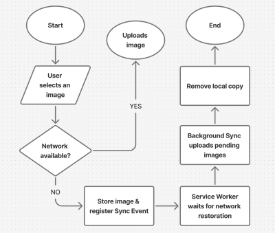
As shown in the flow chart, the process unfolds as follows:
- The user selects an image.
The process begins by letting the user select their image. - The image is stored locally in
IndexedDB.
Next, the system checks for network connectivity. If network connectivity is available, the system uploads the image directly, avoiding unnecessary local storage usage. However, if the network is not available, the image will be stored inIndexedDB. - The service worker detects when the network is restored.
With the image stored inIndexedDB, the system waits to detect when the network connection is restored to continue with the next step. - The background sync processes pending uploads.
The moment the connection is restored, the system will try to upload the image again. - The file is successfully uploaded.
The moment the image is uploaded, the system will remove the local copy stored inIndexedDB.
Implementing The System
The first step in the system implementation is allowing the user to select their images. There are different ways you can achieve this:
- You can use a simple
<input type="file">element; - A drag-and-drop interface.
I would advise that you use both. Some users prefer to use the drag-and-drop interface, while others think the only way to upload images is through the <input type="file"> element. Having both options will help improve the user experience. You can also consider allowing users to paste images directly in the browser using the Clipboard API.
Registering The Service Worker
At the heart of this solution is the service worker. Our service worker is going to be responsible for retrieving the image from the IndexedDB store, uploading it when the internet connection is restored, and clearing the IndexedDB store when the image has been uploaded.
To use a service worker, you first have to register one:
if ('serviceWorker' in navigator) {
  navigator.serviceWorker.register('/service-worker.js')
    .then(reg => console.log('Service Worker registered', reg))
    .catch(err => console.error('Service Worker registration failed', err));
}
Checking For Network Connectivity
Remember, the problem we are trying to solve is caused by unreliable network connectivity. If this problem does not exist, there is no point in trying to solve anything. Therefore, once the image is selected, we need to check if the user has a reliable internet connection before registering a sync event and storing the image in IndexedDB.
function uploadImage() {
  if (navigator.onLine) {
    // Upload Image
  } else {
    // register Sync Event
    // Store Images in IndexedDB
  }
}
Note: I’m only using the navigator.onLine property here to demonstrate how the system would work. The navigator.onLine property is unreliable, and I would suggest you come up with a custom solution to check whether the user is connected to the internet or not. One way you can do this is by sending a ping request to a server endpoint you’ve created.
Registering The Sync Event
Once the network test fails, the next step is to register a sync event. The sync event needs to be registered at the point where the system fails to upload the image due to a poor internet connection.
async function registerSyncEvent() {
  if ('SyncManager' in window) {
    const registration = await navigator.serviceWorker.ready;
    await registration.sync.register('uploadImages');
    console.log('Background Sync registered');
  }
}
After registering the sync event, you need to listen for it in the service worker.
self.addEventListener('sync', (event) => {
  if (event.tag === 'uploadImages') {
    event.waitUntil(sendImages());
  }
});
The sendImages function is going to be an asynchronous process that will retrieve the image from IndexedDB and upload it to the server. This is what it’s going to look like:
async function sendImages() {
  try {
    // await image retrieval and upload
  } catch (error) {
    // throw error
  }
}
Opening The Database
The first thing we need to do in order to store our image locally is to open an IndexedDB store. As you can see from the code below, we are creating a global variable to store the database instance. The reason for doing this is that, subsequently, when we want to retrieve our image from IndexedDB, we wouldn’t need to write the code to open the database again.
let database; // Global variable to store the database instance

function openDatabase() {
  return new Promise((resolve, reject) => {
    if (database) return resolve(database); // Return existing database instance

    const request = indexedDB.open("myDatabase", 1);

    request.onerror = (event) => {
      console.error("Database error:", event.target.error);
      reject(event.target.error); // Reject the promise on error
    };

    request.onupgradeneeded = (event) => {
        const db = event.target.result;
        // Create the "images" object store if it doesn't exist.
        if (!db.objectStoreNames.contains("images")) {
          db.createObjectStore("images", { keyPath: "id" });
        }
        console.log("Database setup complete.");
    };

    request.onsuccess = (event) => {
      database = event.target.result; // Store the database instance globally
      resolve(database); // Resolve the promise with the database instance
    };
  });
}
Storing The Image In IndexedDB
With the IndexedDB store open, we can now store our images.
Now, you may be wondering why an easier solution like
localStoragewasn’t used for this purpose.The reason for that is that
IndexedDBoperates asynchronously and doesn’t block the main JavaScript thread, whereaslocalStorageruns synchronously and can block the JavaScript main thread if it is being used.
Here’s how you can store the image in IndexedDB:
async function storeImages(file) {
  // Open the IndexedDB database.
  const db = await openDatabase();
  // Create a transaction with read and write access.
  const transaction = db.transaction("images", "readwrite");
  // Access the "images" object store.
  const store = transaction.objectStore("images");
  // Define the image record to be stored.
  const imageRecord = {
    id: IMAGE_ID,   // a unique ID
    image: file     // Store the image file (Blob)
  };
  // Add the image record to the store.
  const addRequest = store.add(imageRecord);
  // Handle successful addition.
  addRequest.onsuccess = () => console.log("Image added successfully!");
  // Handle errors during insertion.
  addRequest.onerror = (e) => console.error("Error storing image:", e.target.error);
}
With the images stored and the background sync set, the system is ready to upload the image whenever the network connection is restored.
Retrieving And Uploading The Images
Once the network connection is restored, the sync event will fire, and the service worker will retrieve the image from IndexedDB and upload it.
async function retrieveAndUploadImage(IMAGE_ID) {
  try {
    const db = await openDatabase(); // Ensure the database is open
    const transaction = db.transaction("images", "readonly");
    const store = transaction.objectStore("images");
    const request = store.get(IMAGE_ID);
    request.onsuccess = function (event) {
      const image = event.target.result;
      if (image) {
        // upload Image to server here
      } else {
        console.log("No image found with ID:", IMAGE_ID);
      }
    };
    request.onerror = () => {
        console.error("Error retrieving image.");
    };
  } catch (error) {
    console.error("Failed to open database:", error);
  }
}
Deleting The IndexedDB Database
Once the image has been uploaded, the IndexedDB store is no longer needed. Therefore, it should be deleted along with its content to free up storage.
function deleteDatabase() {
  // Check if there's an open connection to the database.
  if (database) {
    database.close(); // Close the database connection
    console.log("Database connection closed.");
  }

  // Request to delete the database named "myDatabase".
  const deleteRequest = indexedDB.deleteDatabase("myDatabase");

  // Handle successful deletion of the database.
  deleteRequest.onsuccess = function () {
    console.log("Database deleted successfully!");
  };

  // Handle errors that occur during the deletion process.
  deleteRequest.onerror = function (event) {
    console.error("Error deleting database:", event.target.error);
  };

  // Handle cases where the deletion is blocked (e.g., if there are still open connections).
  deleteRequest.onblocked = function () {
    console.warn("Database deletion blocked. Close open connections and try again.");
  };
}
With that, the entire process is complete!
Considerations And Limitations
While we’ve done a lot to help improve the experience by supporting offline uploads, the system is not without its limitations. I figured I would specifically call those out because it’s worth knowing where this solution might fall short of your needs.
- No Reliable Internet Connectivity Detection
JavaScript does not provide a foolproof way to detect online status. For this reason, you need to come up with a custom solution for detecting online status. - Chromium-Only Solution
The Background Sync API is currently limited to Chromium-based browsers. As such, this solution is only supported by Chromium browsers. That means you will need a more robust solution if you have the majority of your users on non-Chromium browsers. IndexedDBStorage Policies
Browsers impose storage limitations and eviction policies forIndexedDB. For instance, in Safari, data stored inIndexedDBhas a lifespan of seven days if the user doesn’t interact with the website. This is something you should bear in mind if you do come up with an alternative for the background sync API that supports Safari.
Enhancing The User Experience
Since the entire process happens in the background, we need a way to inform the users when images are stored, waiting to be uploaded, or have been successfully uploaded. Implementing certain UI elements for this purpose will indeed enhance the experience for the users. These UI elements may include toast notifications, upload status indicators like spinners (to show active processes), progress bars (to show state progress), network status indicators, or buttons to provide retry and cancel options.
Wrapping Up
Poor internet connectivity can disrupt the user experience of a web application. However, by leveraging PWA technologies such as IndexedDB, service workers, and the Background Sync API, developers can help improve the reliability of web applications for their users, especially those in areas with unreliable internet connectivity.
(gg, yk)
What Does It Really Mean For A Site To Be Keyboard Navigable
What Does It Really Mean For A Site To Be Keyboard Navigable What Does It Really Mean For A Site To Be Keyboard Navigable Eleanor Hecks 2025-04-18T13:00:00+00:00 2025-06-25T15:04:30+00:00 Efficient navigation is vital for a functional website, but not everyone uses the internet the same way. […]
Accessibility
What Does It Really Mean For A Site To Be Keyboard Navigable
Eleanor Hecks 2025-04-18T13:00:00+00:00
2025-06-25T15:04:30+00:00
Efficient navigation is vital for a functional website, but not everyone uses the internet the same way. While most visitors either scroll on mobile or click through with a mouse, many people only use their keyboards. Up to 10 million American adults have carpal tunnel syndrome, which may cause pain when holding a mouse, and vision problems can make it difficult to follow a cursor. Consequently, you should keep your site keyboard navigable to achieve universal appeal and accessibility.
Understanding Keyboard Navigation
Keyboard navigation allows users to engage with your website solely through keyboard input. That includes using shortcuts and selecting elements with the Tab and Enter keys.
There are more than 500 keyboard shortcuts among operating systems and specific apps your audience may use. Standard ones for web navigation include Ctrl + F to find words or resources, Shift + Arrow to select text, and Ctrl + Tab to move between browser tabs. While these are largely the responsibilities of the software companies behind the specific browser or OS, you should still consider them.
Single-button navigation is another vital piece of keyboard navigability. Users may move between clickable items with the Tab and Shift keys, use the Arrow keys to scroll, press Enter or Space to “click” a link, and exit pop-ups with Esc.

The Washington Post homepage goes further. Pressing Tab highlights clickable elements as it should, but the first button press brings up a link to the site’s accessibility statement first. Users can navigate past this, but including it highlights how the design understands how keyboard navigability is a matter of accessibility.
You should understand how people may use these controls so you can build a site that facilitates them. These navigation options are generally standard, so any deviation or lack of functionality will stand out. Ensuring keyboard navigability, especially in terms of enabling these specific shortcuts and controls, will help you meet such expectations and avoid turning users away.
Why Keyboard Navigation Matters In Web Design
Keyboard navigability is crucial for a few reasons. Most notably, it makes your site more accessible. In the U.S. alone, over one in four people have a disability, and many such conditions affect technology use. For instance, motor impairments make it challenging for someone to use a standard mouse, and users with vision problems typically require keyboard and screen reader use.
Beyond accounting for various usage needs, enabling a wider range of control methods makes a site convenient. Using a keyboard rather than a mouse is faster when it works as it should and may feel more comfortable. Considering how workers spend nearly a third of their workweek looking for information, any obstacles to efficiency can be highly disruptive.
Falling short in these areas may lead to legal complications. Regulations like the Americans with Disabilities Act necessitate tech accessibility. While the ADA has no binding rules for what constitutes an accessible website, it specifically mentions keyboard navigation in its nonbinding guidance. Failing to support such functionality does not necessarily mean you’ll face legal penalties, but courts can use these standards to inform their decision on whether your site is reasonably accessible.
In 2023, Kitchenaid faced a class-action lawsuit for failing to meet such standards. Plaintiffs alleged that the company’s site didn’t support alt text or keyboard navigation, making it inaccessible to users with visual impairments. While the case ultimately settled out of court, it’s a reminder of the potential legal and financial repercussions of overlooking inclusivity.
Outside the law, an inaccessible site presents ethical concerns, as it shows preferential treatment for those who can use a mouse, even if that’s unintentional. Even without legal action, public recognition of this bias may lead to a drop in visitors and a tainted public image.
Elements Of A Keyboard-Navigable Site
Thankfully, ensuring keyboard navigability is a straightforward user experience design practice. Because navigation is standard across OSes and browsers, keyboard-accessible sites employ a few consistent elements.
Focus Indicators
Web Accessibility In Mind states that sites must provide a visual indicator of elements currently in focus when users press Tab. Focus indicators are typically a simple box around the highlighted icon.
These are standard in CSS, but some designers hide them, so avoid using outline:0 or outline:none to limit their visibility. You can also increase the contrast or change the indicator’s color in CSS.

The CNN Breaking News homepage is a good example of a strong focus indicator. Pressing Tab immediately brings up the box, which is bold enough to see easily and even uses a white border when necessary to stand out against black or dark-colored site elements.
Logical Tab Order
The order in which the focus indicator moves between elements also matters. Generally speaking, pressing the Tab key should move it from left to right and top to bottom — the same way people read in English.
A few errors can stand in the way. Disabled buttons disrupt keyboard navigation flow by skipping an element with no explanation or highlighting it without making it clickable. Similarly, an interface where icons don’t fall in a predictable left-to-right, top-to-bottom order will make logical tab movement difficult.

The Sutton Maddock Vehicle Rental site is a good example of what not to do. When you press Tab, the focus indicator jumps from “Contact” to the Facebook link before going backward to the Twitter link. It starts at the right and moves left when it goes to the next line — the opposite order of what feels natural.
Skip Navigation Links
Skip links are also essential. These interactive elements let keyboard users jump to specific content without repeated keystrokes. Remember, these skips must be one of the first areas highlighted when you press Tab so they work as intended.

The HSBC Group homepage has a few skip navigation links. Pressing Tab pulls up three options, letting users quickly jump to whichever part of the site interests them.
Keyboard-Accessible Interactive Elements
Finally, all interactive elements on a keyboard-navigable site should be accessible via keystrokes. Anything people can click on or drag with a cursor should also support navigation and interaction. Enabling this is as simple as letting users select all items with the Tab or Arrow keys and press them with Space or Enter.

Appropriately, this Arizona State University page on keyboard accessibility showcases this concept well. All drop-down menus are possible to open by navigating to them via Tab and pressing Enter, so users don’t need a mouse to interact with them.
How to Test for Keyboard Navigability
After designing a keyboard-accessible UX, you should test it to ensure that it works properly. The easiest way to do this is to explore the site solely with your keyboard. The chart below outlines the criteria to look for when determining whether your site is legitimately keyboard navigable.
| Keyboard Navigable | Not Keyboard Navigable | |
|---|---|---|
| Clickable Elements | All elements are reachable through the keyboard and open when you press Enter. | Only some elements are possible to reach through the keyboard. Some links may be broken or not open when you press Enter. |
| Focus Indicators | Pressing Tab, Space, or Enter brings up a focus indicator that is easy to see in all browsers. | Focus indicators may not appear when pressing all buttons. The box may be hard to see or only appear in some browsers. |
| Skip Navigation Links | Pressing Tab for the first time pulls up at least one skip link to take users to much-visited content or menus. Continuing to press Tab moves the focus indicator past these links to highlight elements on the page as normal. | No skip links appear when pressing Tab for the first time. Alternatively, they appear after moving through all other elements. Skip links may not be functional. |
| Screen Reader Support | Screen readers can read each element when highlighted with the focus indicator. | Some elements may not encourage any action from screen readers when highlighted. |
The Web Content Accessibility Guidelines outline two test rules to verify keyboard navigability:
- The first ensures all interactive elements are accessible via the Tab key,
- The second checks for keyboard scroll functionality.
Employ both standards to review your UX before making a site live.
Typical issues include the inability to highlight elements with the Tab key or things that don’t fall in a natural order. You can discover both problems by trying to access everything with your keyboard. However, you may prefer to conduct a navigability audit through a third party. Many private companies offer these services, but you can also use the Bureau of Internet Accessibility for a basic WCAG audit.
Make Your Site Keyboard Navigable Today
Keyboard navigability ensures you cater to all needs and preferences for an inclusive, accessible website design. While it’s straightforward to implement, it’s also easy to miss, so remember these principles when designing your UX and testing your site.
WCAG provides several techniques you can employ to meet keyboard accessibility standards and enhance your users’ experience:
- Technique G90, for keyboard-triggered event handlers
- Technique G202, for general keyboard functionality
- Technique H91, for forming controls and links in HTML
Follow these guidelines and use WCAG’s test rules to create an accessible site. Remember to re-check it every time you add elements or change your UX.
Additionally, consider the following recommended reads to learn more about keyboards and their role in accessibility:
- “A Guide To Keyboard Accessibility: HTML And CSS (Part 1),” Cristian Díaz
- “A Guide To Keyboard Accessibility: JavaScript (Part 2),” Cristian Díaz
- “A Complete Guide To Mechanical Keyboards,” Ben Frain
- “UX Improvements For Keyboard Accessibility,” Vitaly Friedman
- “I Used The Web For A Day With Just A Keyboard,” Chris Ashton
User-friendliness is an industry best practice that demonstrates your commitment to inclusivity for all. Even users without disabilities will appreciate intuitive, efficient keyboard navigation.
(yk)
Fostering An Accessibility Culture
Fostering An Accessibility Culture Fostering An Accessibility Culture Daniel Devesa Derksen-Staats 2025-04-17T08:00:00+00:00 2025-06-25T15:04:30+00:00 A year ago, I learned that my role as an accessibility engineer was at risk of redundancy. It was a tough moment, both professionally and personally. For quite some time, my mind […]
Accessibility
Fostering An Accessibility Culture
Daniel Devesa Derksen-Staats 2025-04-17T08:00:00+00:00
2025-06-25T15:04:30+00:00
A year ago, I learned that my role as an accessibility engineer was at risk of redundancy. It was a tough moment, both professionally and personally. For quite some time, my mind raced with guilt, self-doubt, plain sadness… But as I sat with these emotions, I found one line of thought that felt productive: reflection. What did I do well? What could I have done better? What did I learn?
Looking back, I realized that as part of a small team in a massive organization, we focused on a long-term goal that we also believed was the most effective and sustainable path: gradually shaping the organization’s culture to embrace accessibility.
Around the same time, I started listening to “Atomic Habits” by James Clear. The connection was immediate. Habits and culture are tightly linked concepts, and fostering an accessibility culture was really about embedding accessibility habits into everyone’s processes. That’s what we focused on. It took us time (and plenty of trial and error) to figure this out, and while there’s no definitive playbook for creating an accessibility program at a large organization, I thought it might help others if I shared my experiences.
Before we dive in, here’s a quick note: This is purely my personal perspective, and you’ll find a bias towards culture and action in big organizations. I’m not speaking on behalf of any employer, past or present. The progress we made was thanks to the incredible efforts of every member of the team and beyond. I hope these reflections resonate with those looking to foster an accessibility culture at their own companies.
Goals Vs. Systems
To effectively shape habits, it’s crucial to focus on systems and processes (who we want to become) rather than obsessing over a final goal (or what we want to achieve). This perspective is especially relevant in accessibility.
Take the goal of making your app accessible. If you focus solely on achieving compliance without changing your systems (embedding accessibility into processes and culture), progress will be temporary.
For example, you might request an accessibility audit and fix the flagged issues to achieve compliance. While this can provide “quick” results, it’s often a short-lived solution.
Software evolves constantly: features are rewritten, old code is removed, and new functionality is added. Without an underlying system in place, accessibility issues can quickly resurface. Worse, this approach may reinforce the idea that accessibility is something external, checked by someone else, and fixed only when flagged. Not to mention that it becomes increasingly expensive the later accessibility issues are addressed in the process. It can also feel demoralizing when accessibility becomes synonymous with a long list of last-minute tickets when you are busiest.

Despite this, companies constantly focus on the goal rather than the systems.
“Accessibility is both a state and a practice.”
— Sommer Panage, SwiftTO talk, “Building Accessibility into Your Company, Team, and Culture”
I’ll take the liberty of tweaking that to an aspirational state. Without recognizing the importance of the practice, any progress made is at risk of regression.
Instead, I encourage organizations to focus on building habits and embedding good accessibility practices into their workflows. A strong system not only ensures lasting progress but also fosters a culture where accessibility becomes second nature.
What Is Your Actual Goal?
That doesn’t mean goals are useless — they’re very effective in setting up direction.
In my team, we often said (only half-jokingly) that our ultimate goal was to put ourselves out of a job. This mindset reflects an important principle: accessibility is a cross-organizational responsibility, not the task of a single person or team.
That’s why, in my opinion, focusing solely on compliance rather than culture transformation (or prioritizing the “state” of accessibility over the “practice”) is a flawed strategy.
The real goal should be to build a user-centric culture where accessibility is embedded in every workflow, decision, and process. By doing so, companies can create products where accessibility is not about checking boxes and closing tickets but delivering meaningful and inclusive experiences to all users.
How Do We Get There?
Different companies (of various sizes, structures, and cultures) will approach accessibility differently, depending on where they are in their journey. I still have to meet, though, an accessibility team that ever felt they had enough resources. This makes careful resource allocation a cornerstone of your strategy. And while there’s no one-size-fits-all solution, shifting left (addressing issues earlier in the development process) tends to be the most effective approach in most cases.
Design Systems
If your company has a design system, partnering with the team that owns it can be one of your biggest wins. Fixing a single component used across dozens of places improves the experience everywhere it’s used. This approach scales beautifully.
Involvement in foundational decisions and discussions, like choosing color palettes, typography, and component interactions, and so on, can also be very valuable. Contributing to documentation and guidelines tailored to accessibility can help teams across the organization make informed decisions.
For a deeper dive, I recommend Feli Bernutz’s excellent talk, “Designing APIs: How to Ensure Accessibility in Design Systems.”
Community Building
It is worth repeating, you’ll need as many allies as possible. The more limited your resources, the more important this becomes. Something as simple as a Slack channel that becomes a safe space where people can ask questions and share tips can go a long way. Other ideas include lunch-and-learns, regular meetups, office hours, or building a more formal champions network. And, very importantly, it is about finding ways of recognising and celebrating wins and everyone’s good work.
If you’re exploring this, I highly recommend joining the Champions of Accessibility Network (CAN) group. It’s a great way to learn and connect with others who are passionate about accessibility.
Education
Education is key for scaling accessibility efforts. While not everyone needs to be an expert, we should strive for everyone to know the basics. Repeatedly raising basic issues like missing accessibility labels, small target sizes, poor color contrast, and so on, can’t be productive.
Consider periodic training for different roles (PMs, designers, engineers…), embedding accessibility into onboarding sessions and documentation. You’ll need to find what works for you.
At Spotify, I found onboarding sessions for designers highly effective, as most features start with design. A Deque case study found that 67% of automatically detectable accessibility issues originate with design, reinforcing the importance of this approach. If your company has an education or training programme, partner with them. At Spotify, they were our biggest allies. They’ll help you get it right.
Automation
Everything that can be automated should eventually be automated. We know there’s already a lot on your plate, and automation should help lighten the load. This is especially true in larger organizations, where it can help scale efforts more efficiently. However, automated accessibility checks are not the silver bullet some might hope for.
One key issue is viewing automation as the solution rather than a safety net. Some companies claim automated tools catch as much as 57% of all issues or even 80% of issues by volume (PDF), though it is widely accepted that the figure is about 30%. Native mobile apps present greater challenges, making it likely that the real number is significantly lower for iOS and Android. These tools, and the high expectations around them, can create a false sense of security or reduce efforts to merely appease an automated tool of choice.
Automation doesn’t (and shouldn’t) replace intentionality. We should aim to deliver great accessible experiences from the start rather than wait for a tool to flag issues after the fact.
“
Whether your focus is on compliance or customer satisfaction, manual testing remains an essential part of the process. Whenever possible, you should also be testing with real users.
For me, the greatest value of automation is in catching basic regressions before release and serving as a gentle nudge to developers, reminding them to consider accessibility more thoughtfully. Ideally, they don’t just fix an issue and move on but take a moment to reflect:
- How did this issue arise in the first place?
- Did we consider accessibility during development?
- Did we skip manual testing with a screen reader?
When it comes to shaping habits, the environment matters. A strong accessibility culture isn’t built on willpower alone. It thrives on systems that encourage good practices and make bad ones harder to fall into. Nudges like automated checks, documentation, and proactive education are invaluable for keeping accessibility at the top of the mind.
Remediation
I won’t lie; the moment I was first told my new job was to work on accessibility, I immediately jumped in, doing what I knew best, trying to fix as many issues as possible myself. While rewarding at first, this approach isn’t scalable in larger organizations. It can quickly lead to burnout. It also sets an expectation within the company that it’s your team’s responsibility to get it done, an expectation that becomes increasingly difficult to reset as time goes on.
Not saying you shouldn’t be hands-on, though! But you need to be strategic. Try to focus on supporting teams with complex issues, pair programming with colleagues, code reviews, or implementing cross-app improvements, ideally in partnership with the design system teams. This way, your efforts can have a broader impact.
Auditing
Accessibility audits are another tool in your toolbox. Audits can be valuable but are often overused. They’re most effective after teams have done their best to make the product accessible, serving as a validation step rather than the starting point. After all, how useful is an audit if a significant portion of the flagged issues are basic problems that automated tools could have detected?
Alternatively, audits might help when you need quick results but don’t have the time or resources to upskill your workforce in time for a timely and necessary remediation.
While audits have their place and, as mentioned, can be valuable in certain situations, I wouldn’t rely on them to be the cornerstone of your strategy.
And So Much More
Try to find what works for your team, and, most importantly, adapt as circumstances change. Beyond the strategies mentioned, you might explore other initiatives:
- Collecting accessibility metrics,
- Conducting user research and testing,
- Improving procurement practices,
- Ensuring accessible content and communications,
- Supporting accessible hiring, workplace platforms, and tools.
It doesn’t mean one area of action is more important than another. Actually, in my view, one of the biggest reasons cultural change around accessibility takes longer than other areas is the lack of diversity in the workforce. Contributing to lines of action to address this issue might not be as immediately obvious as others.
The industry hasn’t done enough to hire people with disabilities, leaving them underrepresented in building products that truly work for them. Worse yet, they face more barriers in the hiring process. And even when they do get hired, they may find that the tools meant to enable us to do our work and be productive don’t work for them.
The key is to identify and lay out your areas of action first, then prioritize strategically while staying flexible as circumstances evolve. A thoughtful, adaptive approach ensures that no matter the challenge, your efforts remain impactful, avoiding stretching your team too thin and losing focus.
Valley Of Despair
Here’s the truth that everyone working in accessibility inevitably and unfortunately faces sooner rather than later: accessibility done right, as we’ve seen so far, takes time. And that goes against the “move fast and break things” culture of quick results and short-termism that many companies still follow, even if they won’t openly admit it.
The slow-cooking nature of the process can, therefore, work against us. Being patient and trusting that small changes will aggregate and compound over time is incredibly challenging and sometimes nerve-racking. On top of that, if there’s a misalignment with leadership about what the ultimate goal is, or if there’s pressure to deliver quick results, it’s easy to feel like throwing in the towel, or worse, to experience burnout.
Unfortunately, burnout is an all-too-common issue in the accessibility community.
If you’d like to learn more about it, I highly recommend Shell Little’s talk, “The Accessibility to Burnout Pipeline.”
In those moments of doubt, it is useful to remember the quote embraced by the San Antonio Spurs NBA team, originally from social reformer Jacob Riis:
“When nothing seems to help, I go and look at a stonecutter hammering away at his rock perhaps a hundred times without as much as a crack showing in it. Yet at the hundred and first blow it will split in two, and I know it was not that blow that did it — but all that had gone before.”
— Jacob Riis
This serves as a powerful reminder that every small effort contributes to the eventual breakthrough, even when progress feels invisible.
An Uncomfortable Truth
Top-down approaches are easier, and yet, most accessibility initiatives start from the bottom. For a sustainable strategy, however, you’ll need both. If necessary, you’ll have to get buy-in from leadership or risk feeling like you’re constantly swimming upstream. Surprisingly, this is often harder than it seems. This topic could easily be an article on its own, but Vitaly Friedman offers some useful pointers in his piece “How To Make A Strong Case For Accessibility.”
In my experience, leadership buy-in is crucial to fostering an accessibility culture. Leaders often want to see how accessibility impacts the bottom line and whether investing in it is profitable. The hardest part is getting started, so if you can make a convincing case this way, do it.
I once watched a talk by Dave Dame titled “Stakeholders Agree That Accessibility Is Important, But That Does Not Mean They Will Invest In Accessibility.” He made an excellent point: You may need to speak the business language to get their attention. As Dave put it, “I have Cerebral Palsy, but my money doesn’t.”
There is also data out there suggesting that accessibility can be a worthwhile investment.

Still, I would encourage everyone to strive to change that mindset.
Doing accessibility for economic or legal reasons is valid, but it can lead to perverse incentives, where the bare minimum and compliance become the strategy, or where teams constantly need to prove their return on investment.
“
It is better to do it for the “wrong” reasons than not to do it at all. But ultimately, those aren’t the reasons we should be doing it.
The “13 Letters” podcast opened with an incredibly interesting two-part episode featuring Mike Shebanek. In it, Mike explains how Apple eventually renewed its commitment to accessibility because, in the state of Maine, schools were providing Macs and needed a screen reader for students who required one. It seems like a somewhat business-driven decision. But years later, Tim Cook famously stated, “When we work on making our devices accessible by the blind, I don’t consider the bloody ROI.” He also remarked, “Accessibility rights are human rights.”
That’s the mindset I wish more CEOs and leaders had. It is a story of how a change of mindset from “we have to do it” to “it is a core part of what we do” leads to a lasting and successful accessibility culture. Going beyond the bare minimum, Apple has become a leader in accessibility. An innovative company that consistently makes products more accessible and pushes the entire industry forward.
The Good News
Once good habits are established, they tend to stick around. When I was let go, some people (I’m sure trying to comfort me) said the accessibility of the app would quickly regress and that the company would soon realize their mistake. Unexpectedly for them, I responded that I actually hoped it wouldn’t regress anytime soon. That, to me, would be the sign that I had done my job well.
And honestly, I felt confident it wouldn’t. Incredible people with deep knowledge and a passion for accessibility and building high-quality products stayed at the company. I knew the app was in good hands.
But it’s important not to fall into complacency. Cultures can be taken for granted, but they need constant nurturing and protection. A company that hires too fast, undergoes a major layoff, gets acquired, experiences high turnover, or sees changes in leadership or priorities… Any of these can pretty quickly destabilize something that took years to build.
Wrapping Up
This might not be your experience, and what we did may not work for you, but I hope you find this insight useful. I have, as they say, strong opinions, but loosely held. So I’m looking forward to knowing what you think and learning about your experiences too.
There’s no easy way or silver bullet! It’s actually very hard! The odds are against you. And we tend to constantly be puzzled about why the world is against us doing something that seems so obviously the right thing to do: to invite and include as many people as possible to use your product, to remove barriers, to avoid exclusion. It is important to talk about exclusion, too, when we talk about accessibility.
“Even though we were all talking about inclusion, we each had a different understanding of that word. Exclusion, on the other hand, is unanimously understood as being left out (…) Once we learn how to recognize exclusion, we can begin to see where a product or experience that works well for some might have barriers for someone else. Recognizing exclusion sparks a new kind of creativity on how a solution can be better.”
Something that might help: always assume goodwill and try to meet people where they are. I need to remind myself of this quite often.
“It is all about understanding where people are, meeting them where they’re at (…) People want to fundamentally do the right thing (…) They might not know what they don’t know (…) It might mean stepping back and going to the fundamentals (…) I know some people get frustrated about having to re-explain accessibility over and over again, but I believe that if we are not willing to do that, then how are we gonna change the hearts and minds of people?”
I’d encourage you to:
- If you haven’t, just start. No matter what.
- Play the long game, and focus more on systems and processes than just goals.
- Build a network: rally allies around you and secure buy-in from leadership by showing that accessibility is not extra work; if considered after the fact, they’re actually missed steps.
- Shift left and be strategic: reflect on where your limited resources can have the biggest, most lasting impact.
- Be persistent. Be resilient.
But honestly, anything you can do is progress. And progress is all we need, just for things to be a little better every day. Your job is incredibly important. Thanks for all you do!
Accessibility: This is the way!
(yk)
Inclusive Dark Mode: Designing Accessible Dark Themes For All Users
Inclusive Dark Mode: Designing Accessible Dark Themes For All Users Inclusive Dark Mode: Designing Accessible Dark Themes For All Users Alex Williams 2025-04-15T13:00:00+00:00 2025-06-25T15:04:30+00:00 Dark mode, a beloved feature in modern digital interfaces, offers a visually striking alternative to traditional light themes. Its allure lies […]
Accessibility
Inclusive Dark Mode: Designing Accessible Dark Themes For All Users
Alex Williams 2025-04-15T13:00:00+00:00
2025-06-25T15:04:30+00:00
Dark mode, a beloved feature in modern digital interfaces, offers a visually striking alternative to traditional light themes. Its allure lies in the striking visual contrast it provides, a departure from the light themes that have dominated our screens for decades.
However, its design often misses the mark on an important element — accessibility. For users with visual impairments or sensitivities, dark mode can introduce significant challenges if not thoughtfully implemented.
Hence, designing themes with these users in mind can improve user comfort in low-light settings while creating a more equitable digital experience for everyone. Let’s take a look at exactly how this can be done.
The Pros And Cons Of Dark Modes In Terms Of Accessibility
Dark mode can offer tangible accessibility benefits when implemented with care. For many users, especially those who experience light sensitivity, a well-calibrated dark theme can reduce eye strain and provide a more comfortable reading experience. In low-light settings, the softer background tones and reduced glare may help lessen fatigue and improve visual focus.
However, these benefits are not universal. For some users, particularly those with conditions such as astigmatism or low contrast sensitivity, dark mode can actually compromise readability. Light text on a dark background may lead to blurred edges or halo effects around characters, making it harder to distinguish content.
The Role Of Contrast In Dark Mode Accessibility
When you’re designing, contrast isn’t just another design element, it’s a key player in dark mode’s overall readability and accessibility. A well-designed dark mode, with the right contrast, can also enhance user engagement, creating a more immersive experience and drawing users into the content.

First and foremost, cleverly executing your site’s dark mode will result in a lower bounce rate (as much as 70%, according to one case study from Brazil). You can then further hack this statistic and greet visitors with a deep black, reinforcing your rankings in organic search results by sending positive signals to Google.
How is this possible? Well, the darker tones can hold attention longer, especially in low-light settings, leading to higher interaction rates while making your design more accessible. The point is, without proper contrast, even the sleekest dark mode design can become difficult to navigate and uncomfortable to use.
Designing For Contrast In Dark Mode
Instead of using pure black backgrounds, which can cause eye strain and make text harder to read, opt for dark grays. These softer tones help reduce harsh contrast and provide a modern look.
However, it’s important to note that color adjustments alone don’t solve technical challenges like anti-aliasing. In dark mode, anti-aliasing has the problem of halo effects, where the edges of the text appear blurred or overly luminous. To mitigate these issues, designers should test their interfaces on various devices and browsers and consider CSS properties to improve text clarity.
Real-world user testing, especially with individuals who have visual impairments, is essential to fine-tune these details and ensure an accessible experience for all users.
For individuals with low vision or color blindness, the right contrast can mean the difference between a frustrating and a seamless user experience. To keep your dark mode design looking its best, don’t forget to also:
- Try to choose high-contrast color combinations for improved readability.
- Make sure you avoid overly saturated colors, as they can strain the eyes in dark mode.
- Use contrast checker tools like WebAIM to evaluate your design choices and ensure accessibility.
These simple adjustments make a big difference in creating a dark mode that everyone can use comfortably.
The Importance Of Readability In Dark Themes
While dark themes provide a sleek and visually appealing interface, some features still require lighter colors to remain functional and readable.
Certain interactive elements like buttons or form fields need to be easily distinguishable, especially if it involves transactions or providing personal information. Simply put, no one wants to sign documents digitally if they have to look for the right field, nor do they want to make a transaction if there is friction.
In addition to human readability, machine readability is equally important in an age of increased automation. Machine readability refers to how effective computers and bots are at extracting and processing data from the interface without human intervention. It’s important for pretty much any type of interface that has automation built into the workflows. For example, if the interface utilizes machine learning, machine readability is essential. Machine learning relies on accurate, quality data and effective interaction between different modules and systems, which makes machine readability critical to make it effective.
You can help ensure your dark mode interface is machine-readable in the following ways:
- Use clear, semantic markup.
Write your HTML so that it naturally describes the structure of the page. This means using proper tags (like<header>,<nav>,<main>, and<footer>) and ARIA roles. When your code is organized this way, machines can read and understand your page better, regardless of whether it’s in dark or light mode. - Keep the structure consistent across themes.
Whether users choose dark mode or light mode, the underlying structure of your content should remain the same. This consistency ensures that screen readers and other accessibility tools can interpret the page without confusion. - Maintain good color contrast.
In dark mode, use color choices that meet accessibility standards. This not only helps people with low vision but also ensures that automated tools can verify your design’s accessibility. - Implement responsive styles with media queries.
Use CSS media queries like ‘prefers-color-scheme’ to automatically adjust the interface based on the user’s system settings. This makes sure that the switch between dark and light modes happens smoothly and predictably, which helps both users and assistive technologies process the content correctly.
Making sure that data, especially in automated systems, is clear and accessible prevents functionality breakdowns and guarantees seamless workflows.
Best Strategies For Designing Accessible Dark Themes
Although we associate visual accessibility with visual impairments, the truth is that it’s actually meant for everyone. Easier access is something we all strive for, right? But more than anything, practicality is what matters. Fortunately, the strategies below fit the description to a tee.
Strengthen Contrast For Usability
Contrast is the backbone of dark mode design. Without proper implementation, elements blend together, creating a frustrating user experience. Instead of looking at contrast as just a relationship between colors, try to view it in the context of other UI elements:
- Rethink background choices.
Instead of pure black, which can cause harsh contrast and eye strain, use dark gray shades like #121212. These tones offer a softer, more adaptable visual experience. - Prioritize key elements.
Ensure interactive elements like buttons and links have contrast ratios exceeding 4.5:1. This not only aids readability but also emphasizes functionality. - Test in real environments.
Simulate low-light and high-glare conditions to see how contrast performs in real-life scenarios.
Pay Special Attention To Typography In Dark Themes
The use of effective typography is vital for preserving readability in dark mode. In particular, the right font choice can make your design both visually appealing and functional, while the wrong one can cause strain and confusion for users.

Thus, when designing dark themes, it’s essential to prioritize text clarity without sacrificing aesthetics. You can do this by prioritizing:
- Sans-serif fonts
They are often the best option for dark mode, as they offer a clean, modern look and remain highly readable when paired with a well-balanced contrast. - Strategic use of light elements
Consider incorporating subtle, lighter accents to emphasize key elements, such as headings, call-to-action buttons, or critical information, without fully shifting to a light mode. These accents act as visual cues, drawing attention to important content. - Proper font metrics and stylization
It’s important to consider font size and weight—larger, bolder fonts tend to stand out better against dark backgrounds, ensuring that your text is easy to read.
Make Sure Your Color Integration Is Thoughtful
Colors in dark mode require a delicate balance to ensure accessibility. It’s not as simple as looking at a list of complimentary color pairs and basing your designs around them. Instead, you must think about how users with visual impairments will experience the dark theme design.
While avoiding color combinations like red and green for the sake of colorblind users is a widely known rule, visual impairment is more than just color blindness. In particular, you have to pay attention to:
- Low vision: Ensure text is clear with strong contrast and scalable fonts. Avoid thin typefaces and cluttered layouts for better readability.
- Light sensitivity (photophobia): Minimize bright elements against dark backgrounds to reduce eye strain. Provide brightness and contrast adjustment options for comfort.
- Glaucoma: Use bold, clear fonts and simplify layouts to minimize visual confusion. Focus on reducing clutter and enhancing readability.
- Macular degeneration: Provide large text and high-contrast visuals to aid users with central vision loss. Refrain from relying on centrally aligned, intricate elements.
- Diabetic retinopathy: Keep designs simple, avoiding patterns or textures that obscure content. Use high-contrast and well-spaced elements for clarity.
- Retinitis pigmentosa: Place essential elements centrally with high contrast for those with peripheral vision loss. Avoid spreading critical information across wide areas.
- Cataracts: Reduce glare by using dark gray backgrounds instead of pure black. Incorporate soft, muted colors, and avoid sharp contrasts.
- Night blindness: Provide bright, legible text with balanced contrast against dark themes. Steer clear of overly dim elements that can strain vision.
As you can see, there are a lot of different considerations. Something you need to account for is that it’s nigh-on impossible to have a solution that will fix all the issues. You can’t test an interface for every single individual who uses it. The best you can do is make it as accessible as possible for as many users as possible, and you can always make adjustments in later iterations if there are major issues for a segment of users.

Understanding Color Perception And Visual Impairments To Get The Ideal Dark Mode
Even though dark mode doesn’t target only users with visual impairments, their input and ease of use are perhaps the most important.
The role of color perception in dark mode varies significantly among users, especially for those with visual impairments like color blindness or low vision. These conditions can make it challenging to distinguish certain colors on dark backgrounds, which can affect how users navigate and interact with your design.
In particular, some colors that seem vibrant in light mode may appear muted or blend into the background, making it difficult for users to see or interact with key elements. This is exactly why testing your color palette across different displays and lighting conditions is essential to ensure consistency and accessibility. However, you probably won’t be able to test for every single screen type, device, or environmental condition. Once again, make the dark mode interface as accessible as possible, and make adjustments in later iterations based on feedback.
For users with visual impairments, accessible color palettes can make a significant difference in their experience. Interactive elements, such as buttons or links, need to stand out clearly from the rest of the design, using colors that provide strong contrast and clear visual cues.

In the example above, Slack did an amazing job providing users with visual impairments with premade options. That way, someone can save hours of valuable time. If it wasn’t obvious by now, apps that do this find much more success in customer attraction (and retention) than those that don’t.
Making Dark Mode A User Choice
Dark mode is often celebrated for its ability to reduce screen glare and blue light, making it more comfortable for users who experience certain visual sensitivities, like eye strain or discomfort from bright screens.
For many, this creates a more pleasant browsing experience, particularly in low-light environments. However, dark mode isn’t a perfect solution for everyone.

Users with astigmatism, for instance, may find it difficult to read light text on a dark background. The contrast can cause the text to blur or create halos, making it harder to focus. Likewise, some users prefer dark mode for its reduced eye strain, while others may find it harder to read or simply prefer light mode.
These different factors mean that adaptability is important to better accommodate users who may have certain visual sensitivities. You can allow users to toggle between dark and light modes based on their preferences. For even greater comfort, think of providing options to customize text colors and background shades.
Switching between dark and light modes should also be smooth and unobtrusive. Whether you’re working in a bright office or relaxing in a dimly lit room, the transition should never disrupt your workflow.
On top of that, remembering your preferences automatically for future sessions creates a consistent and thoughtful user experience. These adjustments turn dark mode into a truly personalized feature, tailored to elevate every interaction you have with the interface.
Conclusion
While dark mode offers benefits like reduced eye strain and energy savings, it still has its limits. Focusing on key elements like contrast, readability, typography, and color perception helps guarantee that your designs are inclusive and user-friendly for all of your users.
Offering dark mode as an optional, customizable feature empowers users to interact with your interface in a way that best suits their needs. Meanwhile, prioritizing accessibility in dark mode design creates a more equitable digital experience for everyone, regardless of their abilities or preferences.
(yk)
How To Build A Business Case To Promote Accessibility In Your B2B Products
How To Build A Business Case To Promote Accessibility In Your B2B Products How To Build A Business Case To Promote Accessibility In Your B2B Products Gloria Diaz Alonso 2025-04-04T12:00:00+00:00 2025-06-25T15:04:30+00:00 When I started working on promoting accessibility, I was fully convinced of its value […]
Accessibility
How To Build A Business Case To Promote Accessibility In Your B2B Products
Gloria Diaz Alonso 2025-04-04T12:00:00+00:00
2025-06-25T15:04:30+00:00
When I started working on promoting accessibility, I was fully convinced of its value and was determined to bring it to the business stakeholders. I thought that the moment I started pushing for it inside the company, my key stakeholders would be convinced, committed, and enlightened, and everyone would start working to make it possible.
I prepared a lovely presentation about the benefits of accessibility. I made sure my presentation reflected that accessibility is the right thing to do: it is good for everyone, including those who don’t have a disability; it improves usability, makes the code more robust, and, of course, promotes inclusivity. I confidently shared it with my stakeholders. I was so excited. Aaaaaand BOOM… I hit a wall. They didn’t show much interest. I repetitively got comments, such as:
- It doesn’t bring much value to us.
- It doesn’t impact the revenue.
- The regulation doesn’t apply to us, so there is no reason.
- Accessibility is just for a few people with disabilities.
- It would cost too much.
“People don’t manage to understand the real value. How can they say it has no impact?” I thought. After some time of processing my frustration and thinking about it, I realized that maybe I was not communicating the value correctly. I was not speaking the same language, and I was just approaching it from my perspective. It was just a presentation, not a business case.
If there is something I had to learn when working that I didn’t in university, it is that if you want to move things forward in a company, you have to have a business case. I never thought that being a UX Designer would imply building so many of them. The thing with business cases, and that I neglected on my first attempts, is that they put the focus on, well, “the business”.
The ultimate goal is to build a powerful response to the question “Why should WE spend money and resources on this and not on something else?” not “Why is it good?” in general.
After some trial and error, I understood a bit better how to tackle the main comments and answer this question to move the conversation forward. Of course, the business case and strategy you build will depend a lot on the specific situation of your company and your product, but here is my contribution, hoping it can help.
In this article, I will focus on two of the most common situations: pushing for accessibility in a new product or feature and starting to bring accessibility to existing products that didn’t consider it before.
Implementing accessibility has a cost. Everything in a project has a cost. If developers are solving accessibility issues, they are not working on new features, so at the very least, you have to consider the opportunity cost. You have to make sure that you transform that cost into an investment and that that investment provides good results. You need to provide some more details on how you do it, so here are the key questions that help me to build my case:
- Why should we spend money and resources on this and not on something else?
- What exactly do we want to do?
- What are the expected results?
- How much would it cost?
- How can I make a decision?
Why Should We Spend Money And Resources On This And Not On Something Else?
Risk Prevention
There is a good chance that your stakeholders have heard about accessibility due to the regulations. In the past years, accessibility has become a hot topic, mainly motivated by the European Accessibility Act (EAA), the Web Accessibility Directive (WAD) in Europe or the Americans with Disabilities Act (ADA), and the Section 508 of the Rehabilitation Act in the US and equivalent regulations on other countries. They should definitely be aware of them. However, unless they are from the legal department, they may not need to know every detail; just having an overview should be enough to understand the landscape. You can simplify it a bit, so no one panics.
One of the most useful slides I use is a summary table of the regulations with some key information:
- What is the goal of the regulation?
- Who is it targeting?
- Relevant deadlines.
- How does it affect us?
This is essential information that you have to adapt to your business context. If you have some B2C or supply to the government, you may be affected. Even if you are pure private B2B, you will be partly affected, as more and more clients may include accessibility as a requirement for all the software they purchase. - If your company operates only in one country, it would be a good idea to include a summary of your country-specific regulations.
In addition, explain how the WCAG relates to the regulation. In the end, it is a third-party international standard used as the baseline for most official laws and directives and comes up in conversations quite often.
Keep in mind that using the regulation to motivate your case can work, but only to some point. We are aware that the regulation about accessibility is getting stronger and the requirements are affecting a good number of companies, especially big companies, but still not everyone. If you only base your case on it, the easy answer is, “Yeah, well, but we are not required to do it”.
If we start working now we will have time to prepare. If we consider accessibility for all the new features and projects, the cost won’t be affected much, and we will be prepared for the future.
However, many companies still don’t see the urgency of working on it if they are not directly required to do so by the regulation yet, and it is not certain that they will need to do it in the future. They prefer not to focus on it until that moment arrives. It is not necessarily a problem to be prioritized now, and there may be more urgent matters.
They should be aware of the regulations and the situation. We should show them how they could be affected, but if we don’t show the real value that accessibility brings to the products and the company, the conversation may end there.
Explore If It Can Be A Competitive Advantage
Big companies are starting to consider accessibility as part of their procurement process, which means that it is a hard requirement to become a provider, a checkbox in the selection process. You can try reaching out to your sales department to see if any clients are asking about your plans regarding accessibility compliance. If so, make sure you document them in the business case. Include some rough background research about those clients:
- Are they strategic clients?
- Are they clients who already have one of our products and want to expand?
- How much revenue can they potentially bring?
- Are they important companies in the industry that others may use as a reference?
- Was it a one-time question?
- Did they try to push for it?
The potential revenue and interest from important clients can be a good motivation.
In addition, try to find out if your competitors care about accessibility or are compliant. You can go to their website and see if they have an accessibility statement, if they have any certification by external parties (normally on the footer), if they include their accessibility level on their sales materials, or just try basic keyboard navigation and run an automatic checker to see what their situation is. If none of them are compliant or their accessibility level is really low, becoming compliant or implementing accessibility may be a competitive advantage for you, a differentiator. On the other hand, if they are compliant and you are not, you may lose some deals because of it.
To sum up, check clients’ interest in the topic, compare the situation of different competitors, and see if accessibility could be a potential revenue generator.
Showcase The Value It Brings To Your Users
Depending on the industries your product focuses on, the assumption may be that you don’t have a big user base of people with disabilities, and therefore, your users won’t benefit much from accessibility.
Accessibility helps everyone, and if you are reading this article, it is probably because you agree with it. But that statement sounds too generic and a bit theoretical, so it is important to provide specific and accurate examples around your users, in particular, that help people visualize it.
Think of your user base. What characteristics do they have? In which situations do they use your software? Maybe most of your users don’t have a disability, or you don’t even have the data about it, but they are office workers who use your software a lot, and having good keyboard navigation would help them to be more efficient. Maybe most of them are over fifty years old and can benefit from adapting the font size. They might have to use the software in the open air and are affected by sun glare, so they need high contrast between elements, or they have to wear gloves and prefer larger target sizes.
And I would say you always have to account for neurodiversity. The idea is to identify in which everyday situations your users face they can benefit from accessibility, even if they don’t have a disability.
Another key thing is to look for specific feedback from your users and customers on accessibility. If you are lucky enough to have an insight repository, look for anything related. Keep in mind that people can be asking about accessibility without knowing that they are asking for accessibility, so don’t expect to find all the insights directly with an “accessibility” tag, but rather search for related keywords in the “user’s vocabulary” (colors, hard to click, mobile devices, zoom, keyboard, error, and so on).
If you don’t have access to a repository, you can contact customer service and try to find out help requests or feedback about it with them. Anything you find is evidence that your users, your specific users, benefit from accessibility.
Highlight The Overlap With Good Practices
Accessibility overlaps heavily with best practices for usability, design, and development. Working on it helps us improve the overall product quality without, in some cases, adding extra effort.
In terms of design, the overlap between accessibility improvements and usability improvements is really huge. Things like writing precise error messages, having a clear page structure, relying on consistency, including clear labels and instructions, or keeping the user in control are some examples of the intersection. To visualize it, I like taking the 10 usability heuristics of Nielsen Norman and relating them to design-related success criteria from the WCAG.
For the developers, the work on accessibility creates a more structured code that is easier to understand. Some of the key aspects are the use of markup and the proper order of the code. In addition, the use of landmarks is key for managing responsive interfaces and, of course, choosing the most adequate component for the specific functionality needed and identifying it correctly with unique labels prevents the product from having unexpected behaviors.
As for the QA team, the test that they perform can vary a lot based on the product, but testing the responsiveness is normally a must, as well as keyboard navigation since it increases the efficiency of repetitive tasks.
Considering accessibility implies having clear guidelines that help you to work in the correct direction and overlap with things that we should already be doing.
What Exactly Do We Want To Do?
As we said, we are going to focus on two of the most common situations: pushing for accessibility in a new product or feature and starting to incorporate accessibility into existing products that didn’t consider it before.
New Products Or Features
If you are about to build a product from scratch, you have a wonderful opportunity to apply an accessibility-first approach and consider accessibility by default from the very beginning. This approach allows you to minimize the number of accessibility issues that end up reaching the user and reduces the cost of rework when trying to fix them or when looking for compliance.
One of the key things you need to successfully apply this approach is considering accessibility as a shared responsibility. The opposite of an accessibility-first approach is the retroactive consideration of accessibility. When you only care for accessibility after the implementation and run an audit on the released product, you will find all the issues that accumulated. Plenty of them could have been easily solvable if you knew them when you were designing or coding, but solving them afterward becomes complicated.
For example, if you only considered drag and drop for rearranging a list of items, now you have to rethink the interaction process and make sure it works in all the cases, devices, and so on. If single-point interactions were a requirement from the beginning, you would just implement them naturally and save time.
Applying an accessibility-first approach means that everyone has to contribute.
- The POs have to make sure that accessibility is included as a requirement and that people have the time and resources to cover it.
- Designers have to follow best practices and guidelines to make sure the design itself is accessible.
- The devs should do the same, include markup and proper semantics, and follow the guidelines for accessible code.
- QAs are the final filter before the product reaches the user. They should try to pick as much as possible so it can get fixed.
If everyone shares the ownership and spends a bit more time on including accessibility in their task, the overall result will have a good base. Of course, you may still need to tackle some specific issues with an expert, and when auditing the final product, you will probably still find some issues that escaped the process, but the number will be drastically lower.
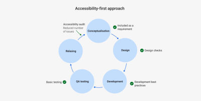
In addition, the process of auditing your product can get much lighter. Running an accessibility audit means first defining who will do it: is it internal or external? If it is external, which providers? How long would it take to negotiate the contract?
Afterward, you have to set the scope of the audit. It is impossible to check the full product, so you start by checking the most important workflows and key pages. Then, you will do the analysis. The result is normally a list of issues prioritized based on the user impact and some recommendations for remediating it.
Once you have the issues, you have to plan the remediation and figure out how much capacity from the teams we have to allocate to it based on when we want to have the fixes ready. You also have to group similar issues together to prevent the change of context during remediation, increase efficiency, and eliminate all duplicated issues (the auditors may not know the architecture of the product, so you may find several issues documented that, in reality, are just one because you are using the same component).
Considering this full process, for a large product, you can easily spend three months just before you start the actual remediation of the issues. Applying an accessibility-first approach means that the number of issues that reach the audit of the released product is much lower, so the process of auditing and fixing goes much faster.

If you can apply this approach, you should definitely consider the need for educational resources and their impact. You don’t want people just to work on accessibility but to understand the value they are creating when doing it (I am preparing another article that focuses on this). You want them to feel comfortable with the topic and understand what their responsibilities are and which things they have to pay attention to. Check if you already have accessibility resources inside the company that you can use. The important thing for the business is that those resources are going to contribute to reducing the effort.
The implementation of an accessibility-first approach has a very clear learning curve. In the beginning, people will take a bit of extra time to consider accessibility as part of their task, but after they have done it for several tasks, it comes naturally, and the effort needed to implement it really drops.
Think of “not relying on color only for conveying information”, as a designer, the first two times you have to figure something out instead of just changing the color of a text or icon to convey a status, you spend some time looking for solutions, afterward, you already have in mind a bunch of strategies that allow you to directly chose a valid option almost automatically.
Using an accessibility-first approach for new products is a clear strategy, but it is also valid for new features in an existing product. If you include it by default in anything new you create, you are preventing new issues from accumulating.
To sum up, applying an accessibility-first approach is really beneficial.
Considering accessibility from the beginning can help you to largely reduce the number of issues that may appear in audits after the release since it prevents the issues from accumulating, distributes the effort across the full product team, and substantially reduces the cost, as there will be less need for retroactive remediation of the issues that appear.
“
If you can implement an accessibility-first approach, do it.
Existing Products Or Features
If you try to bring accessibility to legacy products that have been running for many years, an accessibility-first approach may not be enough. In these cases, there are a million topics competing for priority and resources. Accessibility may be perceived as a massive effort that brings reduced value.
You may face a product that can have a big technical debt, that may not have a big user base of people with disabilities, or in which the number of existing accessibility issues is so overwhelming that you would need five years to solve them. You won´t be able to move forward if you try to solve all the problems at once. Here are some of the strategies that have worked for me to kick off the work on accessibility.
Start by checking the Design System. If the Design System has accessibility issues, they are going to be inherited by all the products that use them, so it is better to solve them at a higher level than to have each product team solving the exact same issue in all their products. You can begin by taking a quick look at it:
- Does it consider color contrast?
- And target size?
- Does the documentation include any accessibility considerations or guidelines?
- Are there color-dependent components?
If you have a dedicated team for the Design System, you can also reach out to them. You can find out what is their level of awareness on the topic. If they don’t have much knowledge, you can give them an introduction or help them identify and fix the knowledge gaps they have.
If you notice some issues, you can organize a proper audit of the design system from the design and development perspective and pair up with them to fix as much as you can. It is a good way of getting some extra hands to help you while tackling strategic issues.
When working on the Design System, you can also spot which components or areas are more complex and create guidelines and documentation together with them to help the teams reuse those components and patterns, leveraging accessibility.
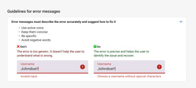
If the Design System is in good shape, you don’t have one, or you prefer to focus only on the product, you need to start by analyzing and fixing the most relevant part. You have to set a manageable scope. I recommend taking the most relevant workflows and the ones the users use the most. Two or three of them could be a good start. Inside the workflows, try picking the pages that have different structures so you can have a representative sample, for instance, one with a form, a table, plain text, lots of images, and so on. In many cases, the pages that share the same structure share the same problems, so having more variety in the sample helps you to pick more critical issues.
Once you have chosen the workflows and screens, you can audit them, but with a reduced scope. If your product has never considered accessibility, it is likely to have way too many issues. When doing an audit, you normally test compliance with all the success criteria (59 if we consider levels A and AA) and do manual testing with different browsers, screen readers, and devices. Then, document each of the issues, prioritize them, and include the remediation in the planning.
It takes a lot of time, and you may get hundreds of issues, or even thousands, which makes you feel like “I will never get this done” and if you even get there like “I am finally done with this I don’t want to hear about it for a long time”. If this is the situation you are forecasting for the business, most likely, you will not get the green light for the project. It is too much of an investment. So unless they have hard requirements for compliance coming from some really strategic customers, you are going to get stuck.
As we said, ideally, we would do a complete audit and fix everything, but delivering some value is better than delivering nothing, so instead, you can propose a reduced first audit to get you on the move. Rather than doing a detailed audit of all 59 criteria, I normally focus on these three things:
- Running an automatic check. It is very fast and prepares the report by itself. Though it is only capable of finding around 30% of the issues, it is a good start.
- Doing basic manual keyboard testing, checking that all the interactive elements are focusable, in the logical order, and following the expected keyboard command interactions.
- Doing a quick responsive test. Basically, what breaks when I change the viewport? Do I have information on top of each other when I zoom in? Can I still use the functionalities?
With these three tests, you will already have a large number of critical issues and blockers to solve while staying close to the overlapping area between accessibility and good design and development practices and not taking too much time.
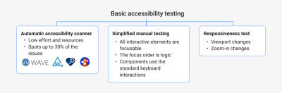
Remember, the goal of this first audit is to get easy-to-identify critical issues to have a starting point, not to solve all the problems. In this way, you can start delivering value while building the idea that accessibility is not a one-time fix but a continuous process. In addition, it gives you a lot of insights into the aspects in which the teams need guidelines and training, as well as defining the minimum things that the different roles have to consider when working to reduce the number of future accessibility issues. You want to take it as a learning opportunity.
Note: Accessibility insights is a good tool for auditing by yourself as it includes explanations and visual helpers and guides you through the process.
Screen reader testing should be added to the audit scope if you can, but it can be hard to do it if you have never done it before, and some of the issues will already be highlighted during the automatic check and the keyboard testing.
What Are The Expected Results?
The results you want to achieve are going to have a huge impact on the strategy.
Are you aiming for compliance or bringing value to the users and preparing for the future?
This is a key question you have to ask yourself.
Compliance with the regulation is pretty much a binary option. To be compliant with the WCAG at a certain level, let’s say AA, you should pass all the success criteria for that level and the previous ones. Each success criterion intends to help people with a specific disability. If you try to be compliant only with some of them, you would be leaving people out. Of course, in reality, there are always going to be some minor issues and violations of a success criterion that reach the user. But the idea is that you are either compliant or not. With this in mind, you have to make sure that you consider several audits, ideally by a certified external party that can reassure your compliance.
Trying to become compliant with a product that has never considered accessibility can become quite a large task, so it may not be the best first step. But, in general, if you are aiming for full compliance, it may be because you have strong motivations coming from the risk reduction and competitive advantage categories.
On the other hand, if your goal is to start including accessibility in the product to prepare for the future and help users, you will probably target a lighter result. Rather than looking for perfection, you want to start to have a level that is good enough as soon as possible.
Compliance is binary, but accessibility is a spectrum. You can have a pretty good level of accessibility even if you are not fully compliant.
“
You can focus on identifying and solving the most critical issues for the users and on applying an accessibility-first approach to new developments. The result is probably not compliant and not perfect, but it eliminates critical barriers without a huge effort. It will have basic accessibility to help users, and you can apply an iterative approach to improve the level.
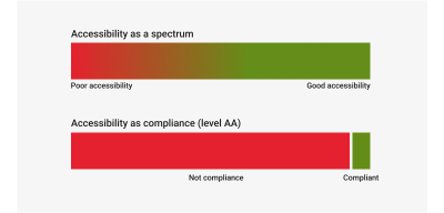
Keep in mind that it is impossible to have a 100% accessible product. As the product evolves, there are always going to be some issues that escape the test and reach the user. The important thing is to work to ensure that these issues are minor ones and not blockers or critical ones. If you can get the resources to fix the most important problems, you are already bringing value, even if you don’t reach compliance.
How Much Would It Cost?
An accessibility-first approach typically means you have to assign 5 to 10% of the product capacity to apply it (the number goes down to 5% due to the learning curve). The underlying risk, though, is that the business still considers these percentages to be too high. To prevent this from happening, you have to highlight strongly the side value of accessibility and the huge overlap it has with the design and development best practices we mentioned above.
In addition, to help justify the cost, you can look for examples inside your company that allow you to compare it with the cost of retroactive fitting accessibility. If there are not any, you can look for some basic issue, such as the lack of structure of a page, and use it to illustrate that in order to add the structure afterward, once the product is released you would need to do a substantial rework or ask a developer to help you to estimate the effort of adding a heading structure to 40 different pages after released.
As for introducing accessibility in existing products, the cost can be quite hard to estimate. Having a rough audit can help you understand how many critical issues you have at the start, and you can ask developers to help you estimate some of the changes to get a rough idea.
The most interesting approach that helps you to reduce the “cost of accessibility” is exploiting the overlap between accessibility and usability or product features.
“
If you attach accessibility improvements to usability or UX ones, then it doesn’t really need dedicated capacity. For example, if some of the inputs are lacking labels or instructions and your users get confused, it is a usability problem that overlaps with accessibility. Normally, accessibility issues related to the Reflow criteria are quite time-consuming, as they rely on a proper responsive design. But isn’t it just good design?
I recommend checking the list of features in the product backlog and the feedback from the users to find out which accessibility improvements can you combine with them, especially with features that have priority according to the product strategy (such us, enabling the product on mobile devices, or improving efficiency by promoting keyboard navigation).
The bigger the overlap, the more you can reduce the effort. This said, I would say it is better not to make it too ambitious when you are starting. It is better to start moving, even if it is slowly, than to hit a wall. When you manage to start with it, you will spark curiosity in other people, gain allies, and have results that can help you to expand the project and the scope.
You can also consider an alternative approach, define an affordable capacity that you could dedicate based on your product situation (maybe 10 or 15%), and set the scope to match it.
Finally, it is also important to gather the existing resources you have access to, internal or external. If there are guidelines, if the Design System is accessible, if there are related company goals, educational sessions… Whatever is there already is something you can use, and that doesn’t add to the total cost of the project. If the Design System is accessible, it would be a waste if we don’t leverage it and make sure we implement the components in an accessible way. You can put together an overview to show the support you have.
How Can I Make A Decision?
Business stakeholders are short on time and have many things in mind. If you want them to make a decision and consider all the factors when making it, you have to help them visualize them together in an executive summary.
If there is a single direction that you are trying to promote, for example, implementing an accessibility-first approach for new products and features, you can put on a slide the three key questions we mentioned above and the answers to those questions:
- What exactly do we want to do?
- What are the expected results?
- How much would it cost?
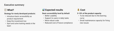
If there are different directions you can take, for example, you want to start to incorporate accessibility into products that meet certain conditions, or you can afford different capacities dedicated to accessibility for different products, you can use a decision-making diagram or a decision-making matrix. The idea is to visualize the different criteria that can affect the strategy and the adapted result for each of them.
For example,
- Do I have clients inquiring about accessibility?
- Is the product already using an accessible design system?
- Are we considering opening part of the product to B2C?
- Is the product going to take responsiveness and mobile interactions as a priority?
- Do we want to expand the product target market to governmental institutions?
Mapping out the factors and possible directions can help you and decision-makers understand which products can be a better starting point for accessibility, where it makes sense to allocate more capacity, and which possibilities are open. This becomes especially relevant when you are trying to bring accessibility to several products at the same time.
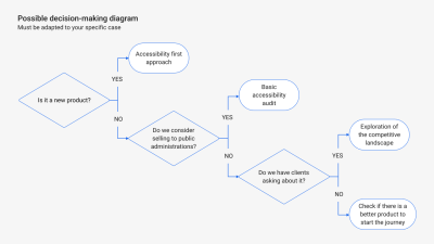
Whatever representation you choose for your conditions, make sure it visualizes the answers to those questions to facilitate the decision-making process and get approval. I generally include it at the end of the presentation, or even at the beginning and the end.
Keep It Up!
Even if your business case is really good, sometimes you don’t get to have a big impact due to circumstances. It may be that there is a big shift in priorities, that the stakeholders change, that your contract ends (if you are a consultant), or that the company just doesn’t have the resources to work on it at that moment, and it gets postponed.
I know it can be very frustrating, but don´t lose the motivation. Change can move quite slowly, especially in big companies, but if you have put the topic into people’s minds, it will be back on the table. In the meantime, you can try organizing evangelization sessions for the teams to find new allies and share your passion. You may need to wait a bit more, but there will be more opportunities to push the topic again, and since people already know about it, you will probably get more support. You have initiated the change, and your effort will not be lost.
Key Points
- Highlight the specific impact of accessibility on your specific products and users.
- Check if accessibility could be a competitive differentiator.
- Leverage the overlap between accessibility and good practices or product features to reduce the effort.
- Include the existing resources and how you can benefit from them.
- Clarify the expected result based on the effort.
- Visualize the key points of the strategy to help the decision-making and approval process.
- It is better to start with a small scope and iterate than not start at all.
(yk)
The Importance Of Graceful Degradation In Accessible Interface Design
The Importance Of Graceful Degradation In Accessible Interface Design The Importance Of Graceful Degradation In Accessible Interface Design Eleanor Hecks 2024-12-06T09:00:00+00:00 2025-06-25T15:04:30+00:00 Graceful degradation is a design approach that ensures the basics of a website will still function even if specific individual parts of it […]
Accessibility
The Importance Of Graceful Degradation In Accessible Interface Design
Eleanor Hecks 2024-12-06T09:00:00+00:00
2025-06-25T15:04:30+00:00
Graceful degradation is a design approach that ensures the basics of a website will still function even if specific individual parts of it stop working. The approach removes single points of failure: just because one thing stops working doesn’t mean the system as a whole fails. A site following this principle fails in pieces instead of all at once, so the most important features remain available when some components encounter an error.
The idea or the concept of single points of failure is well known in the manufacturing sector. It’s one of the most common resilience strategies in manufacturing and supply chain operations. A factory with multiple sources of material can keep working even when one supplier becomes unavailable. However, it’s become increasingly crucial to web development as user expectations around availability and functionality rise.
Data center redundancy is a common example of graceful degradation in web development. By using multiple server components, websites ensure they’ll stay up when one or more servers fail. In a design context, it may look like guaranteeing the lack of support for a given feature in a user’s browser or device doesn’t render an app unusable.

Escalators are a familiar real-world example of the same concept. When they stop working, they can still get people from one floor to the next by acting as stairs. They may not be as functional as they normally are, but they’re not entirely useless.

The BBC News webpage is a good example of graceful degradation in web design. As this screenshot shows, the site prioritizes loading navigation and the text within a news story over images. Consequently, slow speeds or old, incompatible browser plugins may make pictures unavailable, but the site’s core function — sharing the news — is still accessible.

In contrast, the Adobe Express website is an example of what happens without graceful degradation. Instead of making some features unavailable or dropping load times, the entire site is inaccessible on some browsers. Consequently, users have to update or switch software to use the web app, which isn’t great for accessibility.
Graceful Degradation vs. Progressive Enhancement
The graceful degradation approach acts as the opposite of progressive enhancement — an approach in which a designer builds the basics of a website and progressively adds features that are turned on only if a browser is capable of running them. Each layer of features is turned off by default, allowing for one seamless user experience designed to work for everyone.
There is much debate between designers about whether graceful degradation or progressive enhancement is the best way to build site functionality. In reality, though, both are important. Each method has unique pros and cons, so the two can complement each other to provide the most resilience.
Progressive enhancement is a good strategy when building a new site or app because you ensure a functional experience for everyone from the start. However, new standards and issues can emerge in the future, which is where graceful degradation comes in. This approach helps you adjust an existing website to comply with new accessibility standards or resolve a compatibility problem you didn’t notice earlier.
Focusing solely on one design principle or the other will limit accessibility. Progressive enhancement alone struggles to account for post-launch functionality issues, while graceful degradation alone may fail to provide the most feature-rich baseline experience. Combining both will produce the best result.
“
How Graceful Degradation Impacts Accessibility
Ensuring your site or app remains functional is crucial for accessibility. When core functions become unavailable, the platform is no longer accessible to anyone. On a smaller scale, if features like text-to-speech readers or video closed captioning stop working, users with sight difficulties may be unable to enjoy the site.
Graceful degradation’s impact on accessibility is all the larger when considering varying device capabilities. As the average person spends 3.6 hours each day on their phone, failing to ensure a site supports less powerful mobile browsers will alienate a considerable chunk of your audience. Even if some complex functions may not work on mobile, sacrificing those to keep the bulk of the website available on phones ensures broader accessibility.
Outdated browsers are another common accessibility issue you can address with graceful degradation. Consider this example from Fairleigh Dickinson University about Adobe Flash, which most modern browsers no longer support.

Software still using Flash cannot use the multi-factor authentication feature in question. As a result, users with older programs can’t log in. Graceful degradation may compromise by making some functionality unavailable to Flash-supporting browsers while still allowing general access. That way, people don’t need to upgrade to use the service.
How to Incorporate Graceful Degradation Into Your Site
Graceful degradation removes technological barriers to accessibility. In a broader sense, it also keeps your site or app running at all times, even amid unforeseen technical difficulties. While there are many ways you can achieve that, here are some general best practices to follow.
Identify Mission-Critical Functions
The first step in ensuring graceful degradation is determining what your core functions are. You can only guarantee the availability of mission-critical features once you know what’s essential and what isn’t.
Review your user data to see what your audience interacts with most — these are generally elements worth prioritizing. Anything related to site security, transactions, and readability is also crucial. Infrequently used features or elements like video players and interactive maps are nice to have but okay to sacrifice if you must to ensure mission-critical components remain available.
Build Redundancy
Once you’ve categorized site functions by criticality, you can ensure redundancy for the most important ones. That may mean replicating elements in a few forms to work on varying browsers or devices. Alternatively, you could provide multiple services to carry out important functions, like supporting alternate payment methods or providing both video and text versions of content.
Remember that redundancy applies to the hardware your platform runs on, too. The Uptime Institute classifies data centers into tiers, which you can use to determine what redundant systems you need. Similarly, make sure you can run your site on multiple servers to avoid a crash should one go down.
Accommodate All Browsers
Remember that graceful degradation is also about supporting software and hardware of varying capabilities. One of the most important considerations under that umbrella for web design is to accommodate outdated browsers.
While mobile devices don’t support Flash, some older versions of desktop browsers still use it. You can work with both by avoiding Flash — you can often use HTML5 instead — but not requiring users to have a non-Flash-supporting browser. Similarly, you can offer low-bandwidth, simple alternatives to any features that take up considerable processing power to keep things accessible on older systems.

Remember to pay attention to newer software’s security settings, too. Error messages like this one a Microsoft user posted about can appear if a site does not support some browsers’ updated security protocols. Always keep up with updates from popular platforms like Chrome and Safari to meet these standards and avoid such access issues.
Employ Load Balancing and Caching
Load balancing is another crucial step in graceful degradation. Many cloud services automatically distribute traffic between server resources to prevent overloading. Enabling this also ensures that requests can be processed on a different part of the system if another fails.
Caching is similar. By storing critical data, you build a fallback plan if an external service or application program interface (API) doesn’t work. When the API doesn’t respond, you can load the cached data instead. As a result, caches significantly reduce latency in many cases, but you should be aware that you can’t cache everything. Focus on the most critical functions.
Test Before Publishing
Finally, be sure to test your website for accessibility issues before taking it live. Access it from multiple devices, including various browser versions. See if you can run it on a single server to test its ability to balance loads.
You likely won’t discover all possible errors in testing, but it’s better to catch some than none. Remember to test your site’s functionality before any updates or redesigns, too.
Getting Started With Graceful Degradation
Designers, both big and small, can start their graceful degradation journey by tweaking some settings with their web hosting service. AWS offers guidance for managing failures you can use to build degradation into your site’s architecture. Hosting providers should also allow you to upgrade your storage plan and configure your server settings to provide redundancy and balance loads.
Businesses large enough to run their own data centers should install redundant server capacity and uninterruptible power supplies to keep things running. Smaller organizations can instead rely on their code, using semantic HTML to keep it simple enough for multiple browsers. Programming nonessential things like images and videos to stop when bandwidth is low will also help.
Virtualization systems like Kubernetes are also useful as a way to scale site capacity and help load elements separately from one another to maintain accessibility. Testing tools like BrowserStack, WAVE, and CSS HTML Validator can assist you by revealing if your site has functional issues on some browsers or for certain users.
At its core, web accessibility is about ensuring a platform works as intended for all people. While design features may be the most obvious part of that goal, technical defenses also play a role. A site is only accessible when it works, so you must keep it functional, even when unexpected hiccups occur.
Graceful degradation is not a perfect solution, but it prevents a small issue from becoming a larger one. Following these five steps to implement it on your website or app will ensure that your work in creating an accessible design doesn’t go to waste.
(yk)
Creating An Effective Multistep Form For Better User Experience
Creating An Effective Multistep Form For Better User Experience Creating An Effective Multistep Form For Better User Experience Amejimaobari Ollornwi 2024-12-03T10:00:00+00:00 2025-06-25T15:04:30+00:00 For a multistep form, planning involves structuring questions logically across steps, grouping similar questions, and minimizing the number of steps and the amount […]
Accessibility
Creating An Effective Multistep Form For Better User Experience
Amejimaobari Ollornwi 2024-12-03T10:00:00+00:00
2025-06-25T15:04:30+00:00
For a multistep form, planning involves structuring questions logically across steps, grouping similar questions, and minimizing the number of steps and the amount of required information for each step. Whatever makes each step focused and manageable is what should be aimed for.
In this tutorial, we will create a multistep form for a job application. Here are the details we are going to be requesting from the applicant at each step:
- Personal Information
Collects applicant’s name, email, and phone number. - Work Experience
Collects the applicant’s most recent company, job title, and years of experience. - Skills & Qualifications
The applicant lists their skills and selects their highest degree. - Review & Submit
This step is not going to collect any information. Instead, it provides an opportunity for the applicant to go back and review the information entered in the previous steps of the form before submitting it.
You can think of structuring these questions as a digital way of getting to know somebody. You can’t meet someone for the first time and ask them about their work experience without first asking for their name.
Based on the steps we have above, this is what the body of our HTML with our form should look like. First, the main <form> element:
<form id="jobApplicationForm">
  <!-- Step 1: Personal Information -->
  <!-- Step 2: Work Experience -->
  <!-- Step 3: Skills & Qualifications -->
  <!-- Step 4: Review & Submit -->
</form>
Step 1 is for filling in personal information, like the applicant’s name, email address, and phone number:
<form id="jobApplicationForm">
  <!-- Step 1: Personal Information -->
  <fieldset class="step" id="step-1">
    <legend id="step1Label">Step 1: Personal Information</legend>
    <label for="name">Full Name</label>
    <input type="text" id="name" name="name" required />
    <label for="email">Email Address</label>
    <input type="email" id="email" name="email" required />
    <label for="phone">Phone Number</label>
    <input type="tel" id="phone" name="phone" required />
  </fieldset>

  <!-- Step 2: Work Experience -->
  <!-- Step 3: Skills & Qualifications -->
  <!-- Step 4: Review & Submit -->
</form>
Once the applicant completes the first step, we’ll navigate them to Step 2, focusing on their work experience so that we can collect information like their most recent company, job title, and years of experience. We’ll tack on a new <fieldset> with those inputs:
<form id="jobApplicationForm">
  <!-- Step 1: Personal Information -->

  <!-- Step 2: Work Experience -->
  <fieldset class="step" id="step-2" hidden>
    <legend id="step2Label">Step 2: Work Experience</legend>
    <label for="company">Most Recent Company</label>
    <input type="text" id="company" name="company" required />
    <label for="jobTitle">Job Title</label>
    <input type="text" id="jobTitle" name="jobTitle" required />
    <label for="yearsExperience">Years of Experience</label>
    <input
      type="number"
      id="yearsExperience"
      name="yearsExperience"
      min="0"
      required
    />
  </fieldset>

  <!-- Step 3: Skills & Qualifications -->
  <!-- Step 4: Review & Submit -->
</form>
Step 3 is all about the applicant listing their skills and qualifications for the job they’re applying for:
<form id="jobApplicationForm">
  <!-- Step 1: Personal Information -->
  <!-- Step 2: Work Experience -->

  <!-- Step 3: Skills & Qualifications -->
  <fieldset class="step" id="step-3" hidden>
    <legend id="step3Label">Step 3: Skills & Qualifications</legend>
    <label for="skills">Skill(s)</label>
    <textarea id="skills" name="skills" rows="4" required></textarea>
    <label for="highestDegree">Degree Obtained (Highest)</label>
    <select id="highestDegree" name="highestDegree" required>
      <option value="">Select Degree</option>
      <option value="highschool">High School Diploma</option>
      <option value="bachelor">Bachelor's Degree</option>
      <option value="master">Master's Degree</option>
      <option value="phd">Ph.D.</option>
    </select>
  </fieldset>
  <!-- Step 4: Review & Submit -->
  <fieldset class="step" id="step-4" hidden>
    <legend id="step4Label">Step 4: Review & Submit</legend>
    <p>Review your information before submitting the application.</p>
    <button type="submit">Submit Application</button>
  </fieldset>
</form>
And, finally, we’ll allow the applicant to review their information before submitting it:
<form id="jobApplicationForm">
  <!-- Step 1: Personal Information -->
  <!-- Step 2: Work Experience -->
  <!-- Step 3: Skills & Qualifications -->

  <!-- Step 4: Review & Submit -->
  <fieldset class="step" id="step-4" hidden>
    <legend id="step4Label">Step 4: Review & Submit</legend>
    <p>Review your information before submitting the application.</p>
    <button type="submit">Submit Application</button>
  </fieldset>
</form>
Notice: We’ve added a hidden attribute to every fieldset element but the first one. This ensures that the user sees only the first step. Once they are done with the first step, they can proceed to fill out their work experience on the second step by clicking a navigational button. We’ll add this button later on.
Adding Styles
To keep things focused, we’re not going to be emphasizing the styles in this tutorial. What we’ll do to keep things simple is leverage the Simple.css style framework to get the form in good shape for the rest of the tutorial.
If you’re following along, we can include Simple’s styles in the document <head>:
<link rel="stylesheet" href="https://cdn.simplecss.org/simple.min.css" />
And from there, go ahead and create a style.css file with the following styles that I’ve folded up.
<details>
  <summary>View CSS</summary>
  body {
    min-height: 100vh;
    display: flex;
    align-items: center;
    justify-content: center;
  }
  main {
    padding: 0 30px;
  }
  h1 {
    font-size: 1.8rem;
    text-align: center;
  }
  .stepper {
    display: flex;
    justify-content: flex-end;
    padding-right: 10px;
  }
  form {
    box-shadow: 0px 0px 6px 2px rgba(0, 0, 0, 0.2);
    padding: 12px;
  }
  input,
  textarea,
  select {
    outline: none;
  }
  input:valid,
  textarea:valid,
  select:valid,
  input:focus:valid,
  textarea:focus:valid,
  select:focus:valid {
    border-color: green;
  }
  input:focus:invalid,
  textarea:focus:invalid,
  select:focus:invalid {
    border: 1px solid red;
  }
</details>
Form Navigation And Validation
An easy way to ruin the user experience for a multi-step form is to wait until the user gets to the last step in the form before letting them know of any error they made along the way. Each step of the form should be validated for errors before moving on to the next step, and descriptive error messages should be displayed to enable users to understand what is wrong and how to fix it.
Now, the only part of our form that is visible is the first step. To complete the form, users need to be able to navigate to the other steps. We are going to use several buttons to pull this off. The first step is going to have a Next button. The second and third steps are going to have both a Previous and a Next button, and the fourth step is going to have a Previous and a Submit button.
<form id="jobApplicationForm">
  <!-- Step 1: Personal Information -->
  <fieldset>
    <!-- ... -->
    <button type="button" class="next" onclick="nextStep()">Next</button>
  </fieldset>

  <!-- Step 2: Work Experience -->
  <fieldset>
    <!-- ... -->
    <button type="button" class="previous" onclick="previousStep()">Previous</button>
    <button type="button" class="next" onclick="nextStep()">Next</button>
  </fieldset>

  <!-- Step 3: Skills & Qualifications -->
  <fieldset>
    <!-- ... -->
    <button type="button" class="previous" onclick="previousStep()">Previous</button>
    <button type="button" class="next" onclick="nextStep()">Next</button>
  </fieldset>

  <!-- Step 4: Review & Submit -->
  <fieldset>
    <!-- ... -->
    <button type="button" class="previous" onclick="previousStep()">Previous</button>
    <button type="submit">Submit Application</button>
  </fieldset>
</form>
Notice: We’ve added onclick attributes to the Previous and Next buttons to link them to their respective JavaScript functions: previousStep() and nextStep().
The “Next” Button
The nextStep() function is linked to the Next button. Whenever the user clicks the Next button, the nextStep() function will first check to ensure that all the fields for whatever step the user is on have been filled out correctly before moving on to the next step. If the fields haven’t been filled correctly, it displays some error messages, letting the user know that they’ve done something wrong and informing them what to do to make the errors go away.
Before we go into the implementation of the nextStep function, there are certain variables we need to define because they will be needed in the function. First, we need the input fields from the DOM so we can run checks on them to make sure they are valid.
// Step 1 fields
const name = document.getElementById("name");
const email = document.getElementById("email");
const phone = document.getElementById("phone");

// Step 2 fields
const company = document.getElementById("company");
const jobTitle = document.getElementById("jobTitle");
const yearsExperience = document.getElementById("yearsExperience");

// Step 3 fields
const skills = document.getElementById("skills");
const highestDegree = document.getElementById("highestDegree");
Then, we’re going to need an array to store our error messages.
let errorMsgs = [];
Also, we would need an element in the DOM where we can insert those error messages after they’ve been generated. This element should be placed in the HTML just below the last fieldset closing tag:
<div id="errorMessages" style="color: rgb(253, 67, 67)"></div>
Add the above div to the JavaScript code using the following line:
const errorMessagesDiv = document.getElementById("errorMessages");
And finally, we need a variable to keep track of the current step.
let currentStep = 1;
Now that we have all our variables in place, here’s the implementation of the nextstep() function:
function nextStep() {
  errorMsgs = [];
  errorMessagesDiv.innerText = "";

  switch (currentStep) {
    case 1:
      addValidationErrors(name, email, phone);
      validateStep(errorMsgs);
      break;

    case 2:
      addValidationErrors(company, jobTitle, yearsExperience);
      validateStep(errorMsgs);
      break;

    case 3:
      addValidationErrors(skills, highestDegree);
      validateStep(errorMsgs);
      break;
  }
}
The moment the Next button is pressed, our code first checks which step the user is currently on, and based on this information, it validates the data for that specific step by calling the addValidationErrors() function. If there are errors, we display them. Then, the form calls the validateStep() function to verify that there are no errors before moving on to the next step. If there are errors, it prevents the user from going on to the next step.
Whenever the nextStep() function runs, the error messages are cleared first to avoid appending errors from a different step to existing errors or re-adding existing error messages when the addValidationErrors function runs. The addValidationErrors function is called for each step using the fields for that step as arguments.
Here’s how the addValidationErrors function is implemented:
function addValidationErrors(fieldOne, fieldTwo, fieldThree = undefined) {
  if (!fieldOne.checkValidity()) {
    const label = document.querySelector(`label[for="${fieldOne.id}"]`);
    errorMsgs.push(`Please Enter A Valid ${label.textContent}`);
  }

  if (!fieldTwo.checkValidity()) {
    const label = document.querySelector(`label[for="${fieldTwo.id}"]`);
    errorMsgs.push(`Please Enter A Valid ${label.textContent}`);
  }

  if (fieldThree && !fieldThree.checkValidity()) {
    const label = document.querySelector(`label[for="${fieldThree.id}"]`);
    errorMsgs.push(`Please Enter A Valid ${label.textContent}`);
  }

  if (errorMsgs.length > 0) {
    errorMessagesDiv.innerText = errorMsgs.join("n");
  }
}
This is how the validateStep() function is defined:
function validateStep(errorMsgs) {
  if (errorMsgs.length === 0) {
    showStep(currentStep + 1);
  }
}
The validateStep() function checks for errors. If there are none, it proceeds to the next step with the help of the showStep() function.
function showStep(step) {
  steps.forEach((el, index) => {
    el.hidden = index + 1 !== step;
  });
  currentStep = step;
}
The showStep() function requires the four fieldsets in the DOM. Add the following line to the top of the JavaScript code to make the fieldsets available:
const steps = document.querySelectorAll(".step");
What the showStep() function does is to go through all the fieldsets in our form and hide whatever fieldset is not equal to the one we’re navigating to. Then, it updates the currentStep variable to be equal to the step we’re navigating to.
The “Previous” Button
The previousStep() function is linked to the Previous button. Whenever the previous button is clicked, similarly to the nextStep function, the error messages are also cleared from the page, and navigation is also handled by the showStep function.
function previousStep() {
  errorMessagesDiv.innerText = "";
  showStep(currentStep - 1);
}
Whenever the showStep() function is called with “currentStep - 1” as an argument (as in this case), we go back to the previous step, while moving to the next step happens by calling the showStep() function with “currentStep + 1” as an argument (as in the case of the validateStep() function).
Improving User Experience With Visual Cues
One other way of improving the user experience for a multi-step form, is by integrating visual cues, things that will give users feedback on the process they are on. These things can include a progress indicator or a stepper to help the user know the exact step they are on.
Integrating A Stepper
To integrate a stepper into our form (sort of like this one from Material Design), the first thing we need to do is add it to the HTML just below the opening <form> tag.
<form id="jobApplicationForm">
  <div class="stepper">
    <span><span class="currentStep">1</span>/4</span>
  </div>
  <!-- ... -->
</form>
Next, we need to query the part of the stepper that will represent the current step. This is the span tag with the class name of currentStep.
const currentStepDiv = document.querySelector(".currentStep");
Now, we need to update the stepper value whenever the previous or next buttons are clicked. To do this, we need to update the showStep() function by appending the following line to it:
currentStepDiv.innerText = currentStep;
This line is added to the showStep() function because the showStep() function is responsible for navigating between steps and updating the currentStep variable. So, whenever the currentStep variable is updated, the currentStepDiv should also be updated to reflect that change.
Storing And Retrieving User Data
One major way we can improve the form’s user experience is by storing user data in the browser. Multistep forms are usually long and require users to enter a lot of information about themselves. Imagine a user filling out 95% of a form, then accidentally hitting the F5 button on their keyboard and losing all their progress. That would be a really bad experience for the user.
Using localStorage, we can store user information as soon as it is entered and retrieve it as soon as the DOM content is loaded, so users can always continue filling out their forms from wherever they left off. To add this feature to our forms, we can begin by saving the user’s information as soon as it is typed. This can be achieved using the input event.
Before adding the input event listener, get the form element from the DOM:
const form = document.getElementById("jobApplicationForm");
Now we can add the input event listener:
// Save data on each input event
form.addEventListener("input", () => {
  const formData = {
    name: document.getElementById("name").value,
    email: document.getElementById("email").value,
    phone: document.getElementById("phone").value,
    company: document.getElementById("company").value,
    jobTitle: document.getElementById("jobTitle").value,
    yearsExperience: document.getElementById("yearsExperience").value,
    skills: document.getElementById("skills").value,
    highestDegree: document.getElementById("highestDegree").value,
  };
  localStorage.setItem("formData", JSON.stringify(formData));
});
Next, we need to add some code to help us retrieve the user data once the DOM content is loaded.
window.addEventListener("DOMContentLoaded", () => {
  const savedData = JSON.parse(localStorage.getItem("formData"));
  if (savedData) {
    document.getElementById("name").value = savedData.name || "";
    document.getElementById("email").value = savedData.email || "";
    document.getElementById("phone").value = savedData.phone || "";
    document.getElementById("company").value = savedData.company || "";
    document.getElementById("jobTitle").value = savedData.jobTitle || "";
    document.getElementById("yearsExperience").value = savedData.yearsExperience || "";
    document.getElementById("skills").value = savedData.skills || "";
    document.getElementById("highestDegree").value = savedData.highestDegree || "";
  }
});
Lastly, it is good practice to remove data from localStorage as soon as it is no longer needed:
// Clear data on form submit
form.addEventListener('submit', () => {
  // Clear localStorage once the form is submitted
  localStorage.removeItem('formData');
});
Adding The Current Step Value To localStorage
If the user accidentally closes their browser, they should be able to return to wherever they left off. This means that the current step value also has to be saved in localStorage.
To save this value, append the following line to the showStep() function:
localStorage.setItem("storedStep", currentStep);
Now we can retrieve the current step value and return users to wherever they left off whenever the DOM content loads. Add the following code to the DOMContentLoaded handler to do so:
const storedStep = localStorage.getItem("storedStep");

if (storedStep) {
    const storedStepInt = parseInt(storedStep);
    steps.forEach((el, index) => {
      el.hidden = index + 1 !== storedStepInt;
    });
    currentStep = storedStepInt;
    currentStepDiv.innerText = currentStep;
  }
Also, do not forget to clear the current step value from localStorage when the form is submitted.
localStorage.removeItem("storedStep");
The above line should be added to the submit handler.
Wrapping Up
Creating multi-step forms can help improve user experience for complex data entry. By carefully planning out steps, implementing form validation at each step, and temporarily storing user data in the browser, you make it easier for users to complete long forms.
For the full implementation of this multi-step form, you can access the complete code on GitHub.
(gg, yk)