


Intent Prototyping: A Practical Guide To Building With Clarity (Part 2)
Ready to move beyond static mockups? Here is a practical, step-by-step guide to Intent Prototyping — a disciplined method that uses AI to turn your design intent (UI sketches, conceptual models,
Ux
Build A Static RSS Reader To Fight Your Inner FOMO
RSS is a classic technology that fetches content from websites and feeds it to anyone who subscribes to it with a URL. It’s based on XML, and we can use it to consume the feeds in our own apps. Kari
Javascript
Freebie: Flat Jewels Icon Set
We’re back, this time with a gem of a giveaway! Courtesy of Pixelkit, we have here 25 handpicked flat icons to be given away to hongkiat.com readers. Available in a variety of sizes – from 32
Freebies

Beyond The Hype: What AI Can Really Do For Product Design
Beyond The Hype: What AI Can Really Do For Product Design Beyond The Hype: What AI Can Really Do For Product Design Nikita Samutin 2025-08-18T13:00:00+00:00 2025-08-21T11:03:55+00:00 These days, it’s easy to find curated lists of AI tools for designers, galleries of generated illustrations, and countless […]
Accessibility
Beyond The Hype: What AI Can Really Do For Product Design
Nikita Samutin 2025-08-18T13:00:00+00:00
2025-08-21T11:03:55+00:00
These days, it’s easy to find curated lists of AI tools for designers, galleries of generated illustrations, and countless prompt libraries. What’s much harder to find is a clear view of how AI is actually integrated into the everyday workflow of a product designer — not for experimentation, but for real, meaningful outcomes.
I’ve gone through that journey myself: testing AI across every major stage of the design process, from ideation and prototyping to visual design and user research. Along the way, I’ve built a simple, repeatable workflow that significantly boosts my productivity.
In this article, I’ll share what’s already working and break down some of the most common objections I’ve encountered — many of which I’ve faced personally.
Stage 1: Idea Generation Without The Clichés
Pushback: “Whenever I ask AI to suggest ideas, I just get a list of clichés. It can’t produce the kind of creative thinking expected from a product designer.”
That’s a fair point. AI doesn’t know the specifics of your product, the full context of your task, or many other critical nuances. The most obvious fix is to “feed it” all the documentation you have. But that’s a common mistake as it often leads to even worse results: the context gets flooded with irrelevant information, and the AI’s answers become vague and unfocused.
Current-gen models can technically process thousands of words, but the longer the input, the higher the risk of missing something important, especially content buried in the middle. This is known as the “lost in the middle” problem.
To get meaningful results, AI doesn’t just need more information — it needs the right information, delivered in the right way. That’s where the RAG approach comes in.
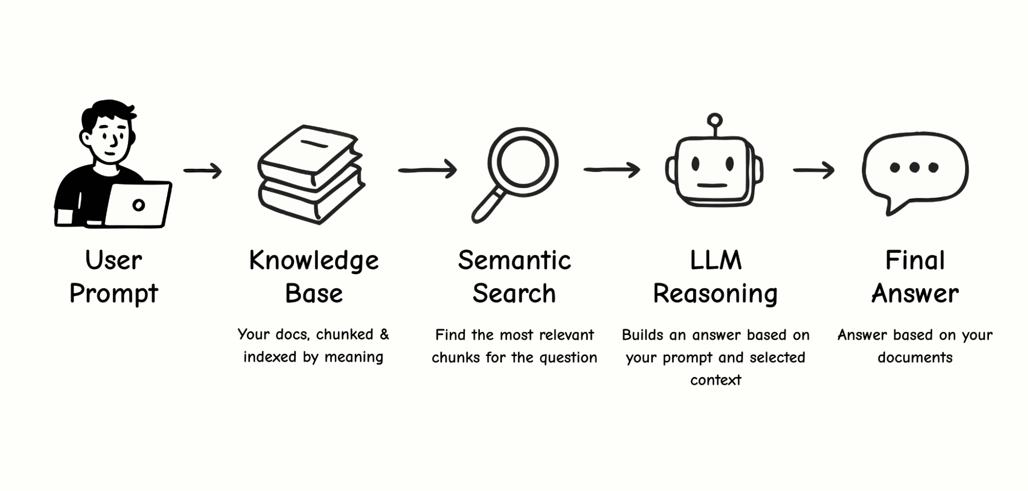
How RAG Works
Think of RAG as a smart assistant working with your personal library of documents. You upload your files, and the assistant reads each one, creating a short summary — a set of bookmarks (semantic tags) that capture the key topics, terms, scenarios, and concepts. These summaries are stored in a kind of “card catalog,” called a vector database.
When you ask a question, the assistant doesn’t reread every document from cover to cover. Instead, it compares your query to the bookmarks, retrieves only the most relevant excerpts (chunks), and sends those to the language model to generate a final answer.
How Is This Different from Just Dumping a Doc into the Chat?
Let’s break it down:
Typical chat interaction
It’s like asking your assistant to read a 100-page book from start to finish every time you have a question. Technically, all the information is “in front of them,” but it’s easy to miss something, especially if it’s in the middle. This is exactly what the “lost in the middle” issue refers to.
RAG approach
You ask your smart assistant a question, and it retrieves only the relevant pages (chunks) from different documents. It’s faster and more accurate, but it introduces a few new risks:
- Ambiguous question
You ask, “How can we make the project safer?” and the assistant brings you documents about cybersecurity, not finance. - Mixed chunks
A single chunk might contain a mix of marketing, design, and engineering notes. That blurs the meaning so the assistant can’t tell what the core topic is. - Semantic gap
You ask, “How can we speed up the app?” but the document says, “Optimize API response time.” For a human, that’s obviously related. For a machine, not always.

These aren’t reasons to avoid RAG or AI altogether. Most of them can be avoided with better preparation of your knowledge base and more precise prompts. So, where do you start?
Start With Three Short, Focused Documents
These three short documents will give your AI assistant just enough context to be genuinely helpful:
- Product Overview & Scenarios
A brief summary of what your product does and the core user scenarios. - Target Audience
Your main user segments and their key needs or goals. - Research & Experiments
Key insights from interviews, surveys, user testing, or product analytics.
Each document should focus on a single topic and ideally stay within 300–500 words. This makes it easier to search and helps ensure that each retrieved chunk is semantically clean and highly relevant.
Language Matters
In practice, RAG works best when both the query and the knowledge base are in English. I ran a small experiment to test this assumption, trying a few different combinations:
- English prompt + English documents: Consistently accurate and relevant results.
- Non-English prompt + English documents: Quality dropped sharply. The AI struggled to match the query with the right content.
- Non-English prompt + non-English documents: The weakest performance. Even though large language models technically support multiple languages, their internal semantic maps are mostly trained in English. Vector search in other languages tends to be far less reliable.
Takeaway: If you want your AI assistant to deliver precise, meaningful responses, do your RAG work entirely in English, both the data and the queries. This advice applies specifically to RAG setups. For regular chat interactions, you’re free to use other languages. A challenge also highlighted in this 2024 study on multilingual retrieval.
From Outsider to Teammate: Giving AI the Context It Needs
Once your AI assistant has proper context, it stops acting like an outsider and starts behaving more like someone who truly understands your product. With well-structured input, it can help you spot blind spots in your thinking, challenge assumptions, and strengthen your ideas — the way a mid-level or senior designer would.
Here’s an example of a prompt that works well for me:
Your task is to perform a comparative analysis of two features: “Group gift contributions” (described in group_goals.txt) and “Personal savings goals” (described in personal_goals.txt).
The goal is to identify potential conflicts in logic, architecture, and user scenarios and suggest visual and conceptual ways to clearly separate these two features in the UI so users can easily understand the difference during actual use.
Please include:
- Possible overlaps in user goals, actions, or scenarios;
- Potential confusion if both features are launched at the same time;
- Any architectural or business-level conflicts (e.g. roles, notifications, access rights, financial logic);
- Suggestions for visual and conceptual separation: naming, color coding, separate sections, or other UI/UX techniques;
- Onboarding screens or explanatory elements that might help users understand both features.
If helpful, include a comparison table with key parameters like purpose, initiator, audience, contribution method, timing, access rights, and so on.
AI Needs Context, Not Just Prompts
If you want AI to go beyond surface-level suggestions and become a real design partner, it needs the right context. Not just more information, but better, more structured information.
Building a usable knowledge base isn’t difficult. And you don’t need a full-blown RAG system to get started. Many of these principles work even in a regular chat: well-organized content and a clear question can dramatically improve how helpful and relevant the AI’s responses are. That’s your first step in turning AI from a novelty into a practical tool in your product design workflow.
Stage 2: Prototyping and Visual Experiments
Pushback: “AI only generates obvious solutions and can’t even build a proper user flow. It’s faster to do it manually.”
That’s a fair concern. AI still performs poorly when it comes to building complete, usable screen flows. But for individual elements, especially when exploring new interaction patterns or visual ideas, it can be surprisingly effective.
For example, I needed to prototype a gamified element for a limited-time promotion. The idea is to give users a lottery ticket they can “flip” to reveal a prize. I couldn’t recreate the 3D animation I had in mind in Figma, either manually or using any available plugins. So I described the idea to Claude 4 in Figma Make and within a few minutes, without writing a single line of code, I had exactly what I needed.
At the prototyping stage, AI can be a strong creative partner in two areas:
- UI element ideation
It can generate dozens of interactive patterns, including ones you might not think of yourself. - Micro-animation generation
It can quickly produce polished animations that make a concept feel real, which is great for stakeholder presentations or as a handoff reference for engineers.
AI can also be applied to multi-screen prototypes, but it’s not as simple as dropping in a set of mockups and getting a fully usable flow. The bigger and more complex the project, the more fine-tuning and manual fixes are required. Where AI already works brilliantly is in focused tasks — individual screens, elements, or animations — where it can kick off the thinking process and save hours of trial and error.
A quick UI prototype of a gamified promo banner created with Claude 4 in Figma Make. No code or plugins needed.
Here’s another valuable way to use AI in design — as a stress-testing tool. Back in 2023, Google Research introduced PromptInfuser, an internal Figma plugin that allowed designers to attach prompts directly to UI elements and simulate semi-functional interactions within real mockups. Their goal wasn’t to generate new UI, but to check how well AI could operate inside existing layouts — placing content into specific containers, handling edge-case inputs, and exposing logic gaps early.
The results were striking: designers using PromptInfuser were up to 40% more effective at catching UI issues and aligning the interface with real-world input — a clear gain in design accuracy, not just speed.
That closely reflects my experience with Claude 4 and Figma Make: when AI operates within a real interface structure, rather than starting from a blank canvas, it becomes a much more reliable partner. It helps test your ideas, not just generate them.
Stage 3: Finalizing The Interface And Visual Style
Pushback: “AI can’t match our visual style. It’s easier to just do it by hand.”
This is one of the most common frustrations when using AI in design. Even if you upload your color palette, fonts, and components, the results often don’t feel like they belong in your product. They tend to be either overly decorative or overly simplified.
And this is a real limitation. In my experience, today’s models still struggle to reliably apply a design system, even if you provide a component structure or JSON files with your styles. I tried several approaches:
- Direct integration with a component library.
I used Figma Make (powered by Claude) and connected our library. This was the least effective method: although the AI attempted to use components, the layouts were often broken, and the visuals were overly conservative. Other designers have run into similar issues, noting that library support in Figma Make is still limited and often unstable. - Uploading styles as JSON.
Instead of a full component library, I tried uploading only the exported styles — colors, fonts — in a JSON format. The results improved: layouts looked more modern, but the AI still made mistakes in how styles were applied. - Two-step approach: structure first, style second.
What worked best was separating the process. First, I asked the AI to generate a layout and composition without any styling. Once I had a solid structure, I followed up with a request to apply the correct styles from the same JSON file. This produced the most usable result — though still far from pixel-perfect.

So yes, AI still can’t help you finalize your UI. It doesn’t replace hand-crafted design work. But it’s very useful in other ways:
- Quickly creating a visual concept for discussion.
- Generating “what if” alternatives to existing mockups.
- Exploring how your interface might look in a different style or direction.
- Acting as a second pair of eyes by giving feedback, pointing out inconsistencies or overlooked issues you might miss when tired or too deep in the work.
AI won’t save you five hours of high-fidelity design time, since you’ll probably spend that long fixing its output. But as a visual sparring partner, it’s already strong. If you treat it like a source of alternatives and fresh perspectives, it becomes a valuable creative collaborator.
“
Stage 4: Product Feedback And Analytics: AI As A Thinking Exosuit
Product designers have come a long way. We used to create interfaces in Photoshop based on predefined specs. Then we delved deeper into UX with mapping user flows, conducting interviews, and understanding user behavior. Now, with AI, we gain access to yet another level: data analysis, which used to be the exclusive domain of product managers and analysts.
As Vitaly Friedman rightly pointed out in one of his columns, trying to replace real UX interviews with AI can lead to false conclusions as models tend to generate an average experience, not a real one. The strength of AI isn’t in inventing data but in processing it at scale.
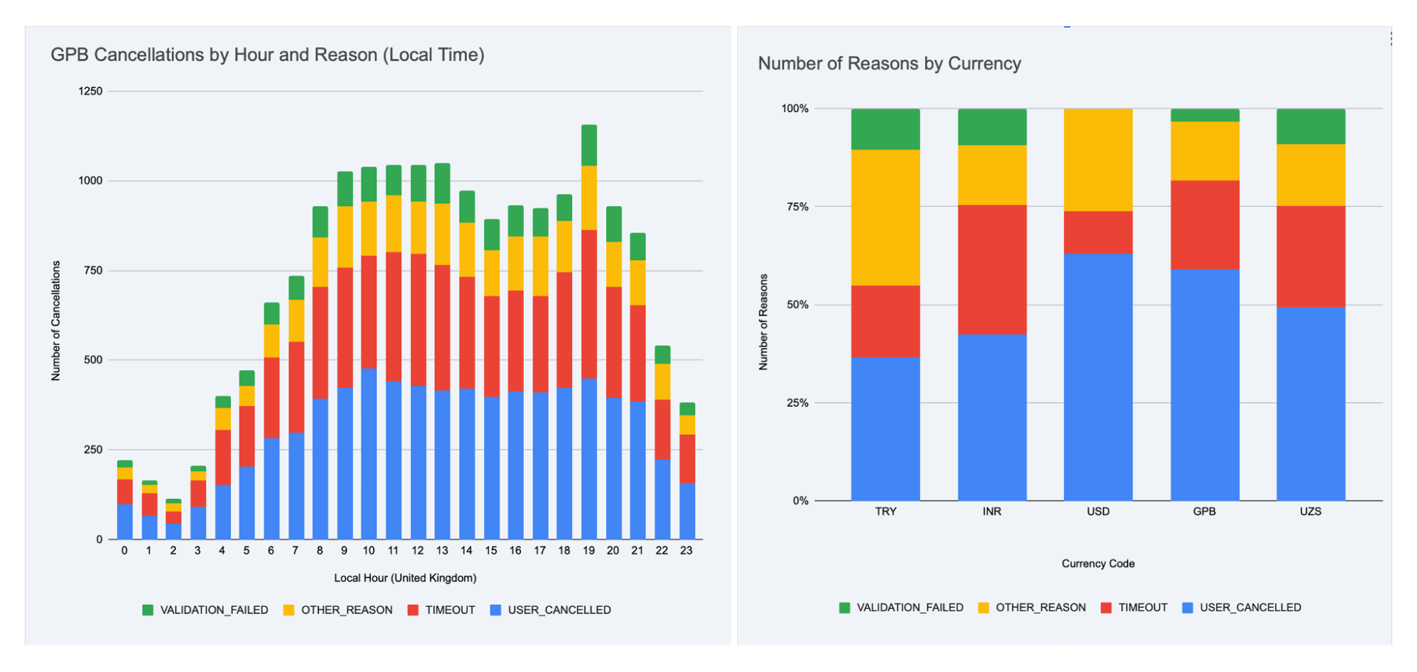
Let me give a real example. We launched an exit survey for users who were leaving our service. Within a week, we collected over 30,000 responses across seven languages.
Simply counting the percentages for each of the five predefined reasons wasn’t enough. I wanted to know:
- Are there specific times of day when users churn more?
- Do the reasons differ by region?
- Is there a correlation between user exits and system load?
The real challenge was… figuring out what cuts and angles were even worth exploring. The entire technical process, from analysis to visualizations, was done “for me” by Gemini, working inside Google Sheets. This task took me about two hours in total. Without AI, not only would it have taken much longer, but I probably wouldn’t have been able to reach that level of insight on my own at all.

AI enables near real-time work with large data sets. But most importantly, it frees up your time and energy for what’s truly valuable: asking the right questions.
“
A few practical notes: Working with large data sets is still challenging for models without strong reasoning capabilities. In my experiments, I used Gemini embedded in Google Sheets and cross-checked the results using ChatGPT o3. Other models, including the standalone Gemini 2.5 Pro, often produced incorrect outputs or simply refused to complete the task.
AI Is Not An Autopilot But A Co-Pilot
AI in design is only as good as the questions you ask it. It doesn’t do the work for you. It doesn’t replace your thinking. But it helps you move faster, explore more options, validate ideas, and focus on the hard parts instead of burning time on repetitive ones. Sometimes it’s still faster to design things by hand. Sometimes it makes more sense to delegate to a junior designer.
But increasingly, AI is becoming the one who suggests, sharpens, and accelerates. Don’t wait to build the perfect AI workflow. Start small. And that might be the first real step in turning AI from a curiosity into a trusted tool in your product design process.
Let’s Summarize
- If you just paste a full doc into chat, the model often misses important points, especially things buried in the middle. That’s the “lost in the middle” problem.
- The RAG approach helps by pulling only the most relevant pieces from your documents. So responses are faster, more accurate, and grounded in real context.
- Clear, focused prompts work better. Narrow the scope, define the output, and use familiar terms to help the model stay on track.
- A well-structured knowledge bas makes a big difference. Organizing your content into short, topic-specific docs helps reduce noise and keep answers sharp.
- Use English for both your prompts and your documents. Even multilingual models are most reliable when working in English, especially for retrieval.
- Most importantly: treat AI as a creative partner. It won’t replace your skills, but it can spark ideas, catch issues, and speed up the tedious parts.
Further Reading
- “AI-assisted Design Workflows: How UX Teams Move Faster Without Sacrificing Quality”, Cindy Brummer
This piece is a perfect prequel to my article. It explains how to start integrating AI into your design process, how to structure your workflow, and which tasks AI can reasonably take on — before you dive into RAG or idea generation. - “8 essential tips for using Figma Make”, Alexia Danton
While this article focuses on Figma Make, the recommendations are broadly applicable. It offers practical advice that will make your work with AI smoother, especially if you’re experimenting with visual tools and structured prompting. - “What Is Retrieval-Augmented Generation aka RAG”, Rick Merritt
If you want to go deeper into how RAG actually works, this is a great starting point. It breaks down key concepts like vector search and retrieval in plain terms and explains why these methods often outperform long prompts alone.
(yk)

The Power Of The Intl API: A Definitive Guide To Browser-Native Internationalization
The Power Of The <code>Intl</code> API: A Definitive Guide To Browser-Native Internationalization The Power Of The <code>Intl</code> API: A Definitive Guide To Browser-Native Internationalization Fuqiao Xue 2025-08-08T10:00:00+00:00 2025-08-13T15:04:28+00:00 It’s a common misconception that internationalization (i18n) is simply about translating text. While crucial, translation is merely […]
Accessibility
The Power Of The <code>Intl</code> API: A Definitive Guide To Browser-Native Internationalization
Fuqiao Xue 2025-08-08T10:00:00+00:00
2025-08-13T15:04:28+00:00
It’s a common misconception that internationalization (i18n) is simply about translating text. While crucial, translation is merely one facet. One of the complexities lies in adapting information for diverse cultural expectations: How do you display a date in Japan versus Germany? What’s the correct way to pluralize an item in Arabic versus English? How do you sort a list of names in various languages?
Many developers have relied on weighty third-party libraries or, worse, custom-built formatting functions to tackle these challenges. These solutions, while functional, often come with significant overhead: increased bundle size, potential performance bottlenecks, and the constant struggle to keep up with evolving linguistic rules and locale data.
Enter the ECMAScript Internationalization API, more commonly known as the Intl object. This silent powerhouse, built directly into modern JavaScript environments, is an often-underestimated, yet incredibly potent, native, performant, and standards-compliant solution for handling data internationalization. It’s a testament to the web’s commitment to being worldwide, providing a unified and efficient way to format numbers, dates, lists, and more, according to specific locales.
Intl And Locales: More Than Just Language Codes
At the heart of Intl lies the concept of a locale. A locale is far more than just a two-letter language code (like en for English or es for Spanish). It encapsulates the complete context needed to present information appropriately for a specific cultural group. This includes:
- Language: The primary linguistic medium (e.g.,
en,es,fr). - Script: The script (e.g.,
Latnfor Latin,Cyrlfor Cyrillic). For example,zh-Hansfor Simplified Chinese, vs.zh-Hantfor Traditional Chinese. - Region: The geographic area (e.g.,
USfor United States,GBfor Great Britain,DEfor Germany). This is crucial for variations within the same language, such asen-USvs.en-GB, which differ in date, time, and number formatting. - Preferences/Variants: Further specific cultural or linguistic preferences. See “Choosing a Language Tag” from W3C for more information.
Typically, you’ll want to choose the locale according to the language of the web page. This can be determined from the lang attribute:
// Get the page's language from the HTML lang attribute
const pageLocale = document.documentElement.lang || 'en-US'; // Fallback to 'en-US'
Occasionally, you may want to override the page locale with a specific locale, such as when displaying content in multiple languages:
// Force a specific locale regardless of page language
const tutorialFormatter = new Intl.NumberFormat('zh-CN', { style: 'currency', currency: 'CNY' });

console.log(`Chinese example: ${tutorialFormatter.format(199.99)}`); // Output: ¥199.99
In some cases, you might want to use the user’s preferred language:
// Use the user's preferred language
const browserLocale = navigator.language || 'ja-JP';

const formatter = new Intl.NumberFormat(browserLocale, { style: 'currency', currency: 'JPY' });
When you instantiate an Intl formatter, you can optionally pass one or more locale strings. The API will then select the most appropriate locale based on availability and preference.
Core Formatting Powerhouses
The Intl object exposes several constructors, each for a specific formatting task. Let’s delve into the most frequently used ones, along with some powerful, often-overlooked gems.
1. Intl.DateTimeFormat: Dates and Times, Globally
Formatting dates and times is a classic i18n problem. Should it be MM/DD/YYYY or DD.MM.YYYY? Should the month be a number or a full word? Intl.DateTimeFormat handles all this with ease.
const date = new Date(2025, 6, 27, 14, 30, 0); // June 27, 2025, 2:30 PM

// Specific locale and options (e.g., long date, short time)
const options = {
  weekday: 'long',
  year: 'numeric',
  month: 'long',
  day: 'numeric',
  hour: 'numeric',
  minute: 'numeric',
  timeZoneName: 'shortOffset' // e.g., "GMT+8"
};

console.log(new Intl.DateTimeFormat('en-US', options).format(date));

// "Friday, June 27, 2025 at 2:30 PM GMT+8"
console.log(new Intl.DateTimeFormat('de-DE', options).format(date));

// "Freitag, 27. Juni 2025 um 14:30 GMT+8"

// Using dateStyle and timeStyle for common patterns
console.log(new Intl.DateTimeFormat('en-GB', { dateStyle: 'full', timeStyle: 'short' }).format(date));

// "Friday 27 June 2025 at 14:30"

console.log(new Intl.DateTimeFormat('ja-JP', { dateStyle: 'long', timeStyle: 'short' }).format(date));

// "2025年6月27日 14:30"
The flexibility of options for DateTimeFormat is vast, allowing control over year, month, day, weekday, hour, minute, second, time zone, and more.
2. Intl.NumberFormat: Numbers With Cultural Nuance
Beyond simple decimal places, numbers require careful handling: thousands separators, decimal markers, currency symbols, and percentage signs vary wildly across locales.
const price = 123456.789;

// Currency formatting
console.log(new Intl.NumberFormat('en-US', { style: 'currency', currency: 'USD' }).format(price));

// "$123,456.79" (auto-rounds)

console.log(new Intl.NumberFormat('de-DE', { style: 'currency', currency: 'EUR' }).format(price));

// "123.456,79 €"

// Units
console.log(new Intl.NumberFormat('en-US', { style: 'unit', unit: 'meter', unitDisplay: 'long' }).format(100));

// "100 meters"

console.log(new Intl.NumberFormat('fr-FR', { style: 'unit', unit: 'kilogram', unitDisplay: 'short' }).format(5.5));

// "5,5 kg"
Options like minimumFractionDigits, maximumFractionDigits, and notation (e.g., scientific, compact) provide even finer control.
3. Intl.ListFormat: Natural Language Lists
Presenting lists of items is surprisingly tricky. English uses “and” for conjunction and “or” for disjunction. Many languages have different conjunctions, and some require specific punctuation.
This API simplifies a task that would otherwise require complex conditional logic:
const items = ['apples', 'oranges', 'bananas'];

// Conjunction ("and") list
console.log(new Intl.ListFormat('en-US', { type: 'conjunction' }).format(items));

// "apples, oranges, and bananas"

console.log(new Intl.ListFormat('de-DE', { type: 'conjunction' }).format(items));

// "Äpfel, Orangen und Bananen"

// Disjunction ("or") list
console.log(new Intl.ListFormat('en-US', { type: 'disjunction' }).format(items));

// "apples, oranges, or bananas"

console.log(new Intl.ListFormat('fr-FR', { type: 'disjunction' }).format(items));

// "apples, oranges ou bananas"
4. Intl.RelativeTimeFormat: Human-Friendly Timestamps
Displaying “2 days ago” or “in 3 months” is common in UI, but localizing these phrases accurately requires extensive data. Intl.RelativeTimeFormat automates this.
const rtf = new Intl.RelativeTimeFormat('en-US', { numeric: 'auto' });

console.log(rtf.format(-1, 'day'));    // "yesterday"
console.log(rtf.format(1, 'day'));     // "tomorrow"
console.log(rtf.format(-7, 'day'));    // "7 days ago"
console.log(rtf.format(3, 'month'));   // "in 3 months"
console.log(rtf.format(-2, 'year'));   // "2 years ago"

// French example:
const frRtf = new Intl.RelativeTimeFormat('fr-FR', { numeric: 'auto', style: 'long' });

console.log(frRtf.format(-1, 'day'));    // "hier"
console.log(frRtf.format(1, 'day'));     // "demain"
console.log(frRtf.format(-7, 'day'));    // "il y a 7 jours"
console.log(frRtf.format(3, 'month'));   // "dans 3 mois"
The numeric: 'always' option would force “1 day ago” instead of “yesterday”.
5. Intl.PluralRules: Mastering Pluralization
This is arguably one of the most critical aspects of i18n. Different languages have vastly different pluralization rules (e.g., English has singular/plural, Arabic has zero, one, two, many…). Intl.PluralRules allows you to determine the “plural category” for a given number in a specific locale.
const prEn = new Intl.PluralRules('en-US');

console.log(prEn.select(0));    // "other" (for "0 items")
console.log(prEn.select(1));    // "one"   (for "1 item")
console.log(prEn.select(2));    // "other" (for "2 items")

const prAr = new Intl.PluralRules('ar-EG');

console.log(prAr.select(0));    // "zero"
console.log(prAr.select(1));    // "one"
console.log(prAr.select(2));    // "two"
console.log(prAr.select(10));   // "few"
console.log(prAr.select(100));  // "other"
This API doesn’t pluralize text directly, but it provides the essential classification needed to select the correct translation string from your message bundles. For example, if you have message keys like item.one, item.other, you’d use pr.select(count) to pick the right one.
6. Intl.DisplayNames: Localized Names For Everything
Need to display the name of a language, a region, or a script in the user’s preferred language? Intl.DisplayNames is your comprehensive solution.
// Display language names in English
const langNamesEn = new Intl.DisplayNames(['en'], { type: 'language' });

console.log(langNamesEn.of('fr'));      // "French"
console.log(langNamesEn.of('es-MX'));   // "Mexican Spanish"

// Display language names in French
const langNamesFr = new Intl.DisplayNames(['fr'], { type: 'language' });

console.log(langNamesFr.of('en'));      // "anglais"
console.log(langNamesFr.of('zh-Hans')); // "chinois (simplifié)"

// Display region names
const regionNamesEn = new Intl.DisplayNames(['en'], { type: 'region' });

console.log(regionNamesEn.of('US'));    // "United States"
console.log(regionNamesEn.of('DE'));    // "Germany"

// Display script names
const scriptNamesEn = new Intl.DisplayNames(['en'], { type: 'script' });

console.log(scriptNamesEn.of('Latn'));  // "Latin"
console.log(scriptNamesEn.of('Arab'));  // "Arabic"
With Intl.DisplayNames, you avoid hardcoding countless mappings for language names, regions, or scripts, keeping your application robust and lean.
Browser Support
You might be wondering about browser compatibility. The good news is that Intl has excellent support across modern browsers. All major browsers (Chrome, Firefox, Safari, Edge) fully support the core functionality discussed (DateTimeFormat, NumberFormat, ListFormat, RelativeTimeFormat, PluralRules, DisplayNames). You can confidently use these APIs without polyfills for the majority of your user base.
Conclusion: Embrace The Global Web With Intl
The Intl API is a cornerstone of modern web development for a global audience. It empowers front-end developers to deliver highly localized user experiences with minimal effort, leveraging the browser’s built-in, optimized capabilities.
By adopting Intl, you reduce dependencies, shrink bundle sizes, and improve performance, all while ensuring your application respects and adapts to the diverse linguistic and cultural expectations of users worldwide. Stop wrestling with custom formatting logic and embrace this standards-compliant tool!
It’s important to remember that Intl handles the formatting of data. While incredibly powerful, it doesn’t solve every aspect of internationalization. Content translation, bidirectional text (RTL/LTR), locale-specific typography, and deep cultural nuances beyond data formatting still require careful consideration. (I may write about these in the future!) However, for presenting dynamic data accurately and intuitively, Intl is the browser-native answer.
Further Reading & Resources
- MDN Web Docs:
- ECMAScript Internationalization API Specification: The official ECMA-402 Standard
- Choosing a Language Tag
(gg, yk)
Automating Design Systems: Tips And Resources For Getting Started
Automating Design Systems: Tips And Resources For Getting Started Automating Design Systems: Tips And Resources For Getting Started Joas Pambou 2025-08-06T10:00:00+00:00 2025-08-07T14:02:50+00:00 A design system is more than just a set of colors and buttons. It’s a shared language that helps designers and developers build […]
Accessibility
Automating Design Systems: Tips And Resources For Getting Started
Joas Pambou 2025-08-06T10:00:00+00:00
2025-08-07T14:02:50+00:00
A design system is more than just a set of colors and buttons. It’s a shared language that helps designers and developers build good products together. At its core, a design system includes tokens (like colors, spacing, fonts), components (such as buttons, forms, navigation), plus the rules and documentation that tie all together across projects.
If you’ve ever used systems like Google Material Design or Shopify Polaris, for example, then you’ve seen how design systems set clear expectations for structure and behavior, making teamwork smoother and faster. But while design systems promote consistency, keeping everything in sync is the hard part. Update a token in Figma, like a color or spacing value, and that change has to show up in the code, the documentation, and everywhere else it’s used.
The same thing goes for components: when a button’s behavior changes, it needs to update across the whole system. That’s where the right tools and a bit of automation can make the difference. They help reduce repetitive work and keep the system easier to manage as it grows.
In this article, we’ll cover a variety of tools and techniques for syncing tokens, updating components, and keeping docs up to date, showing how automation can make all of it easier.
The Building Blocks Of Automation
Let’s start with the basics. Color, typography, spacing, radii, shadows, and all the tiny values that make up your visual language are known as design tokens, and they’re meant to be the single source of truth for the UI. You’ll see them in design software like Figma, in code, in style guides, and in documentation. Smashing Magazine has covered them before in great detail.
The problem is that they often go out of sync, such as when a color or component changes in design but doesn’t get updated in the code. The more your team grows or changes, the more these mismatches show up; not because people aren’t paying attention, but because manual syncing just doesn’t scale. That’s why automating tokens is usually the first thing teams should consider doing when they start building a design system. That way, instead of writing the same color value in Figma and then again in a configuration file, you pull from a shared token source and let that drive both design and development.
There are a few tools that are designed to help make this easier.
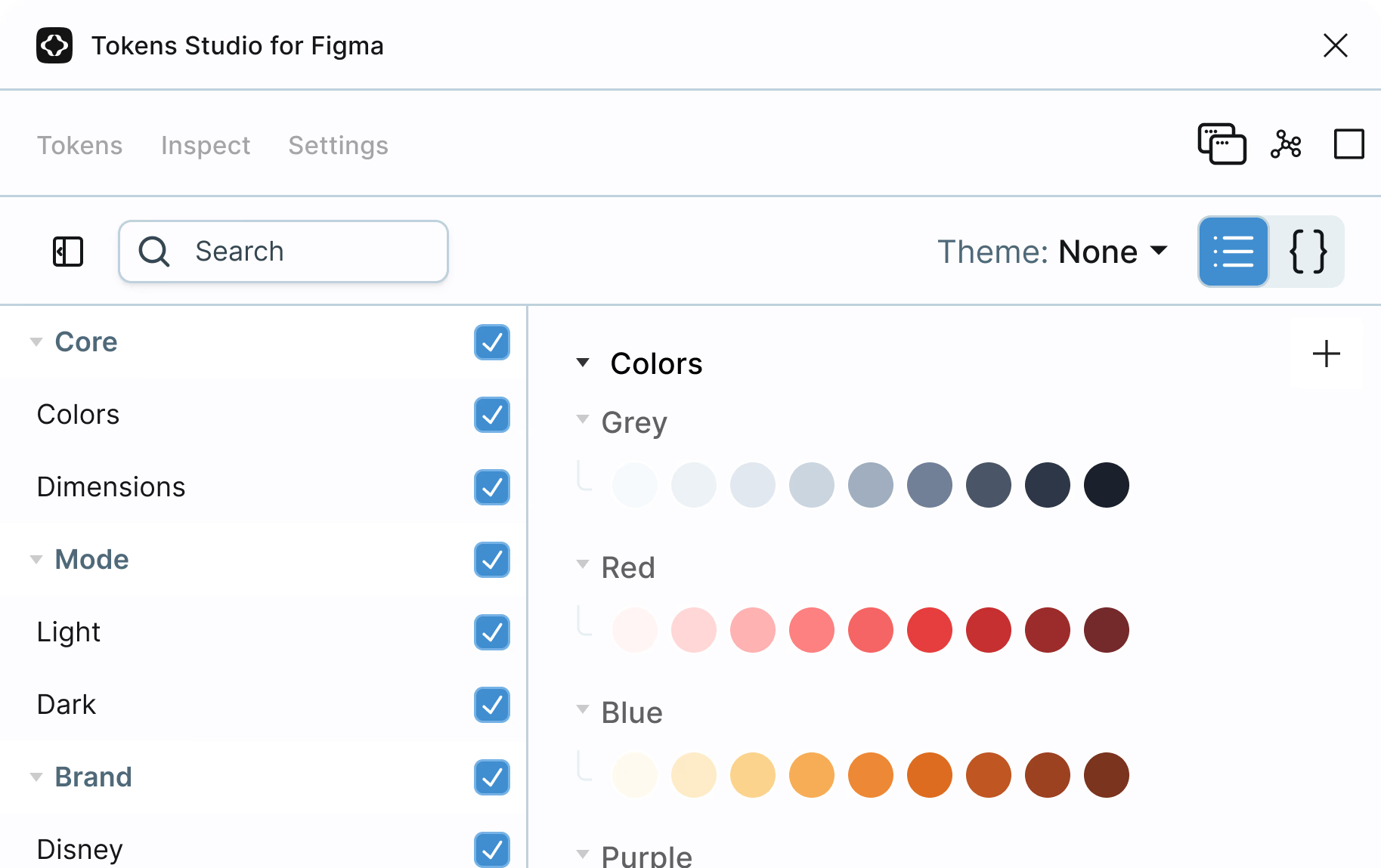
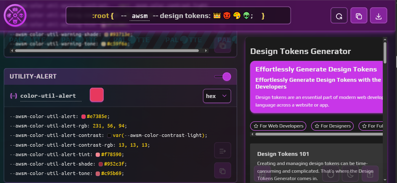
Token Studio
Token Studio is a Figma plugin that lets you manage design tokens directly in your file, export them to different formats, and sync them to code.

Specify
Specify lets you collect tokens from Figma and push them to different targets, including GitHub repositories, continuous integration pipelines, documentation, and more.
Design-tokens.dev
Design-tokens.dev is a helpful reference if you want tips for things like how to structure tokens, format them (e.g., JSON, YAML, and so on), and think about token types.

NameDesignTokens.guide
NamedDesignTokens.guide helps with naming conventions, which is honestly a common pain point, especially when you’re working with a large number of tokens.

Once your tokens are set and connected, you’ll spend way less time fixing inconsistencies. It also gives you a solid base to scale, whether that’s adding themes, switching brands, or even building systems for multiple products.
That’s also when naming really starts to count. If your tokens or components aren’t clearly named, things can get confusing quickly.
Note: Vitaly Friedman’s “How to Name Things” is worth checking out if you’re working with larger systems.
From there, it’s all about components. Tokens define the values, but components are what people actually use, e.g., buttons, inputs, cards, dropdowns — you name it. In a perfect setup, you build a component once and reuse it everywhere. But without structure, it’s easy for things to “drift” out of scope. It’s easy to end up with five versions of the same button, and what’s in code doesn’t match what’s in Figma, for example.
Automation doesn’t replace design, but rather, it connects everything to one source.
The Figma component matches the one in production, the documentation updates when the component changes, and the whole team is pulling from the same library instead of rebuilding their own version. This is where real collaboration happens.
Here are a few tools that help make that happen:
| Tool | What It Does |
|---|---|
| UXPin Merge | Lets you design using real code components. What you prototype is what gets built. |
| Supernova | Helps you publish a design system, sync design and code sources, and keep documentation up-to-date. |
| Zeroheight | Turns your Figma components into a central, browsable, and documented system for your whole team. |
How Does Everything Connect?
A lot of the work starts right inside your design application. Once your tokens and components are in place, tools like Supernova help you take it further by extracting design data, syncing it across platforms, and generating production-ready code. You don’t need to write custom scripts or use the Figma API to get value from automation; these tools handle most of it for you.
But for teams that want full control, Figma does offer an API. It lets you do things like the following:
- Pull token values (like colors, spacing, typography) directly from Figma files,
- Track changes to components and variants,
- Tead metadata (like style names, structure, or usage patterns), and
- Map which components are used where in the design.
The Figma API is REST-based, so it works well with custom scripts and automations. You don’t need a huge setup, just the right pieces. On the development side, teams usually use Node.js or Python to handle automation. For example:
- Fetch styles from Figma.
- Convert them into JSON.
- Push the values to a design token repo or directly into the codebase.
You won’t need that level of setup for most use cases, but it’s helpful to know it’s there if your team outgrows no-code tools.
- Where do your tokens and components come from?
- How do updates happen?
- What tools keep everything connected?
The workflow becomes easier to manage once that’s clear, and you spend less time trying to fix changes or mismatches. When tokens, components, and documentation stay in sync, your team moves faster and spends less time fixing the same issues.
Extracting Design Data
Figma is a collaborative design tool used to create UIs: buttons, layouts, styles, components, everything that makes up the visual language of the product. It’s also where all your design data lives, which includes the tokens we talked about earlier. This data is what we’ll extract and eventually connect to your codebase. But first, you’ll need a setup.
To follow along:
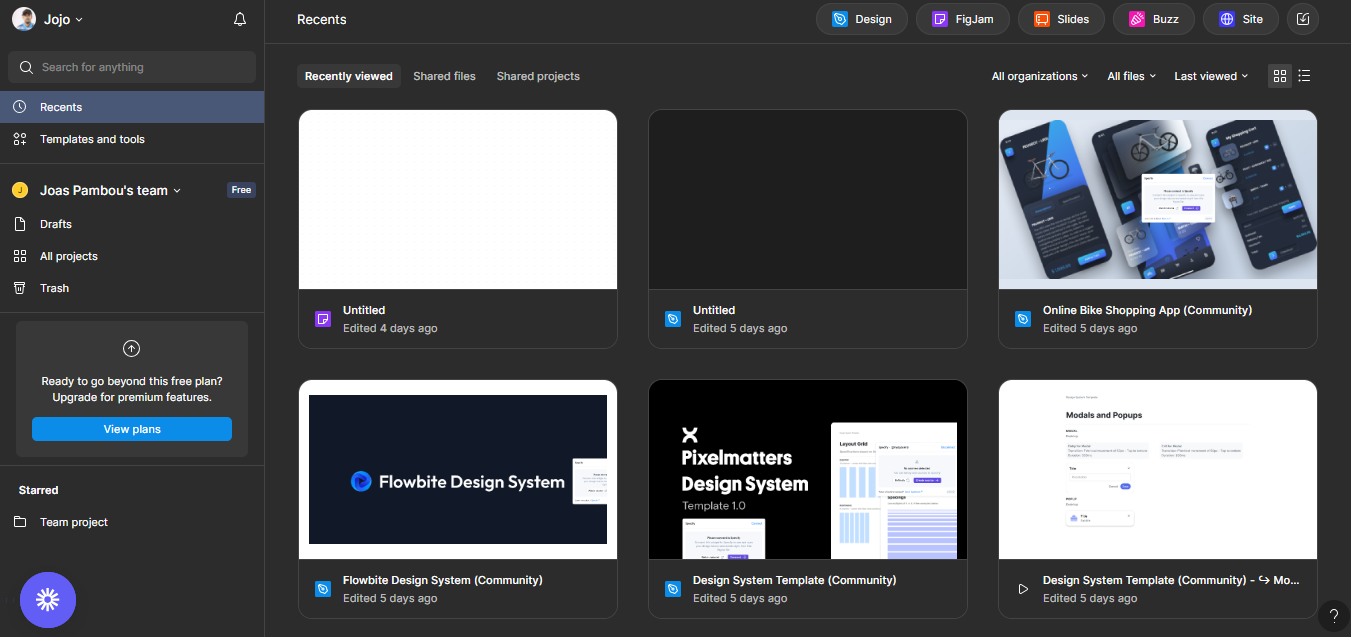
- Go to figma.com and create a free account.
- Download the Figma desktop app if you prefer working locally, but keep an eye on system requirements if you’re on an older device.
Once you’re in, you’ll see a home screen that looks something like the following:

From here, it’s time to set up your design tokens. You can either create everything from scratch or use a template from the Figma community to save time. Templates are a great option if you don’t want to build everything yourself. But if you prefer full control, creating your setup totally works too.
There are other ways to get tokens as well. For example, a site like namedesigntokens.guide lets you generate and download tokens in formats like JSON. The only catch is that Figma doesn’t let you import JSON directly, so if you go that route, you’ll need to bring in a middle tool like Specify to bridge that gap. It helps sync tokens between Figma, GitHub, and other places.
For this article, though, we’ll keep it simple and stick with Figma. Pick any design system template from the Figma community to get started; there are plenty to choose from.
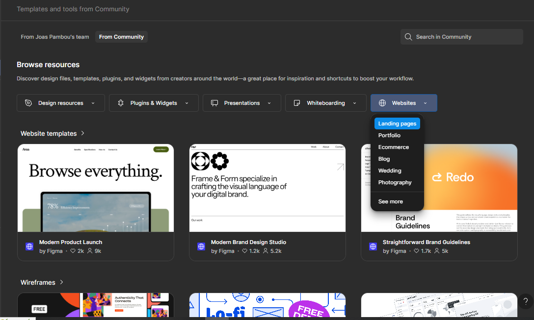

Depending on the template you choose, you’ll get a pre-defined set of tokens that includes colors, typography, spacing, components, and more. These templates come in all types: website, e-commerce, portfolio, app UI kits, you name it. For this article, we’ll be using the /Design-System-Template–Community because it includes most of the tokens you’ll need right out of the box. But feel free to pick a different one if you want to try something else.
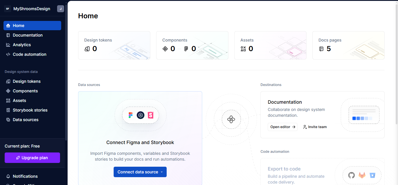
Once you’ve picked your template, it’s time to download the tokens. We’ll use Supernova, a tool that connects directly to your Figma file and pulls out design tokens, styles, and components. It makes the design-to-code process a lot smoother.
Step 1: Sign Up on Supernova
Go to supernova.io and create an account. Once you’re in, you’ll land on a dashboard that looks like this:

Step 2: Connect Your Figma File
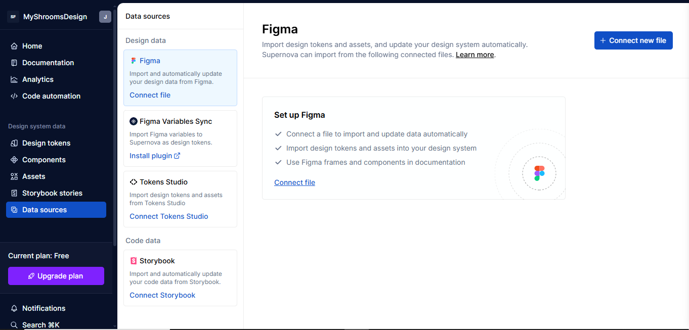
To pull in the tokens, head over to the Data Sources section in Supernova and choose Figma from the list of available sources. (You’ll also see other options like Storybook or Figma variables, but we’re focusing on Figma.) Next, click on Connect a new file, paste the link to your Figma template, and click Import.

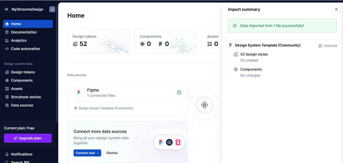
Supernova will load the full design system from your template. From your dashboard, you’ll now be able to see all the tokens.

Turning Tokens Into Code
Design tokens are great inside Figma, but the real value shows when you turn them into code. That’s how the developers on your team actually get to use them.
Here’s the problem: Many teams default to copying values manually for things like color, spacing, and typography. But when you make a change to them in Figma, the code is instantly out of sync. That’s why automating this process is such a big win.
Instead of rewriting the same theme setup for every project, you generate it, constantly translating designs into dev-ready assets, and keep everything in sync from one source of truth.
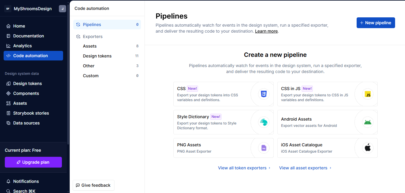
Now that we’ve got all our tokens in Supernova, let’s turn them into code. First, go to the Code Automation tab, then click New Pipeline. You’ll see different options depending on what you want to generate: React Native, CSS-in-JS, Flutter, Godot, and a few others.
Let’s go with the CSS-in-JS option for the sake of demonstration:

After that, you’ll land on a setup screen with three sections: Data, Configuration, and Delivery.
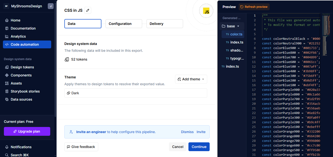
Data
Here, you can pick a theme. At first, it might only give you “Black” as the option; you can select that or leave it empty. It really doesn’t matter for the time being.

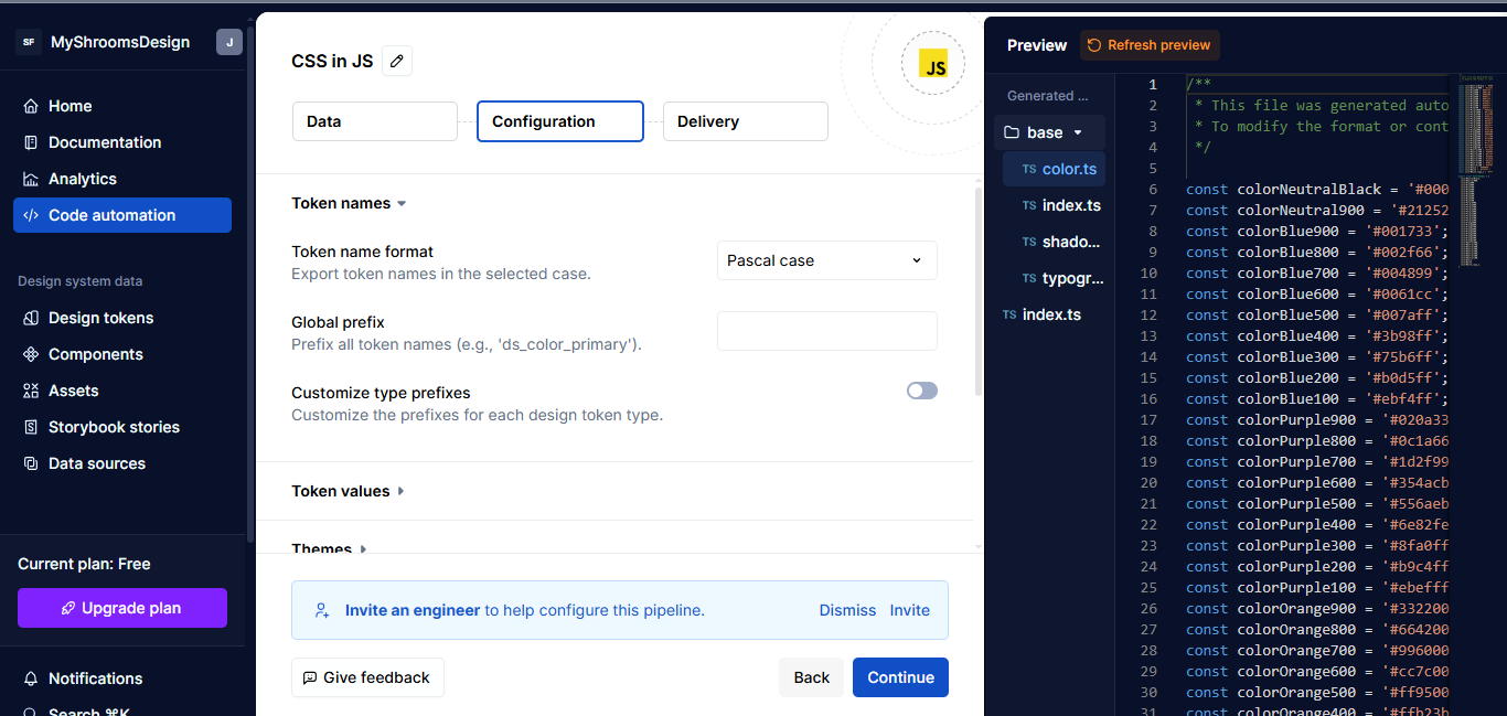
Configuration
This is where you control how the code is structured. I picked PascalCase for how token names are formatted. You can also update how things like spacing, colors, or font styles are grouped and saved.

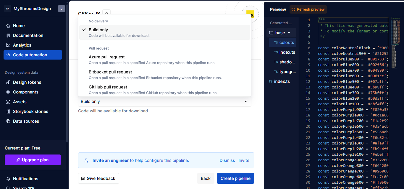
Delivery
This is where you choose how you want the output delivered. I chose “Build Only”, which builds the code for you to download.

Once you’re done, click Save. The pipeline is created, and you’ll see it listed in your dashboard. From here, you can download your token code, which is already generated.
Automating Documentation
So, what’s the point of documentation in a design system?
You can think of it as the instruction manual for your team. It explains what each token or component is, why it exists, and how to use it. Designers, developers, and anyone else on your team can stay on the same page — no guessing, no back-and-forth. Just clear context.
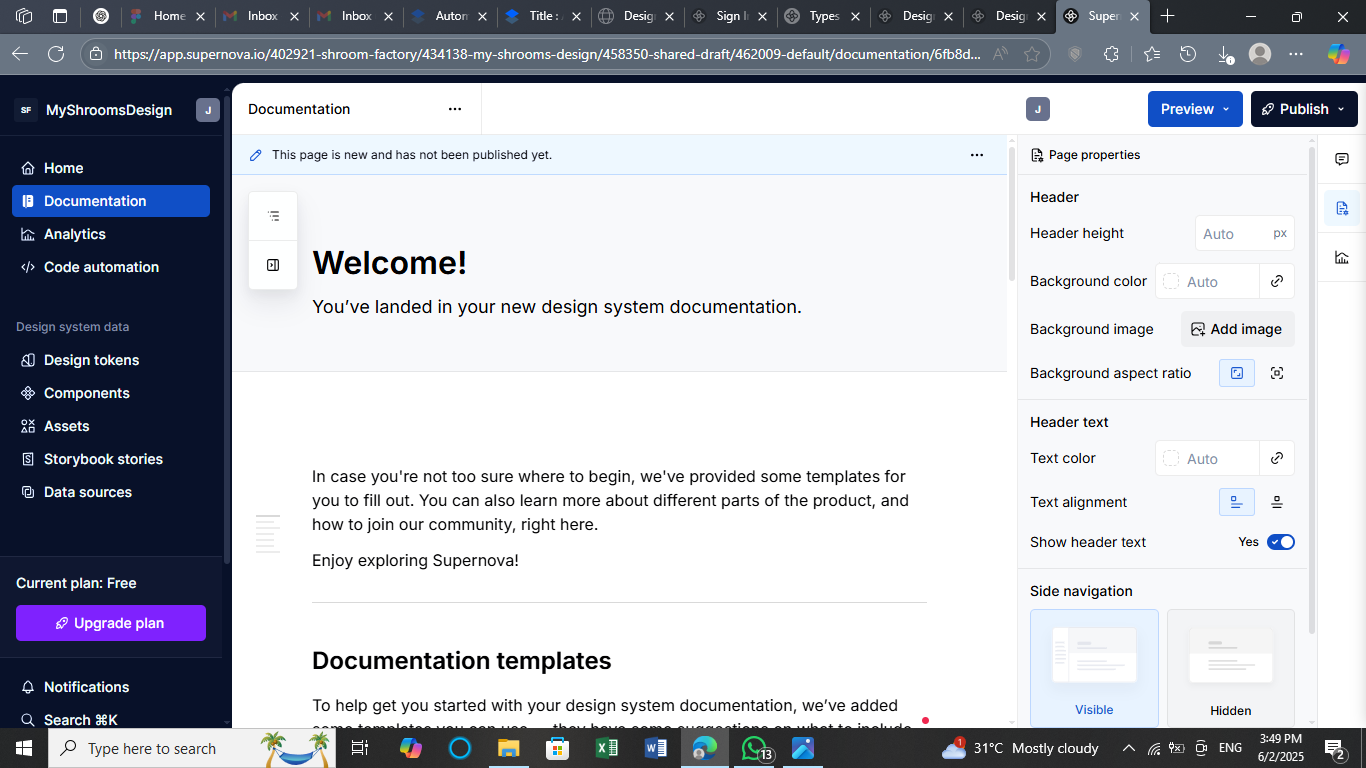
Let’s continue from where we stopped. Supernova is capable of handling your documentation. Head over to the Documentation tab. This is where you can start editing everything about your design system docs, all from the same place.
You can:
- Add descriptions to your tokens,
- Define what each base token is for (as well as what it’s not for),
- Organize sections by colors, typography, spacing, or components, and
- Drop in images, code snippets, or examples.
You’re building the documentation inside the same tool where your tokens live. In other words, there’s no jumping between tools and no additional setup. That’s where the automation kicks in. You edit once, and your docs stay synced with your design source. It all stays in one environment.

Once you’re done, click Publish and you will be presented with a new window asking you to sign in. After that, you’re able to access your live documentation site.
Practical Tips For Automations
Automation is great. It saves hours of manual work and keeps your design system tight across design and code. The trick is knowing when to automate and how to make sure it keeps working over time. You don’t need to automate everything right away. But if you’re doing the same thing over and over again, that’s a kind of red flag.
A few signs that it’s time to consider using automation:
- You’re using the same styles across multiple platforms (like web and mobile).
- You have a shared design system used by more than one team.
- Design tokens change often, and you want updates to flow into code automatically.
- You’re tired of manual updates every time the brand team tweaks a color.
There are three steps you need to consider. Let’s look at each one.
Step 1: Keep An Eye On Tools And API Updates
If your pipeline depends on design tools, like Figma, or platforms, like Supernova, you’ll want to know when changes are made and evaluate how they impact your work, because even small updates can quietly affect your exports.
It’s a good idea to check Figma’s API changelog now and then, especially if something feels off with your token syncing. They often update how variables and components are structured, and that can impact your pipeline. There’s also an RSS feed for product updates.
The same goes for Supernova’s product updates. They regularly roll out improvements that might tweak how your tokens are handled or exported. If you’re using open-source tools like Style Dictionary, keeping an eye on the GitHub repo (particularly the Issues tab) can save you from debugging weird token name changes later.
All of this isn’t about staying glued to release notes, but having a system to check if something suddenly stops working. That way, you’ll catch things before they reach production.
Step 2: Break Your Pipeline Into Smaller Steps
A common trap teams fall into is trying to automate everything in one big run: colors, spacing, themes, components, and docs, all processed in a single click. It sounds convenient, but it’s hard to maintain, and even harder to debug.
It’s much more manageable to split your automation into pieces. For example, having a single workflow that handles your core design tokens (e.g., colors, spacing, and font sizes), another for theme variations (e.g., light and dark themes), and one more for component mapping (e.g., buttons, inputs, and cards). This way, if your team changes how spacing tokens are named in Figma, you only need to update one part of the workflow, not the entire system. It’s also easier to test and reuse smaller steps.
Step 3: Test The Output Every Time
Even if everything runs fine, always take a moment to check the exported output. It doesn’t need to be complicated. A few key things:
- Are the token names clean and readable?
If you see something likePrimaryColorColorText, that’s a red flag. - Did anything disappear or get renamed unexpectedly?
It happens more often than you think, especially with typography or spacing tokens after design changes. - Does the UI still work?
If you’re using something like Tailwind, CSS variables, or custom themes, double-check that the new token values aren’t breaking anything in the design or build process.
To catch issues early, it helps to run tools like ESLint or Stylelint right after the pipeline completes. They’ll flag odd syntax or naming problems before things get shipped.
How AI Can Help
Once your automation is stable, there’s a next layer that can boost your workflow: AI. It’s not just for writing code or generating mockups, but for helping with the small, repetitive things that eat up time in design systems. When used right, AI can assist without replacing your control over the system.
Here’s where it might fit into your workflow:
Naming Suggestions
When you’re dealing with hundreds of tokens, naming them clearly and consistently is a real challenge. Some AI tools can help by suggesting clean, readable names for your tokens or components based on patterns in your design. It’s not perfect, but it’s a good way to kickstart naming, especially for large teams.
Pattern Recognition
AI can also spot repeated styles or usage patterns across your design files. If multiple buttons or cards share similar spacing, shadows, or typography, tools powered by AI can group or suggest components for systemization even before a human notices.
Automated Documentation
Instead of writing everything from scratch, AI can generate first drafts of documentation based on your tokens, styles, and usage. You still need to review and refine, but it takes away the blank-page problem and saves hours.
Here are a few tools that already bring AI into the design and development space in practical ways:
- Uizard: Uizard uses AI to turn wireframes into designs automatically. You can sketch something by hand, and it transforms that into a usable mockup.
- Anima: Anima can convert Figma designs into responsive React code. It also helps fill in real content or layout structures, making it a powerful bridge between design and development, with some AI assistance under the hood.
- Builder.io: Builder uses AI to help generate and edit components visually. It’s especially useful for marketers or non-developers who need to build pages fast. AI helps streamline layout, content blocks, and design rules.
Conclusion
This article is not about achieving complete automation in the technical sense, but more about using smart tools to streamline the menial and manual aspects of working with design systems. Exporting tokens, generating docs, and syncing design with code can be automated, making your process quicker and more reliable with the right setup.
Instead of rebuilding everything from scratch every time, you now have a way to keep things consistent, stay organized, and save time.
Further Reading
- “Design System Guide” by Romina Kavcic
- “Design System In 90 Days” by Vitaly Friedman
(gg, yk)
UX Job Interview Helpers
UX Job Interview Helpers UX Job Interview Helpers Vitaly Friedman 2025-08-05T13:00:00+00:00 2025-08-07T14:02:50+00:00 When talking about job interviews for a UX position, we often discuss how to leave an incredible impression and how to negotiate the right salary. But it’s only one part of the story. […]
Accessibility
UX Job Interview Helpers
Vitaly Friedman 2025-08-05T13:00:00+00:00
2025-08-07T14:02:50+00:00
When talking about job interviews for a UX position, we often discuss how to leave an incredible impression and how to negotiate the right salary. But it’s only one part of the story. The other part is to be prepared, to ask questions, and to listen carefully.
Below, I’ve put together a few useful resources on UX job interviews — from job boards to Notion templates and practical guides. I hope you or your colleagues will find it helpful.
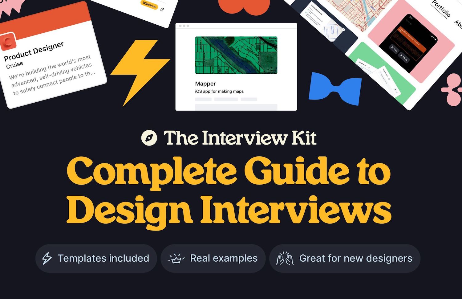
The Design Interview Kit
As you are preparing for that interview, get ready with the Design Interview Kit (Figma), a helpful practical guide that covers how to craft case studies, solve design challenges, write cover letters, present your portfolio, and negotiate your offer. Kindly shared by Oliver Engel.

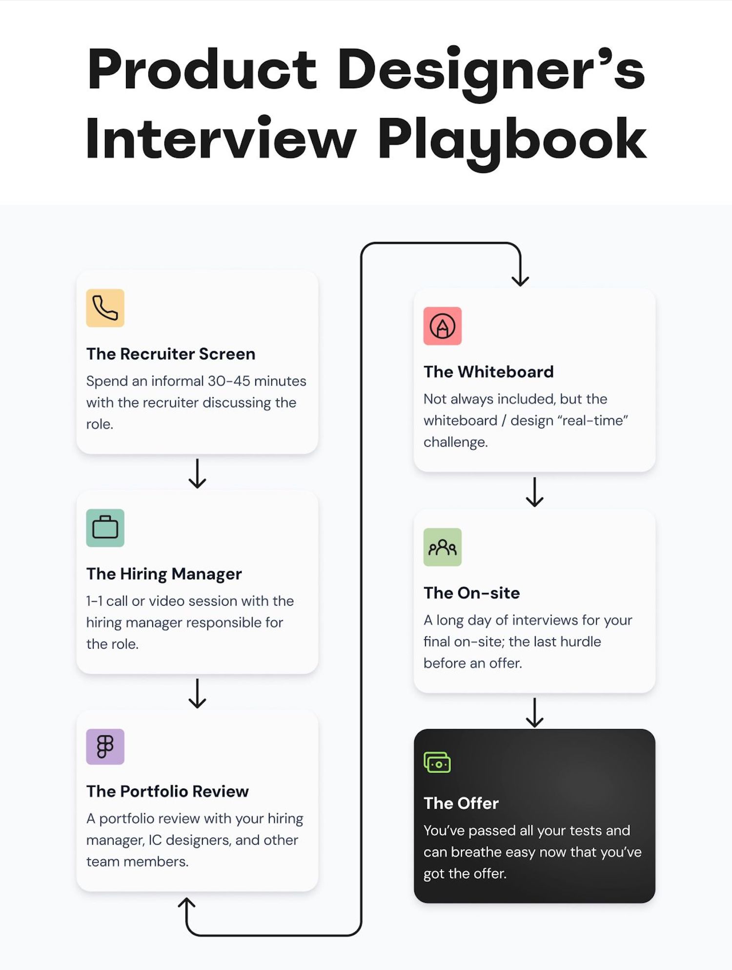
The Product Designer’s (Job) Interview Playbook (PDF)
The Product Designer’s (Job) Interview Playbook (PDF) is a practical little guide for designers through each interview phase, with helpful tips and strategies on things to keep in mind, talking points, questions to ask, red flags to watch out for and how to tell a compelling story about yourself and your work. Kindly put together by Meghan Logan.

From my side, I can only wholeheartedly recommend to not only speak about your design process. Tell stories about the impact that your design work has produced. Frame your design work as an enabler of business goals and user needs. And include insights about the impact you’ve produced — on business goals, processes, team culture, planning, estimates, and testing.
Also, be very clear about the position that you are applying for. In many companies, titles do matter. There are vast differences in responsibilities and salaries between various levels for designers, so if you see yourself as a senior, review whether it actually reflects in the position.
A Guide To Successful UX Job Interviews (+ Notion template)
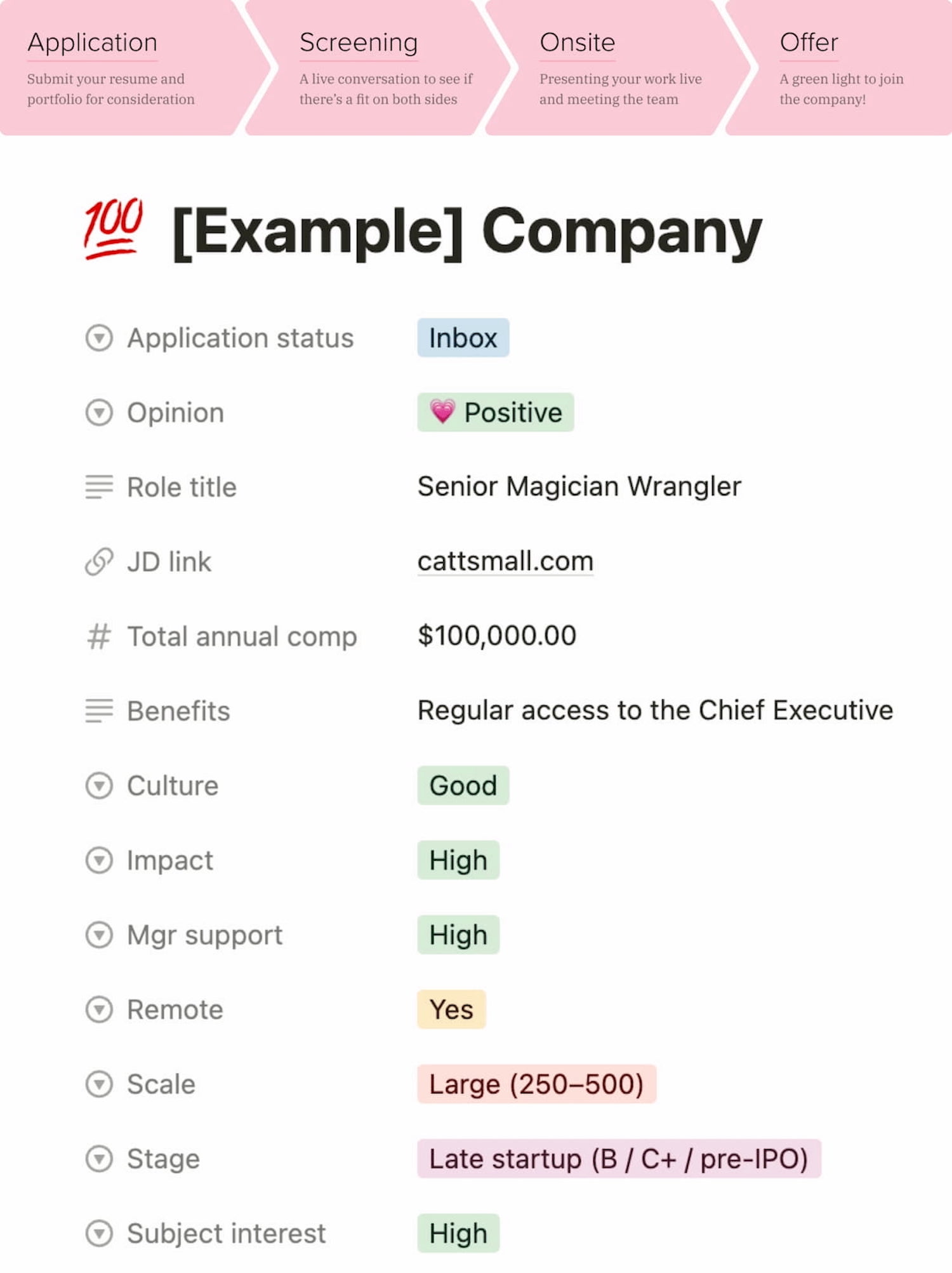
Catt Small’s Guide To Successful UX Job Interviews, a wonderful practical series on how to build a referral pipeline, apply for an opening, prepare for screening and interviews, present your work, and manage salary expectations. You can also download a Notion template.

30 Useful Questions To Ask In UX Job Interviews
In her wonderful article, Nati Asher has suggested many useful questions to ask in a job interview when you are applying as a UX candidate. I’ve taken the liberty of revising some of them and added a few more questions that might be worth considering for your next job interview.

- What are the biggest challenges the team faces at the moment?
- What are the team’s main strengths and weaknesses?
- What are the traits and skills that will make me successful in this position?
- Where is the company going in the next 5 years?
- What are the achievements I should aim for over the first 90 days?
- What would make you think “I’m so happy we hired X!”?
- Do you have any doubts or concerns regarding my fit for this position?
- Does the team have any budget for education, research, etc.?
- What is the process of onboarding in the team?
- Who is in the team, and how long have they been in that team?
- Who are the main stakeholders I will work with on a day-to-day basis?
- Which options do you have for user research and accessing users or data?
- Are there analytics, recordings, or other data sources to review?
- How do you measure the impact of design work in your company?
- To what extent does management understand the ROI of good UX?
- How does UX contribute strategically to the company’s success?
- Who has the final say on design, and who decides what gets shipped?
- What part of the design process does the team spend most time on?
- How many projects do designers work on simultaneously?
- How has the organization overcome challenges with remote work?
- Do we have a design system, and in what state is it currently?
- Why does a company want to hire a UX designer?
- How would you describe the ideal candidate for this position?
- What does a career path look like for this role?
- How will my performance be evaluated in this role?
- How long do projects take to launch? Can you give me some examples?
- What are the most immediate projects that need to be addressed?
- How do you see the design team growing in the future?
- What traits make someone successful in this team?
- What’s the most challenging part of leading the design team?
- How does the company ensure it’s upholding its values?
Before a job interview, have your questions ready. Not only will they convey a message that you care about the process and the culture, but also that you understand what is required to be successful. And this fine detail might go a long way.
Don’t Forget About The STAR Method
Interviewers closer to business will expect you to present examples of your work using the STAR method (Situation — Task — Action — Result), and might be utterly confused if you delve into all the fine details of your ideation process or the choice of UX methods you’ve used.
- Situation: Set the scene and give necessary details.
- Task: Explain your responsibilities in that situation.
- Action: Explain what steps you took to address it.
- Result: Share the outcomes your actions achieved.
As Meghan suggests, the interview is all about how your skills add value to the problem the company is currently solving. So ask about the current problems and tasks. Interview the person who interviews you, too — but also explain who you are, your focus areas, your passion points, and how you and your expertise would fit in a product and in the organization.
Wrapping Up
A final note on my end: never take a rejection personally. Very often, the reasons you are given for rejection are only a small part of a much larger picture — and have almost nothing to do with you. It might be that a job description wasn’t quite accurate, or the company is undergoing restructuring, or the finances are too tight after all.
Don’t despair and keep going. Write down your expectations. Job titles matter: be deliberate about them and your level of seniority. Prepare good references. Have your questions ready for that job interview. As Catt Small says, “once you have a foot in the door, you’ve got to kick it wide open”.
You are a bright shining star — don’t you ever forget that.
Job Boards
- Remote + In-person
- IXDA
- Who Is Still Hiring?
- UXPA Job Bank
- Otta
- Boooom
- Black Creatives Job Board
- UX Research Jobs
- UX Content Jobs
- UX Content Collective Jobs
- UX Writing Jobs
Useful Resources
- “How To Be Prepared For UX Job Interviews,” by yours truly
- “UX Job Search Strategies and Templates,” by yours truly
- “How To Ace Your Next Job Interview,” by Startup.jobs
- “Cracking The UX Job Interview,” by Artiom Dashinsky
- “The Product Design Interview Process,” by Tanner Christensen
- “10 Questions To Ask in a UX Interview,” by Ryan Scott
- “Six questions to ask after a UX designer job interview,” by Nick Babich
Meet “Smart Interface Design Patterns”
You can find more details on design patterns and UX in Smart Interface Design Patterns, our 15h-video course with 100s of practical examples from real-life projects — with a live UX training later this year. Everything from mega-dropdowns to complex enterprise tables — with 5 new segments added every year. Jump to a free preview. Use code BIRDIE to save 15% off.

Video + UX Training
$ 495.00 $ 699.00
Get Video + UX Training
25 video lessons (15h) + Live UX Training.
100 days money-back-guarantee.
Video only
$ 300.00$ 395.00
40 video lessons (15h). Updated yearly.
Also available as a UX Bundle with 2 video courses.
(yk)
Designing Better UX For Left-Handed People
Designing Better UX For Left-Handed People Designing Better UX For Left-Handed People Vitaly Friedman 2025-07-25T15:00:00+00:00 2025-07-30T15:33:12+00:00 Many products — digital and physical — are focused on “average” users — a statistical representation of the user base, which often overlooks or dismisses anything that deviates from that average, […]
Accessibility
Designing Better UX For Left-Handed People
Vitaly Friedman 2025-07-25T15:00:00+00:00
2025-07-30T15:33:12+00:00
Many products — digital and physical — are focused on “average” users — a statistical representation of the user base, which often overlooks or dismisses anything that deviates from that average, or happens to be an edge case. But people are never edge cases, and “average” users don’t really exist. We must be deliberate and intentional to ensure that our products reflect that.
Today, roughly 10% of people are left-handed. Yet most products — digital and physical — aren’t designed with them in mind. And there is rarely a conversation about how a particular digital experience would work better for their needs. So how would it adapt, and what are the issues we should keep in mind? Well, let’s explore what it means for us.
.course-intro{–shadow-color:206deg 31% 60%;background-color:#eaf6ff;border:1px solid #ecf4ff;box-shadow:0 .5px .6px hsl(var(–shadow-color) / .36),0 1.7px 1.9px -.8px hsl(var(–shadow-color) / .36),0 4.2px 4.7px -1.7px hsl(var(–shadow-color) / .36),.1px 10.3px 11.6px -2.5px hsl(var(–shadow-color) / .36);border-radius:11px;padding:1.35rem 1.65rem}@media (prefers-color-scheme:dark){.course-intro{–shadow-color:199deg 63% 6%;border-color:var(–block-separator-color,#244654);background-color:var(–accent-box-color,#19313c)}}
This article is part of our ongoing series on UX. You can find more details on design patterns and UX strategy in Smart Interface Design Patterns 🍣 — with live UX training coming up soon. Jump to table of contents.
Left-Handedness ≠ “Left-Only”
It’s easy to assume that left-handed people are usually left-handed users. However, that’s not necessarily the case. Because most products are designed with right-handed use in mind, many left-handed people have to use their right hand to navigate the physical world.
From very early childhood, left-handed people have to rely on their right hand to use tools and appliances like scissors, openers, fridges, and so on. That’s why left-handed people tend to be ambidextrous, sometimes using different hands for different tasks, and sometimes using different hands for the same tasks interchangeably. However, only 1% of people use both hands equally well (ambidextrous).

In the same way, right-handed people aren’t necessarily right-handed users. It’s common to be using a mobile device in both left and right hands, or both, perhaps with a preference for one. But when it comes to writing, a preference is stronger.
Challenges For Left-Handed Users
Because left-handed users are in the minority, there is less demand for left-handed products, and so typically they are more expensive, and also more difficult to find. Troubles often emerge with seemingly simple tools — scissors, can openers, musical instruments, rulers, microwaves and bank pens.

For example, most scissors are designed with the top blade positioned for right-handed use, which makes cutting difficult and less precise. And in microwaves, buttons and interfaces are nearly always on the right, making left-handed use more difficult.
Now, with digital products, most left-handed people tend to adapt to right-handed tools, which they use daily. Unsurprisingly, many use their right hand to navigate the mouse. However, it’s often quite different on mobile where the left hand is often preferred.
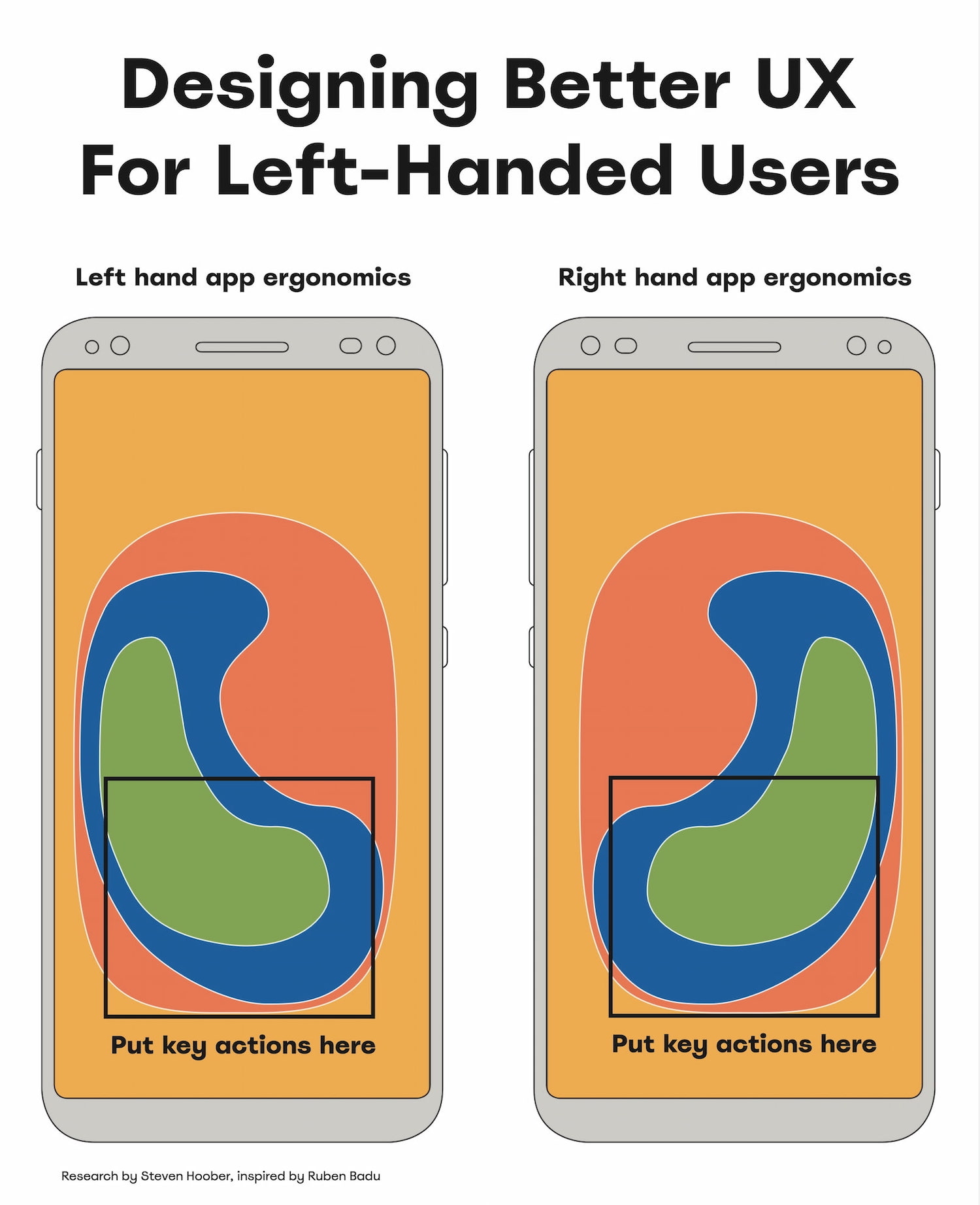
- Don’t make design decisions based on left/right-handedness.
- Allow customizations based on the user’s personal preferences.
- Allow users to re-order columns (incl. the Actions column).
- In forms, place action buttons next to the last user’s interaction.
- Keyboard accessibility helps everyone move faster (Esc).
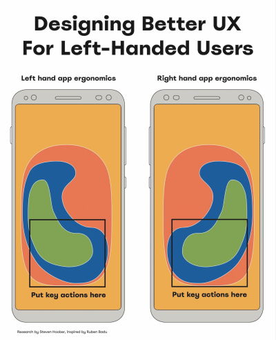
Usability Guidelines To Support Both Hands
As Ruben Babu writes, we shouldn’t design a fire extinguisher that can’t be used by both hands. Think pull up and pull down, rather than swipe left or right. Minimize the distance to travel with the mouse. And when in doubt, align to the center.
- Bottom left → better for lefties, bottom right → for righties.
- With magnifiers, users can’t spot right-aligned buttons.
- On desktop, align buttons to the left/middle, not right.
- On mobile, most people switch both hands when tapping.
- Key actions → put in middle half to two-thirds of the screen.

A simple way to test the mobile UI is by trying to use the opposite-handed UX test. For key flows, we try to complete them with your non-dominant hand and use the opposite hand to discover UX shortcomings.
For physical products, you might try the oil test. It might be more effective than you might think.
Good UX Works For Both
Our aim isn’t to degrade the UX of right-handed users by meeting the needs of left-handed users. The aim is to create an accessible experience for everyone. Providing a better experience for left-handed people also benefits right-handed people who have a temporary arm disability.
And that’s an often-repeated but also often-overlooked universal principle of usability: better accessibility is better for everyone, even if it might feel that it doesn’t benefit you directly at the moment.
Useful Resources
- “Discover Hidden UX Flaws With the Opposite-Handed UX Test,” by Jeff Huang
- “Right-Aligned Buttons Aren’t More Efficient For Right-Handed People,” by Julia Y.
- “Mobile Accessibility Target Sizes Cheatsheet,” by Vitaly Friedman
- “Why The World Is Not Designed For Left-Handed People,” by Elvis Hsiao
- “Usability For Left Handedness 101”, by Ruben Babu
- Touch Design For Mobile Interfaces, by Steven Hoober
Meet “Smart Interface Design Patterns”
You can find more details on design patterns and UX in Smart Interface Design Patterns, our 15h-video course with 100s of practical examples from real-life projects — with a live UX training later this year. Everything from mega-dropdowns to complex enterprise tables — with 5 new segments added every year. Jump to a free preview. Use code BIRDIE to save 15% off.
Video + UX Training
$ 495.00 $ 699.00
Get Video + UX Training
25 video lessons (15h) + Live UX Training.
100 days money-back-guarantee.
Video only
$ 300.00$ 395.00
40 video lessons (15h). Updated yearly.
Also available as a UX Bundle with 2 video courses.
(yk)
Handling JavaScript Event Listeners With Parameters
Handling JavaScript Event Listeners With Parameters Handling JavaScript Event Listeners With Parameters Amejimaobari Ollornwi 2025-07-21T10:00:00+00:00 2025-07-23T15:03:27+00:00 JavaScript event listeners are very important, as they exist in almost every web application that requires interactivity. As common as they are, it is also essential for them to […]
Accessibility
Handling JavaScript Event Listeners With Parameters
Amejimaobari Ollornwi 2025-07-21T10:00:00+00:00
2025-07-23T15:03:27+00:00
JavaScript event listeners are very important, as they exist in almost every web application that requires interactivity. As common as they are, it is also essential for them to be managed properly. Improperly managed event listeners can lead to memory leaks and can sometimes cause performance issues in extreme cases.
Here’s the real problem: JavaScript event listeners are often not removed after they are added. And when they are added, they do not require parameters most of the time — except in rare cases, which makes them a little trickier to handle.
A common scenario where you may need to use parameters with event handlers is when you have a dynamic list of tasks, where each task in the list has a “Delete” button attached to an event handler that uses the task’s ID as a parameter to remove the task. In a situation like this, it is a good idea to remove the event listener once the task has been completed to ensure that the deleted element can be successfully cleaned up, a process known as garbage collection.
A Common Mistake When Adding Event Listeners
A very common mistake when adding parameters to event handlers is calling the function with its parameters inside the addEventListener() method. This is what I mean:
button.addEventListener('click', myFunction(param1, param2));
The browser responds to this line by immediately calling the function, irrespective of whether or not the click event has happened. In other words, the function is invoked right away instead of being deferred, so it never fires when the click event actually occurs.
You may also receive the following console error in some cases:

addEventListener on EventTarget: parameter is not of type Object. (Large preview)
This error makes sense because the second parameter of the addEventListener method can only accept a JavaScript function, an object with a handleEvent() method, or simply null. A quick and easy way to avoid this error is by changing the second parameter of the addEventListener method to an arrow or anonymous function.
button.addEventListener('click', (event) => {
  myFunction(event, param1, param2); // Runs on click
});
The only hiccup with using arrow and anonymous functions is that they cannot be removed with the traditional removeEventListener() method; you will have to make use of AbortController, which may be overkill for simple cases. AbortController shines when you have multiple event listeners to remove at once.
For simple cases where you have just one or two event listeners to remove, the removeEventListener() method still proves useful. However, in order to make use of it, you’ll need to store your function as a reference to the listener.
Using Parameters With Event Handlers
There are several ways to include parameters with event handlers. However, for the purpose of this demonstration, we are going to constrain our focus to the following two:
Option 1: Arrow And Anonymous Functions
Using arrow and anonymous functions is the fastest and easiest way to get the job done.
To add an event handler with parameters using arrow and anonymous functions, we’ll first need to call the function we’re going to create inside the arrow function attached to the event listener:
const button = document.querySelector("#myButton");

button.addEventListener("click", (event) => {
  handleClick(event, "hello", "world");
});
After that, we can create the function with parameters:
function handleClick(event, param1, param2) {
  console.log(param1, param2, event.type, event.target);
}
Note that with this method, removing the event listener requires the AbortController. To remove the event listener, we create a new AbortController object and then retrieve the AbortSignal object from it:
const controller = new AbortController();
const { signal } = controller;
Next, we can pass the signal from the controller as an option in the removeEventListener() method:
button.addEventListener("click", (event) => {
  handleClick(event, "hello", "world");
}, { signal });
Now we can remove the event listener by calling AbortController.abort():
controller.abort()
Option 2: Closures
Closures in JavaScript are another feature that can help us with event handlers. Remember the mistake that produced a type error? That mistake can also be corrected with closures. Specifically, with closures, a function can access variables from its outer scope.
In other words, we can access the parameters we need in the event handler from the outer function:
function createHandler(message, number) {
  // Event handler
  return function (event) {
  console.log(`${message} ${number} - Clicked element:`, event.target);
    };
  }

  const button = document.querySelector("#myButton");
  button.addEventListener("click", createHandler("Hello, world!", 1));
}
This establishes a function that returns another function. The function that is created is then called as the second parameter in the addEventListener() method so that the inner function is returned as the event handler. And with the power of closures, the parameters from the outer function will be made available for use in the inner function.
Notice how the event object is made available to the inner function. This is because the inner function is what is being attached as the event handler. The event object is passed to the function automatically because it’s the event handler.
To remove the event listener, we can use the AbortController like we did before. However, this time, let’s see how we can do that using the removeEventListener() method instead.
In order for the removeEventListener method to work, a reference to the createHandler function needs to be stored and used in the addEventListener method:
function createHandler(message, number) {
  return function (event) {
    console.log(`${message} ${number} - Clicked element:`, event.target);
  };
}
const handler = createHandler("Hello, world!", 1);
button.addEventListener("click", handler);
Now, the event listener can be removed like this:
button.removeEventListener("click", handler);
Conclusion
It is good practice to always remove event listeners whenever they are no longer needed to prevent memory leaks. Most times, event handlers do not require parameters; however, in rare cases, they do. Using JavaScript features like closures, AbortController, and removeEventListener, handling parameters with event handlers is both possible and well-supported.
(gg, yk)
Why Non-Native Content Designers Improve Global UX
Why Non-Native Content Designers Improve Global UX Why Non-Native Content Designers Improve Global UX Oleksii Tkachenko 2025-07-18T13:00:00+00:00 2025-07-23T15:03:27+00:00 A few years ago, I was in a design review at a fintech company, polishing the expense management flows. It was a routine session where we reviewed […]
Accessibility
Why Non-Native Content Designers Improve Global UX
Oleksii Tkachenko 2025-07-18T13:00:00+00:00
2025-07-23T15:03:27+00:00
A few years ago, I was in a design review at a fintech company, polishing the expense management flows. It was a routine session where we reviewed the logic behind content and design decisions.
While looking over the statuses for submitted expenses, I noticed a label saying ‘In approval’. I paused, re-read it again, and asked myself:
“Where is it? Are the results in? Where can I find them? Are they sending me to the app section called “Approval”?”
This tiny label made me question what was happening with my money, and this feeling of uncertainty was quite anxiety-inducing.
My team, all native English speakers, did not flinch, even for a second, and moved forward to discuss other parts of the flow. I was the only non-native speaker in the room, and while the label made perfect sense to them, it still felt off to me.
After a quick discussion, we landed on ‘Pending approval’ — the simplest and widely recognised option internationally. More importantly, this wording makes it clear that there’s an approval process, and it hasn’t taken place yet. There’s no need to go anywhere to do it.
Some might call it nitpicking, but that was exactly the moment I realised how invisible — yet powerful — the non-native speaker’s perspective can be.
In a reality where user testing budgets aren’t unlimited, designing with familiar language patterns from the start helps you prevent costly confusions in the user journey.
“
Those same confusions often lead to:
- Higher rate of customer service queries,
- Lower adoption rates,
- Higher churn,
- Distrust and confusion.
As A Native Speaker, You Don’t See The Whole Picture
Global products are often designed with English as their primary language. This seems logical, but here’s the catch:
Roughly 75% of English-speaking users are not native speakers, which means 3 out of every 4 users.
Native speakers often write on instinct, which works much like autopilot. This can often lead to overconfidence in content that, in reality, is too culturally specific, vague, or complex. And that content may not be understood by 3 in 4 people who read it.
If your team shares the same native language, content clarity remains assumed by default rather than proven through pressure testing.
The price for that is the accessibility of your product. A study by National Library of Medicine found that US adults who had proficiency in English but did not use it as their primary language were significantly less likely to be insured, even when provided with the same level of service as everyone else.
In other words, they did not finish the process of securing a healthcare provider — a process that’s vital to their well-being, in part, due to unclear or inaccessible communication.
If people abandon the process of getting something as vital as healthcare insurance, it’s easy to imagine them dropping out during checkout, account setup, or app onboarding.

Non-native content designers, by contrast, do not write on autopilot. Because of their experience learning English, they’re much more likely to tune into nuances, complexity, and cultural exclusions that natives often overlook. That’s the key to designing for everyone rather than 1 in 4.
Non-native Content Designers Make Your UX Global
Spotting The Clutter And Cognitive Load Issues
When a non-native speaker has to pause, re-read something, or question the meaning of what’s written, they quickly identify it as a friction point in the user experience.
Why it’s important: Every extra second users have to spend understanding your content makes them more likely to abandon the task. This is a high price that companies pay for not prioritising clarity.
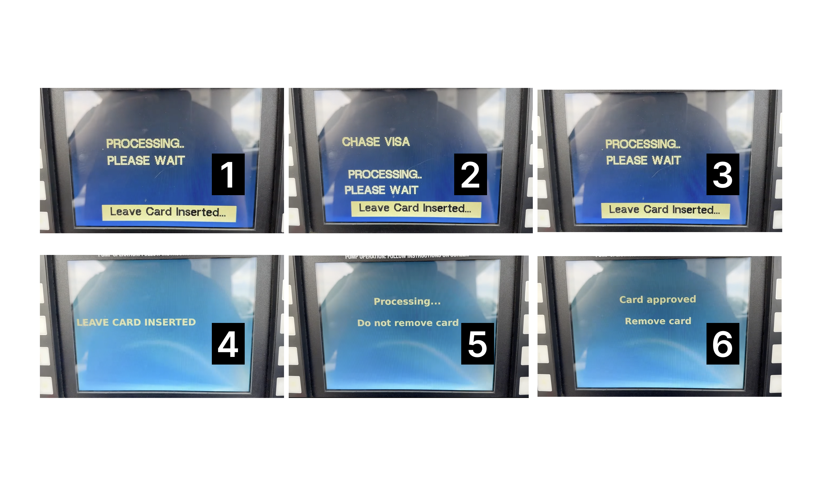
Cognitive load is not just about complex sentences but also about the speed. There’s plenty of research confirming that non-native speakers read more slowly than native speakers. This is especially important when you work on the visibility of system status — time-sensitive content that the user needs to scan and understand quickly.
One example you can experience firsthand is an ATM displaying a number of updates and instructions. Even when they’re quite similar, it still overwhelms you when you realise that you missed one, not being able to finish reading.
This kind of rapid-fire updates can increase frustration and the chances of errors.
Always Advocating For Plain English
They tend to review and rewrite things more often to find the easiest way to communicate the message. What a native speaker may consider clear enough might be dense or difficult for a non-native to understand.
Why it’s important: Simple content better scales across countries, languages, and cultures.
Catching Culture-specific Assumptions And References
When things do not make sense, non-native speakers challenge them. Besides the idioms and other obvious traps, native speakers tend to fall into considering their life experience to be shared with most English-speaking users.
Cultural differences might even exist within one globally shared language. Have you tried saying ‘soccer’ instead of ‘football’ in a conversation with someone from the UK? These details may not only cause confusion but also upset people.
Why it’s important: Making sure your product is free from culture-specific references makes your product more inclusive and safeguards you from alienating your users.
They Have Another Level Of Empathy For The Global Audience
Being a non-native speaker themselves, they have experience with products that do not speak clearly to them. They’ve been in the global user’s shoes and know how it impacts the experience.
Why it’s important: Empathy is a key driver towards design decisions that take into account the diverse cultural and linguistic background of the users.
How Non-native Content Design Can Shape Your Approach To Design
Your product won’t become better overnight simply because you read an inspiring article telling you that you need to have a more diverse team. I get it. So here are concrete changes that you can make in your design workflows and hiring routines to make sure your content is accessible globally.
Run Copy Reviews With Non-native Readers
When you launch a new feature or product, it’s a standard practice to run QA sessions to review visuals and interactions. When your team does not include the non-native perspective, the content is usually overlooked and considered fine as long as it’s grammatically correct.
I know, having a dedicated localisation team to pressure-test your content for clarity is a privilege, but you can always start small.
At one of my previous companies, we established a ‘clarity heroes council’ — a small team of non-native English speakers with diverse cultural and linguistic backgrounds. During our reviews, they often asked questions that surprised us and highlighted where clarity was missing:
- What’s a “grace period”?
- What will happen when I tap “settle the payment”?
These questions flag potential problems and help you save both money and reputation by avoiding thousands of customer service tickets.
Review Existing Flows For Clarity
Even if your product does not have major releases regularly, it accumulates small changes over time. They’re often plugged in as fixes or small improvements, and can be easily overlooked from a QA perspective.
A good start will be a regular look at the flows that are critical to your business metrics: onboarding, checkout, and so on. Fence off some time for your team quarterly or even annually, depending on your product size, to come together and check whether your key content pieces serve the global audience well.
Usually, a proper review is conducted by a team: a product designer, a content designer, an engineer, a product manager, and a researcher. The idea is to go over the flows, research insights, and customer feedback together. For that, having a non-native speaker on the audit task force will be essential.
If you’ve never done an audit before, try this template as it covers everything you need to start.
Make Sure Your Content Guidelines Are Global-ready
If you haven’t done it already, make sure your voice & tone documentation includes details about the level of English your company is catering to.
This might mean working with the brand team to find ways to make sure your brand voice comes through to all users without sacrificing clarity and comprehension. Use examples and showcase the difference between sounding smart or playful vs sounding clear.
Leaning too much towards brand personality is where cultural differences usually shine through. As a user, you might’ve seen it many times. Here’s a banking app that wanted to seem relaxed and relatable by introducing ‘Dang it’ as the only call-to-action on the screen.
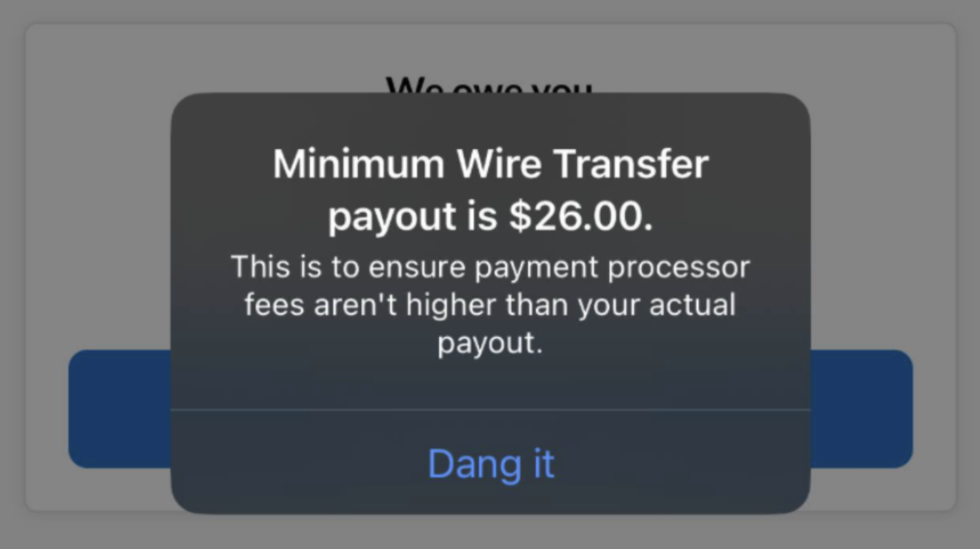
However, users with different linguistic backgrounds might not be familiar with this expression. Worse, they might see it as an action, leaving them unsure of what will actually happen after tapping it.
Considering how much content is generated with AI today, your guidelines have to account for both tone and clarity. This way, when you feed these requirements to the AI, you’ll see the output that will not just be grammatically correct but also easy to understand.
Incorporate Global English Heuristics Into Your Definition Of Success
Basic heuristic principles are often documented as a part of overarching guidelines to help UX teams do a better job. The Nielsen Norman Group usability heuristics cover the essential ones, but it doesn’t mean you shouldn’t introduce your own. To complement this list, add this principle:
Aim for global understanding: Content and design should communicate clearly to any user regardless of cultural or language background.
You can suggest criteria to ensure it’s clear how to evaluate this:
- Action transparency: Is it clear what happens next when the user proceeds to the next screen or page?
- Minimal ambiguity: Is the content open to multiple interpretations?
- International clarity: Does this content work in a non-Western context?
Bring A Non-native Perspective To Your Research, Too
This one is often overlooked, but collaboration between the research team and non-native speaking writers is super helpful. If your research involves a survey or interview, they can help you double-check whether there is complex or ambiguous language used in the questions unintentionally.
In a study by the Journal of Usability Studies, 37% of non-native speakers did not manage to answer the question that included a word they did not recognise or could not recall the meaning of. The question was whether they found the system to be “cumbersome to use”, and the consequences of getting unreliable data and measurements on this would have a negative impact on the UX of your product.
Another study by UX Journal of User Experience highlights how important clarity is in surveys. While most people in their study interpreted the question “How do you feel about … ?” as “What’s your opinion on …?”, some took it literally and proceeded to describe their emotions instead.
This means that even familiar terms can be misinterpreted. To get precise research results, it’s worth defining key terms and concepts to ensure common understanding with participants.
Globalise Your Glossary
At Klarna, we often ran into a challenge of inconsistent translation for key terms. A well-defined English term could end up having from three to five different versions in Italian or German. Sometimes, even the same features or app sections could be referred to differently depending on the market — this led to user confusion.
To address this, we introduced a shared term base — a controlled vocabulary that included:
- English term,
- Definition,
- Approved translations for all markets,
- Approved and forbidden synonyms.
Importantly, the term selection was dictated by user research, not by assumption or personal preferences of the team.

If you’re unsure where to begin, use this product content vocabulary template for Notion. Duplicate it for free and start adding your terms.
We used a similar setup. Our new glossary was shared internally across teams, from product to customer service. Results? Reducing the support tickets related to unclear language used in UI (or directions in the user journey) by 18%. This included tasks like finding instructions on how to make a payment (especially with the least popular payment methods like bank transfer), where the late fee details are located, or whether it’s possible to postpone the payment. And yes, all of these features were available, and the team believed they were quite easy to find.
A glossary like this can live as an add-on to your guidelines. This way, you will be able to quickly get up to speed new joiners, keep product copy ready for localisation, and defend your decisions with stakeholders.
Approach Your Team Growth With An Open Mind
‘Looking for a native speaker’ still remains a part of the job listing for UX Writers and content designers. There’s no point in assuming it’s intentional discrimination. It’s just a misunderstanding that stems from not fully accepting that our job is more about building the user experience than writing texts that are grammatically correct.
Here are a few tips to make sure you hire the best talent and treat your applicants fairly:
- Remove the ‘native speaker’ and ‘fluency’ requirement.
Instead, focus on the core part of our job: add ‘clear communicator’, ‘ability to simplify’, or ‘experience writing for a global audience’.
- Judge the work, not the accent.
Over the years, there have been plenty of studies confirming that the accent bias is real — people having an unusual or foreign accent are considered less hirable. While some may argue that it can have an impact on the efficiency of internal communications, it’s not enough to justify the reason to overlook the good work of the applicant.
My personal experience with the accent is that it mostly depends on the situation you’re in. When I’m in a friendly environment and do not feel anxiety, my English flows much better as I do not overthink how I sound. Ironically, sometimes when I’m in a room with my team full of British native speakers, I sometimes default to my Slavic accent. The question is: does it make my content design expertise or writing any worse? Not in the slightest.
Therefore, make sure you judge the portfolios, the ideas behind the interview answers, and whiteboard challenge presentations, instead of focusing on whether the candidate’s accent implies that they might not be good writers.
Good Global Products Need Great Non-native Content Design
Non-native content designers do not have a negative impact on your team’s writing. They sharpen it by helping you look at your content through the lens of your real user base. In the globalised world, linguistic purity no longer benefits your product’s user experience.
Try these practical steps and leverage the non-native speaking lens of your content designers to design better international products.
(yk)
Unmasking The Magic: The Wizard Of Oz Method For UX Research
Unmasking The Magic: The Wizard Of Oz Method For UX Research Unmasking The Magic: The Wizard Of Oz Method For UX Research Victor Yocco 2025-07-10T10:00:00+00:00 2025-07-16T16:32:47+00:00 New technologies and innovative concepts frequently enter the product development lifecycle, promising to revolutionize user experiences. However, even the […]
Accessibility
Unmasking The Magic: The Wizard Of Oz Method For UX Research
Victor Yocco 2025-07-10T10:00:00+00:00
2025-07-16T16:32:47+00:00
New technologies and innovative concepts frequently enter the product development lifecycle, promising to revolutionize user experiences. However, even the most ingenious ideas risk failure without a fundamental grasp of user interaction with these new experiences.
Consider the plight of the Nintendo Power Glove. Despite being a commercial success (selling over 1 million units), its release in late 1989 was followed by its discontinuation less than a full year later in 1990. The two games created solely for the Power Glove sold poorly, and there was little use for the Glove with Nintendo’s already popular traditional console games.
A large part of the failure was due to audience reaction once the product (which allegedly was developed in 8 weeks) was cumbersome and unintuitive. Users found syncing the glove to the moves in specific games to be extremely frustrating, as it required a process of coding the moves into the glove’s preset move buttons and then remembering which buttons would generate which move. With the more modern success of Nintendo’s WII and other movement-based controller consoles and games, we can see the Power Glove was a concept ahead of its time.

If Power Glove’s developers wanted to conduct effective research prior to building it out, they would have needed to look beyond traditional methods, such as surveys and interviews, to understand how a user might truly interact with the Glove. How could this have been done without a functional prototype and slowing down the overall development process?
Enter the Wizard of Oz method, a potent tool for bridging the chasm between abstract concepts and tangible user understanding, as one potential option. This technique simulates a fully functional system, yet a human operator (“the Wizard”) discreetly orchestrates the experience. This allows researchers to gather authentic user reactions and insights without the prerequisite of a fully built product.
The Wizard of Oz (WOZ) method is named in tribute to the similarly named book by Frank L. Baum. In the book, the Wizard is simply a man hidden behind a curtain, manipulating the reality of those who travel the land of Oz. Dorothy, the protagonist, exposes the Wizard for what he is, essentially an illusion or a con who is deceiving those who believe him to be omnipotent. Similarly, WOZ takes technologies that may or may not currently exist and emulates them in a way that should convince a research participant they are using an existing system or tool.
WOZ enables the exploration of user needs, validation of nascent concepts, and mitigation of development risks, particularly with complex or emerging technologies.
The product team in our above example might have used this method to have users simulate the actions of wearing the glove, programming moves into the glove, and playing games without needing a fully functional system. This could have uncovered the illogical situation of asking laypeople to code their hardware to be responsive to a game, show the frustration one encounters when needing to recode the device when changing out games, and also the cumbersome layout of the controls on the physical device (even if they’d used a cardboard glove with simulated controls drawn in crayon on the appropriate locations.
Jeff Kelley credits himself (PDF) with coining the term WOZ method in 1980 to describe the research method he employed in his dissertation. However, Paula Roe credits Don Norman and Allan Munro for using the method as early as 1973 to conduct testing on an airport automated travel assistant. Regardless of who originated the method, both parties agree that it gained prominence when IBM later used it to conduct studies on a speech-to-text tool known as The Listening Typewriter (see Image below).
In this article, I’ll cover the core principles of the WOZ method, explore advanced applications taken from practical experience, and demonstrate its unique value through real-world examples, including its application to the field of agentic AI. UX practitioners can use the WOZ method as another tool to unlock user insights and craft human-centered products and experiences.
The Yellow Brick Road: Core Principles And Mechanics
The WOZ method operates on the premise that users believe they are interacting with an autonomous system while a human wizard manages the system’s responses behind the scenes. This individual, often positioned remotely (or off-screen), interprets user inputs and generates outputs that mimic the anticipated functionality of the experience.
Cast Of Characters
A successful WOZ study involves several key roles:
- The User
The participant who engages with what they perceive as the functional system. - The Facilitator
The researcher who guides the user through predefined tasks and observes their behavior and reactions. - The Wizard
The individual manipulates the system’s behavior in real-time, providing responses to user inputs. - The Observer (Optional)
An additional researcher who observes the session without direct interaction, allowing for a secondary perspective on user behavior.
Setting The Stage For Believability: Leaving Kansas Behind
Creating a convincing illusion is key to the success of a WOZ study. This necessitates careful planning of the research environment and the tasks users will undertake. Consider a study evaluating a new voice command system for smart home devices. The research setup might involve a physical mock-up of a smart speaker and predefined scenarios like “Play my favorite music” or “Dim the living room lights.” The wizard, listening remotely, would then trigger the appropriate responses (e.g., playing a song, verbally confirming the lights are dimmed).
Or perhaps it is a screen-based experience testing a new AI-powered chatbot. You have users entering commands into a text box, with another member of the product team providing responses simultaneously using a tool like Figma/Figjam, Miro, Mural, or other cloud-based software that allows multiple users to collaborate simultaneously (the author has no affiliation with any of the mentioned products).
The Art Of Illusion
Maintaining the illusion of a genuine system requires the following:
- Timely and Natural Responses
The wizard must react to user inputs with minimal delay and in a manner consistent with expected system behavior. Hesitation or unnatural phrasing can break the illusion. - Consistent System Logic
Responses should adhere to a predefined logic. For instance, if a user asks for the weather in a specific city, the wizard should consistently provide accurate information. - Handling the Unexpected
Users will inevitably deviate from planned paths. The wizard must possess the adaptability to respond plausibly to unforeseen inputs while preserving the perceived functionality.
Ethical Considerations
Transparency is crucial, even in a method that involves a degree of deception. Participants should always be debriefed after the session, with a clear explanation of the Wizard of Oz technique and the reasons for its use. Data privacy must be maintained as with any study, and participants should feel comfortable and respected throughout the process.
Distinguishing The Method
The WOZ method occupies a unique space within the UX research toolkit:
- Unlike usability testing, which evaluates existing interfaces, Wizard of Oz explores concepts before significant development.
- Distinct from A/B testing, which compares variations of a product’s design, WOZ assesses entirely new functionalities that might otherwise lack context if shown to users.
- Compared to traditional prototyping, which often involves static mockups, WOZ offers a dynamic and interactive experience, enabling observation of real-time user behavior with a simulated system.
This method proves particularly valuable when exploring truly novel interactions or complex systems where building a fully functional prototype is premature or resource-intensive. It allows researchers to answer fundamental questions about user needs and expectations before committing significant development efforts.
Let’s move beyond the foundational aspects of the WOZ method and explore some more advanced techniques and critical considerations that can elevate its effectiveness.
Time Savings: WOZ Versus Crude Prototyping
It’s a fair question to ask whether WOZ is truly a time-saver compared to even cruder prototyping methods like paper prototypes or static digital mockups.
While paper prototypes are incredibly fast to create and test for basic flow and layout, they fundamentally lack dynamic responsiveness. Static mockups offer visual fidelity but cannot simulate complex interactions or personalized outputs.
The true time-saving advantage of the WOZ emerges when testing novel, complex, or AI-driven concepts. It allows researchers to evaluate genuine user interactions and mental models in a seemingly live environment, collecting rich behavioral data that simpler prototypes cannot. This fidelity in simulating a dynamic experience, even with a human behind the curtain, often reveals critical usability or conceptual flaws far earlier and more comprehensively than purely static representations, ultimately preventing costly reworks down the development pipeline.
Additional Techniques And Considerations
While the core principle of the WOZ method is straightforward, its true power lies in nuanced application and thoughtful execution. Seasoned practitioners may leverage several advanced techniques to extract richer insights and address more complex research questions.
Iterative Wizardry
The WOZ method isn’t necessarily a one-off endeavor. Employing it in iterative cycles can yield significant benefits. Initial rounds might focus on broad concept validation and identifying fundamental user reactions. Subsequent iterations can then refine the simulated functionality based on previous findings.
For instance, after an initial study reveals user confusion with a particular interaction flow, the simulation can be adjusted, and a follow-up study can assess the impact of those changes. This iterative approach allows for a more agile and user-centered exploration of complex experiences.
Managing Complexity
Simulating complex systems can be difficult for one wizard. Breaking complex interactions into smaller, manageable steps is crucial. Consider researching a multi-step onboarding process for a new software application. Instead of one person trying to simulate the entire flow, different aspects could be handled sequentially or even by multiple team members coordinating their responses.
Clear communication protocols and well-defined responsibilities are essential in such scenarios to maintain a seamless user experience.
Measuring Success Beyond Observation
While qualitative observation is a cornerstone of the WOZ method, defining clear metrics can add a layer of rigor to the findings. These metrics should match research goals. For example, if the goal is to assess the intuitiveness of a new navigation pattern, you might track the number of times users express confusion or the time it takes them to complete specific tasks.
Combining these quantitative measures with qualitative insights provides a more comprehensive understanding of the user experience.
Integrating With Other Methods
The WOZ method isn’t an island. Its effectiveness can be amplified by integrating it with other research techniques. Preceding a WOZ study with user interviews can help establish a deeper understanding of user needs and mental models, informing the design of the simulated experience. Following a WOZ study, surveys can gather broader quantitative feedback on the concepts explored. For example, after observing users interact with a simulated AI-powered scheduling tool, a survey could gauge their overall trust and perceived usefulness of such a system.
When Not To Use WOZ
WOZ, as with all methods, has limitations. A few examples of scenarios where other methods would likely yield more reliable findings would be:
- Detailed Usability Testing
Humans acting as wizards cannot perfectly replicate the exact experience a user will encounter. WOZ is often best in the early stages, where prototypes are rough drafts, and your team is looking for guidance on a solution that is up for consideration. Testing on a more detailed wireframe or prototype would be preferable to WOZ when you have entered the detailed design phase. - Evaluating extremely complex systems with unpredictable outputs
If the system’s responses are extremely varied, require sophisticated real-time calculations that exceed human capacity, or are intended to be genuinely unpredictable, a human may struggle to simulate them convincingly and consistently. This can lead to fatigue, errors, or improvisations that don’t reflect the intended system, thereby compromising the validity of the findings.
Training And Preparedness
The wizard’s skill is critical to the method’s success. Training the individual(s) who will be simulating the system is essential. This training should cover:
- Understanding the Research Goals
The wizard needs to grasp what the research aims to uncover. - Consistency in Responses
Maintaining consistent behavior throughout the sessions is vital for user believability. - Anticipating User Actions
While improvisation is sometimes necessary, the wizard should be prepared for common user paths and potential deviations. - Remaining Unbiased
The wizard must avoid leading users or injecting their own opinions into the simulation. - Handling Unexpected Inputs
Clear protocols for dealing with unforeseen user actions should be established. This might involve having a set of pre-prepared fallback responses or a mechanism for quickly consulting with the facilitator.
All of this suggests the need for practice in advance of running the actual session. We shouldn’t forget to have a number of dry runs in which we ask our colleagues or those who are willing to assist to not only participate but also think about possible responses that could stump the wizard or throw things off if the user might provide them during a live session.
I suggest having a believable prepared error statement ready to go for when a user throws a curveball. A simple response from the wizard of “I’m sorry, I am unable to perform that task at this time” might be enough to move the session forward while also capturing a potentially unexpected situation your team can address in the final product design.
Was This All A Dream? The Art Of The Debrief
The debriefing session following the WOZ interaction is an additional opportunity to gather rich qualitative data. Beyond asking “What did you think?” effective debriefing involves sharing the purpose of the study and the fact that the experience was simulated.
Researchers should then conduct psychological probing to understand the reasons behind user behavior and reactions. Asking open-ended questions like “Why did you try that?” or “What were you expecting to happen when you clicked that button?” can reveal valuable insights into user mental models and expectations.
Exploring moments of confusion, frustration, or delight in detail can uncover key areas for design improvement. Think about the potential information the Power Gloves’ development team could have uncovered if they’d asked participants what the experience of programming the glove and trying to remember what they’d programmed into which set of keys had been.
Case Studies: Real-World Applications
The value of the WOZ method becomes apparent when examining its application in real-world research scenarios. Here is an in-depth review of one scenario and a quick summary of another study involving WOZ, where this technique proved invaluable in shaping user experiences.
Unraveling Agentic AI: Understanding User Mental Models
A significant challenge in the realm of emerging technologies lies in user comprehension. This was particularly evident when our team began exploring the potential of Agentic AI for enterprise HR software.
Agentic AI refers to artificial intelligence systems that can autonomously pursue goals by making decisions, taking actions, and adapting to changing environments with minimal human intervention. Unlike generative AI that primarily responds to direct commands or generates content, Agentic AI is designed to understand user intent, independently plan and execute multi-step tasks, and learn from its interactions to improve performance over time. These systems often combine multiple AI models and can reason through complex problems. For designers, this signifies a shift towards creating experiences where AI acts more like a proactive collaborator or assistant, capable of anticipating needs and taking the initiative to help users achieve their objectives rather than solely relying on explicit user instructions for every step.
Preliminary research, including surveys and initial interviews, suggested that many HR professionals, while intrigued by the concept of AI assistance, struggled to grasp the potential functionality and practical implications of truly agentic systems — those capable of autonomous action and proactive decision-making. We saw they had no reference point for what agentic AI was, even after we attempted relevant analogies to current examples.
Building a fully functional agentic AI prototype at this exploratory stage was impractical. The underlying algorithms and integrations were complex and time-consuming to develop. Moreover, we risked building a solution based on potentially flawed assumptions about user needs and understanding. The WOZ method offered a solution.
Setup
We designed a scenario where HR employees interacted with what they believed was an intelligent AI assistant capable of autonomously handling certain tasks. The facilitator presented users with a web interface where they could request assistance with tasks like “draft a personalized onboarding plan for a new marketing hire” or “identify employees who might benefit from proactive well-being resources based on recent activity.”
Behind the scenes, a designer acted as the wizard. Based on the user’s request and the (simulated) available data, the designer would craft a response that mimicked the output of an agentic AI. For the onboarding plan, this involved assembling pre-written templates and personalizing them with details provided by the user. For the well-being resource identification, the wizard would select a plausible list of employees based on the general indicators discussed in the scenario.
Crucially, the facilitator encouraged users to interact naturally, asking follow-up questions and exploring the system’s perceived capabilities. For instance, a user might ask, “Can the system also schedule the initial team introductions?” The wizard, guided by pre-defined rules and the overall research goals, would respond accordingly, perhaps with a “Yes, I can automatically propose meeting times based on everyone’s calendars” (again, simulated).
As recommended, we debriefed participants following each session. We began with transparency, explaining the simulation and that we had another live human posting the responses to the queries based on what the participant was saying. Open-ended questions explored initial reactions and envisioned use. Task-specific probing, like “Why did you expect that?” revealed underlying assumptions. We specifically addressed trust and control (“How much trust…? What level of control…?”). To understand mental models, we asked how users thought the “AI” worked. We also solicited improvement suggestions (“What features…?”).
By focusing on the “why” behind user actions and expectations, these debriefings provided rich qualitative data that directly informed subsequent design decisions, particularly around transparency, human oversight, and prioritizing specific, high-value use cases. We also had a research participant who understood agentic AI and could provide additional insight based on that understanding.
Key Insights
This WOZ study yielded several crucial insights into user mental models of agentic AI in an HR context:
- Overestimation of Capabilities
Some users initially attributed near-magical abilities to the “AI”, expecting it to understand highly nuanced or ambiguous requests without explicit instruction. This highlighted the need for clear communication about the system’s actual scope and limitations. - Trust and Control
A significant theme revolved around trust and control. Users expressed both excitement about the potential time savings and anxiety about relinquishing control over important HR processes. This indicated a need for design solutions that offered transparency into the AI’s decision-making and allowed for human oversight. - Value in Proactive Assistance
Users reacted positively to the AI proactively identifying potential issues (like burnout risk), but they emphasized the importance of the AI providing clear reasoning and allowing human HR professionals to review and approve any suggested actions. - Need for Tangible Examples
Abstract explanations of agentic AI were insufficient. Users gained a much clearer understanding through these simulated interactions with concrete tasks and outcomes.
Resulting Design Changes
Based on these findings, we made several key design decisions:
- Emphasis on Transparency
The user interface would need to clearly show the AI’s reasoning and the data it used to make decisions. - Human Oversight and Review
Built-in approval workflows would be essential for critical actions, ensuring HR professionals retain control. - Focus on Specific, High-Value Use Cases
Instead of trying to build a general-purpose agent, we prioritized specific use cases where agentic capabilities offered clear and demonstrable benefits. - Educational Onboarding
The product onboarding would include clear, tangible examples of the AI’s capabilities in action.
Exploring Voice Interaction for In-Car Systems
In another project, we used the WOZ method to evaluate user interaction with a voice interface for controlling in-car functions. Our research question focused on the naturalness and efficiency of voice commands for tasks like adjusting climate control, navigating to points of interest, and managing media playback.
We set up a car cabin simulator with a microphone and speakers. The wizard, located in an adjacent room, listened to the user’s voice commands and triggered the corresponding actions (simulated through visual changes on a display and audio feedback). This allowed us to identify ambiguous commands, areas of user frustration with voice recognition (even though it was human-powered), and preferences for different phrasing and interaction styles before investing in complex speech recognition technology.
These examples illustrate the versatility and power of the method in addressing a wide range of UX research questions across diverse product types and technological complexities. By simulating functionality, we can gain invaluable insights into user behavior and expectations early in the design process, leading to more user-centered and ultimately more successful products.
The Future of Wizardry: Adapting To Emerging Technologies
The WOZ method, far from being a relic of simpler technological times, retains relevance as we navigate increasingly sophisticated and often opaque emerging technologies.
The WOZ method’s core strength, the ability to simulate complex functionality with human ingenuity, makes it uniquely suited for exploring user interactions with systems that are still in their nascent stages.
“
WOZ In The Age Of AI
Consider the burgeoning field of AI-powered experiences. Researching user interaction with generative AI, for instance, can be effectively done through WOZ. A wizard could curate and present AI-generated content (text, images, code) in response to user prompts, allowing researchers to assess user perceptions of quality, relevance, and trust without needing a fully trained and integrated AI model.
Similarly, for personalized recommendation systems, a human could simulate the recommendations based on a user’s stated preferences and observed behavior, gathering valuable feedback on the perceived accuracy and helpfulness of such suggestions before algorithmic development.
Even autonomous systems, seemingly the antithesis of human control, can benefit from WOZ studies. By simulating the autonomous behavior in specific scenarios, researchers can explore user comfort levels, identify needs for explainability, and understand how users might want to interact with or override such systems.
Virtual And Augmented Reality
Immersive environments like virtual and augmented reality present new frontiers for user experience research. WOZ can be particularly powerful here.
Imagine testing a novel gesture-based interaction in VR. A researcher tracking the user’s hand movements could trigger corresponding virtual events, allowing for rapid iteration on the intuitiveness and comfort of these interactions without the complexities of fully programmed VR controls. Similarly, in AR, a wizard could remotely trigger the appearance and behavior of virtual objects overlaid onto the real world, gathering user feedback on their placement, relevance, and integration with the physical environment.
The Human Factor Remains Central
Despite the rapid advancements in artificial intelligence and immersive technologies, the fundamental principles of human-centered design remain as relevant as ever. Technology should serve human needs and enhance human capabilities.
The WOZ method inherently focuses on understanding user reactions and behaviors and acts as a crucial anchor in ensuring that technological progress aligns with human values and expectations.
“
It allows us to inject the “human factor” into the design process of even the most advanced technologies. Doing this may help ensure these innovations are not only technically feasible but also truly usable, desirable, and beneficial.
Conclusion
The WOZ method stands as a powerful and versatile tool in the UX researcher’s toolkit. The WOZ method’s ability to bypass limitations of early-stage development and directly elicit user feedback on conceptual experiences offers invaluable advantages. We’ve explored its core mechanics and covered ways of maximizing its impact. We’ve also examined its practical application through real-world case studies, including its crucial role in understanding user interaction with nascent technologies like agentic AI.
The strategic implementation of the WOZ method provides a potent means of de-risking product development. By validating assumptions, uncovering unexpected user behaviors, and identifying potential usability challenges early on, teams can avoid costly rework and build products that truly resonate with their intended audience.
I encourage all UX practitioners, digital product managers, and those who collaborate with research teams to consider incorporating the WOZ method into their research toolkit. Experiment with its application in diverse scenarios, adapt its techniques to your specific needs and don’t be afraid to have fun with it. Scarecrow costume optional.
(yk)
Meet Accessible UX Research, A Brand-New Smashing Book
Meet Accessible UX Research, A Brand-New Smashing Book Meet Accessible UX Research, A Brand-New Smashing Book Vitaly Friedman 2025-06-20T16:00:00+00:00 2025-06-25T15:04:30+00:00 UX research can take so much of the guesswork out of the design process! But it’s easy to forget just how different people are and […]
Accessibility
Meet Accessible UX Research, A Brand-New Smashing Book
Vitaly Friedman 2025-06-20T16:00:00+00:00
2025-06-25T15:04:30+00:00
UX research can take so much of the guesswork out of the design process! But it’s easy to forget just how different people are and how their needs and preferences can vary. We can’t predict the needs of every user, but we shouldn’t expect different people using the product in roughly the same way. That’s how we end up with an incomplete, inaccurate, or simply wrong picture of our customers.
There is no shortage of accessibility checklists and guidelines. But accessibility isn’t a checklist. It doesn’t happen by accident. It’s a dedicated effort to include and consider and understand different needs of different users to make sure everyone can use our products successfully. That’s why we’ve teamed up with Michele A. Williams on a shiny new book around just that.
Meet Accessible UX Research, your guide to making UX research more inclusive of participants with different needs — from planning and recruiting to facilitation, asking better questions, avoiding bias, and building trust. Pre-order the book.

Print + eBook
{
“sku”: “accessible-ux-research”,
“type”: “Book”,
“price”: “44.00”,
“prices”: [{
“amount”: “44.00”,
“currency”: “USD”,
“items”: [
{“amount”: “34.00”, “type”: “Book”},
{“amount”: “10.00”, “type”: “E-Book”}
]
}, {
“amount”: “44.00”,
“currency”: “EUR”,
“items”: [
{“amount”: “34.00”, “type”: “Book”},
{“amount”: “10.00”, “type”: “E-Book”}
]
}
]
}
$
44.00
Quality hardcover. Free worldwide shipping starting in August 2025.
100 days money-back-guarantee.
eBook
{
“sku”: “accessible-ux-research-ebook”,
“type”: “E-Book”,
“price”: “19.00”,
“prices”: [{
“amount”: “19.00”,
“currency”: “USD”
}, {
“amount”: “19.00”,
“currency”: “EUR”
}
]
}
$
19.00
DRM-free, of course. ePUB, Kindle, PDF available for download later this summer.
Included with your Smashing Membership.
Get the eBook
Download PDF, ePUB, Kindle.
Thanks for being smashing! ❤️
About The Book
The book isn’t a checklist for you to complete as a part of your accessibility work. It’s a practical guide to inclusive UX research, from start to finish. If you’ve ever felt unsure how to include disabled participants, or worried about “getting it wrong,” this book is for you. You’ll get clear, practical strategies to make your research more inclusive, effective, and reliable.
Inside, you’ll learn how to:
- Plan research that includes disabled participants from the start,
- Recruit participants with disabilities,
- Facilitate sessions that work for a range of access needs,
- Ask better questions and avoid unintentionally biased research methods,
- Build trust and confidence in your team around accessibility and inclusion.
The book also challenges common assumptions about disability and urges readers to rethink what inclusion really means in UX research and beyond. Let’s move beyond compliance and start doing research that reflects the full diversity of your users. Whether you’re in industry or academia, this book gives you the tools — and the mindset — to make it happen.
High-quality hardcover. Written by Dr. Michele A. Williams. Cover art by Espen Brunborg. Print shipping in August 2025. eBook available for download later this summer. Pre-order the book.
Contents
- Disability mindset: For inclusive research to succeed, we must first confront our mindset about disability, typically influenced by ableism.
- Diversity of disability: Accessibility is not solely about blind screen reader users; disability categories help us unpack and process the diversity of disabled users.
- Disability in the stages of UX research: Disabled participants can and should be part of every research phase — formative, prototype, and summative.
- Recruiting disabled participants: Recruiting disabled participants is not always easy, but that simply means we need to learn strategies on where to look.
- Designing your research: While our goal is to influence accessible products, our research execution must also be accessible.
- Facilitating an accessible study: Preparation and communication with your participants can ensure your study logistics run smoothly.
- Analyzing and reporting with accuracy and impact: How you communicate your findings is just as important as gathering them in the first place — so prepare to be a storyteller, educator, and advocate.
- Disability in the UX research field: Inclusion isn’t just for research participants, it’s important for our colleagues as well, as explained by blind UX Researcher Dr. Cynthia Bennett.
Who This Book Is For
Whether a UX professional who conducts research in industry or academia, or more broadly part of an engineering, product, or design function, you’ll want to read this book if…
- You have been tasked to improve accessibility of your product, but need to know where to start to facilitate this successfully.
- You want to establish a culture for accessibility in your company, but not sure how to make it work.
- You want to move from WCAG/EAA compliance to established accessibility practices and inclusion in research practices and beyond.
- You want to improve your overall accessibility knowledge and be viewed as an Accessibility Specialist for your organization.

Print + eBook
{
“sku”: “accessible-ux-research”,
“type”: “Book”,
“price”: “44.00”,
“prices”: [{
“amount”: “44.00”,
“currency”: “USD”,
“items”: [
{“amount”: “34.00”, “type”: “Book”},
{“amount”: “10.00”, “type”: “E-Book”}
]
}, {
“amount”: “44.00”,
“currency”: “EUR”,
“items”: [
{“amount”: “34.00”, “type”: “Book”},
{“amount”: “10.00”, “type”: “E-Book”}
]
}
]
}
$
44.00
Quality hardcover. Free worldwide shipping starting in August 2025.
100 days money-back-guarantee.
eBook
{
“sku”: “accessible-ux-research-ebook”,
“type”: “E-Book”,
“price”: “19.00”,
“prices”: [{
“amount”: “19.00”,
“currency”: “USD”
}, {
“amount”: “19.00”,
“currency”: “EUR”
}
]
}
$
19.00
DRM-free, of course. ePUB, Kindle, PDF available for download later this summer.
Included with your Smashing Membership.
Get the eBook
Download PDF, ePUB, Kindle.
Thanks for being smashing! ❤️
About the Author
 Dr. Michele A. Williams is owner of M.A.W. Consulting, LLC – Making Accessibility Work. Her 20+ years of experience include influencing top tech companies as a Senior User Experience (UX) Researcher and Accessibility Specialist and obtaining a PhD in Human-Centered Computing focused on accessibility. An international speaker, published academic author, and patented inventor, she is passionate about educating and advising on technology that does not exclude disabled users.
Testimonials
“Accessible UX Research stands as a vital and necessary resource. In addressing disability at the User Experience Research layer, it helps to set an equal and equitable tone for products and features that resonates through the rest of the creation process. The book provides a solid framework for all aspects of conducting research efforts, including not only process considerations, but also importantly the mindset required to approach the work.
This is the book I wish I had when I was first getting started with my accessibility journey. It is a gift, and I feel so fortunate that Michele has chosen to share it with us all.”
Eric Bailey, Accessibility Advocate
“User research in accessibility is non-negotiable for actually meeting users’ needs, and this book is a critical piece in the puzzle of actually doing and integrating that research into accessibility work day to day.”
Devon Pershing, Author of The Accessibility Operations Guidebook
“Our decisions as developers and designers are often based on recommendations, assumptions, and biases. Usually, this doesn’t work, because checking off lists or working solely from our own perspective can never truly represent the depth of human experience. Michele’s book provides you with the strategies you need to conduct UX research with diverse groups of people, challenge your assumptions, and create truly great products.”
Manuel Matuzović, Author of the Web Accessibility Cookbook
“This book is a vital resource on inclusive research. Michele Williams expertly breaks down key concepts, guiding readers through disability models, language, and etiquette. A strong focus on real-world application equips readers to conduct impactful, inclusive research sessions. By emphasizing diverse perspectives and proactive inclusion, the book makes a compelling case for accessibility as a core principle rather than an afterthought. It is a must-read for researchers, product-makers, and advocates!”
Anna E. Cook, Accessibility and Inclusive Design Specialist
Technical Details
- ISBN: 978-3-910835-03-0 (print)
- Quality hardcover, stitched binding, ribbon page marker.
- Free worldwide airmail shipping from Germany starting in August 2025.
- eBook available for download as PDF, ePUB, and Amazon Kindle later this summer.
- Pre-order the book.
Community Matters ❤️
Producing a book takes quite a bit of time, and we couldn’t pull it off without the support of our wonderful community. A huge shout-out to Smashing Members for the kind, ongoing support. The eBook is and always will be free for Smashing Members as soon as it’s out. Plus, Members get a friendly discount when purchasing their printed copy. Just sayin’! 😉
More Smashing Books & Goodies
Promoting best practices and providing you with practical tips to master your daily coding and design challenges has always been (and will be) at the core of everything we do at Smashing.
In the past few years, we were very lucky to have worked together with some talented, caring people from the web community to publish their wealth of experience as printed books that stand the test of time. Addy, Heather, and Steven are three of these people. Have you checked out their books already?
Success at Scale
A deep dive into how production sites of different sizes tackle performance, accessibility, capabilities, and developer experience at scale.
Understanding Privacy
Everything you need to know to put your users first and make a better web.
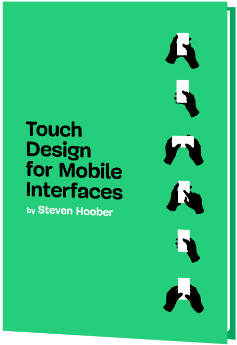
Touch Design for Mobile Interfaces
Learn how touchscreen devices really work — and how people really use them.
(as, cm)
What I Wish Someone Told Me When I Was Getting Into ARIA
What I Wish Someone Told Me When I Was Getting Into ARIA What I Wish Someone Told Me When I Was Getting Into ARIA Eric Bailey 2025-06-16T13:00:00+00:00 2025-06-25T15:04:30+00:00 If you haven’t encountered ARIA before, great! It’s a chance to learn something new and exciting. If […]
Accessibility
What I Wish Someone Told Me When I Was Getting Into ARIA
Eric Bailey 2025-06-16T13:00:00+00:00
2025-06-25T15:04:30+00:00
If you haven’t encountered ARIA before, great! It’s a chance to learn something new and exciting. If you have heard of ARIA before, this might help you better understand it or maybe even teach you something new!
These are all things I wish someone had told me when I was getting started on my web accessibility journey. This post will:
- Provide a mindset for how to approach ARIA as a concept,
- Debunk some common misconceptions, and
- Provide some guiding thoughts to help you better understand and work with it.
It is my hope that in doing so, this post will help make an oft-overlooked yet vital corner of web design and development easier to approach.
What This Post Is Not
This is not a recipe book for how to use ARIA to build accessible websites and web apps. It is also not a guide for how to remediate an inaccessible experience. A lot of accessibility work is highly contextual. I do not know the specific needs of your project or organization, so trying to give advice here could easily do more harm than good.
Instead, think of this post as a “know before you go” guide. I’m hoping to give you a good headspace to approach ARIA, as well as highlight things to watch out for when you undertake your journey. So, with that out of the way, let’s dive in!
So, What Is ARIA?
ARIA is what you turn to if there is not a native HTML element or attribute that is better suited for the job of communicating interactivity, purpose, and state.
Think of it like a spice that you sprinkle into your markup to enhance things.
Adding ARIA to your HTML markup is a way of providing additional information to a website or web app for screen readers and voice control software.
- Interactivity means the content can be activated or manipulated. An example of this is navigating to a link’s destination.
- Purpose means what something is used for. An example of this is a text input used to collect someone’s name.
- State means the current status content has been placed in and controlled by states, properties, and values. An example of this is an accordion panel that can either be expanded or collapsed.
Here is an illustration to help communicate what I mean by this:

- The presence of HTML’s
buttonelement will instruct assistive technology to report it as a button, letting someone know that it can be activated to perform a predefined action. - The presence of the text string “Mute” will be reported by assistive technology to clue the person into what the button is used for.
- The presence of
aria-pressed="true"means that someone or something has previously activated the button, and it is now in a “pushed in” state that sustains its action.
This overall pattern will let people who use assistive technology know:
- If something is interactive,
- What kind of interactive behavior it performs, and
- Its current state.
ARIA’s History
ARIA has been around for a long time, with the first version published on September 26th, 2006.

ARIA was created to provide a bridge between the limitations of HTML and the need for making interactive experiences understandable by assistive technology.
“
The latest version of ARIA is version 1.2, published on June 6th, 2023. Version 1.3 is slated to be released relatively soon, and you can read more about it in this excellent article by Craig Abbott.
You may also see it referred to as WAI-ARIA, where WAI stands for “Web Accessibility Initiative.” The WAI is part of the W3C, the organization that sets standards for the web. That said, most accessibility practitioners I know call it “ARIA” in written and verbal communication and leave out the “WAI-” part.
The Spirit Of ARIA Reflects The Era In Which It Was Created
The reason for this is simple: The web was a lot less mature in the past than it is now. The most popular operating system in 2006 was Windows XP. The iPhone didn’t exist yet; it was released a year later.
From a very high level, ARIA is a snapshot of the operating system interaction paradigms of this time period. This is because ARIA recreates them.

The Mindset
Smartphones with features like tappable, swipeable, and draggable surfaces were far less commonplace. Single Page Application “web app” experiences were also rare, with Ajax-based approaches being the most popular. This means that we have to build the experiences of today using the technology of 2006. In a way, this is a good thing. It forces us to take new and novel experiences and interrogate them.
Interactions that cannot be broken down into smaller, more focused pieces that map to ARIA patterns are most likely inaccessible. This is because they won’t be able to be operated by assistive technology or function on older or less popular devices.
I may be biased, but I also think these sorts of novel interactions that can’t translate also serve as a warning that a general audience will find them to be confusing and, therefore, unusable. This belief is important to consider given that the internet serves:
- An unknown number of people,
- Using an unknown number of devices,
- Each with an unknown amount of personal customizations,
- Who have their own unique needs and circumstances and
- Have unknown motivational factors.
Interaction Expectations
Contemporary expectations for keyboard-based interaction for web content — checkboxes, radios, modals, accordions, and so on — are sourced from Windows XP and its predecessor operating systems. These interaction models are carried forward as muscle memory for older people who use assistive technology. Younger people who rely on assistive technology also learn these de facto standards, thus continuing the cycle.
What does this mean for you? Someone using a keyboard to interact with your website or web app will most likely try these Windows OS-based keyboard shortcuts first. This means things like pressing:
- Enter to navigate to a link’s destination,
- Space to activate buttons,
- Home and End to jump to the start or end of a list of items, and so on.
It’s Also A Living Document
This is not to say that ARIA has stagnated. It is constantly being worked on with new additions, removals, and clarifications. Remember, it is now at version 1.2, with version 1.3 arriving soon.
In parallel, HTML as a language also reflects this evolution. Elements were originally created to support a document-oriented web and have been gradually evolving to support more dynamic, app-like experiences. The great bit here is that this is all conducted in the open and is something you can contribute to if you feel motivated to do so.
ARIA Has Rules For Using It
There are five rules included in ARIA’s documentation to help steer how you approach it:
- Use a native element whenever possible.
An example would be using an anchor element (<a>) for a link rather than adivwith a click handler and aroleoflink. - Don’t adjust a native element’s semantics if at all possible.
An example would be trying to use a heading element as a tab rather than wrapping the heading in a semantically neutraldiv. - Anything interactive has to be keyboard operable.
If you can’t use it with a keyboard, it isn’t accessible. Full stop. - Do not use
role="presentation"oraria-hidden="true"on a focusable element.
This makes something intended to be interactive unable to be used by assistive technology. - Interactive elements must be named.
An example of this is using the text string “Print” for abuttonelement.
Observing these five rules will do a lot to help you out. The following is more context to provide even more support.
ARIA Has A Taxonomy
There is a structured grammar to ARIA, and it is centered around roles, as well as states and properties.
Roles
A Role is what assistive technology reads and then announces. A lot of people refer to this in shorthand as semantics. HTML elements have implied roles, which is why an anchor element will be announced as a link by screen readers with no additional work.
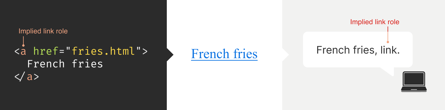

Implied roles are almost always better to use if the use case calls for them. Recall the first rule of ARIA here. This is usually what digital accessibility practitioners refer to when they say, “Just use semantic HTML.”
There are many reasons for favoring implied roles. The main consideration is better guarantees of support across an unknown number of operating systems, browsers, and assistive technology combinations.
Roles have categories, each with its own purpose. The Abstract role category is notable in that it is an organizing supercategory not intended to be used by authors:
Abstract roles are used for the ontology. Authors MUST NOT use abstract roles in content.
<!-- This won't work, don't do it -->
<h2 role="sectionhead">
  Anatomy and physiology
</h2>

<!-- Do this instead -->
<section aria-labeledby="anatomy-and-physiology">
  <h2 id="anatomy-and-physiology">
    Anatomy and physiology
  </h2>
</section>
Additionally, in the same way, you can only declare ARIA on certain things, you can only declare some ARIA as children of other ARIA declarations. An example of this is the the listitem role, which requires a role of list to be present on its parent element.
So, what’s the best way to determine if a role requires a parent declaration? The answer is to review the official definition.
States And Properties
States and properties are the other two main parts of ARIA‘s overall taxonomy.
Implicit roles are provided by semantic HTML, and explicit roles are provided by ARIA. Both describe what an element is. States describe that element’s characteristics in a way that assistive technology can understand. This is done via property declarations and their companion values.

ARIA states can change quickly or slowly, both as a result of human interaction as well as application state. When the state is changed as a result of human interaction, it is considered an “unmanaged state.” Here, a developer must supply the underlying JavaScript logic to control the interaction.
When the state changes as a result of the application (e.g., operating system, web browser, and so on), this is considered “managed state.” Here, the application automatically supplies the underlying logic.
How To Declare ARIA
Think of ARIA as an extension of HTML attributes, a suite of name/value pairs. Some values are predefined, while others are author-supplied:

For the examples in the previous graphic, the polite value for aria-live is one of the three predefined values (off, polite, and assertive). For aria-label, “Save” is a text string manually supplied by the author.
You declare ARIA on HTML elements the same way you declare other attributes:
<!--
  Applies an id value of
  "carrot" to the div
-->
<div id="carrot"></div>

<!--
  Hides the content of this paragraph
  element from assistive technology
-->
<p aria-hidden="true">
  Assistive technology can't read this
</p>

<!--
  Provides an accessible name of "Stop",
  and also communicates that the button
  is currently pressed. A type property
  with a value of "button" prevents
  browser form submission.
-->
<button
  aria-label="Stop"
  aria-pressed="true"
  type="button">
  <!-- SVG icon -->
</button>
Other usage notes:
- You can place more than one ARIA declaration on an HTML element.
- The order of placement of ARIA when declared on an HTML element does not matter.
- There is no limit to how many ARIA declarations can be placed on an element. Be aware that the more you add, the more complexity you introduce, and more complexity means a larger chance things may break or not function as expected.
- You can declare ARIA on an HTML element and also have other non-ARIA declarations, such as
classorid. The order of declarations does not matter here, either.
It might also be helpful to know that boolean attributes are treated a little differently in ARIA when compared to HTML. Hidde de Vries writes about this in his post, “Boolean attributes in HTML and ARIA: what’s the difference?”.
Not A Whole Lot Of ARIA Is “Hardcoded”
In this context, “hardcoding” means directly writing a static attribute or value declaration into your component, view, or page.
A lot of ARIA is designed to be applied or conditionally modified dynamically based on application state or as a response to someone’s action. An example of this is a show-and-hide disclosure pattern:
- ARIA’s
aria-expandedattribute is toggled fromfalsetotrueto communicate if the disclosure is in an expanded or collapsed state. - HTML’s
hiddenattribute is conditionally removed or added in tandem to show or hide the disclosure’s full content area.
<div class="disclosure-container">
  <button
    aria-expanded="false"
    class="disclosure-toggle"
    type="button">
    How we protect your personal information
  </button>
  <div
    hidden
    class="disclosure-content">
    <ul>
      <li>Fast, accurate, thorough and non-stop protection from cyber attacks</li>
      <li>Patching practices that address vulnerabilities that attackers try to exploit</li>
      <li>Data loss prevention practices help to ensure data doesn't fall into the wrong hands</li>
      <li>Supply risk management practices help ensure our suppliers adhere to our expectations</li>
    </ul>
    <p>
      <a href="/security/">Learn more about our security best practices</a>.
    </p>
  </div>
</div>
A common example of a hardcoded ARIA declaration you’ll encounter on the web is making an SVG icon inside a button decorative:
<button type="button>
  <svg aria-hidden="true">
    <!-- SVG code -->
  </svg>
  Save
</button>
Here, the string “Save” is what is required for someone to understand what the button will do when they activate it. The accompanying icon helps that understanding visually but is considered redundant and therefore decorative.
Declaring An Aria Role On Something That Already Uses That Role Implicitly Does Not Make It “Extra” Accessible
An implied role is all you need if you’re using semantic HTML. Explicitly declaring its role via ARIA does not confer any additional advantages.
<!--
  You don't need to declare role="button" here.
  Using the <button> element will make assistive
  technology announce it as a button. The
  role="button" declaration is redundant.
 -->
<button role="button">
  Save
</button>
You might occasionally run into these redundant declarations on HTML sectioning elements, such as <main role="main">, or <footer role="contentinfo">. This isn’t needed anymore, and you can just use the <main> or <footer> elements.
The reason for this is historic. These declarations were done for support reasons, in that it was a stop-gap technique for assistive technology that needed to be updated to support these new-at-the-time HTML elements.
Contemporary assistive technology does not need these redundant declarations. Think of it the same way that we don’t have to use vendor prefixes for the CSS border-radius property anymore.
Note: There is an exception to this guidance. There are circumstances where certain complex and complicated markup patterns don’t work as expected for assistive technology. In these cases, we want to hardcode the implicit role as explicit ARIA to ensure it works. This assistive technology support concern is covered in more detail later in this post.
You Don’t Need To Say What A Control Is; That Is What Roles Are For
Both implicit and explicit roles are announced by screen readers. You don’t need to include that part for things like the interactive element’s text string or an aria-label.
<!-- Don't do this -->
<button
  aria-label="Save button"
  type="button">
  <!-- Icon SVG -->
</button>

<!-- Do this instead -->
<button
  aria-label="Save"
  type="button">
  <!-- Icon SVG -->
</button>
Had we used the string value of “Save button” for our Save button, a screen reader would announce it along the lines of, “Save button, button.” That’s redundant and confusing.
ARIA Roles Have Very Specific Meanings
We sometimes refer to website and web app navigation colloquially as menus, especially if it’s an e-commerce-style mega menu.
In ARIA, menus mean something very specific. Don’t think of global or in-page navigation or the like. Think of menus in this context as what appears when you click the Edit menu button on your application’s menubar.

Using a role improperly because its name seems like an appropriate fit at first glance creates confusion for people who do not have the context of the visual UI. Their expectations will be set with the announcement of the role, then subverted when it does not act the way it is supposed to.
Imagine if you click on a link, and instead of taking you to another webpage, it sends something completely unrelated to your printer instead. It’s sort of like that.
Declaring role="menu" is a common example of a misapplied role, but there are others. The best way to know what a role is used for? Go straight to the source and read up on it.
Certain Roles Are Forbidden From Having Accessible Names
These roles are caption, code, deletion, emphasis, generic, insertion, paragraph, presentation, strong, subscript, and superscript.
This means you can try and provide an accessible name for one of these elements — say via aria-label — but it won’t work because it’s disallowed by the rules of ARIA’s grammar.
<!-- This won't work-->
<strong aria-label="A 35% discount!">
  $39.95
</strong>

<!-- Neither will this -->
<code title="let JavaScript example">
  let submitButton = document.querySelector('button[type="submit"]');
</code>
For these examples, recall that the role is implicit, sourced from the declared HTML element.
Note here that sometimes a browser will make an attempt regardless and overwrite the author-specified string value. This overriding is a confusing act for all involved, which led to the rule being established in the first place.
You Can’t Make Up ARIA And Expect It To Work
I’ve witnessed some developers guess-adding CSS classes, such as .background-red or .text-white, to their markup and being rewarded if the design visually updates correctly.
The reason this works is that someone previously added those classes to the project. With ARIA, the people who add the content we can use are the Accessible Rich Internet Applications Working Group. This means each new version of ARIA has a predefined set of properties and values. Assistive technology is then updated to parse those attributes and values, although this isn’t always a guarantee.
Declaring ARIA, which isn’t part of that predefined set, means assistive technology won’t know what it is and consequently won’t announce it.
<!--
  There is no "selectpanel" role in ARIA.
  Because of this, this code will be announced
  as a button and not as a select panel.
-->
<button
  role="selectpanel"
  type="button">
  Choose resources
</button>
ARIA Fails Silently
This speaks to the previous section, where ARIA won’t understand words spoken to it that exist outside its limited vocabulary.
There are no console errors for malformed ARIA. There’s also no alert dialog, beeping sound, or flashing light for your operating system, browser, or assistive technology. This fact is yet another reason why it is so important to test with actual assistive technology.
You don’t have to be an expert here, either. There is a good chance your code needs updating if you set something to announce as a specific state and assistive technology in its default configuration does not announce that state.
ARIA Only Exposes The Presence Of Something To Assistive Technology
Applying ARIA to something does not automatically “unlock” capabilities. It only sends a hint to assistive technology about how the interactive content should behave.
For assistive technology like screen readers, that hint could be for how to announce something. For assistive technology like refreshable Braille displays, it could be for how it raises and lowers its pins. For example, declaring role="button" on a div element does not automatically make it clickable. You will still need to:
- Target the
divelement in JavaScript, - Tie it to a click event,
- Author the interactive logic that it performs when clicked, and then
- Accommodate all the other expected behaviors.
This all makes me wonder why you can’t save yourself some work and use a button element in the first place, but that is a different story for a different day.
Additionally, adjusting an element’s role via ARIA does not modify the element’s native functionality. For example, you can declare role="image" on a div element. However, attempting to declare the alt or src attributes on the div won’t work. This is because alt and src are not supported attributes for div.

Declaring an ARIA Role On Something Will Override Its Semantics, But Not Its Behavior
This speaks to the previous section on ARIA only exposing something’s presence. Don’t forget that certain HTML elements have primary and secondary interactive capabilities built into them.
For example, an anchor element’s primary capability is navigating to whatever URL value is provided for its href attribute. Secondary capabilities for an anchor element include copying the URL value, opening it in a new tab or incognito window, and so on.

These secondary capabilities are still preserved. However, it may not be apparent to someone that they can use them — or use them in the way that they’d expect — depending on what is announced.
The opposite is also true. When an element has no capabilities, having its role adjusted does not grant it any new abilities. Remember, ARIA only announces. This is why that div with a role of button assigned to it won’t do anything when clicked if no companion JavaScript logic is also present.

You Will Need To Declare ARIA To Make Certain Interactions Accessible
A lot of the previous content may make it seem like ARIA is something you should avoid using altogether. This isn’t true. Know that this guidance is written to help steer you to situations where HTML does not offer the capability to describe an interaction out of the box. This space is where you want to use ARIA.
Knowing how to identify this area requires spending some time learning what HTML elements there are, as well as what they are and are not used for. I quite like HTML5 Doctor’s Element Index for upskilling on this.
Certain ARIA States Require Certain ARIA Roles To Be Present
This is analogous to how HTML has both global attributes and attributes that can only be used on a per-element basis. For example, aria-describedby can be used on any HTML element or role. However, aria-posinset can only be used with article, comment, listitem, menuitem, option, radio, row, and tab roles. Remember here that these roles can be provided by either HTML or ARIA.
Learning what states require which roles can be achieved by reading the official reference. Check for the “Used in Roles” portion of each entry’s characteristics:

aria-setsize. (Large preview)
Automated code scanners — like axe, WAVE, ARC Toolkit, Pa11y, equal-access, and so on — can catch this sort of thing if they are written in error. I’m a big fan of implementing these sorts of checks as part of a continuous integration strategy, as it makes it a code quality concern shared across the whole team.
ARIA Is More Than Web Browsers
Speaking of technology that listens, it is helpful to know that the ARIA you declare instructs the browser to speak to the operating system the browser is installed on. Assistive technology then listens to what the operating system reports. It then communicates that to the person using the computer, tablet, smartphone, and so on.

A person can then instruct assistive technology to request the operating system to take action on the web content displayed in the browser.

This interaction model is by design. It is done to make interaction from assistive technology indistinguishable from interaction performed without assistive technology.
There are a few reasons for this approach. The most important one is it helps preserve the privacy and autonomy of the people who rely on assistive technologies.
Just Because It Exists In The ARIA Spec Does Not Mean Assistive Technology Will Support It
This support issue was touched on earlier and is a difficult fact to come to terms with.
Contemporary developers enjoy the hard-fought, hard-won benefits of the web standards movement. This means you can declare HTML and know that it will work with every major browser out there. ARIA does not have this. Each assistive technology vendor has its own interpretation of the ARIA specification. Oftentimes, these interpretations are convergent. Sometimes, they’re not.
Assistive technology vendors also have support roadmaps for their products. Some assistive technology vendors:
- Will eventually add support,
- May never, and some
- Might do so in a way that contradicts how other vendors choose to implement things.
There is also the operating system layer to contend with, which I’ll cover in more detail in a little bit. Here, the mechanisms used to communicate with assistive technology are dusty, oft-neglected areas of software development.
With these layers comes a scenario where the assistive technology can support the ARIA declared, but the operating system itself cannot communicate the ARIA’s presence, or vice-versa. The reasons for this are varied but ultimately boil down to a historic lack of support, prioritization, and resources. However, I am optimistic that this is changing.
Additionally, there is no equivalent to Caniuse, Baseline, or Web Platform Status for assistive technology. The closest analog we have to support checking resources is a11ysupport.io, but know that it is the painstaking work of a single individual. Its content may not be up-to-date, as the work is both Herculean in its scale and Sisyphean in its scope. Because of this, I must re-stress the importance of manually testing with assistive technology to determine if the ARIA you use works as intended.
How To Determine ARIA Support
There are three main layers to determine if something is supported:
- Operating system and version.
- Assistive technology and version,
- Browser and browser version.
1. Operating System And Version
Each operating system (e.g., Windows, macOS, Linux) has its own way of communicating what content is present to assistive technology. Each piece of assistive technology has to accommodate how to parse that communication.
Some assistive technology is incompatible with certain operating systems. An example of this is not being able to use VoiceOver with Windows, or JAWS with macOS. Furthermore, each version of each operating system has slight variations in what is reported and how. Sometimes, the operating system needs to be updated to “teach” it the updated AIRA vocabulary. Also, do not forget that things like bugs and regressions can occur.
2. Assistive Technology And Version
There is no “one true way” to make assistive technology. Each one is built to address different access needs and wants and is done so in an opinionated way — think how different web browsers have different features and UI.
Each piece of assistive technology that consumes web content has its own way of communicating this information, and this is by design. It works with what the operating system reports, filtered through things like heuristics and preferences.

aria-label. (Large preview)
Like operating systems, assistive technology also has different versions with what each version is capable of supporting. They can also be susceptible to bugs and regressions.
Another two factors worth pointing out here are upgrade hesitancy and lack of financial resources. Some people who rely on assistive technology are hesitant to upgrade it. This is based on a very understandable fear of breaking an important mechanism they use to interact with the world. This, in turn, translates to scenarios like holding off on updates until absolutely necessary, as well as disabling auto-updating functionality altogether.
Lack of financial resources is sometimes referred to as the disability or crip tax. Employment rates tend to be lower for disabled populations, and with that comes less money to spend on acquiring new technology and updating it. This concern can and does apply to operating systems, browsers, and assistive technology.
3. Browser And Browser Version
Some assistive technology works better with one browser compared to another. This is due to the underlying mechanics of how the browser reports its content to assistive technology. Using Firefox with NVDA is an example of this.
Additionally, the support for this reporting sometimes only gets added for newer versions. Unfortunately, it also means support can sometimes accidentally regress, and people don’t notice before releasing the browser update — again, this is due to a historic lack of resources and prioritization.
The Less Commonly-Used The ARIA You Declare, The Greater The Chance You’ll Need To Test It
Common ARIA declarations you’ll come across include, but are not limited to:
aria-label,aria-labelledby,aria-describedby,aria-hidden,aria-live.
These are more common because they’re more supported. They are more supported because many of these declarations have been around for a while. Recall the previous section that discussed actual assistive technology support compared to what the ARIA specification supplies.
Newer, more esoteric ARIA, or historically deprioritized declarations, may not have that support yet or may never. An example of how complicated this can get is aria-controls.
aria-controls is a part of ARIA that has been around for a while. JAWS had support for aria-controls, but then removed it after user feedback. Meanwhile, every other screen reader I’m aware of never bothered to add support.
What does that mean for us? Determining support, or lack thereof, is best accomplished by manual testing with assistive technology.
The More ARIA You Add To Something, The Greater The Chance Something Will Behave Unexpectedly
This fact takes into consideration the complexities in preferences, different levels of support, bugs, regressions, and other concerns that come with ARIA’s usage.
Philosophically, it’s a lot like adding more interactive complexity to your website or web app via JavaScript. The larger the surface area your code covers, the bigger the chance something unintended happens.
Consider the amount of ARIA added to a component or discrete part of your experience. The more of it there is declared nested into the Document Object Model (DOM), the more it interacts with parent ARIA declarations. This is because assistive technology reads what the DOM exposes to help determine intent.
A lot of contemporary development efforts are isolated, feature-based work that focuses on one small portion of the overall experience. Because of this, they may not take this holistic nesting situation into account. This is another reason why — you guessed it — manual testing is so important.
Anecdotally, WebAIM’s annual Millions report — an accessibility evaluation of the top 1,000,000 websites — touches on this phenomenon:
Increased ARIA usage on pages was associated with higher detected errors. The more ARIA attributes that were present, the more detected accessibility errors could be expected. This does not necessarily mean that ARIA introduced these errors (these pages are more complex), but pages typically had significantly more errors when ARIA was present.
Assistive Technology May Support Your Invalid ARIA Declaration
There is a chance that ARIA, which is authored inaccurately, will actually function as intended with assistive technology. While I do not recommend betting on this fact to do your work, I do think it is worth mentioning when it comes to things like debugging.
This is due to the wide range of familiarity there is with people who author ARIA.
Some of the more mature assistive technology vendors try to accommodate the lower end of this familiarity. This is done in order to better enable the people who use their software to actually get what they need.
There isn’t an exhaustive list of what accommodations each piece of assistive technology has. Think of it like the forgiving nature of a browser’s HTML parser, where the ultimate goal is to render content for humans.
aria-label Is Tricky
aria-label is one of the most common ARIA declarations you’ll run across. It’s also one of the most misused.
aria-label can’t be applied to non-interactive HTML elements, but oftentimes is. It can’t always be translated and is oftentimes overlooked for localization efforts. Additionally, it can make things frustrating to operate for people who use voice control software, where the visible label differs from what the underlying code uses.
Another problem is when it overrides an interactive element’s pre-existing accessible name. For example:
<!-- Don't do this -->
<a
  aria-label="Our services"
  href="/services/">
  Services
</a>
This is a violation of WCAG Success Criterion 2.5.3: Label in Name, pure and simple. I have also seen it used as a way to provide a control hint. This is also a WCAG failure, in addition to being an antipattern:
<!-- Also don't do this -->
<a
  aria-label="Click this link to learn more about our unique and valuable services"
  href="/services/">
  Services
</a>
These factors — along with other considerations — are why I consider aria-label a code smell.
aria-live Is Even Trickier
Live region announcements are powered by aria-live and are an important part of communicating updates to an experience to people who use screen readers.
Believe me when I say that getting aria-live to work properly is tricky, even under the best of scenarios. I won’t belabor the specifics here. Instead, I’ll point you to “Why are my live regions not working?”, a fantastic and comprehensive article published by TetraLogical.
The ARIA Authoring Practices Guide Can Lead You Astray
Also referred to as the APG, the ARIA Authoring Practices Guide should be treated with a decent amount of caution.

The Downsides
The guide was originally authored to help demonstrate ARIA’s capabilities. As a result, its code examples near-exclusively, overwhelmingly, and disproportionately favor ARIA.
Unfortunately, the APG’s latest redesign also makes it far more approachable-looking than its surrounding W3C documentation. This is coupled with demonstrating UI patterns in a way that signals it’s a self-serve resource whose code can be used out of the box.
These factors create a scenario where people assume everything can be used as presented. This is not true.
Recall that just because ARIA is listed in the spec does not necessarily guarantee it is supported. Adrian Roselli writes about this in detail in his post, “No, APG’s Support Charts Are Not ‘Can I Use’ for ARIA”.
Also, remember the first rule of ARIA and know that an ARIA-first approach is counter to the specification’s core philosophy of use.
In my experience, this has led to developers assuming they can copy-paste code examples or reference how it’s structured in their own efforts, and everything will just work. This leads to mass frustration:
- Digital accessibility practitioners have to explain that “doing the right thing” isn’t going to work as intended.
- Developers then have to revisit their work to update it.
- Most importantly, people who rely on assistive technology risk not being able to use something.
This is to say nothing about things like timelines and resourcing, working relationships, reputation, and brand perception.
The Upside
The APG’s main strength is highlighting what keyboard keypresses people will expect to work on each pattern.
Consider the listbox pattern. It details keypresses you may expect (arrow keys, Space, and Enter), as well as less-common ones (typeahead selection and making multiple selections). Here, we need to remember that ARIA is based on the Windows XP era. The keyboard-based interaction the APG suggests is built from the muscle memory established from the UI patterns used on this operating system.
While your tree view component may look visually different from the one on your operating system, people will expect it to be keyboard operable in the same way. Honoring this expectation will go a long way to ensuring your experiences are not only accessible but also intuitive and efficient to use.
Another strength of the APG is giving standardized, centralized names to UI patterns. Is it a dropdown? A listbox? A combobox? A select menu? Something else?
When it comes to digital accessibility, these terms all have specific meanings, as well as expectations that come with them. Having a common vocabulary when discussing how an experience should work goes a long way to ensuring everyone will be on the same page when it comes time to make and maintain things.
macOS VoiceOver Can Also Lead You Astray
VoiceOver on macOS has been experiencing a lot of problems over the last few years. If I could wager a guess as to why this is, as an outsider, it is that Apple’s priorities are focused elsewhere.
The bulk of web development efforts are conducted on macOS. This means that well-intentioned developers will reach for VoiceOver, as it comes bundled with macOS and is therefore more convenient. However, macOS VoiceOver usage has a drastic minority share for desktops and laptops. It is under 10% of usage, with Windows-based JAWS and NVDA occupying a combined 78.2% majority share:

The Problem
The sad, sorry truth of the matter is that macOS VoiceOver, in its current state, has a lot of problems. It should only be used to confirm that it can operate the experience the way Windows-based screen readers can.
This means testing on Windows with NVDA or JAWS will create an experience that is far more accurate to what most people who use screen readers on a laptop or desktop will experience.
Dealing With The Problem
Because of this situation, I heavily encourage a workflow that involves:
- Creating an experience’s underlying markup,
- Testing it with NVDA or JAWS to set up baseline expectations,
- Testing it with macOS VoiceOver to identify what doesn’t work as expected.
Most of the time, I find myself having to declare redundant ARIA on the semantic HTML I write in order to address missed expected announcements for macOS VoiceOver.
macOS VoiceOver testing is still important to do, as it is not the fault of the person who uses macOS VoiceOver to get what they need, and we should ensure they can still have access.
You can use apps like VirtualBox and Windows evaluation Virtual Machines to use Windows in your macOS development environment. Services like AssistivLabs also make on-demand, preconfigured testing easy.
What About iOS VoiceOver?
Despite sharing the same name, VoiceOver on iOS is a completely different animal. As software, it is separate from its desktop equivalent and also enjoys a whopping 70.6% usage share.
With this knowledge, know that it’s also important to test the ARIA you write on mobile to make sure it works as intended.
You Can Style ARIA
ARIA attributes can be targeted via CSS the way other HTML attributes can. Consider this HTML markup for the main navigation portion of a small e-commerce site:
<nav aria-label="Main">
  <ul>
    <li>
      <a href="/home/">Home</a>
      <a href="/products/">Products</a>
      <a aria-current="true" href="/about-us/">About Us</a>
      <a href="/contact/">Contact</a>
    </li>
  </ul>
</nav>
The presence of aria-current="true" on the “About Us” link will tell assistive technology to announce that it is the current part of the site someone is on if they are navigating through the main site navigation.
We can also tie that indicator of being the current part of the site into something that is shown visually. Here’s how you can target the attribute in CSS:
nav[aria-label="Main"] [aria-current="true"] {
  border-bottom: 2px solid #ffffff;
}
This is an incredibly powerful way to tie application state to user-facing state. Combine it with modern CSS like :has() and view transitions and you have the ability to create robust, sophisticated UI with less reliance on JavaScript.
You Can Also Use ARIA When Writing UI Tests
Tests are great. They help guarantee that the code you work on will continue to do what you intended it to do.
A lot of web UI-based testing will use the presence of classes (e.g., .is-expanded) or data attributes (ex, data-expanded) to verify a UI’s existence, position and states. These types of selectors also have a far greater likelihood to be changed as time goes on when compared to semantic code and ARIA declarations.
This is something my coworker Cam McHenry touches on in his great post, “How I write accessible Playwright tests”. Consider this piece of Playwright code, which checks for the presence of a button that toggles open an edit menu:
// Selects an element with a role of `button`
// that has an accessible name of "Edit"
const editMenuButton = await page.getByRole('button', { name: "Edit" });

// Requires the edit button to have a property
// of `aria-haspopup` with a value of `true`
expect(editMenuButton).toHaveAttribute('aria-haspopup', 'true');
The test selects UI based on outcome rather than appearance. That’s a far more reliable way to target things in the long-term.
This all helps to create a virtuous feedback cycle. It enshrines semantic HTML and ARIA’s presence in your front-end UI code, which helps to guarantee accessible experiences don’t regress. Combining this with styling, you have a powerful, self-contained system for building robust, accessible experiences.
ARIA Is Ultimately About Caring About People
Web accessibility can be about enabling important things like scheduling medical appointments. It is also about fun things like chatting with your friends. It’s also used for every web experience that lives in between.
Using semantic HTML — supplemented with a judicious application of ARIA — helps you enable these experiences. To sum things up, ARIA:
- Has been around for a long time, and its spirit reflects the era in which it was first created;
- Has a governing taxonomy, vocabulary, and rules for use and is declared in the same way HTML attributes are;
- Is mostly used for dynamically updating things, controlled via JavaScript;
- Has highly specific use cases in mind for each of its roles;
- Fails silently if mis-authored;
- Only exposes the presence of something to assistive technology and does not confer interactivity;
- Requires input from the web browser, but also the operating system, in order for assistive technology to use it;
- Has a range of actual support, complicated by the more of it you use;
- Has some things to watch out for, namely
aria-label, the ARIA Authoring Practices Guide, and macOS VoiceOver support; - Can also be used for things like visual styling and writing resilient tests;
- Is best evaluated by using actual assistive technology.
Viewed one way, ARIA is arcane, full of misconceptions, and fraught with potential missteps. Viewed another, ARIA is a beautiful and elegant way to programmatically communicate the interactivity and state of a user interface.
I choose the second view. At the end of the day, using ARIA helps to ensure that disabled people can use a web experience the same way everyone else can.
Thank you to Adrian Roselli and Jan Maarten for their feedback.
Further Reading
- “What the Heck is ARIA? A Beginner’s Guide to ARIA for Accessibility,” Kat Shaw
- “Accessibility APIs: A Key To Web Accessibility,” Léonie Watson & Chaals McCathie Nevile
- “Semantics to Screen Readers,” Melanie Richards
- “What ARIA does not do,” Steve Faulkner
- “What ARIA still does not do,” stevef
- “APG support tables — why they matter,” Michael Fairchild
- “ARIA vs HTML,” Adrian Roselli
(gg, yk)