


Persuasive Design: Ten Years Later
Many product teams still lean on usability improvements and isolated behavioral tweaks to address weak activation, drop-offs, and low retention – only to see results plateau or slip into shallow gam
Ux
Human Strategy In An AI-Accelerated Workflow
UX design is entering a new phase, with designers shifting from makers of outputs to directors of intent. AI can now generate wireframes, prototypes, and even design systems in minutes, but UX has nev
Ux
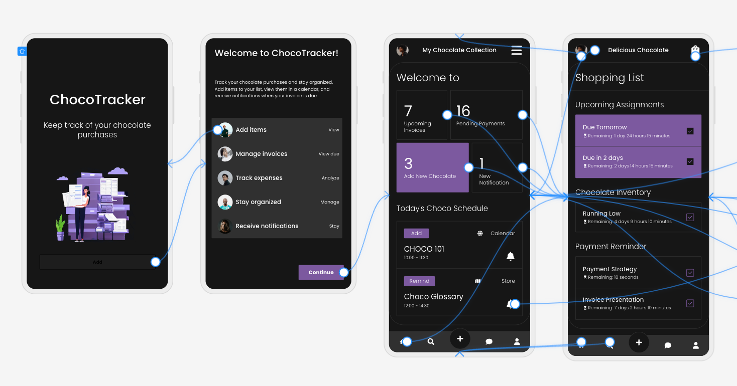
Now Shipping: Accessible UX Research, A New Smashing Book By Michele Williams
Our newest Smashing Book, “Accessible UX Research” by Michele Williams, is finally shipping worldwide — and we couldn’t be happier! This book is about research, but you’ll also learn about a
Accessibility

Persuasive Design: Ten Years Later
Many product teams still lean on usability improvements and isolated behavioral tweaks to address weak activation, drop-offs, and low retention – only to see results plateau or slip into shallow gam
Ux
Persuasive Design: Ten Years Later
Anders Toxboe
Ten years ago, persuasive design was a relatively new frontier in the field of UX. In a 2015 Smashing article, I was among those who showed a way for practitioners to move from being primarily focused on improving usability and removing friction to also guide users toward a desired outcome. The premise was simple: by leveraging psychology, we could influence user behavior and drive outcomes like higher sign-ups, faster and richer onboarding, and stronger retention and engagement.
A decade later, that promise has proven true — but not in the same way many of us expected. Most product teams still face familiar problems: high bounce rates, weak activation, and users dropping off before experiencing core value. Usability improvements help, but they don’t always address the behavioral gap that sits underneath these patterns.
Persuasive design didn’t disappear — it matured.
Today, the more useful version of this work is often called behavioral design: a way to align product experiences with the real drivers of human behavior, with an ethical mindset. Done well, it can improve conversion, onboarding completion, engagement, and long-term use without slipping into manipulation.
Here’s what I’ll cover:
- What has held up from the last decade of persuasive design;
- What didn’t hold up, especially the limits of pattern-first gamification;
- What changed in how we model behavior, from triggers to context and systems;
- How to use modern behavioral frameworks to improve both discovery and ideation;
- A practical way to run this work as a team, using a five-exercise workshop sequence, you can adapt to your product.
The goal is not to add more tactics to your toolkit. It’s to help you build a repeatable, shared approach to diagnosing behavioral barriers and designing solutions that support both users’ goals and business outcomes.
Is Persuasion The Same As Deception?
Behavioral Design is not about slapping deceptive patterns or superficial “growth hacks” onto your UI. It’s about understanding what truly enables or hinders your users on their way to achieving their goal and then designing experiences that guide them to success.
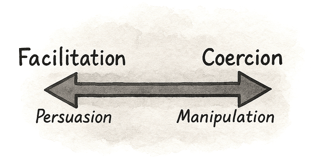
Behavioral design is more about bridging the gap between what users want (achieving their goals, feeling value) and what businesses need (activation, retention, revenue), creating win-win outcomes where good UX and good business results align.
But like with all powerful tools, they can be used both for good and bad. The difference lies in the intention of the designer. Some designers argue for not promoting behavioral or persuasive design, while others argue that we need to understand the tools to learn how to use them well and how we can easily, and often mindlessly, fall into the trap of promoting an unethical lens.
If we are not enlightened, then how can we judge what represents good and bad practice? If we do not understand how psychology works, then we lack the awareness needed to spot our biases. If we don’t understand these tools, we can’t spot when they’re misused.
The difference between persuasion and deception is intention, plus accountability.
A Decade Later, What Have We learned?
In the early 2010s, many teams treated persuasive design as almost synonymous with gamification. If you added points, badges, and leaderboards, you were doing psychology. And to be fair, those surface mechanics did work in some cases, at least in the short term. They could nudge people through onboarding flows or encourage a few extra logins. But over the decade, their limits became clear. Once the novelty wore off, many of these systems felt shallow. Users learned to ignore streaks that did not connect to anything meaningful or dropped out when they realized the game layer was not helping them reach a real goal.
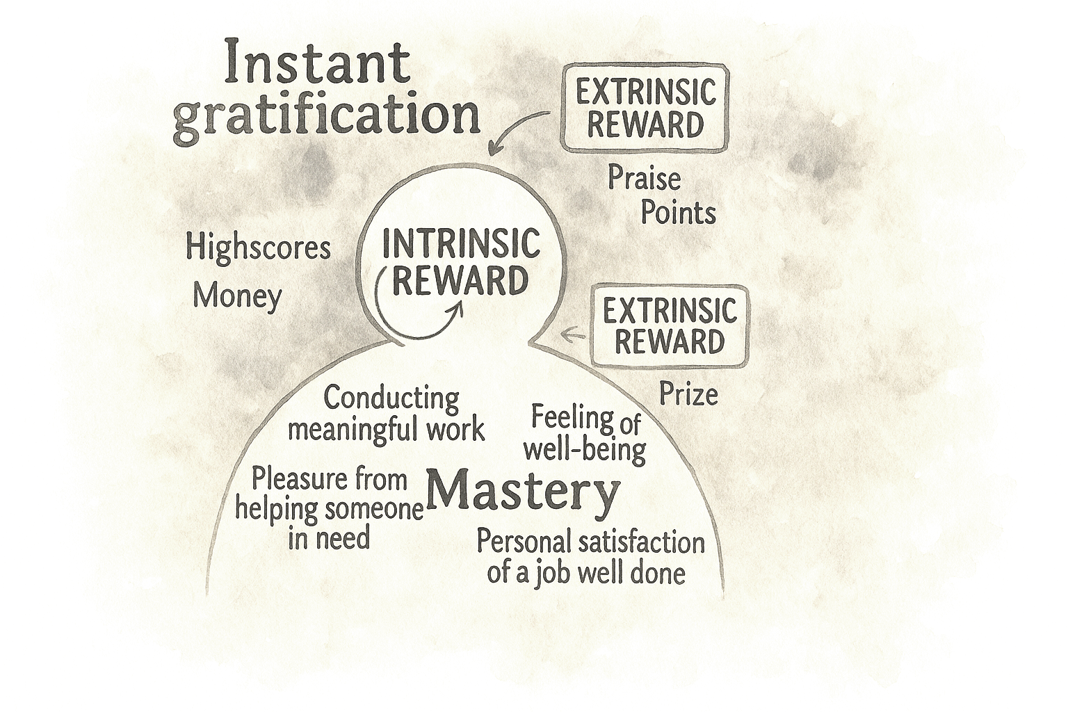
This is where self-determination theory has quietly reshaped how serious teams think about motivation. It distinguishes between extrinsic motivators, such as rewards, points, and status, and intrinsic drivers like autonomy, competence, and relatedness. Put simply, if your “gamification” fights against what people actually care about, it will eventually fail. The interventions that have survived are the ones that support intrinsic needs. A language learning streak that makes you feel more capable and shows progress can work because it makes the core activity feel more meaningful and manageable. A badge that only exists to move a dashboard number, on the other hand, quickly becomes noise.
Lesson 1: From Quick Fixes To Behavioral Strategy
One key lesson from the past decade is that behavioral design creates the most value when it moves beyond isolated fixes and becomes a deliberate strategy. Many product teams start with a narrow goal: improve a sign-up rate, reduce drop-off, or boost early retention. When standard UX optimizations plateau, they turn to psychology for a quick lift, often with success.
The biggest opportunity is not one more uplift on a stubborn metric, but having a systematic way to understand and shape behavior across the product.
Behavioral design isn’t about hacks.
It’s about helping people succeed.
Common signals are easy to recognize: people sign up but never finish onboarding; they click around once and never return; key features sit unused. A behavioral strategy doesn’t just ask “What can we change on this screen?” It asks what is happening in the user’s mind and context at those moments.
That might lead you to design an onboarding experience that uses curiosity and the goal-gradient effect to guide people to a clear first win, instead of hoping they read a help doc. Or it might lead you to design for exploration and commitment over time: social proof where it actually matters, appropriate challenges that stretch but don’t overwhelm, progressive disclosure so advanced features show up when people are ready, and the right triggers at the most opportune moment instead of random nags.
Great products aren’t just easy to use.
They’re easier to commit to.
Product psychology has shifted from scattered hypotheses to a growing library of repeatable patterns. Those patterns only shine when they sit inside a coherent behavioral model: what users are trying to achieve, what blocks them, and which levers the team will pull at each stage.
Simple nudges, inspired by Thaler and Sunstein, have helped popularize behavioral thinking in design. But we’ve also learned that nudges alone rarely solve deeper behavioral challenges. A behavioral strategy goes further: it blends tactics, grounds them in real motivations, and ties experiments to a clear theory of change. The goal is not a one-off win on today’s dashboard, but a way of working that compounds over time.
Lesson 2: Game Mechanics Alone Are Not Enough
Game mechanics alone are no longer a credible behavioral strategy. Ten years ago, adding points, badges, and leaderboards was almost shorthand for “we’re doing psychology.” Today, most teams have learned the hard way that this is decoration unless it serves a real need.
A behavioral approach starts with a blunt question: What is the game layer in service of, and for whom? Does it help people make progress that matters to them, or does it just keep a dashboard happy? If it ignores intrinsic motivation, it will look clever in a slide deck and brittle in production.
In practice, that means points and streaks are not treated as automatic upgrades anymore. Teams ask whether a mechanic helps users feel more competent, more in control, or more connected to others. A streak only makes sense if it reflects real progress in a skill the user cares about. A leaderboard only adds value if people actually want to compare themselves and if the ranking helps them decide what to do next. If it does not pass those tests, it is clutter, not a motivational engine.
Streaks and badges only work when they support something users truly value.
The most effective products now start with the intrinsic side. They are clear about what the product helps users become or achieve, and only then ask whether a game mechanic can amplify that journey. When game elements are added, they live in the core loop rather than on top of it. They show mastery, mark meaningful milestones, and reinforce self-driven goals. That is the difference between treating gamification as a paint job and using it to support users on a path they already care about.
Lesson 3: From Cause And Effect To Holistic Systems Thinking
Early persuasive design often assumed a simple logic: find the broken step, add the right lever, and users move forward. Nice on a slide, rarely true in reality.
People don’t act for a single reason. They have context, history, competing goals, mood, time pressure, trust issues, and different definitions of success. Two users can take the same step for completely different reasons. The same user can behave differently on a different day.
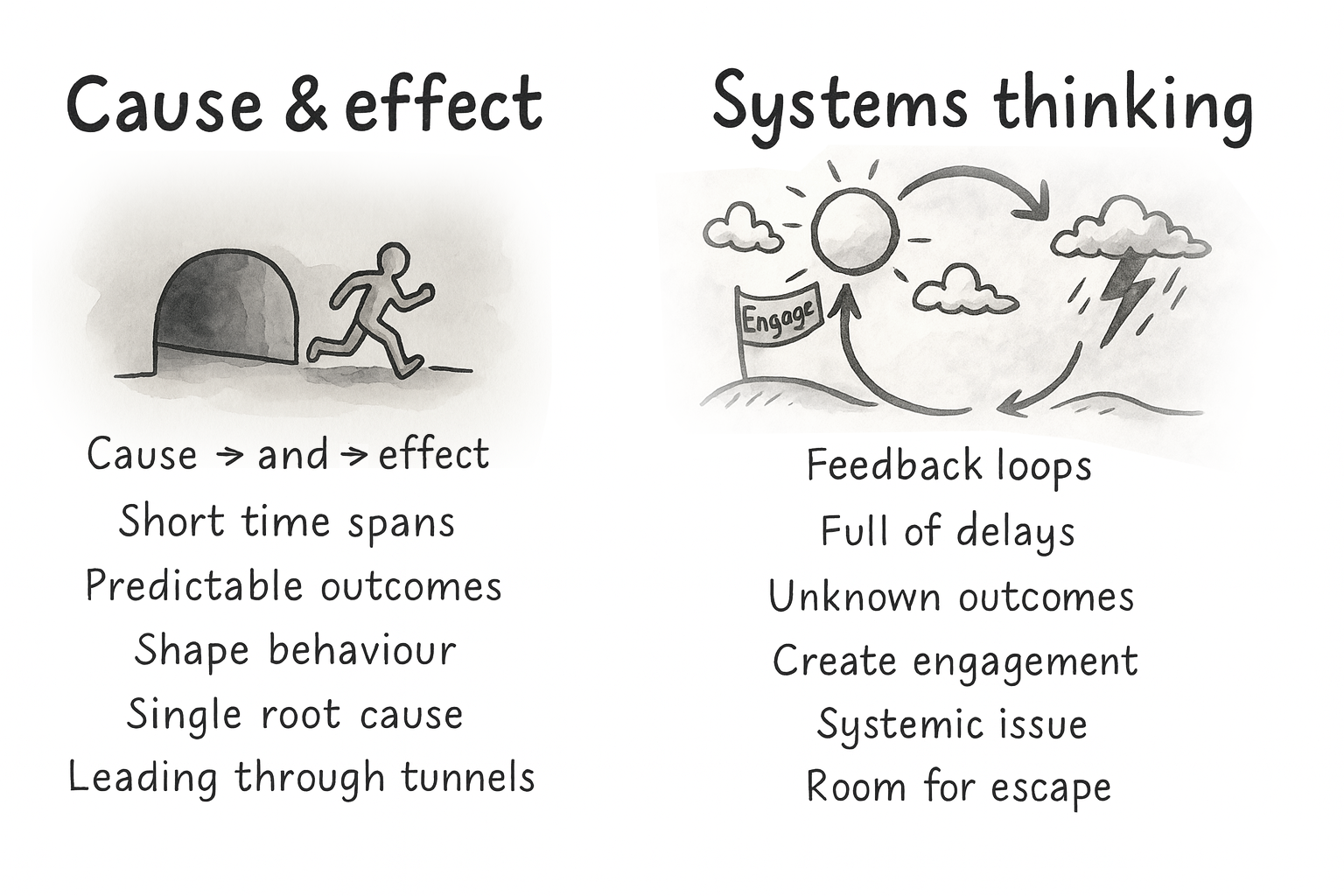
That’s why systems thinking matters. Behavior is shaped by feedback loops and delays, not just one trigger. Outcomes we care about, trust, competence, and habit, are built over time. A change that boosts this week’s conversion can still weaken next month’s retention.
If you have ever shipped a “conversion win” and then watched support tickets, refunds, or churn go up, you have felt this. The local metric improved. The system got worse.
Your design structures either enable people or box them in. Defaults, navigation, feedback, pacing, rewards — each of these decisions reshapes the system and therefore the journeys people take through it.
So the job is not to perfect a single funnel. It is to build an environment where multiple valid paths can succeed, and where the system supports long-term goals, not just short-term clicks.
The job isn’t to perfect one funnel, but to support multiple valid paths.
A mature behavioral strategy is explicit about that. It is designed for several paths instead of one “happy flow,” supports autonomy instead of forcing compliance, and looks at downstream effects instead of only first-step conversion.
Lesson 4: From Triggers To Context
The same shift has happened in the frameworks we use. A decade ago, the Fogg Behavior Model (FBM) was everywhere. It gave teams a simple trio: motivation, ability, trigger — and a clear message: shouting louder with prompts does not fix low motivation or poor ability. That alone was a useful upgrade.
Fogg’s own work has moved on, too. With Tiny Habits, the focus leans more on identity, emotion, and making behaviors feel easy and personally meaningful. That mirrors a broader shift in the field: away from “fire more prompts” and toward designing environments where the right behavior feels natural.
Teams eventually ran into the same wall: prompts do not fix low capability or missing opportunity. You cannot nag people into skills they do not have or into contexts that do not exist. That is where many teams that work deeply with behavior change have gravitated toward COM-B as a more complete foundation.
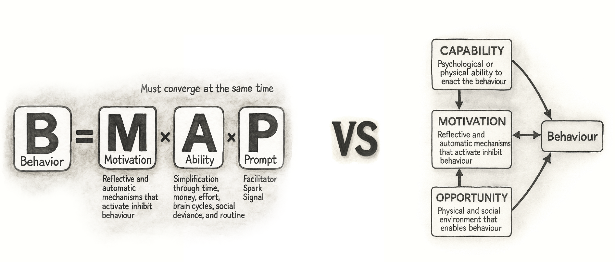
COM-B breaks behavior into capability, opportunity, and motivation. It starts with a blunt check: can people actually do this, and does their environment let them? That maps well to modern products, where behavior happens across devices, channels, and moments, not on a single screen. It also plugs into broader behavior change work in health and public policy, so we do not have to reinvent everything inside UX.
Thinking this way nudges teams away from simple cause-and-effect stories. A drop in completion rate is no longer “the button is bad” or “we need more reminders,” but a question about how skills, context, and motivation interact. A capability issue might need a better interface and better education. An opportunity issue might be about device access, timing, or social surroundings, not layout. Motivation might be shaped as much by pricing and brand trust as by any in-product message.
Modern behavioral design is less about activating clicks and more about shaping conditions where action feels easy and meaningful.
This broader lens also makes cross-functional work simpler. Product, design, marketing, and data can share one behavior model and still see their own responsibilities in it. Designers shape perceived capability and opportunity in the interface, marketing shapes motivational framing and triggers, and operations shape the structural opportunity in the service. Instead of everyone pushing their own levers in isolation, COM-B helps teams see that they are working on different parts of the same system.
Lesson 5: Psychology Can Also Be Used To Design And Decode Discovery
COM-B is often used as a bridge between discovery and ideation. On the discovery side, it gives structure to research. You can use it to design interview guides, read analytics, and make sense of observational studies. It was built to diagnose what needs to change for a behavior to shift, which maps neatly onto early product discovery.
Good discovery doesn’t just ask what users say, but examines what their behavior reveals.
Instead of asking “Why did you stop using the product?” and writing down the first answer, you deliberately walk through capability, opportunity, and motivation. You ask things like:
- Can users actually do this, given their skills and knowledge?
- Does their context help or hinder them in practice?
- How strong is their motivation compared with other demands on their time and money?
You walk through recent experiences in detail: which device they used, what time of day it was, who else was around, and what else they were juggling. You talk about how important this behavior is compared with everything else in their life and what trade-offs they make. To participants, these questions feel natural. Under the hood, you are systematically covering all three parts of COM-B, in line with how behavior change practitioners use the model in qualitative work.
You can look at behavioral data in the same way. Funnel drop-offs, time on task, and click patterns are clues: are people stuck because they cannot progress, because the environment gets in the way, or because they do not care enough to continue? Modern analytics tools make it easier to watch what people actually do rather than only what they report, and combining quantitative and qualitative data gives you a fuller picture than either alone.
When there is a gap between what people say and what they do, you treat it as a signal rather than an irritation. Someone might say that saving for retirement is very important, but never set up a recurring transfer. A user might claim that onboarding was simple, while their session shows repeated back and forth between steps. Those mismatches are often where biases, habits, and emotional barriers live. By labelling them in terms of capability, opportunity, and motivation, and linking them to specific barriers like risk aversion, analysis paralysis, status quo bias or present bias, you move from vague “insights” to a structured map of what is actually in the way.
The gap between what people say and what they do is not noise — it’s the map.
The output of this kind of discovery is not just personas and journeys. You also get a clear statement of the current behavior, the target behavior, and the behavioral barriers and enablers that sit between them.
Lesson 6: Use Behavioral Discovery In Your Ideation
The bridge from discovery to ideation can be a single sentence template:
From current behavior to target behavior, by doing X, because of barrier Y.
This “from–to–by–why” framing forces teams to say what they actually believe. You are not just saying “add a checklist.” You are saying: “We believe a checklist will help new users feel more capable, which will increase the chance they complete setup in their first session.” Now it is a behavioral hypothesis you can test with experiments, not just a design idea you hope for.
From there, you can generate several variants that express the same principle in different ways and design experiments around them. You might try a few messages that all lean on loss aversion, or several ways of simplifying a high-friction step, or different forms of social proof that vary in tone and proximity.
The important shift is that you are no longer throwing ideas at the wall. You are deliberately targeting the capability, opportunity, or motivation issues that discovery surfaced, and testing which levers actually work in your context.
Every idea should answer one question: which barrier are we trying to change?
Over time, this loop between behavioral discovery and ideation turns into a local playbook. You learn that in your product, some principles reliably help your users and others fall flat. You also learn that patterns from glowing case studies do not automatically transfer. Even gamification and behavior change research often emphasize context-specific, user-centred implementations rather than generic recipes.
This dual use of psychology in discovery and ideation is one of the bigger shifts of the past decade. A product trio can look at a stubborn drop-off point and ask, together, “Is this a capability, opportunity, or motivation issue?” Then they generate ideas that target that part of the system instead of guessing. That shared language makes behavioral design less of a specialist add-on and more of a normal way for cross-functional teams to reason about their work.
A Decade Later: What Has Proven To Work In Practice
If the first decade of persuasive design taught us anything, it is that behavioral insight is cheap until a team can act on it together.
Methods matter.
Over time, a small set of workshop formats has consistently helped product teams uncover behavioral barriers, align on opportunities, and generate solutions grounded in real psychology instead of surface patterns. As behavioral design has grown from tactical nudges into a strategic discipline, an obvious question keeps coming up: How do teams actually do this work together in practice?
How do product managers, designers, researchers, and engineers move from scattered observations (“people seem confused here”) to a shared behavioral diagnosis, and then to targeted ideas that reflect the real drivers of capability, opportunity, and motivation?
One effective way to make this concrete is through a workshop format. The aim is to help teams:
- Interpret research through a behavioral lens,
- Surface capability, opportunity, and motivation gaps,
- Prioritize high-potential opportunities, and
- Generate ideas that are both psychologically sound and ethically considered.
Real product work is messy and full of feedback loops; nobody follows a perfect step-by-step checklist. But for learning, and especially for introducing behavioral design into a team for the first time, a structured sequence of exercises gives people a mental model. It shows the journey from early discovery to behavioral clarity, from opportunities to ideas, and finally to interventions that have been stress-tested through an ethical lens.
The exercises below are one such recipe. The order is intentional: each step builds on the previous one to move from empathy and insight to prioritized opportunities, concrete concepts, and responsible solutions. No team will follow it letter-perfect every time, but it reflects how behavioral design work tends to unfold when it goes well.
Before diving into the details, here is the full recipe and how each exercise contributes to the bigger behavioral design process:
- Behavioral Empathy Mapping
Builds a shared understanding of the user’s psychological landscape: emotions, habits, misconceptions, and sources of friction. - Behavioral Journey Mapping
Maps the user’s flow over time, and overlays behavioral enablers and obstacles. - Behavior Scoring
Prioritizes which behavioral opportunities to tackle first based on impact, feasibility, and evidence. - Ideas First, Patterns Later
Encourages context-first ideation, then uses persuasive patterns to refine and strengthen promising concepts. - Dark Reality
Evaluates ethical risks, unintended consequences, and potential misuse.
A note on timing: In practice, this sequence can be run in different formats depending on constraints. For a compact format, teams often run Exercises 1–3 in a half-day workshop, and Exercises 4–5 in a second half-day session. With more time, the work can be spread across a full week: discovery synthesis early in the week, prioritization mid-week, and ideation plus ethical review toward the end. The structure matters more than the schedule; the goal is to preserve the progression from understanding → prioritization → ideation → reflection.
Below is a brief walkthrough of each exercise as I typically facilitate them in workshops in tandem with a library of persuasive patterns.
Exercise 1: Behavioral Empathy Mapping
The first step is building a shared, psychologically informed understanding of users. Behavioral Empathy Mapping extends traditional empathy mapping by paying attention to what users attempt, avoid, postpone, misunderstand, or feel uncertain about. These subtle behavioral signals often reveal more than stated needs or pain points.
Goal: Understand what drives or blocks the target behavior by capturing what users think, feel, say, and do — and spotting behavioral barriers and enablers.
Steps:
- On a whiteboard or large paper, draw an empathy map: Thinking & Feeling, Seeing, Saying & Doing, and Hearing.
- Add research insights by letting everyone silently add sticky notes from interviews, data, support logs, or observations into the quadrants. One insight per note.
- Identify barriers and enablers.
Cluster notes that make the behavior harder (barriers) or easier (enablers).
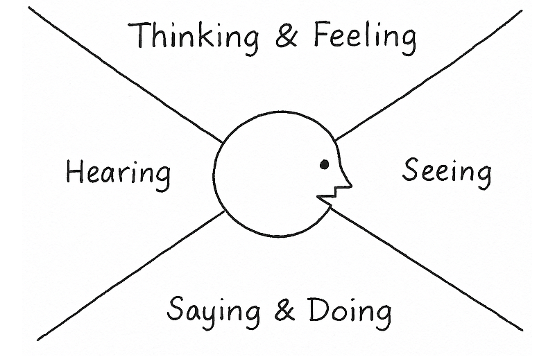
Output: A focused map of the psychological and contextual forces shaping the target behavior, ready to feed into Behavioral Journey Mapping.
Exercise 2: Behavioral Journey Mapping
Once you understand the user’s mindset and context, the next step is to map how those forces play out across time. Behavioral Journey Mapping overlays the user’s goals, actions, emotions, and environment onto the product journey, highlighting the specific moments where behavior tends to stall or shift.
Unlike traditional journey maps, the behavioral version focuses on where capability breaks down, where the environment works against the user, and where motivation fades or conflicts arise. These become early signals of where change is both needed and possible.
The output shows the team precisely where the product is asking too much, where users lack support, or where additional motivation or clarity might be required.
Goal: Map the steps from the user’s starting point to the target behavior, and capture the key enablers and barriers along the way.
Steps:
- Draw a horizontal line from A (starting point) to B (target behavior).
- Have everyone write the steps a user takes from A to B on sticky notes (one per note). Include actions inside and outside the product.
- Place the notes in order along the line. Merge duplicates and align on a shared sequence.
- Extend the vertical axis with two rows:
- Enablers (what could help users move forward),
- Barriers (what could slow or stop users).
- Look for steps with many barriers or few enablers. These are behavioral hot spots.
- Highlight the steps where a good nudge could meaningfully help users complete the journey.
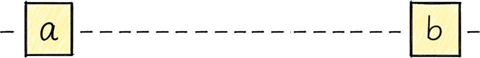

Output: A clear, behavior-focused journey showing where users struggle, why, and which moments offer the most leverage for change.
Exercise 3: Behavior Scoring
With a clearer picture of the user journey and what moments could benefit from a behaviorally helpful hand, you are now ready to identify the behavior it makes most sense to focus on trying to influence.
Goal: Decide which potential target behaviors are worth focusing on first, based on impact, ease of change, and ease of measurement.
Steps:
- List potential target behaviors. Based on the output of the Behavioral Journey Mapping, list behaviors that could potentially be targeted. One behavior per sticky note. Be as concrete as possible (what users do, where, and when).
- Create a table with the following columns:
- Impact of behavior change (how much it could move the goal),
- Ease of change (how realistic it is to influence),
- Ease of measurement (how straightforward it is to track).
- Enter each listed behavior into the table and score them from 0 to 10 in each column.
- Sort behaviors by total score and discuss the highest-scoring ones:
- Do they make sense given what you know about users and constraints?
- Select the primary target behaviors you want to carry into the next exercises.
Optionally, note “bonus behaviors” that might follow as a side effect.
| Potential target behaviors | Impact of behavior change | Ease of change | Ease of measurement | Total |
|---|---|---|---|---|
| … | ||||
| … | ||||
| … |
Output: A small set of prioritized target behaviors with a clear rationale for why they matter now, and a list of lower-priority behaviors you may revisit later.
A filled-out Behavior Scoring table could look like this:
| Potential target behaviors | Impact of behavior change | Ease of change | Ease of measurement | Total |
|---|---|---|---|---|
| User completes onboarding checklist in first session. | 8 | 6 | 9 | 23 |
| User invites at least one teammate within 7 days. | 9 | 4 | 8 | 21 |
| User watches the full product tour video. | 4 | 7 | 6 | 17 |
| User reads help documentation during onboarding. | 3 | 5 | 4 | 12 |
In this case, the checklist completion emerges as the strongest initial focus: it has high impact, is realistically influenceable through design changes, and can be measured reliably. Inviting a teammate may be strategically important, but it may require broader changes beyond interface design, making it a secondary focus.
Exercise 4: Ideas First, Patterns Later
Once the team has agreed on which behavior matters most, the next risk is jumping too quickly to familiar psychological tricks. One of the clearest lessons has been that starting with “the pattern” often leads to generic solutions that feel clever but fail in context.
This exercise deliberately separates idea generation from psychological framing.
Goal: Generate solutions grounded in user context first, then use psychological principles to sharpen and strengthen them.
Steps:
- Start by restating the prioritized target behavior and the key barrier identified during journey mapping. Keep this visible throughout the exercise.
- Then give the team a short, focused ideation window (10–15 minutes).
The rule here is simple: no references to behavioral models, cognitive biases, or persuasive patterns yet. Ideas should come directly from the user context, constraints, and moments uncovered earlier. - Collect ideas on a shared surface and group similar concepts. Look for multiple ways of solving the same underlying problem (cluster them together).
-
Only now do you introduce a library of psychological principles and techniques. I developed the persuasive patterns for this exact purpose. The goal of this step is not to replace ideas, but to refine them:
- Which ideas could be strengthened by reducing friction?
- Which might benefit from clearer feedback, social signals, or better timing?
- Are there alternative ways to achieve the same effect more respectfully or more clearly?
Patterns are used as lenses, not prescriptions. If a pattern does not improve clarity, agency, or usefulness in this context, it is simply ignored.
Output: A refined set of solution concepts that are grounded in real user context and supported, where appropriate, by behavioral principles rather than driven by them.
This sequencing helps teams avoid “pattern-first design,” where ideas are reverse-engineered to fit a theory instead of addressing real human situations.
Exercise 5: Dark Reality
Before ideas turn into experiments or shipped features, they need one final test. Not for feasibility or metrics, but for ethics.
Over the years, this step has proven critical. Many persuasive solutions only reveal their downside when you imagine them working too well, or being applied in the wrong hands, or used on the wrong day by the wrong person.
Goal: Surface ethical risks, unintended consequences, and potential misuse before implementation.
Steps:
- Take one or two of the strongest ideas from the previous exercise.
- Imagine worst-case scenarios by asking the team to deliberately shift perspective:
- What if a competitor used this against us?
- What if this nudges users when they’re stressed, tired, or vulnerable?
- What happens if this works repeatedly over months, not once?
- Could this create pressure, guilt, or dependence?
- Capture concerns around autonomy, trust, fairness, inclusivity, or long-term well-being.
- For each risk, explore ways to soften or counterbalance the effect:
- Clearer intent or transparency,
- Lower frequency or gentler timing,
- Explicit opt-outs,
- Alternative paths forward.
- Some ideas are reshaped. Some are paused.
Some survive intact, but now with greater confidence.
Output: Solutions that have been stress-tested ethically, with known risks acknowledged and mitigated rather than ignored.
Building A Shared Vocabulary For Product Psychology
The teams that get the most out of behavioral design rarely have a single “psychology expert.” Instead, their team shares a vocabulary around product psychology and knows how to communicate around customer problem behaviorally.
A shared vocabulary turns psychology into cross-functional work.
When patterns and principles are shared:
- Product, design, engineering, and marketing can talk about behavior without talking past each other.
- Discovery insights are easier to interpret because common barriers and drivers have names.
- Ideas can be framed as behavioral hypotheses (“we believe this will increase early competence…”) instead of vague guesses.
The Persuasive Patterns collection grew from this need: giving teams a common language and a concrete set of examples to point at. Whether used as a printed deck in a workshop or as long-form references during everyday work, the goal is the same: make product psychology something the whole team can see and discuss.
Persuasive design was often framed as a bag of tricks. Today, the work looks different:
- Game mechanics are used to support intrinsic motivation, not drive vanity engagement.
- Frameworks like COM-B and systems thinking help teams see behavior in context, not as a single trigger.
- Behavioral insight is used to shape discovery and ideation, not just last-minute copy changes.
- Ethics is part of the design brief, not an afterthought.
The next step is not more sophisticated nudges. It is a more systematic practice: simple methods, shared language, and a habit of asking “What is really going on in our users’ lives here?”
If you start by focusing on one behavioral problem, use a couple of the exercises in this article, and give your team a shared set of patterns to reference, you are already practicing persuasive design in the way it has evolved over the last ten years: grounded in evidence, respectful of users, and aimed at outcomes that matter on both sides of the screen.
 (yk)
(yk)

Human Strategy In An AI-Accelerated Workflow
UX design is entering a new phase, with designers shifting from makers of outputs to directors of intent. AI can now generate wireframes, prototypes, and even design systems in minutes, but UX has nev
Ux
Human Strategy In An AI-Accelerated Workflow
Carrie Webster
I’ve been working in User Experience design for more than twenty years. Long enough to have seen the many job titles, from when stakeholders asked us to “just make it pretty” to when wireframes were delivered as annotated PDFs. I’ve seen many tools come and go over the years, methodologies rise and fall, and entire platforms disappear.
Yet, nothing has unsettled designers quite like AI.
When generative AI tools first entered my workflow, my reaction wasn’t excitement — it was unease, with a little bit of curiosity. Watching an interface appear in seconds, complete with sensible spacing, readable typography, and halfway-decent copy, triggered a very real fear: If a machine can do this, where does that leave me?
That fear is now widespread. Designers at every level ask the same question, often quietly, “Will an AI agent replace me by next week/month/year?” While the difference between next week and next year seems a lot, it depends on where you are in your career and the speed at which your employer chooses to engage with AI tools. I have been lucky in several roles to be working with organisations that haven’t allowed the use of AI tools due to data security concerns. If you’re interested in any of these conversations, you can view the discussions happening on platforms like Reddit.
Fearing the takeover of AI in our roles is not irrational. We’re seeing AI generate wireframes, prototypes, personas, usability summaries, accessibility suggestions, and entire design systems. Tasks that once took days can now literally take minutes.
Here’s the uncomfortable truth: If your role is largely about producing artefacts, drawing buttons, aligning components, or translating instructions into screens, then parts of that work are already being automated.
Still, UX design has never truly been about just creating a user interface.
UX is about navigating ambiguity. It’s about advocating for humans in systems optimised for efficiency. It’s about translating messy human needs and equally messy business goals into experiences that feel coherent, fair, sensible, and usable. It’s about solving human problems by creating a useful and effective user experience.
AI isn’t replacing that work. Rather, it’s amplifying everything around it. The real shift happening is that designers are moving from being makers of outputs to directors of intent. From creators to curators. From hands-on executors to strategic decision-makers. That feels exciting to me. And the creativity and ingenuity this brings to the world of UX.
And that shift doesn’t reduce our value as UX designers, but it does redefine it.
What AI Does Better Than Us (The “Boring” Stuff)
Let’s be clear, AI is better than humans at certain aspects of design work. Fighting that reality only keeps us stuck in fear.
Speed And Volume
AI is exceptionally good at generating large volumes of ideas quickly. For example, layout variations, copy options, component structures, and onboarding flows can all be produced in seconds. In early-stage design, this changes everything. Instead of spending hours sketching three concepts, you can review thirty. That doesn’t eliminate creativity but does expand the playground.
McKinsey estimates that generative AI can reduce the time spent on creative and design-related tasks by up to 70%, particularly during ideation and exploration phases.

AI can also help with the research side of UX, for example, exploring the habits of a certain demographic, and creating personas. While this can reduce research time required, the designer is still required to guardrail this by providing accurate prompts and reviewing generated responses. I have personally found that using AI to assist with the initial research for design projects is incredibly useful, specifically when there is limited time and access to users.
Consistency And Rule Adherence
Design systems live or die by consistency. AI excels at following rules relentlessly, colour tokens, spacing systems, typography scales, and accessibility standards. It doesn’t forget. It doesn’t get tired. It doesn’t “eyeball it.”
AI’s precision makes it incredibly valuable for maintaining large-scale design systems, especially in enterprise or government environments where consistency and compliance matter more than novelty. This is one component of my UX role that I am happy to hand over to AI to manage!
Data Processing At Scale
AI can analyse behavioural data at volumes challenging, if not impossible, for a human team to reasonably process. User journey paths, scroll depth, heatmaps to identify mouse interactions, conversion funnels — AI can identify patterns and anomalies almost instantly.
Behavioural analytics platforms increasingly rely on AI to surface insights that designers might otherwise miss. Contentsquare, an AI-powered analytics platform, talks about the impacts and benefits of utilising behavioural analytics data. I’ve always said that quantitative data tells us the “what”, and qualitative data tells us the “why”. This is the human component of research where we get to connect with the users to understand the reason driving the behaviour.
The key insight here is simple: Analysing large volumes of behavioural data was never where our highest value lay.
If AI can take on repetitive production, system enforcement, and raw data analysis, designers would be free to focus on interpretation, judgment, and human meaning, the hardest parts of the job.
What Humans Do Better Than AI (The “Heart” Stuff)
For all its power, AI has a fundamental limitation: it has never and will never be human.
Empathy Is Lived Experience
AI can describe frustration. It can summarise user feedback. It can mimic empathetic language. But it has never felt the quiet rage of a broken form, the anxiety of submitting sensitive data, or the shame of not understanding an interface that assumes too much.
Empathy in UX isn’t a dataset. It’s a lived, embodied understanding of human vulnerability. This is why user interviews still matter. Why contextual inquiry still matters. Why designers who deeply understand their users consistently make better decisions.
In a previous role where I was designing an incredibly complex fraud alert platform, the key to successful outcomes of that design was based on my understanding of the variety of issues faced by customers. I accessed this information directly from members of the customer-facing team. This information was stored in their brain and based on direct experience with customers. No AI could know or access these goldmines of human experiences.
As the Nielsen Norman Group reminds us, good UX design is not about interfaces. It’s about communication and understanding.
Ethics Require Judgment
AI optimises for the objectives we give it. If the goal is engagement, it will try to maximise engagement — regardless of long-term harm.
It doesn’t inherently recognise dark patterns, manipulation, or emotional exploitation. Infinite scroll, variable rewards, and addictive loops are all patterns AI can enthusiastically optimise unless a human intervenes.
The Center for Humane Technology has documented how algorithmic optimisation can unintentionally undermine wellbeing.
Ethical UX design requires designers who can say, “We could do this, but we shouldn’t.”
Strategy Lives In Context
AI doesn’t sit in stakeholder meetings. It doesn’t hear what’s implied but not stated. It doesn’t understand organisational politics, regulatory nuance, or long-term positioning.
“
This is why senior designers increasingly operate at the intersection of product, strategy, and culture.
The lesson is clear: As AI takes over execution, human designers become the guardians of intent.
How The Daily Work Of A Designer Is Changing
This shift isn’t theoretical. It’s already reshaping daily design practice.
From Designing To Prompting
Designers are moving from manipulating pixels to articulating intent. Clear goals, constraints, and priorities become the input.
Instead of asking AI to “draw a dashboard,” the task becomes:
- “Create a dashboard that reduces cognitive load for first-time users.”
- “Explore layouts optimised for accessibility and low vision.”
Prompting isn’t about clever wording; it’s about clarity of thinking and understanding the intent of the outcomes. You may need to tweak your prompts as you go, but this is all part of the learning process of directing AI to deliver the outcomes needed.
From Making To Choosing
AI produces options. Designers make decisions.
A significant portion of future design work will involve reviewing, critiquing, and refining AI-generated outputs, and then selecting what best serves the user and aligns with ethical, business, and accessibility goals.
This mirrors how experienced designers already work: mentoring juniors, reviewing their concepts, and guiding direction, but at a much greater scale, given the sheer number of design options AI tools can generate.
The Movie Director Metaphor
I often describe the modern designer as a movie director. A director doesn’t operate the camera, build the set, or act every role, but they are responsible for the story, the emotional intent, and the audience experience.
AI tools are the crew. Designers are responsible for the meaning of the story.
A Real-World Shift: What This Looks Like In Practice
To make this less abstract, let’s ground it in a familiar scenario.
Ten years ago, a designer might spend days producing wireframes for a new feature, carefully crafting each screen, annotating every interaction, and defending each decision in reviews. Much of the designer’s perceived value lived in the artefacts themselves.
Today, that same feature can be scaffolded in an afternoon with AI support. But here’s what hasn’t changed — the hard conversations.
The UX designer still has to ask:
- Who is this actually for?
- What problem are we solving, and for whom?
- What happens when this fails?
- Who might this unintentionally exclude or disadvantage?
In practice, I’ve seen senior designers spend less time inside design tools and more time facilitating workshops, synthesising messy inputs, mediating between stakeholders, and protecting user needs when trade-offs arise.
“
Conclusion: How To Prepare Right Now
Don’t panic — practice.
Avoiding AI won’t preserve your relevance. Learning to use it thoughtfully will.
Start small:
- Explore Figma’s AI features.
- Use AI for ideation, not final decisions.
- Treat outputs as conversation starters, not answers.
Confidence comes from familiarity, not avoidance.
Invest In Human Skills.
The most resilient designers will double down on:
- Psychology and behavioural science;
- Communication and facilitation;
- Ethics, accessibility, and inclusion;
- Strategic thinking and storytelling.
These skills compound over time, and they can’t be automated.
The designer’s responsibility in an AI-accelerated world:
There’s an uncomfortable implication in all of this that we don’t talk about enough: when AI makes it easier to design anything, designers become more accountable for what gets released into the world. Bad design used to be excused by constraints. Limited time, limited tools, limited data. Those excuses are disappearing. When AI removes friction from execution, the ethical and strategic responsibility lands squarely on human shoulders.
This is where UX designers can, and must, step up as stewards of quality, accessibility, and humanity in digital systems.
Final Thought
AI won’t take your job. But a designer who knows how to think critically, direct intelligently, and collaborate effectively with AI might take the job of a designer who doesn’t.
The future of UX is no less human. It’s more intentional than ever.
(yk)
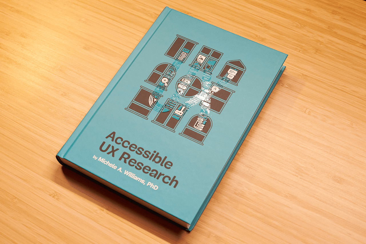
Now Shipping: Accessible UX Research, A New Smashing Book By Michele Williams
Our newest Smashing Book, “Accessible UX Research” by Michele Williams, is finally shipping worldwide — and we couldn’t be happier! This book is about research, but you’ll also learn about a
Accessibility
Now Shipping: Accessible UX Research, A New Smashing Book By Michele Williams
Ari Stiles
Good UX research is at the root of great products. It takes the guesswork out of our designs and helps us solve problems before they grow. One of the best ways to make our research effective is to keep it inclusive — testing with users with different needs and abilities, and using their feedback to build products that work for more people.
Our newest book, Accessible UX Research, can help you plan and execute great user research. Dr. Michele Williams draws from years of experience to build a clear, easy-to-follow roadmap. This book has something for everyone who wants to build digital products well:
- If you are just getting started with research, you will find helpful tips for making your research more inclusive. You will also get a primer on how to ask better questions, understand your own biases, and how to use your limited time and budget effectively.
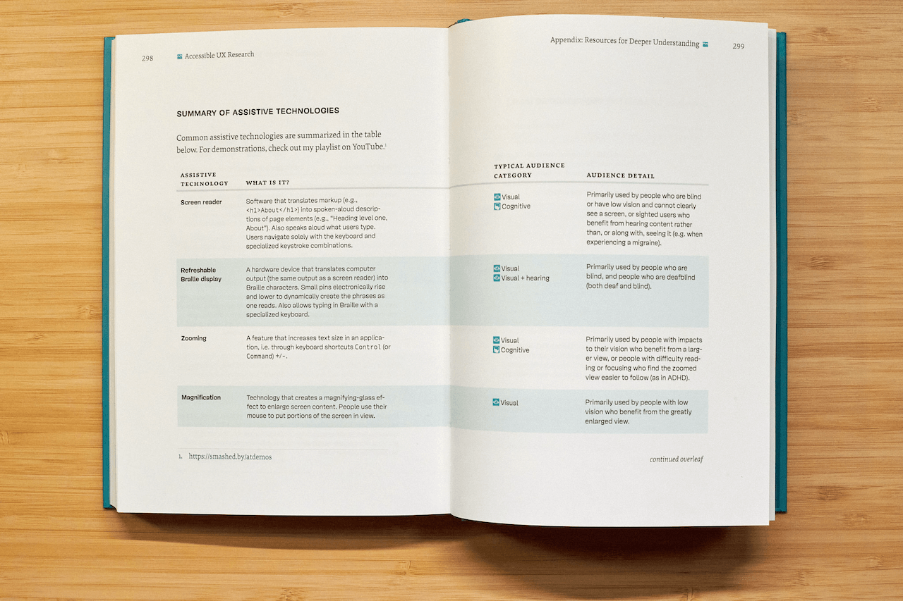
- If you are an accessibility-minded professional, you will find a deep well of details on different assistive technologies, how to include them in your testing environment, and ways to record and share your results to create a real impact on the products you make.
- If you are a developer, a manager, or just someone who wants to understand how different abilities impact each user’s experience, you will find the history, clear descriptions, and cultural touchpoints you need in order to make sense of all the accessibility and inclusion recommendations you encounter.

eBook
$ 19.00
DRM-free, of course. ePUB, Kindle, PDF.
Included with your Smashing Membership.
Get the eBook
Download PDF, ePUB, Kindle.
Thanks for being smashing! ❤️
About The Book
The book isn’t a checklist for you to complete as a part of your accessibility work. It’s a practical guide to inclusive UX research, from start to finish. If you’ve ever felt unsure how to include disabled participants, or worried about “getting it wrong,” this book is for you. You’ll get clear, practical strategies to make your research more inclusive, effective, and reliable.
Inside, you’ll learn how to:
- Plan research that includes disabled participants from the start,
- Recruit participants with disabilities,
- Facilitate sessions that work for a range of access needs,
- Ask better questions and avoid unintentionally biased research methods,
- Build trust and confidence in your team around accessibility and inclusion.
The book also challenges common assumptions about disability and urges readers to rethink what inclusion really means in UX research and beyond. Let’s move beyond compliance and start doing research that reflects the full diversity of your users. Whether you’re in industry or academia, this book gives you the tools — and the mindset — to make it happen.
324 pages. Written by Dr. Michele A. Williams. Cover art by Espen Brunborg. Download a free sample (PDF, 2.3MB) or get the book right away.
Please note: We’ve found a way to get printed books to our US customers! After several months of dealing with customs and tariff issues, we are happy to announce that all of our books — including this brand-new one — are once again shipping worldwide.


Contents
In Accessible UX Research, Michele Williams takes you on a deep dive into the real world of UX research, with a roadmap for including users with different abilities and needs.
-
1. Disability Mindset
-
2. Diversity of Disability
-
3. Disability in the Stages of UX Research
-
4. Recruiting Disabled Participants
-
5. Designing Your Research
-
6. Facilitating An Accessible Study
-
7. Analyzing and Reporting with Accuracy and Impact
-
8. Disability in the UX Research Field
-
Appendix
About the Author
 Dr. Michele A. Williams is owner of M.A.W. Consulting, LLC – Making Accessibility Work. Her 20+ years of experience include influencing top tech companies as a Senior User Experience (UX) Researcher and Accessibility Specialist and obtaining a PhD in Human-Centered Computing focused on accessibility. An international speaker, published academic author, and patented inventor, she is passionate about educating and advising on technology that does not exclude disabled users.
Testimonials
“Accessible UX Research stands as a vital and necessary resource. In addressing disability at the User Experience Research layer, it helps to set an equal and equitable tone for products and features that resonates through the rest of the creation process. The book provides a solid framework for all aspects of conducting research efforts, including not only process considerations, but also importantly the mindset required to approach the work.
This is the book I wish I had when I was first getting started with my accessibility journey. It is a gift, and I feel so fortunate that Michele has chosen to share it with us all.”
Eric Bailey, Accessibility Advocate
“User research in accessibility is non-negotiable for actually meeting users’ needs, and this book is a critical piece in the puzzle of actually doing and integrating that research into accessibility work day to day.”
Devon Pershing, Author of The Accessibility Operations Guidebook
“Our decisions as developers and designers are often based on recommendations, assumptions, and biases. Usually, this doesn’t work, because checking off lists or working solely from our own perspective can never truly represent the depth of human experience. Michele’s book provides you with the strategies you need to conduct UX research with diverse groups of people, challenge your assumptions, and create truly great products.”
Manuel Matuzović, Author of the Web Accessibility Cookbook
“This book is a vital resource on inclusive research. Michele Williams expertly breaks down key concepts, guiding readers through disability models, language, and etiquette. A strong focus on real-world application equips readers to conduct impactful, inclusive research sessions. By emphasizing diverse perspectives and proactive inclusion, the book makes a compelling case for accessibility as a core principle rather than an afterthought. It is a must-read for researchers, product-makers, and advocates!”
Anna E. Cook, Accessibility and Inclusive Design Specialist
Technical Details
- ISBN: 978-3-910835-03-0 (print)
- Quality hardcover, stitched binding, ribbon page marker.
- Free worldwide airmail shipping from Germany.
- eBook available for download as PDF, ePUB, and Amazon Kindle.
eBook
$ 19.00
DRM-free, of course. ePUB, Kindle, PDF.
Included with your Smashing Membership.
Get the eBook
Download PDF, ePUB, Kindle.
Thanks for being smashing! ❤️
Community Matters ❤️
Producing a book takes quite a bit of time, and we couldn’t pull it off without the support of our wonderful community. A huge shout-out to Smashing Members for the kind, ongoing support. The eBook is and always will be free for Smashing Members. Plus, Members get a friendly discount when purchasing their printed copy. Just sayin’! 😉
More Smashing Books & Goodies
Promoting best practices and providing you with practical tips to master your daily coding and design challenges has always been (and will be) at the core of everything we do at Smashing.
In the past few years, we were very lucky to have worked together with some talented, caring people from the web community to publish their wealth of experience as printed books that stand the test of time. Trine, Heather, and Steven are three of these people. Have you checked out their books already?

The Ethical Design Handbook
A practical guide on ethical design for digital products.

Understanding Privacy
Everything you need to know to put your users first and make a better web.
Touch Design for Mobile Interfaces
Learn how touchscreen devices really work — and how people really use them.
(cm, il)
Setting And Persisting Color Scheme Preferences With CSS And A “Touch” Of JavaScript
There are many ways to approach a “Dark Mode” feature that respects a user’s system color scheme preferences and allows for per-site customization. With recent developments in CSS, core function
Javascript
Setting And Persisting Color Scheme Preferences With CSS And A “Touch” Of JavaScript
Henry Bley-Vroman
Many modern websites give users the power to set a site-specific color scheme preference. A basic implementation is straightforward with JavaScript: listen for when a user changes a checkbox or clicks a button, toggle a class (or attribute) on the <body> element in response, and write the styles for that class to override design with a different color scheme.
CSS’s new :has() pseudo-class, supported by major browsers since December 2023, opens many doors for front-end developers. I’m especially excited about leveraging it to modify UI in response to user interaction without JavaScript. Where previously we have used JavaScript to toggle classes or attributes (or to set styles directly), we can now pair :has() selectors with HTML’s native interactive elements.
Supporting a color scheme preference, like “Dark Mode,” is a great use case. We can use a <select> element anywhere that toggles color schemes based on the selected <option> — no JavaScript needed, save for a sprinkle to save the user’s choice, which we’ll get to further in.
Respecting System Preferences
First, we’ll support a user’s system-wide color scheme preferences by adopting a “Light Mode”-first approach. In other words, we start with a light color scheme by default and swap it out for a dark color scheme for users who prefer it.
The prefers-color-scheme media feature detects the user’s system preference. Wrap “dark” styles in a prefers-color-scheme: dark media query.
selector { /* light styles */ @media (prefers-color-scheme: dark) { /* dark styles */ } } Next, set the color-scheme property to match the preferred color scheme. Setting color-scheme: dark switches the browser into its built-in dark mode, which includes a black default background, white default text, “dark” styles for scrollbars, and other elements that are difficult to target with CSS, and more. I’m using CSS variables to hint that the value is dynamic — and because I like the browser developer tools experience — but plain color-scheme: light and color-scheme: dark would work fine.
:root { /* light styles here */ color-scheme: var(--color-scheme, light); /* system preference is "dark" */ @media (prefers-color-scheme: dark) { --color-scheme: dark; /* any additional dark styles here */ } } Giving Users Control
Now, to support overriding the system preference, let users choose between light (default) and dark color schemes at the page level.
HTML has native elements for handling user interactions. Using one of those controls, rather than, say, a <div> nest, improves the chances that assistive tech users will have a good experience. I’ll use a <select> menu with options for “system,” “light,” and “dark.” A group of <input type="radio"> would work, too, if you wanted the options right on the surface instead of a dropdown menu.
<select id="color-scheme"> <option value="system" selected>System</option> <option value="light">Light</option> <option value="dark">Dark</option> </select> Before CSS gained :has(), responding to the user’s selected <option> required JavaScript, for example, setting an event listener on the <select> to toggle a class or attribute on <html> or <body>.
But now that we have :has(), we can now do this with CSS alone! You’ll save spending any of your performance budget on a dark mode script, plus the control will work even for users who have disabled JavaScript. And any “no-JS” folks on the project will be satisfied.
What we need is a selector that applies to the page when it :has() a select menu with a particular [value]:checked. Let’s translate that into CSS:
:root:has(select option[value="dark"]:checked)We’re defaulting to a light color scheme, so it’s enough to account for two possible dark color scheme scenarios:
- The page-level color preference is “system,” and the system-level preference is “dark.”
- The page-level color preference is “dark”.
The first one is a page-preference-aware iteration of our prefers-color-scheme: dark case. A “dark” system-level preference is no longer enough to warrant dark styles; we need a “dark” system-level preference and a “follow the system-level preference” at the page-level preference. We’ll wrap the prefers-color-scheme media query dark scheme styles with the :has() selector we just wrote:
:root { /* light styles here */ color-scheme: var(--color-scheme, light); /* page preference is "system", and system preference is "dark" */ @media (prefers-color-scheme: dark) { &:has(#color-scheme option[value="system"]:checked) { --color-scheme: dark; /* any additional dark styles, again */ } } } Notice that I’m using CSS Nesting in that last snippet. Baseline 2023 has it pegged as “Newly available across major browsers” which means support is good, but at the time of writing, support on Android browsers not included in Baseline’s core browser set is limited. You can get the same result without nesting.
:root { /* light styles */ color-scheme: var(--color-scheme, light); /* page preference is "dark" */ &:has(#color-scheme option[value="dark"]:checked) { --color-scheme: dark; /* any additional dark styles */ } } For the second dark mode scenario, we’ll use nearly the exact same :has() selector as we did for the first scenario, this time checking whether the “dark” option — rather than the “system” option — is selected:
:root { /* light styles */ color-scheme: var(--color-scheme, light); /* page preference is "dark" */ &:has(#color-scheme option[value="dark"]:checked) { --color-scheme: dark; /* any additional dark styles */ } /* page preference is "system", and system preference is "dark" */ @media (prefers-color-scheme: dark) { &:has(#color-scheme option[value="system"]:checked) { --color-scheme: dark; /* any additional dark styles, again */ } } } Now the page’s styles respond to both changes in users’ system settings and user interaction with the page’s color preference UI — all with CSS!
But the colors change instantly. Let’s smooth the transition.
Respecting Motion Preferences
Instantaneous style changes can feel inelegant in some cases, and this is one of them. So, let’s apply a CSS transition on the :root to “ease” the switch between color schemes. (Transition styles at the :root will cascade down to the rest of the page, which may necessitate adding transition: none or other transition overrides.)
Note that the CSS color-scheme property does not support transitions.
:root { transition-duration: 200ms; transition-property: /* properties changed by your light/dark styles */; } Not all users will consider the addition of a transition a welcome improvement. Querying the prefers-reduced-motion media feature allows us to account for a user’s motion preferences. If the value is set to reduce, then we remove the transition-duration to eliminate unwanted motion.
:root { transition-duration: 200ms; transition-property: /* properties changed by your light/dark styles */; @media screen and (prefers-reduced-motion: reduce) { transition-duration: none; } } Transitions can also produce poor user experiences on devices that render changes slowly, for example, ones with e-ink screens. We can extend our “no motion condition” media query to account for that with the update media feature. If its value is slow, then we remove the transition-duration.
:root { transition-duration: 200ms; transition-property: /* properties changed by your light/dark styles */; @media screen and (prefers-reduced-motion: reduce), (update: slow) { transition-duration: 0s; } } Let’s try out what we have so far in the following demo. Notice that, to work around color-scheme’s lack of transition support, I’ve explicitly styled the properties that should transition during theme changes.
See the Pen [CSS-only theme switcher (requires :has()) [forked]](https://codepen.io/smashingmag/pen/YzMVQja) by Henry.
Not bad! But what happens if the user refreshes the pages or navigates to another page? The reload effectively wipes out the user’s form selection, forcing the user to re-make the selection. That may be acceptable in some contexts, but it’s likely to go against user expectations. Let’s bring in JavaScript for a touch of progressive enhancement in the form of…
Persistence
Here’s a vanilla JavaScript implementation. It’s a naive starting point — the functions and variables aren’t encapsulated but are instead properties on window. You’ll want to adapt this in a way that fits your site’s conventions, framework, library, and so on.
When the user changes the color scheme from the <select> menu, we’ll store the selected <option> value in a new localStorage item called "preferredColorScheme". On subsequent page loads, we’ll check localStorage for the "preferredColorScheme" item. If it exists, and if its value corresponds to one of the form control options, we restore the user’s preference by programmatically updating the menu selection.
/* * If a color scheme preference was previously stored, * select the corresponding option in the color scheme preference UI * unless it is already selected. */ function restoreColorSchemePreference() { const colorScheme = localStorage.getItem(colorSchemeStorageItemName); if (!colorScheme) { // There is no stored preference to restore return; } const option = colorSchemeSelectorEl.querySelector(`[value=${colorScheme}]`); if (!option) { // The stored preference has no corresponding option in the UI. localStorage.removeItem(colorSchemeStorageItemName); return; } if (option.selected) { // The stored preference's corresponding menu option is already selected return; } option.selected = true; } /* * Store an event target's value in localStorage under colorSchemeStorageItemName */ function storeColorSchemePreference({ target }) { const colorScheme = target.querySelector(":checked").value; localStorage.setItem(colorSchemeStorageItemName, colorScheme); } // The name under which the user's color scheme preference will be stored. const colorSchemeStorageItemName = "preferredColorScheme"; // The color scheme preference front-end UI. const colorSchemeSelectorEl = document.querySelector("#color-scheme"); if (colorSchemeSelectorEl) { restoreColorSchemePreference(); // When the user changes their color scheme preference via the UI, // store the new preference. colorSchemeSelectorEl.addEventListener("input", storeColorSchemePreference); } Let’s try that out. Open this demo (perhaps in a new window), use the menu to change the color scheme, and then refresh the page to see your preference persist:
See the Pen [CSS-only theme switcher (requires :has()) with JS persistence [forked]](https://codepen.io/smashingmag/pen/GRLmEXX) by Henry.
If your system color scheme preference is “light” and you set the demo’s color scheme to “dark,” you may get the light mode styles for a moment immediately after reloading the page before the dark mode styles kick in. That’s because CodePen loads its own JavaScript before the demo’s scripts. That is out of my control, but you can take care to improve this persistence on your projects.
Persistence Performance Considerations
Where things can get tricky is restoring the user’s preference immediately after the page loads. If the color scheme preference in localStorage is different from the user’s system-level color scheme preference, it’s possible the user will see the system preference color scheme before the page-level preference is restored. (Users who have selected the “System” option will never get that flash; neither will those whose system settings match their selected option in the form control.)
If your implementation is showing a “flash of inaccurate color theme”, where is the problem happening? Generally speaking, the earlier the scripts appear on the page, the lower the risk. The “best option” for you will depend on your specific stack, of course.
What About Browsers That Don’t Support :has()?
All major browsers support :has() today Lean into modern platforms if you can. But if you do need to consider legacy browsers, like Internet Explorer, there are two directions you can go: either hide or remove the color scheme picker for those browsers or make heavier use of JavaScript.
If you consider color scheme support itself a progressive enhancement, you can entirely hide the selection UI in browsers that don’t support :has():
@supports not selector(:has(body)) { @media (prefers-color-scheme: dark) { :root { /* dark styles here */ } } #color-scheme { display: none; } } Otherwise, you’ll need to rely on a JavaScript solution not only for persistence but for the core functionality. Go back to that traditional event listener toggling a class or attribute.
The CSS-Tricks “Complete Guide to Dark Mode” details several alternative approaches that you might consider as well when working on the legacy side of things.
(gg, yk)
Designing For Agentic AI: Practical UX Patterns For Control, Consent, And Accountability
Autonomy is an output of a technical system. Trustworthiness is an output of a design process. Here are concrete design patterns, operational frameworks, and organizational practices for building agen
Ux
Designing For Agentic AI: Practical UX Patterns For Control, Consent, And Accountability
Victor Yocco
In the first part of this series, we established the fundamental shift from generative to agentic artificial intelligence. We explored why this leap from suggesting to acting demands a new psychological and methodological toolkit for UX researchers, product managers, and leaders. We defined a taxonomy of agentic behaviors, from suggesting to acting autonomously, outlined the essential research methods, defined the risks of agentic sludge, and established the accountability metrics required to navigate this new territory. We covered the what and the why.
Now, we move from the foundational to the functional. This article provides the how: the concrete design patterns, operational frameworks, and organizational practices essential for building agentic systems that are not only powerful but also transparent, controllable, and worthy of user trust. If our research is the diagnostic tool, these patterns are the treatment plan. They are the practical mechanisms through which we can give users a palpable sense of control, even as we grant AI unprecedented autonomy. The goal is to create an experience where autonomy feels like a privilege granted by the user, not a right seized by the system.
Core UX Patterns For Agentic Systems
Designing for agentic AI is designing for a relationship. This relationship, like any successful partnership, must be built on clear communication, mutual understanding, and established boundaries.
To manage the shift from suggestion to action, we utilize six patterns that follow the functional lifecycle of an agentic interaction:
- Pre-Action (Establishing Intent)
The Intent Preview and Autonomy Dial ensure the user defines the plan and the agent’s boundaries before anything happens. - In-Action (Providing Context)
The Explainable Rationale and Confidence Signal maintain transparency while the agent works, showing the “why” and “how certain.” - Post-Action (Safety and Recovery)
The Action Audit & Undo and Escalation Pathway provide a safety net for errors or high-ambiguity moments.
Below, we will cover each pattern in detail, including recommendations for metrics for success. These targets are representative benchmarks based on industry standards; adjust them based on your specific domain risk.
1. The Intent Preview: Clarifying the What and How
This pattern is the conversational equivalent of saying, “Here’s what I’m about to do. Are you okay with that?” It’s the foundational moment of seeking consent in the user-agent relationship.
Before an agent takes any significant action, the user must have a clear, unambiguous understanding of what is about to happen. The Intent Preview, or Plan Summary, establishes informed consent. It is the conversational pause before action, transforming a black box of autonomous processes into a transparent, reviewable plan.
Psychological Underpinning
Presenting a plan before action reduces cognitive load and eliminates surprise, giving users a moment to verify the agent truly understands their intent.
Anatomy of an Effective Intent Preview:
- Clarity and Conciseness
The preview must be immediately digestible. It should summarize the primary actions and outcomes in plain language, avoiding technical jargon. For instance, instead of “Executing API call to cancel_booking(id: 4A7B),” it should state, “Cancel flight AA123 to San Francisco.” - Sequential Steps
For multi-step operations, the preview should outline the key phases. This reveals the agent’s logic and allows users to spot potential issues in the proposed sequence. - Clear User Actions
The preview is a decision point, not just a notification. It must be accompanied by a clear set of choices. It’s a moment of intentional friction, a ‘speed bump’ in the process designed to ensure the user is making a conscious choice, particularly for irreversible or high-stakes actions.
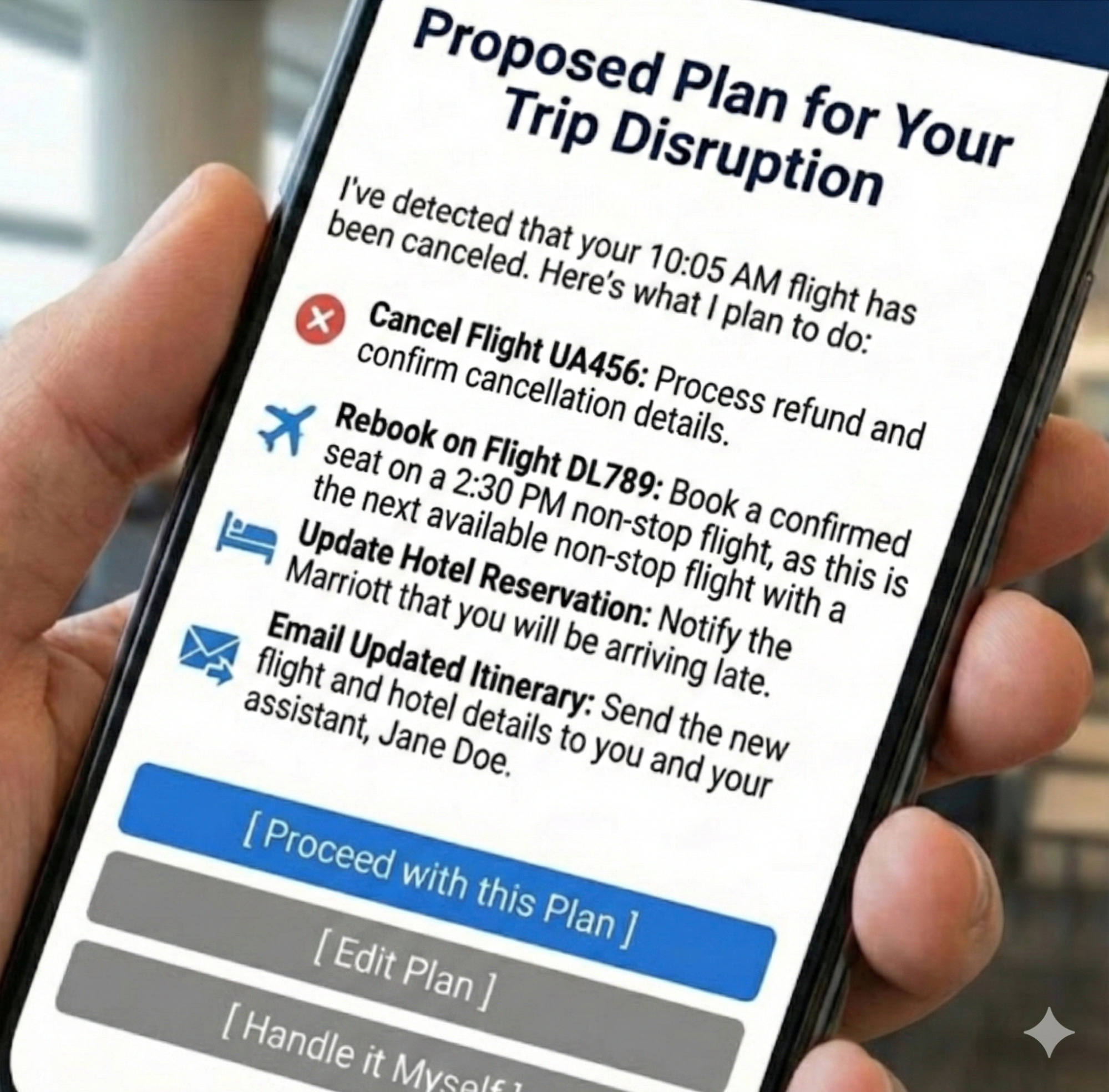
Let’s revisit our travel assistant scenario from the first part of this series. We use this proactive assistant to illustrate how an agent handles a flight cancellation. The agent has detected a flight cancellation and has formulated a recovery plan.
The Intent Preview would look something like this:
Proposed Plan for Your Trip Disruption
I’ve detected that your 10:05 AM flight has been canceled. Here’s what I plan to do:
- Cancel Flight UA456
Process refund and confirm cancellation details.- Rebook on Flight DL789
Book a confirmed seat on a 2:30 PM non-stop flight, as this is the next available non-stop flight with a confirmed seat.- Update Hotel Reservation
Notify the Marriott that you will be arriving late.- Email Updated Itinerary
Send the new flight and hotel details to you and your assistant, Jane Doe.[ Proceed with this Plan ] [ Edit Plan ] [ Handle it Myself ]
This preview is effective because it provides a complete picture, from cancellation to communication, and offers three distinct paths forward: full consent (Proceed), a desire for modification (Edit Plan), or a full override (Handle it Myself). This multifaceted control is the bedrock of trust.
When to Prioritize This Pattern
This pattern is non-negotiable for any action that is irreversible (e.g., deleting user data), involves a financial transaction of any amount, shares information with other people or systems, or makes a significant change that a user cannot easily undo.
Risk of Omission
Without this, users feel ambushed by the agent’s actions and will disable the feature to regain control.
Metrics for Success:
- Acceptance Ratio
Plans Accepted Without Edit / Total Plans Displayed. Target > 85%. - Override Frequency
Total Handle it Myself Clicks / Total Plans Displayed. A rate > 10% triggers a model review. - Recall Accuracy
Percentage of test participants who can correctly list the plan’s steps 10 seconds after the preview is hidden.
Applying This to High-Stakes Domains
While travel plans are a relatable baseline, this pattern becomes indispensable in complex, high-stakes environments where an error results in more than an inconvenience for an individual traveling. Many of us work in settings where wrong decisions may result in a system outage, putting a patient’s safety at risk, or numerous other catastrophic outcomes that unreliable technology would introduce.
Consider a DevOps Release Agent tasked with managing cloud infrastructure. In this context, the Intent Preview acts as a safety barrier against accidental downtime.
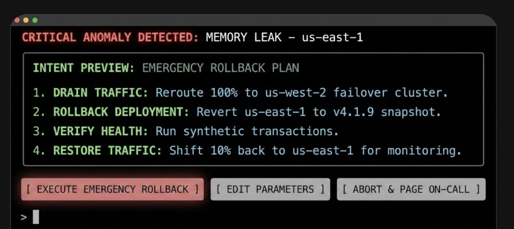
In this interface, the specific terminology (Drain Traffic, Rollback) replaces generalities, and the actions are binary and impactful. The user authorizes a major operational shift based on the agent’s logic, rather than approving a suggestion.
2. The Autonomy Dial: Calibrating Trust With Progressive Authorization
Every healthy relationship has boundaries. The Autonomy Dial is how the user establishes it with their agent, defining what they are comfortable with the agent handling on its own.
Trust is not a binary switch; it’s a spectrum. A user might trust an agent to handle low-stakes tasks autonomously but demand full confirmation for high-stakes decisions. The Autonomy Dial, a form of progressive authorization, allows users to set their preferred level of agent independence, making them active participants in defining the relationship.
Psychological Underpinning
Allowing users to tune the agent’s autonomy grants them a locus of control, letting them match the system’s behavior to their personal risk tolerance.
Implementation
This can be implemented as a simple, clear setting within the application, ideally on a per-task-type basis. Using the taxonomy from our first article, the settings could be:
- Observe & Suggest
I want to be notified of opportunities or issues, but the agent will never propose a plan. - Plan & Propose
The agent can create plans, but I must review every one before any action is taken. - Act with Confirmation
For familiar tasks, the agent can prepare actions, and I will give a final go/no-go confirmation. - Act Autonomously
For pre-approved tasks (e.g., disputing charges under $50), the agent can act independently and notify me after the fact.
An email assistant, for example, could have a separate autonomy dial for scheduling meetings versus sending emails on the user’s behalf. This granularity is key, as it reflects the nuanced reality of a user’s trust.
When to Prioritize This Pattern
Prioritize this in systems where tasks vary widely in risk and personal preference (e.g., financial management tools, communication platforms). It is essential for onboarding, allowing users to start with low autonomy and increase it as their confidence grows.
Risk of Omission
Without this, users who experience a single failure will abandon the agent completely rather than simply dialing back its permissions.
Metrics for Success:
- Trust Density
Percentage breakdown of users per setting (e.g., 20% Suggest, 50% Confirm, 30% Auto). - Setting Churn
Number of Setting Changes / Total Active Users per month. High churn indicates trust volatility.
3. The Explainable Rationale: Answering Why?
After taking an action, a good partner explains their reasoning. This pattern is the open communication that follows an action, answering Why? before it’s even asked. “I did that because you’ve told me in the past that you prefer X.”
When an agent acts, especially autonomously, the immediate question in the user’s mind is often, Why did it do that? The Explainable Rationale pattern proactively answers this question, providing a concise justification for the agent’s decisions. This is not a technical log file. In my first article of this series, we discussed translating system primitives into user-facing language to prevent deception. This pattern is the practical application of that principle. It transforms the raw logic into a human-readable explanation grounded in the user’s own stated preferences and prior inputs.
Psychological Underpinning
When an agent’s actions are explainable, they feel logical rather than random, helping the user build an accurate mental model of how the agent thinks.
Effective Rationales:
- Grounded in Precedent
The best explanations link back to a rule, preference, or prior action. - Simple and Direct
Avoid complex conditional logic. Use a simple “Because you said X, I did Y” structure.
Returning to the travel example, after the flight is rebooked autonomously, the user might see this in their notification feed:
I’ve rebooked your canceled flight.
- New Flight: Delta 789, departing at 2:30 PM.
- Why I took this action:
- Your original flight was canceled by the airline.
- You’ve pre-approved autonomous rebooking for same-day, non-stop flights.
[ View New Itinerary ] [ Undo this Action ]
The rationale is clear, defensible, and reinforces the idea that the agent is operating within the boundaries the user established.
When to Prioritize This Pattern
Prioritize it for any autonomous action where the reasoning isn’t immediately obvious from the context, especially for actions that happen in the background or are triggered by an external event (like the flight cancellation example).
Risk of Omission
Without this, users interpret valid autonomous actions as random behavior or ‘bugs,’ preventing them from forming a correct mental model.
Metrics for Success:
- Why? Ticket Volume
Number of support tickets tagged “Agent Behavior — Unclear” per 1,000 active users. - Rationale Validation
Percentage of users who rate the explanation as ‘Helpful’ in post-interaction microsurveys.
4. The Confidence Signal
This pattern is about the agent being self-aware in the relationship. By communicating its own confidence, it helps the user decide when to trust its judgment and when to apply more scrutiny.
To help users calibrate their own trust, the agent should surface its own confidence in its plans and actions. This makes the agent’s internal state more legible and helps the user decide when to scrutinize a decision more closely.
Psychological Underpinning
Surfacing uncertainty helps prevent automation bias, encouraging users to scrutinize low-confidence plans rather than blindly accepting them.
Implementation:
- Confidence Score
A simple percentage (e.g., Confidence: 95%) can be a quick, scannable indicator. - Scope Declaration
A clear statement of the agent’s area of expertise (e.g., Scope: Travel bookings only) helps manage user expectations and prevents them from asking the agent to perform tasks it’s not designed for. - Visual Cues
A green checkmark can denote high confidence, while a yellow question mark can indicate uncertainty, prompting the user to review more carefully.
When to Prioritize This Pattern
Prioritize when the agent’s performance can vary significantly based on the quality of input data or the ambiguity of the task. It is especially valuable in expert systems (e.g., medical aids, code assistants) where a human must critically evaluate the AI’s output.
Risk of Omission
Without this, users will fall victim to automation bias, blindly accepting low-confidence hallucinations, or anxiously double-check high-confidence work.
Metrics for Success:
- Calibration Score
Pearson correlation between Model Confidence Score and User Acceptance Rate. Target > 0.8. - Scrutiny Delta
Difference between the average review time of low-confidence plans and high-confidence plans. Expected to be positive (e.g., +12 seconds).
5. The Action Audit & Undo: The Ultimate Safety Net
Trust requires knowing you can recover from a mistake. The Undo function is the ultimate relationship safety net, assuring the user that even if the agent misunderstands, the consequences are not catastrophic.
The single most powerful mechanism for building user confidence is the ability to easily reverse an agent’s action. A persistent, easy-to-read Action Audit log, with a prominent Undo button for every possible action, is the ultimate safety net. It dramatically lowers the perceived risk of granting autonomy.
Psychological Underpinning
Knowing that a mistake can be easily undone creates psychological safety, encouraging users to delegate tasks without fear of irreversible consequences.
Design Best Practices:
- Timeline View
A chronological log of all agent-initiated actions is the most intuitive format. - Clear Status Indicators
Show whether an action was successful, is in progress, or has been undone. - Time-Limited Undos
For actions that become irreversible after a certain point (e.g., a non-refundable booking), the UI must clearly communicate this time window (e.g., Undo available for 15 minutes). This transparency about the system’s limitations is just as important as the undo capability itself. Being honest about when an action becomes permanent builds trust.
When to Prioritize This Pattern
This is a foundational pattern that should be implemented in nearly all agentic systems. It is absolutely non-negotiable when introducing autonomous features or when the cost of an error (financial, social, or data-related) is high.
Risk of Omission
Without this, one error permanently destroys trust, as users realize they have no safety net.
Metrics for Success:
- Reversion Rate
Undone Actions / Total Actions Performed. If the Reversion Rate > 5% for a specific task, disable automation for that task. - Safety Net Conversion
Percentage of users who upgrade to Act Autonomously within 7 days of successfully using Undo.
6. The Escalation Pathway: Handling Uncertainty Gracefully
A smart partner knows when to ask for help instead of guessing. This pattern allows the agent to handle ambiguity gracefully by escalating to the user, demonstrating a humility that builds, rather than erodes, trust.
Even the most advanced agent will encounter situations where it is uncertain about the user’s intent or the best course of action. How it handles this uncertainty is a defining moment. A well-designed agent doesn’t guess; it escalates.
Psychological Underpinning
When an agent acknowledges its limits rather than guessing, it builds trust by respecting the user’s authority in ambiguous situations.
Escalation Patterns Include:
- Requesting Clarification
“You mentioned ‘next Tuesday.’ Do you mean September 30th or October 7th?” - Presenting Options
“I found three flights that match your criteria. Which one looks best to you?” - Requesting Human Intervention
For high-stakes or highly ambiguous tasks, the agent should have a clear pathway to loop in a human expert or support agent. The prompt might be: “This transaction seems unusual, and I’m not confident about how to proceed. Would you like me to flag this for a human agent to review?”
When to Prioritize This Pattern
Prioritize in domains where user intent can be ambiguous or highly context-dependent (e.g., natural language interactions, complex data queries). Use this whenever the agent operates with incomplete information or when multiple correct paths exist.
Risk of Omission
Without this, the agent will eventually make a confident, catastrophic guess that alienates the user.
Metrics for Success:
- Escalation Frequency
Agent Requests for Help / Total Tasks. Healthy range: 5-15%. - Recovery Success Rate
Tasks Completed Post-Escalation / Total Escalations. Target > 90%.
| Pattern | Best For | Primary Risk | Key Metric |
|---|---|---|---|
| Intent Preview | Irreversible or financial actions | User feels ambushed | >85% Acceptance Rate |
| Autonomy Dial | Tasks with variable risk levels | Total feature abandonment | Setting Churn |
| Explainable Rationale | Background or autonomous tasks | User perceives bugs | “Why?” Ticket Volume |
| Confidence Signal | Expert or high-stakes systems | Automation bias | Scrutiny Delta |
| Action Audit & Undo | All agentic systems | Permanent loss of trust | <5% Reversion Rate |
| Escalation Pathway | Ambiguous user intent | Confident, catastrophic guesses | >90% Recovery Success |
Table 1: Summary of Agentic AI UX patterns. Remember to adjust the metrics based on your specific domain risk and needs.
Designing for Repair and Redress
This is learning how to apologize effectively. A good apology acknowledges the mistake, fixes the damage, and promises to learn from it.
Errors are not a possibility; they are an inevitability.
“
Empathic Apologies and Clear Remediation
When an agent makes a mistake, the error message is the apology. It must be designed with psychological precision. This moment is a critical opportunity to demonstrate accountability. From a service design perspective, this is where companies can use the service recovery paradox: the phenomenon where a customer who experiences a service failure, followed by a successful and empathetic recovery, can actually become more loyal than a customer who never experienced a failure at all. A well-handled mistake can be a more powerful trust-building event than a long history of flawless execution.
The key is treating the error as a relationship rupture that needs to be mended. This involves:
- Acknowledge the Error
The message should state clearly and simply that a mistake was made.
Example: I incorrectly transferred funds. - State the Immediate Correction
Immediately follow up with the remedial action.
Example: I have reversed the action, and the funds have been returned to your account. - Provide a Path for Further Help
Always offer a clear link to human support. This de-escalates frustration and shows that there is a system of accountability beyond the agent itself.
A well-designed repair UI might look like this:
We made a mistake on your recent transfer.
I apologize. I transferred $250 to the wrong account.✔ Corrective Action: The transfer has been reversed, and your $250 has been refunded.
✔ Next Steps: The incident has been flagged for internal review to prevent it from happening again.Need further help? [ Contact Support ]
Building the Governance Engine for Safe Innovation
The design patterns described above are the user-facing controls, but they cannot function effectively without a robust internal support structure. This is not about creating bureaucratic hurdles; it is about building a strategic advantage. An organization with a mature governance framework can ship more ambitious agentic features with greater speed and confidence, knowing that the necessary guardrails are in place to mitigate brand risk. This governance engine turns safety from a checklist into a competitive asset.
This engine should function as a formal governance body, an Agentic AI Ethics Council, comprising a cross-functional alliance of UX, Product, and Engineering, with vital support from Legal, Compliance, and Support. In smaller organizations, these ‘Council’ roles often collapse into a single triad of Product, Engineering, and Design leads.
A Checklist for Governance
- Legal/Compliance
This team is the first line of defense, ensuring the agent’s potential actions stay within regulatory and legal boundaries. They help define the hard no-go zones for autonomous action. - Product
The product manager is the steward of the agent’s purpose. They define and monitor its operational boundaries through a formal autonomy policy that documents what the agent is and is not allowed to do. They own the Agent Risk Register. - UX Research
This team is the voice of the user’s trust and anxiety. They are responsible for a recurring process for running trust calibration studies, simulated misbehavior tests, and qualitative interviews to understand the user’s evolving mental model of the agent. - Engineering
This team builds the technical underpinnings of trust. They must architect the system for robust logging, one-click undo functionality, and the hooks needed to generate clear, explainable rationales. - Support
These teams are on the front lines of failure. They must be trained and equipped to handle incidents caused by agent errors, and they must have a direct feedback loop to the Ethics Council to report on real-world failure patterns.
This governance structure should maintain a set of living documents, including an Agent Risk Register that proactively identifies potential failure modes, Action Audit Logs that are regularly reviewed, and the formal Autonomy Policy Documentation.
Where to Start: A Phased Approach for Product Leaders
For product managers and executives, integrating agentic AI can feel like a monumental task. The key is to approach it not as a single launch, but as a phased journey of building both technical capability and user trust in parallel. This roadmap allows your organization to learn and adapt, ensuring each step is built on a solid foundation.
Phase 1: Foundational Safety (Suggest & Propose)
The initial goal is to build the bedrock of trust without taking significant autonomous risks. In this phase, the agent’s power is limited to analysis and suggestion.
- Implement a rock-solid Intent Preview: This is your core interaction model. Get users comfortable with the idea of the agent formulating plans, while keeping the user in full control of execution.
- Build the Action Audit & Undo infrastructure: Even if the agent isn’t acting autonomously yet, build the technical scaffolding for logging and reversal. This prepares your system for the future and builds user confidence that a safety net exists.
Phase 2: Calibrated Autonomy (Act with Confirmation)
Once users are comfortable with the agent’s proposals, you can begin to introduce low-risk autonomy. This phase is about teaching users how the agent thinks and letting them set their own pace.
- Introduce the Autonomy Dial with limited settings: Start by allowing users to grant the agent the power to Act with Confirmation.
- Deploy the Explainable Rationale: For every action the agent prepares, provide a clear explanation. This demystifies the agent’s logic and reinforces that it is operating based on the user’s own preferences.
Phase 3: Proactive Delegation (Act Autonomously)
This is the final step, taken only after you have clear data from the previous phases demonstrating that users trust the system.
- Enable Act Autonomously for specific, pre-approved tasks: Use the data from Phase 2 (e.g., high Proceed rates, low Undo rates) to identify the first set of low-risk tasks that can be fully automated.
- Monitor and Iterate: The launch of autonomous features is not the end, but the beginning of a continuous cycle of monitoring performance, gathering user feedback, and refining the agent’s scope and behavior based on real-world data.
Design As The Ultimate Safety Lever
The emergence of agentic AI represents a new frontier in human-computer interaction. It promises a future where technology can proactively reduce our burdens and streamline our lives. But this power comes with profound responsibility.
“
As UX professionals, product managers, and leaders, our role is to act as the stewards of that trust. By implementing clear design patterns for control and consent, designing thoughtful pathways for repair, and building robust governance frameworks, we create the essential safety levers that make agentic AI viable. We are not just designing interfaces; we are architecting relationships. The future of AI’s utility and acceptance rests on our ability to design these complex systems with wisdom, foresight, and a deep-seated respect for the user’s ultimate authority.
(gg, yk)
Designing A Streak System: The UX And Psychology Of Streaks
What makes streaks so powerful and addictive? To design them well, you need to understand how they align with human psychology. Victor Ayomipo breaks down the UX and design principles behind effective
Ux
Designing A Streak System: The UX And Psychology Of Streaks
Victor Ayomipo
I’m sure you’ve heard of streaks or used an app with one. But ever wondered why streaks are so popular and powerful? Well, there is the obvious one that apps want as much of your attention as possible, but aside from that, did you know that when the popular learning app Duolingo introduced iOS widgets to display streaks, user commitment surged by 60%. Sixty percent is a massive shift in behaviour and demonstrates how “streak” patterns can be used to increase engagement and drive usage.
At its most basic, a streak is the number of consecutive days that a user completes a specific activity. Some people also define it as a “gamified” habit or a metric designed to encourage consistent usage.
But streaks transcend beyond being a metric or a record in an app; it is more psychological than that. Human instincts are easy to influence with the right factors. Look at these three factors: progress, pride, and fear of missing out (commonly called FOMO). What do all these have in common? Effort. The more effort you put into something, the more it shapes your identity, and that is how streaks crosses into the world of behavioural psychology.
Now, with great power comes great responsibility, and because of that, there’s a dark side to streaks.
In this article, we’ll be going into the psychology, UX, and design principles behind building an effective streak system. We’ll look at (1) why our brains almost instinctively respond to streak activity, (2) how to design streaks in ways that genuinely help users, and (3) the technical work involved in building a streak pattern.
The Psychology Behind Streaks
To design and build an effective streak system, we need to understand how it aligns with how our brains are wired. Like, what makes it so effective to the extent that we feel so much intense dedication to protect our streaks?
There are three interesting, well-documented psychology principles that support what makes streaks so powerful and addictive.
Loss Aversion
This is probably the strongest force behind streaks. I say this because most times, you almost can’t avoid this in life.
Think of it this way: If a friend gives you $100, you’d be happy. But if you lost $100 from your wallet, that would hurt way more. The emotional weight of those situations isn’t equal. Loss hurts way more than gain feels good.
Let’s take it further and say that I give you $100 and ask you to play a gamble. There’s a 50% chance you win another $100 and a 50% chance you lose the original $100. Would you take it? I wouldn’t. Most people wouldn’t. That’s loss aversion.
If you think about it, it is logical, it is understandable, it is human.
The concept behind loss aversion is that we feel the pain of losing something twice as much as the pleasure of gaining something of equal value. In psychological terms, loss lingers more than gains do.
You probably see how this relates to streaks. To build a noticeable streak, it requires effort; as a streak grows, the motivation behind it begins to fade; or more accurately, it starts to become secondary.
Here’s an example: Say your friend has a three-day streak closing their “Move Rings” on their Apple Watch. They have almost nothing to lose beyond wanting to achieve their goal and be consistent. At the same time, you have an impressive 219-day streak going. Chances are that you are trapped by the fear of losing it. You most likely aren’t thinking about the achievement at this point; it’s more about protecting your invested effort, and that is loss aversion.
Duolingo explains how loss aversion contributes to a user’s reluctance to break a long streak, even on their laziest days. In a way, a streak can turn into a habit when loss aversion settles in.
The Fogg Behaviour Model (B = MAP)
Now that we understand the fear of losing the effort invested in longer streaks, another question is: What makes us do the thing in the first place, day after day, even before the streak gets big?
That’s what the Fogg Behaviour Model is about. It is relatively simple. A behaviour (B) only occurs when three factors — Motivation (M), Ability (A), and Prompt (P) — align at the same moment. Thus, the equation B=MAP.
If any of these factors, even one, is missing at that moment, the behaviour won’t happen.
So, for a streak system to be efficient and recurring, all three factors must be present:
Motivation
This is fragile and not something that is consistently present. There are days when you’re pumped to learn Spanish, and days you don’t even feel an iota of willpower to learn the language. Motivation by itself to build a habit is unreliable and a losing battle from day one.
Ability
To compensate for the limitations of motivation, ability is critical. In this context, ability means the ease of action, i.e, the effort is so easy that it’s unrealistic to say it isn’t possible. Most apps intentionally use this. Apple Fitness just needs you to stand for one minute in an hour to earn a tick towards your Stand goal. Duolingo only needs one completed lesson. These tasks do not require all that much effort. The barrier is so low that even on your worst days, you can do it. But the combined effort of an ongoing streak is where the idea of losing that streak kicks in.
Prompt
This is what completes the equation. Humans are naturally forgetful, so yes, ability can get us 90% there. But a prompt reminds us to act. Streaks are persistent by design, so users need to be constantly reminded to act. To see how powerful a prompt can be, Duolingo did an A/B test to see if a little red badge on the app’s icon increased consistent usage. It produced a 6% increase in daily active users. Just a red badge.
Model Limitations
All this being said, there is a limitation to the Fogg model whereby critics and modern research have noticed that a design that relies too heavily on prompts, like aggressive notifications, risks creating mental fatigue. Constant notifications and overtime could cause users to churn. So, watch out for that.
The Zeigarnik Effect
How do you feel when you leave a task of project half-done? That irritates many people because unfinished tasks occupy more mental space than the things we complete. When something is done and gone, we tend to forget it. When something is left undone, it tends to weigh on our minds.
This is exactly why digital products use artificial progress indicators, like Upwork’s profile completion bar, to let a user know that their profile is only “60% complete”. It nudges the user to finish what they started.
Let’s look at another example. You have five tasks in a to-do list app, and at the end of the day, you only check four of them as completed. Many of us will feel unaccomplished because of that one unfinished task. That, right there, is the Zeigarnik effect.
The Zeigarnik effecthe was demonstrated by psychologist Bluma Zeigarnik, who described that we tend to keep incomplete tasks active in our memory longer than completed tasks.
A streak pattern naturally taps into this in UX design. Let’s say you are on day 63 of a learning streak. At that point, you’re in an ongoing pattern of unfinished business. Your brain would rarely forget about it as it sits in the back of your mind. At this point, your brain becomes the one sending you notifications.
When you put these psychological forces together, you begin to truly understand why streaks aren’t just a regular app feature; they are capable of reshaping human behaviour.
But somewhere along the line — I can’t say exactly when, as it differs for everyone — things reach a point where a streak shifts from “fun” to something you feel you can’t afford to lose. You don’t want 58 days of effort to go to waste, do you? That is what makes a streak system effective. If done right, streaks help users build astounding habits that accomplish a goal. It could be reading daily or hitting the gym consistently.
These repeated actions (sometimes small) compound over time and become evident in our daily lives. But there are two sides to every coin.
The Thin Line Between Habit And Compulsion
If you have been following along, you can already tell there’s a dark side to streak systems. Habit formation is about consistency with a repeated goal. Compulsion, however, is the consistency of working on a goal that is no longer needed but held onto out of fear or pressure. It is a razor-thin line.
You brush your teeth every morning without thinking; it is automatic and instinctive, with a clear goal of having good breath. That’s a streak that forms a good habit. An ethical streak system gives users space to breathe. If, for some reason, you don’t brush in the morning, you can brush at noon. Imperfection is allowed without fear of losing a long effort.
Compulsion takes the opposite route, whereby a streak makes you anxious, you feel guilty or even exhausted, and sometimes, it feels like you haven’t accomplished anything, despite all your work. You act not because you want to, but because you’re subconsciously terrified of seeing your progress reset to zero.
Someone even described this perfectly, “I felt that I was cheating, but simply did not care. I am nothing without my streak”. This shows the extreme hold streaks can have on an individual. To the extent that users begin to tie their self-worth to an arbitrary metric rather than the original goal or reason they started the streak in the first place. The streak becomes who they are, not just what they do.
A well-designed ethical streak system should feel like encouragement to the user, not pressure or obligation. This relates to the balance of intrinsic and extrinsic motivation. Extrinsic motivation (external rewards, avoiding punishment) might get users started, but intrinsic motivation (doing the task for a personal goal like learning Spanish because you genuinely want to communicate with a loved one) is stronger for long-term engagement.
A good system should gravitate towards intrinsic motivation with careful use of extrinsic elements, i.e., remind users of how far they have come, not threaten them with what they might lose. Again, it is a fine line.
A simple test when designing a streak system is to actually take some time and think whether your products make money by selling solutions to anxiety that your product created. If yes, there’s a high chance you are exploiting users.
So the next question becomes, If I choose to use streak, how do I design it in a way that genuinely helps users achieve their goals?
The UX of Good Streak System Design
I believe this is where most projects either nail an effective streak system or completely mess it up. Let’s go through some UX principles of a good streak design.
Keep It Effortless
You’ve probably heard this before, maybe from books like Atomic Habits, but it’s worth mentioning that one of the easiest ways habits can be formed is by making the action tiny and easy. This is similar to the ability factor we discussed from the Fogg Behaviour Model.
“
If a daily action requires willpower to complete, that action won’t make it past five days. Why? You can’t be motivated five days in a row.
Case in point: If you run a meditation app, you don’t need to make users go through a 20-minute session just to maintain the streak. Try a single minute, maybe even something as small as thirty seconds, instead.
As the saying goes, little drops of water make the mighty ocean. Small efforts compile into big achievements with time. That should be the goal: remove friction, especially when the moment might be difficult. When users are stressed or overwhelmed, let them know that simply showing up, even for a few seconds, counts as effort.
Provide Clear Visual Feedback
Humans are visual by nature. Most times, we need to see something to believe; there’s this need to visualize things to understand them better and put things into perspective.
This is why streak patterns often use visual elements, like graphs, checkmarks, progress rings, and grids, to visualize effort. Look at GitHub’s contribution graph. It is a simple visualization of consistency. Yet developers breathe it in like oxygen.
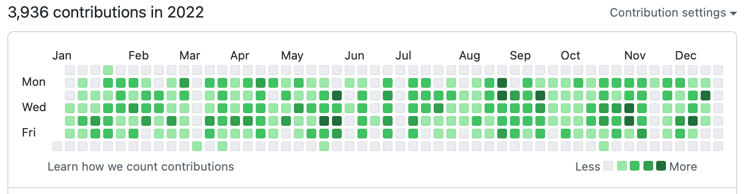
The key is not to make a streak system feel abstract. It should feel real and earned. For instance, Duolingo and Apple’s Fitness activity rings use clean animation designs on completion of a streak, and GitHub shows historical data of a user’s consistency over time.
Use Good Timing
I mentioned earlierthat humans are generally forgetful by nature, and that prompts can help maintain forward momentum. Without prompts, most new users forget to keep going. Life can get busy, motivation disappears, and things happen. Even long-time users benefit from prompts, though most times, they are already locked inside the habit loop. Nevertheless, even the most committed person can accidentally miss a day.
Your streak system most definitely needs reminders. The most-used prompt reminders are push notifications. Timing really matters when working with push notifications. The type of app matters, too. Sending a notification at 9 a.m. saying “You haven’t practiced today” is just weird for a learning app because many have things to do in the day before they even think about completing a lesson. If we’re talking about a fitness app, though, it is reasonable and maybe even expected to be reminded earlier in the day.
Push notifications vary significantly by app category. Fitness apps, for instance, see higher engagement with early morning notifications (7–8 AM), while productivity apps might perform better in early noon. The key is to A/B test your app’s timing based on your users’ behaviours rather than assuming things are one-size-fits-all. What works for a meditation app might not work for a coding tracker.
Other prompt methods are red dots on the app icon and even app widgets. Studies vary, but the average person unlocks their device between 50-150 times a day (PDF). If a user sees a red dot on an app or a widget that indicates a current streak every time they unlock their phone, it increases commitment.
Just don’t overdo it; the prompt should serve as a reminder, not a nag.
Celebrate Milestones
A streak system should try to celebrate milestones to reignite emotions, especially for users deep into a streak.
When a user hits Day 7, Day 30, Day 50, Day 100, Day 365, you should make a big deal out of it. Acknowledge achievements — especially for long-time users.
As we saw earlier, Duolingo figured this out and implemented an animated graphic that celebrates milestones with confetti. Some platforms even give substantial bonus rewards that validate users’ efforts. And this can be beneficial to apps, such that users tend to share their milestones publicly on social media.
Another benefit is the anticipation that comes before reaching milestones. It isn’t just keeping the streak alive endlessly; users have something to look forward to.
Use Grace Mechanisms
Life is unpredictable. People get distracted. Any good streak system should expect imperfection. One of the biggest psychological threats to a streak system is the hard reset to zero after just a single missed day.
An “ethical” streak system should provide the user with some slack. Let’s say you have a 90-day chess learning streak. You have been consistent for three good months, and one day, your phone dies while traveling, and just like that, 90 becomes 0 — everything, all that effort, is erased, and progress vanishes. The user might be completely devastated. The thought of rebuilding it from scratch is so demoralizing that the effort isn’t worth it. At worst, a user might abandon the app after feeling like a failure.
Consider adding a “grace” mechanism to your streak system:
- Streak Freeze
Allow users to intentionally miss a day without penalties. - Extra Time
Allow a few hours (2–3) past the usual deadline before triggering a reset. - Decay Models
Instead of a hard reset, the streak decreases by a small amount, e.g., 10 days is deducted from the streak per missed day.
Use An Encouraging Tone
Let’s compare two messages shown to users when a streak breaks:
- “You lost your 42-day streak. Start over.”
- “You showed up for 42 days straight. That’s incredible progress! Wanna give it another try?”
Both convey the same information, but the emotional impact is different. The first message would most likely make a user feel demoralized and cause them to quit. The second message celebrates what has already been achieved and gently encourages the user to try again.
Streak Systems Design Challenges
Before we go into the technical specifics of building a streak system, you should be aware of the challenges that you might face. Things can get complicated, as you might expect.
Handling Timezones
There is a reason why handling time and date is among the most difficult concepts developers deal with. There’s formatting, internationalization, and much more to consider.
Let me ask you this: What counts as a day?
We know the world runs on different time zones, and as if that is not enough, some regions have Daylight Saving Time (DST) that happens twice a year. Where do you even begin handling these edge cases? What counts as the “start” of tomorrow?
Some developers try to avoid this by using one central timezone, like UTC. For some users, this would yield correct results, but for some, it could be off by an hour, two hours, or more. This inconsistency ruins the user experience. Users care less how you handle the time behind the scenes; all they expect is that if they perform a streak action at 11:40 p.m., then it should register at that exact time, in their context. You should define “one day” based on the user’s local timezone, not the server time.
Sure, you can take the easy route and reset streaks globally for all users at midnight UTC, but you are very much creating unfairness. Someone in California always has eight extra hours to complete their task than someone living in London. That’s an unjust design flaw that punishes certain users because of their location. And what if that person in London is only visiting, completes a task, then returns to another timezone?
One effective solution to all these is to ask users to explicitly set their timezone during onboarding (preferably after first authentication). It’s a good idea to include a subtle note that providing timezone information is only used for the app to accurately track progress, rather than being used as personally identifiable data. And it’s another good idea to make that a changeable setting.
I suggest that anyone avoid directly handling timezone logic in an app. Use tried-and-true date libraries, like Moment.js or pytz (Python), etc. There’s no need to reinvent the wheel for something as complex as this.
Missed Days And Edge Cases
Another challenge you should worry about is uncontrollable edge cases like users oversleeping, server downtime, lag, network failures, and so on. Using the idea of grace mechanisms, like the ones we discussed earlier, can help.
A grace window of two hours might help both user and developer, in the sense that users are not rigidly punished for uncontrollable life circumstances. For developers, grace windows are helpful in those uncontrollable moments when the server goes down in the middle of the night.
Above all, never trust the client. Always validate on the server-side. The server should be the single source of truth.
Cheating Prevention
Again, I cannot stress this enough: Make sure to validate everything server-side. Users are humans, and humans might cheat if given the opportunity. It is unavoidable.
You might try:
- Storing all actions with UTC timestamps.
The client can send their local time, but the server can immediately convert that to UTC and validate against the server time. That way, if the client’s timestamp is suspiciously far, the system can reject it as an error, and the UI can respond accordingly. - Using event-based tracking.
In other words, store a record of each action with metadata including information like the user’s ID, the type of action performed, and the timestamp and timezone. This helps with validation.
Building A Streak System Engine
This isn’t a code tutorial, so I will avoid dumping a bunch of code on you. I’ll keep this practical and describe how things generally operate a streak system engine as far as architecture, flow, and reliability.
Core Architecture
As I’ve said several times, make the serverthe single source of truth for streak data. The architecture can go something like this on the server:
- Store each user’s data in a database.
- Store the current streak store (default as 0) as an integer.
- Store the timezone preference, i.e., IANA Timezone string (either implicitly from local timestamp or explicitly by asking user to select their timezone). For example, “America/New_York”.
- Handle all logic to determine if the streak continues or breaks, with a timezone check that is relative to the user’s local timezone.
Meanwhile, on the client-side:
- Display the current streak, normally fetched from the server.
- Send action done in the form of metadata to the server to validate whether the user actually completed a qualifying streak action.
- Provide visual feedback based on the server responses.
So, in short, the brain is on the server, and the client is for display purposes and submitting events. This saves you a lot of failures and edge cases, plus makes updates and fixes easier.
The Logical Flow
Let’s simulate a walkthrough of how a minimal efficient streak system engine would go when a user completes an action:
- The user completes a qualifying streak action.
- The client sends an event to the server as metadata. This could be “User X completed action Y at timestamp Z”.
- The server receives this event and does basic validation. Is this a real user? Are they authenticated? Is the action valid? Is the timezone consistent?
- If this passes, the server retrieves the user’s streak data from the database.
- Then, convert the received action timestamp to the user’s local timezone.
- Let the server compare the calendar dates (not timestamps) in the user’s local timezone:
- If it is the same day, then the action is redundant and there is no change in the streak.
- If it is the next day, then the streak extends and increments by 1.
- If there is a gap of more than one day, the streak breaks. However, this is where you might apply grace mechanics.
- If the grace mechanism is missed, then reset the streak to 1.
- If you choose to save historical data for milestone achievements, then update variables like “longest streak” or “total active days”.
- The server then updates the database and responds to the client. Something like this:
{ "current_streak": 48, "longest_streak": 50, "total_active_days": 120, "streak_extended": true, } As a further measure, the server should either retry or reject and notify the client when anything fails during the process.
Building For Resilience
As mentioned before, users losing a streak due to bugs or server downtime is terrible UX, and users don’t expect to take the fall for it. Thus, your streak system should have safeguards for those scenarios.
If the server is down for maintenance (or whatever reason), consider allowing a temporary window of additional hours to get it fixed so actions can be submitted late and still count. You can also choose to notify users, especially if the situation is capable of affecting an ongoing streak.
Note: Establish an admin backdoor where data can be manually restored. Bugs are inevitable, and some users would call your app out or reach out to support that their streak broke for a reason they could not control. You should be able to manually restore the streaks if, after investigation, the user is right.
Conclusion
One thing remains clear: Streaks are really powerful because of how human psychology works on a fundamental level.
The best streak system out there is the one that users don’t think about consciously. It has become a routine of immediate results or visible progress, like brushing teeth, which becomes a regular habit.
And I’m just gonna say it: Not all products need a streak system. Should you really force consistency just because you want daily active users? The answer may very well be “no”.
(gg, yk)
Converting Plain Text To Encoded HTML With Vanilla JavaScript
What do you do when you need to convert plain text into formatted HTML? Perhaps you reach for Markdown or manually write in the element tags yourself. Or maybe you have one or two of the dozens of onl
Javascript
Converting Plain Text To Encoded HTML With Vanilla JavaScript
Alexis Kypridemos
When copying text from a website to your device’s clipboard, there’s a good chance that you will get the formatted HTML when pasting it. Some apps and operating systems have a “Paste Special” feature that will strip those tags out for you to maintain the current style, but what do you do if that’s unavailable?
Same goes for converting plain text into formatted HTML. One of the closest ways we can convert plain text into HTML is writing in Markdown as an abstraction. You may have seen examples of this in many comment forms in articles just like this one. Write the comment in Markdown and it is parsed as HTML.
Even better would be no abstraction at all! You may have also seen (and used) a number of online tools that take plainly written text and convert it into formatted HTML. The UI makes the conversion and previews the formatted result in real time.
Providing a way for users to author basic web content — like comments — without knowing even the first thing about HTML, is a novel pursuit as it lowers barriers to communicating and collaborating on the web. Saying it helps “democratize” the web may be heavy-handed, but it doesn’t conflict with that vision!

We can build a tool like this ourselves. I’m all for using existing resources where possible, but I’m also for demonstrating how these things work and maybe learning something new in the process.
Defining The Scope
There are plenty of assumptions and considerations that could go into a plain-text-to-HTML converter. For example, should we assume that the first line of text entered into the tool is a title that needs corresponding <h1> tags? Is each new line truly a paragraph, and how does linking content fit into this?
Again, the idea is that a user should be able to write without knowing Markdown or HTML syntax. This is a big constraint, and there are far too many HTML elements we might encounter, so it’s worth knowing the context in which the content is being used. For example, if this is a tool for writing blog posts, then we can limit the scope of which elements are supported based on those that are commonly used in long-form content: <h1>, <p>, <a>, and <img>. In other words, it will be possible to include top-level headings, body text, linked text, and images. There will be no support for bulleted or ordered lists, tables, or any other elements for this particular tool.
The front-end implementation will rely on vanilla HTML, CSS, and JavaScript to establish a small form with a simple layout and functionality that converts the text to HTML. There is a server-side aspect to this if you plan on deploying it to a production environment, but our focus is purely on the front end.
Looking At Existing Solutions
There are existing ways to accomplish this. For example, some libraries offer a WYSIWYG editor. Import a library like TinyMCE with a single <script> and you’re good to go. WYSIWYG editors are powerful and support all kinds of formatting, even applying CSS classes to content for styling.
But TinyMCE isn’t the most efficient package at about 500 KB minified. That’s not a criticism as much as an indication of how much functionality it covers. We want something more “barebones” than that for our simple purpose. Searching GitHub surfaces more possibilities. The solutions, however, seem to fall into one of two categories:
- The input accepts plain text, but the generated HTML only supports the HTML
<h1>and<p>tags. - The input converts plain text into formatted HTML, but by ”plain text,” the tool seems to mean “Markdown” (or a variety of it) instead. The txt2html Perl module (from 1994!) would fall under this category.
Even if a perfect solution for what we want was already out there, I’d still want to pick apart the concept of converting text to HTML to understand how it works and hopefully learn something new in the process. So, let’s proceed with our own homespun solution.
Setting Up The HTML
We’ll start with the HTML structure for the input and output. For the input element, we’re probably best off using a <textarea>. For the output element and related styling, choices abound. The following is merely one example with some very basic CSS to place the input <textarea> on the left and an output <div> on the right:
See the Pen [Base Form Styles [forked]](https://codepen.io/smashingmag/pen/OJGoNOX) by Geoff Graham.
You can further develop the CSS, but that isn’t the focus of this article. There is no question that the design can be prettier than what I am providing here!
Capture The Plain Text Input
We’ll set an onkeyup event handler on the <textarea> to call a JavaScript function called convert() that does what it says: convert the plain text into HTML. The conversion function should accept one parameter, a string, for the user’s plain text input entered into the <textarea> element:
<textarea onkeyup='convert(this.value);'></textarea>onkeyup is a better choice than onkeydown in this case, as onkeyup will call the conversion function after the user completes each keystroke, as opposed to before it happens. This way, the output, which is refreshed with each keystroke, always includes the latest typed character. If the conversion is triggered with an onkeydown handler, the output will exclude the most recent character the user typed. This can be frustrating when, for example, the user has finished typing a sentence but cannot yet see the final punctuation mark, say a period (.), in the output until typing another character first. This creates the impression of a typo, glitch, or lag when there is none.
In JavaScript, the convert() function has the following responsibilities:
- Encode the input in HTML.
- Process the input line-by-line and wrap each individual line in either a
<h1>or<p>HTML tag, whichever is most appropriate. - Process the output of the transformations as a single string, wrap URLs in HTML
<a>tags, and replace image file names with<img>elements.
And from there, we display the output. We can create separate functions for each responsibility. Let’s name them accordingly:
html_encode()convert_text_to_HTML()convert_images_and_links_to_HTML()
Each function accepts one parameter, a string, and returns a string.
Encoding The Input Into HTML
Use the html_encode() function to HTML encode/sanitize the input. HTML encoding refers to the process of escaping or replacing certain characters in a string input to prevent users from inserting their own HTML into the output. At a minimum, we should replace the following characters:
<with<>with>&with&'with'"with"
JavaScript does not provide a built-in way to HTML encode input as other languages do. For example, PHP has htmlspecialchars(), htmlentities(), and strip_tags() functions. That said, it is relatively easy to write our own function that does this, which is what we’ll use the html_encode() function for that we defined earlier:
function html_encode(input) { const textArea = document.createElement("textarea"); textArea.innerText = input; return textArea.innerHTML.split("<br>").join("\n"); } HTML encoding of the input is a critical security consideration. It prevents unwanted scripts or other HTML manipulations from getting injected into our work. Granted, front-end input sanitization and validation are both merely deterrents because bad actors can bypass them. But we may as well make them work a little harder.
As long as we are on the topic of securing our work, make sure to HTML-encode the input on the back end, where the user cannot interfere. At the same time, take care not to encode the input more than once. Encoding text that is already HTML-encoded will break the output functionality. The best approach for back-end storage is for the front end to pass the raw, unencoded input to the back end, then ask the back-end to HTML-encode the input before inserting it into a database.
That said, this only accounts for sanitizing and storing the input on the back end. We still have to display the encoded HTML output on the front end. There are at least two approaches to consider:
- Convert the input to HTML after HTML-encoding it and before it is inserted into a database.
This is efficient, as the input only needs to be converted once. However, this is also an inflexible approach, as updating the HTML becomes difficult if the output requirements happen to change in the future. - Store only the HTML-encoded input text in the database and dynamically convert it to HTML before displaying the output for each content request.
This is less efficient, as the conversion will occur on each request. However, it is also more flexible since it’s possible to update how the input text is converted to HTML if requirements change.
Applying Semantic HTML Tags
Let’s use the convert_text_to_HTML() function we defined earlier to wrap each line in their respective HTML tags, which are going to be either <h1> or <p>. To determine which tag to use, we will split the text input on the newline character (\n) so that the text is processed as an array of lines rather than a single string, allowing us to evaluate them individually.
function convert_text_to_HTML(txt) { // Output variable let out = ''; // Split text at the newline character into an array const txt_array = txt.split("\n"); // Get the number of lines in the array const txt_array_length = txt_array.length; // Variable to keep track of the (non-blank) line number let non_blank_line_count = 0; for (let i = 0; i < txt_array_length; i++) { // Get the current line const line = txt_array[i]; // Continue if a line contains no text characters if (line === ''){ continue; } non_blank_line_count++; // If a line is the first line that contains text if (non_blank_line_count === 1){ // ...wrap the line of text in a Heading 1 tag out += `<h1>${line}</h1>`; // ...otherwise, wrap the line of text in a Paragraph tag. } else { out += `<p>${line}</p>`; } } return out; } In short, this little snippet loops through the array of split text lines and ignores lines that do not contain any text characters. From there, we can evaluate whether a line is the first one in the series. If it is, we slap a <h1> tag on it; otherwise, we mark it up in a <p> tag.
This logic could be used to account for other types of elements that you may want to include in the output. For example, perhaps the second line is assumed to be a byline that names the author and links up to an archive of all author posts.
Tagging URLs And Images With Regular Expressions
Next, we’re going to create our convert_images_and_links_to_HTML() function to encode URLs and images as HTML elements. It’s a good chunk of code, so I’ll drop it in and we’ll immediately start picking it apart together to explain how it all works.
function convert_images_and_links_to_HTML(string){ let urls_unique = []; let images_unique = []; const urls = string.match(/https*:\/\/[^\s<),]+[^\s<),.]/gmi) ?? []; const imgs = string.match(/[^"'>\s]+\.(jpg|jpeg|gif|png|webp)/gmi) ?? []; const urls_length = urls.length; const images_length = imgs.length; for (let i = 0; i < urls_length; i++){ const url = urls[i]; if (!urls_unique.includes(url)){ urls_unique.push(url); } } for (let i = 0; i < images_length; i++){ const img = imgs[i]; if (!images_unique.includes(img)){ images_unique.push(img); } } const urls_unique_length = urls_unique.length; const images_unique_length = images_unique.length; for (let i = 0; i < urls_unique_length; i++){ const url = urls_unique[i]; if (images_unique_length === 0 || !images_unique.includes(url)){ const a_tag = `<a href="${url}" target="_blank">${url}</a>`; string = string.replace(url, a_tag); } } for (let i = 0; i < images_unique_length; i++){ const img = images_unique[i]; const img_tag = `<img src="${img}" alt="">`; const img_link = `<a href="${img}">${img_tag}</a>`; string = string.replace(img, img_link); } return string; } Unlike the convert_text_to_HTML() function, here we use regular expressions to identify the terms that need to be wrapped and/or replaced with <a> or <img> tags. We do this for a couple of reasons:
- The previous
convert_text_to_HTML()function handles text that would be transformed to the HTML block-level elements<h1>and<p>, and, if you want, other block-level elements such as<address>. Block-level elements in the HTML output correspond to discrete lines of text in the input, which you can think of as paragraphs, the text entered between presses of the Enter key. - On the other hand, URLs in the text input are often included in the middle of a sentence rather than on a separate line. Images that occur in the input text are often included on a separate line, but not always. While you could identify text that represents URLs and images by processing the input line-by-line — or even word-by-word, if necessary — it is easier to use regular expressions and process the entire input as a single string rather than by individual lines.
Regular expressions, though they are powerful and the appropriate tool to use for this job, come with a performance cost, which is another reason to use each expression only once for the entire text input.
Remember: All the JavaScript in this example runs each time the user types a character, so it is important to keep things as lightweight and efficient as possible.
I also want to make a note about the variable names in our convert_images_and_links_to_HTML() function. images (plural), image (singular), and link are reserved words in JavaScript. Consequently, imgs, img, and a_tag were used for naming. Interestingly, these specific reserved words are not listed on the relevant MDN page, but they are on W3Schools.
We’re using the String.prototype.match() function for each of the two regular expressions, then storing the results for each call in an array. From there, we use the nullish coalescing operator (??) on each call so that, if no matches are found, the result will be an empty array. If we do not do this and no matches are found, the result of each match() call will be null and will cause problems downstream.
const urls = string.match(/https*:\/\/[^\s<),]+[^\s<),.]/gmi) ?? []; const imgs = string.match(/[^"'>\s]+\.(jpg|jpeg|gif|png|webp)/gmi) ?? []; Next up, we filter the arrays of results so that each array contains only unique results. This is a critical step. If we don’t filter out duplicate results and the input text contains multiple instances of the same URL or image file name, then we break the HTML tags in the output. JavaScript does not provide a simple, built-in method to get unique items in an array that’s akin to the PHP array_unique() function.
The code snippet works around this limitation using an admittedly ugly but straightforward procedural approach. The same problem is solved using a more functional approach if you prefer. There are many articles on the web describing various ways to filter a JavaScript array in order to keep only the unique items.
We’re also checking if the URL is matched as an image before replacing a URL with an appropriate <a> tag and performing the replacement only if the URL doesn’t match an image. We may be able to avoid having to perform this check by using a more intricate regular expression. The example code deliberately uses regular expressions that are perhaps less precise but hopefully easier to understand in an effort to keep things as simple as possible.
And, finally, we’re replacing image file names in the input text with <img> tags that have the src attribute set to the image file name. For example, my_image.png in the input is transformed into <img src='my_image.png'> in the output. We wrap each <img> tag with an <a> tag that links to the image file and opens it in a new tab when clicked.
There are a couple of benefits to this approach:
- In a real-world scenario, you will likely use a CSS rule to constrain the size of the rendered image. By making the images clickable, you provide users with a convenient way to view the full-size image.
- If the image is not a local file but is instead a URL to an image from a third party, this is a way to implicitly provide attribution. Ideally, you should not rely solely on this method but, instead, provide explicit attribution underneath the image in a
<figcaption>,<cite>, or similar element. But if, for whatever reason, you are unable to provide explicit attribution, you are at least providing a link to the image source.
It may go without saying, but “hotlinking” images is something to avoid. Use only locally hosted images wherever possible, and provide attribution if you do not hold the copyright for them.
Before we move on to displaying the converted output, let’s talk a bit about accessibility, specifically the image alt attribute. The example code I provided does add an alt attribute in the conversion but does not populate it with a value, as there is no easy way to automatically calculate what that value should be. An empty alt attribute can be acceptable if the image is considered “decorative,” i.e., purely supplementary to the surrounding text. But one may argue that there is no such thing as a purely decorative image.
That said, I consider this to be a limitation of what we’re building.
Displaying the Output HTML
We’re at the point where we can finally work on displaying the HTML-encoded output! We’ve already handled all the work of converting the text, so all we really need to do now is call it:
function convert(input_string) { output.innerHTML = convert_images_and_links_to_HTML(convert_text_to_HTML(html_encode(input_string))); } If you would rather display the output string as raw HTML markup, use a <pre> tag as the output element instead of a <div>:
<pre id='output'></pre> The only thing to note about this approach is that you would target the <pre> element’s textContent instead of innerHTML:
function convert(input_string) { output.textContent = convert_images_and_links_to_HTML(convert_text_to_HTML(html_encode(input_string))); } Conclusion
We did it! We built one of the same sort of copy-paste tool that converts plain text on the spot. In this case, we’ve configured it so that plain text entered into a <textarea> is parsed line-by-line and encoded into HTML that we format and display inside another element.
See the Pen [Convert Plain Text to HTML (PoC) [forked]](https://codepen.io/smashingmag/pen/yLrxOzP) by Geoff Graham.
We were even able to keep the solution fairly simple, i.e., vanilla HTML, CSS, and JavaScript, without reaching for a third-party library or framework. Does this simple solution do everything a ready-made tool like a framework can do? Absolutely not. But a solution as simple as this is often all you need: nothing more and nothing less.
As far as scaling this further, the code could be modified to POST what’s entered into the <form> using a PHP script or the like. That would be a great exercise, and if you do it, please share your work with me in the comments because I’d love to check it out.
References
- “How to HTML-encode a String” (W3Docs)
- “How to escape & unescape HTML characters in string in JavaScript” (Educative.io)
- “How to get all unique values (remove duplicates) in a JavaScript array?”” (GeeksforGeeks)
- “Getting Unique Array Values in Javascript and Typescript,” Chris Engelsma
- “Threats of Using Regular Expressions in JavaScript,” Dulanka Karunasena
(gg, yk)
Building Digital Trust: An Empathy-Centred UX Framework For Mental Health Apps
Designing for mental health means designing for vulnerability. Empathy-Centred UX becomes not a “nice to have” but a fundamental design requirement. Here’s a practical framework for building tru
Ux
Building Digital Trust: An Empathy-Centred UX Framework For Mental Health Apps
Kat Homan
Imagine a user opening a mental health app while feeling overwhelmed with anxiety. The very first thing they encounter is a screen with a bright, clashing colour scheme, followed by a notification shaming them for breaking a 5-day “mindfulness streak,” and a paywall blocking the meditation they desperately need at that very moment. This experience isn’t just poor design; it can be actively harmful. It betrays the user’s vulnerability and erodes the very trust the app aims to build.
When designing for mental health, this becomes both a critical challenge and a valuable opportunity. Unlike a utility or entertainment app, the user’s emotional state cannot be treated as a secondary context. It is the environment your product operates in.
With over a billion people living with mental health conditions and persistent gaps in access to care, safe and evidence-aligned digital support is increasingly relevant. The margin for error is negligible. Empathy-Centred UX becomes not a “nice to have” but a fundamental design requirement. It is an approach that moves beyond mere functionality to deeply understand, respect, and design for the user’s intimate emotional and psychological needs.
But how do we translate this principle into practice? How do we build digital products that are not just useful, but truly trustworthy?
Throughout my career as a product designer, I’ve found that trust is built by consistently meeting the user’s emotional needs at every stage of their journey. In this article, I will translate these insights into a hands-on empathy-centred UX framework. We will move beyond theory to dive deeper into applicable tools that help create experiences that are both humane and highly effective.
In this article, I’ll share a practical, repeatable framework built around three pillars:
- Onboarding as a supportive first conversation.
- Interface design for a brain in distress.
- Retention patterns that deepen trust rather than pressure users.
Together, these pillars offer a grounded way to design mental health experiences that prioritise trust, emotional safety, and real user needs at every step.
The Onboarding Conversation: From a Checklist to a Trusted Companion
Onboarding is “a first date” between a user and the app — and the first impression carries immense stakes, determining whether the user decides to continue engaging with the app. In mental health tech, with up to 20,000 mental-health-related apps on the market, product designers face a dilemma of how to integrate onboarding’s primary goals without making the design feel too clinical or dismissive for a user seeking help.
The Empathy Tool
In my experience, I have found it essential to design onboarding as the first supportive conversation. The goal is to help the user feel seen and understood by delivering a small dose of relief quickly, not just overload them with data and the app’s features.
Case Study: A Teenager’s Parenting Journey
At Teeni, an app for parents of teenagers, onboarding requires an approach that solves two problems: (1) acknowledge the emotional load of parenting teens and show how the app can share that load; (2) collect just enough information to make the first feed relevant.
Recognition And Relief
Interviews surfaced a recurring feeling among parents: “I’m a bad parent, I’ve failed at everything.” My design idea was to provide early relief and normalisation through a city-at-night metaphor with lit windows: directly after the welcome page, a user engages with three brief, animated and optional stories based on frequent challenges of teenage parenting, in which they can recognise themselves (e.g., a story of a mother learning to manage her reaction to her teen rolling their eyes). This narrative approach reassures parents that they are not alone in their struggles, normalising and helping them cope with stress and other complex emotions from the very beginning.
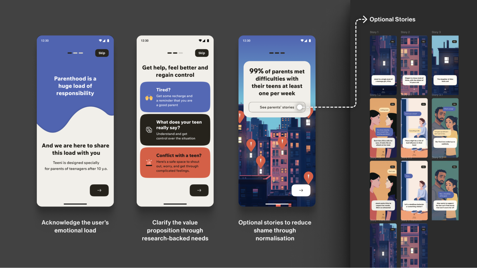
Note: Early usability sessions indicated strong emotional resonance, but post-launch analytics showed that the optionality of the storytelling must be explicit. The goal is to balance the storytelling to avoid overwhelming the distressed parent, directly acknowledging their reality: “Parenting is tough. You’re not alone.”
Progressive Profiling
To tailor guidance to each family, we defined the minimal data needed for personalisation. On the first run, we collect only the essentials for a basic setup (e.g., parent role, number of teens, and each teen’s age). Additional, yet still important, details (specific challenges, wishes, requests) are gathered gradually as users progress through the app, avoiding long forms for those who need support immediately.
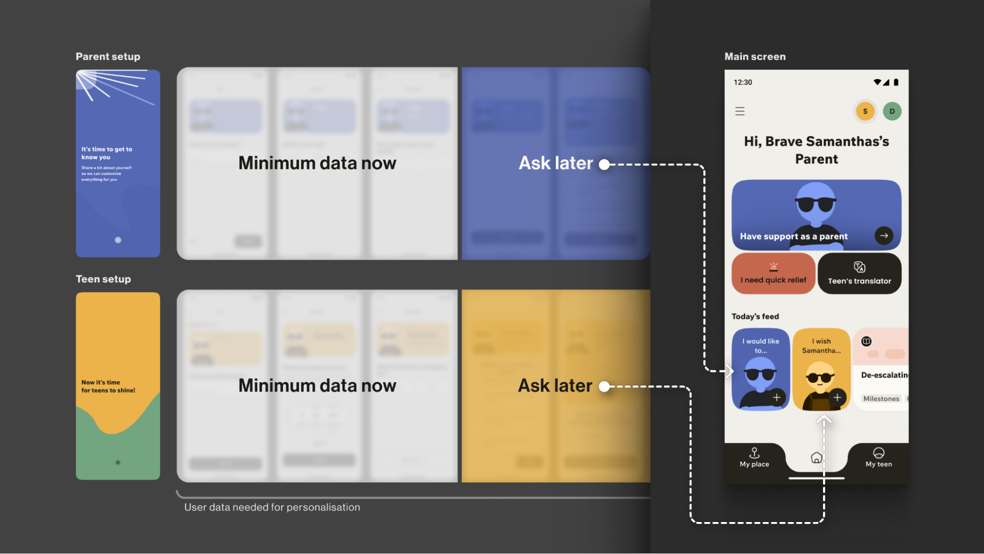
The entire onboarding is centred around a consistently supportive choice of words, turning a typically highly practical, functional process into a way to connect with the vulnerable user on a deeper emotional level, while keeping an explicit fast path.
Your Toolbox
- Use Validating Language
Start with “It’s okay to feel this way,” not “Allow notifications.” - Understand “Why”, not just “What”
Collect only what you’ll use now and defer the rest via progressive profiling. Use simple, goal-focused questions to personalise users’ experience. - Prioritise Brevity and Respect
Keep onboarding skimmable, make optionality explicit, and let user testing define the minimum effective length &mdashl the shorter is usually the better. - Keep an Eye on Feedback and Iterate
Track time-to-first-value and step drop-offs; pair these with quick usability sessions, then adjust based on what you learn.
This initial conversation sets the stage for trust. But this trust is fragile. The next step is to ensure the app’s very environment doesn’t break it.
The Emotional Interface: Maintaining Trust In A Safe Environment
A user experiencing anxiety or depression often shows reduced cognitive capacity, which affects their attention span and the speed with which they process information and lowers tolerance for dense layouts and fast, highly stimulating visuals. This means that high-saturation palettes, abrupt contrast changes, flashing, and dense text can feel overwhelming for them.
The Empathy Tool
When designing a user flow for a mental health app, I always apply the Web Content Accessibility Guidelines 2.2 as a foundational baseline. On top of that, I choose a “low-stimulus”, “familiar and safe” visual language to minimise the user’s cognitive load and create a calm, predictable, and personalised environment. Where appropriate, I add subtle, opt-in haptics and gentle micro-interactions for sensory grounding, and offer voice features as an option in high-stress moments (alongside low-effort tap flows) to enhance accessibility.
Imagine you need to guide your users “by the hand”: we want to make sure their experience is as effortless as possible, and they are quickly guided to the support they need, so we avoid complicated forms and long wordings.
Case: Digital Safe Space
For the app focused on instant stress relief, Bear Room, I tested a “cosy room” design. My initial hypothesis was validated through a critical series of user interviews: the prevailing design language of many mental health apps appeared misaligned with the needs of our audience. Participants grappling with conditions such as PTSD and depression repeatedly described competing apps as “too bright, too happy, and too overwhelming,” which only intensified their sense of alienation instead of providing solace. This suggested a mismatch for our segment, which instead sought a sense of safety in the digital environment.
This feedback informed a low-arousal design strategy. Rather than treating “safe space” as a visual theme, we approached it as a holistic sensory experience. The resulting interface is a direct antithesis to digital overload; it gently guides the user through the flow, keeping in mind that they are likely in a state where they lack the capacity to concentrate. The text is divided into smaller parts and is easily scannable and quickly defined. The emotional support tools — such as a pillow — are highlighted on purpose for convenience.
The interface employs a carefully curated, non-neon, earthy palette that feels grounding rather than stimulating, and it rigorously eliminates any sudden animations or jarring bright alerts that could trigger a stress response. This deliberate calmness is not an aesthetic afterthought but the app’s most critical feature, establishing a foundational sense of digital safety.
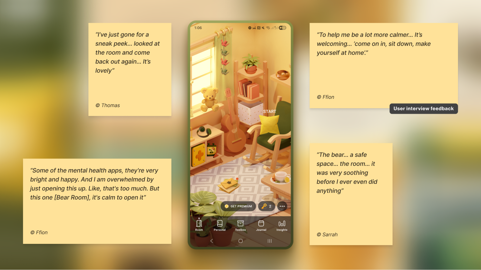
To foster a sense of personal connection and psychological ownership, the room introduces three opt-in “personal objects”: Mirror, Letter, and Frame. Each invites a small, successful act of contribution (e.g., leaving a short message to one’s future self or curating a set of personally meaningful photos), drawing on the IKEA effect (PDF).
For instance, Frame functions as a personal archive of comforting photo albums that users can revisit when they need warmth or reassurance. Because Frame is represented in the digital room as a picture frame on the wall, I designed an optional layer of customisation to deepen this connection: users can replace the placeholder with an image from their collection — a loved one, a pet, or a favourite landscape — displayed in the room each time they open the app. This choice is voluntary, lightweight, and reversible, intended to help the space feel more “mine” and deepen attachment without increasing cognitive load.
Note: Always adapt to the context. Try to avoid making the colour palette too pastel. It is useful to balance the brightness based on the user research, to protect the right level of the app’s contrast.
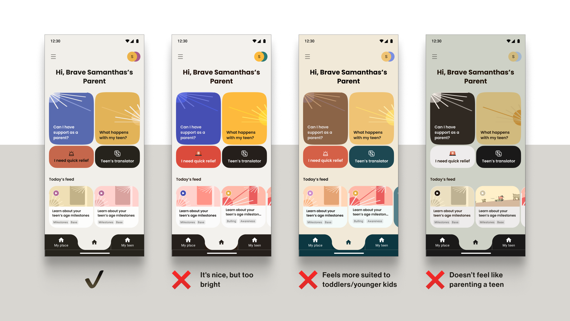
Case: Emotional Bubbles
In Food for Mood, I used a visual metaphor: coloured bubbles representing goals and emotional states (e.g., a dense red bubble for “Performance”). This allows users to externalise and visualise complex feelings without the cognitive burden of finding the right words. It’s a UI that speaks the language of emotion directly.
In an informal field test with young professionals (the target audience) in a co-working space, participants tried three interactive prototypes and rated each on simplicity and enjoyment. The standard card layout scored higher on simplicity, but the bubble carousel scored better on engagement and positive affect — and became the preferred option for the first iteration. Given that the simplicity trade-off was minimal (4⁄5 vs. 5⁄5) and limited to the first few seconds of use, I prioritised the concept that made the experience feel more emotionally rewarding.
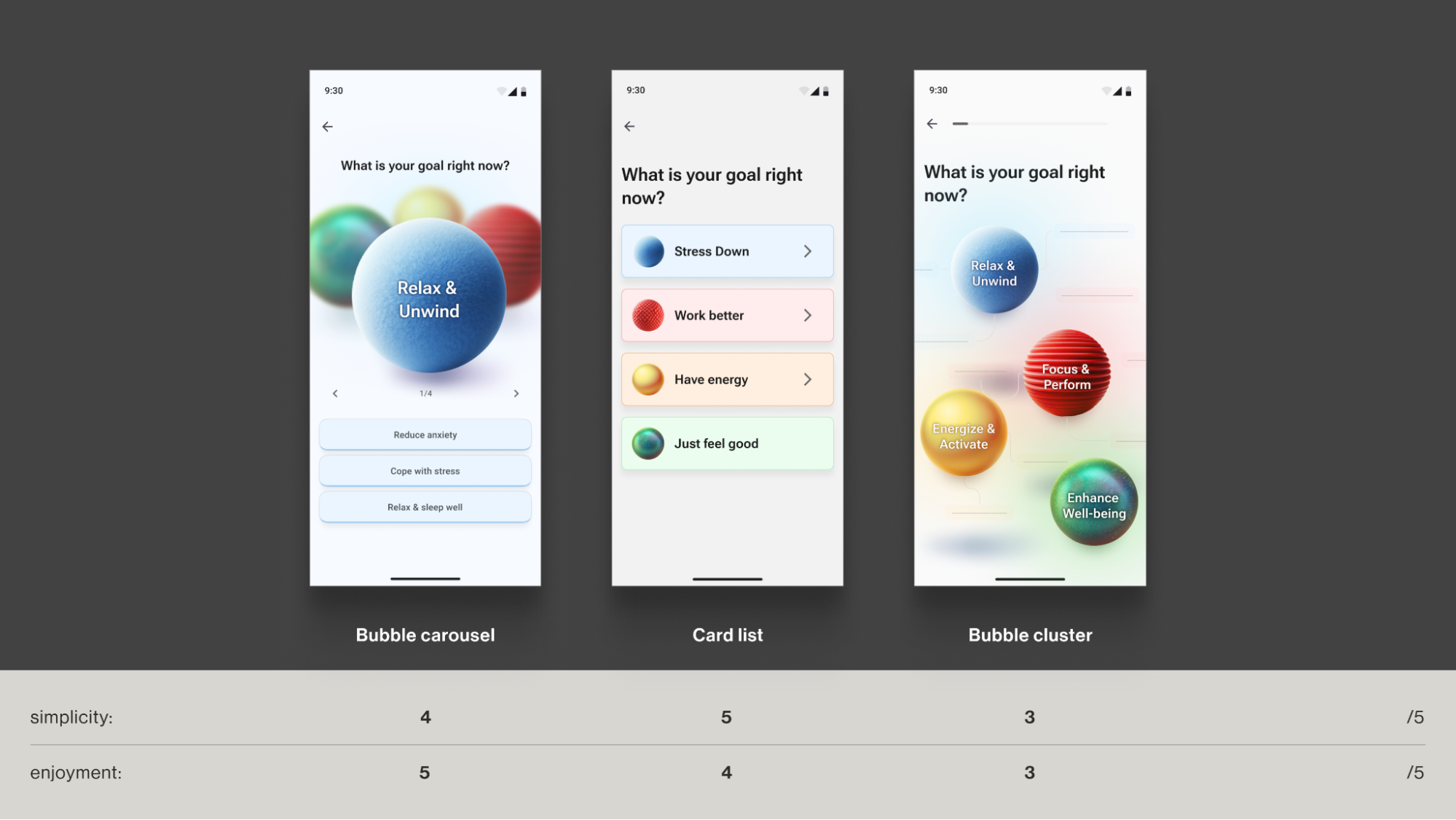
Case: Micro-interactions And Sensory Grounding
Adding a touch of tactile micro-interactions like bubble-wrap popping in Bear Room, may also offer users moments of kinetic relief. Integrating deliberate, tactile micro-interactions, such as the satisfying bubble-wrap popping mechanic, provides a focused act that can help an overwhelmed user feel more grounded. It offers a moment of pure, sensory distraction for a person stuck in a torrent of stressful thoughts. This isn’t about gamification in the traditional, points-driven sense; it’s about offering a controlled, sensory interruption to the cycle of anxiety.
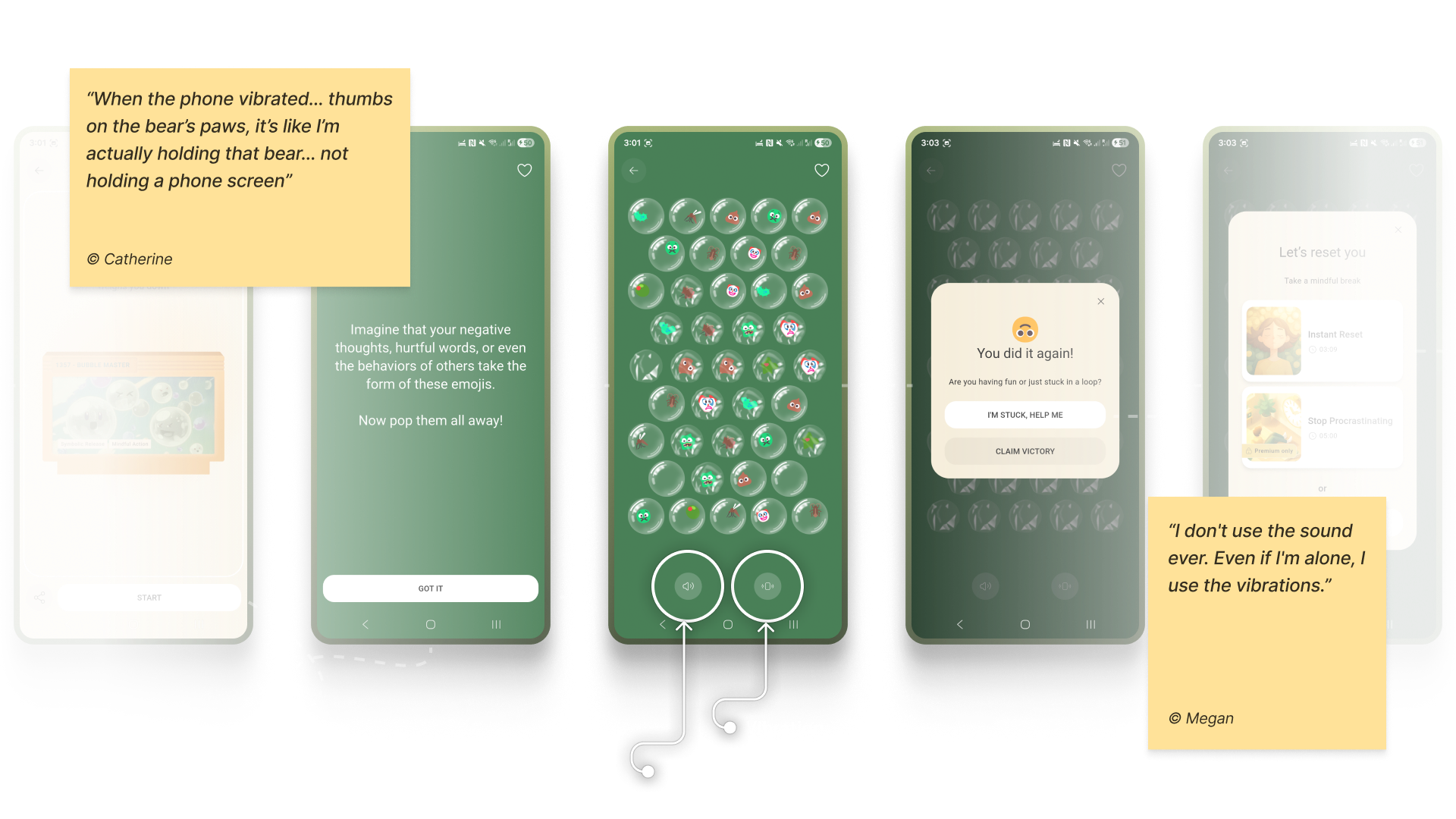
Note: Make tactile effects opt-in and predictable. Unexpected sensory feedback can increase arousal rather than reduce it for some users.
Case: Voice Assistants
When a user is in a state of high anxiety or depression, it can become an extra effort for them to type something in the app or make choices. In moments when attention is impaired, and a simple, low-cognitive choice (e.g., ≤4 clearly labelled options) isn’t enough, voice input can offer a lower-friction way to engage and communicate empathy.
In both Teeni and Bear Room, voice was integrated as a primary path for flows related to fatigue, emotional overwhelm, and acute stress — always alongside a text input alternative. Simply putting feelings into words (affect labelling) has been shown to reduce emotional intensity for some users, and spoken input also provides a richer context for tailoring support.
For Bear Room, we give users a choice to share what’s on their mind via a prominent mic button (with text input available below. The app then analyses their response with AI (does not diagnose) and provides a set of tailored practices to help them cope. This approach gives users a space for the raw, unfiltered expression of emotion when texting feels too heavy.
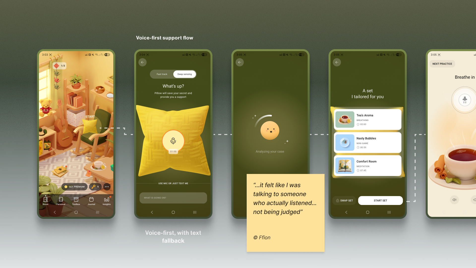
Similarly, Teeni’s “Hot flow” lets parents vent frustration and describe a difficult trigger via voice. Based on the case description, AI gives a one-screen piece of psychoeducational content, and in a few steps, the app suggests an appropriate calming tool, uniting both emotional and relational support.
“
Note: Mental-health topics are highly sensitive, and many people feel uncomfortable sharing sensitive data with an app — especially amid frequent news about data breaches and data being sold to third parties. Before recording, show a concise notice that explains how audio is processed, where it’s processed, how long it’s stored, and that it is not sold or shared with third parties. Present this in a clear, consent step (e.g., GDPR-style). For products handling personal data, it’s also best practice to provide an obvious “Delete all data” option.
Your Toolbox
- Accessibility-Friendly User Flow
Aim to become your user’s guide. Only use the text that is important, highlight key actions, and provide simple, step-by-step paths. - Muted Palettes
There’s no one-size-fits-all colour rule for mental-health apps. Align palette with purpose and audience; if you use muted palettes, verify WCAG 2.2 contrast thresholds and avoid flashing. - Tactile Micro-interactions
Use subtle, predictable, opt-in haptics and gentle micro-interactions for moments of kinetic relief. - Voice-First Design
Offer voice input as an alternative to typing or single-tap actions in low-energy/high-pressure states - Subtle Personalisation
Integrate small, voluntary customisations (like a personal photo in a digital frame) to foster a stronger emotional bond. - Privacy by Default
Ask for explicit consent to process personal data. State clearly how, where, and for how long data is processed, and that it’s not sold or shared — and honour it.
A safe interface builds trust in the moment. The final pillar is about earning the trust that brings users back, day after day.
The Retention Engine: Deepening Trust Through Genuine Connection
Encouraging consistent use without manipulation often requires innovative solutions in mental health. The app, as a business, faces an ethical dilemma: its mission is to prioritise user wellbeing, which means it cannot indulge users simply to maximise their screen time. Streaks, points, and time limits can also induce anxiety and shame, negatively affecting the user’s mental health. The goal is not to maximise screen time, but to foster a supportive rhythm of use that aligns with the non-linear journey of mental health.
The Empathy Tool
I replace anxiety-inducing gamification with retention engines powered by empathy. This involves designing loops that intrinsically motivate users through three core pillars: granting them agency with customisable tools, connecting them to a supportive community, and ensuring the app itself acts as a consistent source of support, making return visits feel like a choice, not a chore or pressure.
Case: “Key” Economy
In search of reimagining retention mechanics away from punitive streaks and towards a model of compassionate encouragement, the Bear Room team came up with the idea of the so-called “Key” economy. Unlike a streak that shames users for missing a day, users are envisioned to earn “keys” for logging in every third day — a rhythm that acknowledges the non-linear nature of healing and reduces the pressure of daily performance. Keys never gate SOS sets or essential coping practices. Keys only unlock more objects and advanced content; the core toolkit is always free. The app should also preserve users’ progress regardless of their level of engagement.
The system’s most empathetic innovation, however, lies in the ability for users to gift their hard-earned keys to others in the community who may be in greater need (still in the process of making). This intends to transform the act of retention from a self-focused chore into a generous, community-building gesture.
It aims to foster a culture of mutual support, where consistent engagement is not about maintaining a personal score, but about accumulating the capacity to help others.
Why it Works
- It’s Forgiving.
Unlike a streak, missing a day doesn’t reset progress; it just delays the next key. This removes shame. - It’s Community-driven.
Users can give their keys to others. This transforms retention from a selfish act into a generous one, reinforcing the app’s core value of community support.
Case: The Letter Exchange
Within Bear Room, users can write and receive supportive letters anonymously to other users around the world. This tool leverages AI-powered anonymity to create a safe space for radical vulnerability. It provides a real human connection while completely protecting user privacy, directly addressing the trust deficit. It shows users they are not alone in their struggles, a powerful retention driver.
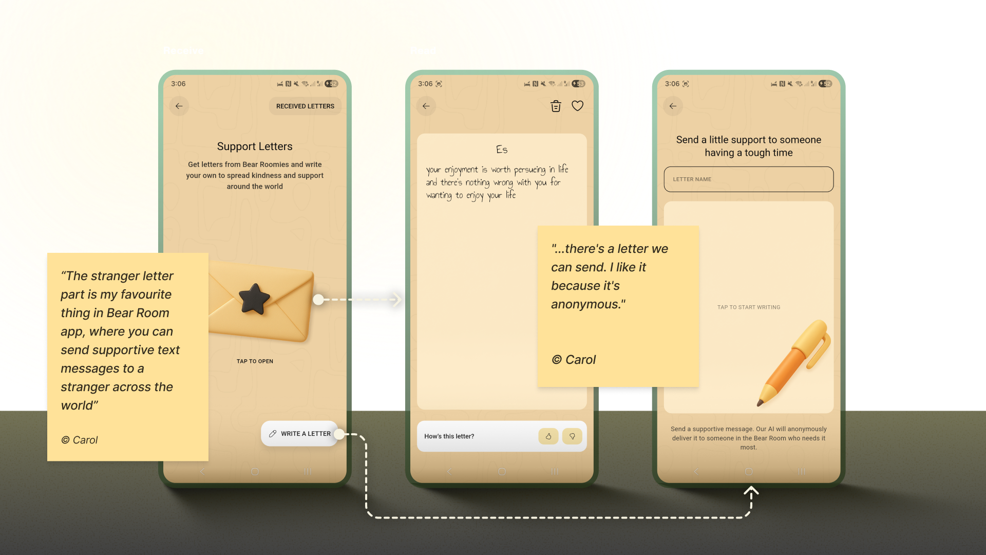
Note: Data privacy is always a priority in product design, but (again) it’s crucial to approach it firsthand in mental health. In the case of the letter exchange, robust anonymity isn’t just a setting; it is the foundational element that creates the safety required for users to be vulnerable and supportive with strangers.
Case: Teenager Translator
The “Teenager Translator” in Teeni became a cornerstone of our retention strategy by directly addressing the moment of crisis where parents were most likely to disengage. When a parent inputs their adolescent’s angry words like “What’s wrong with you? It’s my phone, I will watch what I want, just leave me alone!”, the tool instantly provides an empathetic translation of the emotional subtext, a de-escalation guide, and a practical script for how to respond.
This immediate, actionable support at the peak of frustration transforms the app from a passive resource into an indispensable crisis-management tool. By delivering profound value exactly when and where users need it most, it creates powerful positive reinforcement that builds habit and loyalty, ensuring parents return to the app not just to learn, but to actively navigate their most challenging moments.
Your Toolbox
- Reframe Metrics
Change “You broke your 7-day streak!” to “You’ve practiced 5 of the last 10 days. Every bit helps.” - Compassion Access Policy
Never gate crisis or core coping tools behind paywalls or keys. - Build Community Safely
Facilitate anonymous, moderated peer support. - Offer Choice
Let users control the frequency and type of reminders. - Keep an Eye on Reviews
Monitor app-store reviews and social mentions regularly; tag themes (bugs, UX friction, feature requests), quantify trends, and close the loop with quick fixes or clarifying updates.
Your Empathy-First Launchpad: Three Pillars To Trust
Let’s return to the overwhelmed user from the introduction. They open an app that greets them with a tested, audience-aligned visual language, a validating first message, and a retention system that supports rather than punishes.
This is the power of an Empathy-Centred UX Framework. It forces us to move beyond pixels and workflows to the heart of the user experience: emotional safety. But to embed this philosophy in design processes, we need a structured, scalable approach. My designer path led me to the following three core pillars:
- The Onboarding Conversation
Start by transforming the initial setup from a functional checklist into the first supportive, therapy-informed dialogue. This pillar is rooted in using validating language, keeping asking “why” to understand deeper needs, and prioritising brevity and respect to make the user feel seen and understood from their very first interactions. - The Emotional Interface
Adjust the design to a low-stimulus digital environment for a brain in distress. This pillar focuses on the visual and interactive tools: muted palettes, calming micro-interactions, voice-first features, and personalisation, to make sure a user enters a calm, predictable, and safe digital environment. Certainly, these tools are not limited to the ones I applied throughout my experience, and there is always room for creativity, keeping in mind users’ preferences and scientific research. - The Retention Engine
Be persistent in upholding genuine connection over manipulative gamification. This pillar focuses on building lasting engagement through forgiving systems (like the “Key” economy), community-driven support (like letter exchanges), and tools that offer profound value in moments of crisis (like the Teenager Translator). When creating such tools, aim for a supportive rhythm of use that aligns with the non-linear journey of mental health.
Trust Is The Success: Balancing Game
While we, as designers, don’t directly define the app’s success metrics, we cannot deny that our work influences the final outcomes. This is where our practical tools in mental health apps may come in partnership with the product owner’s goals. All the tools are designed based on hypotheses, evaluations of whether users need them, further testing, and metric analysis.
I would argue that one of the most critical success components for a mental health app is trust. Although it is not easy to measure, our role as designers lies precisely in creating a UX Framework that respects and listens to its users and makes the app fully accessible and inclusive.
The trick is to achieve a sustainable balance between helping users reach their wellness goals and the gaming effect, so they also benefit from the process and atmosphere. It is a blend of enjoyment from the process and fulfillment from the health benefits, where we want to make a routine meditation exercise something pleasant. Our role as product designers is to always keep in mind that the end goal for the user is to achieve a positive psychological effect, not to remain in a perpetual gaming loop.
Of course, we need to keep in mind that the more responsibility the app takes for its users’ health, the more requirements there arise for its design.
When this balance is struck, the result is more than just better metrics; it’s a profound positive impact on your users’ lives. In the end, empowering a user’s well-being is the highest achievement our craft can aspire to.
(yk)
The Forensics Of React Server Components (RSCs)
We love client-side rendering for the way it relieves the server of taxing operations, but serving an empty HTML page often leads to taxing user experiences during the initial page load. We love serve
Javascript
The Forensics Of React Server Components (RSCs)
Lazar Nikolov
This article is sponsored by Sentry.io
In this article, we’re going to look deeply at React Server Components (RSCs). They are the latest innovation in React’s ecosystem, leveraging both server-side and client-side rendering as well as streaming HTML to deliver content as fast as possible.
We will get really nerdy to get a full understanding of how RSCs fit into the React picture, the level of control they offer over the rendering lifecycle of components, and what page loads look like with RSCs in place.
But before we dive into all of that, I think it’s worth looking back at how React has rendered websites up until this point to set the context for why we need RSCs in the first place.
The Early Days: React Client-Side Rendering
The first React apps were rendered on the client side, i.e., in the browser. As developers, we wrote apps with JavaScript classes as components and packaged everything up using bundlers, like Webpack, in a nicely compiled and tree-shaken heap of code ready to ship in a production environment.
The HTML that returned from the server contained a few things, including:
- An HTML document with metadata in the
<head>and a blank<div>in the<body>used as a hook to inject the app into the DOM; - JavaScript resources containing React’s core code and the actual code for the web app, which would generate the user interface and populate the app inside of the empty
<div>.

A web app under this process is only fully interactive once JavaScript has fully completed its operations. You can probably already see the tension here that comes with an improved developer experience (DX) that negatively impacts the user experience (UX).
The truth is that there were (and are) pros and cons to CSR in React. Looking at the positives, web applications delivered smooth, quick transitions that reduced the overall time it took to load a page, thanks to reactive components that update with user interactions without triggering page refreshes. CSR lightens the server load and allows us to serve assets from speedy content delivery networks (CDNs) capable of delivering content to users from a server location geographically closer to the user for even more optimized page loads.
There are also not-so-great consequences that come with CSR, most notably perhaps that components could fetch data independently, leading to waterfall network requests that dramatically slow things down. This may sound like a minor nuisance on the UX side of things, but the damage can actually be quite large on a human level. Eric Bailey’s “Modern Health, frameworks, performance, and harm” should be a cautionary tale for all CSR work.
Other negative CSR consequences are not quite as severe but still lead to damage. For example, it used to be that an HTML document containing nothing but metadata and an empty <div> was illegible to search engine crawlers that never get the fully-rendered experience. While that’s solved today, the SEO hit at the time was an anchor on company sites that rely on search engine traffic to generate revenue.
The Shift: Server-Side Rendering (SSR)
Something needed to change. CSR presented developers with a powerful new approach for constructing speedy, interactive interfaces, but users everywhere were inundated with blank screens and loading indicators to get there. The solution was to move the rendering experience from the client to the server. I know it sounds funny that we needed to improve something by going back to the way it was before.
So, yes, React gained server-side rendering (SSR) capabilities. At one point, SSR was such a topic in the React community that it had a moment in the spotlight. The move to SSR brought significant changes to app development, specifically in how it influenced React behavior and how content could be delivered by way of servers instead of browsers.

Addressing CSR Limitations
Instead of sending a blank HTML document with SSR, we rendered the initial HTML on the server and sent it to the browser. The browser was able to immediately start displaying the content without needing to show a loading indicator. This significantly improves the First Contentful Paint (FCP) performance metric in Web Vitals.
Server-side rendering also fixed the SEO issues that came with CSR. Since the crawlers received the content of our websites directly, they were then able to index it right away. The data fetching that happens initially also takes place on the server, which is a plus because it’s closer to the data source and can eliminate fetch waterfalls if done properly.
Hydration
SSR has its own complexities. For React to make the static HTML received from the server interactive, it needs to hydrate it. Hydration is the process that happens when React reconstructs its Virtual Document Object Model (DOM) on the client side based on what was in the DOM of the initial HTML.
Note: React maintains its own Virtual DOM because it’s faster to figure out updates on it instead of the actual DOM. It synchronizes the actual DOM with the Virtual DOM when it needs to update the UI but performs the diffing algorithm on the Virtual DOM.
We now have two flavors of Reacts:
- A server-side flavor that knows how to render static HTML from our component tree,
- A client-side flavor that knows how to make the page interactive.
We’re still shipping React and code for the app to the browser because — in order to hydrate the initial HTML — React needs the same components on the client side that were used on the server. During hydration, React performs a process called reconciliation in which it compares the server-rendered DOM with the client-rendered DOM and tries to identify differences between the two. If there are differences between the two DOMs, React attempts to fix them by rehydrating the component tree and updating the component hierarchy to match the server-rendered structure. And if there are still inconsistencies that cannot be resolved, React will throw errors to indicate the problem. This problem is commonly known as a hydration error.
SSR Drawbacks
SSR is not a silver bullet solution that addresses CSR limitations. SSR comes with its own drawbacks. Since we moved the initial HTML rendering and data fetching to the server, those servers are now experiencing a much greater load than when we loaded everything on the client.
Remember when I mentioned that SSR generally improves the FCP performance metric? That may be true, but the Time to First Byte (TTFB) performance metric took a negative hit with SSR. The browser literally has to wait for the server to fetch the data it needs, generate the initial HTML, and send the first byte. And while TTFB is not a Core Web Vital metric in itself, it influences the metrics. A negative TTFB leads to negative Core Web Vitals metrics.
Another drawback of SSR is that the entire page is unresponsive until client-side React has finished hydrating it. Interactive elements cannot listen and “react” to user interactions before React hydrates them, i.e., React attaches the intended event listeners to them. The hydration process is typically fast, but the internet connection and hardware capabilities of the device in use can slow down rendering by a noticeable amount.
The Present: A Hybrid Approach
So far, we have covered two different flavors of React rendering: CSR and SSR. While the two were attempts to improve one another, we now get the best of both worlds, so to speak, as SSR has branched into three additional React flavors that offer a hybrid approach in hopes of reducing the limitations that come with CSR and SSR.
We’ll look at the first two — static site generation and incremental static regeneration — before jumping into an entire discussion on React Server Components, the third flavor.
Static Site Generation (SSG)
Instead of regenerating the same HTML code on every request, we came up with SSG. This React flavor compiles and builds the entire app at build time, generating static (as in vanilla HTML and CSS) files that are, in turn, hosted on a speedy CDN.
As you might suspect, this hybrid approach to rendering is a nice fit for smaller projects where the content doesn’t change much, like a marketing site or a personal blog, as opposed to larger projects where content may change with user interactions, like an e-commerce site.
SSG reduces the burden on the server while improving performance metrics related to TTFB because the server no longer has to perform heavy, expensive tasks for re-rendering the page.
Incremental Static Regeneration (ISR)
One SSG drawback is having to rebuild all of the app’s code when a content change is needed. The content is set in stone — being static and all — and there’s no way to change just one part of it without rebuilding the whole thing.
The Next.js team created the second hybrid flavor of React that addresses the drawback of complete SSG rebuilds: incremental static regeneration (ISR). The name says a lot about the approach in that ISR only rebuilds what’s needed instead of the entire thing. We generate the “initial version” of the page statically during build time but are also able to rebuild any page containing stale data after a user lands on it (i.e., the server request triggers the data check).
From that point on, the server will serve new versions of that page statically in increments when needed. That makes ISR a hybrid approach that is neatly positioned between SSG and traditional SSR.
At the same time, ISR does not address the “stale content” symptom, where users may visit a page before it has finished being generated. Unlike SSG, ISR needs an actual server to regenerate individual pages in response to a user’s browser making a server request. That means we lose the valuable ability to deploy ISR-based apps on a CDN for optimized asset delivery.
The Future: React Server Components
Up until this point, we’ve juggled between CSR, SSR, SSG, and ISR approaches, where all make some sort of trade-off, negatively affecting performance, development complexity, and user experience. Newly introduced React Server Components (RSC) aim to address most of these drawbacks by allowing us — the developer — to choose the right rendering strategy for each individual React component.
RSCs can significantly reduce the amount of JavaScript shipped to the client since we can selectively decide which ones to serve statically on the server and which render on the client side. There’s a lot more control and flexibility for striking the right balance for your particular project.
Note: It’s important to keep in mind that as we adopt more advanced architectures, like RSCs, monitoring solutions become invaluable. Sentry offers robust performance monitoring and error-tracking capabilities that help you keep an eye on the real-world performance of your RSC-powered application. Sentry also helps you gain insights into how your releases are performing and how stable they are, which is yet another crucial feature to have while migrating your existing applications to RSCs. Implementing Sentry in an RSC-enabled framework like Next.js is as easy as running a single terminal command.
But what exactly is an RSC? Let’s pick one apart to see how it works under the hood.
The Anatomy of React Server Components
This new approach introduces two types of rendering components: Server Components and Client Components. The differences between these two are not how they function but where they execute and the environments they’re designed for. At the time of this writing, the only way to use RSCs is through React frameworks. And at the moment, there are only three frameworks that support them: Next.js, Gatsby, and RedwoodJS.

Server Components
Server Components are designed to be executed on the server, and their code is never shipped to the browser. The HTML output and any props they might be accepting are the only pieces that are served. This approach has multiple performance benefits and user experience enhancements:
- Server Components allow for large dependencies to remain on the server side.
Imagine using a large library for a component. If you’re executing the component on the client side, it means that you’re also shipping the full library to the browser. With Server Components, you’re only taking the static HTML output and avoiding having to ship any JavaScript to the browser. Server Components are truly static, and they remove the whole hydration step. - Server Components are located much closer to the data sources — e.g., databases or file systems — they need to generate code.
They also leverage the server’s computational power to speed up compute-intensive rendering tasks and send only the generated results back to the client. They are also generated in a single pass, which avoids request waterfalls and HTTP round trips. - Server Components safely keep sensitive data and logic away from the browser.
That’s thanks to the fact that personal tokens and API keys are executed on a secure server rather than the client. - The rendering results can be cached and reused between subsequent requests and even across different sessions.
This significantly reduces rendering time, as well as the overall amount of data that is fetched for each request.
This architecture also makes use of HTML streaming, which means the server defers generating HTML for specific components and instead renders a fallback element in their place while it works on sending back the generated HTML. Streaming Server Components wrap components in <Suspense> tags that provide a fallback value. The implementing framework uses the fallback initially but streams the newly generated content when it‘s ready. We’ll talk more about streaming, but let’s first look at Client Components and compare them to Server Components.
Client Components
Client Components are the components we already know and love. They’re executed on the client side. Because of this, Client Components are capable of handling user interactions and have access to the browser APIs like localStorage and geolocation.
The term “Client Component” doesn’t describe anything new; they merely are given the label to help distinguish the “old” CSR components from Server Components. Client Components are defined by a "use client" directive at the top of their files.
"use client" export default function LikeButton() { const likePost = () => { // ... } return ( <button onClick={likePost}>Like</button> ) } In Next.js, all components are Server Components by default. That’s why we need to explicitly define our Client Components with "use client". There’s also a "use server" directive, but it’s used for Server Actions (which are RPC-like actions that invoked from the client, but executed on the server). You don’t use it to define your Server Components.
You might (rightfully) assume that Client Components are only rendered on the client, but Next.js renders Client Components on the server to generate the initial HTML. As a result, browsers can immediately start rendering them and then perform hydration later.
The Relationship Between Server Components and Client Components
Client Components can only explicitly import other Client Components. In other words, we’re unable to import a Server Component into a Client Component because of re-rendering issues. But we can have Server Components in a Client Component’s subtree — only passed through the children prop. Since Client Components live in the browser and they handle user interactions or define their own state, they get to re-render often. When a Client Component re-renders, so will its subtree. But if its subtree contains Server Components, how would they re-render? They don’t live on the client side. That’s why the React team put that limitation in place.
But hold on! We actually can import Server Components into Client Components. It’s just not a direct one-to-one relationship because the Server Component will be converted into a Client Component. If you’re using server APIs that you can’t use in the browser, you’ll get an error; if not — you’ll have a Server Component whose code gets “leaked” to the browser.
This is an incredibly important nuance to keep in mind as you work with RSCs.
The Rendering Lifecycle
Here’s the order of operations that Next.js takes to stream contents:
- The app router matches the page’s URL to a Server Component, builds the component tree, and instructs the server-side React to render that Server Component and all of its children components.
- During render, React generates an “RSC Payload”. The RSC Payload informs Next.js about the page and what to expect in return, as well as what to fall back to during a
<Suspense>. - If React encounters a suspended component, it pauses rendering that subtree and uses the suspended component’s fallback value.
- When React loops through the last static component, Next.js prepares the generated HTML and the RSC Payload before streaming it back to the client through one or multiple chunks.
- The client-side React then uses the instructions it has for the RSC Payload and client-side components to render the UI. It also hydrates each Client Component as they load.
- The server streams in the suspended Server Components as they become available as an RSC Payload. Children of Client Components are also hydrated at this time if the suspended component contains any.
We will look at the RSC rendering lifecycle from the browser’s perspective momentarily. For now, the following figure illustrates the outlined steps we covered.

We’ll see this operation flow from the browser’s perspective in just a bit.
RSC Payload
The RSC payload is a special data format that the server generates as it renders the component tree, and it includes the following:
- The rendered HTML,
- Placeholders where the Client Components should be rendered,
- References to the Client Components’ JavaScript files,
- Instructions on which JavaScript files it should invoke,
- Any props passed from a Server Component to a Client Component.
There’s no reason to worry much about the RSC payload, but it’s worth understanding what exactly the RSC payload contains. Let’s examine an example (truncated for brevity) from a demo app I created:
1:HL["/_next/static/media/c9a5bc6a7c948fb0-s.p.woff2","font",{"crossOrigin":"","type":"font/woff2"}] 2:HL["/_next/static/css/app/layout.css?v=1711137019097","style"] 0:"$L3" 4:HL["/_next/static/css/app/page.css?v=1711137019097","style"] 5:I["(app-pages-browser)/./node_modules/next/dist/client/components/app-router.js",["app-pages-internals","static/chunks/app-pages-internals.js"],""] 8:"$Sreact.suspense" a:I["(app-pages-browser)/./node_modules/next/dist/client/components/layout-router.js",["app-pages-internals","static/chunks/app-pages-internals.js"],""] b:I["(app-pages-browser)/./node_modules/next/dist/client/components/render-from-template-context.js",["app-pages-internals","static/chunks/app-pages-internals.js"],""] d:I["(app-pages-browser)/./src/app/global-error.jsx",["app/global-error","static/chunks/app/global-error.js"],""] f:I["(app-pages-browser)/./src/components/clearCart.js",["app/page","static/chunks/app/page.js"],"ClearCart"] 7:["$","main",null,{"className":"page_main__GlU4n","children":[["$","$Lf",null,{}],["$","$8",null,{"fallback":["$","p",null,{"children":"🌀 loading products..."}],"children":"$L10"}]]}] c:[["$","meta","0",{"name":"viewport","content":"width=device-width, initial-scale=1"}]... 9:["$","p",null,{"children":["🛍️ ",3]}] 11:I["(app-pages-browser)/./src/components/addToCart.js",["app/page","static/chunks/app/page.js"],"AddToCart"] 10:["$","ul",null,{"children":[["$","li","1",{"children":["Gloves"," - $",20,["$... To find this code in the demo app, open your browser’s developer tools at the Elements tab and look at the <script> tags at the bottom of the page. They’ll contain lines like:
self.__next_f.push([1,"PAYLOAD_STRING_HERE"]). Every line from the snippet above is an individual RSC payload. You can see that each line starts with a number or a letter, followed by a colon, and then an array that’s sometimes prefixed with letters. We won’t get into too deep in detail as to what they mean, but in general:
HLpayloads are called “hints” and link to specific resources like CSS and fonts.Ipayloads are called “modules,” and they invoke specific scripts. This is how Client Components are being loaded as well. If the Client Component is part of the main bundle, it’ll execute. If it’s not (meaning it’s lazy-loaded), a fetcher script is added to the main bundle that fetches the component’s CSS and JavaScript files when it needs to be rendered. There’s going to be anIpayload sent from the server that invokes the fetcher script when needed."$"payloads are DOM definitions generated for a certain Server Component. They are usually accompanied by actual static HTML streamed from the server. That’s what happens when a suspended component becomes ready to be rendered: the server generates its static HTML and RSC Payload and then streams both to the browser.
Streaming
Streaming allows us to progressively render the UI from the server. With RSCs, each component is capable of fetching its own data. Some components are fully static and ready to be sent immediately to the client, while others require more work before loading. Based on this, Next.js splits that work into multiple chunks and streams them to the browser as they become ready. So, when a user visits a page, the server invokes all Server Components, generates the initial HTML for the page (i.e., the page shell), replaces the “suspended” components’ contents with their fallbacks, and streams all of that through one or multiple chunks back to the client.
The server returns a Transfer-Encoding: chunked header that lets the browser know to expect streaming HTML. This prepares the browser for receiving multiple chunks of the document, rendering them as it receives them. We can actually see the header when opening Developer Tools at the Network tab. Trigger a refresh and click on the document request.

We can also debug the way Next.js sends the chunks in a terminal with the curl command:
curl -D - --raw localhost:3000 > chunked-response.txt 
You probably see the pattern. For each chunk, the server responds with the chunk’s size before sending the chunk’s contents. Looking at the output, we can see that the server streamed the entire page in 16 different chunks. At the end, the server sends back a zero-sized chunk, indicating the end of the stream.
The first chunk starts with the <!DOCTYPE html> declaration. The second-to-last chunk, meanwhile, contains the closing </body> and </html> tags. So, we can see that the server streams the entire document from top to bottom, then pauses to wait for the suspended components, and finally, at the end, closes the body and HTML before it stops streaming.
Even though the server hasn’t completely finished streaming the document, the browser’s fault tolerance features allow it to draw and invoke whatever it has at the moment without waiting for the closing </body> and </html> tags.
Suspending Components
We learned from the render lifecycle that when a page is visited, Next.js matches the RSC component for that page and asks React to render its subtree in HTML. When React stumbles upon a suspended component (i.e., async function component), it grabs its fallback value from the <Suspense> component (or the loading.js file if it’s a Next.js route), renders that instead, then continues loading the other components. Meanwhile, the RSC invokes the async component in the background, which is streamed later as it finishes loading.
At this point, Next.js has returned a full page of static HTML that includes either the components themselves (rendered in static HTML) or their fallback values (if they’re suspended). It takes the static HTML and RSC payload and streams them back to the browser through one or multiple chunks.

As the suspended components finish loading, React generates HTML recursively while looking for other nested <Suspense> boundaries, generates their RSC payloads and then lets Next.js stream the HTML and RSC Payload back to the browser as new chunks. When the browser receives the new chunks, it has the HTML and RSC payload it needs and is ready to replace the fallback element from the DOM with the newly-streamed HTML. And so on.

In Figures 7 and 8, notice how the fallback elements have a unique ID in the form of B:0, B:1, and so on, while the actual components have a similar ID in a similar form: S:0 and S:1, and so on.
Along with the first chunk that contains a suspended component’s HTML, the server also ships an $RC function (i.e., completeBoundary from React’s source code) that knows how to find the B:0 fallback element in the DOM and replace it with the S:0 template it received from the server. That’s the “replacer” function that lets us see the component contents when they arrive in the browser.
The entire page eventually finishes loading, chunk by chunk.
Lazy-Loading Components
If a suspended Server Component contains a lazy-loaded Client Component, Next.js will also send an RSC payload chunk containing instructions on how to fetch and load the lazy-loaded component’s code. This represents a significant performance improvement because the page load isn’t dragged out by JavaScript, which might not even be loaded during that session.

At the time I’m writing this, the dynamic method to lazy-load a Client Component in a Server Component in Next.js does not work as you might expect. To effectively lazy-load a Client Component, put it in a “wrapper” Client Component that uses the dynamic method itself to lazy-load the actual Client Component. The wrapper will be turned into a script that fetches and loads the Client Component’s JavaScript and CSS files at the time they’re needed.
TL;DR
I know that’s a lot of plates spinning and pieces moving around at various times. What it boils down to, however, is that a page visit triggers Next.js to render as much HTML as it can, using the fallback values for any suspended components, and then sends that to the browser. Meanwhile, Next.js triggers the suspended async components and gets them formatted in HTML and contained in RSC Payloads that are streamed to the browser, one by one, along with an $RC script that knows how to swap things out.
The Page Load Timeline
By now, we should have a solid understanding of how RSCs work, how Next.js handles their rendering, and how all the pieces fit together. In this section, we’ll zoom in on what exactly happens when we visit an RSC page in the browser.
The Initial Load
As we mentioned in the TL;DR section above, when visiting a page, Next.js will render the initial HTML minus the suspended component and stream it to the browser as part of the first streaming chunks.
To see everything that happens during the page load, we’ll visit the “Performance” tab in Chrome DevTools and click on the “reload” button to reload the page and capture a profile. Here’s what that looks like:

When we zoom in at the very beginning, we can see the first “Parse HTML” span. That’s the server streaming the first chunks of the document to the browser. The browser has just received the initial HTML, which contains the page shell and a few links to resources like fonts, CSS files, and JavaScript. The browser starts to invoke the scripts.

After some time, we start to see the page’s first frames appear, along with the initial JavaScript scripts being loaded and hydration taking place. If you look at the frame closely, you’ll see that the whole page shell is rendered, and “loading” components are used in the place where there are suspended Server Components. You might notice that this takes place around 800ms, while the browser started to get the first HTML at 100ms. During those 700ms, the browser is continuously receiving chunks from the server.
Bear in mind that this is a Next.js demo app running locally in development mode, so it’s going to be slower than when it’s running in production mode.
The Suspended Component
Fast forward few seconds and we see another “Parse HTML” span in the page load timeline, but this one it indicates that a suspended Server Component finished loading and is being streamed to the browser.

We can also see that a lazy-loaded Client Component is discovered at the same time, and it contains CSS and JavaScript files that need to be fetched. These files weren’t part of the initial bundle because the component isn’t needed until later on; the code is split into their own files.
This way of code-splitting certainly improves the performance of the initial page load. It also makes sure that the Client Component’s code is shipped only if it’s needed. If the Server Component (which acts as the Client Component’s parent component) throws an error, then the Client Component does not load. It doesn’t make sense to load all of its code before we know whether it will load or not.
Figure 12 shows the DOMContentLoaded event is reported at the end of the page load timeline. And, just before that, we can see that the localhost HTTP request comes to an end. That means the server has likely sent the last zero-sized chunk, indicating to the client that the data is fully transferred and that the streaming communication can be closed.
The End Result
The main localhost HTTP request took around five seconds, but thanks to streaming, we began seeing page contents load much earlier than that. If this was a traditional SSR setup, we would likely be staring at a blank screen for those five seconds before anything arrives. On the other hand, if this was a traditional CSR setup, we would likely have shipped a lot more of JavaScript and put a heavy burden on both the browser and network.
This way, however, the app was fully interactive in those five seconds. We were able to navigate between pages and interact with Client Components that have loaded as part of the initial main bundle. This is a pure win from a user experience standpoint.
Conclusion
RSCs mark a significant evolution in the React ecosystem. They leverage the strengths of server-side and client-side rendering while embracing HTML streaming to speed up content delivery. This approach not only addresses the SEO and loading time issues we experience with CSR but also improves SSR by reducing server load, thus enhancing performance.
I’ve refactored the same RSC app I shared earlier so that it uses the Next.js Page router with SSR. The improvements in RSCs are significant:

Looking at these two reports I pulled from Sentry, we can see that streaming allows the page to start loading its resources before the actual request finishes. This significantly improves the Web Vitals metrics, which we see when comparing the two reports.
The conclusion: Users enjoy faster, more reactive interfaces with an architecture that relies on RSCs.
The RSC architecture introduces two new component types: Server Components and Client Components. This division helps React and the frameworks that rely on it — like Next.js — streamline content delivery while maintaining interactivity.
However, this setup also introduces new challenges in areas like state management, authentication, and component architecture. Exploring those challenges is a great topic for another blog post!
Despite these challenges, the benefits of RSCs present a compelling case for their adoption. We definitely will see guides published on how to address RSC’s challenges as they mature, but, in my opinion, they already look like the future of rendering practices in modern web development.
(gg, yk)
Freebie Release: Silver Lining Wallpaper
A storm is brewing. Between the pitchblack view of the ground and the gloomy clouds above, this does not look good. But if you have ever heard of ‘every cloud has a silver lining’, this is the per
Freebies